Author: Paul Meehan

  • Understanding Color Reproduction on Flexible Materials

    Understanding Color Reproduction on Flexible Materials

    Understanding Color Reproduction on Flexible Materials

    An Overview of Ink Dynamics

    Ink dynamics is the science of packaging designers or an art director understanding how certain colors interact with flexible materials and what kind of color variations one can expect in their final package design. For example, colors on a screen will look different than when printed on the final package design — your product packaging designer may even notice differences between the same color printed via rotogravure or flexographic printing methods.

    As you can see, creative design encompasses more than a freelance designer simply understanding a brand’s identity, target audience, business objectives, brand story, and business needs and coming up with a final design, new logo, effective branding, and social media posts to match. They also need to think about colors, vector graphics, and other design principles before they can come up with new branding and a winning design for their notable clients.

    Whether you work with top packaging designers, graphic designers, freelance designers, or a packaging design company, they will be able to tell you what kinds of variation to expect and can help guide you through the complexities of ink dynamics and how it will impact the final custom design packaging for your consumer goods.

    Factors That Can Impact the Color of Your Packaging Design
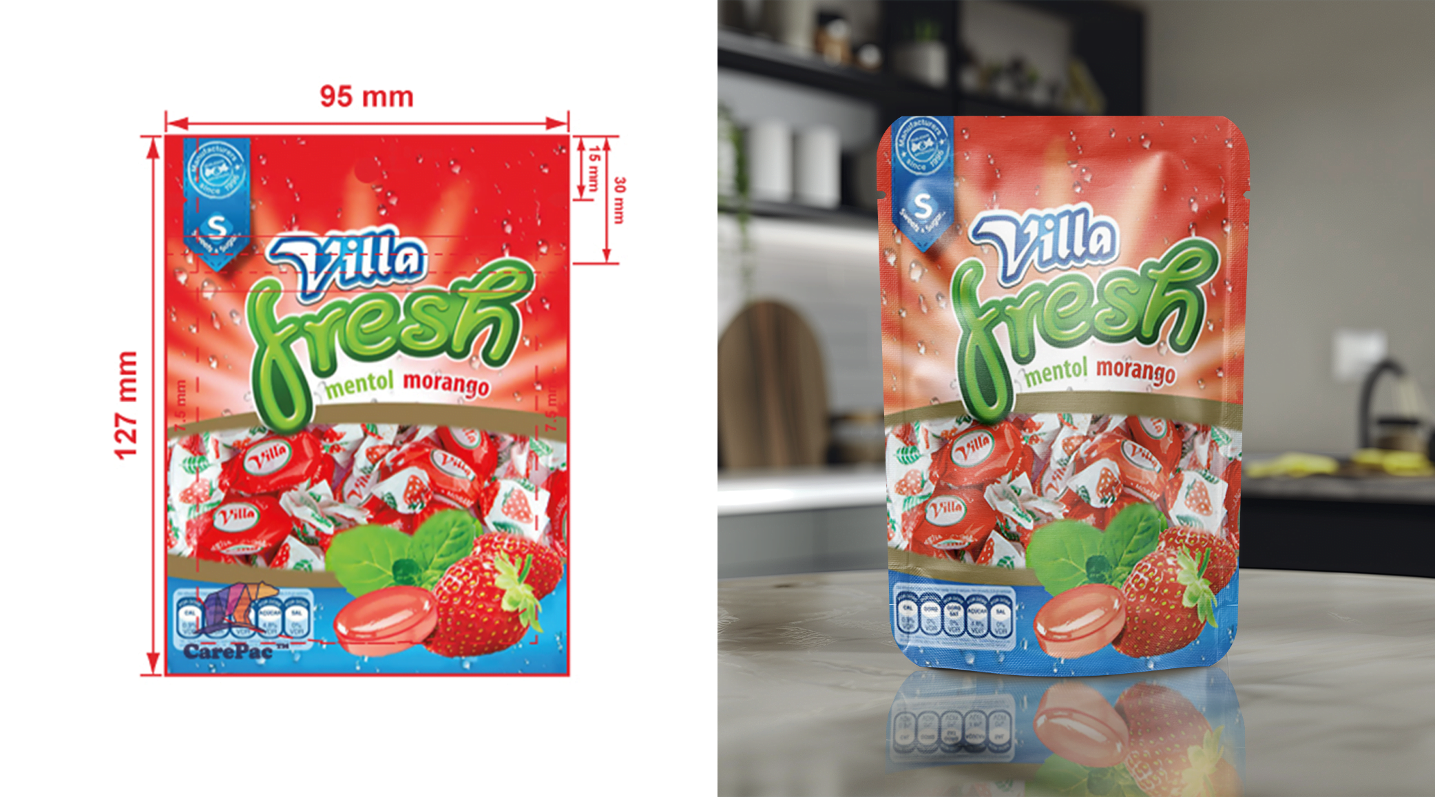
    As mentioned, the colors on your physical custom packaging will differ from how the colors of your package design looks on your computer screen, as printed on other materials, in virtual renderings, or as printed by different methods or on a different printing press.

    The final color on your custom packaging will be influenced by several factors, including the material of your product packaging, inks, and color shift. These variations of package designs are part of the creative process and should not come as a surprise to your creative director, web design team, or social media followers.

    Screen color of your graphic designer

    The color you see on your screen will be different than actual ink on film due to your brightness settings, the light level in the room, and whether you’re sitting in natural or artificial light, among other factors. Top packaging design companies will almost always include a disclaimer about this somewhere on their website.

    Original art

    All original art is best developed by a graphic designer natively in Adobe Illustrator. Art that was adapted from Canva, EPS, SVG, Coral Draw, Photoshop, InDesign etc. may not perform as well as native Adobe Illustrator art, and you may see a more noticeable difference between the package design mock-up colors and the colors in the final product packaging.

    Base material, laminations, and finishes

    The choice of packaging materials for your custom packaging will affect the color of your project. Color printed on clear packaging materials will look different than colors printed on a silver metalized material, white paper, or kraft paper. Your choice of finish will also influence the final color outcome.

    Ink is not 100% opaque

    All ink, and importantly white ink, is not 100% opaque. Areas with white ink coverage will not fully obscure dark colored graphics or products from showing through on clear materials. Your graphic designer or design agency will take this into account as they design your packaging.

    PMS

    Pantone® PMS ink on paper, or as seen in a PMS color deck, will appear different than PMS ink printed on film. Pantone uses LAB to define ink formulations, specific LAB values may not be achievable when printed on film. Different substrates and print conditions using different ink formulations result in different visual results. Certain specialty PMS color decks cannot be accurately matched.

    Digital printing

    All digital printing is a five-color process. Digital printing cannot exactly reproduce Pantone colors, especially those that are outside of the CMYK color gamut of our press. Projects converting from digital to plate printing will not color match 100%, as there will be differences in color. Digital printing is subject to variation between printing lots. PMS color printed digitally will have color shift.

    Color shift

    If you have previously printed this design on another press or material there will be color variation. Projects which are color matched are still subject to color shift may occur.

    The Pros and Cons of Different Printing Techniques
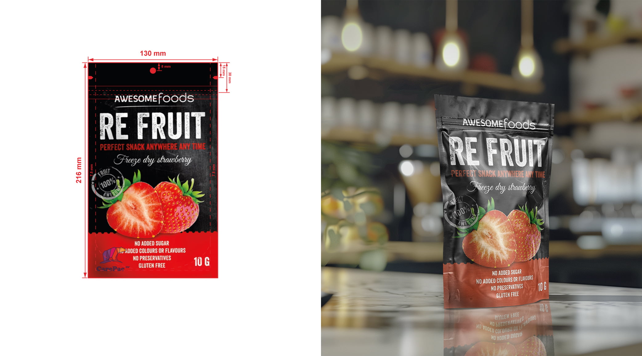
    When it comes to custom packaging design, there are a variety of printing techniques to choose from. A packaging design brief provided by your package designer should include more information about each of these and how they impact certain design elements, but here’s a quick breakdown.

    Digital printing

    Digital printing is an extremely popular printing method for custom packaging design. It’s quick, is good for photographic reproduction, and is great for prototyping and small order runs (as low as 100 bags.)

    Unfortunately, when it comes to consistent color reproduction across different materials and finishes, digital printing is not a favorite of packaging design companies. It’s also more costly and has less bag finish options than others on this list.

    Flexographic printing

    When it comes to product packaging, flexographic printing is good for uncoated paper printing. Additionally, the plastic plates used in this method are quick and easy to produce.

    The disadvantages of using flexographic printing for your product packaging include the print quality on plastics is poorer than other options, and it’s more expensive than rotogravure on a per unit basis.

    Rotogravure printing

    Rotogravure printing is great for longer print runs, offers better Pantone matching, and has more finish options. Since it does require plates, though, there’s higher order minimums than other options (5,000). Additionally, CYMK printing of photographs on design packaging is not as easy with rotogravure printing as it is with digital, so depending on the your packaging design some high color projects make more sense digital upto 25,000 units because of the cost of Rotogravure step. .

    How packaging designers choose the right printing technique

    As you can see, choosing the right printing method for your package design isn’t as easy as it seems. Fortunately, our packaging designers are here to help! They’ll look at the quantity and color count of your packaging design, in addition to how much of the design is made of photographic elements, and they’ll make a recommendation for your unique packaging designs.

    Without understanding the individual characteristics of your packaging and label design, it’s hard for us to make a specific recommendation. Our packaging designers will play a key role in looking at all the different design elements that come up with the design process and will help you choose the technique that’s right for your specific package design.

    Choose CarePac: Your Packaging Designer Partner
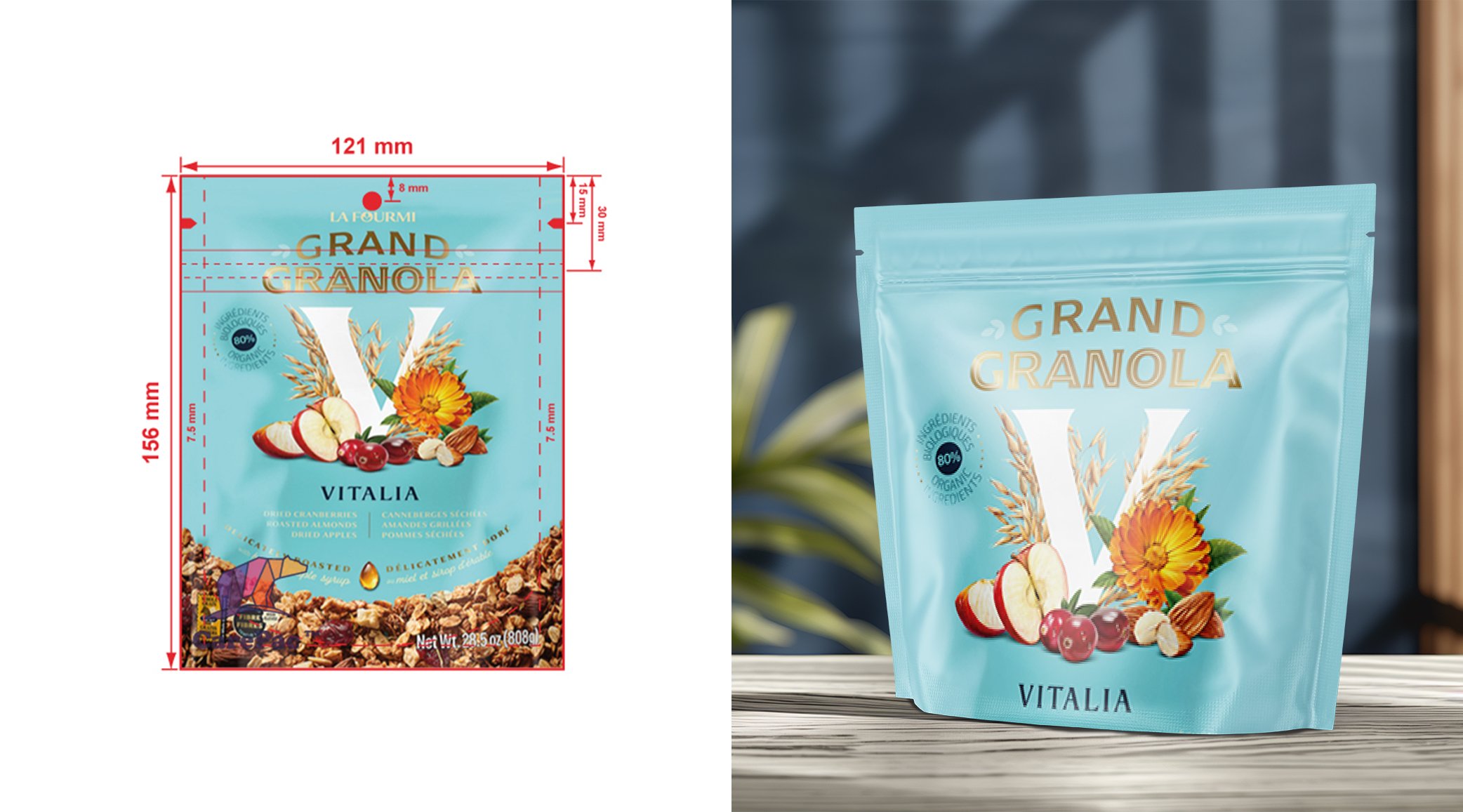
    At CarePac, we care about customer satisfaction, whether you’re a branding agency, a small business, a design professional, a creative agency, or an art director for a retail or consumer goods company. We use strategic thinking and an understanding of your target market to put together award winning packaging designs.

    If you’re looking for generic packaging, there are other packaging design companies you can work with. But if you’re looking for the best packaging designers and the best packaging design ideas, you’ve come to the right place. Here are a few ways ways we’re different from other packaging designers:

    Fully customizable to match your brand identity

    Every part of your product packaging is customizable, from the way it feels to how it closes and is presented on a shelf. We’ll create something that matches your brand identity.

    Low MOQs

    If your brand strategy is to focus on seasonal products, our low MOQs mean you won’t be forced to order product packaging you can’t use.

    Excellent customer service

    Our customer service and graphic design team simply can’t be beat. We’ll set you up with the right packaging designer who actually listens to their client’s ideas and keeps things like final cost and other key elements in mind throughout the design process.

    Variety of packaging materials

    Our packaging designs can work with a variety of materials, and we’ll help you choose the material that works for you. There’s nothing we love more than successful projects or a happy design agency!

    Quick shipping

    You’ll receive your packaging designs in a timely manner, so you won’t be hesitant to work with our design packaging team again on future projects.

    We care about brand loyalty, and will do everything we can to make you a repeat customer. If you’re ready to hire a packaging company, please let it be us!

    Color Reproduction FAQs

    Here are some common questions we receive about color reproduction and package designs:

    Are there eco-friendly ink options for flexible material printing?

    Yes! If part of your brand identity is to be eco-friendly, we can help find materials and inks to match. Just let your package designer or graphic designer know that this is important to you and we will make sure this is incorporated into your final package design.

    Can a package designer use the same ink for different flexible materials?

    Depending on the material and type of printing method (rotogravure, digital, etc.), different inks or ink colors will need to be used. Your package designer will make sure your final package design takes this into account, and will ensure that the colors of your exterior and interior packaging match.
    Lets Get Started

    Made In The USA

    Full PouchCustomization

    Scalable Printing Digital & Plate

  • How to Change DPI on Photoshop: Step by Step Tutorial

    How to Change DPI on Photoshop: Step by Step Tutorial

    How to Change DPI on Photoshop: Step by Step Tutorial

    What is DPI?

    DPI, or dots per inch, defines an image’s sharpness and is essential for ensuring your brand’s colors and print images are vibrant and stay true to the original design. Since DPI affect the clarity, detail, and overall impact of a printed image or new document, understanding the concepts of image resolution, DPI, and how they work together is essential.

    First, we’ll define both terms, as we will be using both terms throughout this informational blog:

    DPI Defined

    Dots per inch (shortened to DPI) measures the printing resolution of an image. As you probably guessed, it indicates how many ink dots are included on each inch of paper. The higher the “dots per inch” are, indicates a higher quality image.

    For larger format printing, like large posters with an image displayed on them, the range of the physical dots per square inch will usually fall between 150 to 300 DPI.

    Image Resolution Defined

    Image resolution (or print resolution) refers to the amount of detail an image has. Often measured in pixels per inch (PPI), high resolution images have more pixels, which translates to more detail and sharper images. Ultimately, the resolution needs to be high enough to avoid pixelation, but low enough so you aren’t spending too much money on the final printed image.

    Why is DPI Important in Packaging Design?

    Resolution and DPI are very important in packaging design. The fact is, low resolution images can harm even the most well thought out advertising campaigns — if the ratio of printed dots is off, it makes customers feel like your brand is unpolished and unreliable. Additionally, if you have text or other important details included in your image you want to make sure your customers can easily see the details, regardless of the screen resolution of their device.

    Finally, an image’s DPI helps ensure color accuracy. The higher the DPI, the more accurate the colors will be during production. This is especially important for brands where their color is extremely well known, like McDonald’s or Reese’s.

    Step-by-Step Guide to Changing DPI In Photoshop

    If you’d like to adjust your DPI resolution in Photoshop, it’s relatively easy. Just follow these steps:

    1. Launch Adobe Photoshop dialog box on your laptop or desktop.

    2. Navigate to File > Open and select your image.

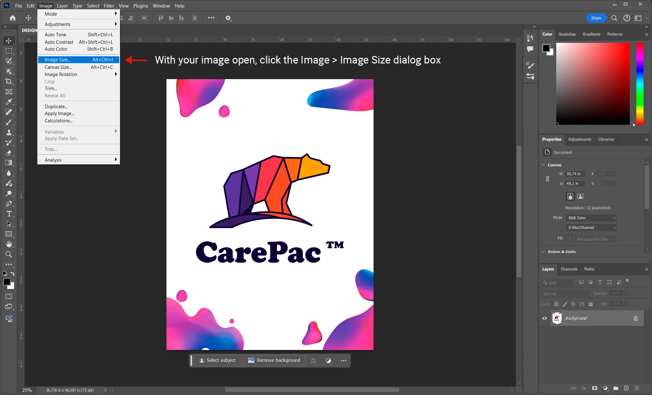
    3. With your image open, click the Image > Image Size dialog box.

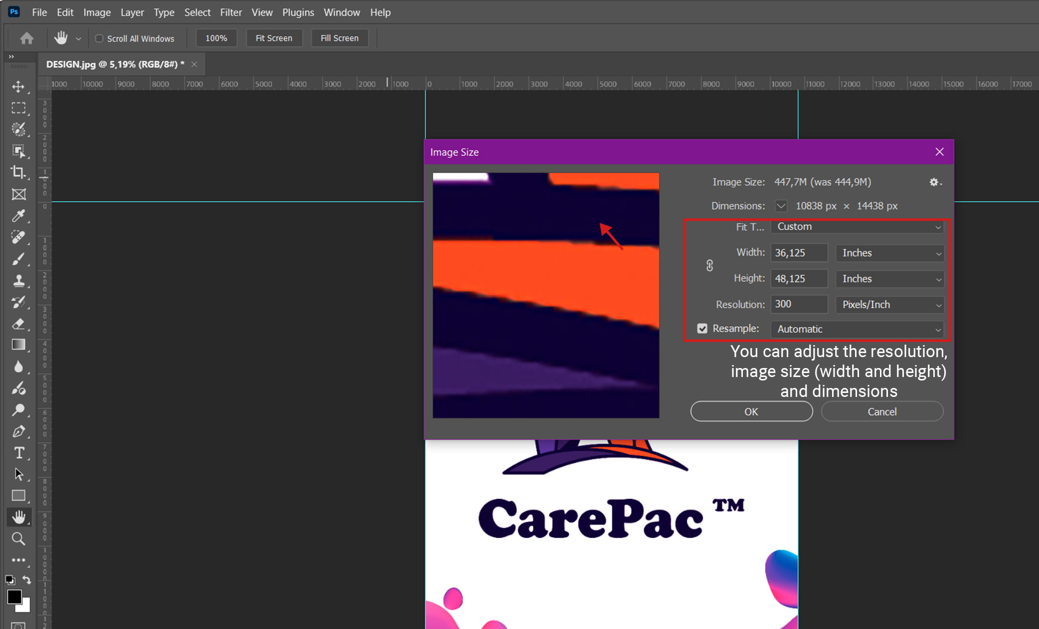
    4. Here, you can adjust the resolution, image size (width and height) and dimensions to your liking.

    You can make these updates to your image without changing the existing pixels of the image — just make sure to deselect “Resample” while you use these tools in Photoshop. This won’t add more pixels; it’ll just adjust the image’s DPI, or dots per inch.

    Within Photoshop you can also see other important image information, like Photoshop metadata and notes left by professional printers and designers.

    Tips for Designers Concerned About Image Quality

    If you’re concerned about image quality and want to create a good print image in Adobe Photoshop, here are some tips from our pros:

    • Always consider the final purpose of your printed or digital image, and work backwards to find the right DPI and image dimensions. Ask yourself these questions: How will the printed image be presented to customers? Will it be viewed from far away or extremely close? What size does it need to be?
    • Check the required resolution before committing the original image to print. Always double check (or triple check!) your settings to avoid surprises and wasted materials.
    • Use the highest quality camera possible when taking photos. It’s easier to catch as much detail as possible while taking the photo vs. bringing a lower quality photo up to a higher resolution. Do your best to take high quality images, as a high resolution photo is easier to work with.
    • Consider the printing paper and ink type. These can affect how the higher resolution image looks in its final form.

    CarePac: Your Digital Image Printed Packaging Partners

    Understanding the importance of image dimensions, resolution, and DPI in Photoshop can be the difference between a high resolution image that properly showcases your brand, and a low resolution image that can harm your reputation.

    When it comes to product packaging, specifically, that’s where we come in. The CarePac Design Team is well versed in the complex landscape of ink dots and how the dots per inch impact the resolution field of the final printed document.

    Contact Us Today to Get Started

    We can walk you through how to adjust DPI in Photoshop, or we can handle the nitty gritty for you. Regardless, we’re all about high quality images and creating product packaging in the perfect print resolution. Contact us today to get started.

    DPI FAQs:

    Here are some common questions we receive about DPI resolution and how to change the DPI in Photoshop.

    What is the recommended DPI for packaging design?

    300 DPI is a good resolution baseline for smaller printed items, while an extremely large file, like billboards and posters, can be closer to 150 DPI.

    Can I increase the DPI of a low-resolution image size?

    Yes, you can increase the dots per inch and resolution setting in Photoshop. See above for a step-by-step breakdown of how to change the DPI and printed dimensions in Photoshop.

    What is the difference between DPI and PPI?

    DPI stands for dots per inch, and PPI stands for pixels per inch. Both terms measure an image’s default resolution, but they refer to different things.

    How does changing DPI affect file size?

    Increasing the dots per inch (DPI) of an image will increase the file size because adding more pixels and/or changing the number of pixels requires more data to store. An increased DPI will almost always increase the size of the new document.

    Why do my prints look different from my screen design?

    There are a few reasons why your prints might look different than your screen designs, including lighting, device quality, resolution, printer brand, ink type, and paper type.

    Let’s Get Started

    Made In The USA

    Full PouchCustomization

    Scalable Printing Digital & Plate

  • The Specifications for Extended Shelf-Life in Food Packaging

    The Specifications for Extended Shelf-Life in Food Packaging

    The Specifications for Extended Shelf-Life in Food Packaging

    What is Extended Shelf Life Food Packaging?

    Food packaging materials have several key roles, one of which is extending shelf life of the food products that are packaged within. Extending shelf life depends on many different factors, including the type of food, the environment the food is stored in, and the material the food is packaged in.

    In addition to attempting to extend shelf life, barrier packaging also helps to keep food free from contamination and microbial growth, makes it more convenient to transport, and helps perishable goods maintain its nutritional value while its in storage for an extended period of time.

    Simply put, selecting the right plastic packaging will help food producers keep their food fresh, effectively fighting food waste. It helps protect food products from light, moisture, and oxygen, effectively improving the flavor while maintaining its texture. Your consumers deserve the very best, and that’s where we come in.

    Things to Consider When Selecting Modified Atmosphere Packaging

    There are several things you must consider when selecting modified atmosphere packaging for your packaged food. From material to sealing techniques, we’ll break down the main considerations below. When combined, they all work together to extend shelf life of food products consumers love.

    Material Choice to Help Extend Food Shelf Life

    Material choice is incredibly important to helping food stay fresh longer. Whether you’re packaging fruit, vegetables, dry foods, or some other kind of food items, the right packaging material can help the food products inside remain fresh and maintain their flavor.

    If the material is too thin it won’t have a strong oxygen barrier or proper gas permeability. You want to avoid tiny holes that impact physical protection, while going with the thinnest material possible to save money. We can help you select the proper food packaging for your consumers needs.

    Barrier Properties to Help Avoid Food Waste

    As previously mentioned, you’ll want your food packaging to have the appropriate barrier properties. Generally speaking, high barrier plastic packaging helps retain flavors and aromas and extend the shelf life of food by creating a tight seal. The barrier protects food from oxygen transmission, organic acids, and helps extend food shelf life during long term storage.

    Packaging Technology

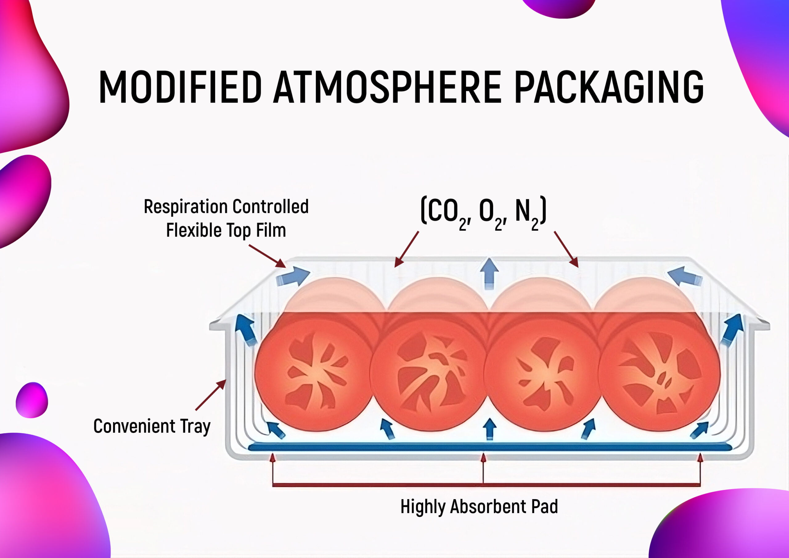
    In addition to selecting the right packaging material and ensuring your bag has barrier properties, you can also include specific packaging technology in your bag. An example of this technology includes opting for modified atmosphere packaging, vacuum packaging, or active and intelligent packaging technologies like oxygen absorbers.

    If you’re unsure about what kind of food preservation technologies are currently available for the food industry, we can walk you through all the sustainable packaging solutions we have available. When keeping food fresh is key, we can help!

    Sealing Techniques

    We cannot stress the importance of proper sealing. You can select the very best packaging materials and opt for an oxygen absorber and materials with antimicrobial properties, but if there is not a proper seal it’s all for nothing. The seal has a direct impact on product shelf life, protecting food from food spoilage. Some popular sealing techniques include heat seal, cold seal, and ultrasonic seal.

    Storage & Handling

    Once you have your packaging materials in hand, it’s important to practice proper storage and handling techniques. This applies to storing and handling the food packaging before it’s in use and after it’s been filled with your food product. You’ll want to keep your bags in a sterile environment, away from mold and bacteria growth, moisture, and UV light. Once packed, the food item should be kept at the proper temperature, and transported with care. Ultimately, you can give your food items a longer shelf life by paying attention to food safety requirements.

    Regulatory Standards

    Finally, each industry has a variety of regulatory standards that companies must meet. For the food industry, specifically, they’ll take into fruit, vegetable, and meat science into consideration when coming up with specific standards to protect food. These standards will protect the nutrient content and freshness of the food items while in long term storage, which will effectively cut back on food waste and food spoilage.

    CarePac: Your Partner in Food Product Packaging

    At CarePac, we’re proud to be your partner in food packaging. With decades of experience with packaging food products, we know just what to do to protect food quality and extend food shelf life. We’ll help you select the perfect material because we understanding the role packaging plays in protecting against food spoilage and waste.

    From protecting your fruits and vegetables from microbial growth and UV light, to designing plastic packaging that will entice your customers to purchase YOUR product, we’re your partner in all things packaging. Contact us today to get started!

    Lets Get Started

    Made In The USA

    Full PouchCustomization

    Scalable Printing Digital & Plate

  • Vertical vs Horizontal Form Fill Seal Machine: VFFS vs HFFS

    Vertical vs Horizontal Form Fill Seal Machine: VFFS vs HFFS

    Vertical vs Horizontal Form Fill Seal Machine: VFFS vs HFFS

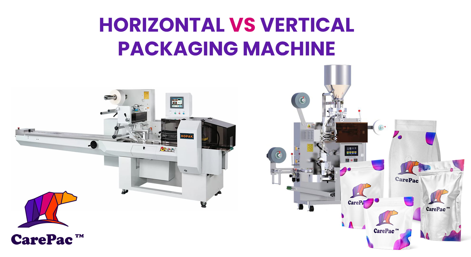
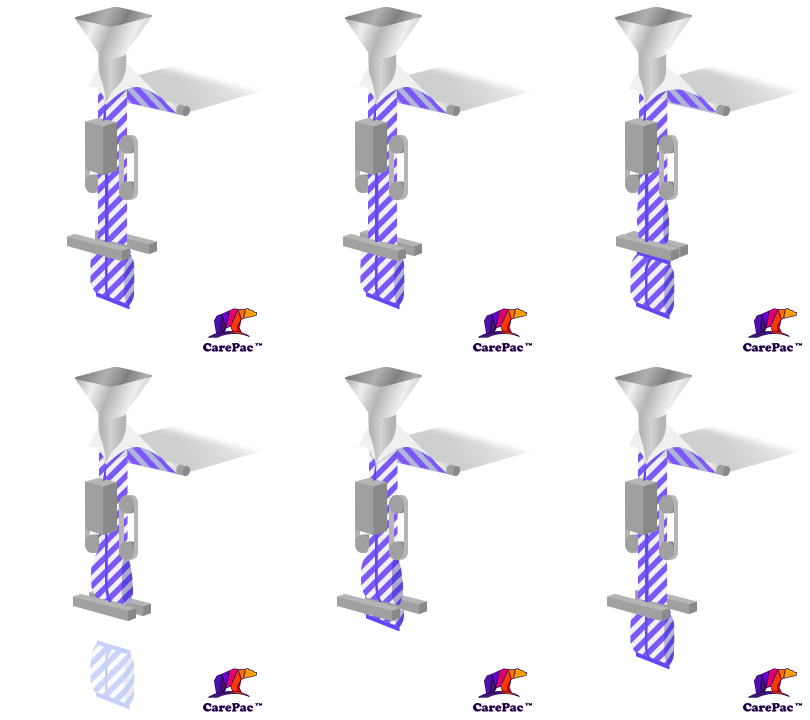
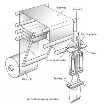
    Vertical form fill seal (VFFS machines) and horizontal form fill seal (HFFS machines) are two different variations of a form fill seal machine that seal the bag or packaging film in different ways. So, what does a form fill seal machine do? To put it simply, a form fill and seal machine uses a flat roll to form a package, fill it with a product, and then seal it.

    It’s important to select the right FFS machine because your materials need to be compatible. Its compatibility affects the efficiency of the packaging process and the quality of the final product. Your packaging provider partner can help you select the appropriate packaging formats.

    What is a Horizontal Form Fill Seal Machine?

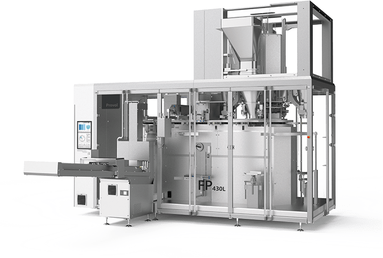
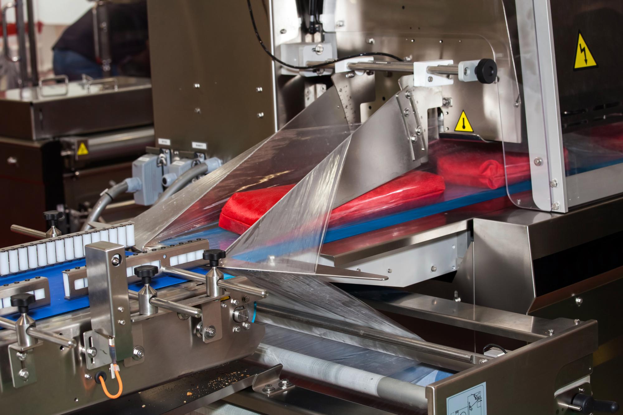
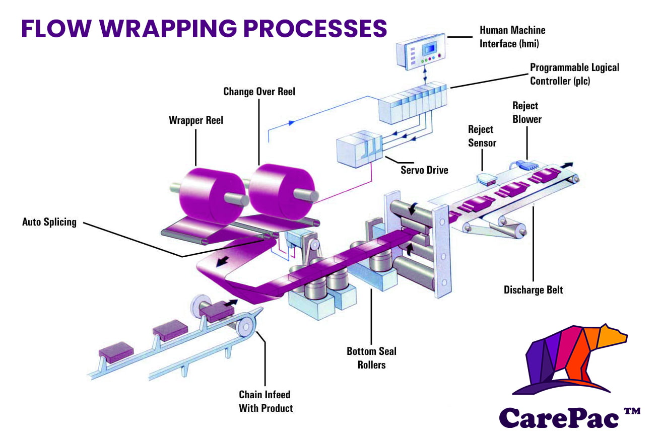
    A horizontal form fill seal machine is a packaging machine that forms, fills, and seals flexible pouches or bags horizontally. Horizontal machines require more room than vertical packaging machines. Although they can wrap everything from small objects to bulky items, HFFS are best for single (and solid) goods. The types of items you’ll often see packaged in horizontal machines are single serving food items, like bakery products and protein bars, making horizontal seal machines a popular choice in the food industry.

    Advantages of Horizontal Packaging Machines

    The advantages of horizontal machines are many. Here are some of the key benefits:

    • Minimal material waste, which can lead to cost savings
    • Cost-effective option for packaging promo items and samples
    • Packaging shape and construction can support brand visibility when combined with the right packaging design
    • HFFS bags weigh less than other packaging types, which can reduce transport costs
    • Available in a range of sizes; can be square and rectangular
    • Can be combined with gas flushing to ensure that all oxygen is removed before being sealed
    • A HFFS machine is better for heavier products

    What is a Vertical Form Fill Seal Machine?

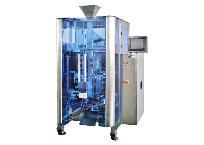
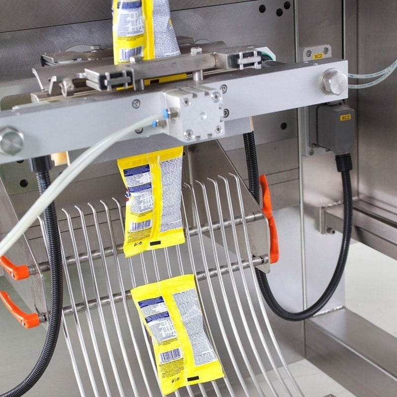
    As you probably guessed, a VFFS machine is used in the packaging industry to form, fill, and seal flexible pouches vertically. VFFS machines are suitable for powder, granular, or liquid products that need to be packaged in a stable and leak-proof manner. Though this packaging machine can be used to package some solids, vertical baggers are usually used for liquids and other consistencies that are difficult for HFFS machines to handle. If you’re packaging a liquid, VFFS machines are your best bet.

    Advantages of Vertical Packaging Machines

    Here are some of the key benefits of a vertical form fill seal machine:

    • Though the cost can vary depending on machine size and production volume, in general VFFS machines are a more cost-effective packaging solution than HFFS machines
    • Due to their compact design, vertical form fill seal machines require less floor space than a horizontal packaging machine, making them a great choice if you have limited space (which many businesses do)
    • Ideal for sealed sachets and pouches and packaging items of varying consistencies

    Key Differences Between Vertical & Horizontal Packaging Machines

    The main differences between vertical machines and HFFS machines can be broken down into the following categories: orientation of packaging, machine footprint, product compatibility, sealing mechanisms, speed and efficiency, and packaging format.

    Packaging Orientation

    As you already know (and as the name indicates) the primary difference between vertical machines and HFFS machines is their physical orientation. HFFS machines seal packaging materials horizontally, while VFFS machines are a packaging solution that seals things vertically.

    Machine Footprint

    An HFFS machine requires more floor space than a vertical form fill seal machine. The reason for this is that horizontal flow wrappers are typically much longer than they are wide. Unfortunately, some facilities just don’t have the room for horizontal seal machines and many businesses make do with a VFFS machine instead.

    Product Compatibility

    If you’re looking for a sealed bag that is holding liquid, powder, or some other type of granular product, a vertical form fill seal machine is your best choice. Single-use food products, like cereal bars and candy bars, are best suited for HFFS machines.

    Speed & Efficiency

    While both HFFS machines and VFFS machines offer unique benefits, machines with a horizontal layout have a clear advantage in terms of packaging speed during the packaging process. Since HFFS machines can pack a large number of stand up pouches in a short about of time, these sealing machines are especially useful for high-volume applications, particularly if your warehouse has multiple filling stations.

    Packaging Format

    Both seal machines can work with various packaging formats and films, though horizontal filling machines work with more closure types. Though VFFS machines can accommodate bags of different sizes, HFFS machines can work with a plastic film, and pouches, cartons, and heavier bags with zippers or nozzles.

    Choosing the Right FFS Machine for Your Needs

    So, how do you choose between horizontal and VFFS machines? It ultimately comes down to your own unique circumstances, as each of these form fill seal machines has its own unique pros and cons. Before you can decide, you’ll need to ask yourself these questions:

    Which product am I packaging?

    HFFS machines are ideal for solid and irregular product shapes. VFFS machines, on the other hand, are the preferred choice for powders, granules, and liquids. If you’re packaging electronic components or a user friendly control panel, you’ll want to go with an HFFS machine. If you’re packaging laundry detergent or liquid dish soap, a VFFS machine is the way to go.

    Does production speed matter?

    If production speed is of the essence (i.e., you use a conveyor belt and need to seal packages quickly), horizontal form fill seal machines can pack up to 400 bags a minute. A VFFS machine is slower.

    How much space do I have?

    If you have a lot of space to house your production line, you can get away with horizontal form fill seal machines. A VFFS machine is a good choice for various industries with a smaller facility.

    CarePac: Your Partner in All Things Packaging

    Regardless of the packaging equipment you choose, both HFFS and VFFS machines allow for precise control, allowing you to maintain high product quality. Though both may have a higher initial investment than other options and have ongoing maintenance costs, they’re both great choices.

    If you have questions about how to package your diverse product lines, we can help. We know how HFFS and VFFS machines work and have tons of experience with both types of machines. If precise product presentation is important to you, we can help provide the packaging your product deserves. Whether you’re a start up or an established company, our packaging design services can help take your brand to the next level.

    Contact us today to get started.

    Lets Get Started

    Made In The USA

    Full PouchCustomization

    Scalable Printing Digital & Plate

  • What is Bleed in Graphic Design?

    What is Bleed in Graphic Design?

    What is Bleed in Graphic Design?

    What is Bleed?

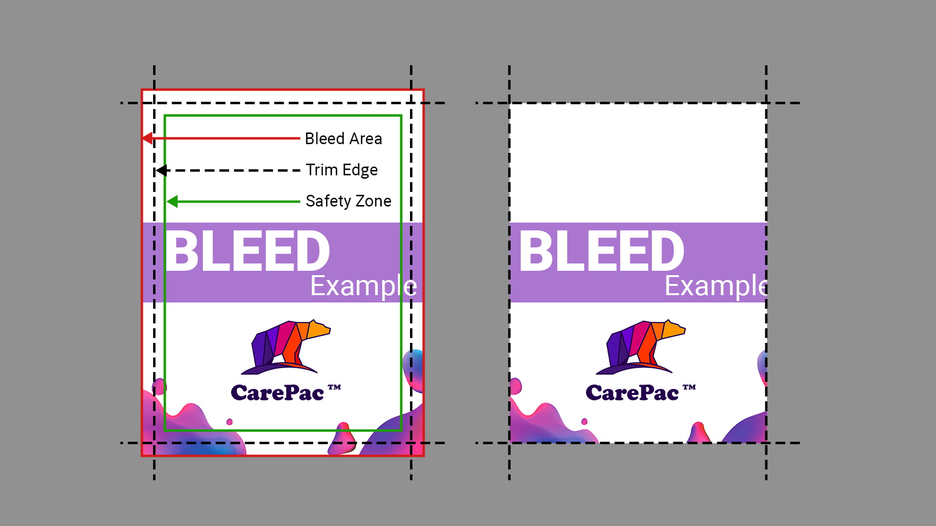
    Bleed refers to the graphic design technique and/or printing process of running artwork to the very edge of a printed document. In doing so, the final printed materials will have elements, colors, and background images that run to the very edge of the page, effectively avoiding unsightly white borders, gaps, spaces, or margins. Many incorrectly assume that bleed elements negatively impact the final print, when in reality bleed is just a technique used by printers and graphic design teams that extends the imagery or background colors to the very edges of the final printed piece.

    Adding a bleed margin during document setup is important in certain printing projects, like business cards, brochures, and posters, as the bleed ensures the color will extend fully across the sheet of paper. Full bleed printing allows for more precise trimming and can help prevent misalignment during the printing and trimming process.

    If you’re unfamiliar with this printing process, we’ll walk you through the basics, including mistakes to avoid and how to set up bleed for the printing process.

    Can flexible barrier packaging be printed full bleed?

    Yes flexible barrier packaging, such as stand up pouches, and box bottom bags can be printed full bleed.

    Is bleed important when designing stand up pouch art?

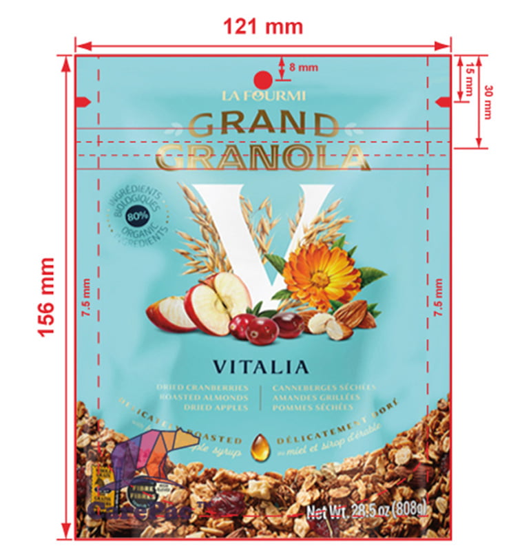
    Typically very little bleed is needed for flexible packaging design files, if you do add bleed limit it to 5mm or less.

    Setting Up Bleed for the Printing Process

    If you want to properly design for full bleed printing during the graphic design stage (i.e., create a bleed line so the finished piece won’t have any white space), here’s how to add a bleed margin to your design in Photoshop, Illustrator, and InDesign:

    Adding a Bleed Trim Line in Photoshop

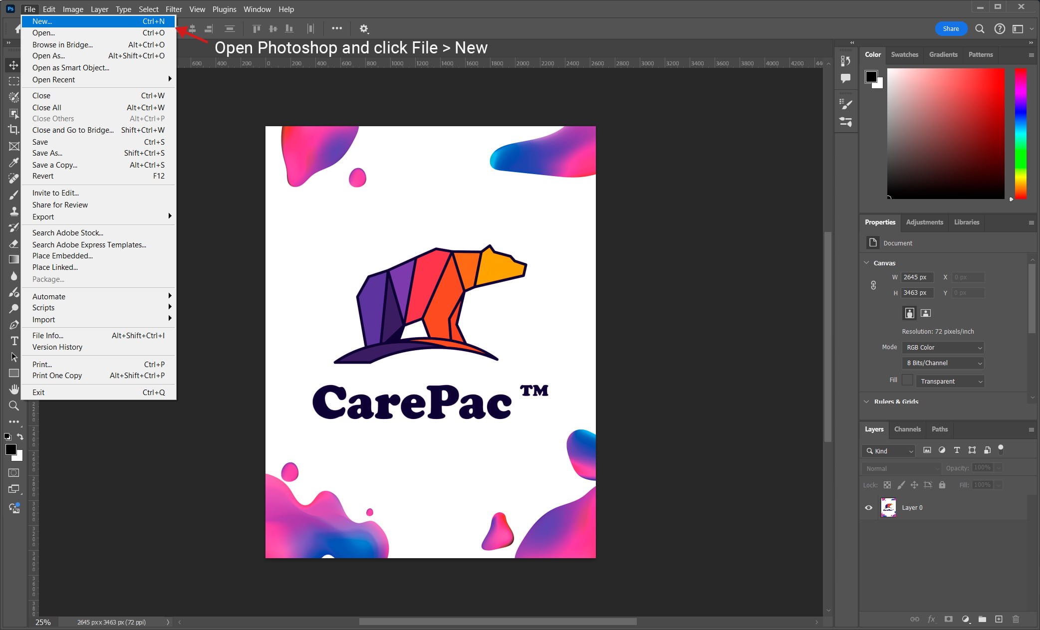
     1. Open Photoshop and click File > New

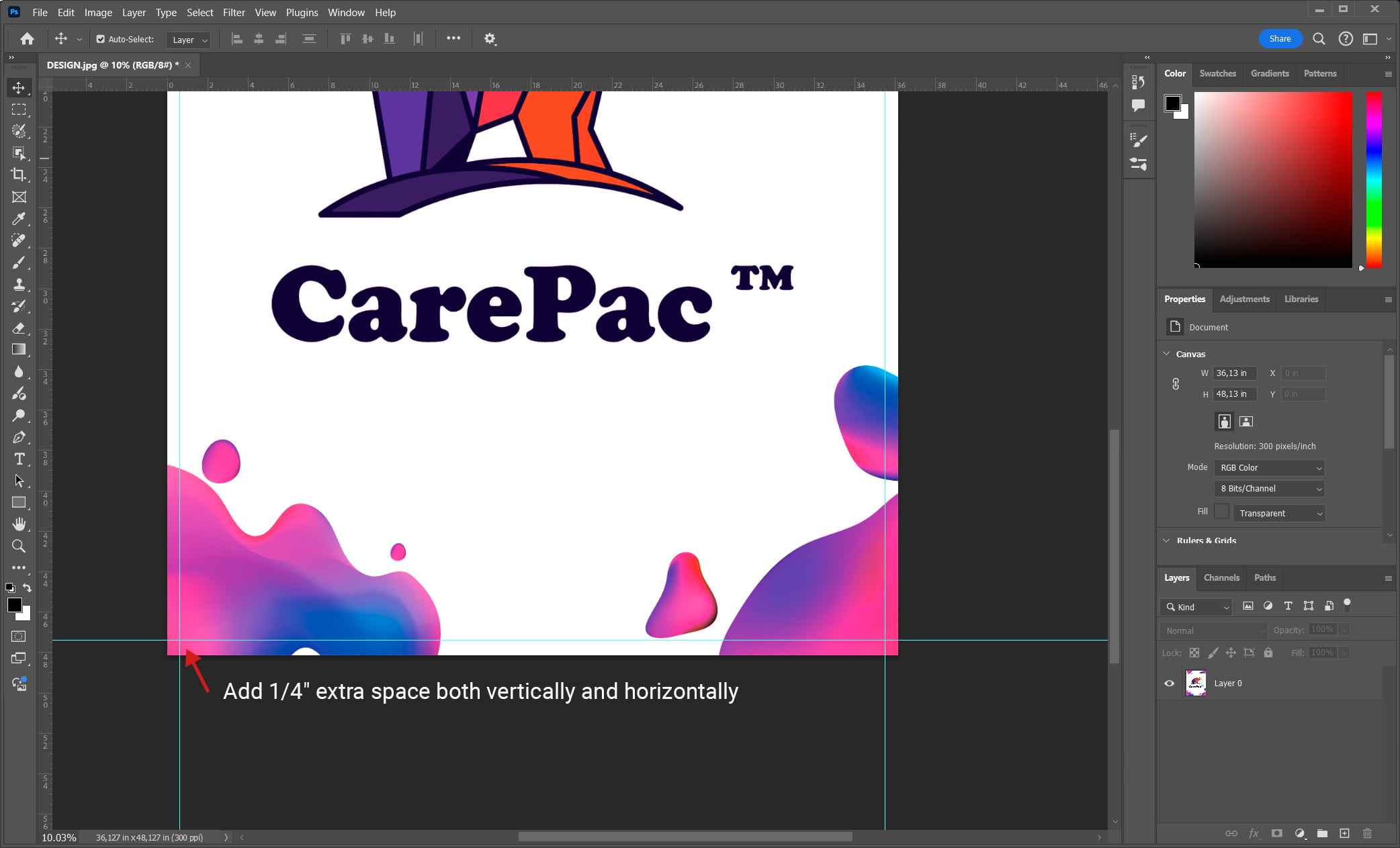
    2. Enter the FULL BLEED dimensions. That is, 1/4″ extra space both vertically and horizontally. This is often referred to as the “safety margin.”

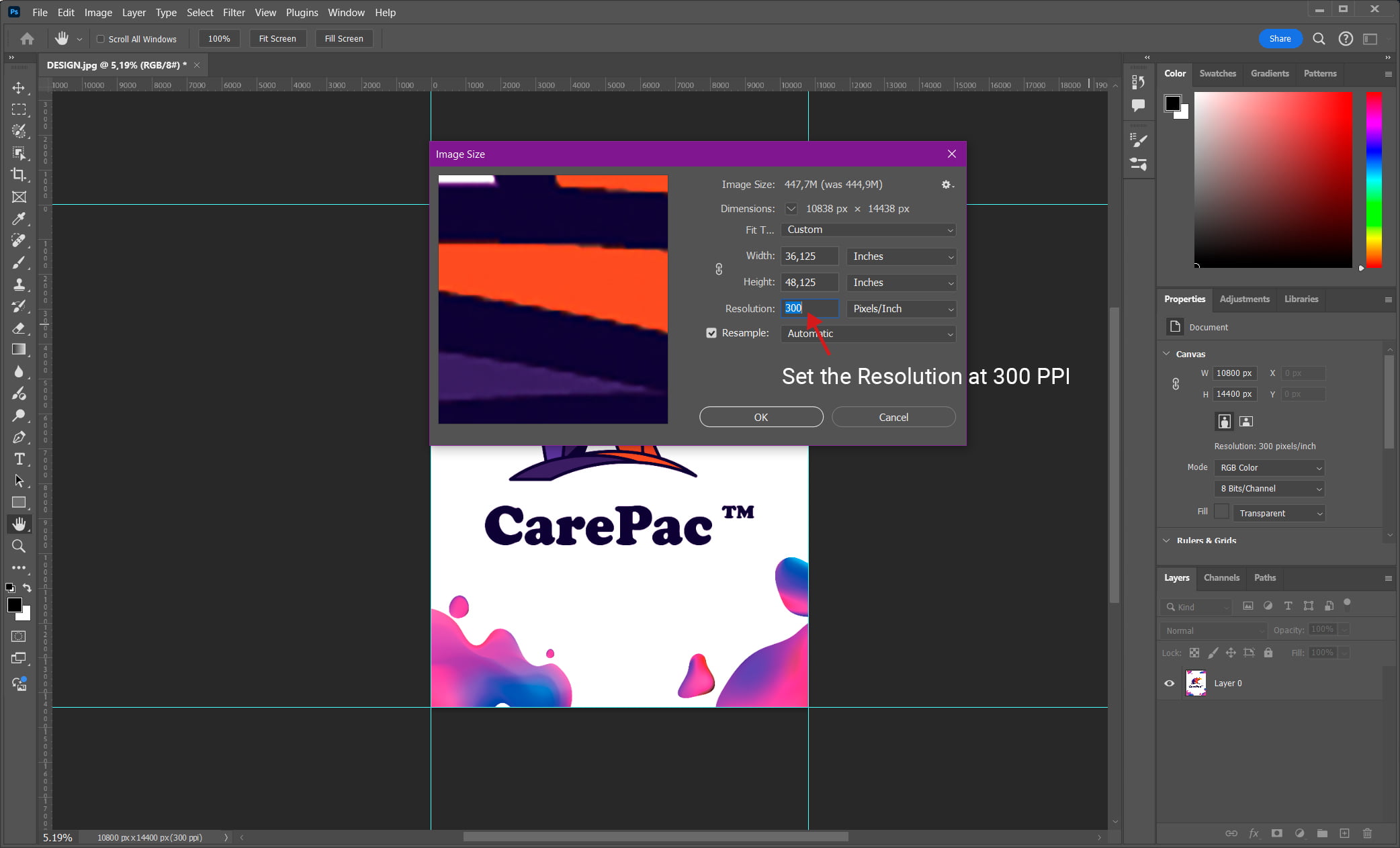
    3. Set the Resolution at 300 PPI

    4. Set the image Color Mode to CMYK

    Adding a Bleed Trim Line in Illustrator

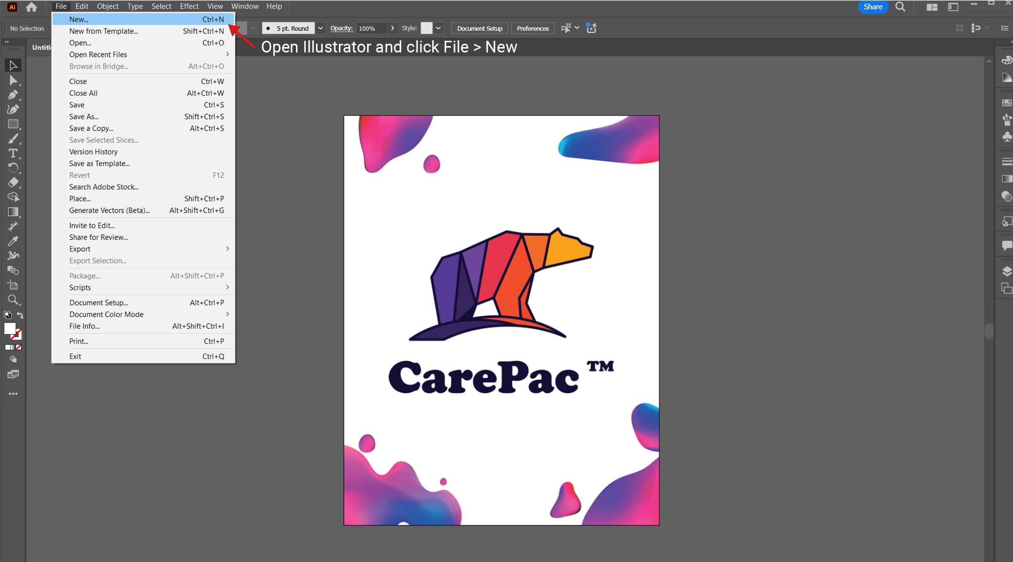
    1. Open Illustrator and click File > New

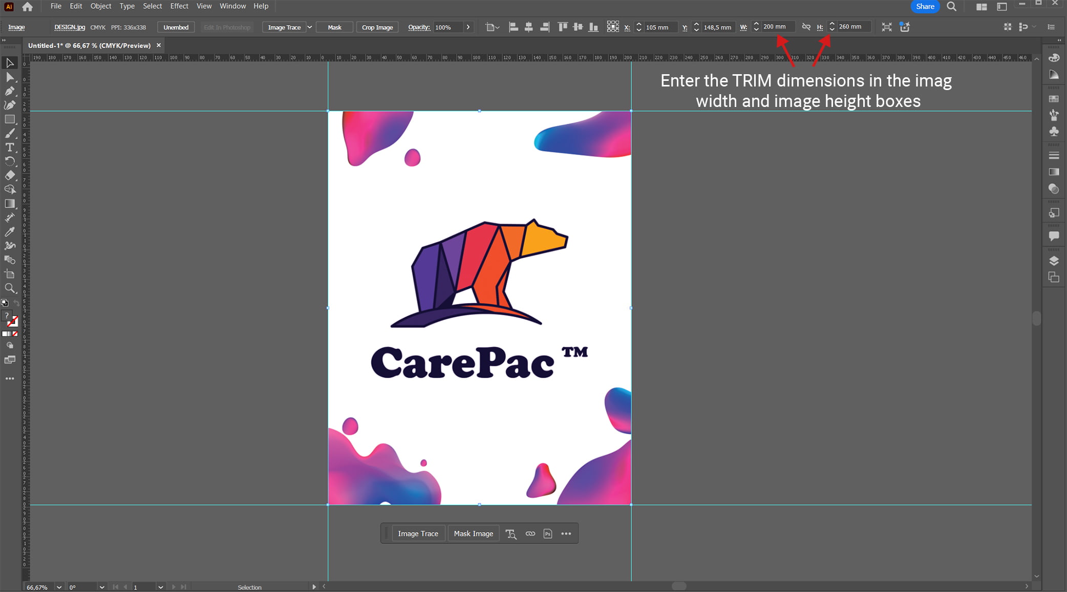
    2. Enter the TRIM dimensions in the image width and image height boxes

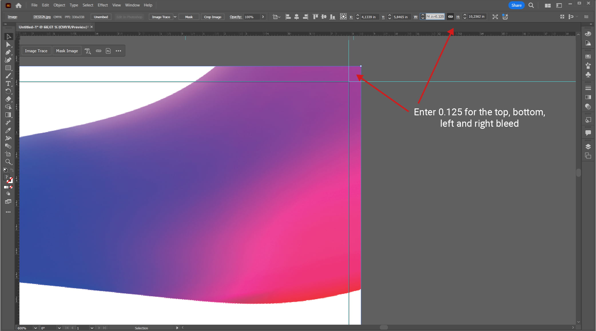
    3. Enter 0.125 for the top, bottom, left and right bleed

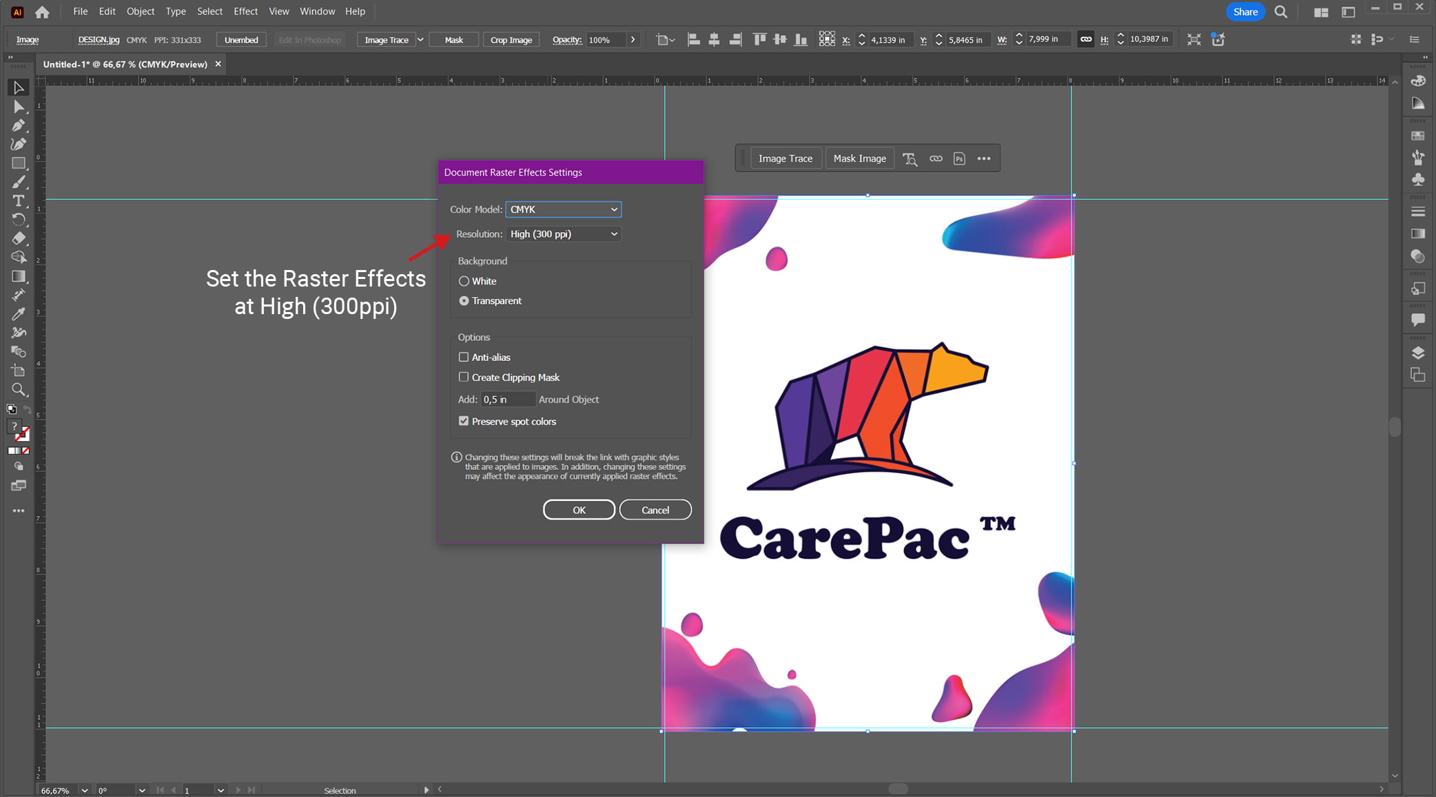
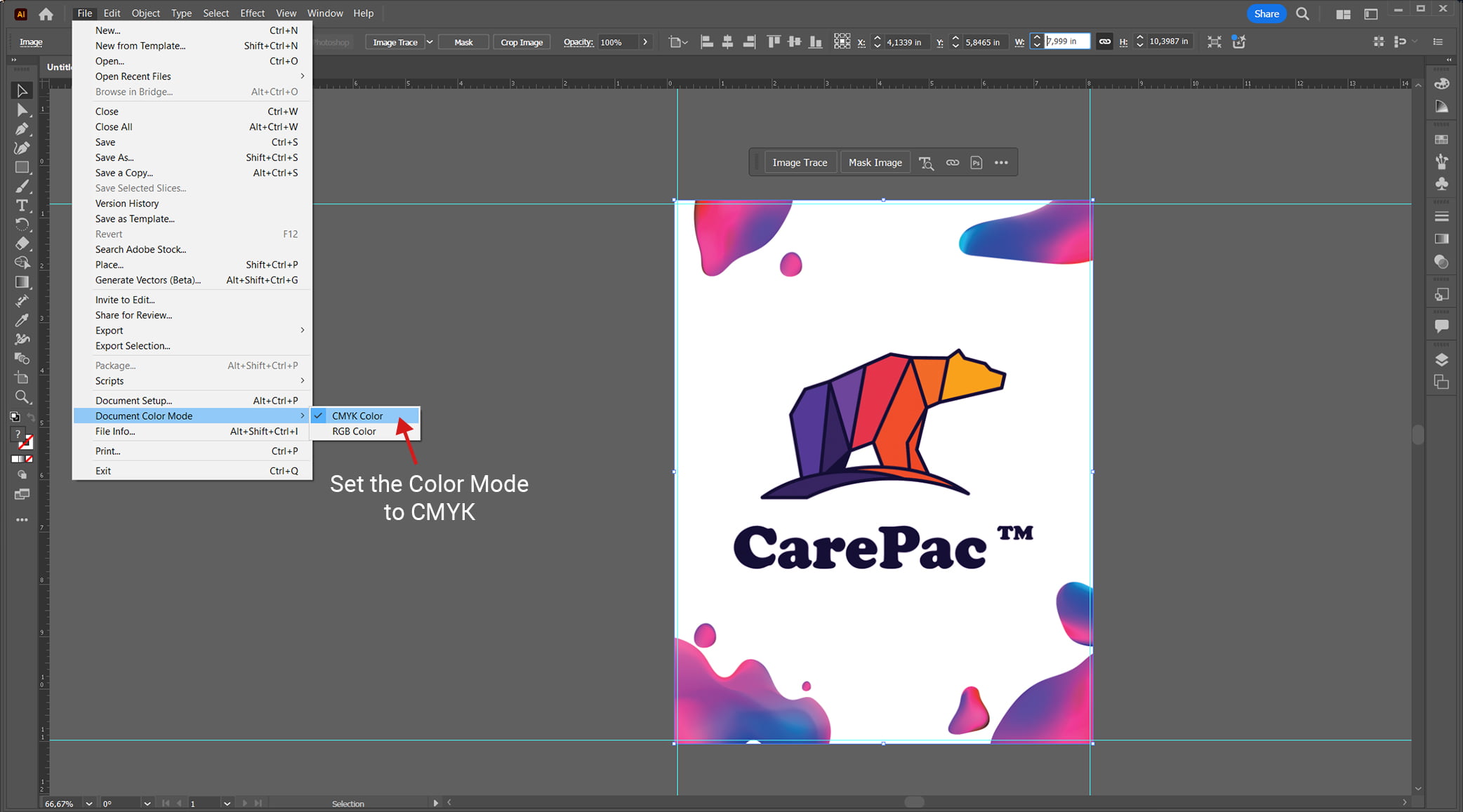
    4. Set the the Color Mode to CMYK

    5. Set the Raster Effects at High (300ppi)

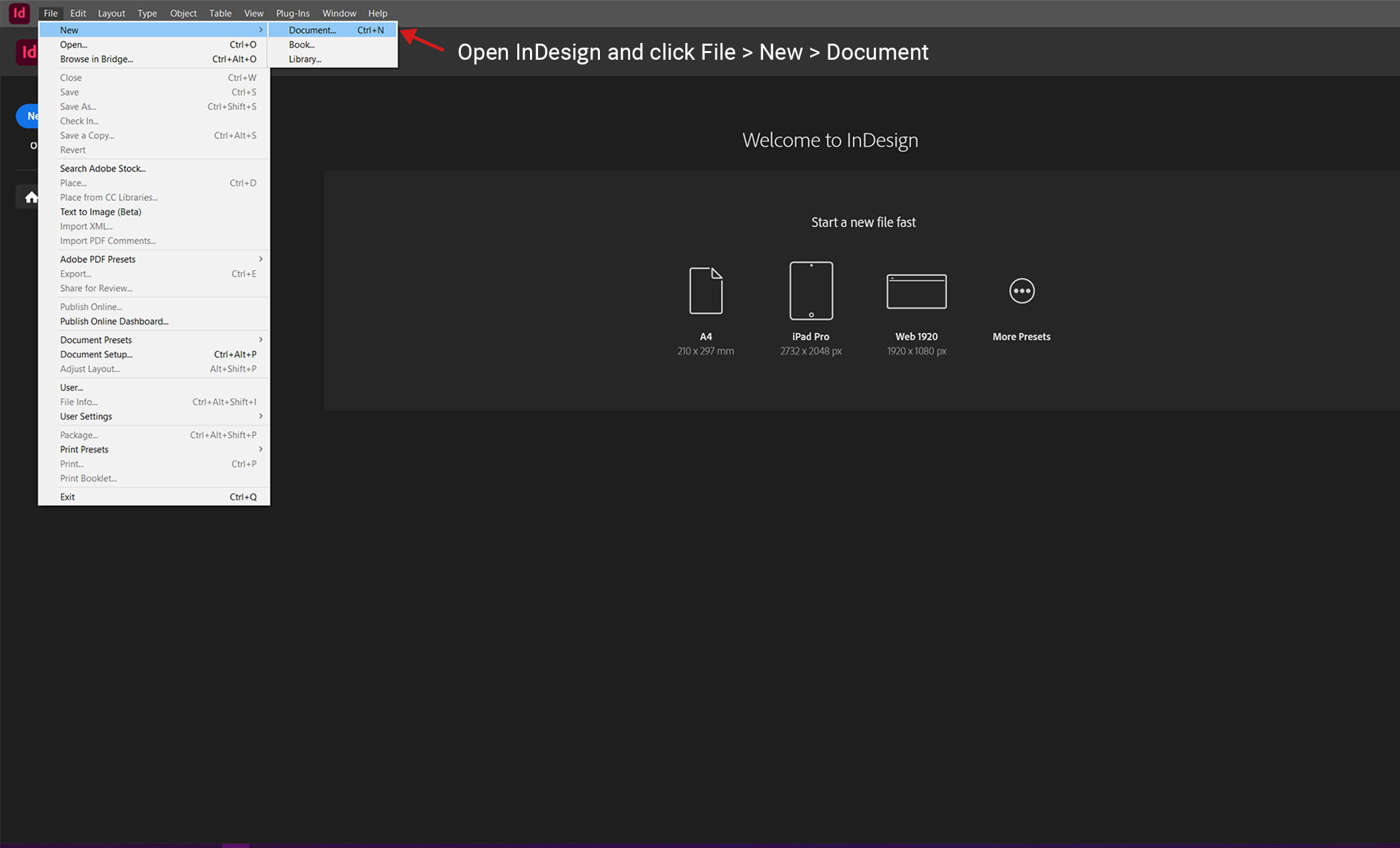
    Adding a Bleed Trim Line in InDesign

    1. Open InDesign and click File > New > Document

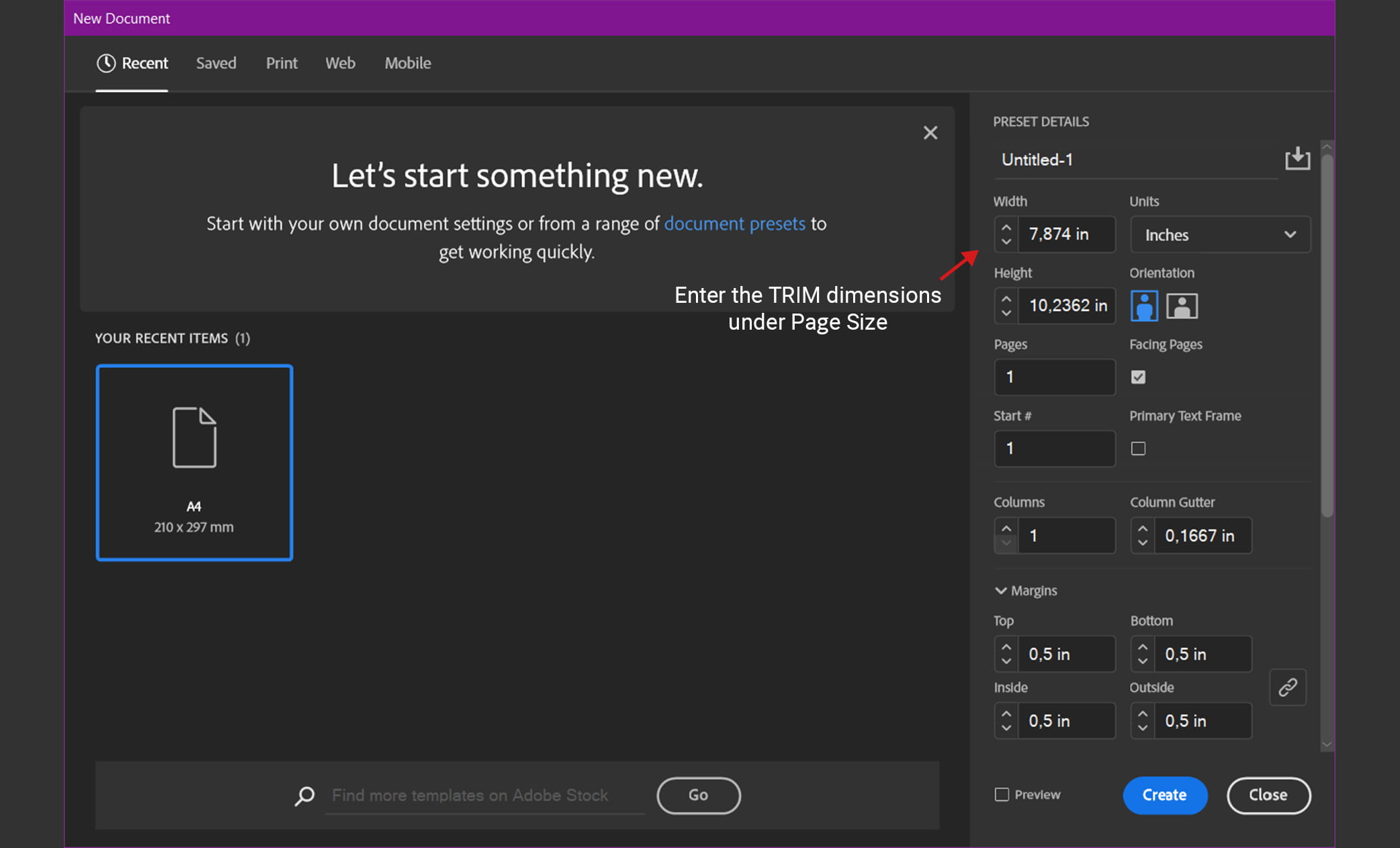
    2. Enter the TRIM dimensions under Page Size

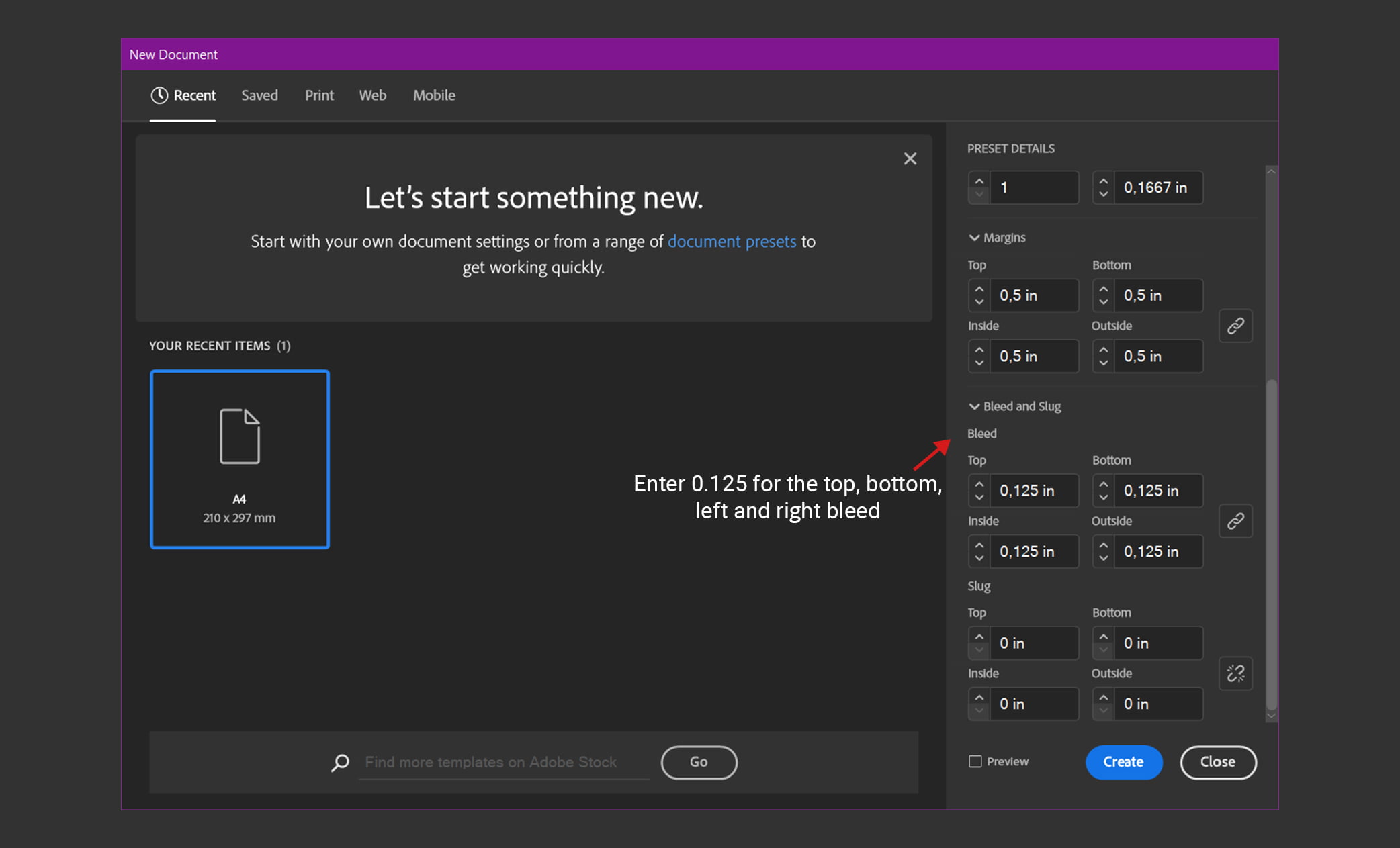
    3. If you do not see “Bleed and Slug” at the bottom of the window, click the “More Options” button.

    4. Enter 0.125 for the top, bottom, left and right bleed

    Before saving any of the above files, make sure to double check the bleed area so that the final trim size and crop marks on the printed pieces will match the safety margin you have in mind.

    Common Bleed Mistakes & Best Practices

    It’s common for first-timers to make mistakes when they try to add bleed margins to their finished product. See below for some common mistakes, followed by some best practices.

    Here are some common mistakes to avoid:

    • Adding a white border as the safety area — avoid white, as this is what you’re trying to circumvent.
    • Putting critical text in the safety margin or full bleed area
    • Expanding the file size to increase the printing dimensions
    • Adding cut marks

    And here are some best practices to keep in mind:

    • Account for bleed line safety margins
    • Extend the design dimension size to 1/8″ on all sides to avoid unprinted edges
    • Be careful during the cutting process to avoid cutting into your full bleed area
    • Always work with professional printers and make sure to meet the specifications of your printer

    CarePac’s Solutions for Flexible Packaging

    Since we focus exclusively on custom flexible packaging solutions for a variety of industries and companies, we have exceptional customer service representatives who are committed to making sure your order is completed to perfection. We can walk you through the basics, or handle it all for you. Contact us today to get started on your next printing project.

    Lets Get Started

    Made In The USA

    Full PouchCustomization

    Scalable Printing Digital & Plate

  • Aspect Ratios in Packaging Design: A Guide for Designers

    Aspect Ratios in Packaging Design: A Guide for Designers

    Aspect Ratios in Packaging Design: A Guide for Designers

    What is an aspect ratio?

    In graphic design, the aspect ratio is the two numbers (or ratio) used to indicate a video or image’s width and height. Aspect ratios for a photo or video are always numbers separated by a colon, with the video or image’s width coming first in the aspect ratio, followed by the height. Aspect ratios help create uniformity across different platforms like computer monitors, social media platforms, print photographs, modern devices like a high definition television, and anywhere else the image or video will be displayed.

    By deciding on a standard aspect ratio for all your brand’s promotional video materials and packaging, you can ensure your image size is accurate and that visuals aren’t stretched or morphed in any way. You’ll also know how much space your image requires in packaging. Selecting the right aspect ratio majorly influences your customer’s perception of the image, and deciding between the different aspect ratios should not be taken lightly.

    In this blog, you’ll learn more about common aspect ratios, how to choose from the various aspect ratios, and how CarePac can help.

    What are common aspect ratios?

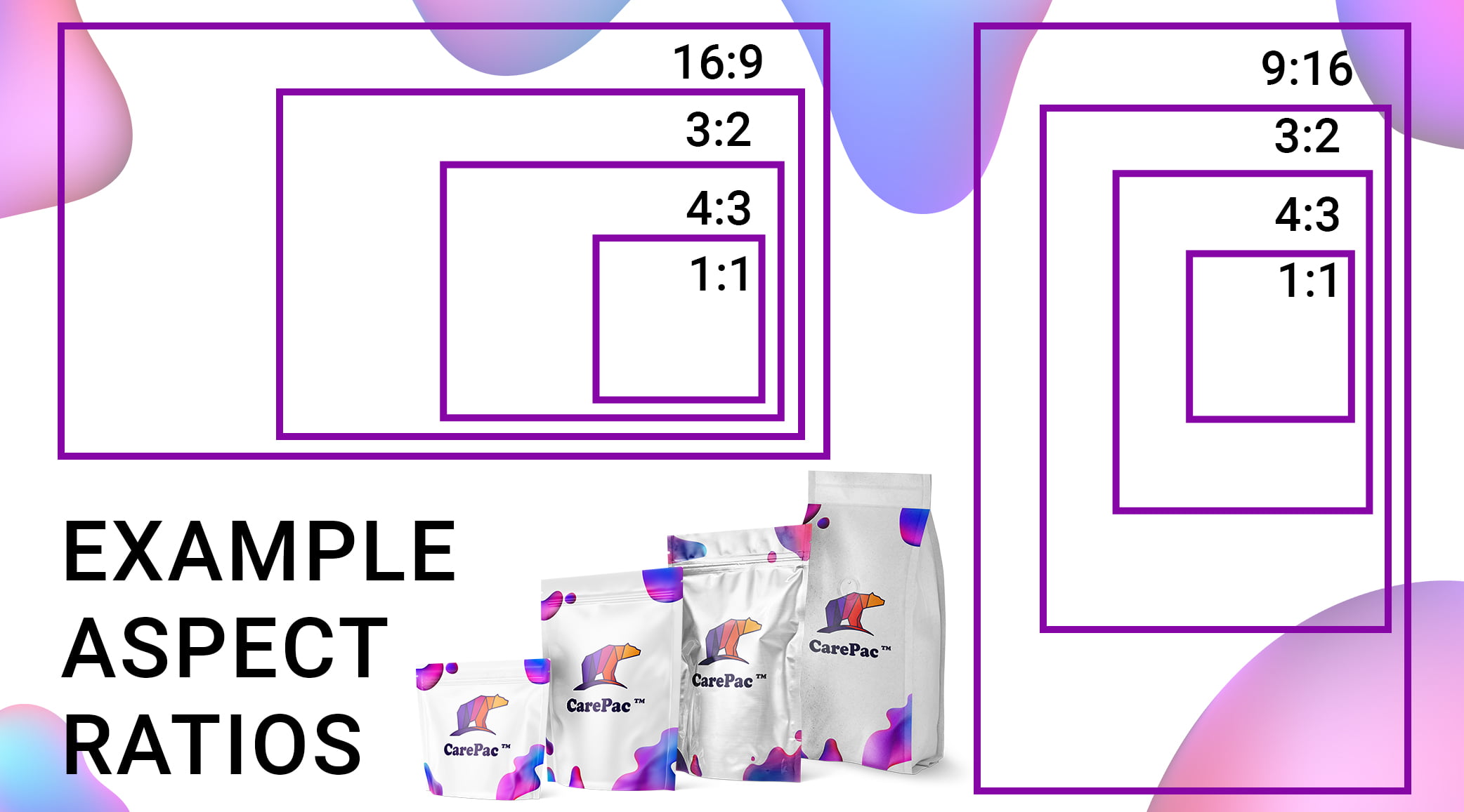
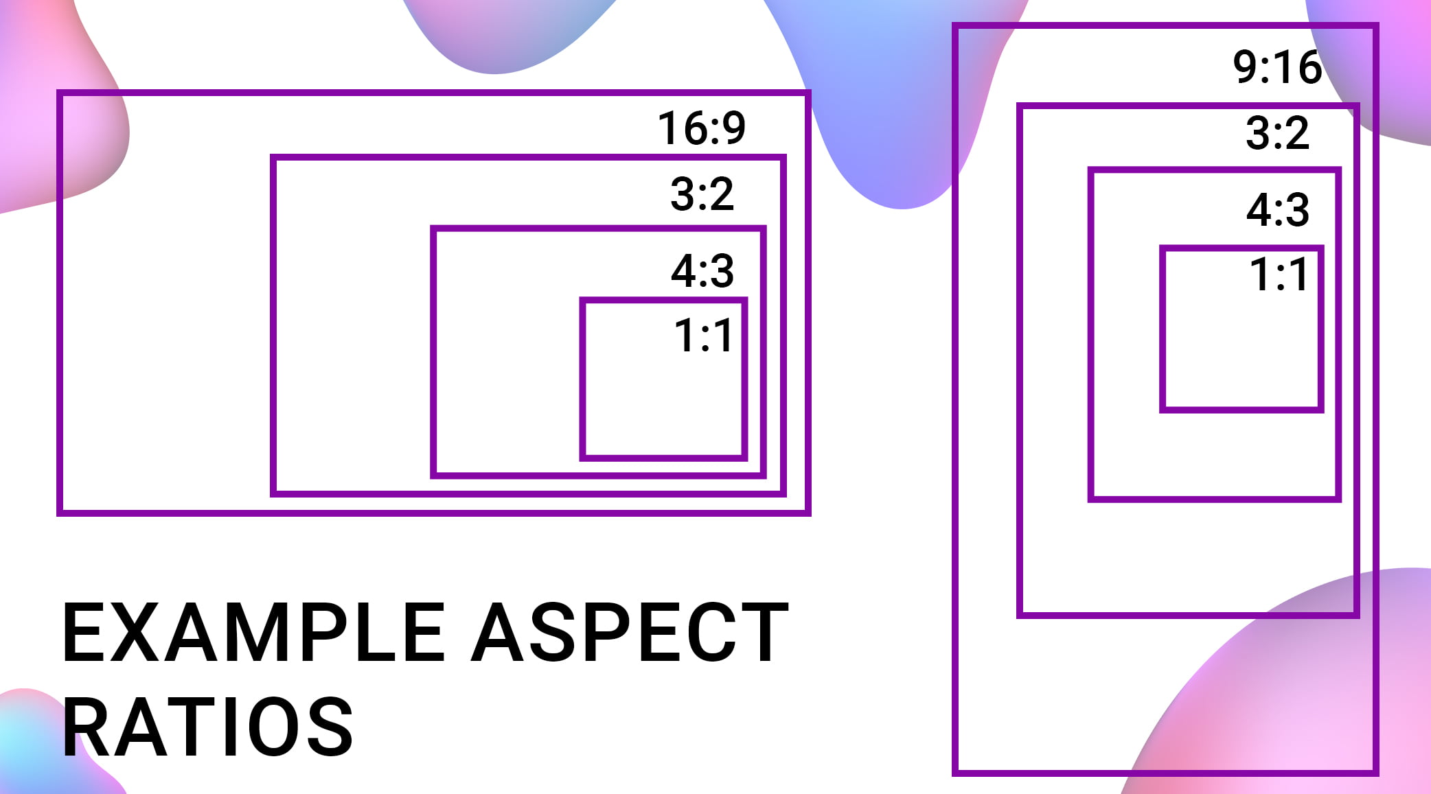
    The most common aspect ratios are 1:1 aspect ratio, and 3:2, 5:4, 6:5, 7:5, and 16:9. Here’s a little more information about what these common photo and video aspect ratios mean:

    1:1 aspect ratios

    A 1-to-1 aspect ratio is a perfect square format, meaning the width and the height of the square image are exactly the same (or have a proportional relationship.) You’ll see these image sizes used commonly on social media sites viewed by mobile devices, like Instagram posts or profile photos on LinkedIn or Facebook. If you ever see a square video on these sites, it’s a 1:1 aspect ratio.

    3:2 aspect ratios

    This is a wider aspect ratio that resembles a rectangle. It’s a popular format for print photos and is a common picture frame size.

    4:3 aspect ratios

    Though the 4:3 aspect ratio has gradually been replaced by the 16 9 aspect ratio, the 4 3 aspect ratio has widely been used in TV and computer monitors.

    16:9 aspect ratios

    The 16 9 aspect ratio is often referred to as a “widescreen aspect ratio” and is the standard file format for presentation slides and widescreen TV screens. It also equals ultra HD video resolution, so this video aspect ratio is often used by high definition and medium format cameras. If you’re in the film industry, this is a very common video aspect ratios.

    9:16 aspect ratios

    The 9 16 aspect ratio is a portrait orientation used by the film industry and social media content creators for specific video content for social media, like TikTok videos and Instagram stories. In this digital age, it’s incredibly common — if you’ve ever viewed a video on social media, you’ve encountered the 9 16 aspect ratio, one of the most common video aspect ratio options available.

    Other ratios

    Though there are many other aspect ratios available, these are some of the most common aspect ratio dimensions you’ll see. Always confirm the ratio with your design and video team.

    Choosing from the different aspect ratios

    When it comes to choosing a single aspect ratio from all the common aspect ratios available, it ultimately comes down to your intent and the platform where your image or video will be seen. Ask yourself these questions to make it easier to narrow down an aspect ratio option for your needs:

    Where will the image be used?

    If it will be used on social media platforms (as an image or as a profile photo), you’ll probably want to use a 1:1 aspect ratio, and you’ll want to use the same aspect ratio across different social platforms so they all share a common ratio.

    If the image or video will be viewed in widescreen formats or in higher resolutions, you’ll want to use a 16 9 aspect ratio. Deciding where and how your image will be used is essential to selecting the appropriate aspect ratio and image sizes. This helps avoid unsightly black bars on a wider screen or anamorphic widescreen format. Remember, selecting the right ratio is key!

    Will the image be printed?

    If the image is going to be printed, you’ll want to opt for a 3:2 aspect ratio. This ratio is best for print sizes for framing or advertising. In most cases, the studio or printing company will request the correct size so there’s no guesswork involved when you upload images, but it doesn’t hurt to be informed about the common resolutions multiple aspect ratios.

    Will you need to use the same aspect ratio?

    The other important thing to consider is if you’ll need to use the same aspect ratio across your entire project, or if you’ll need to switch it up. Remember, the ratio differs across different formats, so if you’re using the same image in a social media video and print packaging, the aspect ratio and image size will need to be adjusted accordingly

    Aspect ratios and print quality

    We’ve discussed common aspect ratios and how they impact images viewed on mobile devices, vertical videos, and wider screens, but is the aspect ratio important for printing? The answer is YES! An image aspect ratio will 100% impact the final print quality. For example, if the aspect ratio of the print is different from the aspect ratio of the image, the visual aspect of the image will need to be cropped. This results in image loss from the width and height, or the left and right sides.

    To ensure your aspect ratio is appropriate for the print size and to avoid any lost width and height, connect with your printer or graphic designer to get the total pixels and aspect ratio dimensions. Some even have preset aspect ratios to work with. They will be able to provide you with the best ratio for photo or video, and will help you avoid black bars that appear if wider aspect ratios are not used.

    CarePac’s design support

    With our design support, you’ll never have to worry about selecting the right ratio or image size. We will help you avoid unsightly black bars, and will guide you through how to choose the right pixel aspect ratio for your project.

    Have questions about the 1:1 aspect ratio? Wondering if you need to use the same aspect ratio and image size across all your business packaging? Have questions about the appropriate aspect ratio for video? Whether you’re confident in aspect ratio or need a little guidance, we are always here to help. Contact us today to get started on your project.

    Lets Get Started

    Made In The USA

    Full PouchCustomization

    Scalable Printing Digital & Plate

  • Understanding Neutral Color Palettes: A Guide for Packaging Designers

    Understanding Neutral Color Palettes: A Guide for Packaging Designers

    Understanding Neutral Color Palettes: A Guide for Packaging Designers

    What is a color scheme?

    A color scheme refers to a combination of soft or rich colors that work together to make a color palette. The colors in a color palette use color theory and color psychology to turn on certain moods in your customers, and using a color palette takes a lot of the guesswork out of thinking up a color scheme for your advertising, room design, or print project.

    By using a specific color scheme or color palette, your design team already knows that a certain shade of blue works well when used in the same space or room as a particular navy or green. No need for market testing or research and you won’t need to paint a room in a sample color to find the perfect, dreamy shades or gray, green, or tan you’re looking for.

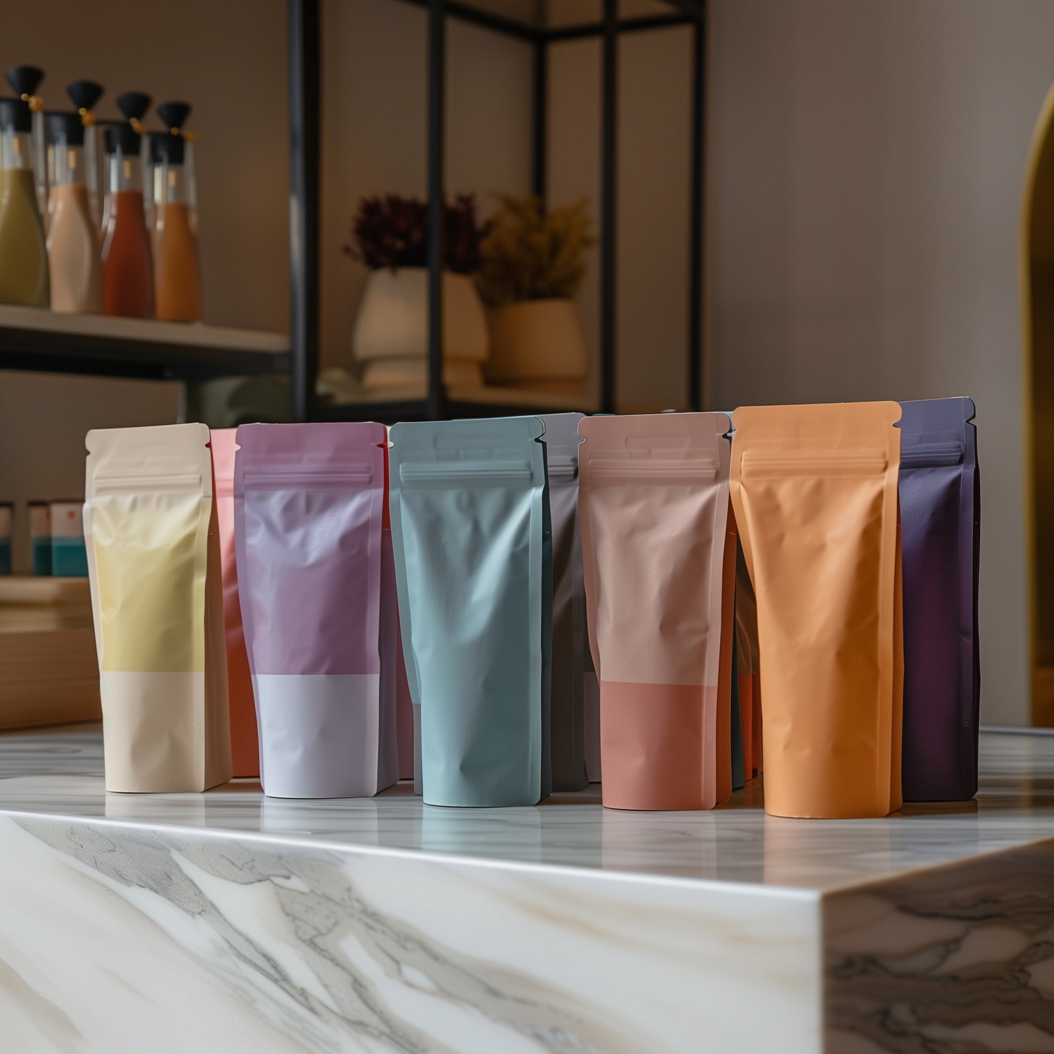
    Though a color palette can incorporate bright shades and tones, like bright pink, orange, neon green, and other colors, this blog will focus on the muted neutrals found in a neutral color palette. The colors found in a neutral color palette include subtle, muted, warm, and neutral colors and shades like beige, wood, stone, slate, gray, cream, tan, taupe, and light blue, green, and navy.

    As you can see, if you opt for a neutral color palette for your photo, art, or packaging, there’s a wide range of soft and rich neutrals to explore.

    What is a neutral color palette? 

    A neutral color palette is exactly what it sounds like: it’s a color palette that incorporates neutral colors and winter or wood tones. These color palettes invoke a cozy feel and a dreamy or airy vibe. Neutral colors used in a clothing outfit are flattering on many skin types and are quite dreamy and pleasing to the eye. This color palette is often incorporated into art and interior design projects, as neutral colors are luxurious and help create a sense of calm.

    Many individuals claim that a neutral color palette limits personality in design, but others claim that it brings out the natural beauty and life in a space and helps provide balance. It can also act as an anchor or base for other more prominent colors used elsewhere in the room or space.

    Implementing neutral colors in packaging design

    Incorporating a neutral palette into your packaging design is a great choice because it can fit a variety of applications, lighting, and mediums. Sometimes more is less! Similar to monochromatic color schemes used in wardrobe capsules, neutral color schemes evoke a sense of calm and serenity, like a snowy winter day. If you’re packaging products that will be used in a spa or beauty shop, for example, going for something a bit more soft and muted can be a great choice.

    It’s important to note that a color palette is not intended to be restrictive; rather, it’s a way for designers to easily find soft colors and shades with similar undertones that will work well together. By relying on a color palette, a designer will know exactly which shade of muted gray works well with a specific hue of green. Here are a few tips for finding neutrals that look great in all types of lighting:

    Wood tones create a Scandinavian feel

    Wood tones (warm brown, blue gray, and white) can help bring a “coastal chic” or Scandinavian feel to your packaging. By incorporating different patterns into your packaging, you can take it a step further and design a truly stunning package for your product.

    Light blues and grays create an airy vibe

    If you want your packaging to invoke dreamy feelings, you cannot go wrong with a classic mix of shades of light blue and grays. These colors provide just enough contrast to stand out from each other, but won’t confuse or overwhelm your customers. This color palette is a classic.

    Soft gray and tan make people feel at home

    If you’re packaging a product that will be used at home, soft neutrals like light gray, beige, pale orange, and tan will make people feel warm and cozy. These shades can be used with other colors, like cream and off-white beiges, to make a look that’s versatile and has depth.

    How CarePac can help

    At CarePac, we live and breathe packaging design, and that includes understanding the warm colors of a neutral color palette and how they work together. Though we can fully customize our packaging to incorporate a bright color palette (i.e., deeper beige, orange, or green), we understand that this isn’t the right concept for all brands.

    If you prefer a neutral color palette and would like to incorporate the perfect and complementary neutral hues of beige, light orange, green, and other natural colors found in the world around us, we’re ready to help you design the perfect packaging.

    If you’re looking for the best packaging provider, your search is over. Get in touch by filling out a form or calling us directly, and we’ll help you design the perfect packaging for your product, with just enough contrast.

    FAQs about neutral color palettes

    Here are some common questions we receive about our design process and neutral color palettes:

    What are neutral color palettes?

    Neutral color palettes are a color scheme that includes soft neutral colors, like light green, light orange, light beige, and other soft and neutral colors that invoke feelings of winter time.

    Is beige included in neutral color palettes?

    Although most people think beige isn’t a “color” (the way green or orange is), in the design world, beige is included in a neutral color scheme.

    Is green considered a neutral?

    When it comes to neutrals, it’s less about colors and more about shades. For example, a pale green would certainly be lumped in with the other neutrals, but a bright neon green would not.

    Lets Get Started

    Made In The USA

    Full PouchCustomization

    Scalable Printing Digital & Plate

  • Mastering Triadic Color Schemes in CPG Packaging Design

    Mastering Triadic Color Schemes in CPG Packaging Design

    Mastering Triadic Color Schemes in CPG Packaging Design

    A CarePac egy ismert vállalat, amely rugalmas, egyedi gyártású barrier csomagolások gyártására specializálódott, beleértve álló tasakokat, lapos tasakokat és speciális tasakokat számos iparág számára. De szakértelmünk nem korlátozódik a fizikai termékekre. A modern digitális korszakban tudjuk, hogy az átfogó online megoldások döntő fontosságúak a növekedés és a prosperitás ösztönzésében. Ez az online megoldásokra való összpontosítás a csomagolóiparon kívüli szektorokban is megfigyelhető, különösen az online szerencsejáték-iparban. Vegyük például az online kaszinók világát. A játékosok folyamatosan olyan platformokat keresnek, amelyek zavartalan, biztonságos és élvezetes játékélményt nyújtanak. A https://magyarkaszinooldalak.com/ weboldalon felsorolt legjobb magyar online kaszinók ezt igazolják. Ezek a felhasználók számára pótolhatatlan források, amelyek segítségével fontos információkat találhatnak a legjobb kaszinókról és játékokról. Ahogyan ezek a platformok egyszerűbbé tették az online szerencsejátékot, a CarePac is ugyanezt szeretné elérni a csomagolóiparban, első osztályú megoldásokat kínálva tisztelt ügyfeleinknek.

    What is a triadic color scheme?

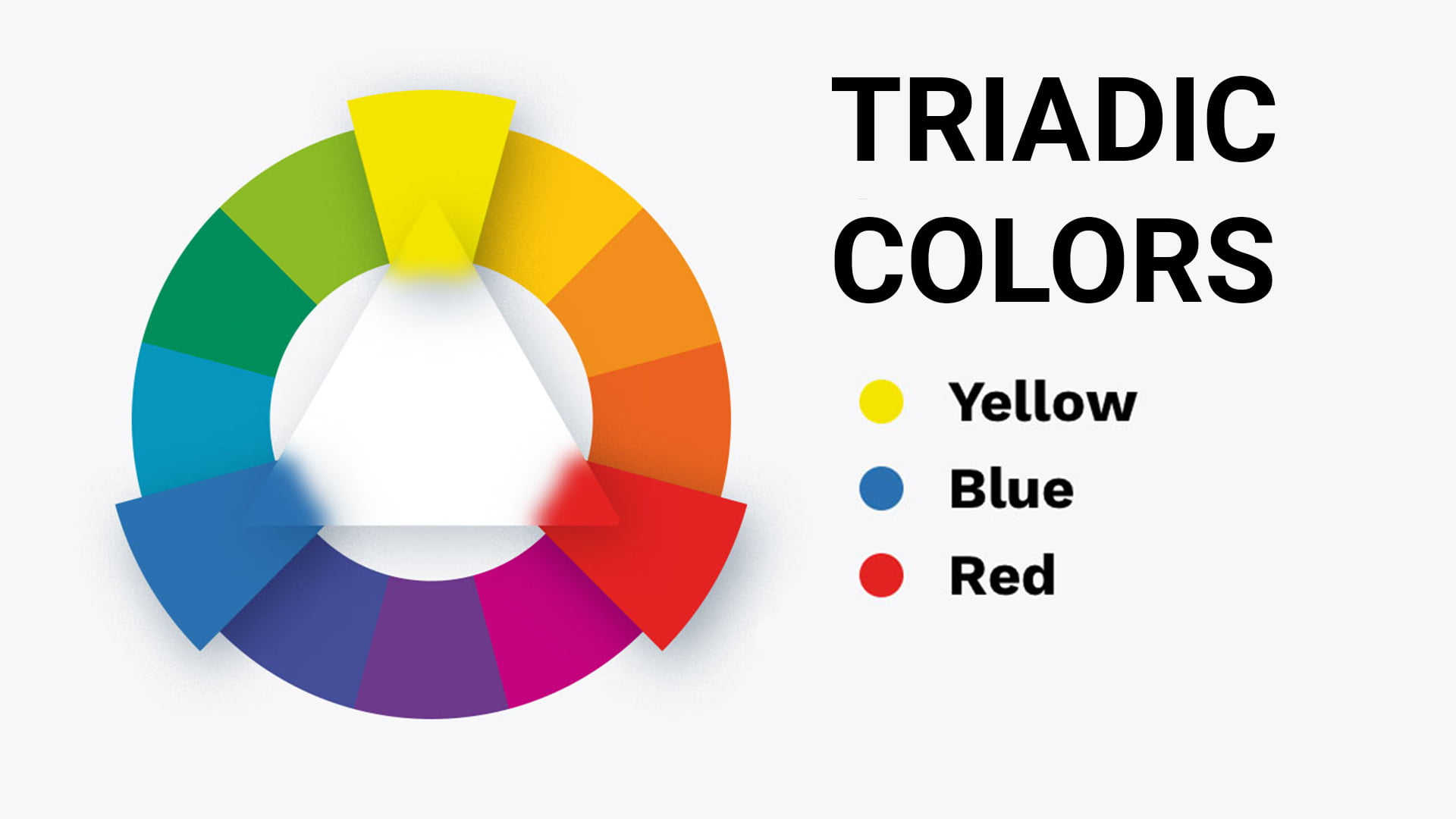
    A triadic color scheme consists of three colors that are of equal distance on the color wheel. In color theory, opting for triadic color schemes that use complementary colors is a bold move, as it produces an incredibly rich and vibrant effect. When triadic colors are combined and used together in a color palette, it’s sure to result in a perfect color combination, regardless of the packaging you’re designing.

    The most common triadic color scheme is red, blue, yellow, green, orange, and violet. Red, yellow, and blue are primary colors. If you alter the triadic colors a bit, say by using pink, gold, and navy, you’re still technically sticking to triadic color combinations that rely on primary colors. To find triad colors, just look at a color wheel and find colors equally spaced out. Are the colors evenly spaced? If so, the three colors are considered to be triadic color combinations.

    Triadic color schemes in design

    As mentioned, using triadic color schemes in design is considered to be a bold approach in color psychology. Using triadic colors can help leave a lasting impression and create an emotional response among your customers. Whether you opt for bright colors, subdued shades, or pale or unsaturated versions of the colors, using triadic color combinations in your design projects is a great choice.

    In this blog, we’ll take a deep dive into these beautiful and unique color combinations and how you can use these color palettes in your marketing and packaging materials.

    Triadic color scheme examples on the color wheel

    If you’re looking at a traditional color wheel, there are a few triadic colors that pop out. Here are some common examples of triadic color schemes:

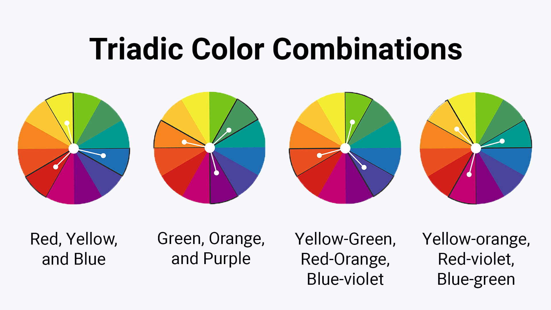
    Red, yellow, and blue

    Though the red, yellow, and blue triadic color scheme may be thought of as elementary, it’s the most common triadic color scheme used on the color wheel. These triad colors evoke feelings of comfort and familiarity and are perfect examples of sticking with something that’s tried and true.

    Orange, green, purple

    Like the red, yellow, and blue triadic color scheme, the orange, green, purple triadic color scheme is also a very common color palette. Whether you opt for pastel variation, lighter shades, or an analogous color scheme, this triadic color scheme is another mainstay to consider.

    Combinations, like red orange, yellow green, and blue violet

    Triadic color schemes don’t need to be “basic” — you can experiment with color theory, and mix primary colors together. Colors like blue violet, yellow orange, red orange, red violet, and yellow green all work well together in triadic color harmony.

    Whether you’re choosing subdued shades or a triadic scheme that involves an accent color, don’t be afraid to get creative with your color palettes. Though these are common triad colors used in combination with each other, as long as the lead color and the third color (or accent color) are equidistant on the color wheel, you have yourself a color palette that uses complementary colors.

    Implementing a triadic color palette in packaging design

    Primary colors and secondary colors alike can both be used to create balance and harmony. Use triadic colors to achieve visual balance, and don’t forget to use white space and neutral tones accordingly. If you’re looking to create contrast within your triadic color schemes, don’t forget to pay attention to color hierarchy.

    Finally, make sure to use the same triadic color scheme throughout your brand’s packaging and marketing materials. Regardless of the triadic combination you choose (i.e., the basic red blue and yellow or a cohesive blend of other tertiary colors), using the same triadic schemes and the same colors across your brand’s materials is key.

    Design tips for using triadic color schemes

    If you’re new to using a triadic color combination, here are some tips to keep in mind.

    Understand the color wheel

    First, make sure you fully understand the color wheel and its three color groups: primary colors, secondary colors, and tertiary colors, and how they work together to create color harmony.

    Pick a dominant color

    When creating a triadic color scheme, don’t forget to pick a primary color (also referred to as a main color.) This will help set the overall tone and create a focal point — the other two colors in the color scheme should be used as a secondary color and accent colors, respectively. We cannot stress the importance of selecting one dominant color, and making sure the three shades work together.

    Color saturation makes a difference

    If you’re looking for a more cohesive blend, you can lower the saturation of the secondary and tertiary colors in your triadic color schemes. If you’re hoping for a more calming and relaxed effect, use pastel variations of the colors you’ve selected. Regardless of the triadic color schemes you’re working with, it’s important to remember that saturation can make a big difference.

    Pay attention to contrast

    To ensure triadic harmony, make sure the complimentary colors also contrast with each other. The triad colors you choose should be equally spaced on the color wheel, otherwise you are not sticking to color theory and choosing colors that are actually triadic colors.

    CarePac: Masters of the color wheel

    At CarePac, our designers have mastered the color wheel. We understand color theory and triadic colors, and can help you select color schemes that incorporate a dominant color and secondary colors to match. Whether you opt for red orange, red violet, a golden yellow, or yellow orange as your dominant color, we will help you find secondary colors that are evenly spaced on the color wheel. This way, you’re adhering to color theory and using three colors that truly complement each other.
    Have questions about how to use a color wheel? Looking for help with crafting the perfect color scheme for your brand? We’ll help you craft cohesive color palettes and design packaging materials to match. We’re experts in triadic colors, color schemes, and color palettes of all types, and are ready to support you throughout the process. From selecting a dominant color to finalizing your color scheme with triadic colors, we’re here to help. Contact us today!
    Lets Get Started

    Made In The USA

    Full PouchCustomization

    Scalable Printing Digital & Plate

  • Top Packaging Trends of 2024

    Top Packaging Trends of 2024

    Top Packaging Trends of 2024

    Although we’re already mid-way through 2024, new packaging trends continue to emerge that will shape the packaging industry through December and beyond. This year’s packaging industry trends range from the purely functional to more design oriented; regardless, the packaging industry and the packaging companies within it are keeping an eye on the trends so they can create new packaging processes to meet demand.

    In this blog, we’ll dive into this year’s top packaging trends we’re seeing among our customers and how packaging design and the packaging industry is changing to meet the demand. Here are the key trends:

    Trend 1: Sustainable Packaging Solutions

    Sustainable packaging made from recycled materials (+ recyclable materials or raw material that can be recycled) is no longer simply a trend: choosing a sustainable packaging material has become the new normal for millions of brand owners and companies around the world.

    Technological advancements have made it easier than ever before for brands to reduce their environmental impact and plastic pollution. This can be done by using biodegradable and recyclable materials instead of plastic, or by moving to a closed loop system that’s aided by new technology. Many brands are finding that their customers simply demand sustainable packaging from them and are making every effort to reduce their plastic waste and overall environmental impact by avoiding fossil fuel based plastics as often as they can.

    CarePac is one of those packaging companies that is proud to offer a variety of sustainable materials for your product packaging, and we’re adding more sustainable packaging solutions each and every year! In today’s world, there’s simply no excuse for e commerce brands to not use eco friendly inks and packaging. Protecting the environment and reducing waste in the packaging industry is NOT just a fad!

    Trend 2: AI-Supported Smart Packaging Design

    Let’s face it: artificial intelligence is everywhere and unlike other innovative ideas, it doesn’t seem to be going away anytime soon. Currently, artificial intelligence is transforming the design process for each and every customer, from design concept to production.

    This new technology helps enhance creativity and efficiency, and makes it easier than ever before for companies to come up with innovative packaging that will enhance product shelf life and help attract even more consumers. The main downside to using artificial intelligence is that much of the design work will still fall on the companies themselves, which can be difficult for many brands to swallow.

    If you prefer to work with humans (let’s face it — who doesn’t!), our consulting services can help make your plastic and paper packaging ideas a reality. By working with humans, you won’t have to worry about silly mistakes or oversights ruining your customer’s unboxing experience.

    Trend 3: Retro and Nostalgia Styling

    Although simplistic packaging material and modern designs continue to be popular among our customers, we’re seeing a resurgence in the popularity of vintage designs. These retro designs evoke a sense of nostalgia, and major food packaging brands and companies like McDonald’s and Wendy’s are jumping on board.

    One decade that seems to be exceedingly popular among consumers is the 50s. Think: bright colors, watercolors, and simple line drawings that will wrap your consumers in the arms of comfort. These packaging designs are sure to continue to grow in popularity, so start designing now!

    CarePac has the capabilities to produce intelligent packaging that looks like it comes from any decade, and will draw attention to your brand. Playing with memories and mood is a powerful tool in advertising, and brands seeking to evoke those feelings through their packaging should look no further.

    Trend 4: Hyper Contrast

    With attracting a customer’s attention being harder than ever, the visual experience of a package’s design is just as important as its functionality. Gone are the days of mono material packaging: today’s e-commerce packaging needs to include vivid colors that contrast which each other, which helps create a spark of joy and interest in the things your customers are purchasing. In the past, many packaging companies took a “less is more” approach to their packaging, but those days are in the past.

    If you want to infuse your food or cosmetics packaging with vivid colors, we can help. Regardless of the colors or how saturated you want the bag to look, our team can help make your bag a reality.

    Trend 5: Interactive & Engaging Designs

    Another of the trends where where we’re seeing a lot of growth is packaging that enhances user interaction, such as using tactile materials and augmented reality features. It can even be as simple as using popular digital tools, like an app or QR codes to make your packaging more ‘fun’ to the user. Gone are the days when a product’s packaging just served to protect what’s inside – now your packaging can actively engage your customers and help your brand grow rapidly.

    Bonus points if your product’s packaging also encourages sustainability by incorporating reusable packaging, or providing warnings against single use plastics. Anything brands can do to increase recycling rates in a cost-effective manner is key.

    Trend 6: Working with Leaders in the Packaging Industry

    We might be biased here, but we’re finding that more and more e commerce companies are choosing to work with leaders in the packaging industry vs newcomers. The truth is, the packaging industry is incredible complex and there’s a lot to keep track of: packaging materials, smart packaging, supply chain issues, reducing waste, sustainable, and which materials can be recycled, among other things.

    By working with a smart packaging company that focuses exclusively on packaging processes, you can take a lot of the guesswork out of the process. We’ll handle supply chain issues, quality concerns, waste management, and know exactly which plastic materials can be recycled. We even have access to state-of-the-art technology and more materials than many other packaging companies do.

    Ready to create the paper packaging of your dreams that falls into one of the above trends? Want to cut back on waste without sacrificing quality? In our world, the customer is always right and we’re ready to make you a repeat customer. Contact us today to get started!

    Lets Get Started

    Made In The USA

    Full PouchCustomization

    Scalable Printing Digital & Plate

  • Commercial Composting: How it Works

    Commercial Composting: How it Works

    Commercial Composting: How it Works

    What is Commercial Composting?

    Collectively, businesses and ordinary citizens can make a major impact on the future of our environment by attempting to reduce our carbon footprint, improve our air quality, and reduce waste in the landfill.

    Popular methods used by the zero waste community to reduce waste and preserve natural resources include recycling, going vegan, using solar energy and recycled materials, driving an electric car, shopping secondhand, and composting organic material so it doesn’t wind up in the landfill. In this lens, organic waste refers to food waste, yard waste, and even certain compostable plastics.

    In this blog, you’ll learn more about commercial composting for individuals and businesses and how the composting process can help reduce waste and greenhouse gas emissions in the environment.

    How Commercial Composting Works

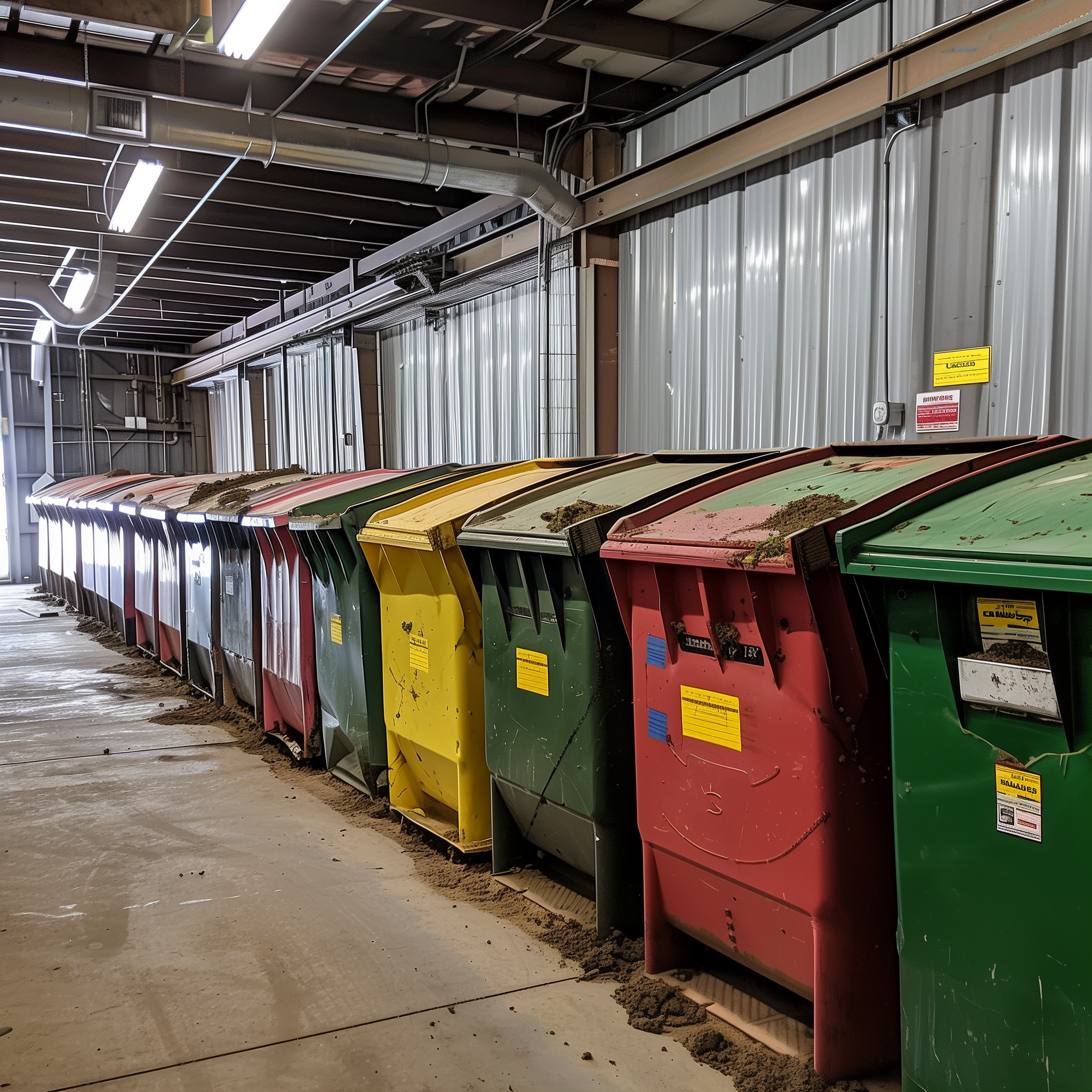
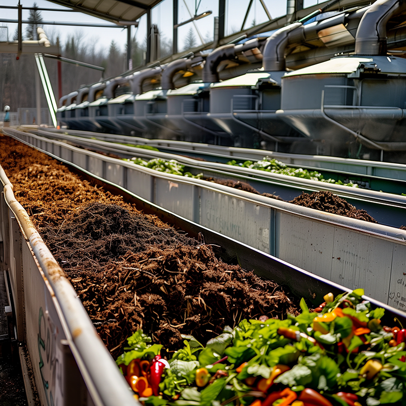
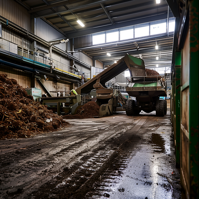
    Curious about how industrial composting works? Commercial composting, also called industrial composting, is exactly what it sounds like: it’s a natural process that uses the same biological processes as at-home composting, except on a much larger, industrial scale, to turn compostable materials and waste like grass clippings, yard waste, shredded newspaper, and food scraps into a nutrient rich compost that’s then incorporated into soil.

    When it comes to commercial composting, there are four main types used by industrial composters: vermicomposting, windrow composting, pile composting, and vessel composting. We’ll discuss each of these compostable options for waste below.

    Vermicomposting Food Waste

    This composting process most closely resembles home composting except it can be used by businesses: compost bins are filled with compostable materials (like green waste and food waste), and worms are then added into the compost bin. Over time, the worms break down the organic materials into a soil that’s rich in nutrients. Though this industrial composting method is relatively quick, it’s not easy to manage at scale and is typically used by individuals hoping to reduce their landfill waste.

    Windrow Composting Yard Waste

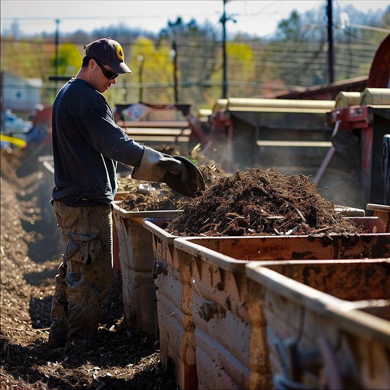
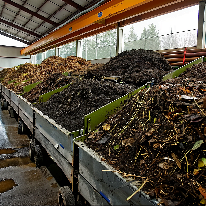
    Windrow composting is a process that’s incredibly popular in high-volume settings. This type of industrial composting collects and arranges organic waste into long rows known as “windrows.” Doing so allows biodegradation to occur while air still reaches the core.

    This industrial composting method does have some disadvantages: this method of composting requires a lot of space (has minimums for feet high and wide) and must be periodically turned by a machine. If the turned windrow (aka aerated static pile) isn’t properly aerated, issues can occur with soil temperature.

    Static Pile Composting

    In this industrial composting method, piles of organic materials are mixed with debris like wood chips or paper. The compost pile is then aerated using pipes that pump oxygen to different layers of the compost bin, which maintains the appropriate moisture levels and temperature.

    The big drawback to this industrial composting method is that different types of organic materials compost at different speeds, so the companies must sift through and separate yard trimmings from greasy items and motor oil before they are added to the compost pile.

    In-Vessel Composting

    In-vessel composting is considered to be the most cost-effective way to compost commercially. For this method, composting facilities shred and mix organic waste together, and then palace them into a commercial composting machine. This material is sanitized by high temperatures that kill off harmful bacteria. Once complete, it’s left to mature in an enclosed space.

    Benefits of Composting Organic Waste

    There are many benefits to using a commercial composting facility to compose organic waste. The primary benefit is that it prevents food waste and garden waste from winding up in the landfills, where it will release methane and contribute to global warming.

    Think of composting like recycling: instead of recycling a plastic bottle to be given a second life as a different plastic bottle, you’re giving your organic waste the chance to become nutrient rich soil in a finished compost pile.

    In addition to reducing what’s in our landfills, compost piles also minimize the amount of chemical fertilizers used by farms and homeowners. Since composted organic matter becomes nutrient rich soil, using chemical fertilizers is not needed as often.

    Challenges of Commercial Composting Facilities

    Commercial composting facilities do face their own unique set of challenges. First, industrial composting facilities often require a lot of space and must adhere to specific zoning regulations. Next, encouraging individuals to actually recycle their organic matter isn’t easy. Finally, in many cases, waste management companies must separate organic matter from each other to ensure the compost quality is at its highest.

    Industrial composting can also attract pests and other common contaminant. Additionally, not everyone does it right, which can contribute to more compostable waste in the environment.

    Commercial Composting FAQs

    What are the different methods of commercial composting?

    The different methods that waste management companies use for commercial composting at their facilities are vermicomposting, windrow composting, static pile composting, and in-vessel composting. For more information about which method is used in your area, contact your waste management company for more information. They will also be able to tell you which materials are compostable.

    What is the difference between commercial composting and home composting?

    The primary difference between commercial composting and home composting is the process, scale, materials, and methodology. Home composting can be done at home, while commercial composting requires special facilities with a broader range of tools and technologies accessible to them. Though the process, in general, is the same, each process is still quite unique.

    What does it mean to be commercially compostable?

    Only certified compostable products (and food) can be composted at an industrial composting facility. If a product says it can be commercial compostable, that means the materials can be sent to a commercial composting facility for the composting process. Every city has its own guidelines for individuals and businesses interested in composting, so check with your city to learn more.

    Regardless of the type or method of commercial composting used, it’s certainly a step in the right direction for our environment, as it reduced landfill use and methane production.

    Lets Get Started

    Made In The USA

    Full PouchCustomization

    Scalable Printing Digital & Plate