Category: Art File Setup

  • What is a Print Ready File? – Guide to Press Ready Artwork

    What is a Print Ready File? – Guide to Press Ready Artwork

    What is a Print Ready File? A Guide to Press Ready Artwork

    What is press ready artwork?

    Print Ready (also called press ready) describes any file that is able to meet the specifications required to be setup for final press work and printing. 

    Download a demo setup file

    Click here to download our demo file which illustrates the best practices we outline here. 
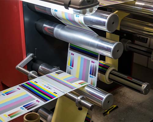
    What is press ready artwork

    CarePac’s Art Setup Checklist for Designers

    If you’re preparing artwork for CarePac, either digital printing, flexographic, or rotogravure printing, here is a quick recap of the important points to hit if you want to create print ready artwork:

    • Outline text: Convert all text to outlines.

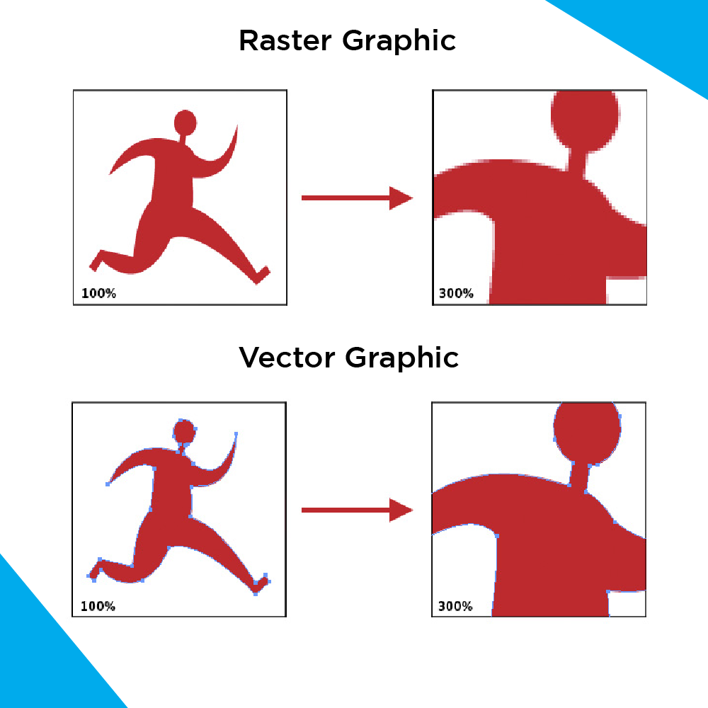
    • Use Vector art: Create all non-photographic text, graphics, and illustrations using vector graphics.

    • Raster images: Should be at least 300DPI (dots per inch). Link or embed these in the file.

    • PMS Colors: PMS color are solid pigment colors not a colour mix like CMYK. Refer to Solid Pigment Uncoated Swatch book. PMS colors used with digital printing will not be 100% accurate to the swatch.

    • Finishes and Effects: Apply a unique off-pallet color to distinguish these areas in the design. Avoid relying on transparency in your design. Also it is best practice to separate designate clear areas in additional panels, see our finish mapping section below.

    • Bleed: Bleed is not required.

    • Plate Printing: 10 color stations are available, but we recommend limiting to 8 colours. White ink counts as a color.

    • Preferred format: Original Adobe Illustrator (AI) or PDF/X-1a.

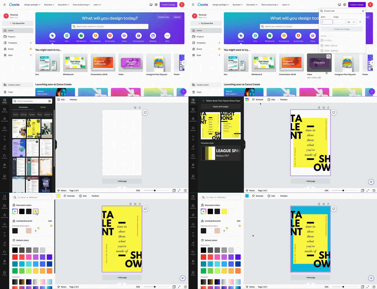
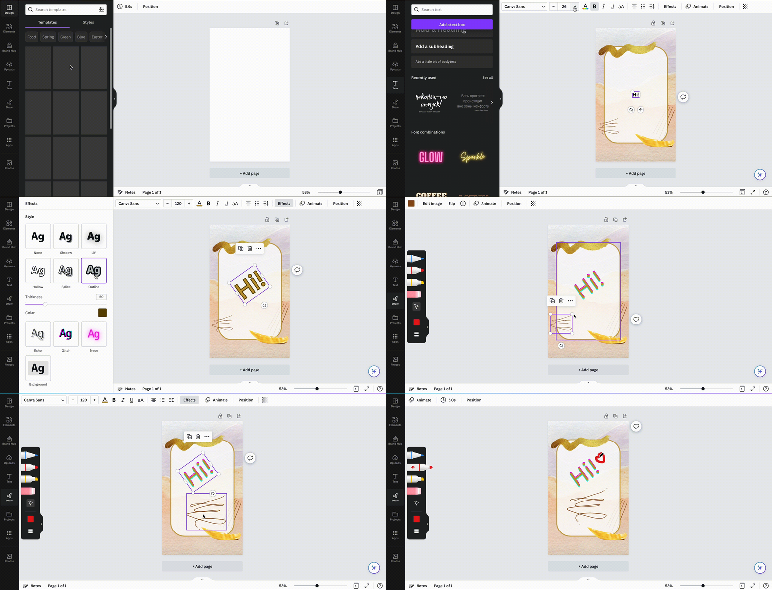
    • Canva: For Canva artwork, export both PDF and SVG versions. If possible, share edit access to the Canva project.

    • Artwork placement: Place all artwork on the same layer as indicated in your dieline. Do not edit the dieline, add color swatches to the color bar, and remove unused color swatches. Avoid placing critical graphics in zipper areas, seal zones, or around hang holes.
    Indicating Finishes, Windows, and Metalized Effects

    Indicating Finishes, Windows, and Metalized Effects

    We recommend using a “finish map” which separates these indications from the printed image and the rest of your graphic design. See below for our specific finish mapping recommendations:

    • Clear areas: Use an obvious color that contrasts with the design to indicate any clear unprinted area.
    • Finish indication: Use a finish map to indicate type and location of bag’s finish.
    • Metalized effects: Indicate areas of metalized effects using a separate metalized map. Choose a color for the metalized area. Do not use a gradient color, use a solid color like grey.

    Note: Use a distinct color to indicate windows in your design. 

    File Types and Formats

    The industry standard, correct file type for flexible printing is Adobe Illustrator. Unlike some printers who may be more selective about the file formats, like most printers CarePac supports Photoshop (.ps), Illustrator (.ai), Adobe InDesign (In), and Acrobat (pdf) but CarePac’s design team can also work with Encapsulated PostScript (.eps), Solid Vector Graphics (.svg), or Canva files. Finally, if all you have is a PNG, JPG or ok print images, we have worked with it all and will work with you.

    When in doubt, ask. Knowing the correct file format before starting the design can help you avoid time consuming revisions down the line. For example, CarePac’s preferred format is an original Adobe Illustrator file or PDF/X-1a, or PDF and SVG for Canva, but another company may prefer something different. “Print ready” varies slightly from printer to printer, so you’ll always want to check.
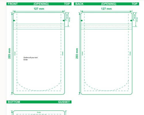
    File Types and FormatsFile Types and Formats

    Artwork preparation (size, resolution, bleed area)

    Now that you know you’re using the appropriate file type, you’ll want to make sure the artwork you’re submitting is the correct size and resolution. All logos should be within the Safe Design Area (typically 1/8″ inside the die line), and that the resolution of the image if it is a raster is at least 300dpi at 100%. Between 300-450dpi is the sweet spot — anything too large or too small will print poorly on the final printed file. Trust us, if at all possible provide a vector copy of important elements like a logo, to avoid seeing individual pixels on the final image, so just follow the above steps!

    CarePac does not require that you bleed the file you submit to CarePac. But if you are going to add a bleed to your own artwork, we recommend adding a 3mm – 5mm (.125″ – .25″ ).

    CarePac’s dieline design checklist

    When designing a dieline, you’ll want to follow this dieline checklist to make sure you’ve covered the basics. As always, our helpful team of designers is here to provide their expertise and help guide you through the process.

    Type Setting

    • Text Formatting: Outline all text.
    • Minimum Font Size: Suggested minimum is around 6 pt. Absolute minimums are 3 pt bold for positive text and 5 pt for reversed text (knockout).
    • Typesetting Caution: Avoid using Photoshop for typesetting or Smart Objects.
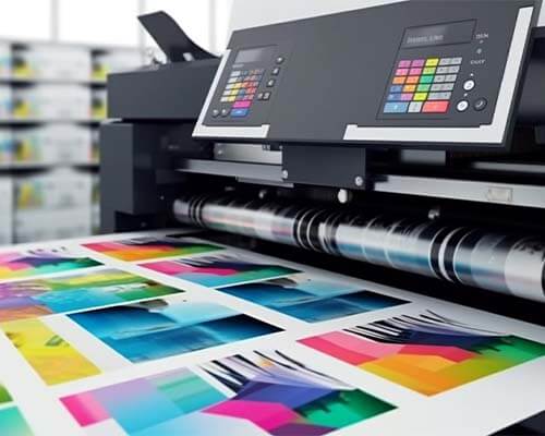
    Type SettingPlate Printing Specifics for packaging

    Plate Printing Specifics


    • Max Colors: Keep under 8 colors (including white ink). Up to 10 colors can be accommodated with additional charges.
    • Line Screen: 177 line screen based on 300 DPI imagery.
    • Under 15% Screen: Eliminate from CMYK mix or convert to 100% spot.
    • PMS Colors: Reference PMS Swatch books. Be aware of differences between on-screen colors and printed or film colors.

    Barcodes and QR Codes Specifications


    • Ideal Size: Between 80% and 120%. Avoid truncating the barcode.
    • Format: Barcodes should be in Vector line art.
    • Ink for Barcodes: Use Pantone Black, or 100% Black.
    • QR Codes: Recommended size is 20mmx20mm. Ensure high contrast (white/black).
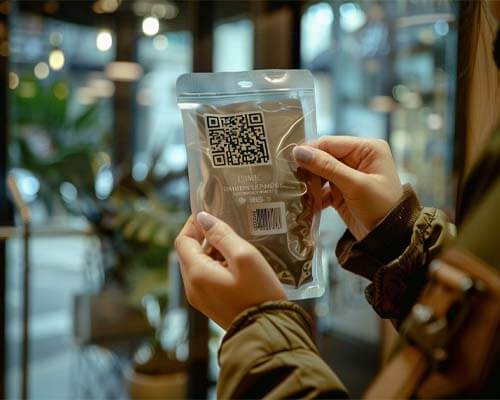
    Barcodes and QR Codes Specifications for printingVector vs. raster images in priting

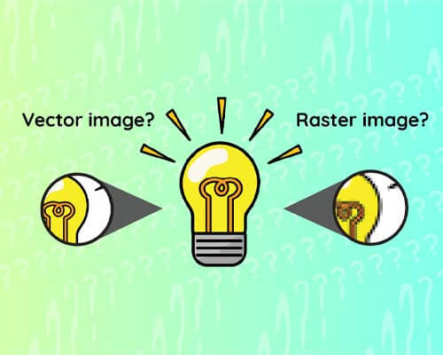
    Vector vs. raster images

    So, what’s better: raster images or vector graphics? In our opinion, vector graphics are preferred since this type of artwork can be scaled to any finished size without sacrificing image quality. Vector images don’t pixelate and it’s native to software like Adobe Illustrator, but it does have its limitations. For example, all photographs will be a rasterized image. Our tip is to reserve raster images just for photographs, and build all logos and other graphics in vector format.

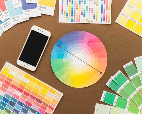
    Use the correct colors

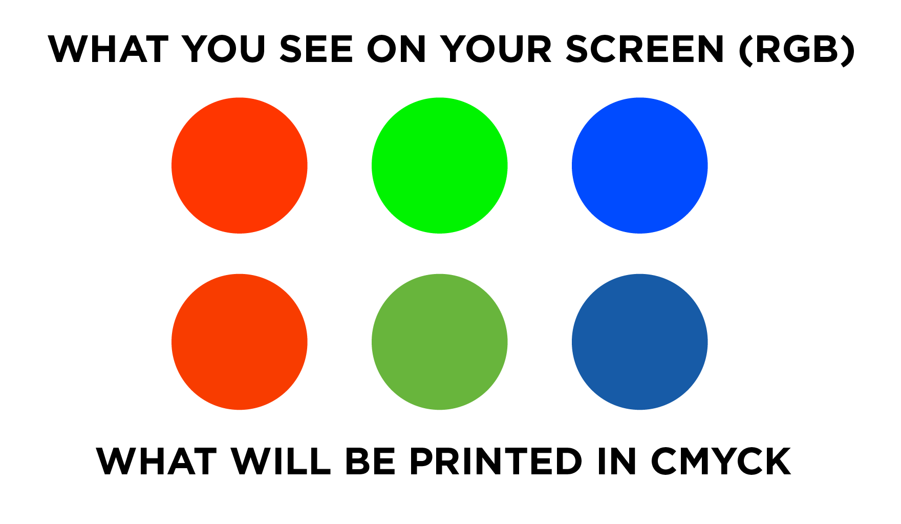
    To ensure you’re creating print ready artwork for graphic designers, you’ll need to set your file format to CMYK color mode. If using Pantones or spot ink colors, apply them and make swatches. This way, in color separations, if you preview the colors they’ll be assigned correctly. Since all printer files use CMYK color space, your colors will change noticeably if they’re submitted in RGB. Since RGB and CMYK are two different color builds that don’t correspond to each other, it is absolutely essential that your print ready artwork is submitted using CMYK color model.

    It is also important to note that the color modes you see on your screen will be different than the color in “real life”. Do not be alarmed- this kind of minor variance is totally normal.
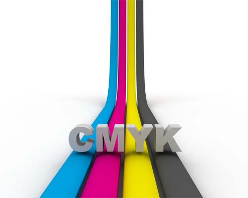
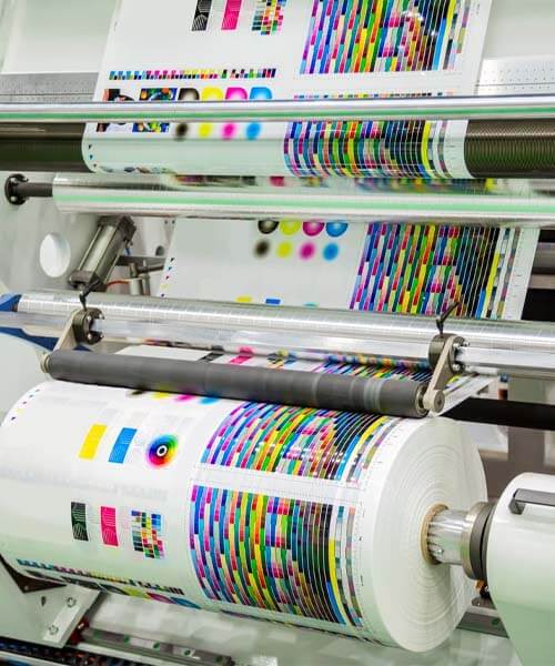
    Use the correct colours in printingSending your print ready artwork in printing

    Sending your print ready artwork

    There are a few different ways you can send us your print ready marketing materials so we can take your print ready art and turn it into a finished printed product via our proprietary printing process.

    • Package your artwork and send the entire project in one packaged file

    • Send any raster image originals that are separate from your artwork.

    • Convert your text to outlines

    We recommend attaching your digital art to the email or uploading the vector file using your printing partner’s preferred system, as embedding them within the email will cause your high resolution image to degrade. Remember to send the appropriate file formats, whether that’s a vector file or raster image.

    Print ready artwork: FAQs

    Here are some common questions we get from potential customers about artwork types and their print readiness:

    What does print ready artwork mean?

    Print ready artwork is a file that’s ready to be printed as is. It helps maintain print quality, and should take things like pixel density, bleed area, and the design and print quality listed above in mind.

    What are some accepted file types?

    CarePac prefers to accept files that are high resolution Illustrator art files (AI, we can also accept Corel Draw and some Canva output but Canva often exports Raster image graphics instead of vectors. Many different file types are accepted by different printers, so it’s important to check with your printer.

    What if my graphics aren’t print ready?

    If your graphics aren’t print ready or are at an unacceptable quality level, our CareDesign team can work with your graphic designer to get your submission in tip top shape shape for printing. While we prefer to only accept art that match our criteria our team of talented pre-press designers are able to fix a lot, we mean A LOT of problematic art, and have developed processes around most any problem you can imagine. So if you just can’t get your new project over the finish line, submit it anyways, we’re here to help, that’s why we’re called CarePac!

    What are the requirements for print ready art files?

    The criteria for print ready art files are laid out in this post, there maybe adjustments depending on some technical print parameters but following these guidelines will help ensure that the artwork designed by your team can be turned into the perfect print. Some things to keep in mind include using CYMK, using vector paths for anything other than photographs, and avoid placing critical graphics along seams or seals.

    I need to make a change to the file’s dieline, can I edit it?

    No, please don’t! Never edit dielines provided to you, if you need a dieline adjustment contact our CareDesign team!

    Should I add Crop marks or other indicators of off-canvas cuts, or prints.

    While we receive artwork with off canvas information daily, there is no need to include this content in your submission.

    Are there any special setup instructions for box bottom bags?

    Box Bottom bag setup is generally the same as any other pouch. One key difference to keep in mind is that box bottom bags require two separate print runs – one for the Front, Back, and Bottom, and another for the sides.

    Note that alignment between side panel print and front/back may not be 100%.

    What are the Line screen specifications by color?


    • C: 177
    • M: 177
    • Y: 177
    • K: 254
    • Spot Color: 254
    • Under 15% Screen: Eliminate from CMYK mix or convert to 100% PMS Spot.

    What is the recommended trap size?

    Typically the CareDesign team will perform all trapping but a good rule of thumb is 0.3mm. If you want to attempt trapping please see this helpful article and video on our site.

    What is the recommended trap size?

    Well you smarty pants, yes there is!

    • Dot: Diamond

    • Min Dot %: 5%

    Get started with CarePac today

    Our eagled eyed production team is ready to turn your printable file into the final product you’ve always dreamed of. With a high quality finish, the appropriate colour mix and pixel density, and state-of-the-art printing plates, our graphic design team promises to create the best print using industry standard practices. Plus, we’ll do so using your desired print materials. With our handy checklist, preparing artwork and high resolution images for printing has never been easier. You have multiple jobs: leave the designing and printing to us! Contact us today to get started!
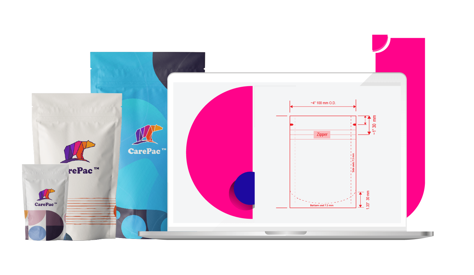
    Lets Get Started

    Made In The USA

    Full PouchCustomization

    Scalable Printing Digital & Plate

  • Granola Bar Wrapper Template (Printable) 

    Granola Bar Wrapper Template (Printable) 

    Granola Bar Wrapper Template (Printable)

    The perfect packaging for your granola bars depends on great artwork, and great artwork can only be accomplished with high-quality, printable granola bar wrapper templates.

    These templates are technically referred to as “dielines”, and allow designers to mockup your design, review its most intricate details, and download your bar mockup PSDs or PDFs directly from your inbox. It really is that simple!

    We’ve worked with thousands of designers throughout the years, and we’re confident that we can help you, too. Our easy-to-use templates make it easier than ever before to download PDF versions of your granola bar packaging and put in an order directly from our website. 

    Why dielines matter

    Dielines are vital in the design process. Think of them like a blueprint for a house — would you build a house without one? Dielines are the blueprint of your design, and ensure that all the physical elements of the final packaging are up to par. This includes the packaging sizing and scale, and the location of all the visual elements, the placement of any folds or creases.

    Contrary to popular belief, dielines aren’t used exclusively for boxes or other rigid packaging. They’re used for a wide spectrum of packaging, including beverage bottles, food packaging, and even brochures or business cards. Essentially anything that’s customized can make use of a dieline.

    Tips for creating dielines

    At the end of the day, a dieline is a collaborative effort between you and your design team. Whether you engage with CarePac and make use of our design team, or work with a team internally, there are a few tips to keep in mind as you dive headfirst into dielines for your granola packaging:

    • Dielines must be created as vector art.
    • Keep your entire creative team involved and updated, especially early on in the process. 
    • Knowing exact specifications is crucial, and can help save you money and time down the line.
    • You may want to consider making a hard copy of the dieline before sending the design to print. This can help you catch minor errors before production.

    As you can see, dielines are all but an essential part of the granola packaging design process. Have questions? We’re more than happy to help!

    Download Your Free Printable Granola Bar Dieline

    At CarePac, we love to share our knowledge and passion for design with our customers. Use the button below to download your free printable wrapper granola bar dieline. 

    Remember, this is a sample so if you’d like us to help you design a fully customized wrapper for your granola bars, we’re more than happy to help.

    Granola bar packaging & dielines: FAQs

    Whether you’re new to designing granola bar packaging or simply need a refresher, here are some of the most common questions we get about granola bar wrappers and dielines.

    What packaging is used for granola bars?

    Usually granola bars are packaged in individual-sized wrappers, which provide a barrier that protects the honey granola or nutty granola bar from the elements. This way, your product stays fresh and your customer stays happy.

    Should I use parchment paper for granola?

    While parchment paper might be suitable for home use, we recommend against using parchment paper for commercial sales. Simply put, the barrier of the parchment paper is too low compared to other alternatives and the granola will dry out too quickly.

    How do you seal granola bars?

    Granola bar wrappers are heat sealable because the innermost layer of the material is a heat sealable LLDPE.

    What are granola bar wrappers made of?

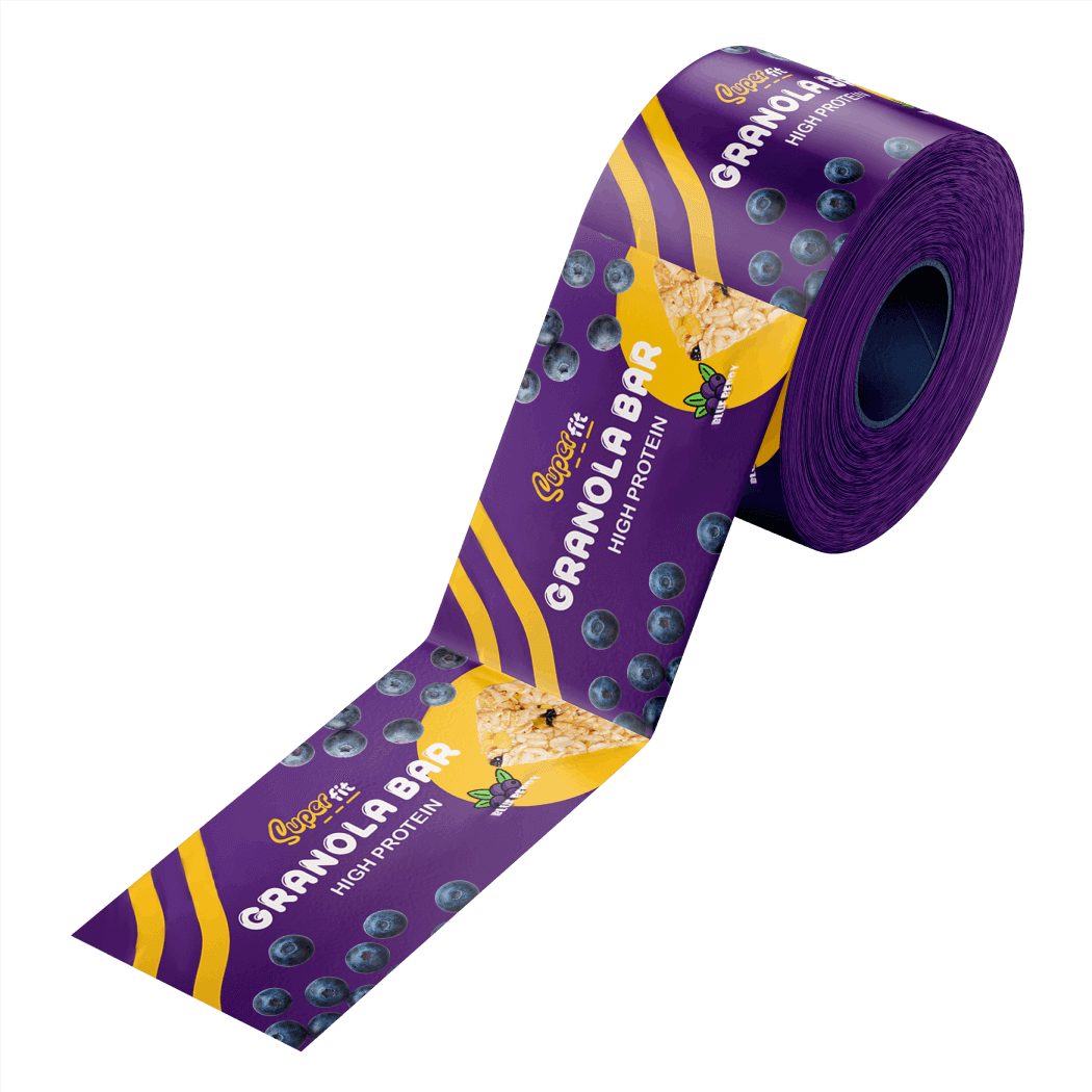
    Laminated Metalized PET is the most common material used for granola bar wrappers. This material is typically between 2-3 mil, and for high-volume production the pre-printed material is supplied in roll stock form and fed into a form fill seal (FFS) machine.

    How do you package homemade granola?

    If you’re making homemade granola, you don’t have to worry about using commercial-grade packaging the way some of our customers do. As such, you can use glass jars, or for longer term storage, metalized mylar bags.

    What are Kind bar wrappers made of?

    Kind bar wrappers appear to be made of a thin file metalized Polyethylene terephthalate. If this is the look and style you’re going for, we can certainly help you achieve it.

    Create Your Granola Bar Packaging Dielines Today

    As you can see, CarePac truly takes the guesswork out of your custom granola bar packaging artwork — and one part of that is through our easy-to-download PDF dielines.

    Before you decide on a final pattern, be sure to double check the size of your granola bar wrappers, the coloring, and granola logo placement before submitting. Once you submit, we’ll send the granola bar packaging template to your email for easy download and use.

    Have questions? Need help? Reach out to the CarePac experts today. Or check out our FAQs.

  • Trapping Artwork

    Trapping Artwork

    Trapping Artwork in Illustrator

     for Prepress File Submission  

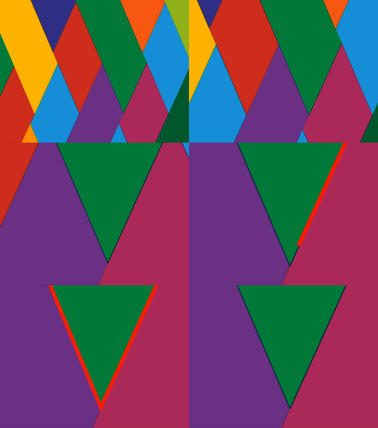
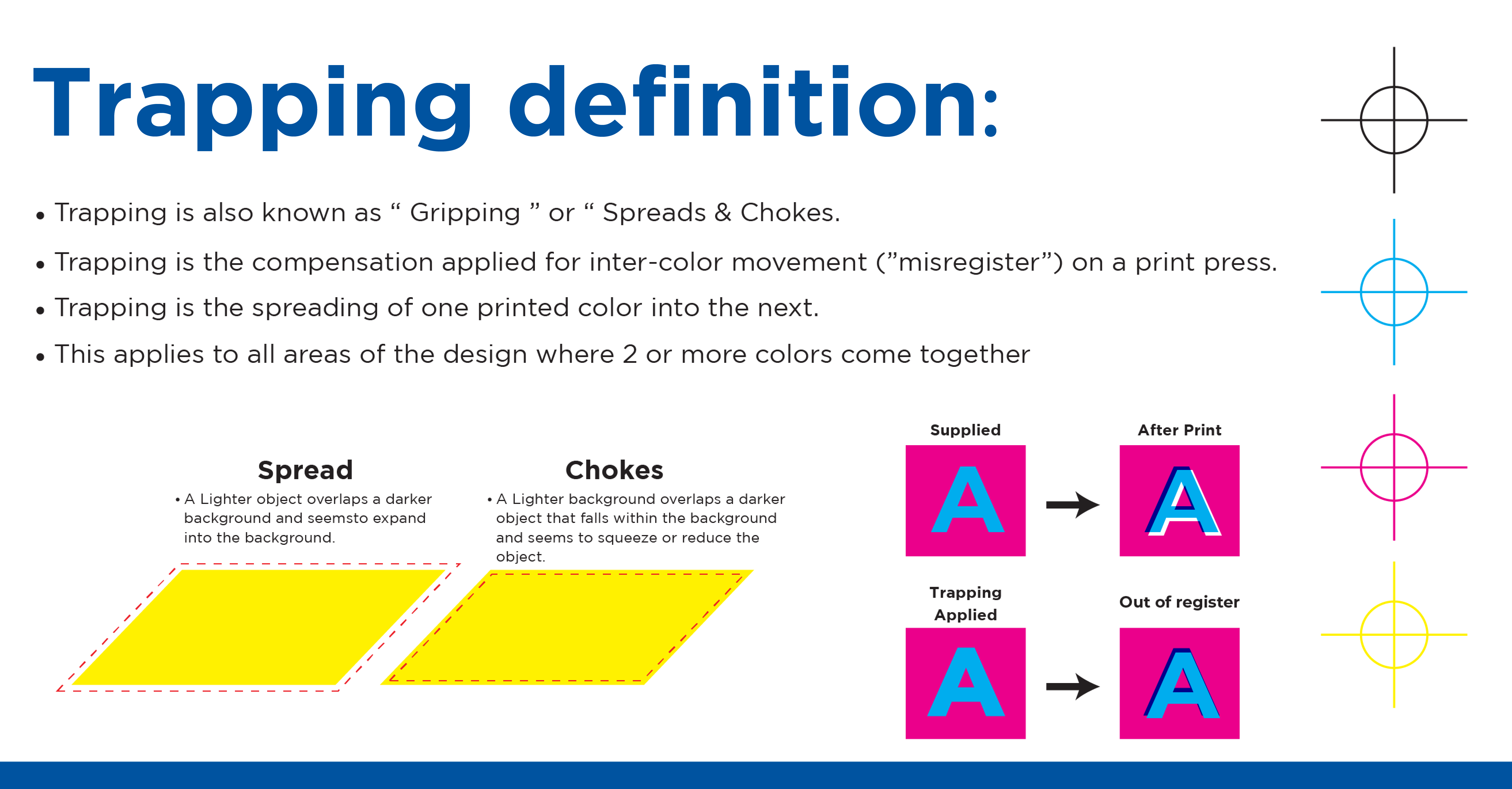
    If you’re printing a pouch or bag with multiple colors, incorrect registration by the printer can result in gaps between the colors on the final product. Which is why it’s important to use a trap to compensate for potential gaps. Simply put, a trap is a small area of overlap between colors and is used by designers to avoid unsightly gaps between colors. You’ve seen art with traps on many products you’ve purchased, but you’ve probably never really understood what they were.

    There are two types of traps, Spread traps and Choke traps. Some complex rules relating to the order of the color cylinders can come into play here, but here is a general rule of thumb for when to apply a spread trap vs a choke trap. 

    Spread Traps

    A spread trap is where a foreground object extends over the background color. Apply spread traps when a lighter color overlaps a darker color background, and after trapping the lighter color will expand into the darker area. 

    Choke Trap

    A choke trap is where the background color overprints the foreground object. Apply a choke trap when a darker object falls within a lighter background, and so reduces or squeezes the object. 

    Easy Trapping Steps in Adobe Illustrator

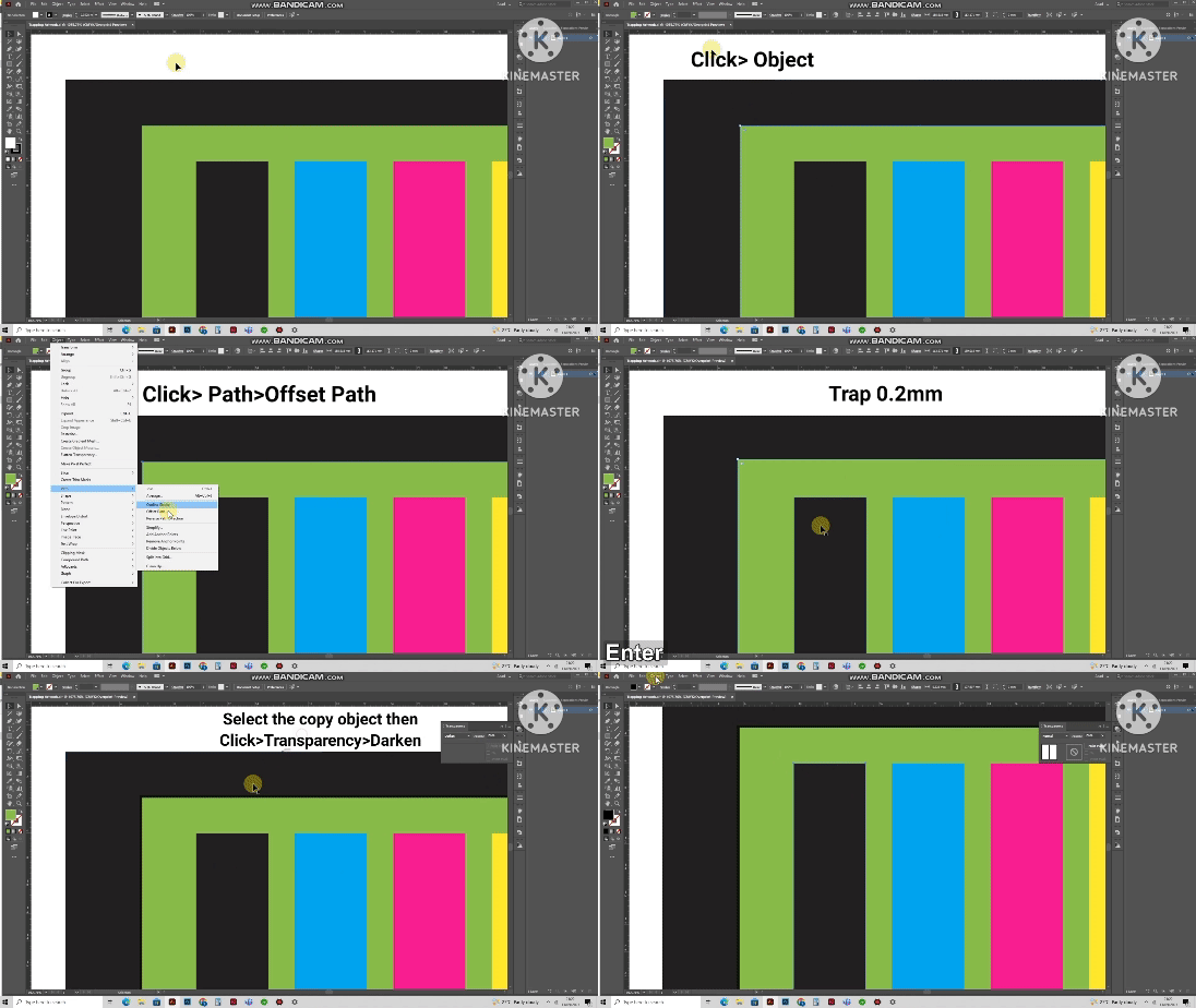
    Below is a quick and easy method to trap art, using path offsets, and transparency darkening to integrate traps into your art design.

    .

    Step 1: Make sure your artwork is in CMYK color mode for printing.

    Step 2: Select the topmost object you tend to trap.

    Step 3: Click Object >Path > Offset Path

    Step 4: For a choke trap apply a negative 0.2mm offset. For a spread trap apply a positive 0.2mm offset. 

    Step 5: Click OK

    Step 6: Make sure you’ve selected your offset path. 

    Step 7: Then click Transparency > Darken

    There you’re done!

    CarePac can help 

    As you can see, creating a trap in Adobe Illustrator can be quite complex. Fortunately, our design specialists can take care of the heavy lifting for you. By engaging with CarePac for the design and manufacturing of your bags, we’ll take care of all the steps in between. Contact us today to learn how we can help you design the bag you’ve always dreamed of. 

  • How to Export Vector Content From Canva

    How to Export Vector Content From Canva

    How to Export Vector Content From Canva

    Canva is a popular graphics design program that’s used by a lot of our customers, and Canva is popular for a few good reasons:

    User-Friendly Interface

    Canva has a simple and intuitive interface that is easy to navigate, even for people with no design experience. The drag-and-drop interface makes it easy to create designs quickly.

    Versatile Design Capabilities

    Canva offers a wide range of design templates, graphics, and fonts that users can choose from to create different types of designs. It also has features that allow users to customize the templates to fit their specific needs.

    Collaboration

    Canva allows users to collaborate with others by sharing designs and giving feedback. This is especially useful for teams working on projects together.

    Cost-Effective

    Canva offers a range of pricing plans, including a free plan, which makes it accessible to people with different budgets.

    Social Media Integration

    Canva is integrated with social media platforms like Facebook, Instagram, and Twitter, making it easy for users to create designs specifically for those platforms.

    It’s important to note that Canva’s vector capabilities are somewhat limited compared to dedicated vector graphics software like Adobe Illustrator. If you need to do more advanced vector work, you may want to consider using a different tool.

    What are vector graphics and why do I need it for my pouch art?

    Unlike raster graphics like JPG, PNG, or bitmap files, which are made up of pixels, vector graphics are made up of mathematical equations and geometric shapes. This means that vector images can be resized without losing their quality or becoming pixelated.

    Because vector images can be easily resized and edited without losing quality, they are particularly useful for projects that require the use of very high-quality graphics are needed, such as pouch printing. The industry standard for vector graphics is adobe illustrator. But some other vector graphics software include CorelDRAW, and Inkscape.

    If vectorized art is not used for your pouch design, you will generally experience a lower quality print. Overall, vector art has become an essential part of the design and creative industry, allowing artists and designers to create versatile and scalable images with precision and ease.

    How to export Vector Content from Canva

    Open the design in Canva.

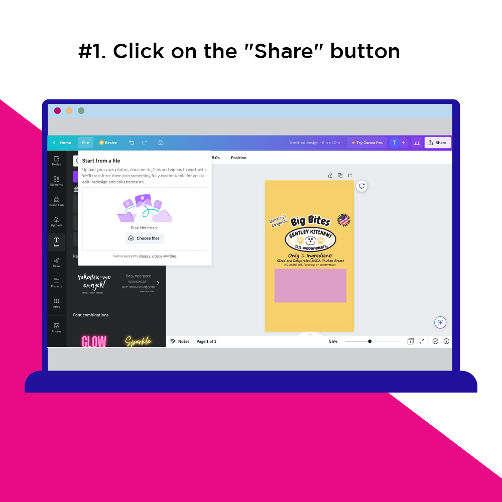
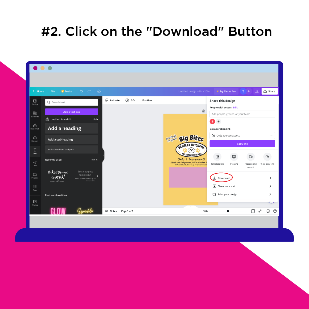
    # 1. Click on the “Share” button at the top right corner of the screen.# 2. Click on the “Download” Button

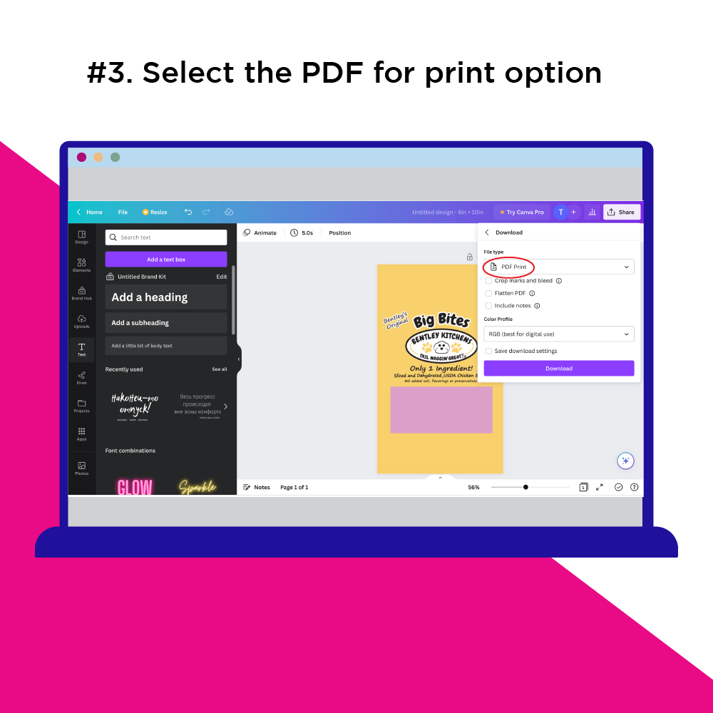
    # 3. Select the PDF for print option. While SVG is a vector option we have found that SVG export is not as reliable as the PDF export option.

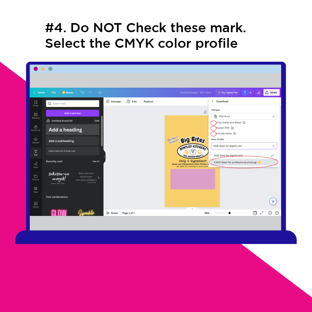
    # 4. Do not check mark “crop marks and bleed”, “flatten PDF”, or “Include notes” options as they add too many unnecessary objects. If you are on a paid plan select the CMYK color profile. Otherwise leave it on RGB.

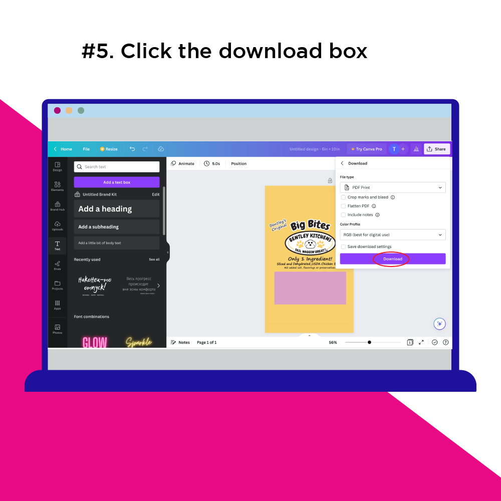
    # 5. Click the download box and you’re done!
    Common issues relate to fonts: There might be font issues, because Canva has their own fonts. Also, the text can be made up of text objects for each character, which can be a pain to edit.
  • Design Proof Review Checklist

    Design Proof Review Checklist

    Design Proof Review Checklist

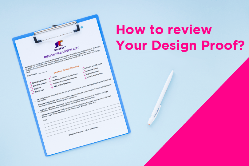
    Your design proof, also called a dieline, or Master art proof. Is a to scale schematic of your pouch. The design proof shows you all the elements which are expected to be present on the finished pouch. Reviewing your design file in detail is very important because once you sign it, you’re telling us to make the pouch based on the design. If you later find a mistake, like a spelling mistake, it could be too late to change, or could incur costs to you. In this article we’ll cover some of the most important steps you should take when reviewing your proof. We also offer a complementary design proof review check list which you can download below. 

    First things first: Check your Pouch Size

    Since your design proof is to-scale, the dimensions listed on the proof will be the finished size of the bag. The biggest mistake customers make is not checking that they size of bag they are ordering will actually fit their product. The best way to confirm sizing is to take whatever bag you’re basing 

    What if I don’t have a bag to base sizing from?

    The best advice would be to review the samples that we sent you to confirm if any of those work. If you’re not working from a sample we sent, then we suggest going to a big box retailer and purchasing pouches that you think might fit your product, then testing it out. 

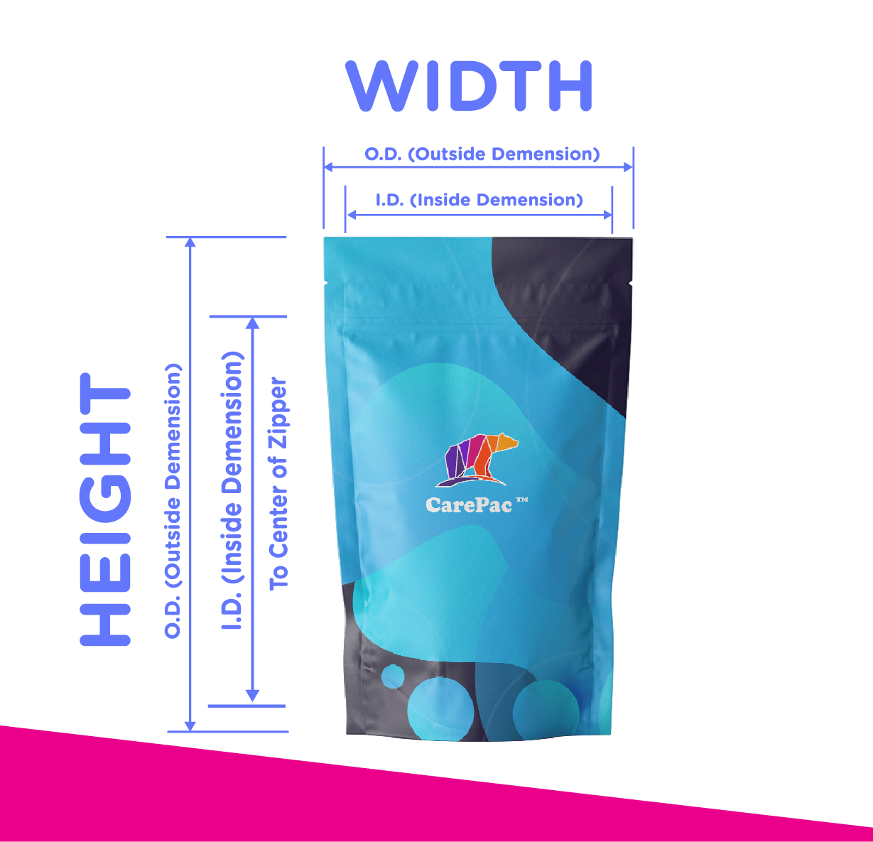
    Make sure you’re not confusing O.D. size and I.D. size.

    O.D. is outside diameter, and refers to the size of the pouch edge to edge with no additional material existing beyond that size. I.D. is inside diameter and refers to the interior usable space. The I.D. will vary depending on the size of your bag seals, position of the zipper or other closure and whether your pouch is a stand up pouch or a flat pouch. This is why it’s critical to have reviewed and confirmed your sizing before proceeding. 

    Spelling and Grammar

    It might seem obvious, but every day a customer will catch a spelling or grammar mistake that they didn’t notice previously. While these mistakes may not always be the end of the world, they project a unprofessional appearance so, it’s best to have two or three people read over the pouch, preferably people who didn’t write the content. This is because our minds will often fill in words to our own writing without us even noticing. But these mistakes will stand out to a reader who is unfamiliar with the content. 

    Material Type & Design

    During your proofing you’ll want to confirm the type of material your pouch is made from. The material of your pouch is listed on your sales order which accompanies your proof. One problem that occurs is during the development process, customers often switch between materials as they decide what is best for their pouch.  

    Bag Configuration

    Now is the time to confirm that the pouch you’re ordering is the proper configuration that you want. The digital design proof will show all the sides of the pouch, so if you don’t see a gusset, then your pouches doesn’t have one. In the diagrams below we’re showing you what some of the most common pouch configuration design schematics look like. 

    Gusseted Pouch

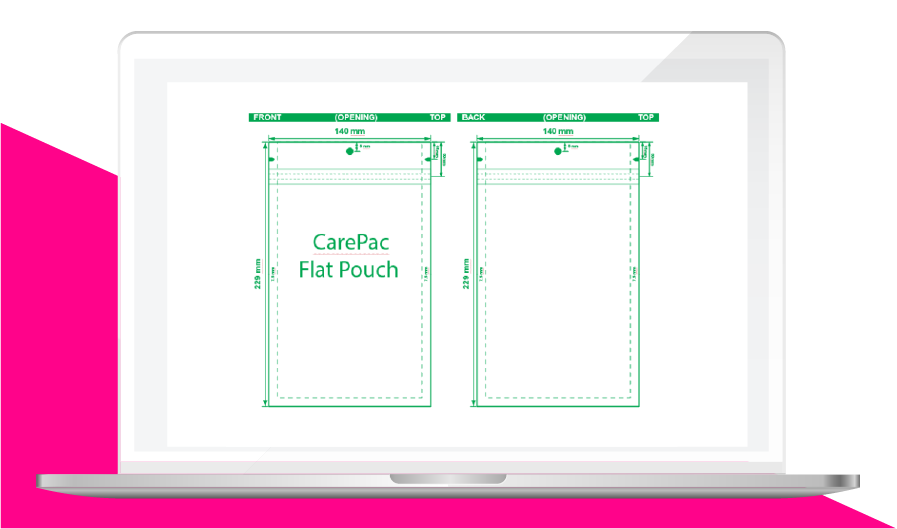
    Lay Flat Pouch

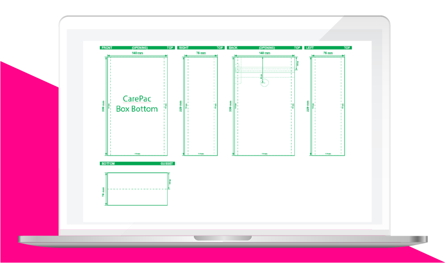
    Box Bottom Pouch

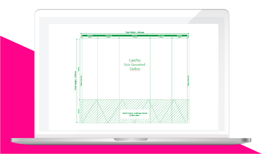
    Side Gusseted

    Print/Proofing Review

    When reviewing the print on your pouch there are several items to specifically take time and double check: Bag Finish, Colors, Barcodes and QR Codes, brand trademark usages, Nutritional and compliance information, and where the folds are. 

    Colors

    The colors being used on your design will be listed on your design proof. Each design proof includes a color bar which designates each color which is being used in the design. There are some differences between the colors used in digital and those used for plate printing. Also some types of bags like box bottom pouches require multiple sets of color plates. 

    Digital Colors

    Pouches which will be digitally printed will be created using a White Cyan, Magenta, Yellow, and Black ink combination. This is often referred to as five color process (or many times mistakenly called four color process). 

    Pantone Colors

    Pantone colors are commonly used by customers to increase overall color fidelity and consistency. Pantone colors applicable to flexible pouches will be from the Formula Guide Solid Coated, or Formula Guide Solid Uncoated.  Pantones from other Formula Guides are typically not compatible with flexible bag printing. 

    Printed Pouch Finish

    Your pouch finish, and the position of any Spot Finish will be indicated on your design files as a separate set of graphic bag schematics. It’s important to check that the finish indicated is the finish that you wanted us to produce for your brand before you order. 

    Barcodes and QR Codes

    Now is the perfect time to confirm that your Barcodes are correct, and have been placed on the correct designs. You don’t want to later find out that the your vanilla flavor’s barcode graphic is actually on the chocolate flavor bag. Scan your barcode or read your QR code on your screen to ensure it has the correct information encoded into it. 

    Trademarks

    Now is also a perfect time to confirm that any trademarks you use on the bag are properly licensed before you put in the order so you don’t get in trouble later. 

    Nutritional and Compliance

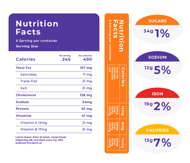
    Nutritional information needs to be accurate, otherwise you’re going to be relabeling the bags later with stickers which is time consuming and easily avoided. Those pesky compliance icons, symbols and consumer warnings should also be given a second look. Typically compliance warnings must be properly formatted and sized. Is your USDA icon the correct size? Is the font on your Surgeon general’s warning the right size? These are important and can be costly mistakes if you don’t double check. 

    Bag Features & Touch/Feel

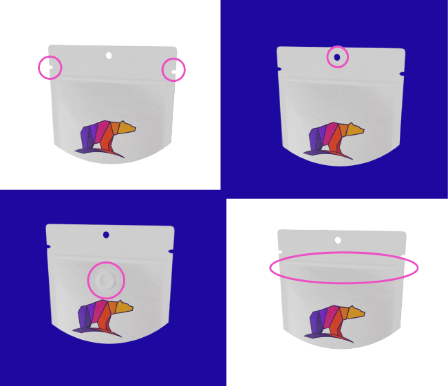
    Getting back to the basics, the bag design schematic shows you the pouch that will be made, in a to scale rendering. The schematic also shows you all the features (i.e. zippers, tear notches, hang holes, valves spouts etc) that will be on the finished pouch, in addition to other aspects (matte, soft touch, etc.). If you don’t see a feature on the bag it’s not being made. 

    Dieline Review Checklist

    We hope this article has given you a nice overview of the dieline review process. We’re including a dieline review checklist which we believe is the most complete check list available and is based on years of experience. Click here to download the design file review check list. 

  • Graphics in Zipper and Seal Zone Areas

    Graphics in Zipper and Seal Zone Areas

    Graphics in Zipper and

     Seal Zone Areas

    A common question that we get is, “Can I print in the seal zones and the zipper area on my pouch?

    Fitting all the client’s contents onto the bag can prove a challenge to say the least. Less-is-More isn’t always possible. Sometimes you’re adapting artwork from a different packaging medium, other-times you using the same artwork on multiple bag sizes. Whether it’s the limitation of design, client requirements, or other variables there will come a time when you must put graphics in the seal area and zipper areas of your pouch

    Printing Content in Zipper and Seal Zones on Pouches & Bags

    The short answer is, Yes! But it’s best to avoid putting important design elements or contents in those areas. So essentially, the long answer is, It depends.

    What is a seal zone on a pouch?

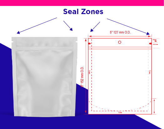
    Seal zones are where the material of the bag is sealed together. Without seals you don’t have a bag and the contents within are not protected. Depending on the pouch configuration involved you may have as few as 2 seal zones or as many as 8.

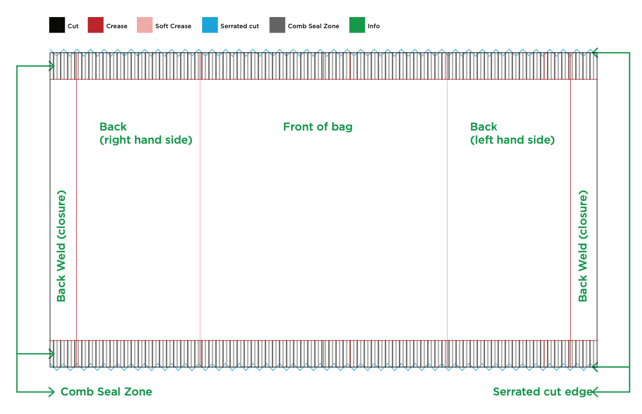
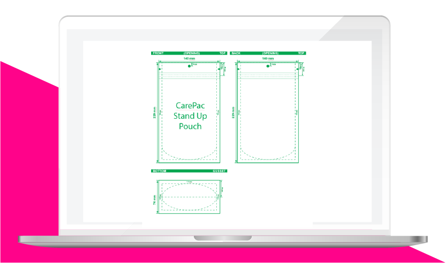
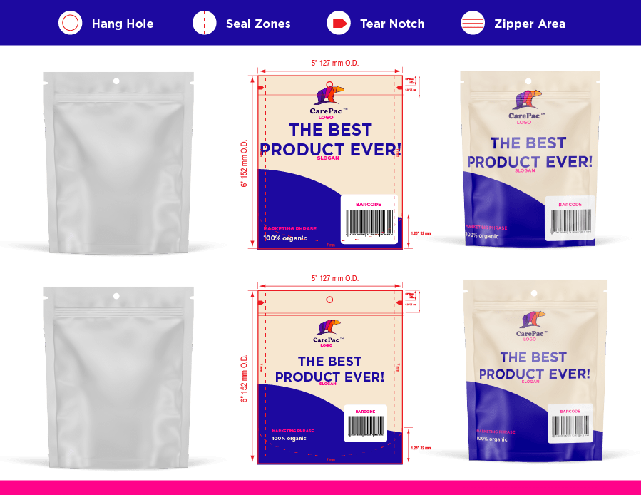
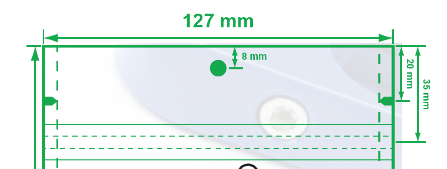
    On our dielines seal zones are show using dashed lines. Seal zones typically run along the edge of the pouch. As in the picture below.

    Pouch Zipper Area Explained

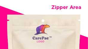
    The zipper area is where the sealing zipper is built into the resealable bag. The zipper is a physical item which takes up space and creates a slight bump and ripple in the pouch surface. Most styles of zippers are heat sealed into the pouch during the pouch making process. Standard zippers will have a zipper flange on both the front and back side of the bags. Ez-Pull / Pull tab zippers exist only in one face of the pouch. Either way, there will be a bump in the material where it conforms to the extruded zipper. 

    What are “important design elements” on pouches?

    You will come to learn that important design elements are anything that is critical to the success of the packaging. This might include barcodes, USDA organic labeling, FDA stamps or icons, P65 statements, or other compliance warnings, nutritional information etc. When designing your bag, you ideally do want to follow our art guidelines and avoid placement of critical graphics in zipper, area, seal zones or around hang hole because you don’t want someone claiming they these items are distorted or otherwise not readable.

    The Basic Rule for Printing in Stand Up Bag Seal Zones

    The basic, fall back rule is don’t put anything in the seal pouch (zones or zipper area) that you need maximum readability. Generally, graphics like logos can be placed in the zipper area with subjective results. Bar codes should never be placed in zipper or seal areas, the seals and zipper can create read errors.  

    Never place the following items in seal zones and it’s best to avoid placing them in the zipper area. 

    • Barcodes
    • Ingredient Allergen information
    • Compliance icons (USDA, EPA, ETC)
    • Nutritional information
    • Ingredient lists. 
    • Compliance warning statements. 

    Generally OK to print in the seals and zipper area

    Generally its best to bleed out graphics, backgrounds, etc through the seal zone. When it comes to the zipper area, the amount of possible distortion is lessened. Here are some design elements which we commonly see placed in the zipper area when the customer is left with no other printing options: 

    • Logos
    • Slogans “the best product ever!”
    • Marketing phrases “100% organic”, “free range” 

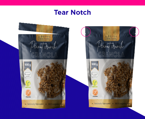
    Remember the tear notch on flexible packaging

    The tear notch is meant to be used, but many times graphic designers forget that it will be! Anything you place above the tear notch will be removed when the consumer opens the pouch. So you’ll want to avoid putting warning logos, and important things above that area. 

    What result can I expect?

    The exact outcome will vary based on several variables including bag material, and colors used, but generally print in the seal zones or zipper area turn out just fine, you just have to be willing to accept that there will be some bumpiness, and possibility of a little distortion.  

    Examples: here are examples of print results obtained when printing in the seal zone.

    Logo in Zipper Area

    Optimal Placement

    Everything is made-to-order, and we’ll ultimately print whatever you need wherever you want it,

    but following the best practices will make for a better outcome!

    Contact us today for a free consultation and quote.

    Everything is made-to-order, and we’ll ultimately print whatever you need wherever you want it, but following the best practices will make for a better outcome!  

  • Is RGB or CMYK better for digital

    Is RGB or CMYK better for digital

     Whether you are a designer or just trying to get a project across the finish line for your team, some things are essential to know if you are working with printed packaging. One of the most important things to know is the concept of RGB vs CMYK color modes.

    The mastery and knowledge of both these concepts are not restricted to the complete forms of both words. It also refers to understanding of how they help optimize the design and printing process. So, for example, it also helps to understand which color mode you choose for products paper envelopes.

    When we try to understand the concepts, they are presented in a challenging way, and we get more apprehensive of learning about them.

    However, in this article, we will explain the RGB and CMYK color modes in a more straight forward way so that you can use them in the best way.

     So, without any further ado, let us get started!
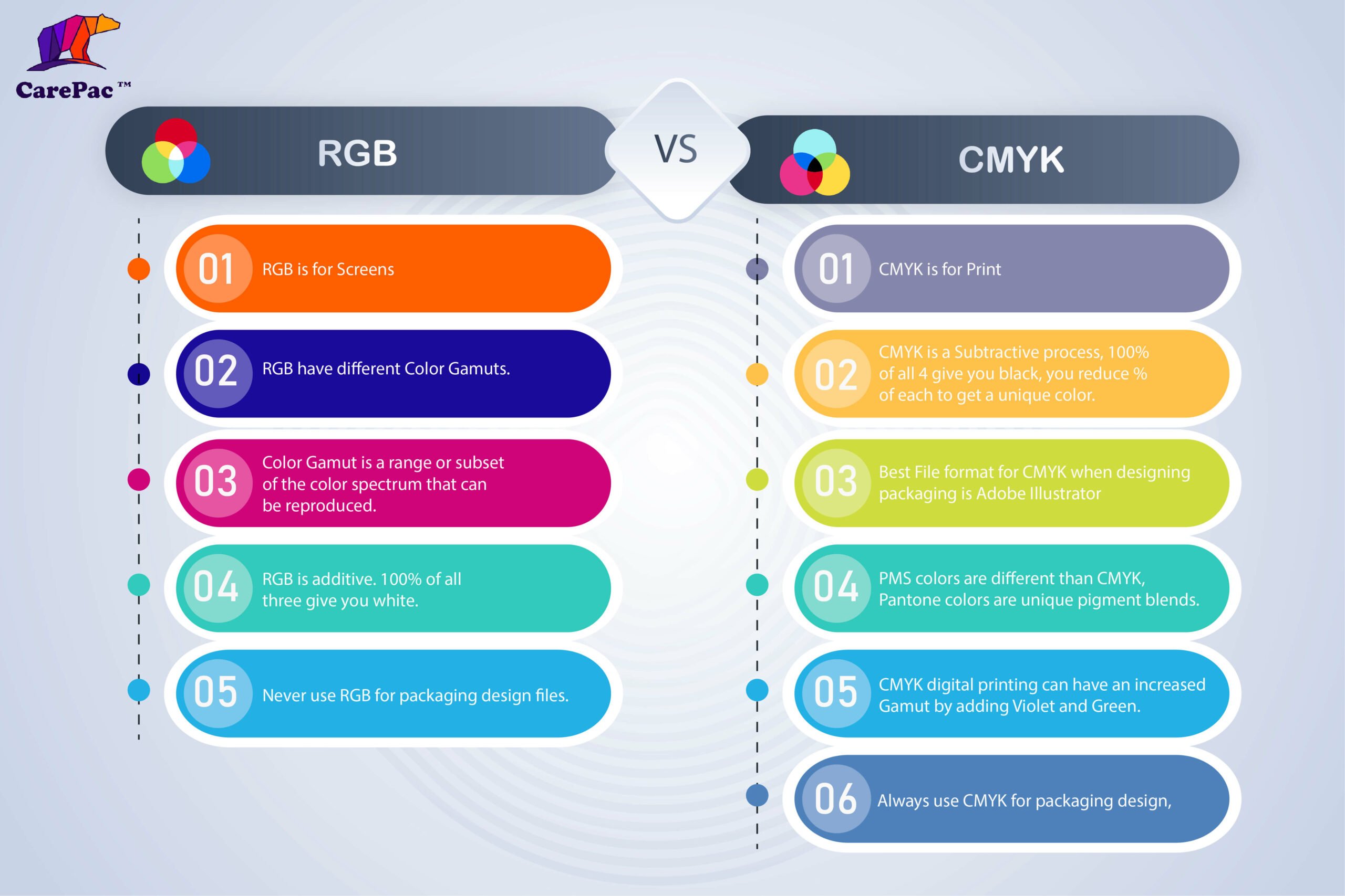
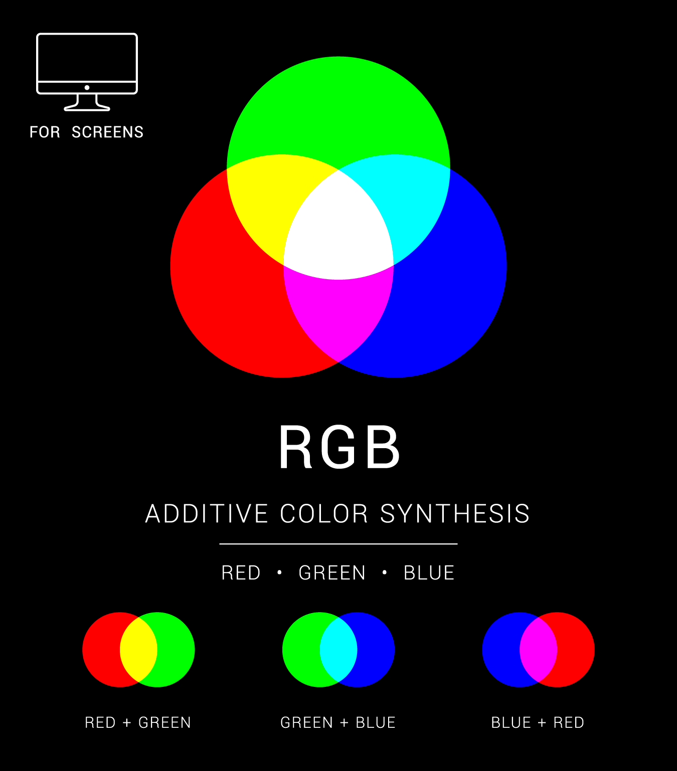
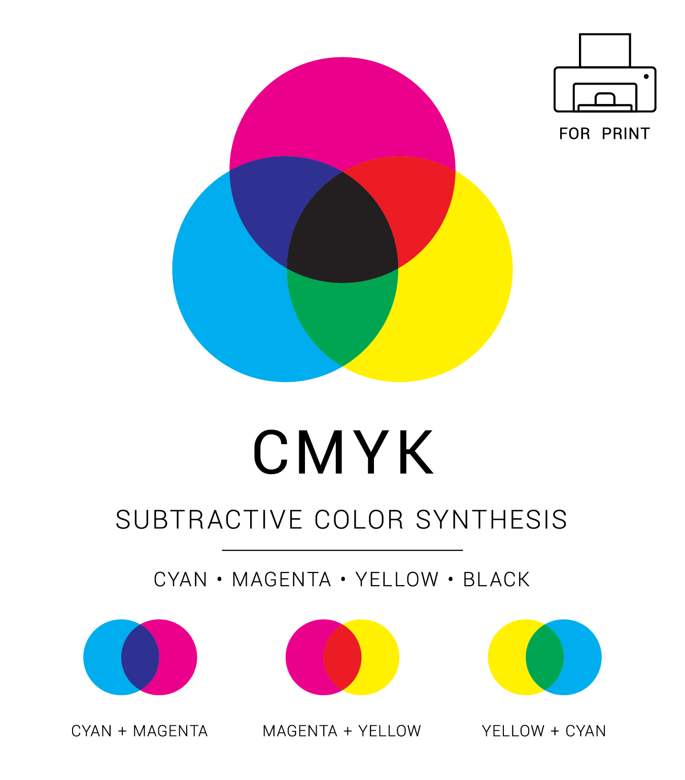
    An infographic showing the differences between RGB and CMYK

    What is RGB?

    The complete form of RGB is Red, Green and Blue and is the color space frequently used for digital images.

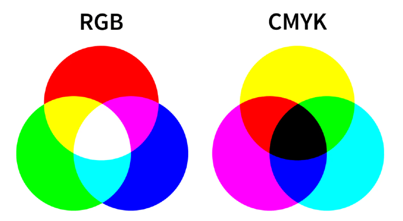
    All the colors initially consist of black darkness; then, the three colors are put on top of one another to create the perfect pigment and brighten it. This is what a light source does, and it produces the color you want by combining red, green, and blue light and adjusting the intensity.

    The graphic designers can adjust and play around with three primary colors (red, green, blue) to control the vibrance, saturation or shadowing to increase or decrease the final color outlook. Moreover, they even can alter the light source so the designers can use it to achieve the required color on the screen.

    When to use RGB?

    There are times when you need to use RGB color mode instead of CMYK to display your design. 

    RGB is for Screens

    If the destination of your design is a digital screen, then you should opt for the RGB color mode. A digital screen includes different devices, like mobile phones, tablets, android televisions, projectors, computers or even cameras.  But that is not all. You will also need to opt for RGB color mode for the following options:

    Websites and applications design

    This includes all the graphical content, like icons, signs, buttons or even graphics.

    Social Media

    Social media content includes posts that incorporate data, images, profile pictures or backgrounds.

    Video Content and Infographics for Web

    Visual content accumulates all types of content mentioned above and other options like videos, infographics or even photographs for various online platforms like websites, applications, or social media.

    Best file formats for RGB

    Now that we have talked about RGB color mode, the next thing that we need to understand is that not all the file formats are for RGB. However, there are some preferred file formats required for RGB.

    JPEGs

    The most common format for RGB is JPEGs. They are easy to read by any software, and you can easily play around with the size and quality. If you like, you might even compress it.

    PNGs

    The second most common but better version of JPEGs is PNGs. They are not only transparent but are of higher resolution, which is great for graphics. This type of format is excellent for website content like icons or buttons.

    PSD

    PSD is an editable file version of photoshop and a common source for RGB documents. It is excellent to use when sharing files with other graphic designers.

    GIFs

    Everyone is aware of GIFs, a combination of different animated elements. It is used on various platforms for work or fun.

    What is CMYK?

    CMYK means Cyan, Magenta, Yellow, Key/Black. The CMYK colors are mixed up using real ink, and a printing machine creates the images.

    This process is referred to as subtractive mixing. All colors begin as white, and every layer of ink diminishes the initial brightness to get the desired color. When all hues are combined, they become absolute black.

    When to use CMYK?

    There are certain times and file formats where you should use CMYK color mode. However, you should avoid doing so other times unless you know which format would be the best.

    You need to understand a simple rule: you should always opt for CMYK when a design needs to be printed. CMYK color helps to recreate a design or a style in a more accurate way.

    It would be best if you choose CMYK in the following project types:

    Printed Packaging Design

    Any packaging design that will be printed digitally, (and some which will be flexographic or rotogravue), should be setup with CMYK. It should be noted that like a onion, color space selection is complex, and we havn’t address PMS colors in this article, but as a rule of thumb, the best place to start with packaging design is using CMYK.

    Advertising

    Marketing collateral like posters, flyers, billboards, brochures, menus, vehicle wraps, business cards, management tags and more.

    Merchandises and materials

    The merchandise and packaging that need to be oriented should be included in the CMYK list, such as products, paper envelopes, collection printed samples, menus, packaging, clothing or even hats.

    Best file formats for CMYK

    AI

    AI is the editable file of Adobe Illustrator, also known as the standard source file. Working with a team of designers, you should always use AI file format.

    PDFs

    We all know PDF versions and have used them for our word files, but we need to understand that it is perfect for CMYK files. One of the reasons is because of its compatibility.

    EPS

    If you don’t want to use AI files, you can choose to go with EPS files. While AI files might be compatible with some software, EPS files are best to work with all the vector programs.

    Moreover, you should also get a printout and then decide if you need to adjust the colors again or are the colors output is good enough.

    TIFFs

    When you save a PSD as a TIFF Photoshop creates a flat Tiff image file and the layer data is a separate Tiff Tag and can have embedded RLE. 

    Why the RGB and CMYK Difference Is Important in Graphic Design

    You should understand and comprehend the difference between RGB and CMYK channels in Graphic Design. One of the significant reasons to understand the difference between the two can affect the final printed version compared to the digital one.


    Both RGB and CMYK are two different color modes. They have their own  requirements, pros and cons.


    Attempting to print a file in the wrong format will result in incorrect colors. This mistake can further be an expensive and time-consuming problem to solve. Therefore, understanding the differences and avoiding these color issues is essential for good design and printing.

    Moreover, it is also essential for the digital printing services to know the difference since they are in charge of printing an order. A little mess up can incur high costs; therefore, digital printing services need to know what is best for digital marketing and other channels.

    For digital printing on pouches your file should be set to CMYK. CMYK stands for Cyan, Magenta, Yellow, Black. These are the ink colors that will be combined when printing your logos and graphics on the pouch. RGB which standards for Red, Green, Blue is applicable to on-screen display and is not used for printing. 

    RGB vs CMYK Model

    RGB is an additive, whereas CMYK is a subtractive color model. RGB color model uses white as the sum of all primary colors and black as the darkness of light. Graphic designers and publishers use the RGB color model for any media that emits light. Because the mediums emit color as red, green, or blue light, RGB is perfect for digital media design.

    In the RGB color paradigm, pixels on a digital screen are all one of three hues when magnified: red, green, or blue. The white light projected by the screen combines the three colors on the eye’s retina to produce a wide variety of additional apparent colors. The rule is that the more color beams sent by the device, the closer the color goes to white.

    However, not producing any beams results in color darkness. This is the inverse of how CYMK operates. CMYK color model employs white as the original color of the print backdrop and black as a color ink combination.

    CYMK is ideal for print marketing materials like logos and best for digital materials because it uses colored ink for printing. Using CMYK, colors are subtracted from the original white light and converted into pigments or dyes.

    Printers apply these pigments onto the paper in the form of tiny cyan, magenta, yellow, and black dots that can be spaced out or used closer together to create the required colors.

    The more colored ink applied on a paper with CYMK, the closer the color gets to black.

    However, as you subtract cyan, magenta, yellow, and black inks, you get the white or original hue of the paper or background. RGB color values vary from 0 to 255, while CMYK color values range from 0% to 100%.

    How to Convert an RGB File to CMYK

    You might have to change the color space of a document, and the change might require changing the colors.

    About Color Spaces

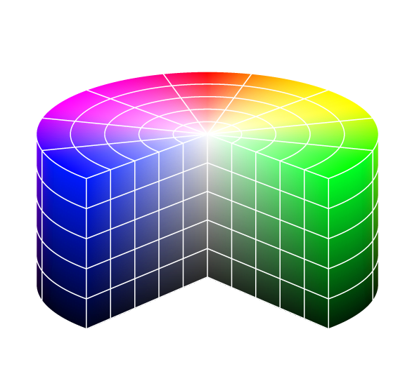
    A color space refers to applying a color model, either RGB or CMYK. RGB and CMYK have numerous color spaces, and each one of them has a unique gamut. Adobe RGB and sRGB are the two most common color formats. However, the screens commonly use standard RGB or sRGB and are appropriate for photos on the web as they are translated by most displays the audience uses.


    If you wish to learn more about color spaces, you need to know the differences between the two-color modes in even more detail.

    The Simple Answer: CMYK+W is for print RGB is for screens

  • Dieline Walk Through

    Dieline Walk Through

    In this video we walk you through a typical flexible barrier packaging dieline. Topics include: reading the dieline, understanding layers, and how to denote finishes, and clear or unprinted areas. Additionally, basic best practices are included. 

  • Flexible Packaging Design File Setup

    Flexible Packaging Design File Setup

    Flexible Packaging Design File Setup

    Setting up art files for flexible barrier packaging has it’s own little quirks and peculiarities that set it apart from other print setups. But never fear! The same basic techniques and knowledge base you have used for off-set or paper printing can be transferred to flexibles.  
    Types of Dielines

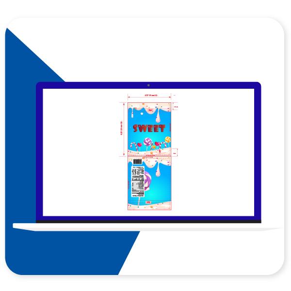
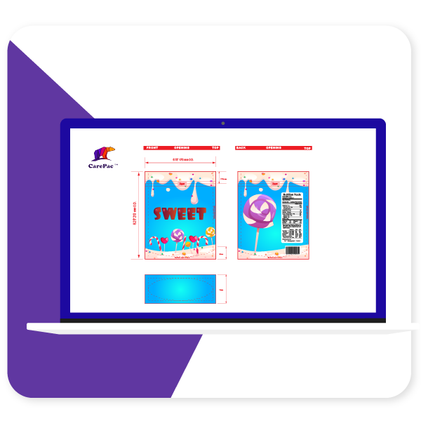
    There are two types of dielines you’ll see presented. A “multi-up” dieline or a as-print dieline. At Carepac we prefer using multi-up because it makes actual proofing easier, but many times you may work with a dieline that is as print. 

    As-Printed Layout

    Multi-Up Dieline

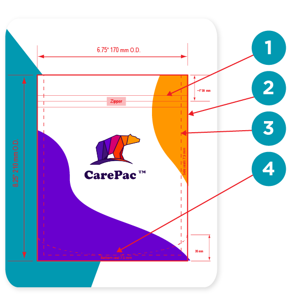
    Reading your dielines

    1. Zipper location

    Yes you can print over the zipper area. Sealing the zipper into the bag does create some wripples / mild distortion so we don’t recommend putting important mission critical items in the zipper area.

    2. Outer edge of bag

    On our dielines the edge is the edge, no additional bleed needed and nothing exists beyond this point. Over the years several customers have thought that the dimensions indicated are ID, inside diameter, which is false. All the dimensions are O.D. Outside diameter. 

    3. Seal Zone

    Seal zones are where the material of the front and back of the bag are sealed together. Seal zones are printable space, the only suggestion is to not put something like a barcode in the seal zone as, similar to zippers, seal zones can have a slight bit of distortion. 

    4. Gusset Zone

    Gusset zones are like seal zones never put a window area in a gusset, as this area will not look good if you put clear window over it. 

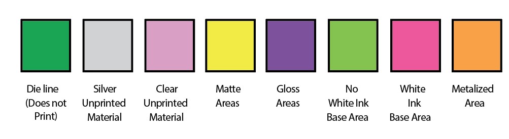
    Dieline Color Bars

    Dielines use various “off canvas” colors to denote physical elements of the bag. These colors should contrast with the artwork, so they are easy to identify. Tese are technically the dielines. Here are some examples of dieline colors, with their corresponding label. 

    Pouch designs will include alot of content which is not actually printed on the pouch. This content is there to convey various specifications. For example when designating areas of clear or unprinted area, merely making those areas transparent in the AI file is not a good practice, why? Because white and transparent can be confused, also your AI files are going to be converted to other file formats for printing (for example rip station files) and ensuring that the person making the conversion understands your intensions is key. 

    It’s important to designate various items such as: 

    • Clear unprinted areas
    • Metalized unprinted area
    • Matte, Gloss, and Spot UV finish areas. 
    • Areas of white ink base and areas without white ink base. 
    • Metalized printed areas (different than unprinted metalized areas)

    Using Art Boards vs Layers

    The decision of using separate art boards or layers is up to you, but typically we suggest layers, even for “off-canvas” layout information such as white ink base areas. This is because you can overlay layers to ensure their locations correctly correspond to the printed areas. 

    Setting Up Your Layers

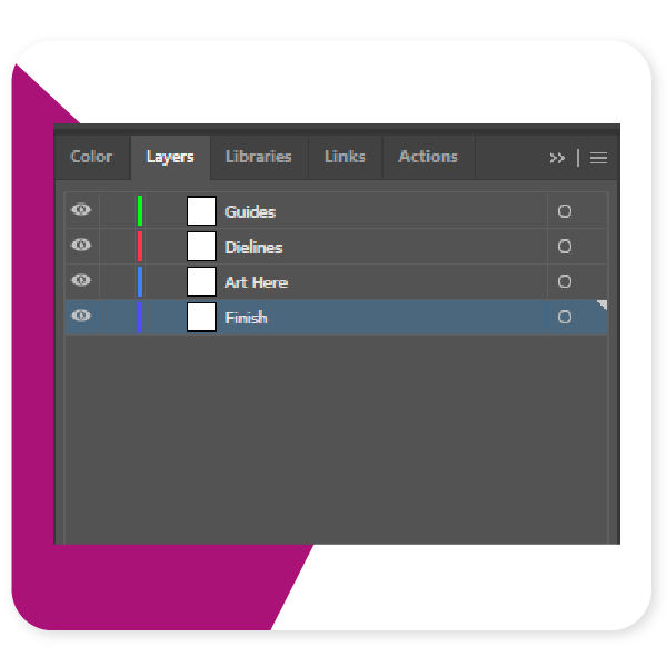
    There are some basic best practices to follow when setting up your layers. Firstly, do not mix the dieline and art layers, this can create errors, and just makes for messy files. Second, if you are designating finish locations for spot UV or matte varnish, use a separate layer for those purposes. 

    1. Separate Dielines from art

    2. All art on one layer

    3. Finish designation layer separate from art. 

    Outline all text

    It’s very common for designers to forget to outline their text. It is important to outline text to ensure that there are no versioning differences between different versions of a font file. If you’ve used a paid font, then we won’t have that font, and if you’ve downloaded a free font from DaFont, Fontspace, fontsquirrel, or any of the numerous font sites, they all will have slightly different versions of the file than what we might have. 

    Define Color Swatches

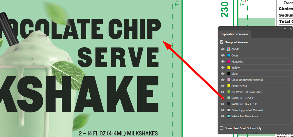
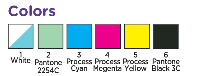
    Messy Color swatches, or failing to setup any swatches is something we see almost daily. Adobe’s built in color swatches allows for color separation and is especially helpful when working with spot ink colors, such as Pantone colors. In the picture below the designer has correctly separated and assigned PMS colors to the art work. Spot ink colors are colors created through the combination of specific ink colors instead of CMYK. Spot colors can be more consistent across print runs, and allow for color matching to pantone ink swatch decks. 

    Pantone Colors

    While talking about Spot colors we should probably address the whole Pantone v. Adobe issues.

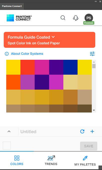
    Pantone and Adobe have been in a bit of a tussle and pantone colors libraries are no longer a free part of adobe illustrator. This has created some issues as the pantone libraries that are freely available are now out of date. There are a few work arounds that we’ll tell you about. 

    The first is of course the official Pantone Plugin. Pantone has released Pantone Connect which is a paid service, part of which is the pantone connect plugin. If you have the Pantone connect plugin then you have access to all the current Pantone colors (as of writing this Pantone Connect is $59/year).

    There are a couple of ways to handle things if you don’t pay for the plugin. First lets talk about something most people don’t understand, screen color is not the same as color on paper (or plastic). Here’s the secret, it doesn’t matter if you have the plugin or not, as long as you have the physical pantone book. 

    You can use whatever color you want to designate your spot. 

    Yes you heard me right, whether you have the plugin or not, it’s really irrelevant for our purposes because, screen colors are not very accurate to being with. As long as you designate the color number correctly in your color section (and assign it a swatch in the Color swatches), then we’ll know what you’re talking about. Since for Pantones to have any real value you should be referencing the printed color decks anyways.  

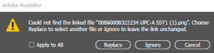
    Don’t Forget Your Links!

    One of the most common issues we run into when setting up customer’s art is the missing link. It’s easy to forget those pesky linked files, but without them we can’t take your files to press. So Lets remember to embed the linked files or include the links folder in your export. 

  • Outlining Text

    Outlining Text

    How To Outline Text

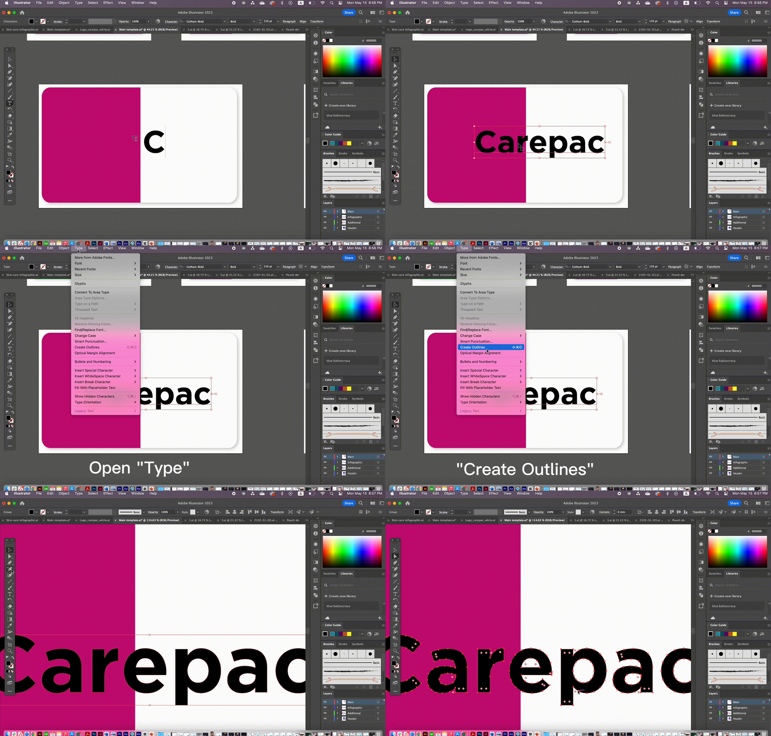
    What does it mean to outline text? Outlining text converts text in your file from editable text elements to press ready vectorized un-editable shapes. In essence it changes the text to shapes like the rest of your design.

    Why is outlined text important? Outlining text is important because it ensures your text prints correctly. 

    • Text can be scaled to print at any size without quality loss
    • The text will be clear and more crisp to read
    • The text will not change when moved between computers with different font file version. 

    Important: Save a backup copy with editable text incase you need to make adjustments. 

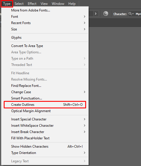
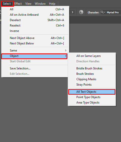
    How to Outline Text: For each AI file, please perform the following tasks. 1. Select -> Object-> All Text Objects2. Type -> Create Outlines3. Save AI file and send back.

    Step 1

    Step 2