Category: Packaging Design

  • Rustic Packaging Ideas & Inspiration: Enhance Your Designs

    Rustic Packaging Ideas & Inspiration: Enhance Your Designs

    Rustic Packaging Ideas & Inspiration:

    Enhance Your Designs

    What is rustic design?

    If you like the rustic touch of brown paper bags, DIY ribbons, and items beautifully packaged in a paper or cardboard box, you’ll love the elegance and value of rustic design. Not only does this fantastic design style create an unforgettable unboxing experience for your customers, but it puts an emphasis on the natural beauty we can already find all around us.

    In interior design, rustic design typically includes aesthetically pleasing elements, like green pine tree branches, ornaments made from wood, lots of warm colors and patterns, and ornaments made from dried flowers and other supplies from nature that help present a personal touch in your home or store.
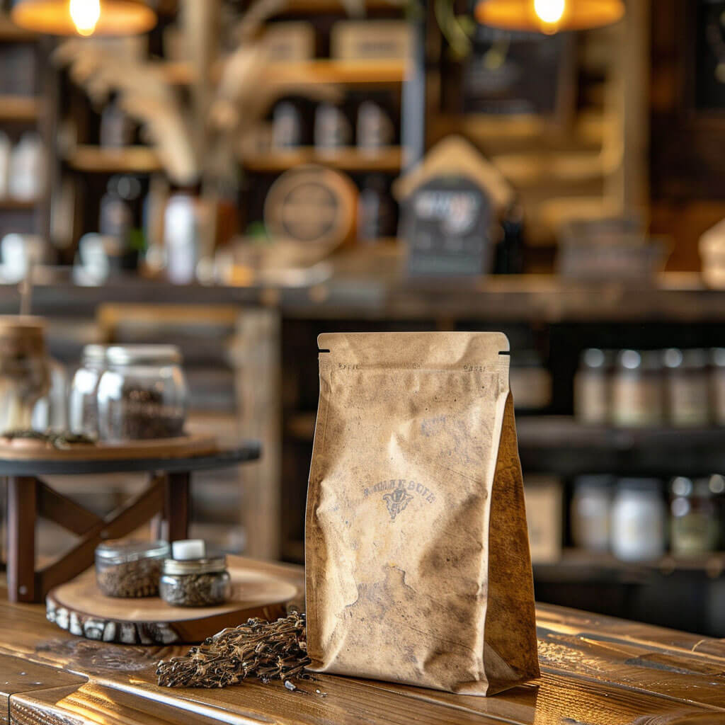
    But did you know rustic elements can make their way into product packaging, too? From wood imprints on a package, rustic gift wrapping, adding DIY eco friendly upcycled cloth or clothing scraps to jars and lids, and using lots of neutral colors on your boxes, there are several ways you can give your packaging a rustic touch.

    So, get inspired and learn how to impress your loyal brand customers with fun and rustic packaging. Read on to learn more about how we can create the perfect packaging for your brand.

    Tips for giving your product packaging a rustic touch 
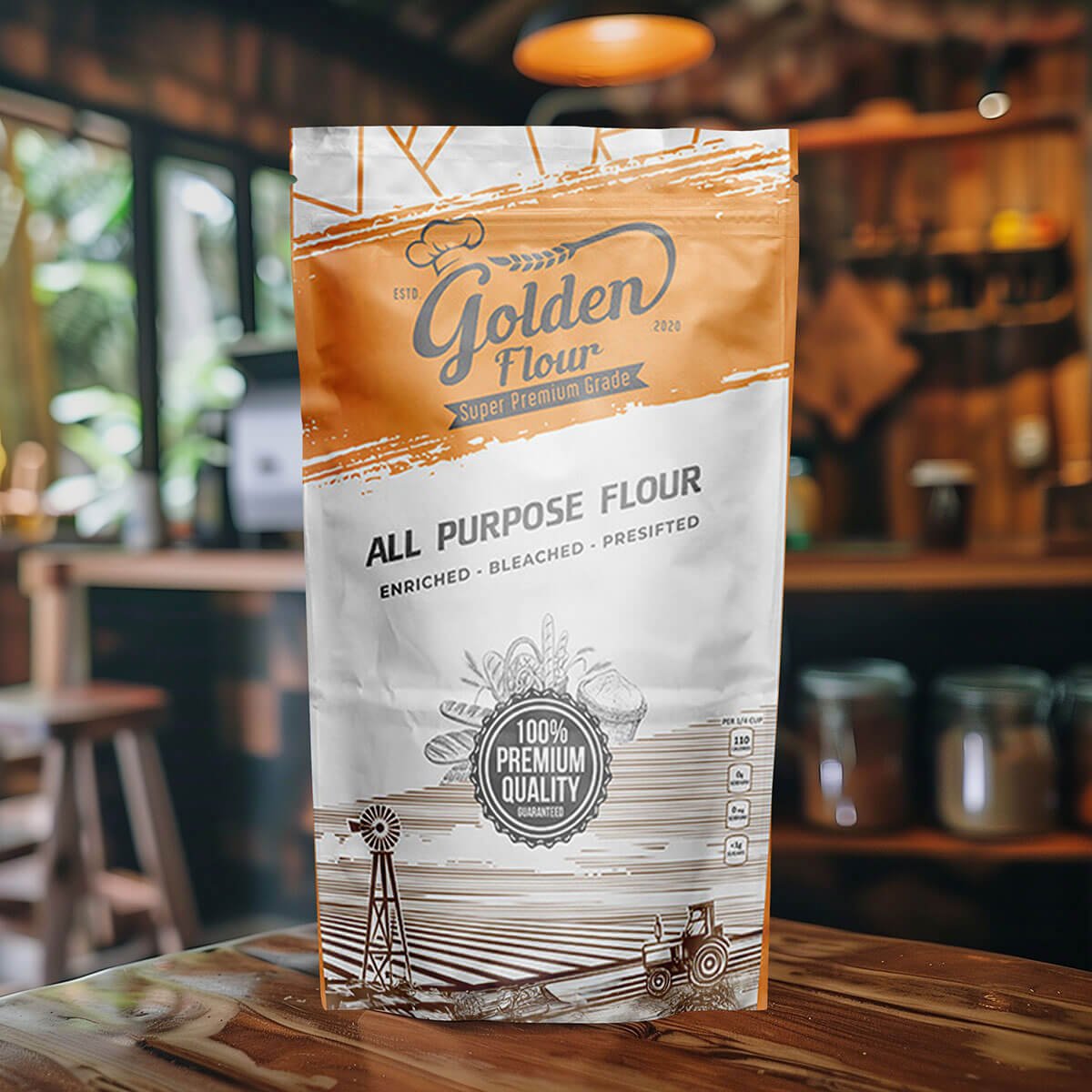
    Use a warm color palette

    When you think about rustic gift wrapping or interior design, which colors do you think of? The browns of Kraft paper, the muted greens of a pine tree, or the beige of a cool winter morning. If you’re selecting a color palette, get creative: look at what other similar products are doing with their branding, and really think about which colors would make you feel special.

    When in doubt, opt for Kraft paper or brown paper bags

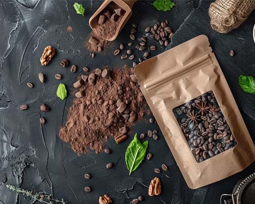
    Packaging your products in Kraft paper, especially if it’s eco friendly or DIY, is one of the easiest ways to incorporate rustic design elements into your packaging. Even better if you add natural decorative pieces into the packaging, like a fresh pine cone from a pine tree or a bundle of dried cranberries. Think about the things that make you think “rustic” and incorporate them into your packaging. They’ll be sure to help your business stand out!

    Natural cardboard with black printing

    Another relatively easy way to enhance your packaging by giving it a rustic feel is to opt for natural, brown cardboard boxes. Then, print your brand’s logo, business catch phrase, or showcase your differentiating factors with black ink. Rustic design doesn’t take a lot of creativity or supplies: keep it simple, use recycled or value materials when you can, and keep an eye on what other brands are doing.

    Add handcrafted design elements to your rustic gift wrapping

    If you prefer to avoid incorporating natural elements into your packaging (like pine cones or branches), consider adding handcrafted ribbons, a vintage stamp, handmade gift tags, or other DIY elements to your business packaging. Not only is this a perfect way to create a rustic feel with your packaging, but it also lets your customers know that the package was designed and put together by a human. Incorporating a human touch like this is especially impactful during the holiday season. 

    Holiday-themed rustic packaging

    Rustic packaging is especially impactful during the holiday season, as it brings customers back to their natural roots (vs. the consumerist culture they’re immersed in.) Here are some tips for incorporating rustic themes into your Christmas wrapping paper and packaging:

    • Use muted Christmas colors in your wrapping paper (i.e., lighter colors of green and red)

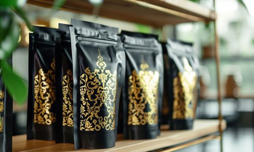
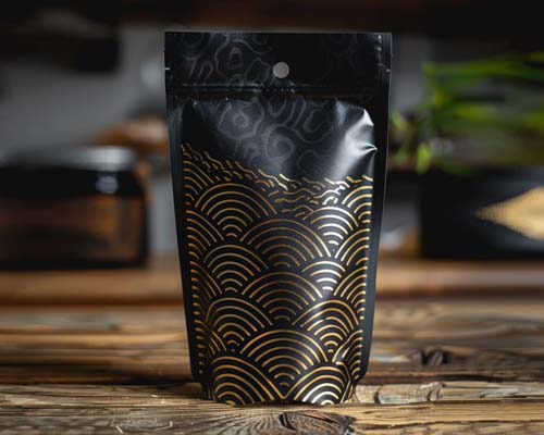
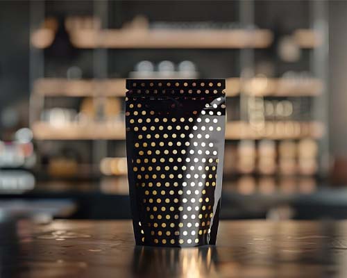
    • Opt for using gold and black ink on your Kraft paper, ribbons, or cardboard gift packaging

    • Incorporate your logo, patterns, or brand name onto the rustic gift wrapping or boxes with an eco friendly stickers

    • When in doubt, err on the side of minimalism vs. doing too much with your boxes and packaging

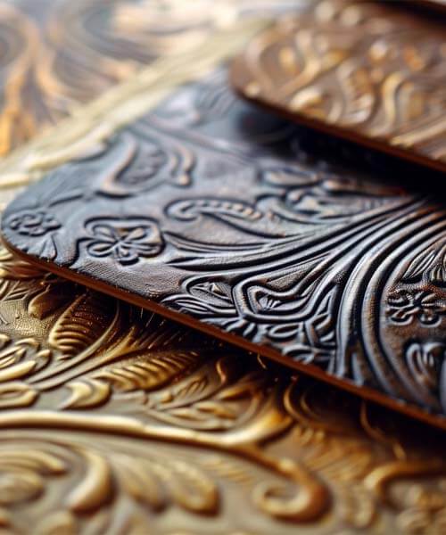
    • Consider creative decoration aspects, like embossing or using a hot stamp onto your packaging.
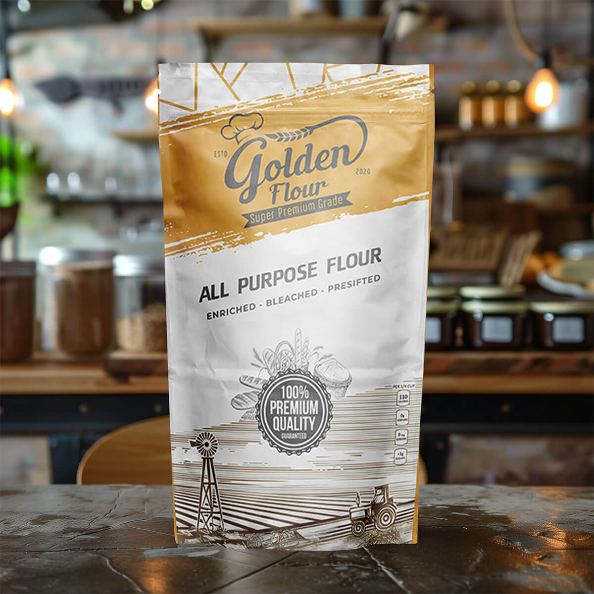
    The above packaging design ideas don’t need to be limited to special occasions or holidays, either. Any gift is a special gift, and you can help your customers feel inspired and complete by getting creative with your DIY packaging and stickers. Whether they’re gifting for a birthday, holiday, or some other special events, rustic gift wrapping can help finalize the perfect gift. 

    How CarePac Enhances Rustic Packaging Designs

    At CarePac, we live and breathe product packaging of all types, from the complex patterns and elegance of over the top packaging to the simple charm of rustic packaging. We can tailor our packaging designs to meet your unique needs, and use only the highest quality materials and printing techniques to achieve your desired aesthetics. Our customers come first, and our designers are ready to get creative and create the fun, charming, and fantastic package you’ve always dreamed of.

    The appeal and benefits of rustic packaging is undeniable, especially around Christmas time, and we’re ready to be your partner in flexible package design. Need packaging that stands out on the shelf? You’ve come to the right place! From paper packaging to plastic packaging, and everything in between, we’re leaders in the packaging market and are ready to make your idea a reality.

    Contact us today if your business is ready to get started.
    Lets Get Started

    Made In The USA

    Full PouchCustomization

    Scalable Printing Digital & Plate

  • A Technical Guide to Custom Packaging Design

    A Technical Guide to Custom Packaging Design

    A Technical Guide to Custom Packaging Design

    Introduction to Customized Packaging Design

    While creating custom packaging can seen daunting, it doesn’t have to be scary. If you’re thinking about designing your own packaging, you’ll soon come to realize that there are a lot of things to think about: minimum order quantities, corrugated packaging vs non-corrugated packaging, deciding on the right size, pouch or box style, how to set up the design file, and so much more! 

    Fortunately, we’re here to clear up a lot of the questions you may have about product packaging. Learn more about the technical nuances with our expert tips that can help elevate your branded boxes, pouches, and packaging products. 

    Introduction to Customized Packaging DesignUnderstanding Your Brand and Audience

    Understanding Your Brand and Audience

    First things first, you need to align your brand’s packaging design with the identity of your business. Of course, this requires you to truly understand your customers. Analyze the preferences and habits of your target audience: where do they usually shop for handmade goods or candles? Do they stress out about using recyclable or compostable materials and inserts, or do they not really care? 

    If you haven’t already done market research or set up buyer personas for your business customers, you’ll want to do this ASAP. This way, you can customize your custom mailer boxes to align with their core values, budget, and interests. 

    Design Fundamentals

    Next, you’ll want to think about the key elements of product packaging design. This includes the colors you want to incorporate into the design, in addition to typography, imagery, and size. So many of our customers do not take size into account, and purchase branded boxes that are too big or too small for their products. In addition to packaging your product, you’ll need to account for extra room for packaging materials (packaging peanuts, wrapping paper, etc.) and any branding materials you’ll be sending along with your product. 

    For this step, it’s important to understand that you’ll be balancing aesthetics with functionality. After all, if your shipping boxes look fantastic but don’t properly protect the products inside, they’re pretty useless, right? And if they’re functional but don’t include branding or your logo, that’s not ideal either. 

    Design FundamentalsMaterial Selection for customzed packaging

    Material Selection

    Now comes the fun part! (OK, maybe it’s just us…) Different packaging materials serve different purposes and have advantages and disadvantages over other materials. We cover each of our materials pretty in-depth here, but here’s the basics about some of our most popular materials.

  • CareClear- Our line of clear polyester laminated films. Clear materials allow for viewing windows and for the product inside to be seen by your customer.

  • CareFoil- Offers a very high barrier since it incorporates a layer of aluminum foil. Perfect for uses where maximum shelf life is required.

  • Care Kraft– Our Kraft material is perfect for uses case that require a natural look and feel, without sacrificing barrier. Kraft gives a paper look to a plastic bag.

  • CareRecycle and CareCompost– Our line of recyclable and compostable materials. Perfect for use in scenarios where opting for an eco-friendly choice is essential. 

  • As you can see, there’s a lot to think about when it comes to selecting a material. Our team can help guide you through choosing the right material for your branded packaging. 

    Technical Aspects of Packaging Design

    As you probably guessed by the title of this section, this is where it gets pretty technical! Luckily, our team of friendly technical experts will guide you through the individual specifications, but here’s the gist of it. The technical aspects you’ll need to take into consideration include: dimensions, bleeds, and print specifications. You’ll also need to take into account the sustainability considerations of your material choice, especially if sustainability is important to your core customer base. 

    Again — we know this can get complicated, so it’s important for us to point out that you won’t be alone in this! We’re here to help you customize your branded boxes so they meet your exact specifications. 

    Technical Aspects of packaging designCompliance and Legal considerations of customized packaging

    Compliance and Legal Considerations

    As you probably already know, each industry has its own standards and regulations, especially around material use and labeling requirements. For example, the cannabis industry requires very specific information and graphics to be added to custom packaging, including item quantity and information about third-party quality testing. The cosmetics industry, on the other hand, requires information to be added about animal testing and shelf life. 

    Although we are more than happy to help design and personalize custom boxes or shipping boxes that adhere to regulations, we encourage all our customers to check with their preferred legal counsel via phone for specifics. In some cases, they can even provide a template. 

    Choose CarePac for Your Custom Shipping Box

    As you can see, we’re experts in everything you need to know about customized packaging and shipping boxes, including box style, the best placement for your logo, and which type of material is the most sturdy or budget friendly. We are here to help, and we encourage you to experience the CarePac difference for yourself. We are family owned and operated, and you won’t be just another number to us. We handle each business partner with respect and care, and can help make your idea a reality. 

    Contact us today to get started on your custom mailer boxes. We provide Instant Quotes for your convenience, and you can also order samples or connect with us directly for more information. With zero setup fees or drama, we’re the best choice in the industry. 

    Choose Carepac for customized packaging

    Design FAQs: Custom Boxes & Pouches  

    Here are a few common questions we receive about the design and production of custom boxes. 

    – How do I choose the right materials for my custom packaging boxes & pouches?

    There are a few important things to consider when choosing materials for your custom boxes, including the functionality and aesthetics of your bag. Functionality: think about barrier, durability, user experience, and size. Aesthetic: think about color, finish, and size. If your bag looks nice, protects the product inside, and doesn’t burst or break during transport, it’s a win! 

    – What are the key elements to consider in packaging design?

    The key things to consider in packaging design as it relates to your custom boxes include: design, material, compliance and legal considerations, logo placement, bag shape, artwork, and costs, among other important considerations. 

    – How do I optimize my packaging design for production?

    To optimize your packaging design for production, consider loading of the product (how much room you need to load your product in the bag), how you will seal the bag, and whether or not your product will fit in the bag with enough room to seal and not have it burst.

    – Where can I find inspiration for my custom printed boxes?

    To find inspiration for your own box options, browse the aisles for samples at your local store or check online! You may also find good inspiration on social media. 

    Lets Get Started

    Made In The USA

    Full PouchCustomization

    Scalable Printing Digital & Plate

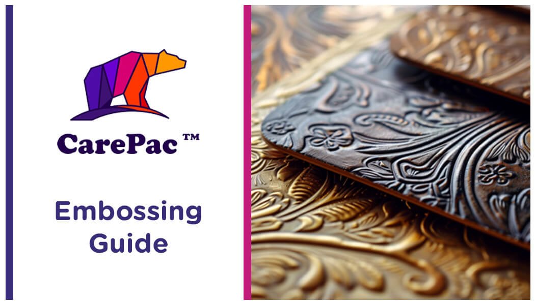
  • What is Embossing

    What is Embossing

    Embossing Guide: Elevating Packaging with Textural Enhancements

    What is embossing?

    If you’ve ever wondered “what is embossing”, you’ve come to the right place. This guide will help you learn how to elevate your packaging with luxurious textural elements, setting your brand apart with a unique touch. You’ll learn how to choose the right materials for the embossing process, designs to consider for the embossed pattern on your packaging, and how to choose the right partner to help you create a polished appearance through a custom embossed effect. 

    Understanding the differences between embossing and debossing

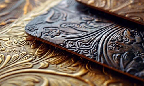
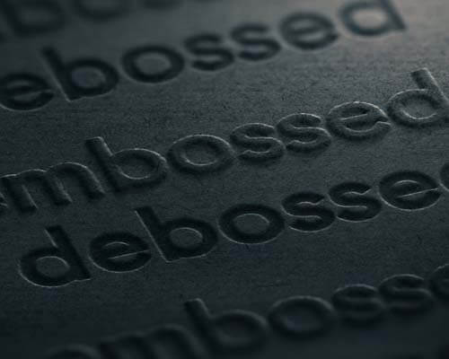
    Although this article discusses embossing specifically, we want to take the time to discuss debossing, since the two are often confused. If you touch the surface of the card and can feel a raised texture, this is an embossed image. If you touch the surface and feel a depression, this is a debossed image. Understanding the differences between the debossing embossing process can be confusing, so hopefully this helps!

    understanding between embossing vs debossing

    Embossing process: Embossed image techniques

    When it comes to embossing paper, there are a few different embossing and debossing techniques to consider, including blind embossing, heat embossing, combination embossing, and the dry embossing technique. We’ll discuss each of these embossed designs and paper embossing techniques below. 

    Blind embossing

    This embossed paper technique allows you to add textured elements to your card stock or emboss paper using a heat tool, embossing powder, embossing ink, and a stamp. Heat embossing can be complex, but in general it involves foil emboss stamping or writing with a special ink, sprinkling embossing powder over the design, and heating it with a heat gun to create the desired raised effect. 

    Blind embossingcombination embossing

    Combination embossing

    Combination embossing involves embossing and foil stamping the same image, and is given this name since it is quite literally a combination between standard embossing and foil stamping. Usually embossing metal plates (also called a sculptured die) will be used in this process, and it’s best used with folding carton boxes, corrugated boxes, or rigid boxes. 

    Dry embossing

    Also referred to as relief or paper embossing, this technique involves creating a raised or textured pattern on paper or cardstock without using ink or heat. Blind embossing is a type of dry embossing, because it uses a stamped image to create an embossed or debossed pattern in lieu of using ink. 

    Dry embossingRegistered embossing

    Registered embossing

    With registered embossing, a blind embossed image is placed with another element created using ink, foil or a second embossed image to create a unique 3D design. The registered emboss technique creates depth and texture, and is ideal for folding cartons and paper packaging, including paper mailers, floor displays, and branded wine bags. 

    Choosing the right materials for embossed packaging

    Typically, the best materials to use for embossing are card stock, rigid cardboard, or thick paper or other materials that provide a bit of rigidity. One household item that’s commonly embossed is a business card, where the logo or name of the individual is in a raised area. 

    Design considerations for embossed packaging

    There are a few design considerations to keep in mind as you create your embossed packaging: 

    Choose the location carefully

    Look closely at your packaging to determine the exact location you want the embossed image to go. This way, you have a better idea of sizing and the space that’s available for other details or images. 

    Choose the correct location carefullyConvert your graphic to vector format for embossing

    Convert your graphic to vector format

    You want to convert your images into a vector format in order to keep the quality of the design. When using vectors, you can resize a graphic as big or small as you would like without compromising the quality of the image.

    Do not go overboard with your design

    Keep it simple! Too many details can muddle the graphic or distort the image. As a rule of thumb, the simpler you can make the design for the embossing or debossing process, the better the results will be. 

    Do not go overboard with your design in embossingThink about the back while embossing

    Think about the back

    When considering an embossed design, it is incredibly important to think about the reverse side of your card or packaging. If you plan on customizing or using the backside of the paper, you may want to consider a different technique. 

    Select your material wisely

    Last but not least, select your material wisely. We discussed some appropriate material to consider above, but if you’re in doubt our CareDesign team can help you select the right material for your design. 

    embossing vs debossing Select your material wisely

    CarePac: The embossing experts

    At CarePac, we have been crafting packaging that has a shiny or polished appearance for years. We have experience with both embossing and debossing, and have a state-of-the-art die cutting machine. We’ll help you select a material, work with you to determine if using metal is appropriate, and can even create a beautiful multi level emboss design for your packaging. 

    You started this blog wondering “what is embossing” and we hope we’ve provided some clarity. Ready to get started on your project? We are, too! Contact us today to get started. 
    CarePac_ The embossing experts

    Lets Get Started

    Made In The USA

    Full PouchCustomization

    Scalable Printing Digital & Plate

  • Foiling Techniques for Eye-Catching Packaging Designs

    Foiling Techniques for Eye-Catching Packaging Designs

    Foiling Techniques for Eye-Catching Packaging Designs

    When it comes to selling your product, first impressions matter. And the best way to make a good first impression is through your packaging design. If you’re looking for ways to take your packaging solutions to the next level, there are a variety of custom packaging techniques to choose from, including embossing, debossing, and foil stamping. Which you choose ultimately depends on the substrate and the type of unique designs you’re most interested in creating. 

    In this blog, we’ll discuss foiling techniques in custom packaging, including the metallic foil stamping process and the unique benefits of foil stamping.

    What is foil stamping?

    Foil stamping is a specialty printing process that uses metal dies, heat, and pressure to apply foil films directly to your packaging in a thin layer. Although hot foil stamping is the most common form of foil stamping, some companies opt for a cold foiling printing technique, which uses UV light to transfer the metallic foil (instead of heat and pressure) to your packaging material. 

    For the sake of this blog, we will discuss using hot stamping foils to create eye catching designs, specifically. Read on to learn about the different types of foil stamping applications and techniques, regardless of your preference for a matte or glossy look.

    What is foil stampingCommon foil stamping applications

    Common foil stamping applications

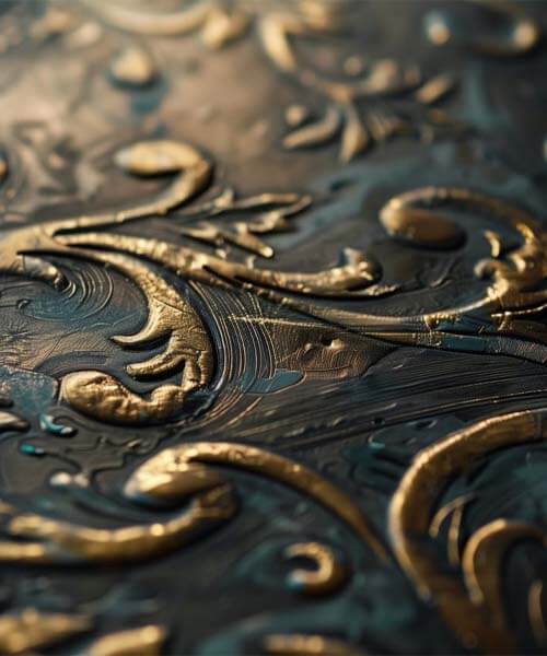
    Often used in stationery, labels, holiday cards, certificates, book covers, and post cards, the addition of a gold or silver foil to your product packaging can give it a very elegant and high-end appearance. Although gold foil is an incredibly popular choice, there are a variety of metallic foils and foil colors to chose from, including holographic foils, metallic or copper, silver foil, and foils with a glossy finish. 

    Different foiling techniques in packaging

    Based on the substrate, type of finish, and desired effect, you can choose from one of these hot stamping techniques. Learn more about the different methods of gold foil stamping below. 

    Flat metallic foil stamping

    With flat foil stamping, a copper or magnesium metal stamp or metal die transfers the foil directly onto the substrate. This is a simple, and economical process and is ideal for companies on a strict budget. 

    Vertical foil printing

    With vertical hot foil stamping, silver or gold foil designs are stamped directly onto flat packaging and paper products in specific cylindrical shaped areas using heat. 

    Sculpted foil stamping

    This hot stamping technique uses metal dies to achieve a raised image via embossing the material. The end result of this stamping process is a clearly designed and “carved” look. With this technique, you can feel the stamped area with your hands.

    Peripheral foil printing

    This stamping process involves transferring foil to the outer perimeter, across the entire circumference, of the product. As you probably guessed, this stamping option is a more expensive option since it involves adding the metallic foil film to the entire package. 

    Design considerations for foil stamping

    If you’re considering incorporating gold foil into your packaging designs, here are some quick tips to keep in mind as you explore the many different types of materials and designs: 

    • Use vector art instead of bitmap or raster as you prepare your file for printing
    • If you’re adding stamping foil to text, in most cases, the minimum recommended font size is 8pt (also remember that types appear bolder in foil then they do in ink)
    • Space out your text for enhanced readability
    • Remember that gold foil printing can be combined with other elements, like high gloss or a rainbow effect. You also aren’t limited to gold: you can choose silver, metallic paper, or holographic foil.

    Design considerations for foil stampingEvaluating the costs

    Evaluating the costs of adding metallic foils into your packaging

    Foil stamping may not appear cost effective from the start, but the process can help increase the perceived value of your brand. Whether you’re competing with other brands or want your brand to reach a new target audience, foil printing is a great option. Whether you opt for gold foil, holographic foil, or one of the other types of foil stamping, one thing is for sure: foil stamping is eye catching and the perfect way to enhance your brand image, regardless of the color or types of foil you use. 

    Choosing the right partner for foiling

    As you can see, foil stamping and foil printing is an incredibly complex process. It’s important to find a partner that’s well-versed in foil stamping, embossing, debossing, and other printing techniques. 

    Fortunately, CarePac lives and breathes product packaging and is very experienced with hot foil stamping. Our CareDesign team can help walk you through the stamped process, from the design stages all the way through shipping. With CarePac, creating the packaging of your dreams is possible! Contact us today to get started. 
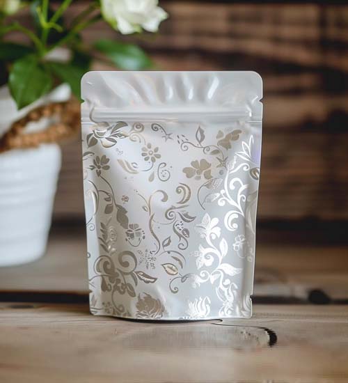
    Choosing the right partner for foiling

    Foil stamping FAQs

    How does foil stamping enhance the visual appeal of a brand’s packaging?

    Since foil stamping produces a reflective and vibrant finish, it can help catch your customer’s attention. Gold, silver, or holographic foil stamping can also make your product more noticeable and attractive on the shelves. 

    Can foil stamping be integrated with other design elements on packaging?

    Yes! With foil stamping, you aren’t just limited to…foil stamping! You can create packaging that also includes features like soft touch, matte, or holographic or metallic paper elements or materials. 

    What is the turnaround time for a foil stamping project with CarePac?

    Our innovative lead-time menu gives you more control over your printing or stamping project. We offer Express, Standard, and Economy options. You can learn more here.

    Do you offer foil stamping prototyping before final order placement?

    Yes! If you want to see your foil stamping project before you put in a large order, there’s no pressure. Just inquire about our printing and prototyping options as you get started with your design. We’re ready to help you achieve the perfect packaging on a timeline that works best for you. We can also help you select the right material, whether you prefer a matte or glossy look. 

    Lets Get Started

    Made In The USA

    Full PouchCustomization

    Scalable Printing Digital & Plate

  • How to Find the PMS Code/Color – Step by Step Tutorial

    How to Find the PMS Code/Color – Step by Step Tutorial

    How to Find the PMS Code/ColorStep-by-Step Tutorial

    Everyone knows Tiffany blue means diamonds, and McDonald’s yellow means French fries. These brand colors are synonymous with the company’s name and what they sell, which is no easy feat. If colors matter to a brand, making sure the colors are accurate when printing marketing and branding materials matters more. But, if you’re reading this blog about Pantone color, we don’t have to tell you this! 

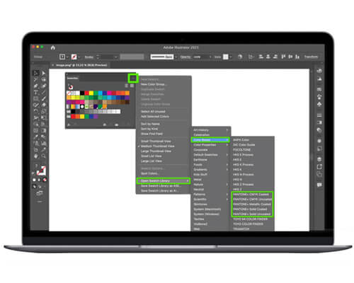
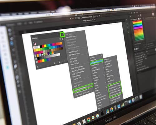
    In this blog, we’ll walk you through how to easily find your Pantone color in Adobe Illustrator so you can effortlessly perfect and print your color choices for stunning designs on paper, plastic, or other materials. But first, we’ll walk you through the background and basics of colors in Adobe Illustrator. 

    Understanding Pantone Color

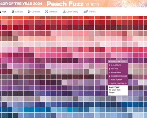
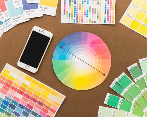
    PMS is an acronym for “Pantone Matching System”. As such, PMS colors are Pantone colors that can be specified for commercial printers. Pantone colors are custom-mixed ink colors that you can request for something like your logo, company name, or other branding asset. 

    Just like a homeowner might select a Pantone color for their walls or custom couch, you can choose Pantone color group for your marketing materials using Pantone colors in Illustrator. 

    Why? Well, accurate color representation matters in design almost more than the logo or “about the company” section on a package or pouch. Your customers see Pantone color before they see branding, and by using the Pantone color system to find the appropriate Pantone color number you can be sure you’re using the right Pantone color. 

    Understanding Pantone colorPantone Connect

    Pantone Connect

    Pantone Connect is a new service from Pantone which combines a website app and an Adobe plugin to work with Pantone colors. 

    If you are willing to pay the monthly fee for Pantone Connect, you can download and install the Pantone Connect plugin and access up to date colors using that plugin. 

    Using Adobe Illustrator’s color tools

    Within the latest version of Adobe Illustrator, there are a variety of Pantone color tools that designers can use to choose colors and use them to create marketing materials. From swatches panel to the eyedropper tool, it can quickly get confusing! Here are just a few of the color tools you’ll find within Adobe Illustrator, not all of which are directly related to Pantone colors:

    Eyedropper Tool

    By using the eyedropper tool in Adobe Illustrator menu, you can sample colors from anywhere in an image and add them to your swatches panel. This way, you can easily apply the sampled color to another object on the Illustrator canvas. 

    Eyedropper-toolSwatches panel

    Swatches Panel

    Also called the color panel, the swatches panel is where colors, tints, gradients, and patterns are stored. You can color mix and edit, or check if the color is safe for print in the swatches panel. 

    Color Guide Panel

    The Color Guide Panel generates a set of color swatches that go well with a base color that you define, also referred to as an “open swatch library”. Think of the color guide panel as a color inspiration tool that you can use while you create or recolor artwork.

    Color guide panelColor Picker Dialogue Box

    Color Picker Dialog Box 

    This is where you fine-tune your choice of colors in Adobe. Here you can create a custom color by entering color values, or by choosing from a library of colors, or a swatch library. 

    Now that you know more about the different Pantone color tools within the menu of Adobe Illustrator, we’ll walk you through how to use the Pantone system color library using Illustrator. 

    How to find PMS color in Illustrator

    If you’re using Adobe Illustrator, it’s easy to find the PMS color of your logo. Just follow these steps, and you can easily apply the PMS color to other marketing materials. Here’s how to find Pantone colors in Adobe programs:

    • Open the file and click on your logo using the “Direct Selection” tool in the drop down menu.
    • On the right side of the window, click on “Colors Panel”.
    • After you find Pantone color or hue, it will be displayed on the overhead menu of the window. 

    You can then use the search bar or pop up menu to recolor artwork or incorporate the Pantone panel of colors into your marketing materials using the recolor artwork tool. Just be sure to use the ‘Save File’ option so you can pick up your printed project at a different time in the future.

    An important note about Pantone colors in Adobe Illustrator

    Told you it’s easy! One important thing to keep in mind: this tool will not show you the exact color of your logo, rather it’ll show you the PMS color that most closely matches the color you’re currently using in your logo. You can find the same colors in the preferred color mode your printer uses, whether that’s the CMYK system or RGB. 

    This is a great tool to use in Adobe Illustrator if you’re looking for the closest PMS match, or if you’re in the process of re-branding and want to switch your logo color to one that’s part of the Pantone swatch panel or Pantone palette. 

    important note about Pantone colors in Adobe Illustrator

    Applying Pantone Colors to Your Design

    So, now that you know what your Pantone color is, how should you apply Pantone swatches to your marketing materials? Well, that’s purely up to you! Here are a few ideas on how to apply Pantone colors to your artwork: 


    • Incorporate your Pantone color into your logo image, or use it in lieu of a logo on your artwork or packaging.
    • Remember that certain CMYK, RGB, or Pantone colors mean certain things to customers. For example, green is often used for natural or healthy foods, while yellow is typically used for serotonin-inducing products.
    • Use colors to draw attention to the most important parts of your packaging.
    • Just remember: once you’ve confirmed your Pantone palette, make sure every member of your design team knows how to access the Pantone colors in Illustrator. This way, they can use the palette on your brand’s artwork and printed materials.

    Pantone Colors & Adobe Illustrator FAQs:

    Here are some common questions we’ve received from customers about finding and using Pantone colors in Illustrator, whether it’s being used on an image, a swatches panel, or in Pantone color books.

    Can I use Pantone colors in all types of design projects?

    Yes. The goal of using Pantone colors in graphic design is that it ensures consistent colors across all platforms. This way, your audience has the same impression of your brand, regardless of the specific asset, package, or marketing material they’re looking at. 

    Are there differences between PMS colors in print and digital design?

    Yes, there are. One important thing to remember as you navigate Pantone colors in Illustrator is that digital printing devices can’t reproduce Pantone colors; you’ll have to first convert them to CMYK color mode.

    How do I ensure accurate Pantone color reproduction across different printing methods?

    The best way to ensure accurate PMS color reproduction across different printing methods is to convert them to the appropriate color group. This will be either CMYK or RGB codes. If your printer uses and prefers Pantone (PMS), you won’t need to make any conversions. But if they prefer CMYK or RGB, you’ll need to take the time to convert them to CMYK or RGB. 

    CarePac: Your Partners in Packaging Design

    At CarePac, we have decades of experience with packaging design and Illustrator. In fact, it’s all we do! 

    Our helpful CareDesign team is well versed in using the Pantone matching system to correlate your brand’s colors to the colors in the Pantone palettes, and we’re more than happy to help guide you through the matching system process. 

    Whether you have a graphic design team or it’s just you, we can help you create the packaging of your dreams. Connect with us today to discuss your project, or get an Instant Quote using our convenient online platform. 

    Let’s Get Started

    Made In The USA

    Full PouchCustomization

    Scalable Printing Digital & Plate

  • Understanding Color Reproduction on Flexible Materials

    Understanding Color Reproduction on Flexible Materials

    Understanding Color Reproduction on Flexible Materials

    Ink dynamics is the study of how a wider range of inks behave and interact with certain materials. It’s an important consideration and essential tool for an infinite number of graphic designers and color reproduction/color management professionals around the world.  Since it directly impacts the quality of the final product, ensuring color accuracy and color temperature on the final product (after it has been printed) is essential.

    Simply put, the visible spectrum of colors looks totally different in a digital image or color photography, on digital cameras, or on computer monitors than it does in real life, as things like reflected light, blue light, light sources (natural vs. fluorescent light) and exposure time can all impact how something looks. Spectral sensitivity and spectral power distribution can also impact the color balance in graphic arts. 

    As such, the study of color reproduction, color temperature, and color rendering is an essential aspect of quality control. This is usually referred to, generally, as color management. 

    The basics of ink dynamics

    When it comes to ink dynamics and understanding its impact on color reproduction, there are a few different things to consider, including ink properties, interaction with flexible materials, and external and environmental factors that can influence ink behavior. We’ll discuss each of these, and its impact on color perception and color rendition, below.

    Ink properties

    Ink is more than just ink: it’s made up of pigments, resins, additives, and solvents. Each of these plays a critical role in determining how an ink dries on different materials and how it will display an entire range of color once dried. 

    It’s important to note that the human eye sees things different in real life than it does on different devices, like like a computer monitor, so understanding how to make an easy adjustment to account for this is key. 

    Ink Properties in color reproductionInteraction with flexible materials for color reproduction

    Interaction with flexible materials

    Different kinds of materials interact with inks different. For example, the color appearance of RGB values will look different on plastics as they do on foils. Additionally, extraneous factors, like porosity and chemical composition of the material will also impact its final color appearance. 

    Factors influencing ink behavior

    Finally, it’s important to understand how different environmental factors (temperature, humidity, printing environment) can impact color perception. 

    Color gamut mapping should take all of these into consideration, as red, green, and blue can all be impacted by a variety of environmental factors. 

    Factors influencing ink behavior

    An exploration of different printing methods  

    There are a few different kinds of printing methods, each of which has a direct impact on color printing and color reproduction. Here’s a quick breakdown of some common standard methods of printing, along with some advantages and limitations in terms of color reproduction. 

    Digital printing

    This type of printing uses a digital system and is best suited for customized or personalized products, and limited edition runs where cost and time are critical factors. Benefits include flexibility, speed (minimal set up time means you’ll receive your packaging faster), and it’s cost-effectiveness. 

    Limitations include color matching (exact PMS color matching is better with the other two options on this list), and material limitations. Unfortunately, digital printing is difficult with very thick materials. 

    Digital-printing-in-color-reproductionRotogravure & flexographic

    Rotogravure & flexographic

    Ideal for large-scale production runs where quality is the focus. These printing methods are typically used for products that require consistent branding and color accuracy over time and across batches, like the Tiffany Blue and McDonald’s Red examples above. In these instances, the specific color must look the same across every type of marketing material or advertisement. 

    This type of printing also results in ink layers that are thicker and more durable, extreme color consistency across RGB values, and exceptional print quality. The limitations are higher initial costs and less flexibility. 

    Choosing the right printing method

    In addition to light sources, color temperature, and how the RGB model or CMYK model looks when using different printing methods, here are some other things to consider: 

    Run length

    Here, you’ll need to think about quantity. If you need a small supply of bags, digital is where it’s at. Flexography is good for medium to large-sized runs, and rotogravure for extremely large runs where quality absolutely cannot be compromised. 

    Run Length in color productionCost in color reproduction

    Cost

    Upfront and ongoing costs should be considered. Choosing digital minimized upfront costs, while rotogravure is expensive initially but is more cost-effective at scale. Flexography is the middle ground. 

    Quality requirements

    What level of detail does your packaging need? How consistent does it need to be? While digital is the most cost-effective option, it is also less consistent.

    Quality of colors in printing productionTime To MArket

    Time to market

    Do you need your packaging right away or can you afford to wait a bit? Digital printing allows for rapid prototyping, while rotogravure can take awhile to produce. 

    Solid pigment inks: An exploration

    Solid pigment inks are a type of ink characterized by their use of solid particles of pigment suspended in a binder. They are a popular choice for projects where color vibrancy and durability are important (such as in flexible packaging). Learn more about the advantages of using PMS colors with solid pigment inks. 

    Advantages of using PMS colors with solid pigment inks

    When discussing color reproduction, there are some benefits to using PMS colors. First, it’s a standardized color palette, so your primary colors will look the same across different batches and printing methods. Second, solid pigment inks are incredibly vibrant and precise. 

    If your brand has a distinct color vision and requires its colors to look the same across the color gamut, regardless of material, using PMS colors and solid pigment inks can help. 

    Advantages Of PMS ColorsChallenges and things to consider

    Challenges and things to consider

    As with anything, there are some unique challenges and restrictions to keep in mind with PMS colors. First, they can increase the cost of printing especially for small runs. Next, PMS colors are not compatible with all materials. 

    One additional consideration to keep in mind: some packaging providers offer eco-friendly inks that offer the same benefits of solid pigments while minimizing environmental impact. 

    CarePac: Pushing the boundaries in flexible packaging

    Can embossing and debossing be combined into a single design?

    Yes! Debossing, embossing, or any combination of the two can be incorporated into your final print pieces. If you’re hoping to save money, though, we recommend choosing one or the other. Since each process uses different settings of die presses, including both techniques into one package can quickly increase the price of your design. 

    Is embossing and debossing suitable for all types of printing?

    No — ideally, embossing and debossing are reserved for paper and cardstock, and ideally the thicker the material the better. This printing technique should be avoided on thinner materials. 

    How does embossing and debossing affect printing costs?

    Of the two, debossing is the cheaper option because it only requires one plate rather than two. If you want your final print piece to have both embossed and debossed designs, this will be even more expensive than just opting for one. Additionally, if you choose to incorporate foil stamping into your final print piece, this will also impact the price. 

    CarePac: Pushing the boundaries in flexible packaging

    If color reproduction and color management across the material and color gamut sounds complicated, that’s because it is. Fortunately, we’re the experts and we’re ready to help. 

    Contact us today to discuss how we can leverage our expertise in ink dynamics and color reproduction to take your packaging to the next level. Together, we can create packaging that not only protects your product but exemplifies your brand. 

    Lets Get Started

    Made In The USA

    Full PouchCustomization

    Scalable Printing Digital & Plate

  • Embossing vs. Debossing – Textured Printing

    Embossing vs. Debossing – Textured Printing

    Embossing vs. Debossing: Unveiling the Art of Textured Printing

    Embossing and debossing are each a printing technique, like silk screening, photo etching, or laser engraving. If you’re looking to customize packaging or cards with your company logo or text, you’ve probably come across articles that explain the embossing process and the debossing process during your research. So, which is better? Do embossed graphics look better than those made with debossing techniques?

    In this blog, we’ll discussing embossing vs debossing so you can choose which tactile effect out of the two techniques is right for you. Regardless of which you choose, the finished print piece will be sure to enhance your brand recognition.

    What is the embossing process?

    Embossing is when you raise the surface of something, creating a three dimensional effect. The process involves pushing an embossed design up from the material using two metal plates- one metal plate is on the top and the other metal plate is on the bottom.

    This technique is ideal for thicker materials, like paper and heavier paper stock, and is often used on wedding invitations and high quality marketing materials. With embossing techniques, the embossed design can be barely raised or very raised — a very raised design is visually appealing and can be achieved via deep embossing. 

    A more complex emboss is, of course, often times more expensive to create than a more simple design. If you’d like a combination emboss, multi level embossing, or a repetitive element or recurring pattern embossed throughout a pouch or bag, you can expect to pay a little more than if only one small portion of your card is embossed. 

    What is the embossing processWhat is debossing process

    What is debossing?

    Unlike embossing, debossing techniques push metal plates into the shape of your design. As such, the design is recessed into the package itself, creating a depressed effect. If you’ve ever held a luxury bag with the name of the brand imprinted into the bag, this is the depressed effect creating via debossing. 

    In either scenario, you can choose to leave the debossed area untouched, or it can be “filled in” via ink or foil stamping. One of the key benefits of debossing, especially when compared to embossing, is that the debossing effect doesn’t impact the back of the package you’re printing. This means you can make the back of the product as visually appealing as the front — whether that’s adding really cool visuals, detailed designs, or some other type of visual embellishment to both the front and the back.

    Ultimately, debossing creates more design flexibility, as you can use the same design on the front, the back, or on both sides.

    Choosing between the embossing and debossing process 

    Embossing and debossing both have their own advantages, and which you choose ultimately depends on your personal preference and on what you’re hoping to achieve with your packaging.

    For example, if you’d like to accentuate raised patterns on your business card or card stock, embossing sounds like it’s the right choice for you. However, if you’d like to make a lasting impression by customizing both the front and the back of your luxury packaging, it sounds like debossing is what you’re looking for. 

    Choosing between the embossing and debossing process

    Considerations for embossing and debossing

    When choosing between embossing and debossing to enhance your brand recognition, there are a few things to consider:

    Keep it simple

    When in doubt, opt for a design that errs on the side of caution. In this case, the more simple the design, the better. Embossing and debossing help drive attention to a single section of your package — if the entire thing incorporates debossed or embossed designs, it defeats the purpose. 

    Keep it simple embossing-vs-debossingUse heavier paper stock

    Use heavier paper stock

    The most effective use of embossing and debossing is on heavier paper. Using heavier paper stock for your imprinted or raised design highlights the depth and detail of the finished printed pieces. 

    Consider the back of your package

    Since registered embossing will affect the back of your business card or packaging (i.e., the embossed image will peek through the back), you’ll want to avoid embossing if you’re hoping to have both the front and back of your package customized.

    Both embossing and debossing create finished print pieces that stand out where others fall flat. Although various materials can be used for these techniques, a small pattern or images emboss better into a thicker card stock or paper, like those typically used for a business card. Though we use offset printing and our printer creates beautiful imagery on other materials, the thicker the material, the better. 

    Consider the back of your package

    Embossing vs debossing FAQs

    Can embossing and debossing be combined into a single design?

    Yes! Debossing, embossing, or any combination of the two can be incorporated into your final print pieces. If you’re hoping to save money, though, we recommend choosing one or the other. Since each process uses different settings of die presses, including both techniques into one package can quickly increase the price of your design. 

    Is embossing and debossing suitable for all types of printing?

    No — ideally, embossing and debossing are reserved for paper and cardstock, and ideally the thicker the material the better. This printing technique should be avoided on thinner materials. 

    How does embossing and debossing affect printing costs?

    Of the two, debossing is the cheaper option because it only requires one plate rather than two. If you want your final print piece to have both embossed and debossed designs, this will be even more expensive than just opting for one. Additionally, if you choose to incorporate foil stamping into your final print piece, this will also impact the price. 

    CarePac: Your partner in custom printed flexible barrier pouches 

    Curious about how embossing, debossing, and foil stamping can help take your design to the next level? With nearly two decades of experience in packaging industry, CarePac can help take your custom printed flexible barrier pouches to the next level. Contact us today to get started!

    Lets Get Started

    Made In The USA

    Full PouchCustomization

    Scalable Printing Digital & Plate

  • What is a Print Ready File? – Guide to Press Ready Artwork

    What is a Print Ready File? – Guide to Press Ready Artwork

    What is a Print Ready File? A Guide to Press Ready Artwork

    What is press ready artwork?

    Print Ready (also called press ready) describes any file that is able to meet the specifications required to be setup for final press work and printing. 

    Download a demo setup file

    Click here to download our demo file which illustrates the best practices we outline here. 

    What is press ready artwork

    CarePac’s Art Setup Checklist for Designers

    If you’re preparing artwork for CarePac, either digital printing, flexographic, or rotogravure printing, here is a quick recap of the important points to hit if you want to create print ready artwork:

    • Outline text: Convert all text to outlines.

    • Use Vector art: Create all non-photographic text, graphics, and illustrations using vector graphics.

    • Raster images: Should be at least 300DPI (dots per inch). Link or embed these in the file.

    • PMS Colors: PMS color are solid pigment colors not a colour mix like CMYK. Refer to Solid Pigment Uncoated Swatch book. PMS colors used with digital printing will not be 100% accurate to the swatch.

    • Finishes and Effects: Apply a unique off-pallet color to distinguish these areas in the design. Avoid relying on transparency in your design. Also it is best practice to separate designate clear areas in additional panels, see our finish mapping section below.

    • Bleed: Bleed is not required.

    • Plate Printing: 10 color stations are available, but we recommend limiting to 8 colours. White ink counts as a color.

    • Preferred format: Original Adobe Illustrator (AI) or PDF/X-1a.

    • Canva: For Canva artwork, export both PDF and SVG versions. If possible, share edit access to the Canva project.

    • Artwork placement: Place all artwork on the same layer as indicated in your dieline. Do not edit the dieline, add color swatches to the color bar, and remove unused color swatches. Avoid placing critical graphics in zipper areas, seal zones, or around hang holes.

    Indicating Finishes, Windows, and Metalized Effects

    Indicating Finishes, Windows, and Metalized Effects

    We recommend using a “finish map” which separates these indications from the printed image and the rest of your graphic design. See below for our specific finish mapping recommendations:

    • Clear areas: Use an obvious color that contrasts with the design to indicate any clear unprinted area.
    • Finish indication: Use a finish map to indicate type and location of bag’s finish.
    • Metalized effects: Indicate areas of metalized effects using a separate metalized map. Choose a color for the metalized area. Do not use a gradient color, use a solid color like grey.

    Note: Use a distinct color to indicate windows in your design. 

    File Types and Formats

    The industry standard, correct file type for flexible printing is Adobe Illustrator. Unlike some printers who may be more selective about the file formats, like most printers CarePac supports Photoshop (.ps), Illustrator (.ai), Adobe InDesign (In), and Acrobat (pdf) but CarePac’s design team can also work with Encapsulated PostScript (.eps), Solid Vector Graphics (.svg), or Canva files. Finally, if all you have is a PNG, JPG or ok print images, we have worked with it all and will work with you.

    When in doubt, ask. Knowing the correct file format before starting the design can help you avoid time consuming revisions down the line. For example, CarePac’s preferred format is an original Adobe Illustrator file or PDF/X-1a, or PDF and SVG for Canva, but another company may prefer something different. “Print ready” varies slightly from printer to printer, so you’ll always want to check.

    File Types and FormatsFile Types and Formats

    Artwork preparation (size, resolution, bleed area)

    Now that you know you’re using the appropriate file type, you’ll want to make sure the artwork you’re submitting is the correct size and resolution. All logos should be within the Safe Design Area (typically 1/8″ inside the die line), and that the resolution of the image if it is a raster is at least 300dpi at 100%. Between 300-450dpi is the sweet spot — anything too large or too small will print poorly on the final printed file. Trust us, if at all possible provide a vector copy of important elements like a logo, to avoid seeing individual pixels on the final image, so just follow the above steps!

    CarePac does not require that you bleed the file you submit to CarePac. But if you are going to add a bleed to your own artwork, we recommend adding a 3mm – 5mm (.125″ – .25″ ).

    CarePac’s dieline design checklist

    When designing a dieline, you’ll want to follow this dieline checklist to make sure you’ve covered the basics. As always, our helpful team of designers is here to provide their expertise and help guide you through the process.

    Type Setting

    • Text Formatting: Outline all text.
    • Minimum Font Size: Suggested minimum is around 6 pt. Absolute minimums are 3 pt bold for positive text and 5 pt for reversed text (knockout).
    • Typesetting Caution: Avoid using Photoshop for typesetting or Smart Objects.

    Type SettingPlate Printing Specifics for packaging

    Plate Printing Specifics


    • Max Colors: Keep under 8 colors (including white ink). Up to 10 colors can be accommodated with additional charges.
    • Line Screen: 177 line screen based on 300 DPI imagery.
    • Under 15% Screen: Eliminate from CMYK mix or convert to 100% spot.
    • PMS Colors: Reference PMS Swatch books. Be aware of differences between on-screen colors and printed or film colors.

    Barcodes and QR Codes Specifications


    • Ideal Size: Between 80% and 120%. Avoid truncating the barcode.
    • Format: Barcodes should be in Vector line art.
    • Ink for Barcodes: Use Pantone Black, or 100% Black.
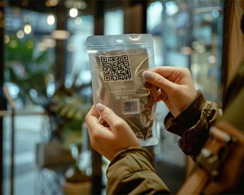
    • QR Codes: Recommended size is 20mmx20mm. Ensure high contrast (white/black).

    Barcodes and QR Codes Specifications for printingVector vs. raster images in priting

    Vector vs. raster images

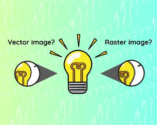
    So, what’s better: raster images or vector graphics? In our opinion, vector graphics are preferred since this type of artwork can be scaled to any finished size without sacrificing image quality. Vector images don’t pixelate and it’s native to software like Adobe Illustrator, but it does have its limitations. For example, all photographs will be a rasterized image. Our tip is to reserve raster images just for photographs, and build all logos and other graphics in vector format.

    Use the correct colors

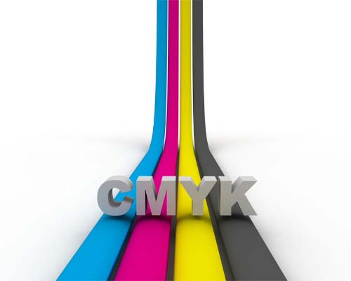
    To ensure you’re creating print ready artwork for graphic designers, you’ll need to set your file format to CMYK color mode. If using Pantones or spot ink colors, apply them and make swatches. This way, in color separations, if you preview the colors they’ll be assigned correctly. Since all printer files use CMYK color space, your colors will change noticeably if they’re submitted in RGB. Since RGB and CMYK are two different color builds that don’t correspond to each other, it is absolutely essential that your print ready artwork is submitted using CMYK color model.

    It is also important to note that the color modes you see on your screen will be different than the color in “real life”. Do not be alarmed- this kind of minor variance is totally normal.

    Use the correct colours in printingSending your print ready artwork in printing

    Sending your print ready artwork

    There are a few different ways you can send us your print ready marketing materials so we can take your print ready art and turn it into a finished printed product via our proprietary printing process.

    • Package your artwork and send the entire project in one packaged file

    • Send any raster image originals that are separate from your artwork.

    • Convert your text to outlines

    We recommend attaching your digital art to the email or uploading the vector file using your printing partner’s preferred system, as embedding them within the email will cause your high resolution image to degrade. Remember to send the appropriate file formats, whether that’s a vector file or raster image.

    Print ready artwork: FAQs

    Here are some common questions we get from potential customers about artwork types and their print readiness:

    What does print ready artwork mean?

    Print ready artwork is a file that’s ready to be printed as is. It helps maintain print quality, and should take things like pixel density, bleed area, and the design and print quality listed above in mind.

    What are some accepted file types?

    CarePac prefers to accept files that are high resolution Illustrator art files (AI, we can also accept Corel Draw and some Canva output but Canva often exports Raster image graphics instead of vectors. Many different file types are accepted by different printers, so it’s important to check with your printer.

    What if my graphics aren’t print ready?

    If your graphics aren’t print ready or are at an unacceptable quality level, our CareDesign team can work with your graphic designer to get your submission in tip top shape shape for printing. While we prefer to only accept art that match our criteria our team of talented pre-press designers are able to fix a lot, we mean A LOT of problematic art, and have developed processes around most any problem you can imagine. So if you just can’t get your new project over the finish line, submit it anyways, we’re here to help, that’s why we’re called CarePac!

    What are the requirements for print ready art files?

    The criteria for print ready art files are laid out in this post, there maybe adjustments depending on some technical print parameters but following these guidelines will help ensure that the artwork designed by your team can be turned into the perfect print. Some things to keep in mind include using CYMK, using vector paths for anything other than photographs, and avoid placing critical graphics along seams or seals.

    I need to make a change to the file’s dieline, can I edit it?

    No, please don’t! Never edit dielines provided to you, if you need a dieline adjustment contact our CareDesign team!

    Should I add Crop marks or other indicators of off-canvas cuts, or prints.

    While we receive artwork with off canvas information daily, there is no need to include this content in your submission.

    Are there any special setup instructions for box bottom bags?

    Box Bottom bag setup is generally the same as any other pouch. One key difference to keep in mind is that box bottom bags require two separate print runs – one for the Front, Back, and Bottom, and another for the sides.

    Note that alignment between side panel print and front/back may not be 100%.

    What are the Line screen specifications by color?


    • C: 177
    • M: 177
    • Y: 177
    • K: 254
    • Spot Color: 254
    • Under 15% Screen: Eliminate from CMYK mix or convert to 100% PMS Spot.

    What is the recommended trap size?

    Typically the CareDesign team will perform all trapping but a good rule of thumb is 0.3mm. If you want to attempt trapping please see this helpful article and video on our site.

    What is the recommended trap size?

    Well you smarty pants, yes there is!

    • Dot: Diamond

    • Min Dot %: 5%

    Get started with CarePac today

    Our eagled eyed production team is ready to turn your printable file into the final product you’ve always dreamed of. With a high quality finish, the appropriate colour mix and pixel density, and state-of-the-art printing plates, our graphic design team promises to create the best print using industry standard practices. Plus, we’ll do so using your desired print materials. With our handy checklist, preparing artwork and high resolution images for printing has never been easier. You have multiple jobs: leave the designing and printing to us! Contact us today to get started!

    Lets Get Started

    Made In The USA

    Full PouchCustomization

    Scalable Printing Digital & Plate

  • Dieline Design Tips & Checklist

    Dieline Design Tips & Checklist

    Dieline Design Tips & Checklist

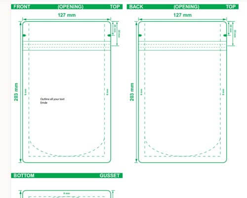
    Crafting your packaging design around a dieline template allows you to be as creative as you’d like with your packaging while still falling within the specific sizing dimensions of the final packaging product. A dieline clearly outlines all the folding marks, cuts, perforations, and glue lines/fold line of the final packaging design, so there’s no surprises when you receive the final product. Think of it like a coloring book: you can incorporate as many colors or designs into the picture as long as you stay within the bold outlines of the book.

    At CarePac, we provide design templates and dielines for our customers, but it’s not uncommon for them to create our use their own. Regardless of whether you use our dieline or a custom dieline you’ve created yourself, here are some dieline design tips to help you get started.
    Tips for document setup

    As discussed on our print ready artwork page, all packaging files should be in CMYK color mode. Our preferred format is Adobe Illustrator (AI) or PDF/X-1a, but other packaging companies may have different preferences. You’ll always want to check. You’ll also need to make sure the orientation of your dieline is facing the correct way – otherwise the text and images of the final design will be facing the wrong way.

    Tips for document setupConsider the material

    Consider the material

    Before using a dieline template, you’ll need to nail down the packaging material. Some materials (like cardboard) are very thick and rigid, which has an impact on how it folds and where it can be cut or perforated. While cardboard is quite rigid, plastic will conform to the contents inside. On the other hand, if you overfill the plastic pouch it could be hard to seal. Work with your packaging provider to decide on a material and discuss how the selected materials will impact your dieline design.
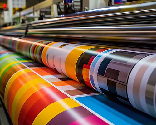
    Factor in size and weight

    Depending on what you’re packaging, your packaging should not only fit around your product but protect it from damage during transit and storage. For example, nobody wants to open up a bag of chips only to find that they’re all shattered into a million pieces. Consider the size, shape, and fragility of your product when using a dieline template to design your finished product.

    Factor in size and weight in packagingLeave space for branding and text in packaging

    Leave space for branding and text

    This is the important part: without incorporating company branding or additional text on your dieline, your customer won’t know what sets your product apart from all the others on the shelf. Make sure there is enough space on the package to include artwork, information about your business and its values, or allergen information for food products. This is the whole point of a dieline: to show you where you can add text and how it’ll look on the final product.

    Test and prototype

    Before you finalize your dieline design and order 10,000 bags or boxes, you’ll want to order prototypes of the bag. This helps you see the bag’s functionality, exact size, the logos and graphics, and any labels in person before committing to a large order. This way, if you notice any mistakes with the packaging design you can rectify it before you waste too much money on the packaging. CarePac offers custom prototyping from 100 bags, which is a major differentiating factor from some of our competitors with minimums that exceed 1,000-10,000 bags.

    Test and Prototyping in packaging

    CarePac’s dieline design checklist

    When designing a dieline, you’ll want to follow this dieline checklist to make sure you’ve covered the basics. As always, our helpful team of designers is here to provide their expertise and help guide you through the process.

    [ ] Software and file setup

    Start your dieline with a brand new vector file in Adobe Illustrator. Your document should be set to the appropriate size and resolution (typically 300 DPI.) Each packaging provider will have different requirements for dieline design, so make sure to check with them directly before submitting a dieline. One thing all companies have in common, though, is using CMYK document color mode.

    Software and file setup in packagingTeam analyzing barrier properties and laminate options to choose the right flexible packaging material for custom plastic pouches, focusing on moisture resistance and food-grade compliance.

    [ ] Material consideration

    Choose your packaging material wisely. Different materials will impact your dieline design in different ways, so work with your design team and make allowances for the thickness of the desired material in your fold and cut lines. You’ll want to make sure that the material you choose (and the design) accounts for the product’s protection during storage and transport.

    [ ] Product dimensions and weight

    Make sure you take the time to measure your product accurately. The packaging design template should accommodate the weight, size, and shape of your product. Not only should you have enough room for your product, but you shouldn’t make the top of your bag too crowded. If your package is overstuffed it simply won’t function as well as a bag with a little room to spare.
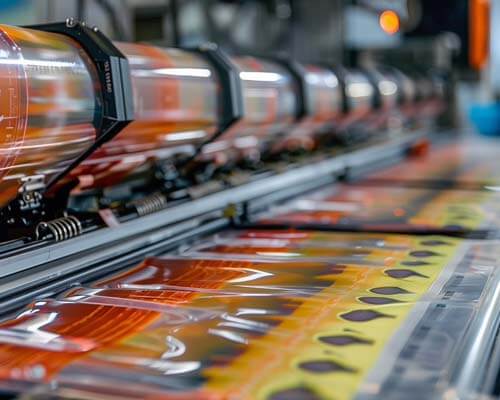
    Product dimensions and weight in packagingBranding and information in packaging

    [ ] Branding and information

    Yes, your packaging templates should leave room for fold and cut lines, but it should also leave room for branding elements, like labels, custom graphics, your own artwork, images, or a little window that lets customer see the product inside. Consider the best placement for visibility and functionality.

    [ ] Prototyping

    Creating a physical prototype of your packaging design that you can hold in your hands is essential. It’s the only way you can sure that you have the correct layout and that your packaging designer has included everything you need into the design.

    Prototyping in packagingFinalize artwork and design of packaging

    [ ] Finalize artwork and design

    Once you have a physical prototype in your hands and have confirmed that it follows the proper layout, you’ll want to finalize the artwork and design. Add a label, account number, or any other custom feature you need. Check your specifications and submit the packaging templates into production. Your job is done!
    Free Dieline Generator

    Dielines define the physical size of your pouches. Fill out this form and you’ll receive the free dieline by email. 

    [tcb-script type=”text/javascript”](function() {try{var f = document.createElement(“iframe”);f.src = ‘https://forms.zohopublic.com/virtualoffice11523/form/DielineGenerator/formperma/9xpz1eH_jWUkNKlv-pIRBI5czqEx1v8PECk0U2_BGRM?zf_rszfm=1’;f.style.border=”none”;f.style.height=”2096px”;f.style.width=”90%”;f.style.transition=”all 0.5s ease”;var d = document.getElementById(“zf_div_9xpz1eH_jWUkNKlv-pIRBI5czqEx1v8PECk0U2_BGRM”);d.appendChild(f);window.addEventListener(‘message’, function (){var evntData = event.data;if( evntData && evntData.constructor == String ){var zf_ifrm_data = evntData.split(“|”);if ( zf_ifrm_data.length == 2 ) {var zf_perma = zf_ifrm_data[0];var zf_ifrm_ht_nw = ( parseInt(zf_ifrm_data[1], 10) + 15 ) + “px”;var iframe = document.getElementById(“zf_div_9xpz1eH_jWUkNKlv-pIRBI5czqEx1v8PECk0U2_BGRM”).getElementsByTagName(“iframe”)[0];if ( (iframe.src).indexOf(‘formperma’) > 0 && (iframe.src).indexOf(zf_perma) > 0 ) {var prevIframeHeight = iframe.style.height;if ( prevIframeHeight != zf_ifrm_ht_nw ) {iframe.style.height = zf_ifrm_ht_nw;}}}}}, false);}catch(e){}})();[/tcb-script]

    Dieline design FAQs

    Here are a few comment questions we receive about dieline design:

    How do I know my product will fit in the bag?

    The best way to make sure your product fits in the bag is to pay for our awesome prototyping service. With as few as 100 bags, it’s a cost efficient way to make sure your product will fit comfortably.

    Will retailers accept my size and configuration?

    In order to ensure your packaging will be accepted by the retailer, you’ll need to check with them directly. You may need a hang hole, and they’re the only ones who can confirm if the bag size is correct for distribution.

    Does it need to stand up?

    Although flat packaging is often the standard, you’ll need to decide internally if your dieline should incorporate the need to stand up into it.

    Do I have to create my own dieline?

    No! CarePac provides design templates, which can be customized to your liking. Because all our packaging is made to order, you have control over the dieline structure and layout.

    CarePac: Your partner in dielines and packaging

    As you can see, creating packaging isn’t always easy. Whether you’re packaging food, clothing, coffee, or snacks, our designers can help you incorporate all the necessary elements onto your bag. From images to folded lines, dielines act as a blueprint to your final design and should be taken seriously. Whether you use your own graphic design software or leverage our design team, dielines are the best way to refine packaging so the final product is exactly what you’re looking for.

    Lets Get Started

    Made In The USA

    Full PouchCustomization

    Scalable Printing Digital & Plate

  • Color Gamuts

    Color Gamuts

    Color Gamut: Maximizing Vibrancyin Flexible Packaging Design

    Introduction to Color Gamuts

    introduction-to-color-gamuts

    Ever picked up a product, drawn in by its flashy packaging, only to find the actual item a shade or two duller than expected? Frustrating, right? That is the persuasive power of colors (specifically red, green, and blue) in flexible packaging. This visible color spectrum (in addition to accurate printing of the colors and how it can affect image quality) may make or break our views and influence our decisions to buy.

    Welcome to the vibrant world of packaging design, where each tone, hue, color temperature, and shade serves as a calculated visual trick to grab your attention in addition to being a visual pleasure. The vivid pop of colors in your favorite candy wrapper, or the lively crimson of a just plucked apple. These eye-catching moments? They’re not random—they’re carefully crafted using the wonders of color standards and the color gamut.

    Now, hold your horses! What is color gamut, you ask? Think of it as a magician’s palette, but instead of tricks, it conjures up the exact cmyk or rgb color space, shades, and tones a designer needs to make your packaging pop. The color gamut refers to the secret sauce for delivering graphic design with accurate, vibrant colors that leap off the shelf and into your shopping cart. Without these color standards, the colors you see commonly represented on a product’s packaging would be dull and washed out.

    Understanding this wider color gamut isn’t just insider knowledge for designers. It serves as your pass to enter a world where packing is an experience rather than merely an outer layer. Come along on a vibrant journey as we explore the mysteries of color gamuts and learn how perfecting the color space enhances the appearance, texture, and appeal of the printed image on flexible packaging.

    Understanding Color Gamut in Flexible Packaging Design

    understanding-color-gamuts

    The color gamut is limited, yet it is like a treasure trove of a range of colors, hues, and tones. It’s the range of colors at our disposal, similar to selecting the same colors from a box of crayons. But here’s the catch—not all surfaces or materials play nice with every crayon in the box. This is where the larger color gamut comes into play.

    When it comes to flexible packaging, think of it as a canvas that comes with its quirks. It’s what allows your designer to produce colors and depict colors on paper as they are in your mind. The type of material used, the printing methods, and even the inks—they all have their say in how vibrant the wider range of colors on your favorite snack bag turn out. Essentially, the wider color gamut won’t always play nicely with every type of material.

    Ever wondered why that fiery red on a plastic pouch doesn’t quite match the same red on paper when viewed with the human eye or on LCD monitors? The visual differences between these color spaces on a computer monitor, an analog television, or on digital cinema is the broader color gamut at play!

    color-gamuts-human-eye-vs-lcd-monitors

    These factors, from the material of the package to how the colors are applied during photo or video editing, dance a complicated tango affecting the reproduction of a wider range of actual colors. Some colors might look bolder on certain materials while the image quality may appear a tad lackluster on most displays. It’s like trying to reproduce different color standards on different surfaces—each one gives a slightly different outcome.

    But fear not! The color gamut dance gives designers the upper hand with color spaces. They tweak and tune their color selections to match the strengths and limitations of these packaging materials, ensuring what you see is what you get. It’s like having a magical recipe that cooks up the exact colors they intend, making that bag of chips or that shampoo bottle pop off the shelf with just the right shades.

    Importance of Accurate Color Reproduction in Flexible Packaging

    Importance of Accurate Color Reproduction

    Ever picked out a product from a lineup because you recognized its packaging primary colors from a mile away? That’s the magic of using a consistent range of colors —your brain’s way of saying, “Hey, that’s my favorite brand!” But what happens when this range of colors play a game of hide-and-seek due to the limitations of such a wide gamut?

    Imagine this: your go-to cereal box suddenly appears a shade lighter than usual. Or worse, the vibrant blue or CMYK inks on your favorite snack bag seems more like a faded memory. It’s not just a visible spectrum color change—it’s a hit to brand identity! Consistent colors hitting the human eye are the superhero capes of branding, instantly signaling familiarity and trust.

    When color gamuts throws a curveball, it’s not just about a change in hue; it’s a hit to the brand’s harmonious symphony. The RGB color space and hues that consumers have grown to identify with dependability and image quality may not be as accurate as they recall, leading them to second-guess their selections. It’s similar like meeting a buddy disguised; you may ultimately identify them, but it will take some time and isn’t exactly the same.

    color-gamuts-rgb-color-space

    Consider the success stories: iconic brands that have nailed the color coverage game. Think about the saturated colors of Coca-Cola red or the Tiffany blue. These brands have mastered the art of consistent color reproduction, becoming instantly recognizable just by their hues. On the flip side, imagine a product whose packaging fails to keep up with its color promise—confusing, right? That’s the gamble when the color gamut limitations muddy the waters of recognition. If you want more accurate printing, pay special attention to your display’s color gamut, particularly in ultra high definition resolutions.

    So, hold tight to that familiar feeling, because in the world of flexible packaging, accurate color reproduction isn’t just about making things look pretty. It’s the glue that holds brand recognition together, ensuring you reach for that familiar package on the shelf without a second thought.

    Importance of Accurate Color Reproduction in Flexible Packaging

    Printing technologies take center stage here.

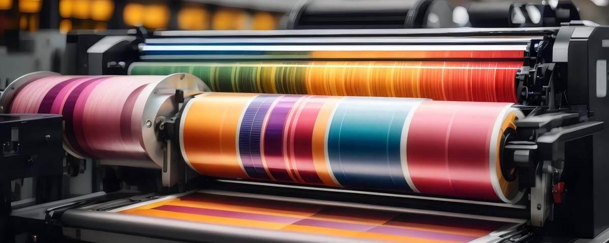
    Rotogravure, the go-to rockstar of printing on flexible packaging, making the wide gamut of colors sing on materials like plastic and films. Then there’s digital printing, the newer kid on the block, showing off its prowess in reproducing intricate designs with vibrant colors. These technologies aren’t just different ways to print—they’re the conductors orchestrating the wider color gamut you see. They’re what take photography technology and color gamut standards to the next level!

    printing-technologiesthe-substrate-material

    But wait, there’s more to this colorful ensemble! The substrate materials

    The very canvas for these colors to dance upon—play a crucial role. Some materials, like paper or certain plastics, embrace colors with open arms, while others might be a bit more reluctant, causing those colors to shy away a bit.

    Enter the color management heroes!

    These systems and tools are like wizards wielding their magical wands to ensure that the wider color gamut you see is what the designer intended. They tweak and fine-tune the color model to fit the capabilities of the printing devices (and technology like LCD monitors, OLED technology, and the internal camera on a laptop) the materials, ensuring a harmonious visual feast for your eyes.

    Yet, despite all these enchantments, challenges abound. Imagine attempting to create a masterpiece with a little supply of brushes and a canvas that doesn’t exactly take paint well. That’s the struggle designers face with the color gamut—juggling the desire for specific colors within the boundaries set by printing devices, LCD monitors, digital video capture, or an iPhone x’s internal camera.

    color-management-heroes

    Strategies to Maximize Color Gamuts for Effective Packaging Design

    First up: color profiling.

    Color profiling in the context of a color gamut is like tailoring a suit to fit just right. It’s similar to customizing a garment to fit perfectly. To ensure that colors are as brilliant as possible when they reach the package, especially if you’re designing using most computer monitors, designers precisely adjust colors for the printing process and the materials utilized. Then comes color separation—it’s like breaking down colors into their individual components to ensure each one stands out, playing its part in creating a vivid visual symphony.

    color-profilingcolor-space-color-gamuts

    But hold your horses! We’re not done yet. Ever heard of color space?

    Think of them as different playgrounds for colors. Designers have access to a broader range of tints and tones when they select the appropriate location, which allows them to broaden their palette. It’s similar to having more crayons in a larger box, allowing designers to better reproduce color, from light magenta to the white point on a package.

    Now, here’s the big secret: collaboration is key!

    Designers, printers, and manufacturers need to join forces like superheroes in a league. When they work hand in hand, sharing insights and expertise, that’s when the magic happens. It’s not just about one person wielding the color wand or adhering to the SRGB standard—it’s a team effort to ensure those red, green, and blue colors dazzle from the shelf to your hands.

    Imagine a world where every color on your favorite snack bag or beverage bottle looks as vivid and enticing as it does in your imagination. That’s the promise of these color model strategies—taking the limitations of the color gamut and stretching them like a canvas, letting designers create vibrant, eye-catching packaging that’s nothing short of a work of art.

    color-gamuts-big-secret

    Conclusion

    In the world of flexible packaging and image quality, the standard color gamut isn’t just a toolbox—it’s the magician’s wand that transforms ordinary packaging into captivating experiences. Its limitations and possibilities dictate the vibrancy and accuracy of colors that catch our eye. From the dance of printing technologies to the harmony of color management, it’s a symphony of technical prowess and artistic finesse. Remember, in the realm of packaging design, understanding and mastering the wider gamut of accurate colors is the gateway to making colors speak volumes!

    Lets Get Started

    Made In The USA

    Full PouchCustomization

    Scalable Printing Digital & Plate