Category: Packaging Design

  • Graphics in Zipper and Seal Zone Areas

    Graphics in Zipper and Seal Zone Areas

    Graphics in Zipper and

     Seal Zone Areas

    A common question that we get is, “Can I print in the seal zones and the zipper area on my pouch?

    Fitting all the client’s contents onto the bag can prove a challenge to say the least. Less-is-More isn’t always possible. Sometimes you’re adapting artwork from a different packaging medium, other-times you using the same artwork on multiple bag sizes. Whether it’s the limitation of design, client requirements, or other variables there will come a time when you must put graphics in the seal area and zipper areas of your pouch

    Printing Content in Zipper and Seal Zones on Pouches & Bags

    The short answer is, Yes! But it’s best to avoid putting important design elements or contents in those areas. So essentially, the long answer is, It depends.

    What is a seal zone on a pouch?

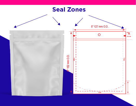
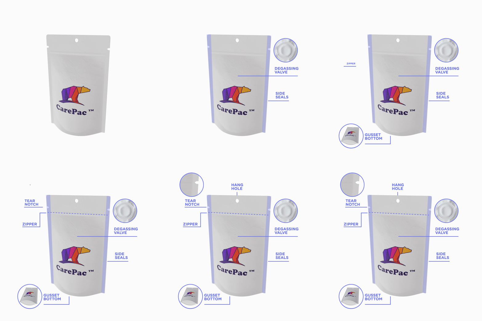
    Seal zones are where the material of the bag is sealed together. Without seals you don’t have a bag and the contents within are not protected. Depending on the pouch configuration involved you may have as few as 2 seal zones or as many as 8.

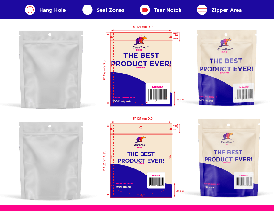
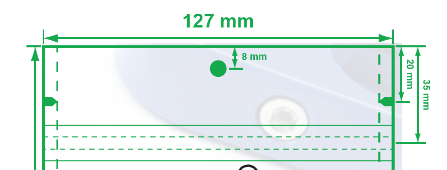
    On our dielines seal zones are show using dashed lines. Seal zones typically run along the edge of the pouch. As in the picture below.

    Pouch Zipper Area Explained

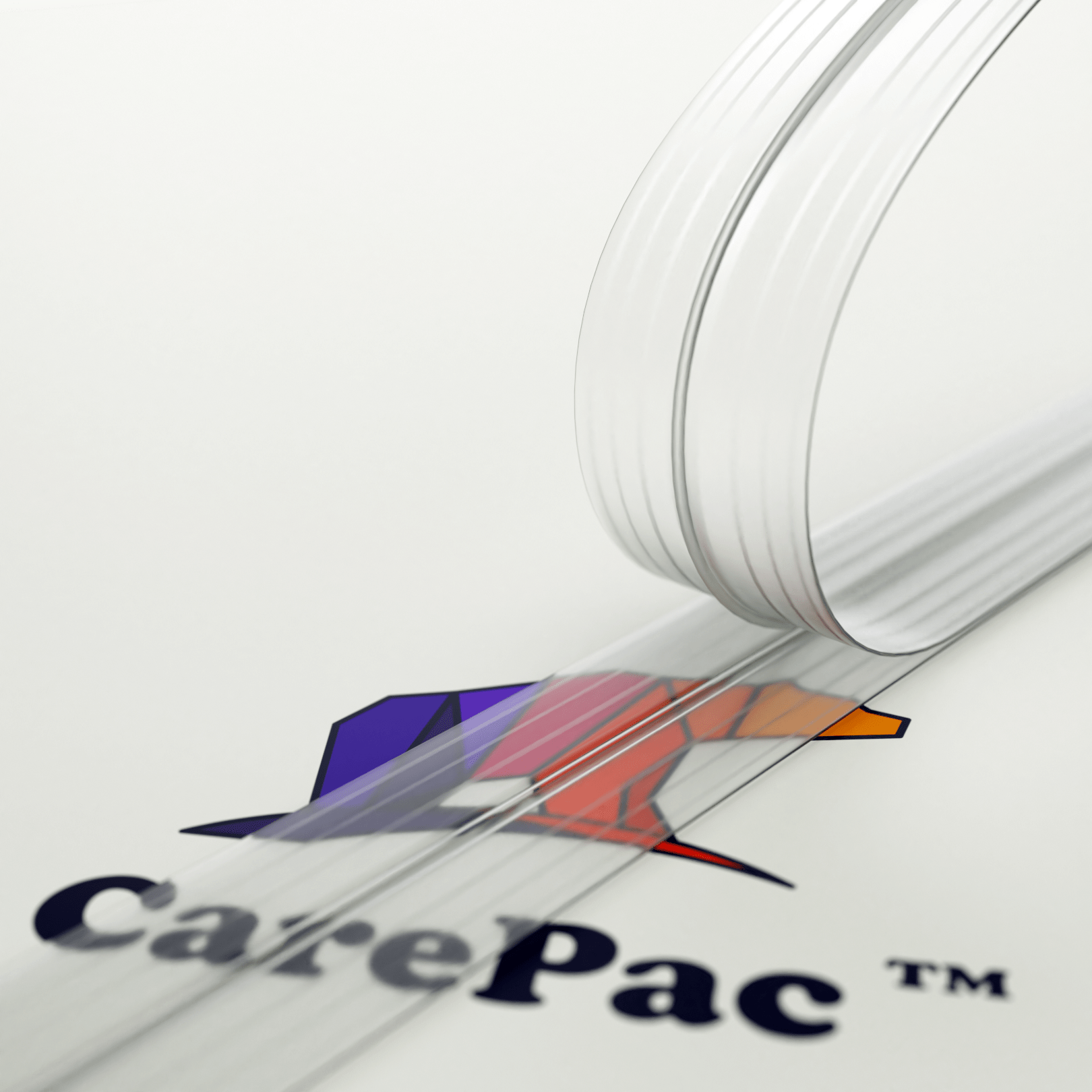
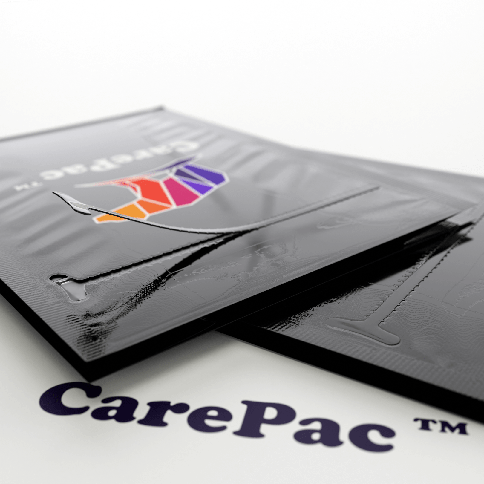
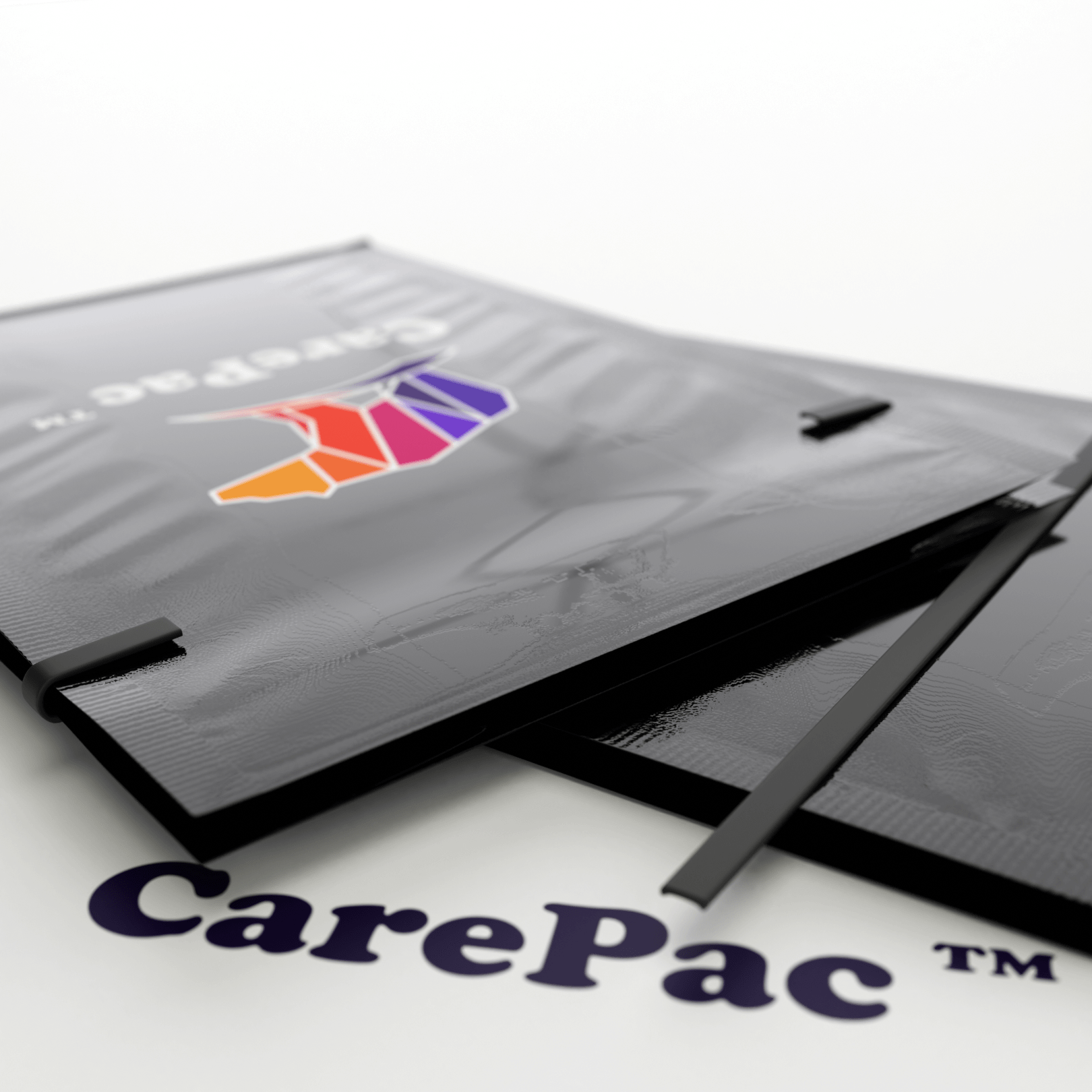
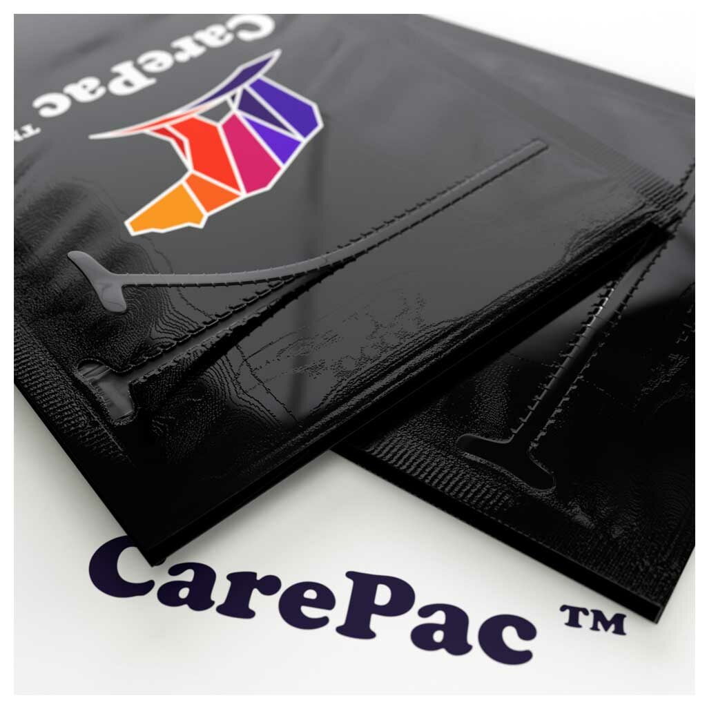
    The zipper area is where the sealing zipper is built into the resealable bag. The zipper is a physical item which takes up space and creates a slight bump and ripple in the pouch surface. Most styles of zippers are heat sealed into the pouch during the pouch making process. Standard zippers will have a zipper flange on both the front and back side of the bags. Ez-Pull / Pull tab zippers exist only in one face of the pouch. Either way, there will be a bump in the material where it conforms to the extruded zipper. 

    What are “important design elements” on pouches?

    You will come to learn that important design elements are anything that is critical to the success of the packaging. This might include barcodes, USDA organic labeling, FDA stamps or icons, P65 statements, or other compliance warnings, nutritional information etc. When designing your bag, you ideally do want to follow our art guidelines and avoid placement of critical graphics in zipper, area, seal zones or around hang hole because you don’t want someone claiming they these items are distorted or otherwise not readable.

    The Basic Rule for Printing in Stand Up Bag Seal Zones

    The basic, fall back rule is don’t put anything in the seal pouch (zones or zipper area) that you need maximum readability. Generally, graphics like logos can be placed in the zipper area with subjective results. Bar codes should never be placed in zipper or seal areas, the seals and zipper can create read errors.  

    Never place the following items in seal zones and it’s best to avoid placing them in the zipper area. 

    • Barcodes
    • Ingredient Allergen information
    • Compliance icons (USDA, EPA, ETC)
    • Nutritional information
    • Ingredient lists. 
    • Compliance warning statements. 

    Generally OK to print in the seals and zipper area

    Generally its best to bleed out graphics, backgrounds, etc through the seal zone. When it comes to the zipper area, the amount of possible distortion is lessened. Here are some design elements which we commonly see placed in the zipper area when the customer is left with no other printing options: 

    • Logos
    • Slogans “the best product ever!”
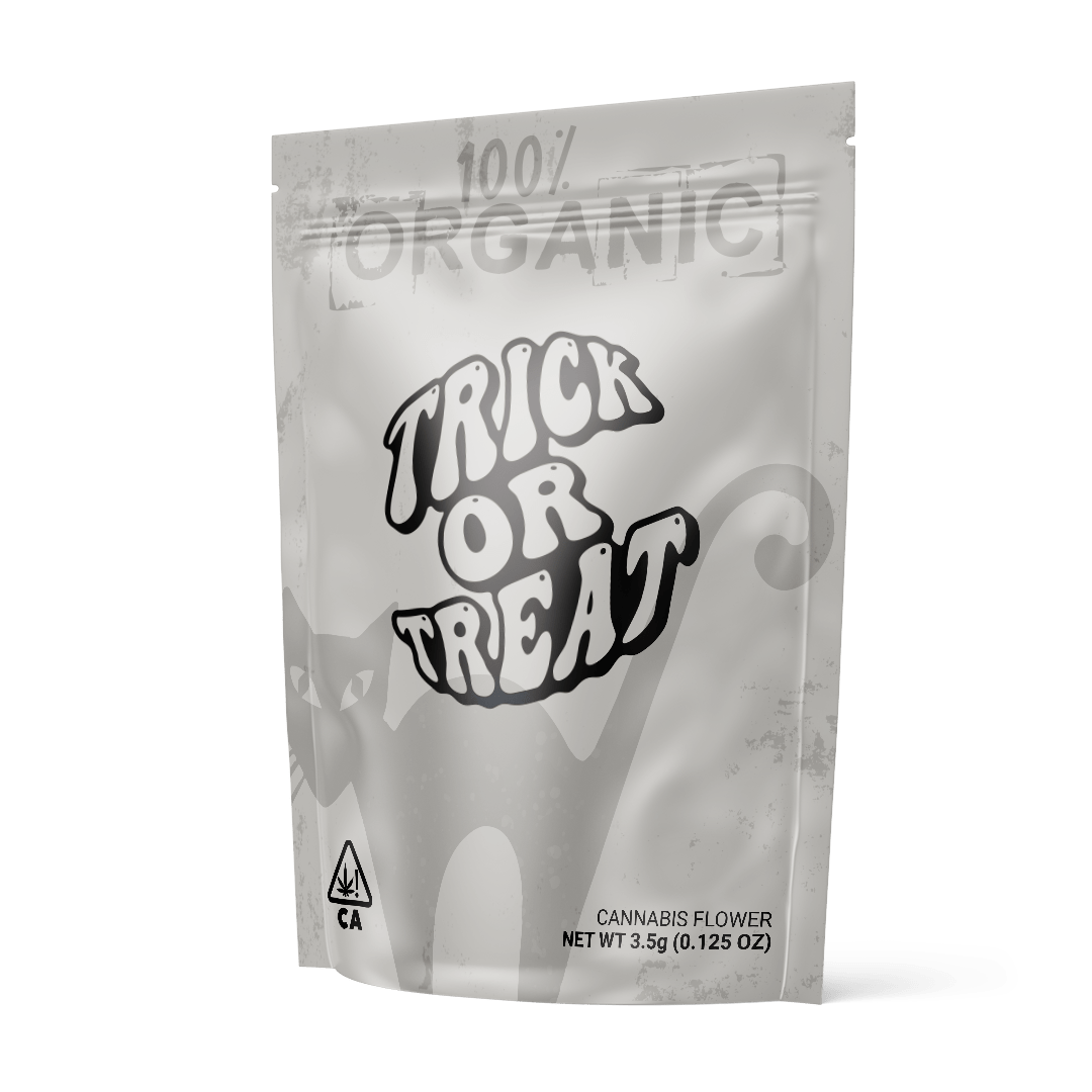
    • Marketing phrases “100% organic”, “free range” 

    Remember the tear notch on flexible packaging

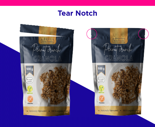
    The tear notch is meant to be used, but many times graphic designers forget that it will be! Anything you place above the tear notch will be removed when the consumer opens the pouch. So you’ll want to avoid putting warning logos, and important things above that area. 

    What result can I expect?

    The exact outcome will vary based on several variables including bag material, and colors used, but generally print in the seal zones or zipper area turn out just fine, you just have to be willing to accept that there will be some bumpiness, and possibility of a little distortion.  

    Examples: here are examples of print results obtained when printing in the seal zone.

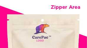
    Logo in Zipper Area

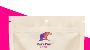
    Optimal Placement

    Everything is made-to-order, and we’ll ultimately print whatever you need wherever you want it,

    but following the best practices will make for a better outcome!

    Contact us today for a free consultation and quote.

    Everything is made-to-order, and we’ll ultimately print whatever you need wherever you want it, but following the best practices will make for a better outcome!  

  • Spice Packaging Design

    Spice Packaging Design

    Spice Packaging Design

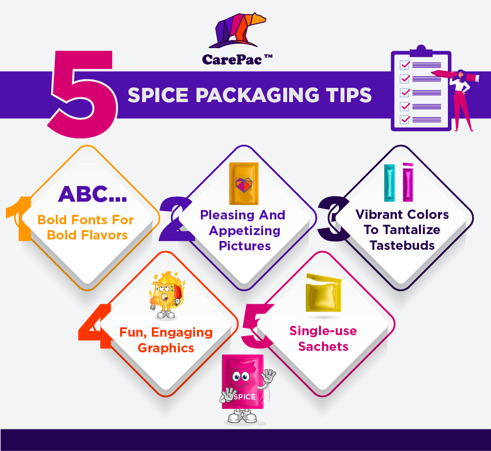
    Spices add flavor to our life. They make food exciting, they elevate basic cooking, and they open doors to new cuisines and cultures. Help them add flavor to their own life by crafting the perfect spice packaging design that makes them want to grab it right off the shelf and step into the kitchen. Looking for five tips for creating packages that sell? Here you go!

    Spice Packaging Design Tips

    1. Bold fonts for bold food flavors.

    Everything about selling flavor has to stand out, and the font choice is no exception! Fonts should be bold, playful, fun, and energetic. Serifs, san serifs, scripts, and a combination of the three are all welcome in exciting but still legible fonts. It’s an opportunity to pick a font that would otherwise be taboo for most products. Let the fonts play a significant visual role and add plenty of variety. Flavors, brand names, ingredients, and nutritional information can be displayed in a way that is crafty, unique, and aesthetically pleasing.

    2. Pleasing and appetizing pictures.

    When we eat, we enjoy food with more than just our sense of taste. We smell as it cooks, we feel the texture as we chew, and we see how yummy and appetizing they look. Selling a spice packet is easier when you have appetizing images of the finished product, so consumers have an immediate idea of how to use it as well as a newly whetted appetite. Likewise, you can also incorporate images of what the spices look like in the packet or even include a viewing window in the package so they can see it directly. They can see it and then visualize how they might use it in their own cooking or imagine how it might taste rubbed on some chicken or tossed in with vegetables, or sprinkled over a taco.

    3. Vibrant colors to tantalize tastebuds.

    This trend goes right alongside the suggestion regarding font choices. Generally, the more colorful a plate is, the tastier we often presume it to be. This is true for the packaging of your spice or mix as well. Incorporate fun, exciting colors that catch their eye and draw in your consumer. Add some flair to dinner with this delicious mix that will easily elevate your cooking. Keep them bright and vibrant, but still within a uniform color palette. Avoid chaos, but don’t be afraid to be loud and bold with the colors.

    4. Pepper in fun, engaging graphics.

    Consumers want to feel the excitement that comes with cooking and eating delicious food. Sell them on your product with fun and engaging graphics that decorate the package itself. Be creative with logos and design elements or incorporate graphics that relate to the dish or the culinary origins of whatever your mix pack involves.

    5. Make good use of single-use sachets.

    Single-use sachets make trying something new easier because they don’t bring the commitment of having a 50-serving pack of the spice blend. They also make it easier on the consumer, who can simply pour the packet into whatever they’re making without needing to measure it out. They’re a product of convenience, and most modern home cooks looking to buy flavor are looking for a convenient way to do it. If you aren’t going to use a single-use sachet, however, make sure to incorporate some way of closing the container, whether it’s a resealable zip-top or a fold-over box-top. Even though seasonings are dried and generally have a longer shelf life than other products, consumers want to ensure they preserve the freshness of their purchase!

    A Dozen Cousins Spice Packaging

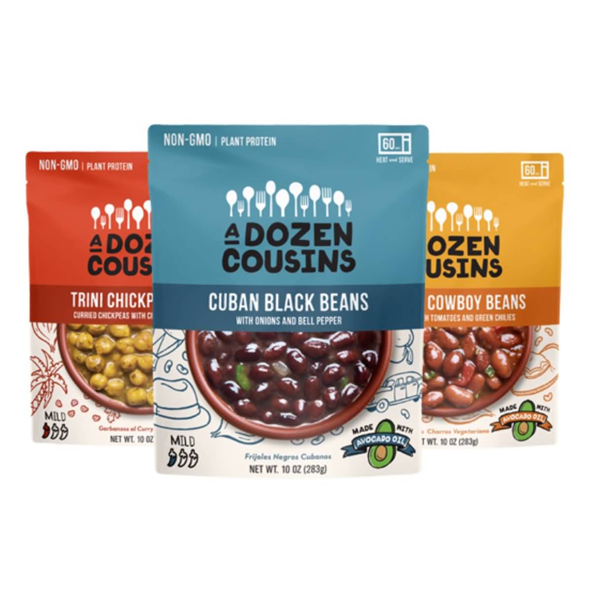
    1. A Dozen Cousins

    A Dozen Cousins creates flavored food, like rice pouches, but they also sell their own blend of seasoning sauce mixes. They sell single-use packs in groups of ten or more and include images of what the seasoning sauce is used for right on the front. They immediately look tasty and delicious. They also incorporate fun, cute graphics around the packaging and in creative ways like to denote the type of product and spiciness level. On these packets alone, there are five different fonts used throughout.

    Iya Foods Spice Packaging

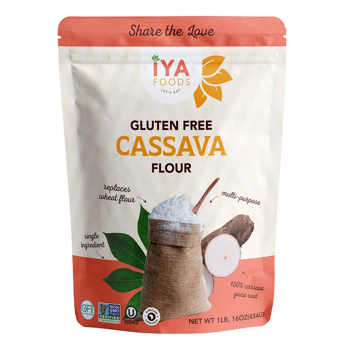
    2. Iya Foods

    Iya Foods uses a few of the items from the trending list, starting with a number of fonts to bring some flair and variety. They aren’t the most exciting of fonts, but they give a touch of enthusiasm to the package that would otherwise be missing with one uniform font. Each flavor pack has a different color on the top and bottom and for the flavor title (e.g., Pepper Soup). They decorate the package with plenty of ingredients, namely, what would be used in the spice packet, so you have familiarity with the ingredients right off the bat. It’s a multi-serving packet, but the flexible packaging and resealable top are a must.

    Flavor Seed Spice Packaging

    3. Flavor Seed

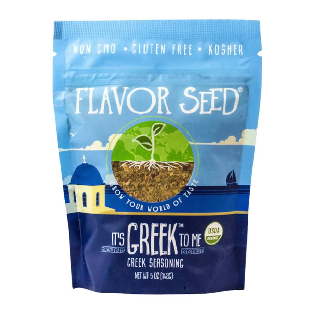
    Flavor Seed starts off its packaging with bright, friendly, welcoming shades of blue, emblematic of the blue skies and blue ocean waters surrounding much of Greece. This Greek seasoning has a graphic of the iconic white structures famous on islands like Mykonos and Santorini, and the fonts are fun and unique and placed all throughout the package. It is also a multi-use package but has the flavor seal to lock in and preserve the freshness of the herbs and spices used.

    Milk Street Spice Packaging

    4. Milk Street

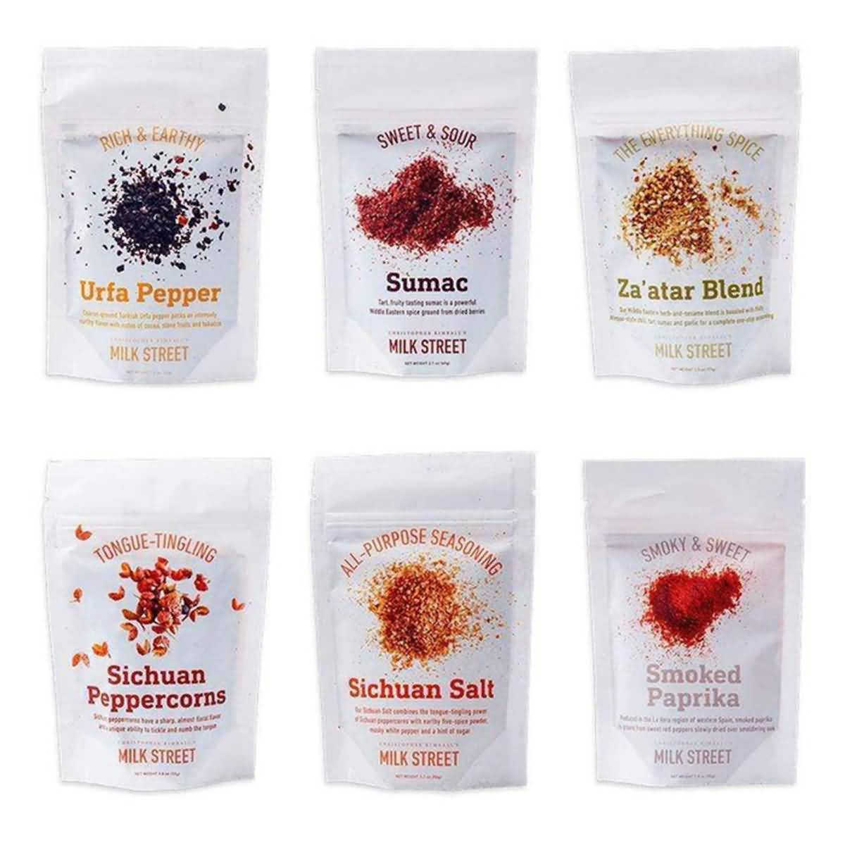
    Milk Street uses white space effectively on its packaging, keeping it white and clean to place greater emphasis and attention on the name of the seasoning and the images as well. The three-font combination is consistent across the different packages, with one font for the name, another for the brief description (e.g., “Tongue-Tingling”), and a third for the information. The spices look visually powerful, displayed on top of the all-white wrap. The packages are also resealable and stand-up pouches, which make them great for storing in kitchen cupboards.

    Spice Cartel Spice Packaging

    5. Spice Cartel

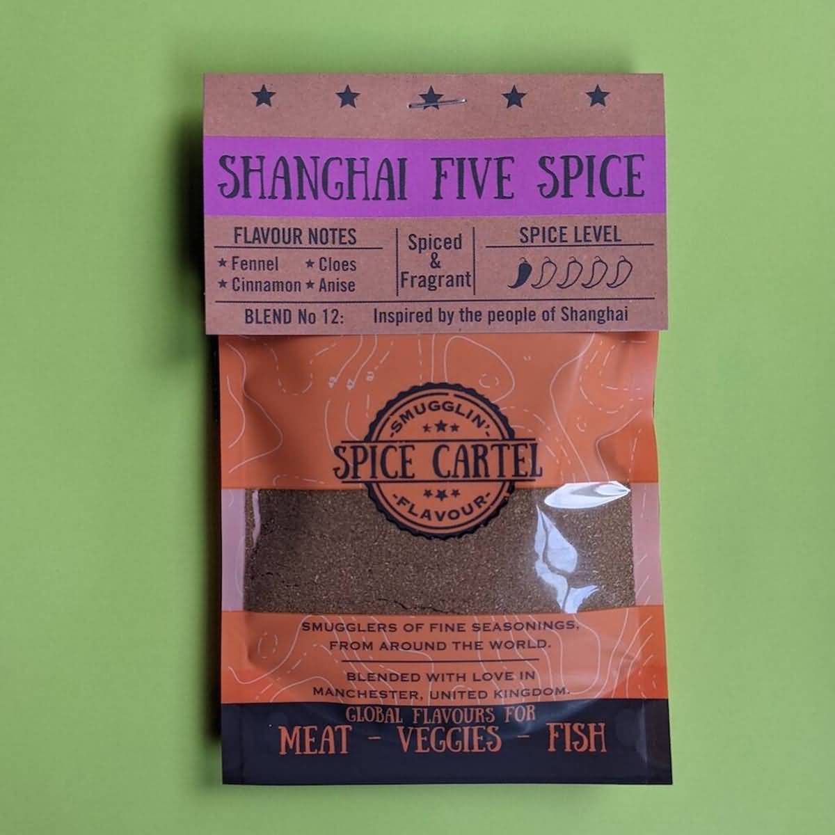
    The Spice Cartel has a great branding concept that feels natural and earth-bound, with playful but legible fonts, a creative name, a viewing window to view the exact product you’re buying, and plenty of essential information on the packet, like spice level, flavor notes, and taste.

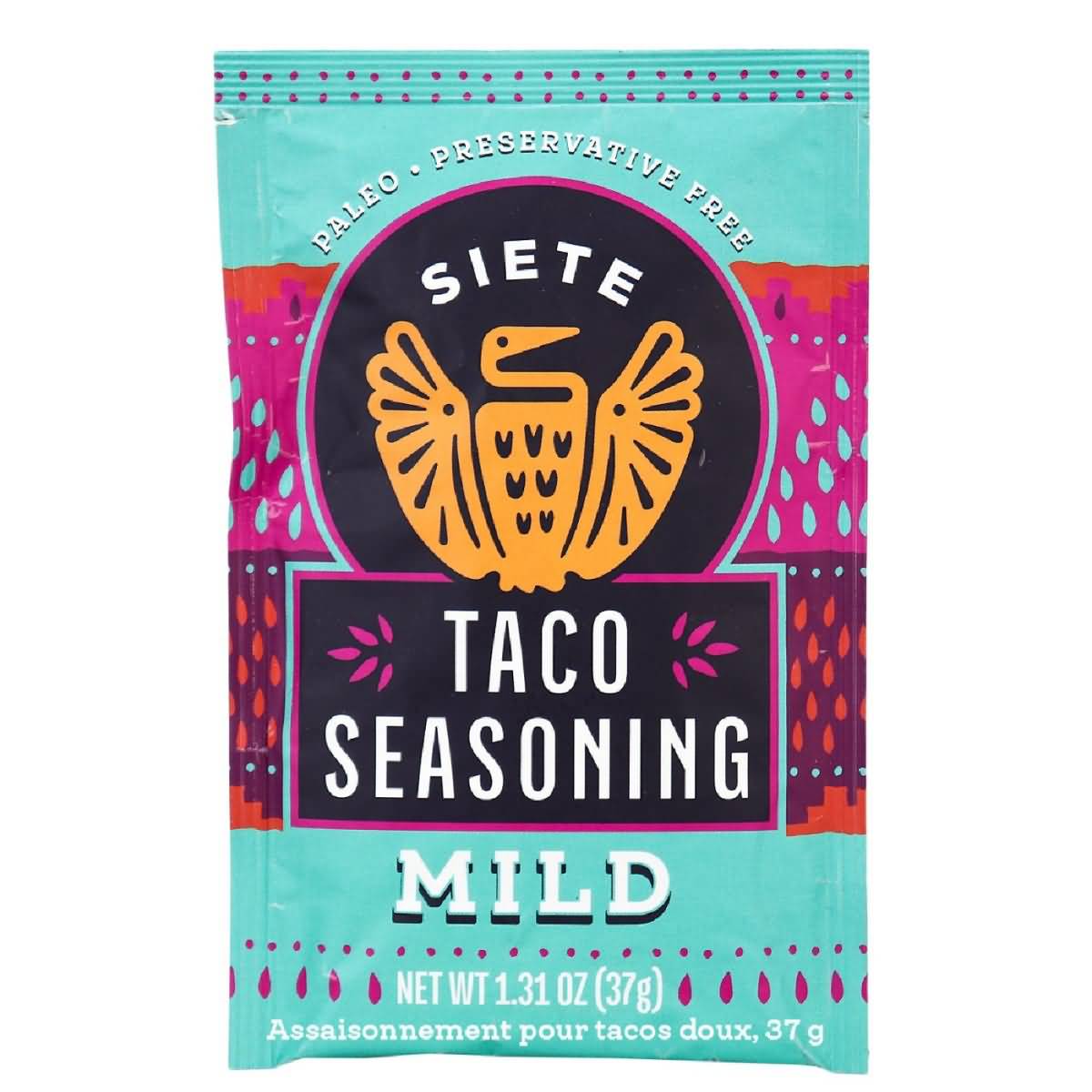
    Siete Taco Seasoning Spice Packaging

    6. Siete

    Siete Family Foods sells better-for-your Mexican-American foods, including grain-free tortillas and chips, paleo seasonings, and dairy-free queso for those with sensitive food allergies. Their taco seasonings come in a range of spice levels and purposes, but all have their signature Siete bird logo and bright, colorful packaging that emphasizes the bright, vivid flavors in their foods. The matte packaging makes their products look slick and smooth without dulling the colors at all. They have their signature fonts as well, which are fun and creative. They’re also single-use packets with a clear designation on how to use them, which make them nice for those looking for convenience!

    Sugar Roti Spice Packaging

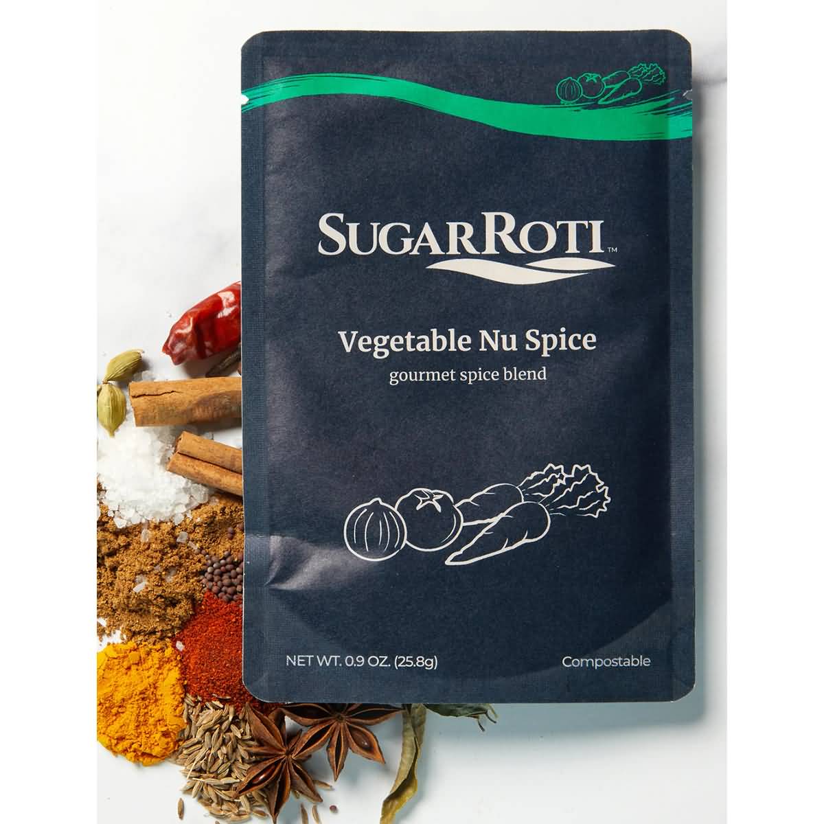
    7. Sugar Roti

    Sugar Roti is a great example of a company that strays from the trends but still has a powerful impact and uses subtlety in an appealing way in their spice packaging designs. Their matte, flexible packaging contains minimal graphics, with a single symbolic logo on the front, along with a flavor, the logo, and unique color to denote the flavor. There isn’t much variety, but the consistency is clean and refined. The single-use, flexible packages are convenient and easy to use when cooking, which is a major bonus.

    Tasty Spice Packaging

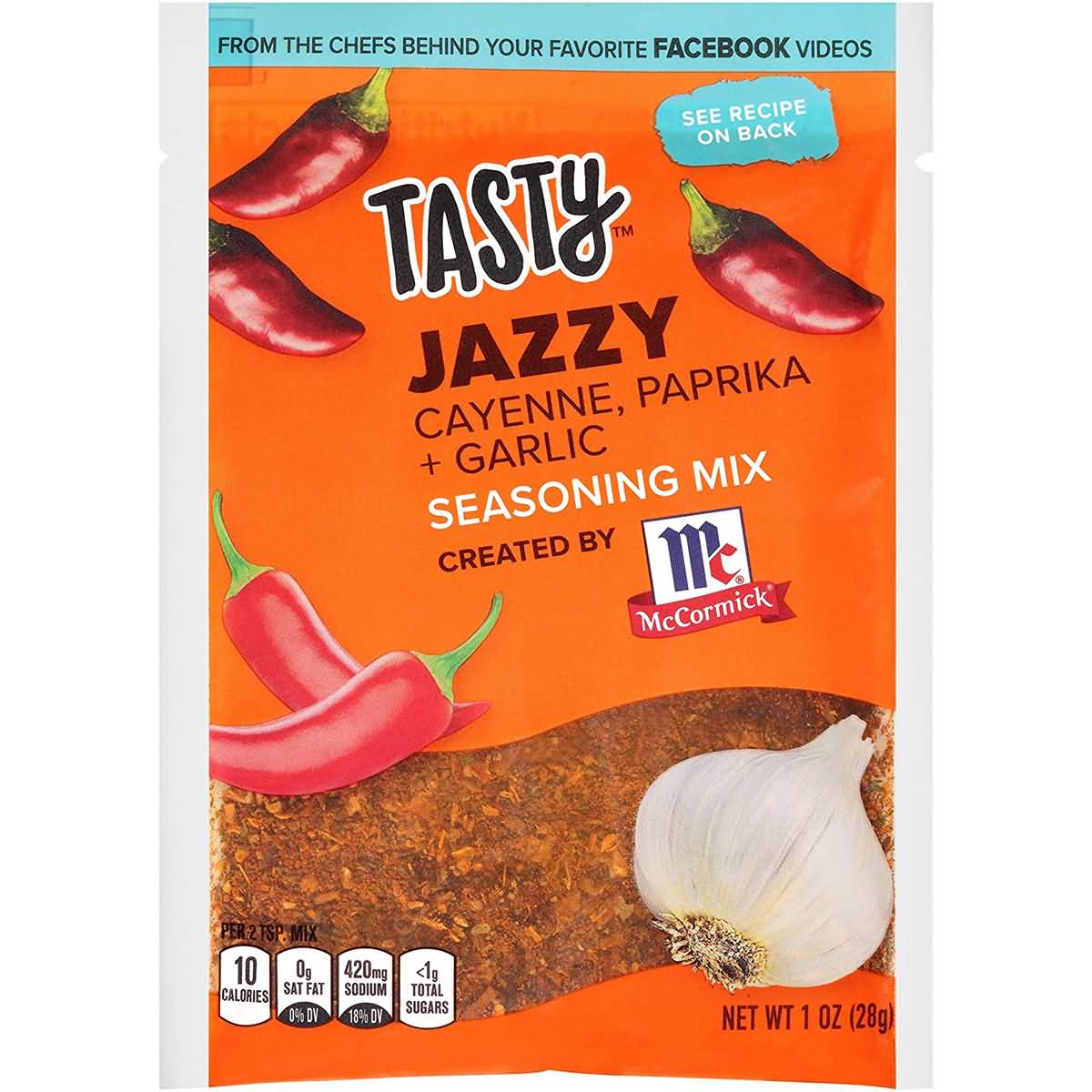
    8. Tasty

    This spice packaging isn’t the cleanest of packaging, but it hits a lot of points well. There’s the blending of fun, energetic fonts, along with a bright color palette of orange and blue. They also include graphics of the ingredients, like garlic and cayenne peppers. The viewing window is the biggest bonus to their packaging, which looks distinctly red-orange and very flavorful. The flexible packaging is single-use, making it easy for those cooking, too.

    Pearl and Johnny Spice Packaging

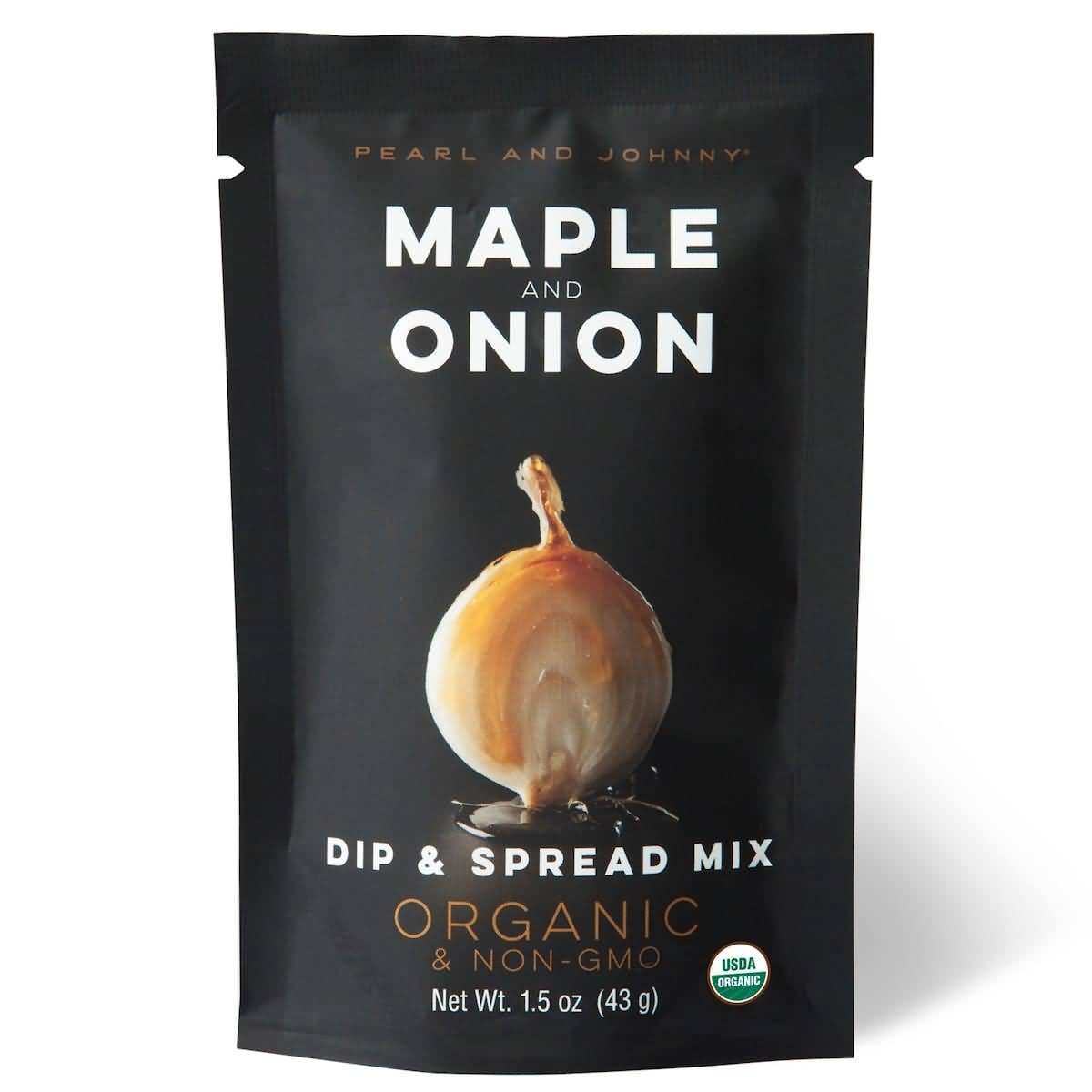
    9. Pearl and Johnny

    The Pearl and Johnny dip and spread mix is another example of a company that strays from the formula a bit, although their packaging looks a bit better than SugarRoti. The matte finish of their flexible packaging looks bold, especially when the graphics of the chili and lime are placed in the center with a reflection beneath. It looks rich and bold in flavor. The combination of bold and thin fonts is also elegant alongside the rest of the packaging. It’s a single-use sachet with an easy-tear top, which is perfect for throwing together a delicious dip in little time.

    Eastern Standard Provisions Spice Packaging

    10. Eastern Standard Provisions

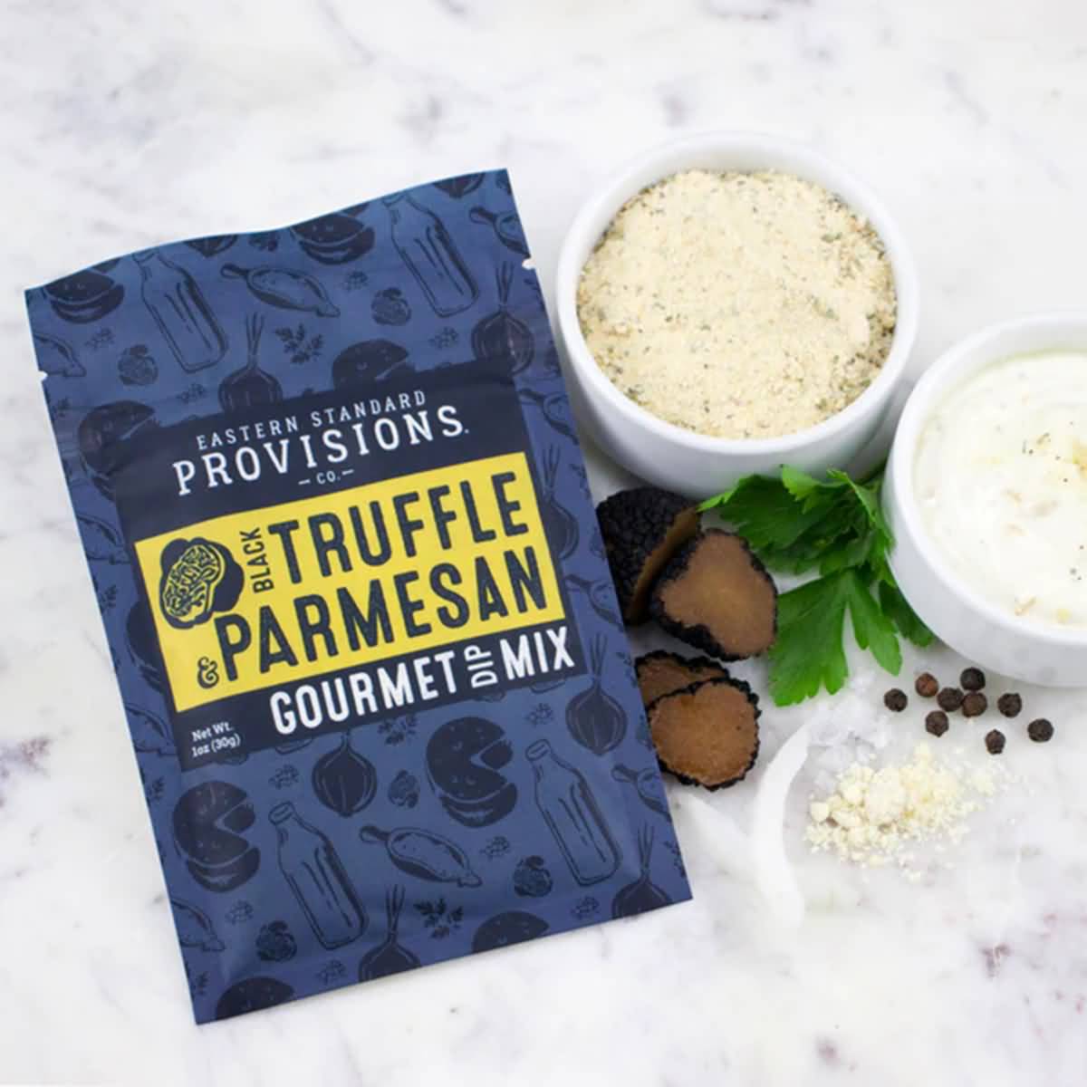
    Eastern Standard Provisions sells gourmet food products like jams, waffles, toppings, and pretzels. Their gourmet Black Truffle and Parmesan dip has to look gourmet as the name suggests, and an elegant blue is just the color to do so. Their packages are resealable and have an easy-to-tear top. It’s a flexible package that makes it easy to work with and use. The royal blue package is emboldened with a yellow block denoting the flavor and is covered in little graphics relating to the product. Their font combinations aren’t as loud or bold as some of the others on this list, but the choices here go better with the gourmet product line.

    Care Pac makes deciding on the right spice packaging design easy. With customizable pouches in a variety of styles, you can select the ideal pouch that works with your product and appeals to your target demographic. Find out more about our packaging for seasonings, spices, rubs, and more. Our helpful packaging designers are on stand by to help you start your spices packaging. Get started now! 

  • Cannabis Pouch Designs

    Cannabis Pouch Designs

    Cannabis Pouch Designs

    Cannabis can be a tricky business to enter into. With more and more states legalizing its use, 

    brands know some areas are oversaturated with competition while others are ready for shops 

    to start opening up. To successfully brand, market, and sell your designer weed brand, your cannabis packaging design is key. 


    Cannabis Pouch Designs & Marijuana Bag Ideas for Weed

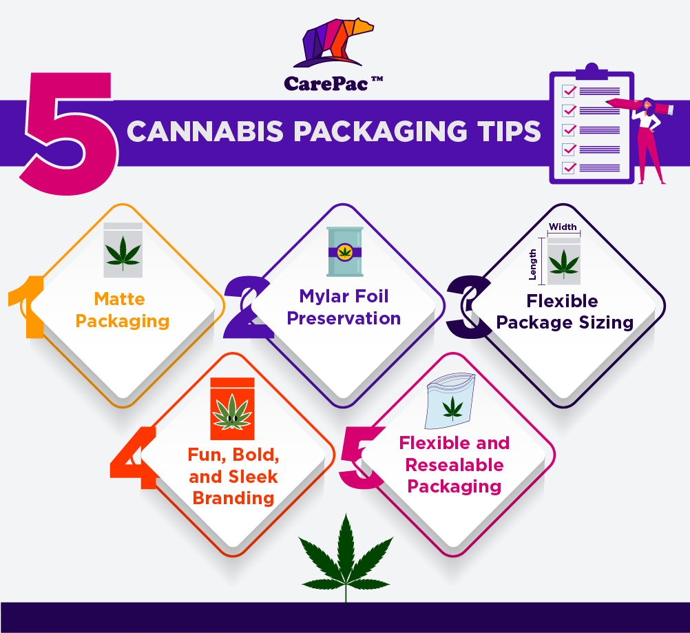
    Here are five packaging tips from cannabis professionals that will boost your chances in the 

    market. 

    1. Matte Packaging Design for Marijuana & Cannabis

    Matte colors, and, in particular, matte black, are among the most popular cannabis packaging trends. It’s a major trend among both big and little cannabis brands alike. Matte black is easy to spot on shelves across stores everywhere. The sleek finished look pairs well with the modern, clean, and futuristic styles of many up-and-coming designer weed shops. Matte blacks paired with one bright, vivid color is attractive but refined at the same time. Matte finishes also add an elegant texture and a regal look to packaging, whether it’s black or another color.

    2. Mylar Foil Preservation for Weed & Cannabis

    Mylar foil packaging is one of the biggest demands in the cannabis industry for a couple of reasons. The first reason is because the mylar foil is able to contain the very pungent odor that typically emanates from cannabis. It has a very distinct smell, and most customers are looking to be discreet with their products. If you can offer packaging that allows them to keep it in a purse or briefly store it in a car or in the cupboard without attracting unwanted attention from children or adults, it will help your product maintain an element of professionalism and desirability.

    3. Custom Flexible Package Sizing for Weed Bags

    Some cannabis companies sell a variety of products, from vape cartridges to flowers to pens, blunts, and gummies, while some sell just blunts and flowers. Regardless of what types of products you’re marketing for cannabis, consider the size of your packaging in how you market different types or quantities of products. Different sizes help customers become regulars because they can recognize the sizes and associate it with their familiar products. It also allows them to feel more discreet in their purchase or bold in their purchase (with a larger size package) and ultimately appeals to a wider variety of customer needs.

    4. Print Fun, Bold, and Sleek Branding & Cannabis Labels

    If you walk into some of the most popular cannabis shops today, shoppers will often find themselves in these hyper-modernized, almost futuristic facilities that feel clean, sharp, and almost like walking into some sort of health clinic. They have a similar aesthetic to the Apple stores we walk by in malls. With the increasing legalization of cannabis, many companies are looking to capitalize on the relaxed experience consumers desire, rather than the former days of what felt like shopping for illegal substances. It’s about transparency, attractiveness, and crafting a full consumer experience from the moment they walk in the doors. Your packaging can easily reflect this attitude, with fun and unique packaging, bold and bright colors, and sleek styles that look as smooth as the cannabis feels.

    5. Custom Flexible and Resealable Weed Packaging Bag

    Flexible packaging is a big draw and works for everything from gummies to buds and flowers to cartridges. They’re easy to toss away once you have what you need, but they’re also easy to store in back pockets and purses or to keep up high on a shelf in the home. In addition to flexible packaging, resealable packaging is also essential. Keep edibles and flowers from drying out by allowing buyers to close their packages back up afterward. Some states and counties even require child-proof seals or a film to ensure that small children aren’t able to mistake a pack of THC gummies for their own sweet treats.

    With these five trends in mind, check out these 10 brands and how they use the trends in their own print and packaging.

    Leafs by Snoop

    1. Leafs by Snoop

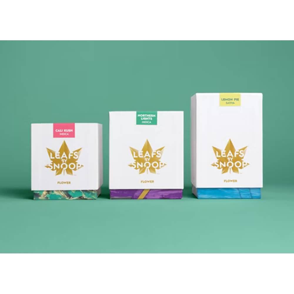
    Leafs by Snoop is one of the biggest selling products on the market, for both the quality but also the branding. The small boxes are among our favorites- they’re stylish and iconic, with minimal-color icons and graphics so shoppers can identify different products and ounce connotations. The packaging centers around the recognizable logo and is largely white, drawing attention to the logo. The only downside is the lack of flexible packaging. While boxes look nice and clean and professional, they’re also easy to smash, including in transit, leading to dented packaging on the shelves.

    Rythm High CBD

    2. Rythm

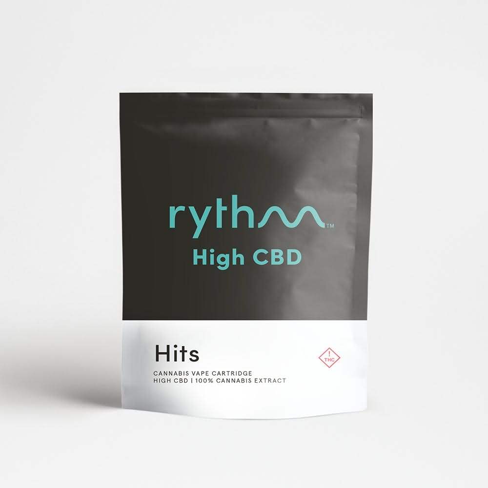
    The logo for rythm does a lot of the work for their branding and their marijuana bags, with the smooth beat symbol taking over the ‘m’. They use the matte black packaging effectively, keeping the color palette minimal with a black and teal ensemble. There’s little else going on for a powerful minimalist appearance, but it all works well together.

    Select X Bites Cannabis Packaging

    3. Select X Bites

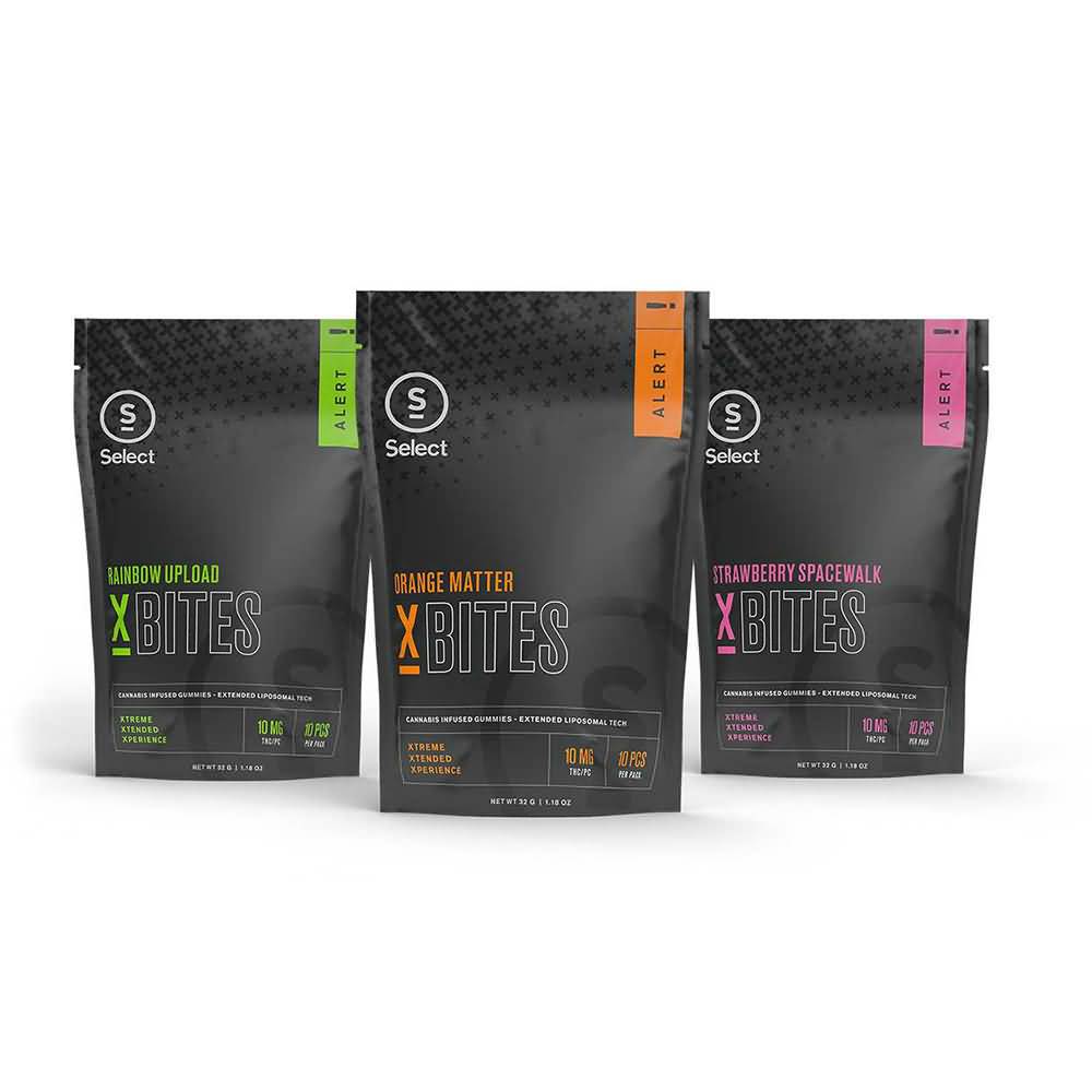
    Another great example of matte black packaging paired with a few select flavor/product colors is Select X Bites. The matte black sheen gives texture and a subdued, cool finish with small pops of color in the different flavors. The highlighter colors, green, orange, and pink are very minimal, as well. It’s bold, flexible, and odor-blocking, as well.

    Wana Gummies Cannabis Packaging

    4. Wana

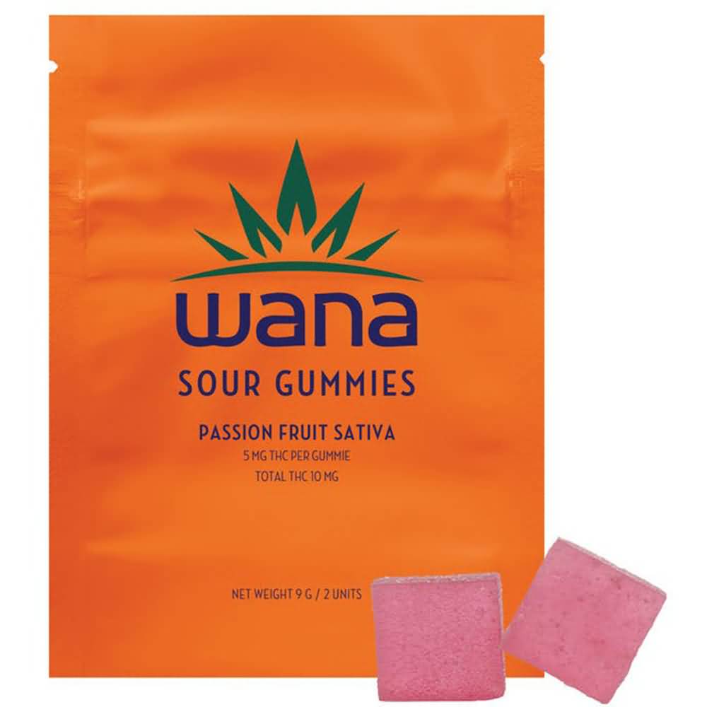
    Wana is a great example of how matte doesn’t always have to come in black, especially on cannabis bags. They use whole package matte colors in a monochromatic design that parallels the flavor of their gummies. Their fonts are unique and recognizable, which helps set themselves as a familiar brand to their consumers. The packages are also resealable, which is essential for saving the remaining gummies until it’s time to enjoy.

    Lost Farm Cannabis Packaging

    5. Lost Farm

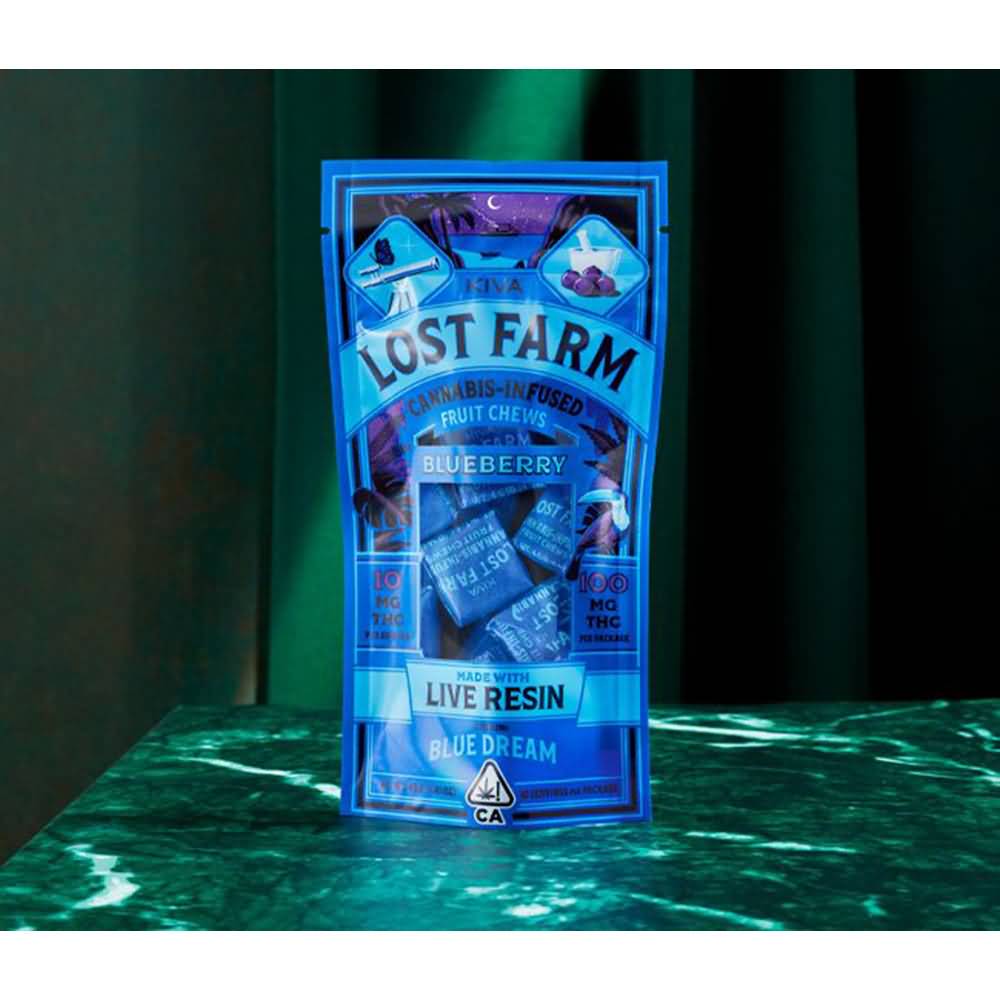
    The Lost Farm gummies and chews are sweet cannabis candies individually wrapped in their flexible, easy-to-open gloss package. The colors are bold and attractive and evoke smooth vibes, similar to how they market their product. They also use a viewing window to show the wrapped product in its packaging, which can be a great bonus for consumers. It’s resealable as well, although, with a window, it is unlikely to be perfectly odor-proof.

    Venice Cookie Co

    6. Venice Cookie Co.

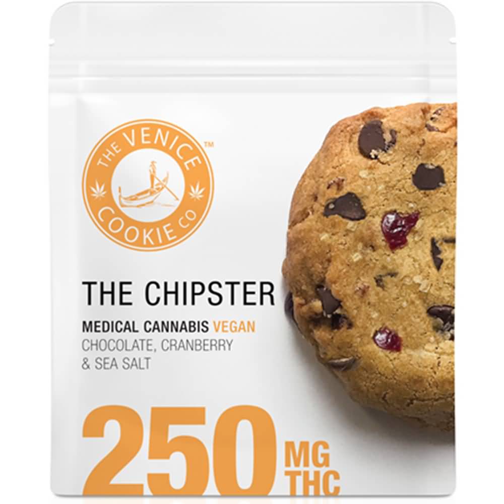
    There’s nothing flashy or bold about The Venice Cookie Co. packaging, nothing unique or particularly eye-catching, but they keep it straight, simple, and to the point. Consumers immediately know exactly what they’re getting (a chocolate chip cookie) and how much (250mg THC). It’s a two-tone color palette with orange and white, and the big tasty graphic of the cookie is physically appealing and appetizing for potential buyers. The package is for one cookie, but it has a resealable package for keeping that cookie fresh in case a user would like to save some for later. 

    Old Pal Vape

    7. Old Pal

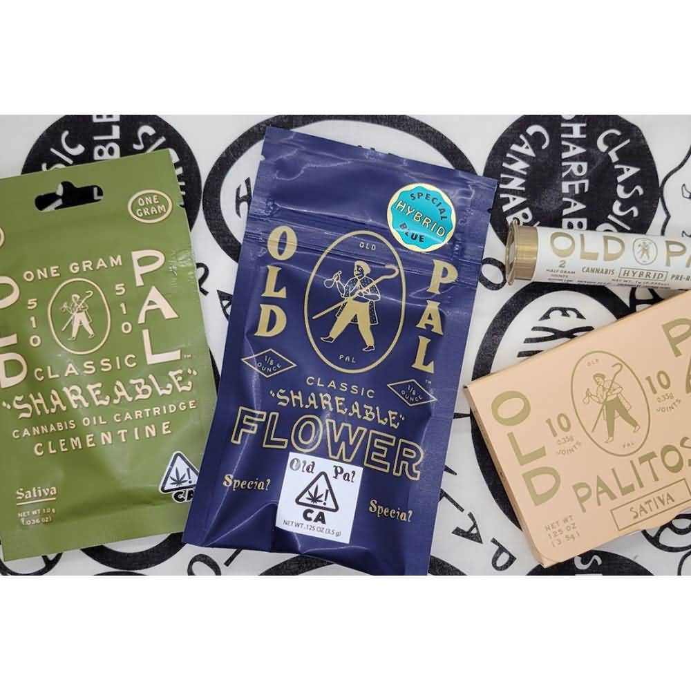
    Yet again, we see effective use of matte packaging, and yet again, it’s not a matte black. The sage green is soothing, earthy, and herbal, which makes it quite the appropriate color for cannabis packaging. It partners well with the gold tone of the lettering and graphics that decorate the package as well. The package is for a shareable vape pen and is packaged in a flexible and resealable wrapper.

    Farmer and the Felon

    8. Farmer and the Felon

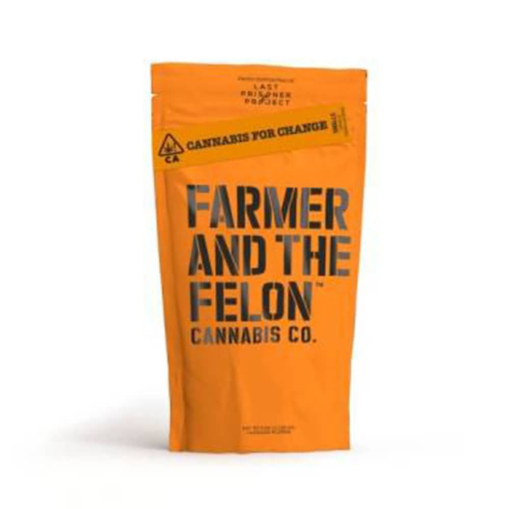
    The Farmer and the Felon has masterfully crafted an out-of-the-box design for their packaging that really makes it stand out from the other trends. Their font is a bold typeface in all capitals that stands at the forefront of their package’s branding. The orange and black tones play off prison colors, which plays off of the felon connotation, making light of the former illegality of cannabis. The packaging is also flexible and resealable, and odor-proof.

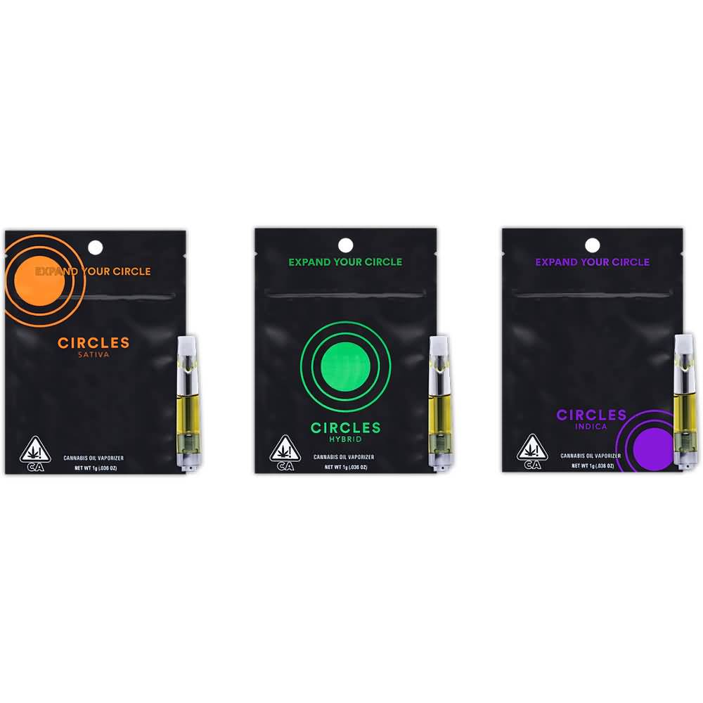
    Circles Vape Cannabis Pouch Design

    9. Circles

    One more matte black finish is thrown into the mix with Circles. If you aren’t picking up on the sleek, elegant look of the matte finishes, then it’s time to start. Circles, as their name suggests, uses circles placed throughout the package as their logo, but in different colors and places. Each matte black package is resealable, has minimal design elements, and has a two-tone color theme.

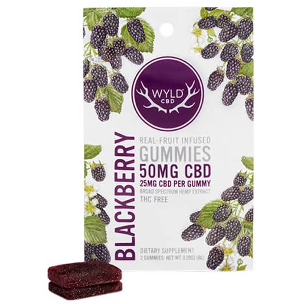
    Wyld Blackberry Gummies Cannabis Pouch Design

    10. Wyld 

    Wyld sells its gummies in a white matte finish, with resealable packages that are flexible and easy to grab and store. They also play off the “wild” theme of their namesake, with graphics representing the flavor decorating the package and a collection of colors to match the flavor as well. It feels earthy and natural and includes all the necessary information right on the package.

    Packaging that is designed to be fun, functional, and attractive is easy when you work with Care Pac designers. Small and medium-sized businesses can find an affordable way to make their own cannabis products stand out with a range of sizes, materials, package types, and closures to meet the needs of your product as well as your state laws. Check out the CarePac website for more information or to see some options! Contact one of our designers today and fill your cart with wonderful options! 

  • Is RGB or CMYK better for digital

    Is RGB or CMYK better for digital

     Whether you are a designer or just trying to get a project across the finish line for your team, some things are essential to know if you are working with printed packaging. One of the most important things to know is the concept of RGB vs CMYK color modes.

    The mastery and knowledge of both these concepts are not restricted to the complete forms of both words. It also refers to understanding of how they help optimize the design and printing process. So, for example, it also helps to understand which color mode you choose for products paper envelopes.

    When we try to understand the concepts, they are presented in a challenging way, and we get more apprehensive of learning about them.

    However, in this article, we will explain the RGB and CMYK color modes in a more straight forward way so that you can use them in the best way.

     So, without any further ado, let us get started!
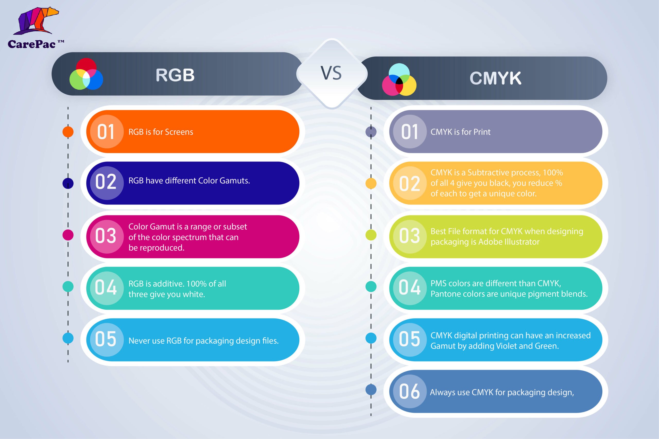
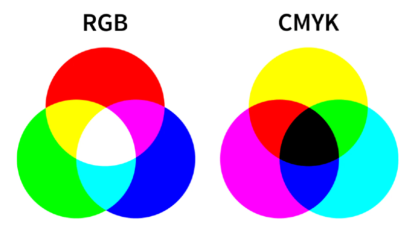
    An infographic showing the differences between RGB and CMYK

    What is RGB?

    The complete form of RGB is Red, Green and Blue and is the color space frequently used for digital images.

    All the colors initially consist of black darkness; then, the three colors are put on top of one another to create the perfect pigment and brighten it. This is what a light source does, and it produces the color you want by combining red, green, and blue light and adjusting the intensity.

    The graphic designers can adjust and play around with three primary colors (red, green, blue) to control the vibrance, saturation or shadowing to increase or decrease the final color outlook. Moreover, they even can alter the light source so the designers can use it to achieve the required color on the screen.

    When to use RGB?

    There are times when you need to use RGB color mode instead of CMYK to display your design. 

    RGB is for Screens

    If the destination of your design is a digital screen, then you should opt for the RGB color mode. A digital screen includes different devices, like mobile phones, tablets, android televisions, projectors, computers or even cameras.  But that is not all. You will also need to opt for RGB color mode for the following options:

    Websites and applications design

    This includes all the graphical content, like icons, signs, buttons or even graphics.

    Social Media

    Social media content includes posts that incorporate data, images, profile pictures or backgrounds.

    Video Content and Infographics for Web

    Visual content accumulates all types of content mentioned above and other options like videos, infographics or even photographs for various online platforms like websites, applications, or social media.

    Best file formats for RGB

    Now that we have talked about RGB color mode, the next thing that we need to understand is that not all the file formats are for RGB. However, there are some preferred file formats required for RGB.

    JPEGs

    The most common format for RGB is JPEGs. They are easy to read by any software, and you can easily play around with the size and quality. If you like, you might even compress it.
    PNGs

    The second most common but better version of JPEGs is PNGs. They are not only transparent but are of higher resolution, which is great for graphics. This type of format is excellent for website content like icons or buttons.

    PSD

    PSD is an editable file version of photoshop and a common source for RGB documents. It is excellent to use when sharing files with other graphic designers.

    GIFs

    Everyone is aware of GIFs, a combination of different animated elements. It is used on various platforms for work or fun.

    What is CMYK?
    CMYK means Cyan, Magenta, Yellow, Key/Black. The CMYK colors are mixed up using real ink, and a printing machine creates the images.

    This process is referred to as subtractive mixing. All colors begin as white, and every layer of ink diminishes the initial brightness to get the desired color. When all hues are combined, they become absolute black.

    When to use CMYK?

    There are certain times and file formats where you should use CMYK color mode. However, you should avoid doing so other times unless you know which format would be the best.

    You need to understand a simple rule: you should always opt for CMYK when a design needs to be printed. CMYK color helps to recreate a design or a style in a more accurate way.

    It would be best if you choose CMYK in the following project types:

    Printed Packaging Design

    Any packaging design that will be printed digitally, (and some which will be flexographic or rotogravue), should be setup with CMYK. It should be noted that like a onion, color space selection is complex, and we havn’t address PMS colors in this article, but as a rule of thumb, the best place to start with packaging design is using CMYK.

    Advertising

    Marketing collateral like posters, flyers, billboards, brochures, menus, vehicle wraps, business cards, management tags and more.

    Merchandises and materials

    The merchandise and packaging that need to be oriented should be included in the CMYK list, such as products, paper envelopes, collection printed samples, menus, packaging, clothing or even hats.

    Best file formats for CMYK

    AI

    AI is the editable file of Adobe Illustrator, also known as the standard source file. Working with a team of designers, you should always use AI file format.

    PDFs

    We all know PDF versions and have used them for our word files, but we need to understand that it is perfect for CMYK files. One of the reasons is because of its compatibility.

    EPS

    If you don’t want to use AI files, you can choose to go with EPS files. While AI files might be compatible with some software, EPS files are best to work with all the vector programs.

    Moreover, you should also get a printout and then decide if you need to adjust the colors again or are the colors output is good enough.

    TIFFs

    When you save a PSD as a TIFF Photoshop creates a flat Tiff image file and the layer data is a separate Tiff Tag and can have embedded RLE. 

    Why the RGB and CMYK Difference Is Important in Graphic Design

    You should understand and comprehend the difference between RGB and CMYK channels in Graphic Design. One of the significant reasons to understand the difference between the two can affect the final printed version compared to the digital one.


    Both RGB and CMYK are two different color modes. They have their own  requirements, pros and cons.


    Attempting to print a file in the wrong format will result in incorrect colors. This mistake can further be an expensive and time-consuming problem to solve. Therefore, understanding the differences and avoiding these color issues is essential for good design and printing.
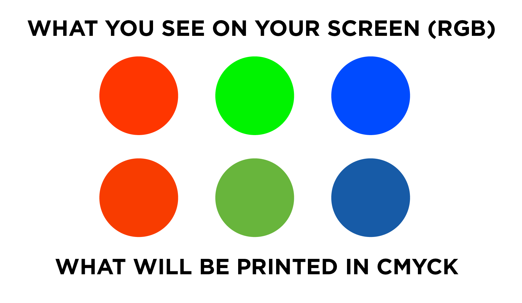
    Moreover, it is also essential for the digital printing services to know the difference since they are in charge of printing an order. A little mess up can incur high costs; therefore, digital printing services need to know what is best for digital marketing and other channels.

    For digital printing on pouches your file should be set to CMYK. CMYK stands for Cyan, Magenta, Yellow, Black. These are the ink colors that will be combined when printing your logos and graphics on the pouch. RGB which standards for Red, Green, Blue is applicable to on-screen display and is not used for printing. 

    RGB vs CMYK Model
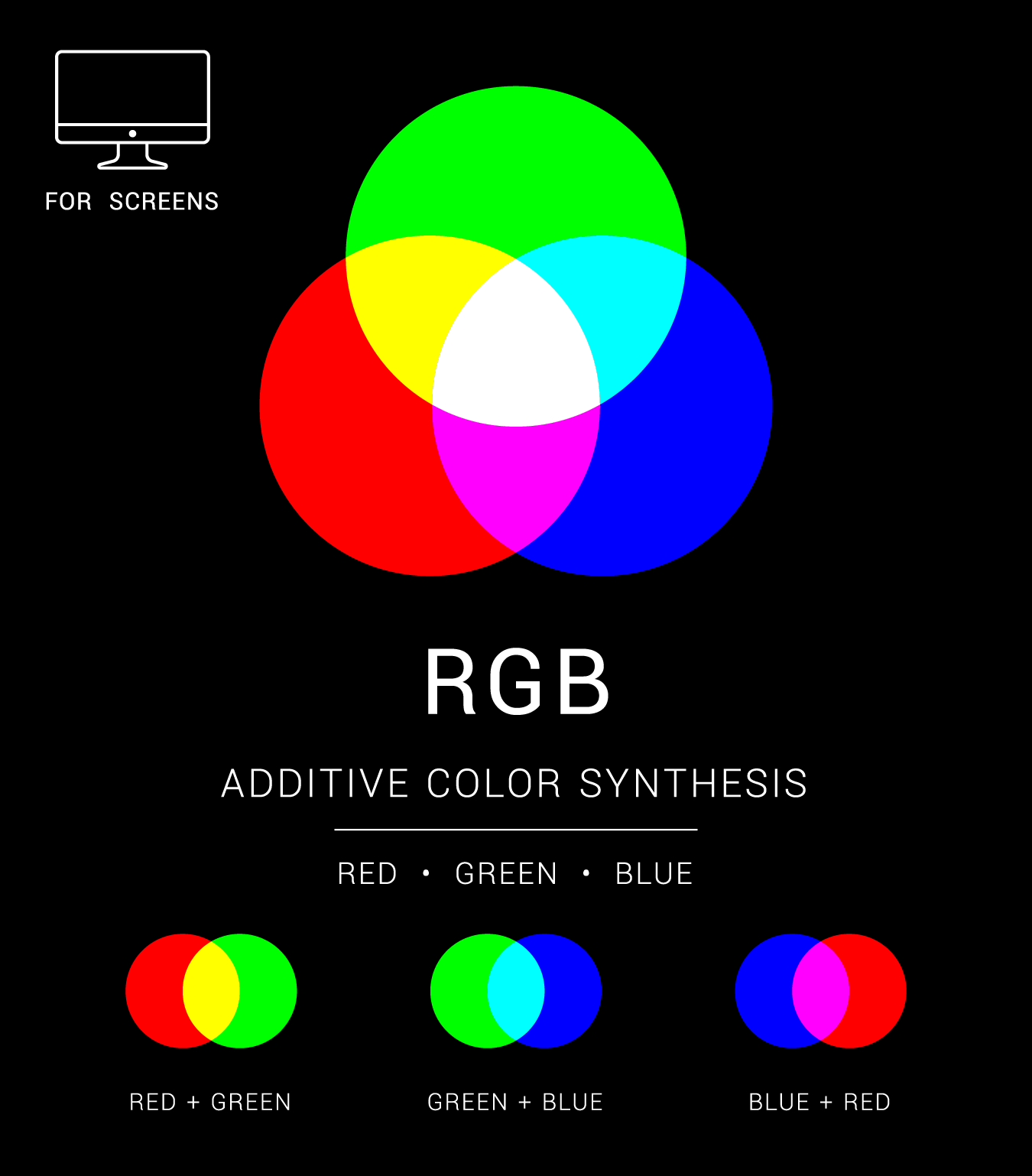
    RGB is an additive, whereas CMYK is a subtractive color model. RGB color model uses white as the sum of all primary colors and black as the darkness of light. Graphic designers and publishers use the RGB color model for any media that emits light. Because the mediums emit color as red, green, or blue light, RGB is perfect for digital media design.

    In the RGB color paradigm, pixels on a digital screen are all one of three hues when magnified: red, green, or blue. The white light projected by the screen combines the three colors on the eye’s retina to produce a wide variety of additional apparent colors. The rule is that the more color beams sent by the device, the closer the color goes to white.

    However, not producing any beams results in color darkness. This is the inverse of how CYMK operates. CMYK color model employs white as the original color of the print backdrop and black as a color ink combination.
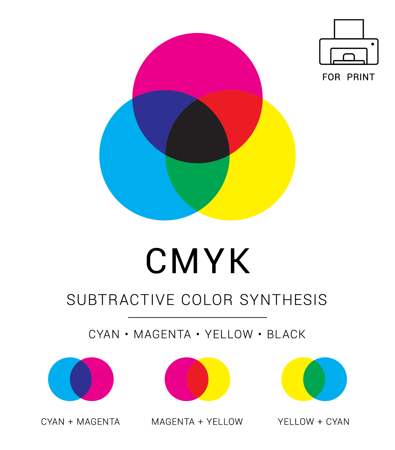
    CYMK is ideal for print marketing materials like logos and best for digital materials because it uses colored ink for printing. Using CMYK, colors are subtracted from the original white light and converted into pigments or dyes.

    Printers apply these pigments onto the paper in the form of tiny cyan, magenta, yellow, and black dots that can be spaced out or used closer together to create the required colors.

    The more colored ink applied on a paper with CYMK, the closer the color gets to black.

    However, as you subtract cyan, magenta, yellow, and black inks, you get the white or original hue of the paper or background. RGB color values vary from 0 to 255, while CMYK color values range from 0% to 100%.

    How to Convert an RGB File to CMYK

    You might have to change the color space of a document, and the change might require changing the colors.

    About Color Spaces

    A color space refers to applying a color model, either RGB or CMYK. RGB and CMYK have numerous color spaces, and each one of them has a unique gamut. Adobe RGB and sRGB are the two most common color formats. However, the screens commonly use standard RGB or sRGB and are appropriate for photos on the web as they are translated by most displays the audience uses.


    If you wish to learn more about color spaces, you need to know the differences between the two-color modes in even more detail.

    The Simple Answer: CMYK+W is for print RGB is for screens

  • Dieline Walk Through

    Dieline Walk Through

    In this video we walk you through a typical flexible barrier packaging dieline. Topics include: reading the dieline, understanding layers, and how to denote finishes, and clear or unprinted areas. Additionally, basic best practices are included. 

  • Flexible Packaging Design File Setup

    Flexible Packaging Design File Setup

    Flexible Packaging Design File Setup

    Setting up art files for flexible barrier packaging has it’s own little quirks and peculiarities that set it apart from other print setups. But never fear! The same basic techniques and knowledge base you have used for off-set or paper printing can be transferred to flexibles.  

    Types of Dielines

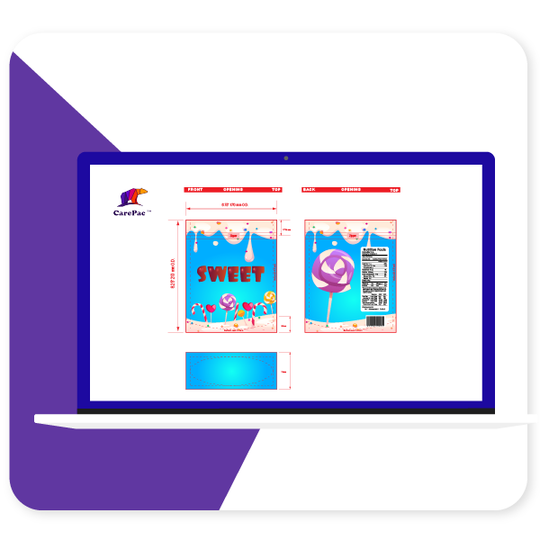
    There are two types of dielines you’ll see presented. A “multi-up” dieline or a as-print dieline. At Carepac we prefer using multi-up because it makes actual proofing easier, but many times you may work with a dieline that is as print. 

    As-Printed Layout

    Multi-Up Dieline

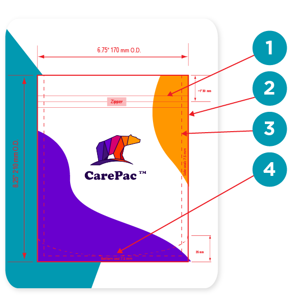
    Reading your dielines

    1. Zipper location

    Yes you can print over the zipper area. Sealing the zipper into the bag does create some wripples / mild distortion so we don’t recommend putting important mission critical items in the zipper area.

    2. Outer edge of bag

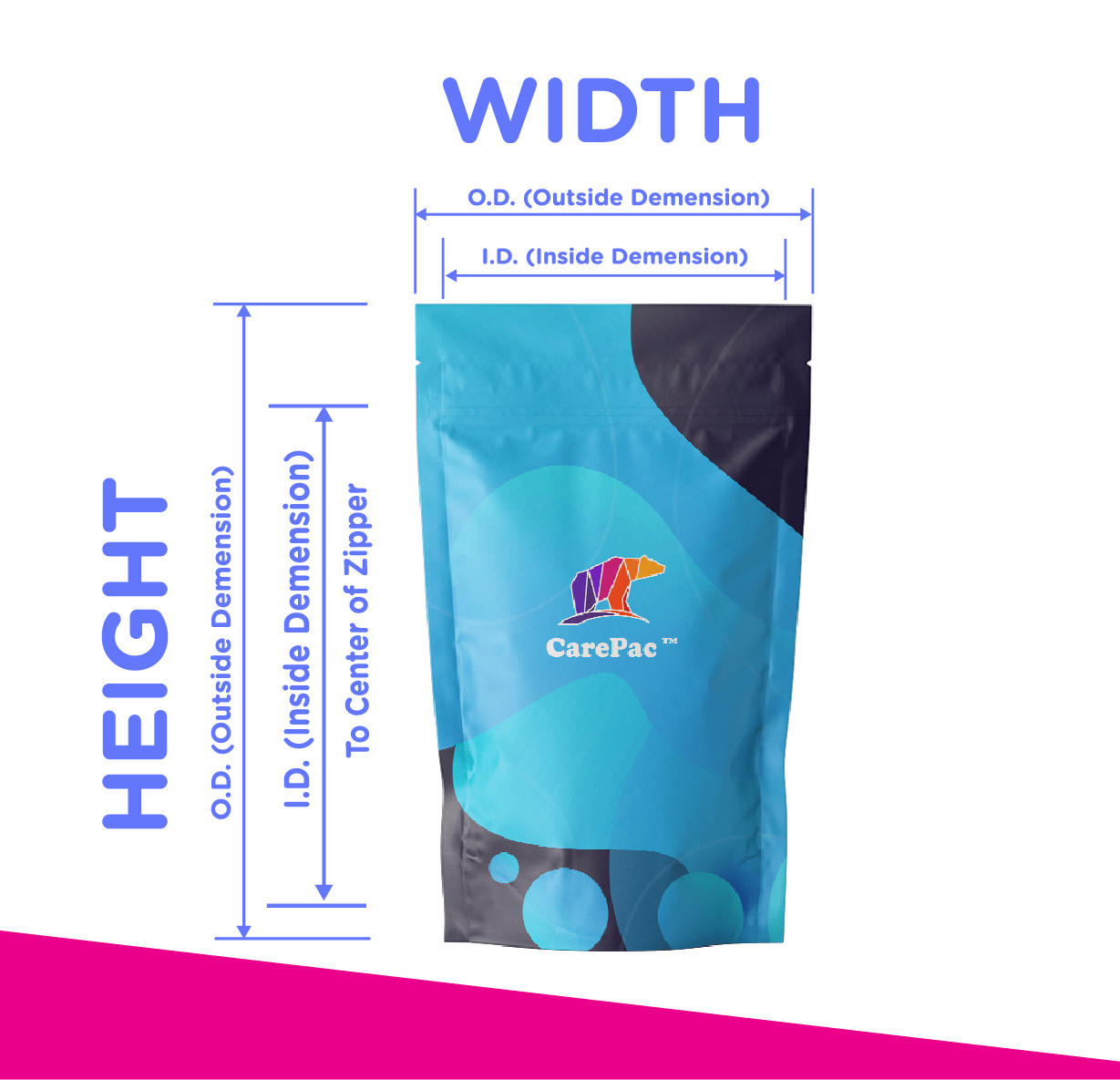
    On our dielines the edge is the edge, no additional bleed needed and nothing exists beyond this point. Over the years several customers have thought that the dimensions indicated are ID, inside diameter, which is false. All the dimensions are O.D. Outside diameter. 

    3. Seal Zone

    Seal zones are where the material of the front and back of the bag are sealed together. Seal zones are printable space, the only suggestion is to not put something like a barcode in the seal zone as, similar to zippers, seal zones can have a slight bit of distortion. 

    4. Gusset Zone

    Gusset zones are like seal zones never put a window area in a gusset, as this area will not look good if you put clear window over it. 

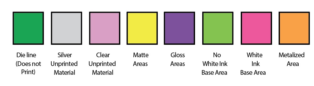
    Dieline Color Bars

    Dielines use various “off canvas” colors to denote physical elements of the bag. These colors should contrast with the artwork, so they are easy to identify. Tese are technically the dielines. Here are some examples of dieline colors, with their corresponding label. 

    Pouch designs will include alot of content which is not actually printed on the pouch. This content is there to convey various specifications. For example when designating areas of clear or unprinted area, merely making those areas transparent in the AI file is not a good practice, why? Because white and transparent can be confused, also your AI files are going to be converted to other file formats for printing (for example rip station files) and ensuring that the person making the conversion understands your intensions is key. 

    It’s important to designate various items such as: 

    • Clear unprinted areas
    • Metalized unprinted area
    • Matte, Gloss, and Spot UV finish areas. 
    • Areas of white ink base and areas without white ink base. 
    • Metalized printed areas (different than unprinted metalized areas)

    Using Art Boards vs Layers

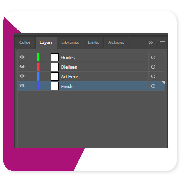
    The decision of using separate art boards or layers is up to you, but typically we suggest layers, even for “off-canvas” layout information such as white ink base areas. This is because you can overlay layers to ensure their locations correctly correspond to the printed areas. 

    Setting Up Your Layers

    There are some basic best practices to follow when setting up your layers. Firstly, do not mix the dieline and art layers, this can create errors, and just makes for messy files. Second, if you are designating finish locations for spot UV or matte varnish, use a separate layer for those purposes. 

    1. Separate Dielines from art

    2. All art on one layer

    3. Finish designation layer separate from art. 

    Outline all text

    It’s very common for designers to forget to outline their text. It is important to outline text to ensure that there are no versioning differences between different versions of a font file. If you’ve used a paid font, then we won’t have that font, and if you’ve downloaded a free font from DaFont, Fontspace, fontsquirrel, or any of the numerous font sites, they all will have slightly different versions of the file than what we might have. 

    Define Color Swatches

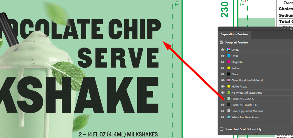
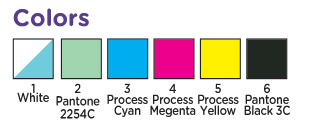
    Messy Color swatches, or failing to setup any swatches is something we see almost daily. Adobe’s built in color swatches allows for color separation and is especially helpful when working with spot ink colors, such as Pantone colors. In the picture below the designer has correctly separated and assigned PMS colors to the art work. Spot ink colors are colors created through the combination of specific ink colors instead of CMYK. Spot colors can be more consistent across print runs, and allow for color matching to pantone ink swatch decks. 

    Pantone Colors

    While talking about Spot colors we should probably address the whole Pantone v. Adobe issues.

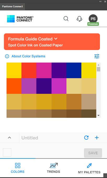
    Pantone and Adobe have been in a bit of a tussle and pantone colors libraries are no longer a free part of adobe illustrator. This has created some issues as the pantone libraries that are freely available are now out of date. There are a few work arounds that we’ll tell you about. 

    The first is of course the official Pantone Plugin. Pantone has released Pantone Connect which is a paid service, part of which is the pantone connect plugin. If you have the Pantone connect plugin then you have access to all the current Pantone colors (as of writing this Pantone Connect is $59/year).

    There are a couple of ways to handle things if you don’t pay for the plugin. First lets talk about something most people don’t understand, screen color is not the same as color on paper (or plastic). Here’s the secret, it doesn’t matter if you have the plugin or not, as long as you have the physical pantone book. 

    You can use whatever color you want to designate your spot. 

    Yes you heard me right, whether you have the plugin or not, it’s really irrelevant for our purposes because, screen colors are not very accurate to being with. As long as you designate the color number correctly in your color section (and assign it a swatch in the Color swatches), then we’ll know what you’re talking about. Since for Pantones to have any real value you should be referencing the printed color decks anyways.  

    Don’t Forget Your Links!

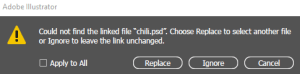
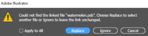
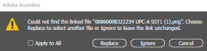
    One of the most common issues we run into when setting up customer’s art is the missing link. It’s easy to forget those pesky linked files, but without them we can’t take your files to press. So Lets remember to embed the linked files or include the links folder in your export. 

  • Outlining Text

    Outlining Text

    How To Outline Text

    What does it mean to outline text? Outlining text converts text in your file from editable text elements to press ready vectorized un-editable shapes. In essence it changes the text to shapes like the rest of your design.

    Why is outlined text important? Outlining text is important because it ensures your text prints correctly. 

    • Text can be scaled to print at any size without quality loss
    • The text will be clear and more crisp to read
    • The text will not change when moved between computers with different font file version. 

    Important: Save a backup copy with editable text incase you need to make adjustments. 

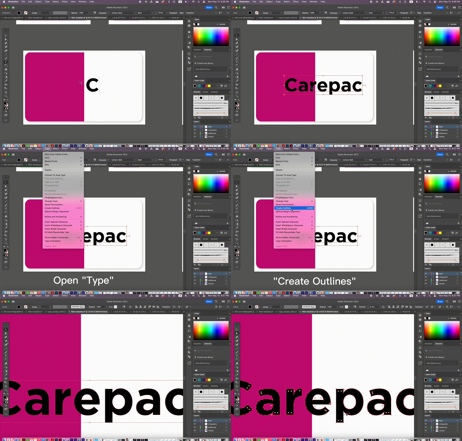
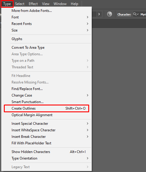
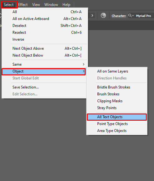
    How to Outline Text: For each AI file, please perform the following tasks. 1. Select -> Object-> All Text Objects2. Type -> Create Outlines3. Save AI file and send back.

    Step 1

    Step 2


  • Coffee Packaging Trends

    Coffee Packaging Trends

    Coffee Packaging Trends

    Coffee Bags

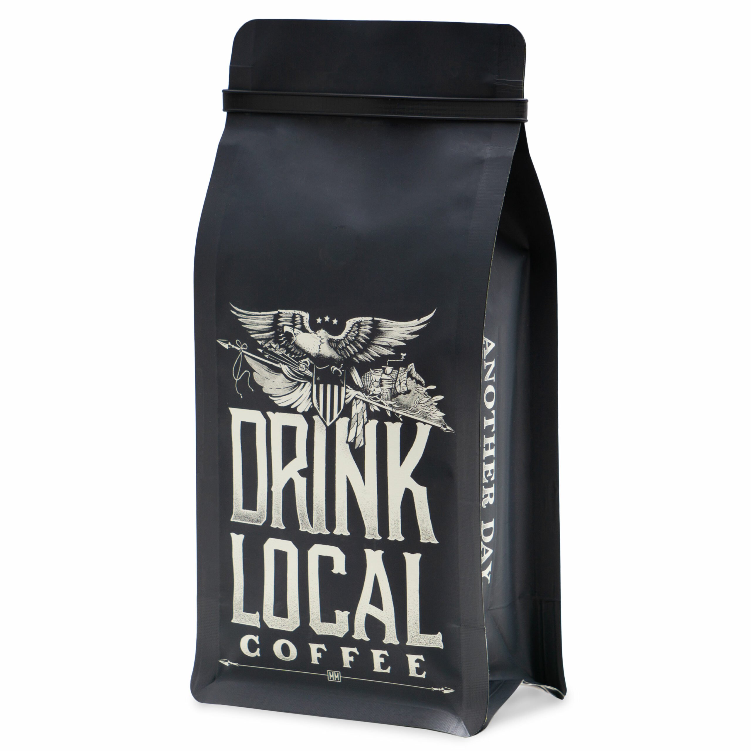
    In the recent past, coffee bags has garnered significant interest from both roasters and consumers. This comes in the wake of concerns over the environmental impact of packaging and research is being conducted in order to provide solutions to this matter. Besides, there is an influx of innovative technology and design options now available to the different coffee roasting companies. These provide new ways to differentiate and stand out from competitors in the coffee niche market.

    Here are some Insights on Coffee Packaging Trends:

    Compostable and Sustainable

    Coffee packaging accounts for close to 3% of the total carbon footprint from the industry. This is particularly concerning for the environmentally savvy consumer and roaster. Therefore, through research and technology, the coffee industry is adopting eco-friendlier packaging seeking sustainability. Besides, these types of packaging are now the focus of more government regulations, all of which are focused on a cleaner environment.

    Note that most consumers are more receptive to branding that leans towards environmentally friendly products.

    Due to adopting sustainable packaging solutions, there are reports of a significant and growing eco-friendly market segment. Specifically, environmentally savvy companies are seeking for solutions that are renewable, compostable, and biodegradable.

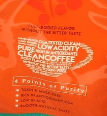
    Listing Coffee Health Benefits on Labels

    The humble coffee bean has a myriad of benefits. These benefits are exciting news for the consumer who care about the healthy aspects of the products he adds to the cart.

    As such, labels that includes the health benefits of the products are one the trends that is rapidly growing. This appeals to the average consumer who would be inspecting the coffee packaging before their purchase. Altogether, this aims to hook the consumer who is changing their shopping habits to include foods or beverages that naturally improve their healthiness.

    Unique Custom Design

    Packaging stands to be the biggest differentiator between the several roasting companies that supply the coffee market. As such, one of the most popular trends is to go for designed coffee packaging that gives the brand a unique look.

    For the packages, reusable printing plates are chosen due to high-quality finish. Further, digital printing has made it possible for a coffee roaster to produce in small batches without compromising on the quality. Finally, roasting companies are adopting more diverse color palettes, all of which are big attention-grabbers when the coffee reaches the shelf.

    Notably, while custom-printing your coffee packages is a significant differentiator, it can be burdensome and costly, especially for single retailers or companies with minor market command. Still, it remains your best shot at capturing the attention of the average consumer and keeping them returning for your coffee. But just make sure that if you do decide to go the route of designing your own packaging, that you do so correctly and avoid these costly mistakes

    Earthy Neutral Tones in Line with Natural Healthy Option Brand

    For businesses keen on being an all-natural brand, the tendency has been to adopt earthy or neutral tones in their packaging. Using said color pallet appeals to the conscientious consumer who prioritizes sustainability and the environment.

    Specifically, packaging that has varied colors of soil, natural minerals, or the ground. When combined with different hues of brown, the whole package has a harmonious scheme that makes the packaging stand out.

    You could consider a brown-tinted earth color for your coffee brand, which should provide an extremely calming and grounding feel as the consumer peruses through the coffee aisle. You can include different hues of mahogany or leather for a luxurious finish. Overall, choosing a color that evocates the natural world usually sells the brand as eco-friendly and sustainable.

    Materials that Meet Barrier and Marketing Needs

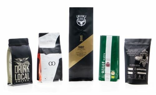
    The visual look of the packaging is one aspect, but another is the choice of the base material that the ink is laid on.  Packaging materials need to provide barrier, but also need to convey the same brand ethos as the art designs. Square bottom style configuration is more popular when you say coffee bags.

    Coffee roasting companies have to consistently tweak their choice of packaging material to meet and respond to the new opportunities in the market. 

    As such, these roasters have their eyes peeled for what the latest innovations are when designing the perfect coffee bag. They have to continuously test out various packaging materials to see which ones have shorter printing timelines, are seasonally fitting, and fit their budget.

    Gloss packaging is preferred as it is an excellent medium for highlighting logos, words, and images on the packages. Besides, shiny packages ought to attract buyers to the brand. The downside of this packaging material is that it is not very natural-looking and might put off the environmentally-conscious consumer.

    Matte packaging is the tendency for those who want a modern-looking pouch that stands out on the shelves. Besides, it makes it easier for the consumer to read off it than a gloss finish. Altogether, it is an excellent option for brands that want all-natural-looking articles.

    Finally, a that is catching on is Soft Touch packaging. This gives a luxurious finish that should attract the high-end consumer. While it looks like matte packaging, the packaging is relatively more expensive and has a different feel to it.

    Flexible Barrier to Keep the Coffee Fresher for Longer

    Granted, coffee does not actually go bad as it is a dry food and therefore does not have a firm expiration date. Still, you want to store your coffee in a manner that ensures that it remains shelf-stable for longer.

    The barrier film for flexible packaging is one of the newest trends that is proving to be a flex for the future. Its technology not only provide a good design that persuades the customer, but it is functional as it pertains to maintaining the quality of the coffee therein.

    There is an increased inclination towards the CareClear clear plastic bags for coffee packaging. This material is not only affordable but protects your dry coffee beans against moisture and oxygen. Another tendency is the addition of EVOH, PVDC, and ALOX in the packaging material to enhance the capabilities of the base material.

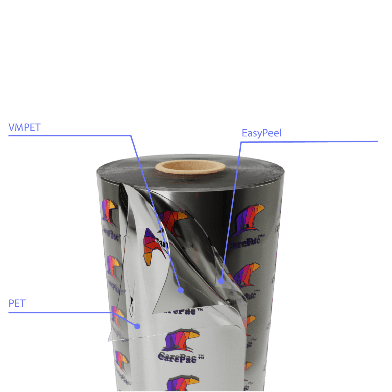
    Gaining more space among the trends is the use of CareSilver metalized PET pouches as the packaging material. These are economical, effective, and free of toxins, including BPA, TSE, Sulphur, and Phosphates, making them a healthy, effective packaging option. Besides, this material gives the packaging a reflective surface that should attract potential customers.

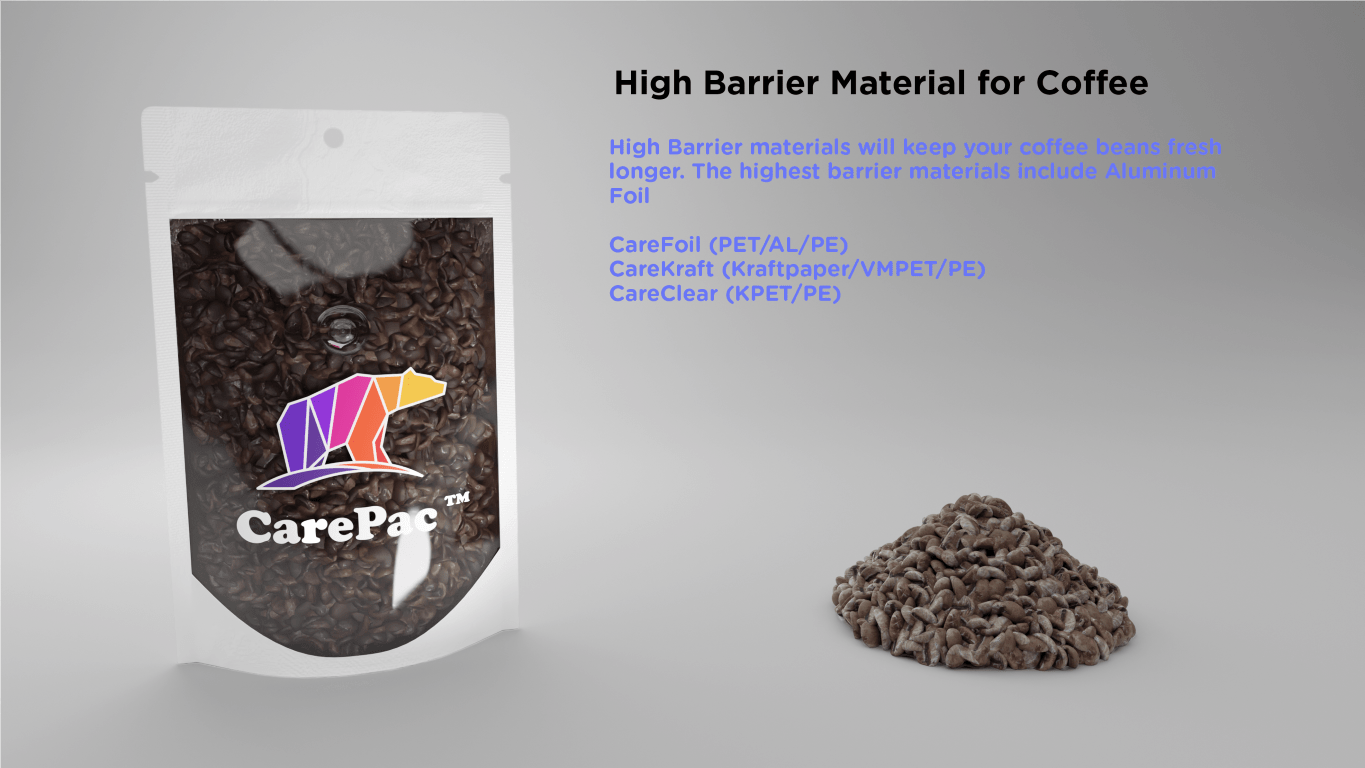
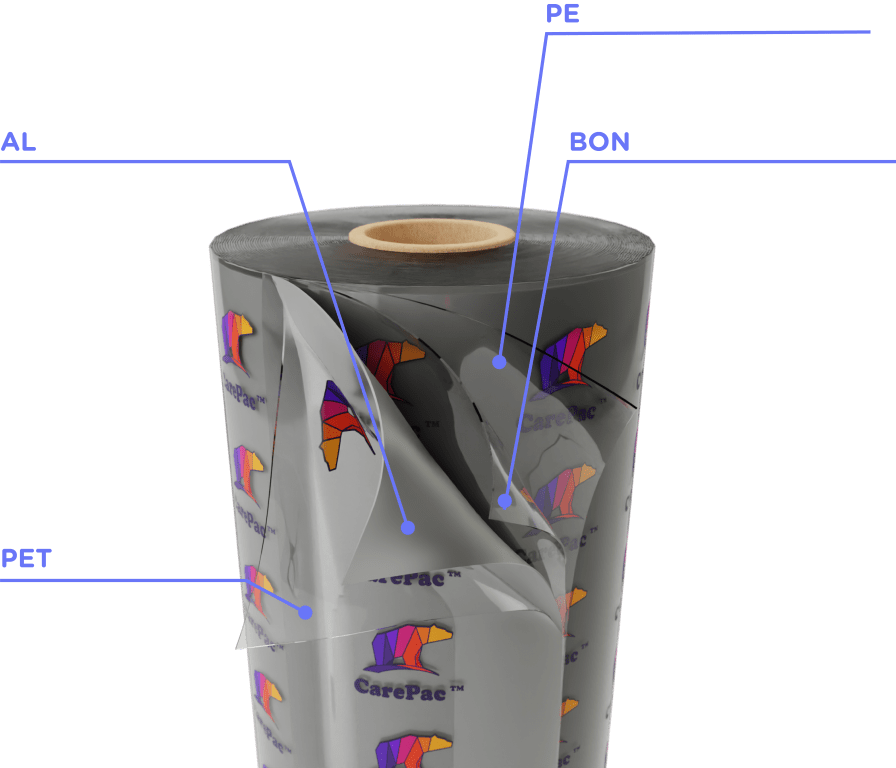
    The highest barrier for your coffee will be found by incorporating Aluminum foil. CareFoil PET/AL/PE offers significant barrier to oxygen and water. This capability can be strengthened using Mylar which makes it an even more effective packaging medium, being the best choice for long shipping periods.

    Finally, for coffee roasting companies who want their packages to have a paper exterior look, the CareKraft packaging solutions make the perfect fit.

    As a roaster, you may want to consider these insights about the emerging patterns and coffee packaging trends. Fortunately, there is an increased emergence of innovative designs that should help a brand differentiate itself from the rest of the herd, through technology, sustainability and unique marketing. This is particularly beneficial for companies that want to take advantage of the skyrocketing online orders. If you want to enjoy packaging that requires low minimum orders and has a 5% price match guarantee, reach out for an instant quote and order samples today.

  • What to Look For in a Coffee Bag

    What to Look For in a Coffee Bag

    What to Look For in

    a Coffee Bag?

    Coffee Bags

        Coffee roasters will tell you that maintaining the freshness of their coffee beans is essential. As a specialty coffee manufacturer, you want coffee packaging that keeps your beans smelling and tasting as fresh as the day you first roasted them. Fancy-looking packaging will only get you so far. High-quality coffee packaging has two jobs. One is to make sure your specialty coffee beans retain all the freshness and flavor you work so hard to create during the roasting process. The other is to make your brand recognizable, so customers keep coming back for more. You can even make the argument that your packaging is almost as important as roasting the beans. 

         It’s important to know what to consider in a coffee bag, and you want to work with a company that asks the right questions. How do you fill your bags? What is the scale of your business? What type of audience do you serve? Do you sell to companies or end-users? Here are some tips to consider when you trying to find the best kind of coffee bags for your business.

    The Perfect Pouch for Coffee Packaging

    A good pouch or bag for your roasted coffee beans has several benefits over the traditional coffee can. Bags and pouches are lightweight and pack well into shipping containers and other equipment, yet they also stand upright on a retail shelf. CarePac features several different style bags to choose from.

    Side Gusseted Pouch

    Side Gusseted Coffee Bag

    This machine made side gusset pouch is a stylish design that holds its shape well while supporting more weight than most types of coffee bags. Works well with supporting features such as an EZ-Pull closure, making the bag easy to open and close for future use. A convenience factor that customers love!

    Quad Seal Coffee Bag

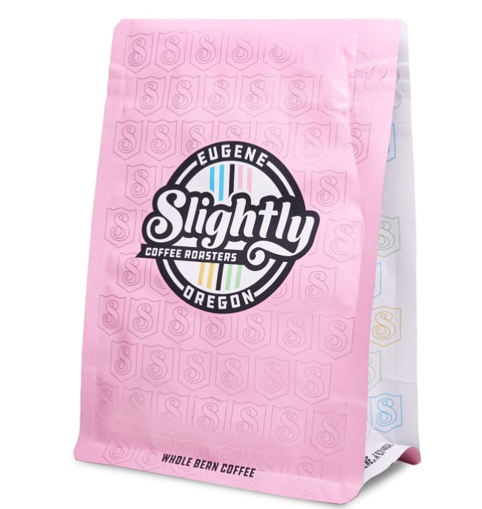
    Another gusseted pouch, but this time all four corners include a nice and tight seal. This offers a clean, square look that is very popular in coffee packaging as it gives you extra room for design and branding. Pair a quad seal bag with a recloseable zipper, and you have a real winner.

    8-Seal Square Bottom Coffee Bag

    Another gusseted pouch, but this time all four corners are sealed nice and tight. This offers a clean, square look that is very popular in coffee packaging as it gives you extra room for design and branding. If you’re a specialty coffee brand, this is a style you’ll want to look into. Pair a quad seal bag with a recloseable zipper, and you have a real winner.

    Stand Up Pouches

    Stand Up Pouches Highly economical, stand-up pouches are considered more of a “new school” design and offer several benefits over other types of bags. It stands up nicely on a shelf and displays clean lines while presenting a familiar shape to consumers. It also allows for the use of an insert zipper, which is excellent for the customer to ensure freshness and means it’s easier for the manufacturer to fill.

    Flexible Barrier Packaging Keeps Coffee Fresh, Like It Should Be

         Whether you specialize in ground coffee or freshly roasted beans, your customer wants it fresh and flavorful, regardless of the roasting notes. Specialty coffee beans are highly susceptible to oxygen, UV, and other environmental factors making airtight packaging essential to the integrity of your beans. Flexible packaging also requires a barrier. You can usually choose between a genuine aluminum barrier or go with a more environmentally friendly high-barrier polyester.

         Aluminum has been used for a long time to keep foods fresh. Our CareFoil line of flexible barrier packaging materials is top-notch. We offer several variations, but all of them provide the ultimate barrier protection of aluminum with the added strength of Mylar. It’s an excellent barrier to both oxygen and moisture. Suppose your audience prefers a more natural look. In that case, our CareKraft barrier materials provide superior barrier protection in a kraft paper exterior look and feel. CareKraft nags are made with encapsulated foil, or high-strength nylon reinforced laminated coating.

          You also want to make sure your product is protected from UV light. UV light can sap the potency right out of your beans, leaving them pale and not tasting that great. Choose an opaque bag that effectively blocks your product from all UV rays. As you can see, there are many choices here and a lot to think about. But don’t worry, you don’t have to know what’s best for your particular product. Our packaging specialists will help you choose the perfect films for what you need.

    Include a Degassing Valve

    After coffee beans are roasted, they continue to emit gases for quite a while. Suppose you package your beans before all the gasses have dissipated. In that case, the gas will be trapped inside the package, causing it to look misshapen and bloated. Not only is this unsightly, but it can also cause the bag to burst open during transport. Adding a degassing valve to your coffee bag takes care of this problem.

    A degassing valve is a one-way valve that allows gas to escape from the bag while not allowing any gas in. It maximizes the freshness of your coffee by allowing unwanted gas to escape while keeping oxygen from entering into the bag’s environment. Oxygen degrades coffee beans, turning them stale and significantly affecting the flavor. Adding a degassing valve not only locks in the taste of your beans, it greatly adds to the shelf-life of your product.

          Also, consider that using a degassing valve can increase your productivity and efficiency. Instead of waiting for your freshly roasted beans to finish emitting gases, you can now package them right away. Any natural gases produced during roasting will escape via the one-way valve.

    Closures & Seals

    Normal Zipper

    NORMAL ZIPPER

    Pull Tab Zipper

    PULL TAB ZIPPER

    TIN – TIE

         Anyone serious about keeping their coffee tasting great knows that you don’t keep your beans in the refrigerator or freezer. What you want is to provide packaging that allows your customers to reuse the original pouch the coffee came in. We already know that coffee should be kept in an airtight bag. But as soon as someone opens the package, it’s no longer airtight! That’s where a reclosable zipper or a tin-tie comes in. You want your customer to take out the amount of coffee they need and then close the bag up tight to keep it fresh.
          Plus, if you have invested in artwork and branding on your packaging, the last thing you want is for your customer to remove the beans and put them in a different container. You want your customer to think of your company each time they make a cup of joe. Adding a reclosable feature is almost a necessity to work toward increased brand loyalty.
    Design a Custom Look for your Coffee Bag

    Coffee Bags

         Since we’re talking about customer loyalty, marketing, and branding, it’s important to remember that grocery stores continually reconfigure their shelving. If your product winds up below or above eye level, you could lose your competitive edge at any time. Small coffee roasters have become more numerous in recent years, which means less shelf space for everyone. Another challenge is that coffee buyers are more concerned with how much a bag of coffee costs as opposed to how much coffee is inside. 

    Your 16oz bag of specialty coffee looks more expensive than that 12oz bag, even if your brand is less money per ounce. Your customer is more apt to grab the cheaper bag even though it’s costing them more money. We know how to configure your coffee packaging to make it perfect for your product. We’ll look at the size of your bag, how your branding is printed, and where it might be sitting on the shelf, so you get the most bang for your buck.

    Do Right By Your Coffee Shop or Coffee Business

         Choosing the right specialty coffee bag means protecting your coffee from air, moisture, light, and heat, which helps to ensure that it is always tasting great. It means knowing the right questions to ask so your packaging comes out just the way you want it. We specialize in working with small-to-medium-size coffee businesses to get them noticed. If you run a coffee shop and want to learn how to create your own coffee business with our packaging, contact us. We can’t wait to work with you!

  • Trends and Opportunities In the Candy Packaging Market

    Trends and Opportunities In the Candy Packaging Market

    Trends and Opportunities In the

    Candy Packaging Market

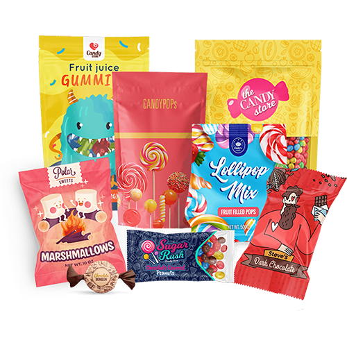
    Like any other retail business, the candy market is increasingly becoming competitive and advanced in line with consumers’ tastes and preferences. However, one that’s setting brands apart is the designs and qualities of their packaging.


    From high infographics, bright colors, impressive designs to imageries, packaging is continuously proving to be a game-changer in the candy market. Here are some trends and opportunities that’ll give you insights into moving with the candy packaging market and, most importantly, stand out on the busy shelves to get the sale done!


    1. Sustainable and Compostable Materials 


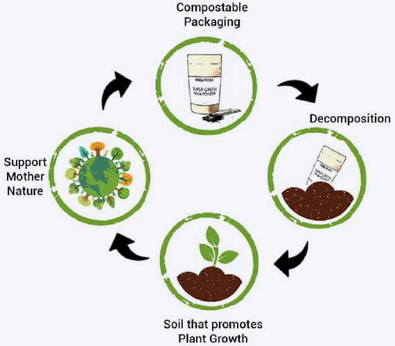
    Eco-friendly or sustainable packaging is increasingly becoming a requirement by the authorities and a consumers’ preference. That explains why sustainable and compostable materials are being embraced in packaging candy and food products in general. For sure, this trend will continue to grow over time as more and more people continue to liken the ‘going green initiative’ in the wake of environmental conservation. And when it comes to compostable and eco-friendly packaging, Carepac is leading the way.


    So, How Do We Excel in Compostable Packaging?


    Carepac has the most recent FCN approved compostable packaging solutions that seamlessly compost under ambient conditions and are also made of renewable materials. We are always partnering with filmmakers and laminators to offer brands the newest and latest innovations in compostable barriers made of biodegradable plastics such as sugarcane corn and cassava.


    Moreover, our bags are fused with enhanced barriers and multiple thickness options to preserve your candy for longer periods. Furthermore, we make sure that the most common pouch configurations such as 3 side seal, tamper-evident, stand up pouches, tubing, and square bottom pouch are strongly compatible with compostable materials.


    Check out some of the compostable packaging materials we provide:


    CareCompost KP Qualities

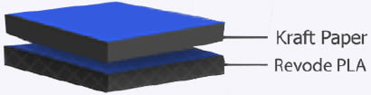
    CareCompost KP is a kraft paper and PLA based compostable material that offers a great cost point.

    1. Exceptional price points and order sizes
    2. Multiple thickness layers
    3. Compatible with most pouch configurations with printable options


    CareCompost NPT Qualities

    This compostable material can be used to make pouches or bags which are totally see through, just like normal plastics. Its pros include;

    1. Moisture barrier
    2. Heat sealable
    3. Transparent to the eyes
    4. Anaerobic digestible
    5. Resistant to oil and grease, and are also made from renewable resources


    CareCompost NKMEPS     


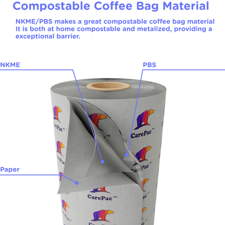
    This is a top of the line compostable lamination structure. Consisting of a NatureFlex bioplastic exterior with a metalized ambient compostable lining. This material provides both a great barrier and a traditional pouch look, along with full plate printing ability. This Material readily decomposes and biodegrades into biomass, water, and CO2. Some pros include;

    1. Requires no specialized composting facilities
    2. Food Contact Approved (FCA/D)
    3. Higher barrier than most compostable materials. 
    4. BioPBS is used as a sealant layer. 


    2. Fold Over Gussets 


    Another trend that is moving the candy market when it comes to packaging is the fold over gussets. This pouch configuration has been popular in the dried goods industry and is now making waves in candy packaging. Here are some of the features that are making candy brands consider it;

    • They are easy to fill and retain some shape in the gusset. 
    • Easily adjustable thus, you can increase the volume of the bag without increasing the overall length and width of the package
    • It is less wasteful and more cost-effective as compared to the traditional cardboard packaging
    • Due to its flexibility, it enhances storage space both at the manufacturer’s facility and on the shelves
    • Its strong and durable high-barrier films allow for a longer shelf life of the candy, and consequently, decreases product recalls
    • Again, its strong materials enable ease of package transportation both to the retailers’ stores and once a buyer has made a purchase  


    3. Haptic Coatings (Soft Touch) 


    Another candy packaging opportunity you need to consider is the haptic coating packaging –soft touch and amiable packaging. It is appealing and attractive to customers, particularly in foodstuff packaging. Hence, it can be a marketing gem.


    And as a matter of fact, California Polytechnic State University research revealed that customers preferred soft touch coating vs. traditional coating and were willing to pay a 5% price premium on cosmetics. Studies have also shown that consumers are more likely to purchase a product if it engages their sense of touch.


    Yet again, soft touch packaging can make the consumer feel as though the product is of high-end quality. And still, due to its comfortable and luxurious feel, it is perfectly suitable for high-grade and premium candies.


    4. Pull Tab Zippers Instead of Standard Zippers


    And when it comes to packaging features, the traditional standard zippers are fading away in favor of pull tab zippers. This is as a result of the so many advantages they have when it comes to loading, including;

    • The entire top of the bag opens for loading; hence the producer or fillers never have to interfere/mess up with the zipper
    • These pull-tab zippers are built on one face of the bag (usually the front) hence allowing the top part of the bag to be completely clear and opened for loading
    • They can be great for roll stock pouches mainly because they’re built on one face of the bag
    • Less time and effort is required when opening the bag as compared to a bottom loading 3-seal, and again it ensures that the bag is full sealed at the end of loading
    • It is most suitable for high-speed filling environments like in auto/machine filling processes


    Furthermore, pull-tab zippers allow customers to easily scoop out, tip or snack from right in the package, thus user-friendly.


    Wrap Up  


    The next time you’re in the market for candy packaging, consider these trends and opportunities, and you’ll surely be ahead of the competition. And even if not ahead, then you’ll be keeping pace with the market and consequently your competitors.


    So, if you need any of these trends and opportunities, such as compostable/eco-friendly candy packaging, look no further than here. Carepac can help you choose the best candy packaging that’ll make you stand out on the competitive shelves. You can reach out to usfor a free consultation if you need to learn more.