Category: Food Industry Packaging

  • SQF and ISO 9001: What You Need to Know 

    SQF and ISO 9001: What You Need to Know 

    SQF and ISO 9001: What You Need to Know

    What is ISO 9001?

    Like ISO 9000, 9002, and other certification standards, 9001 is a quality management system/standard that can be applied to many different industries.

    The regulations focus on recognizing companies that maintain the highest possible standards, including, but not limited to, customer satisfaction, continuous improvement of their processes, a desire to improve quality, an excellent training process, and a commitment to risk management.Compliance with these regulatory requirements shows a company’s strong commitment to constantly improving its quality management systems for its customers.

    What is Safe Quality Food (SQF certification) for food safety?

    SQF certification primarily focuses on food safety management systems. This quality management standard focuses on the food and beverage industry, and its main purpose is to ensure food safety and quality.

    The SQF program is also referred to as “safe quality food SQF”, and SQF looks at a foodservice providers product quality, the efficacy and safety of their food supply chain, and the internal systems of food manufacturing companies within the food industry.

    The current scope of the “safe quality food SQF” standard, which is approved by the Global Food Safety Initiative GFSI, includes various aspects of the safety of food products, including:

    • Food hazard analysis
    • Food safety plans
    • Compliance with regulations ensuring food safety

    The Safe Quality Food SQF certification, specifically, is typically issued by an organization or regulation body that specializes in the SQF program and the Food Safety Initiative GFSI. If you want to show your organization’s commitment to food safety and quality, you cannot go wrong with SQF certification.

    Which is the better food safety standard?

    Simply put, Safe Quality Food SQF is the only standard of the two that focuses solely on food manufacturing and a supplier’s food safety.

    This quality management standard is extremely helpful for food companies or primary producers of a product for the food industry supply chain. As mentioned, Safe Quality Food is regulated by the Global Food Safety Initiative, a company committed to food safety and quality. If your company operates in the food industry, this is a quality certification to go after.

    ISO and SQF program FAQs

    Here are some common questions food companies tend to have about ISO and SQF certification and the certification process.

    What does ISO mean in OSHA?

    ISO stands for the “International Organization for Standardization,” and its standards are crucial in promoting product quality, safety, and satisfaction of customers across a variety of industries.

    Is CarePac ISO certified?

    Yes, we currently have our 9001 certification. We went through the entire certification process and are proud that our management system and internal protocols resulted in certification.If working with a packaging supplier with ISO certification is important to you, you can trust our quality systems. Contact us today to discuss your next project.

    What ISO is SQF?

    SQF is an international standard that focuses specifically on food safety and quality. The process includes the SQF institute looking at companies that supply various elements of our food chain and ensuring they meet the outlined standards.

  • Food Packaging Design

    Food Packaging Design

    CarePac’s Guide

    to Food Packaging Design – Designing Food Packaging

    The phrase “don’t judge a book by its cover” doesn’t apply in the world of flexible food packaging. Technology has made it easier than ever to capitalize on your new idea and build a brand, but just because the product is great, doesn’t mean that your packaging design is.

    New innovations in flexible packaging and pouches allow for even more opportunities to establish a unique brand identity with your packaging design. If you’re just “enclosing” your product, you’re missing a crucial opportunity to tell your brand’s story and build a lasting visual identity with a unique food packaging design.

    So what is the first interaction you want to have with your customer? How will you differentiate your packaging and grab consumer’s attention in a crowded market, and communicate the value of your product at first glance? If you don’t know the first thing about design or packaging, don’t worry, we’ve got you covered. 

    In this blog, you’ll learn how to increase sales, encourage repeat purchases, attract attention, and create a strong brand identity through your product packaging design. 

    #1. Food Packaging Design & Brand Strategy

    The most iconic brands in the world leave an imprint on you. 

    And the product is only one piece in a larger brand strategy puzzle.
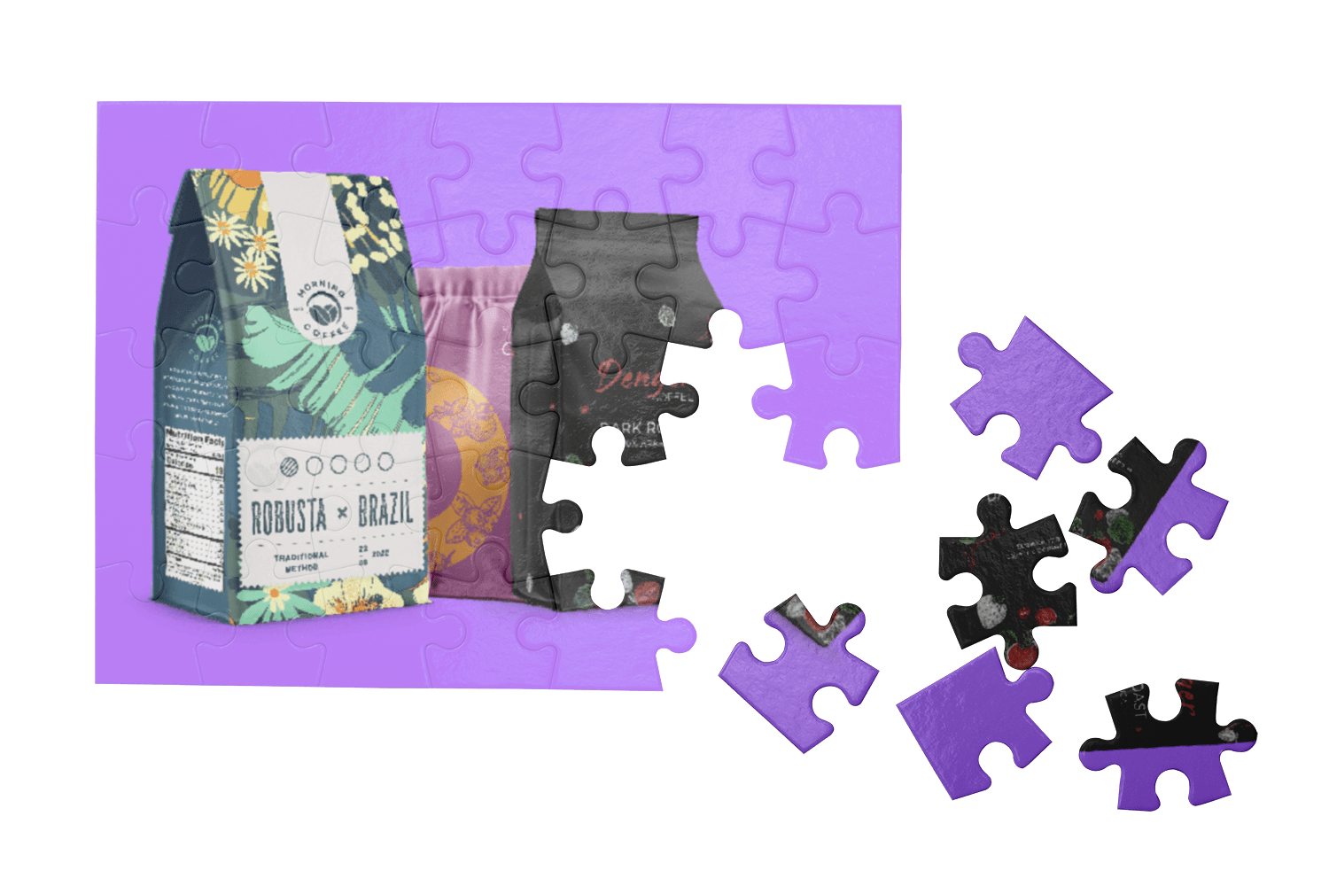
    To give your brand the foundation and momentum it needs to become iconic and build brand loyalty, every aspect of your branding (including the packaging design process) needs to be carefully considered.How is the experience of your product different from other brands? What are the stories, emotions, and narratives that you want your customer to connect with?It doesn’t matter if sustainability, luxury, or affordability, is your primary identity, the same rules of cohesive branding and product packaging still apply in a consumer’s mind. 

    A brand promoting local tribal artisans, for example, might incorporate indigenous art into its designs or packaging. A brand that focuses on organic produce may want to tell potential customers or their target market about how they source their food products. 
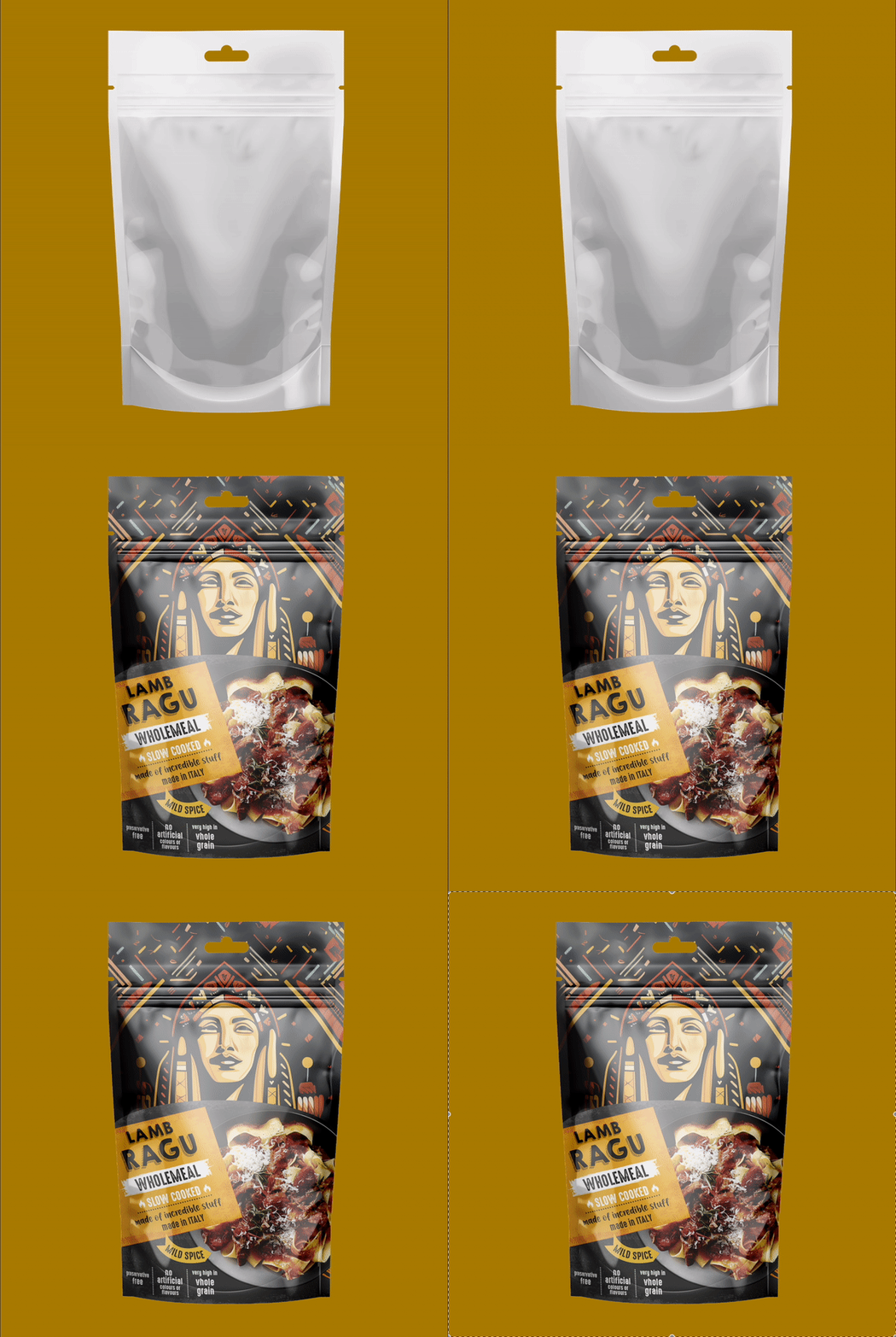
    A luxury brand will have a more sophisticated and exclusive brand voice. They may want to talk about their different flavors, safety concerns, their use of natural ingredients, environmentally friendly packaging, or anything else their ideal customer may be concerned with. 
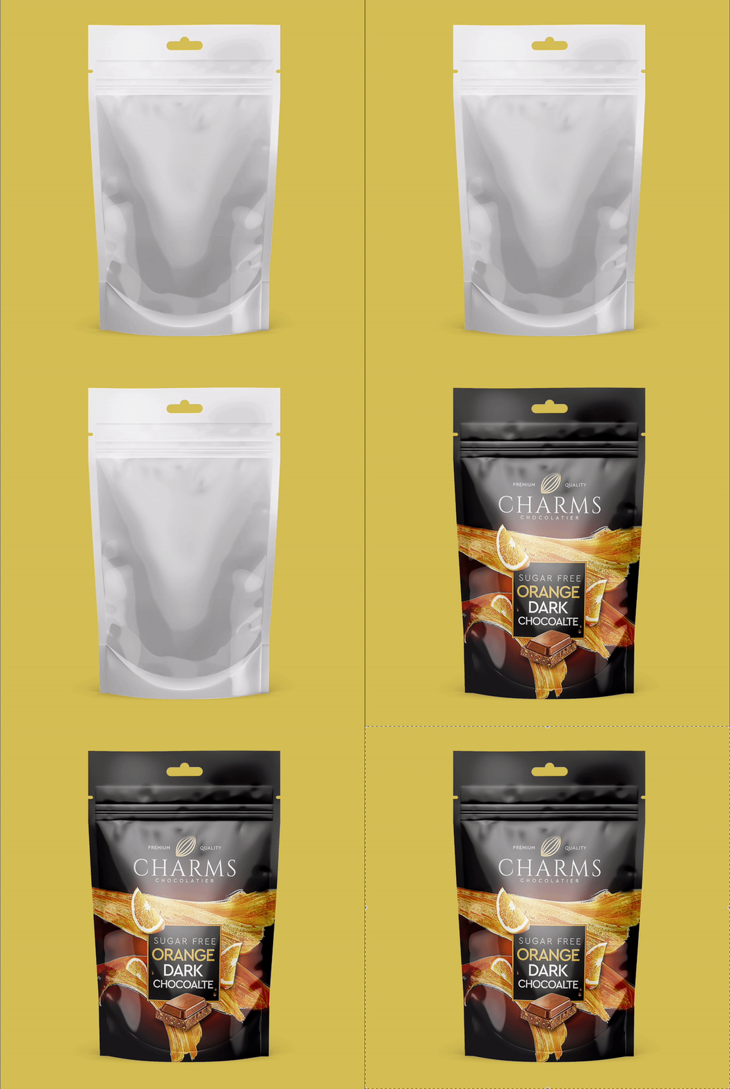
    But brand strategy goes beyond visually appealing packaging and a focus on sustainable materials; think about that first experience your customer has with your product. What emotions do you want them to feel? What type of materials and details can you add for a truly unique brand experience in the grocery store?

    #2. Finding The Target Audience of Your Product

    If you try to sell to everyone, you sell to no one.In order for your brand to be successful, it needs to speak to a specific customer avatar.Is your product for kids or teens? Men, women, or both? Now go deeper. The more layers you can pull back, the easier it will be to market and sell your product. Does your product packaging need to be aesthetically pleasing and forward thinking, or should the label design use bold colors in its unique design? 

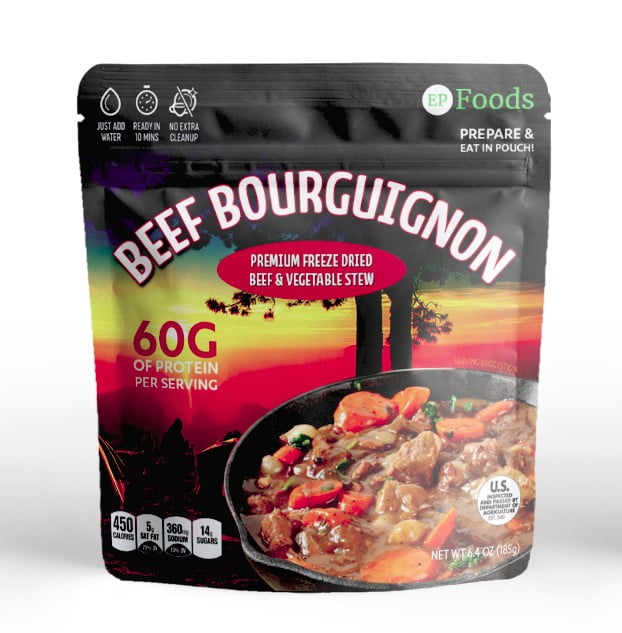
    Let’s look at a quick example.Are you selling beef jerky to younger men who live an rural lifestyle?Or are you selling beef jerky to 22-35 year old men who spend a majority of their time developing self-sufficiency skills and exploring the outdoors with their dog?See the difference? Your brand’s identity should be specific. Otherwise, your talented designers won’t know which key element to incorporate into their great packaging. 
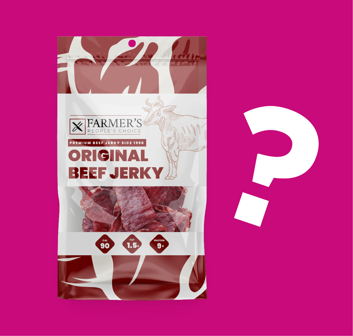
    The latter gives us a much better idea of our ideal target audience.From here, we can imagine the type of media they consume, where they shop, and what other products they might buy. And we can begin to explore durable product packaging options that will correspond to their lifestyle.Imagine the ideal person that you’d like to sell to, and create a detailed list of their traits, interests, and demographics. If they share the same values, this is a great example of something you’d want to incorporate into your great food packaging design. 

    #3. Packaging Design: 

    Analyzing Competition and Listening to Consumers

    In order to know what you may need to change about your food package design,

    you need to have an eye on your competition and their brand identity.

    Competitive Analysis: The first step in understanding the market and your brand identity is to identify both direct and indirect competitors in the food industry. Gather physical or digital samples of competitor product packaging and pouches and analyze designs, size, information provided, material used, information about their packaging label, and the overall ease of use with their packaging. Look for things you like, things you might change, and opportunities to be different when you create packaging for your own product.

    Consumer Feedback: If you have an amazing product, incorporating this into your product packaging should be one of your major goals. You need functional, aesthetic, durable, and effective food packaging design. And the best way to find out what customers like, is to go directly to them.  There are numerous social listening tools that allow you to gauge real-time feedback on competitors’ packaging. Direct from the consumer insights provide a clear picture on market trends and consumer frustrations and needs. 

    #4. Product Packaging – 

    How To Make An Impression On Consumers

    Consumer Experience: Flexible, textured, and unique packaging materials, turn the mundane act of opening your product package into an experience. It can create polarity and give your brand an immediate “wow” factor. The package is the first physical experience your customer will have with your brand, so why not make it special? In the internet age, small details or adding a new spin on an old packaging concept, can bring an element of virality to your brand. It shows your customer that care and attention to detail aren’t just reserved for the product itself.

    Think of resealable pouches for portion control or transparent sections to tease your product. The only limit is your imagination.
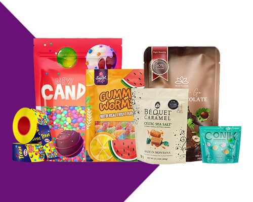
    Food Packaging Shelf-Presence: It’s important to develop collaborative relationships with retailers to ensure you know where your product will be physically placed. For example, if your product is being placed on a grocery aisle end cap rather than a bottom shelf, you may want to change certain design elements or materials. For flexible food packaging pouches, controlling for light, moisture, and oxygen is crucial to ensure a fresh product.
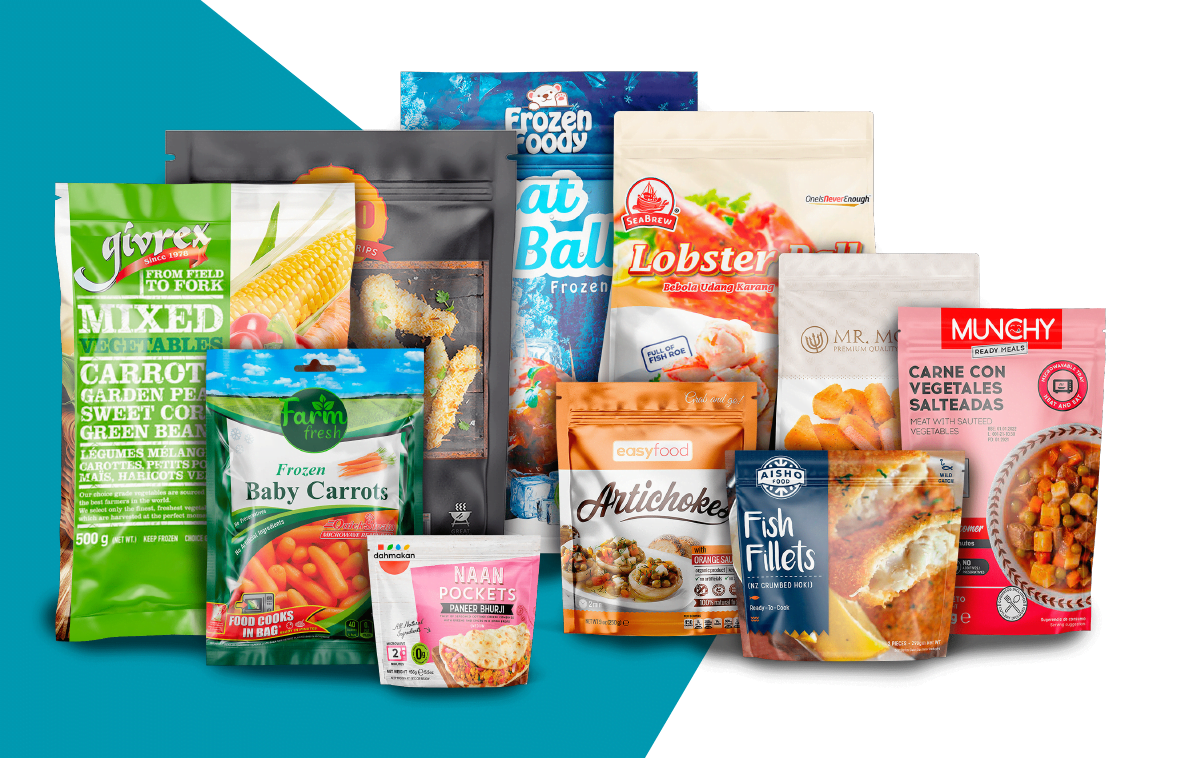
    There are countless options, each with their own pros and cons. Durable plastics like polyethylene are cheap and moisture resistant, but they are conventional and have a large environment footprint. Wax coated paper packaging will be more expensive, but will add a unique appeal to your product and help reduce plastic waste. Most importantly, do research and look at your competitors to see what packaging and pouches they’re using.

    #5. The Art and Science of Packaging Materials & Design

    Eye-catching packaging design influences consumer decisions and perceptions, and elevates your product from your competition. On a crowded store shelf aisle, you want to stand out and become one of the favorites, and the only way to do that is to take your packaging design seriously.If you want to go from “just another product”, to an industry leader, read this next section carefully…

    Color Psychology for Packaging Design: Different colors speak to us at a deeply subconscious level. And if you start to pay attention to the brands around you, you’ll start to see patterns. Certain colors can evoke emotions, influence perceptions, and drive specific buying behavior. A luxury brand might choose a refined monochrome color palette, while a brand emphasizing environmental awareness might use greens and natural earth tones. Regardless of what you choose, make sure it connects to your target consumer and the overall message of your brand

    Packaging Typography: Choosing the right font is crucial to bring your brand’s personality, message, and story to life. The font should align with your brand’s aesthetic, voice, and packaging materials while remaining readable across various sizes and mediums. There are thousands of fonts, so get ready to experiment. If you’re a brand trying to leverage your history, try a classic serif typography. For a clean and minimalist look, try a modern and sleek sans-serif. To ensure readability on your flexible packaging and pouches, make sure your text placement is carefully considered.

    Design Elements and Limited Editions: How many of your customer senses can you engage? Interactive design elements in your packaging help your product stand out and build long-term trust with your customers. These elements can be QR codes that link to digital content or even tactile textures that enhance the package itself. Carefully curated and designed limited edition packaging can also turn your package into a product itself, deepening consumer engagement and adding value and exclusivity
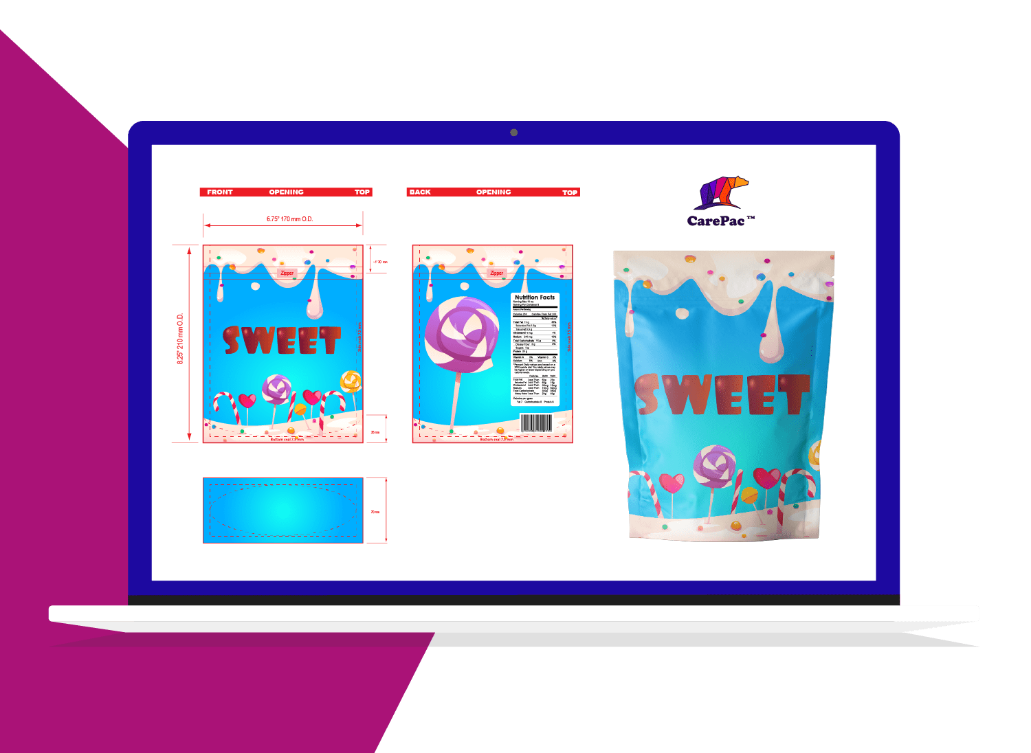
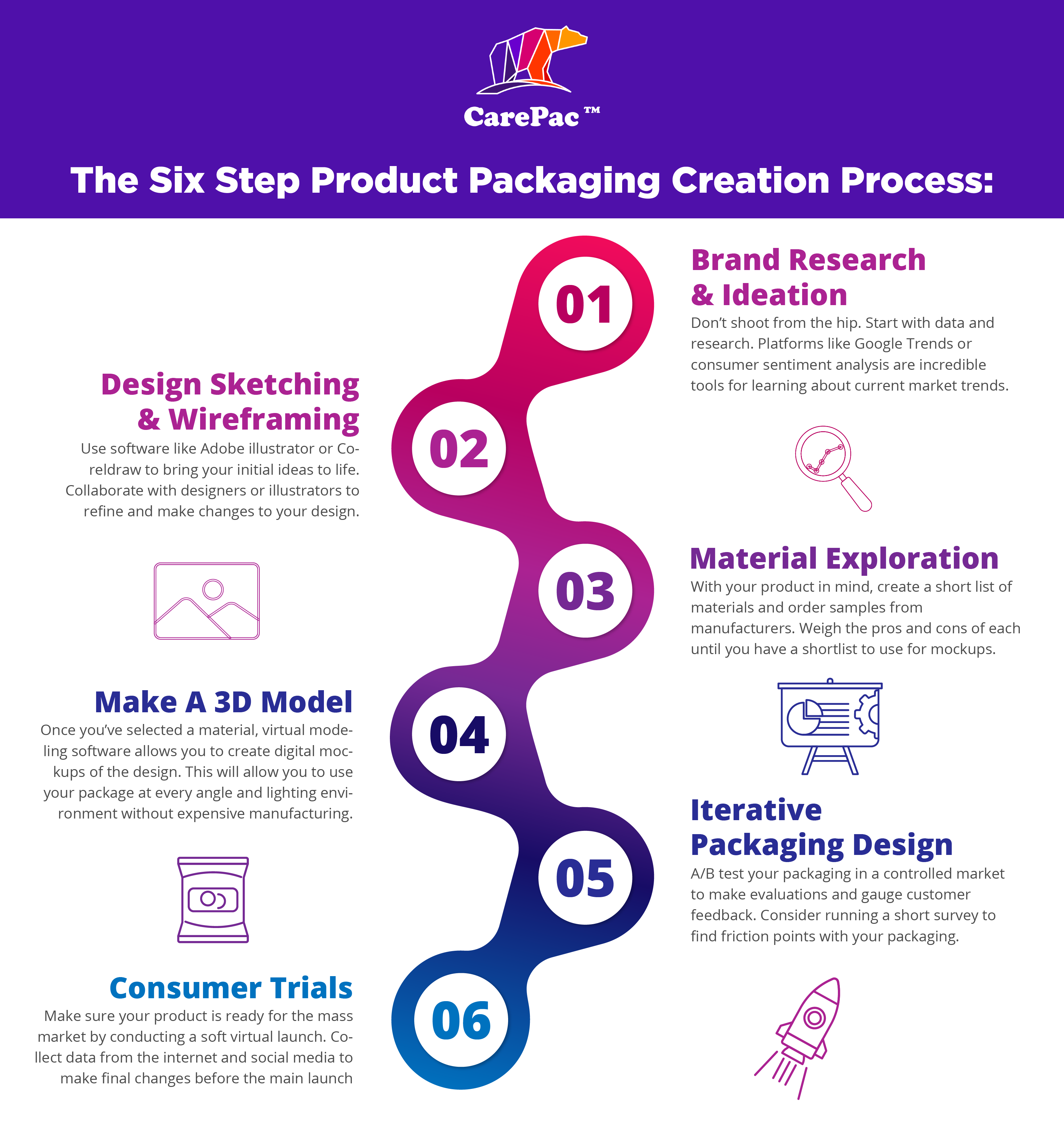
    Sustainable Packaging & Eco-Friendly Packaging Materials

    In today’s market, being an eco-conscious brand that uses sustainable packaging is a win-win. Not only are you helping to contribute to a greener planet, you’re also tapping into consumer demand. Your packaging can be more than just another pouch, it can be a statement of your brand’s commitment to the planet. And by choosing a flexible package option, you’re already committing to a green solution. Flexible sleeves, pouches, and containers require much less energy to manufacture and transport. And they can also be made with a variety of earth-friendly materials like bioplastics, edible material such as seaweed, and plant-based cellulose films.

    When considering your eco-friendly packaging, keep these three things in mind: 

    Eco-Friendly Packaging Materials: Current eco-friendly options give brands an option to go beyond having just biodegradable packaging. There are numerous upcycled or recycled materials that can be used to create effective, eye-catching, and durable packaging. For example, if you’re selling organic free-range coffee, you might consider swapping plastic for an eco-friendly plant-based cellulose alternative.
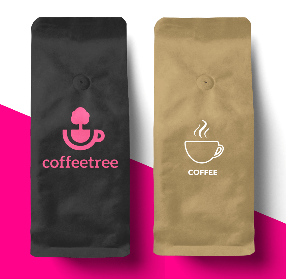
    Product-Package Harmony: It’s crucial that you choose the eco-friendly option that ensures the best experience for your customer. If you’re selling homemade pickles made from an old family recipe, the last thing you want is to lose that fresh out of the jar flavor. When choosing your eco-friendly flexible packaging, consider the shelf-life, temperature, and overall durability needed to ensure your product arrives pristine.
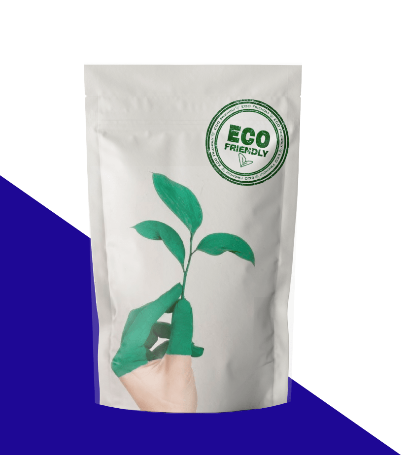
    Inspiring Call-to-Action: Your packaging can also serve as a call to action. An inspirational partnership or compelling brand story can turn the ordinary to extraordinary. For example, TOMS shoes used their packaging to highlight their humanitarian mission to bring quality shoes to those in need.

  • Case Study: Flawlessly Fresh With Flavor

    Case Study: Flawlessly Fresh With Flavor

    Inspired By Italy, Made in Vermont

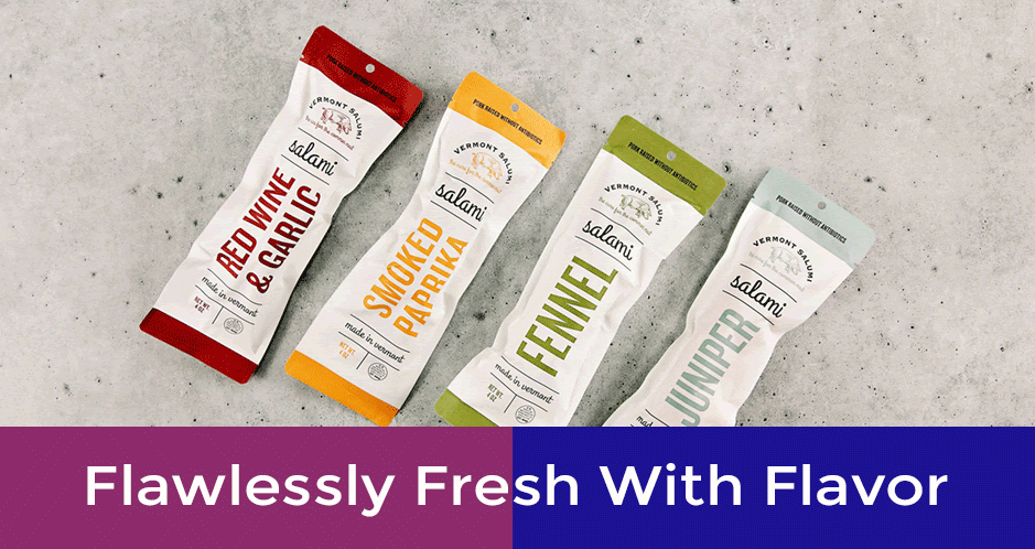
    A family tradition, a love for prosciutto, and an inspiration—say “ciao” to Vermont Salumi. This Italian-inspired meat company stands by their promise to provide cured Italian meats that are filled with flavor and freshness. In order to do this, they had to ensure their products were packaged to perfection. Here’s how we worked together with Vermont Salumi to ensure their product packing was just right.

    Meet Vermont Salumi

    Crafting fresh and cured Italian-style meats in the Vermont countryside, Vermont Salumi makes several savory varieties of fresh sausage, cured salami, and aged whole muscle meats.

    Vermont Salumi’s Packing Needs

    Packaging salami can be tricky, as it needs to preserve the finished aging process and flavor balance. Vermont Salumi was on the hunt to find packing options that could withstand the various storage environments their products would experience through the production channels. Additionally, it was imperative the packaging was functional—and aesthetically pleasing.

    The Results

    Vermont Salumi turned to CarePac to find the solution that packs the right punch for their needs. Our flexibility and customization meant that Vermont Salumi didn’t need to compromise… and the end result was the right packing, for the right price, with the right look. And the proof is in the pancetta with the new packaging, they saw an overall increase in sales and shelf life for their meats. Have a unique packing need? Here at CarePac, we’re up for the challenge—get in touch by phone (via a real person!) or through our contact form.

  • Case Study: One-of-a-Kind Packaging

    Case Study: One-of-a-Kind Packaging

    A Packaging Journey

    From Zero to Success

    Founded by a physician, TouchZero™ is changing the way we clean—by reducing exposure. While developing their unique cleaning solution, the brand team realized that the packaging would make or break the success of this innovative product. Here’s the story of how they landed on a package that is both functional and attractive… oh, and patented.
    The Product BackgroundThese days, the words “cross-contamination” have become part of everyday conversation. As we were all whistling the ABCs while washing our hands, the team at TouchZero was busy developing a one-of-a-kind cleaning product. They saw the need for something that would thoroughly clean surfaces and didn’t require gloves… but would also protect our hands. Enter TouchZero Wipes.

    If there’s one feature of CarePac I really enjoy, it’s their responsiveness and availability. They were always there via email and phone anytime I had a question.

    Touch Zero

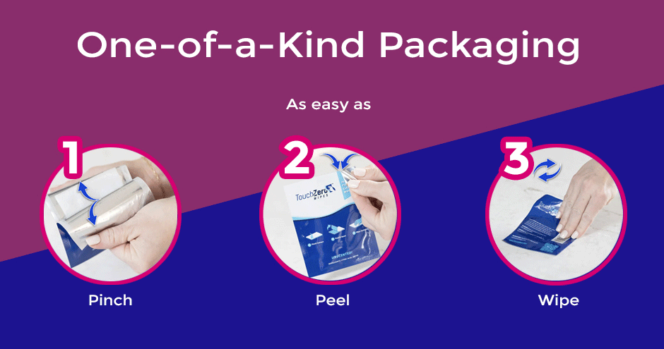
    The Packaging NeedPackaging for the wipes was essential to the use of the product. TouchZero needed to find a way to maintain the integrity of the cleansing solution on the wipe while also providing a means to keep the user’s hands untouched. A well-designed, functional, and easy-to-use package was a must.
    The Successful SolutionAfter ordering samples from CarePac, TouchZero knew we could produce the right deliverable. Together, we set out to develop the perfect pouch. We determined that heat-sealing edges were critical to keeping the wipe operable. And the actual packaging material would act as the “glove” or barrier between the hand and wipe. The solution? A groundbreaking and patented disposable pouch

    Like TouchZero, you’ve worked hard to get your product right. The time and effort you’ve put into all the details are noticeable… and now it’s time to show it off in the best package possible. We’re here to help—get in touch by phone (via a real person!) or through our contact form

  • Case Study: Packaging That’s Fresh as a Noni

    Case Study: Packaging That’s Fresh as a Noni

    Keepin’ It Real

    Say aloha to the Frailey family. They are self-proclaimed “noni-obsessed” and their goal is to share the goodness of this Hawaiian fruit with the world.

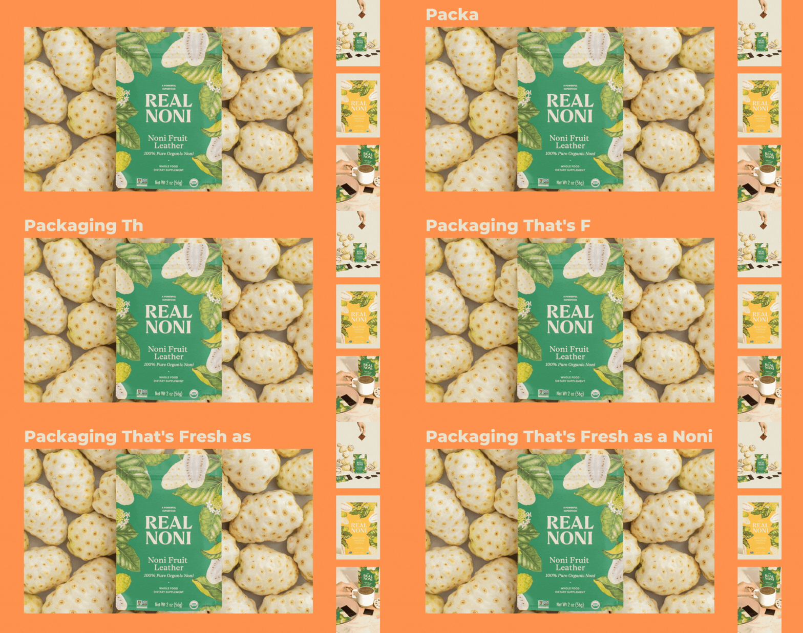
    To do this, the Fraileys needed to find the right packaging to seal in the pureness, portray the beauty of the fruit, and lay flat for easy transporting and displaying. See how we worked together to create the perfect package for this fantastic superfruit.

    What Is Noni?A love of wellness runs in the Frailey family—and the superpowers of noni are too good to be ignored. Used for centuries in Polynesian cultures, this tree-grown fruit packs a powerful punch of anti-inflammatory and antioxidant properties, providing our bodies with many healing and renewing benefits. However, before the family could share their passion, there was one hurdle in the way: to maximize the potency of the fruit, it needed to be captured in raw form.

    Noni’s Packaging NeedsThe Fraileys put their pro-noni noggins together, and after years of research, growing, and testing, they discovered a way to preserve raw noni—and their company, Real Noni, was born. But in order to get the fruit to their customers, the packaging had to be just right. They needed something that could maintain the freshness of the fruit and align with their quality-first approach while also being as beautiful as the fruit itself. With this in mind, they set out to find their perfect package.

    Noni-Worthy ResultsAfter a failed attempt at getting their dream package from an overseas company, Real Noni turned to CarePac. Working together, we found a pouch that ticked every box—exceptional (and BPA-free) vapor and oxygen barriers, FDA Food Grade compliant, reclosable, and custom printed to capture their vivid colors and stunning images. The result? Beautiful packaging and happy customers… a noni dream come true.

    The team at Real Noni understands that packaging can make or break the success of a product. Not only is it needed to protect your prized possession, but it’s also an essential marketing tool that should speak to your brand and attract customers. As packaging experts, CarePac works with all different types of industries and will find a solution for your needs. Get in touch by phone (via a real person!) or through our contact form.

  • Foods To Package in Mylar

    Foods To Package in Mylar

    Foods to Package in Mylar Bags | Mylar Food Storage

    Mylar Bags for Long-TermFood Storage: A Guide

    Ever noticed that “space food” and camping/hiking “survivalist” type foods are often packaged in shiny mylar packaging instead of plastic bags? Well, it isn’t because it looks futuristic — it’s because mylar packaging is accessible and is simply the best packaging and long-term storage method for sundries and dry foods like rice, beans, and flour. In fact, some foods packaged in mylar can last for up to 30 years, and others can even be kept indefinitely!

    In this guide, we’ll discuss why mylar packaging is ideal for long term food storage, what types of food can be packaged and stored in custom mylar bags, which foods should NOT be stored in mylar, and how to select the mylar packaging that’s right for your meal. Learn more about how to store food in mylar. 

    Using Mylar to Store Food

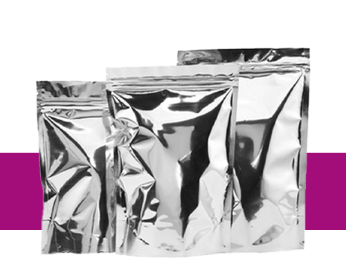
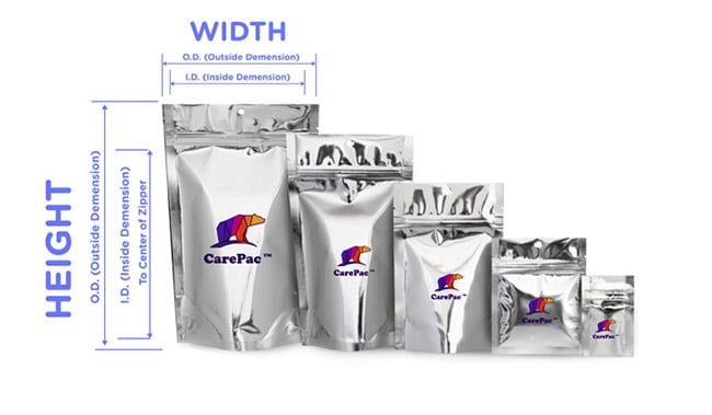
    Mylar packaging is made from several layers of laminated food-grade plastic and aluminum. The fact that there are multiple layers means that the food inside is protected from exposure to oxygen and the elements. They’re ideal for long-term food storage for a few reasons. First, they are very strong and can resist punctures, rips, and tears, at least to a degree. Second, the material is flexible, meaning you can store foods of many shapes and sizes in mylar. And finally, it has built-in barrier properties. As mentioned above, this means the food inside is protected from light and air. 

    If purchased from a company like CarePac, mylar bags are also an economical choice to store food, as you can purchase them in bulk and save money. But, you also aren’t tied to large quantities with CarePac, as we’re proud to offer low MOQs for small companies or product runs. 

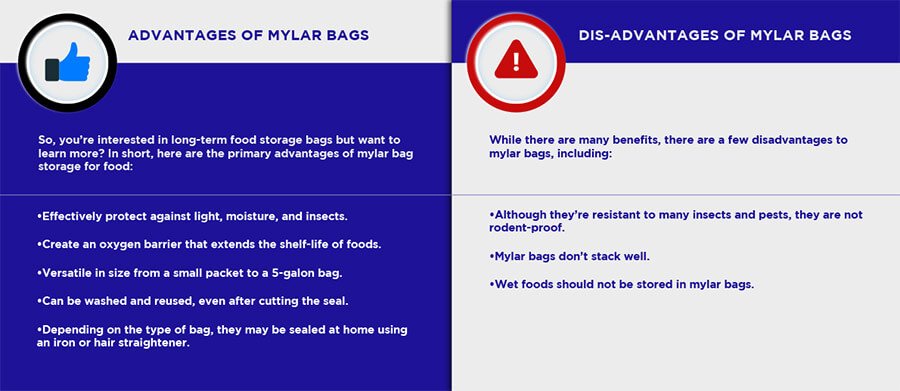
    Advantages and disadvantages of storing food in a mylar bag

    As you can see, a sealing mylar bag is best for dry food storage, such as nuts, crackers, dehydrated fruits and vegetables, and sundries, like flour and rice. We’ll discuss which foods can be stored in a mylar bag (and for generally how long) in the next section.

    Which foods can be stored in mylar bags?

    Dry, low-fat foods can be stored in mylar food bags long-term. Any food with moisture content may start to go bad in mylar bag storage, and there is a risk of botulism if food is packaged and stored incorrectly. All food should be stored with an oxygen absorber, and only foods with 10% or less moisture content can be packaged in mylar bags with an oxygen absorber. Here is just a small sampling of the types of food that can be stored in mylar food bags long-term with an oxygen absorber and how long you can expect them to last: 

    Common Mylar Bag Food Storage Times
    Less than 1 year:
    • Nut
    • Chip
    • Chocolate and candy 
    • Brown rice
    1-3 years:
    • Dehydrated meat
    • Dry biscuits
    • Crackers
    • Roasted coffee beans (if placed in the freezer)
    3-5 years:
    • Baby formula and powdered milk
    • Cornmeal
    • Ground herbs
    • Sprouting seeds
    • Unroasted coffee beans
    5-10 years:
    • Granola
    • Herbs (whole)
    • Quinoa
    • Peanut butter powder
    • Powdered egg
    • Unbleached flour
    • Wheat flakes
    10-20 years:
    • Black-eyed peas
    • Buckwheat
    • Powdered butter/margarine
    • Chickpeas
    • Cocoa powder
    • Flax
    • White flour
    20-30 years:
    • Instant coffee
    • Freeze-dried fruit and veggies
    • Lentils
    • Lima beans
    • Noodles and pasta
    • Rolled oats
    • Tea (bags or loose)
    • White rice
    Indefinitely:
    • Baking soda
    • Baking powder
    • Honey
    • Salt
    • Sugar

    Please note: the list above is a generalization, and assumes that the food was initially preserved, packaged, and stored correctly. If the bag is bulging, this is a sign that bacteria is growing inside, and the bag should be thrown awayimmediately.

    Which Foods CANNOT Be Stored In Mylar Bags?

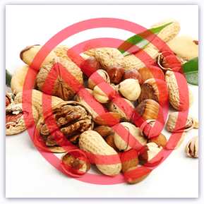
    Due to their moisture content and the risk of botulism, any foods with more than 10% moisture content cannot be stored in sealing mylar bags and should be stored in another type of bag, like plastic bags. Fruits and vegetables must be dehydrated before storing, and meats, nuts, and legumes will go rancid regardless of how they’re prepped or stored.

    Mylar bags for food storage: FAQs

    Here are some common questions we receive about packaging foods in mylar bags for long-term storage:

    Q. How long will foods last in mylar bags?

    If prepped and stored correctly, some foods can last up to 30 years in mylar bags. Foods like coffee beans and brown rice can last 1-3 years, while items like baking soda/powder and salt can last indefinitely in mylar bags.

    Q: How long will pasta last in mylar bags?

    On average, noodles and pasta can last 20-30 years in mylar bags.

    Q: Which foods cannot be stored in mylar bags?

    Anything with moisture content that exceeds 10% cannot be stored in mylar bags. This includes fruits and vegetables, meats, nuts, and legumes.

    Q: What foods are best stored in mylar?

    Dried foods (10% or less moisture content) are best stored in mylar bags. This includes rice, flour, pasta, granola, beans, rolled oats, coffee, and tea.

    Purchase food storage mylar bags at CarePac

    So, interested in long-term food storage bags but aren’t sure where to start? CarePac has you covered with our wide selection of mylar food bags. Shop our selection today! If you plan on customizing your bags, we’ve got you covered there, too. We can add custom colors, labels, tear notches, or anything else you’d like to add to your bags. Get an Instant Quote now to get started. 

  • A guide to the USDA meat stamp

    A guide to the USDA meat stamp

    A guide to the USDA meat stamp

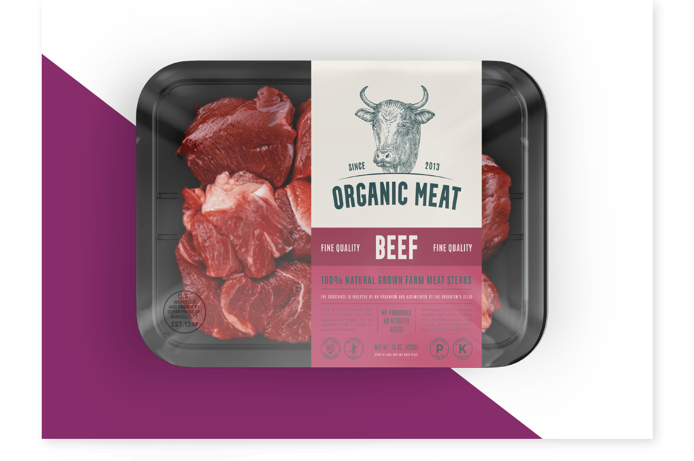
    Decoding Your Meat: A Guide to USDA Beef Labels Beef in Plastic Packaging

    A Guide to the USDA Meat Stamp

     What Do These Stamps Mean?

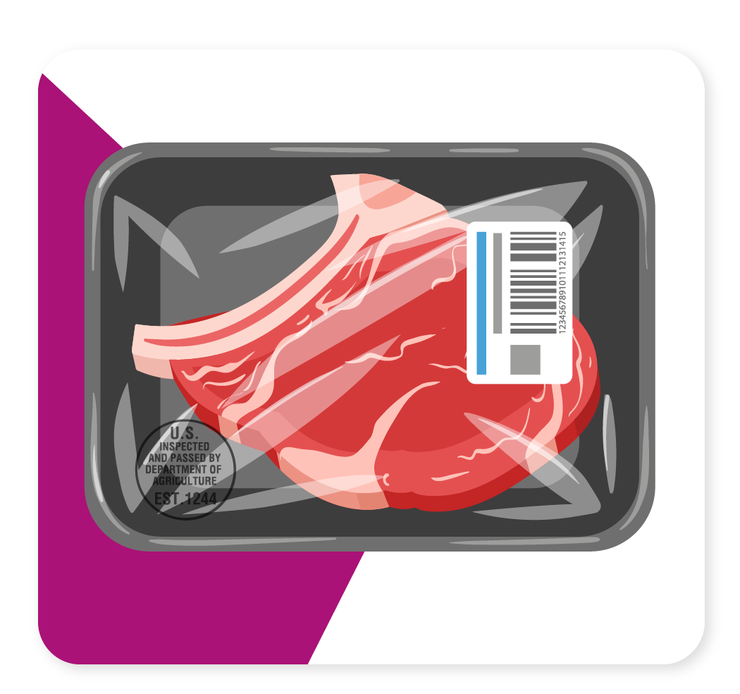
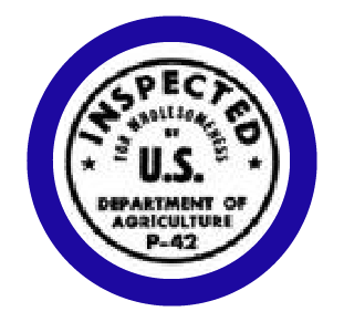
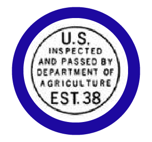
    Meat inspection is a mandatory part of the meat industry in the United States. However, the questions of who inspects the meat, what this stamp means, and what is approved or not still may remain as a question with this fact.

    In the U.S., is meat inspection required?

    Meat processing - Labels and standards Detection and destruction of diseased meat and or contaminated meat

    The Federal Meat Inspection Act (FMIA) requires all commercially sold meat to be inspected and labeled properly. Meat inspections assure the consumer the select of meat they purchase at the market is safe and clean for human consumption at the point at which it is purchased. This includes the inspection of the live animal, carcass, internal organs, plant facilities where it is processed, equipment, personnel, and transportation. Therefore, it is imperative that meat and meat products are unadulterated or misbranded.

    How to grade beef: prime, choice, and selection?

    While grading beef is optional and voluntary after beep passes inspection, not all federal or state inspection grades are the same. There are eight quality grades within the meat grading system, and they are from higher grades to least highest: Prime, Choice, Select, Standard, Commercial, Utility, Cutter, and Canner. However, most consumers are familiar with the top three grades Prime, Choice, and Select.

    How The USDA Grades Your Steak, Know the difference between USDA  Prime, Choice, and Select BeefUSDA Prime beef is produced from young, well-fed beef cattle

    USDA Prime Grade

    USDA Prime is the highest quality grade, with a small percentage of total cattle numbers achieving this grade. The minimum degree of marbling required for carcasses of this grade is “Slightly Abundant.” These are the highest-priced cuts and are typically sold at restaurants or “full service” cases at grocery or butcher stores. You can think of these as being certified tender. 

    Choice beef is high quality, but has less marbling than Prime. It has at least a Small amount of marbling.

    USDA Choice Grade

    USDA Choice is the second highest quality grade and is the most frequently produced. This grade has a minimum degree of marbling and is graded when marbling is “Small.” This USDA certified cut is very tender and juicy and makes up the largest group of carcasses.

    Select beef is very uniform in quality and normally leaner than the higher grades. It is fairly tender, but because it has less marbling, it may lack some of the juiciness and flavor of the higher grades. It has at least a Slight amount of marbling.

    USDA Select Grade

    USDA Select is the second most frequently quality grade produced and has a minimum amount of marbling as determined by “Slight.” This cut tends to be leaner both internally and externally and is commonly found in retail stores as the “common” tender beef purchased for everyday use.

    How is the grade of beef determined?

    USDA grades are determined based on the animal’s maturity when harvested and the amount of intramuscular fat (marbling) in the surface of the ribeye muscle seen between the 12th and 13th ribs. While most cattle in large facilities are processed between 9-30 months of age, the marbling is the determining factor in the quality grade.

    USDA Prime beef is produced from young, well-fed beef cattleChoice beef is high quality, but has less marbling than Prime. It has at least a Small amount of marbling. Select beef is very uniform in quality and normally leaner than the higher grades. It is fairly tender, but because it has less marbling, it may lack some of the juiciness and flavor of the higher grades. It has at least a Slight amount of marbling.

    USDA Quality Grade comes from the amount of marbling observed at one location within the carcass across every cut of meat from that carcass. Therefore, marbelization is important as it gives the beef tenderness and added flavor.

    As the animal matures (ages), the meat becomes tougher and leaner, so the cattle’s age dictates the beef’s tenderness. Thus, the USDA grade showcases the quality of the beef based on the grade and the amount of usable lean meat when the beef is graded.  

    What does beef grade not tell you?

    The meat itself, some factors are not considered by the USDA. This includes factors of the animal's diet, including grass-fed or grain-finished and if the animal was raised in a pasture or not.

    Beef grades, while they do offer some information on the meat itself, some factors are not considered by the USDA. This includes factors of the animal’s diet, including grass-fed or grain-finished and if the animal was raised in a pasture or not.

    In addition, it is important to note that grass-finished beef will not be graded under Prime as they are leaner and do not achieve the USDA’s Prime Grade requirements for tenderness, juiciness, and flavor.

    Types of Meat Inspection stamps your products may need

    Inspect mark on raw beef, pork, lamb and goat

    Raw Meat

    Inspection mark on raw meat from beef, pork, lamb, or goat. 

    Inspect mark on raw and processed poulty

    Poultry

    Inspection mark on poultry that is raw or processed.

    Inspect mark on processed beef, pork, lamb and goat

    Packated and processed meat

    Inspection mark on packaged and processed meat containing beef, pork, lamb, and/or goat. 

    Understanding Meat Stamps

    While it may seem daunting to understand what the USDA stamp means, we hope this article has given insight into what it means and how and why it is used. CarePac is here to answer any further questions you have about the USDA meat inspection stamp and its use on packaging.

  • 5 Tips for Jerky Packaging That Sells and 10 Companies Who Get it Right

    5 Tips for Jerky Packaging That Sells and 10 Companies Who Get it Right

    5 Tips for Jerky Packaging That 

    Sells and 10 Companies Who Get it Right

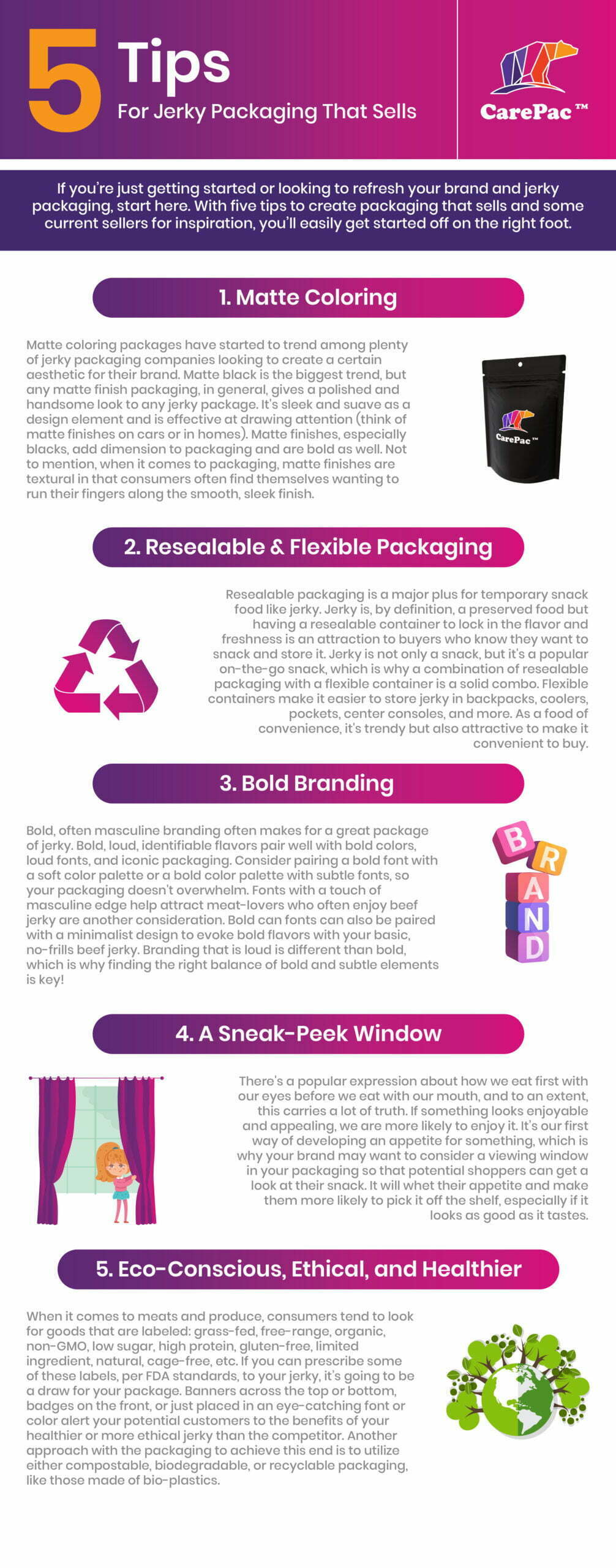
    If you’re just getting started or looking to refresh your beef jerky packaging design, start here. 

    With five tips to create a packaging design that sells and some current sellers for inspiration, you’ll easily get started off on the right foot.  Learn more package design tips below. 

    5 Tips to Consider for Your New Jerky Packaging Design

    1. Matte Finish Packaging For a Sleek Look

    Matte coloring packages have started to trend among plenty of jerky packaging companies looking to create a certain aesthetic for their meat. Matte black is the biggest trend, but any matte finish packaging, in general, gives a polished and handsome look to any jerky package. It’s sleek and suave as a design element and is effective at drawing attention (think of matte finishes on cars or in homes). Matte finishes, especially blacks, add dimension to packaging and are bold as well. Not to mention, when it comes to packaging, matte finishes are textural in that consumers often find themselves wanting to run their fingers along the smooth, sleek finish.

    2. Resealable & Flexible Jerky Packaging

    Resealable packaging is a major plus for temporary snack food like jerky. Jerky is, by definition, a preserved food but having a resealable container to lock in the flavor and freshness is an attraction to buyers who know they want to snack and store it. Jerky is not only a snack, but it’s a popular on-the-go snack, which is why a combination of resealable packaging with a flexible container is a solid combo. Flexible beef jerky bags make it easier to store jerky in backpacks, coolers, pockets, center consoles, and more. As a food of convenience, it’s trendy but also attractive to make it convenient to buy.

    3. Bold Branding on Your Beef Jerky Packaging

    Bold, often masculine branding often makes for a great package of jerky. Bold, loud, identifiable flavors pair well with bold colors, loud fonts, and iconic packaging. Consider pairing a bold font with a soft color palette or a bold color palette with subtle fonts, so your packaging doesn’t overwhelm. Fonts with a touch of masculine edge help attract meat-lovers who often enjoy beef jerky are another consideration. Bold can fonts can also be paired with a minimalist design to evoke bold flavors with your basic, no-frills beef jerky. Branding that is loud is different than bold, which is why finding the right balance of bold and subtle elements is key!

    4. A Sneak-Peek Window So Customers Can See the Meat Snacks

    There’s a popular expression about how we eat first with our eyes before we eat with our mouth, and to an extent, this carries a lot of truth. If something looks enjoyable and appealing, we are more likely to enjoy it. It’s our first way of developing an appetite for something, which is why your brand may want to consider a viewing window in your packaging so that potential shoppers can get a look at their snack. It will whet their appetite and make them more likely to pick it off the shelf, especially if it looks as good as it tastes.

    5. Eco-Conscious, Ethical, and Healthier Bags for Your Beef Jerky

    When it comes to meats and produce, consumers tend to look for goods that are labeled: grass-fed, free-range, organic, non-GMO, low sugar, high protein, sustainable, gluten-free, limited ingredient, natural, cage-free, etc. If you can prescribe some of these labels, per FDA standards, to your jerky, it’s going to be a draw for your package. Banners across the top or bottom, badges on the front, or just placed in an eye-catching font or color alert your potential customers to the benefits of your healthier, sustainable, or more ethical jerky than the competitor. Another approach with the packaging to achieve this end is to utilize either compostable, biodegradable, or recyclable packaging, like those made of bio-plastics for a more sustainable effect for your flat barrier bags.

    10 Jerky Companies to Look to for Design Inspiration

    Stryve Jerky Packaging

    1. Stryve

    Stryve hits a few great trends with its packaging. The bold, easy-to-read fonts placed on bright, matte packaging with a fun blend of colors combine eye-catching with convenience. The flexible packaging is also easy to store for later in small spaces, making this a great choice for on the go. Also included in their packaging are nutritional essentials, like the zero-sugar and high protein markers across the top.

    Righteous Felon Jerky Packaging

    2. Righteous Felon

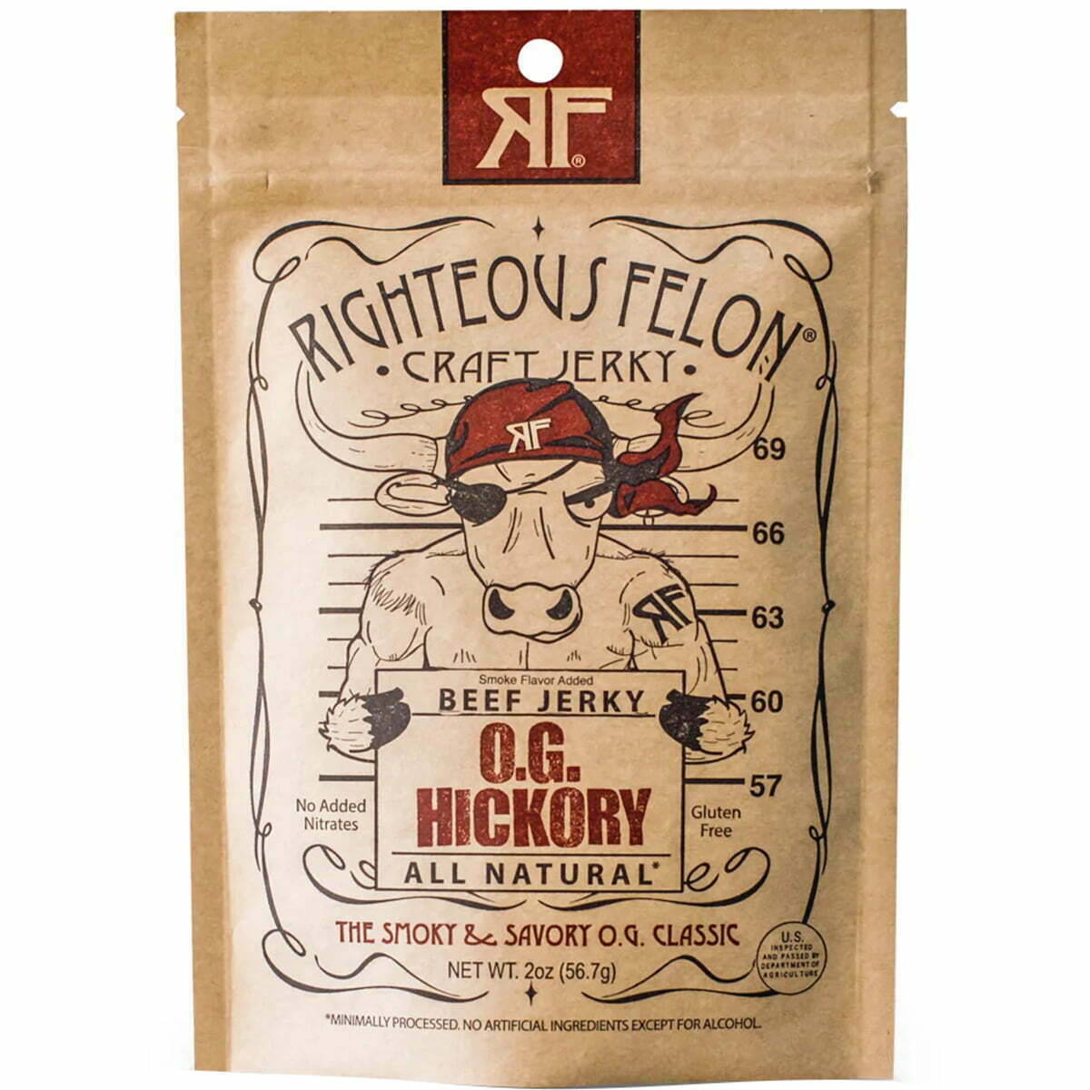
    The Righteous Felon uses creative, fun, and engaging graphics that are immediately eye-catching. It’s framed perfectly on their eco-friendly packaging, with a minimalist color palette of a touch of red. They incorporate all the key information, like flavor, gluten-free, and all-natural labels, into the primary graphic on the front. They also have a resealable pouch which further attracts buyers. It has a masculine name as well as a more masculine graphic, but in a fun, comical way so as to not seem overcompensating. Overall, it’s fun meets functional in a great way.

    Country-Archer-Provisions-Jerky-Packaging

    3. Archer

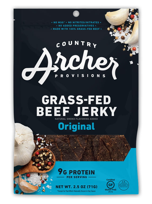
    Country Archer Provisions plays off of colors to help identify their different flavors, with navy blue and light blue for their original flavor jerky. They use orange for a mango-habanero blend, magenta pink for their teriyaki flavor, and lime green for hatch chili. Their typography is straightforward and to the point, keeping it simple and not distracting but not too eye-catching as well. Their biggest wins are the flexible packaging, the health and ethical labels stamped on the front (9g of protein, gluten-free, etc.), and the viewing window in the front to buyers can see the freshness of their snack.

    Lorissa’s Kitchen Jerky Packaging

    4. Lorissa’s Kitchen

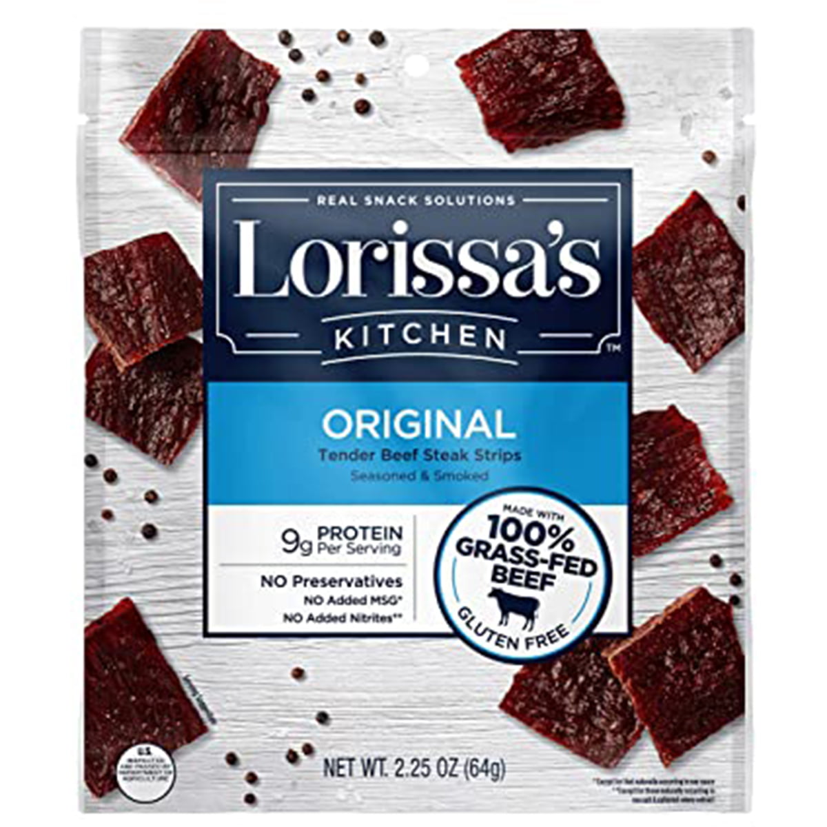
    Lorissa’s Kitchen uses color to identify essential information: organic, grass-fed sustainable beef, gluten-free. Buyers know what they’re getting and are drawn in by the bright green labels. The packaging is flexible and has a resealable top for preserving freshness. They also use all the official labels for USDA Organic and NonGMO foods. Another big bonus is that they’ve printed images of their jerky all over the package, which isn’t as effective as having a viewing window but is better than nothing.

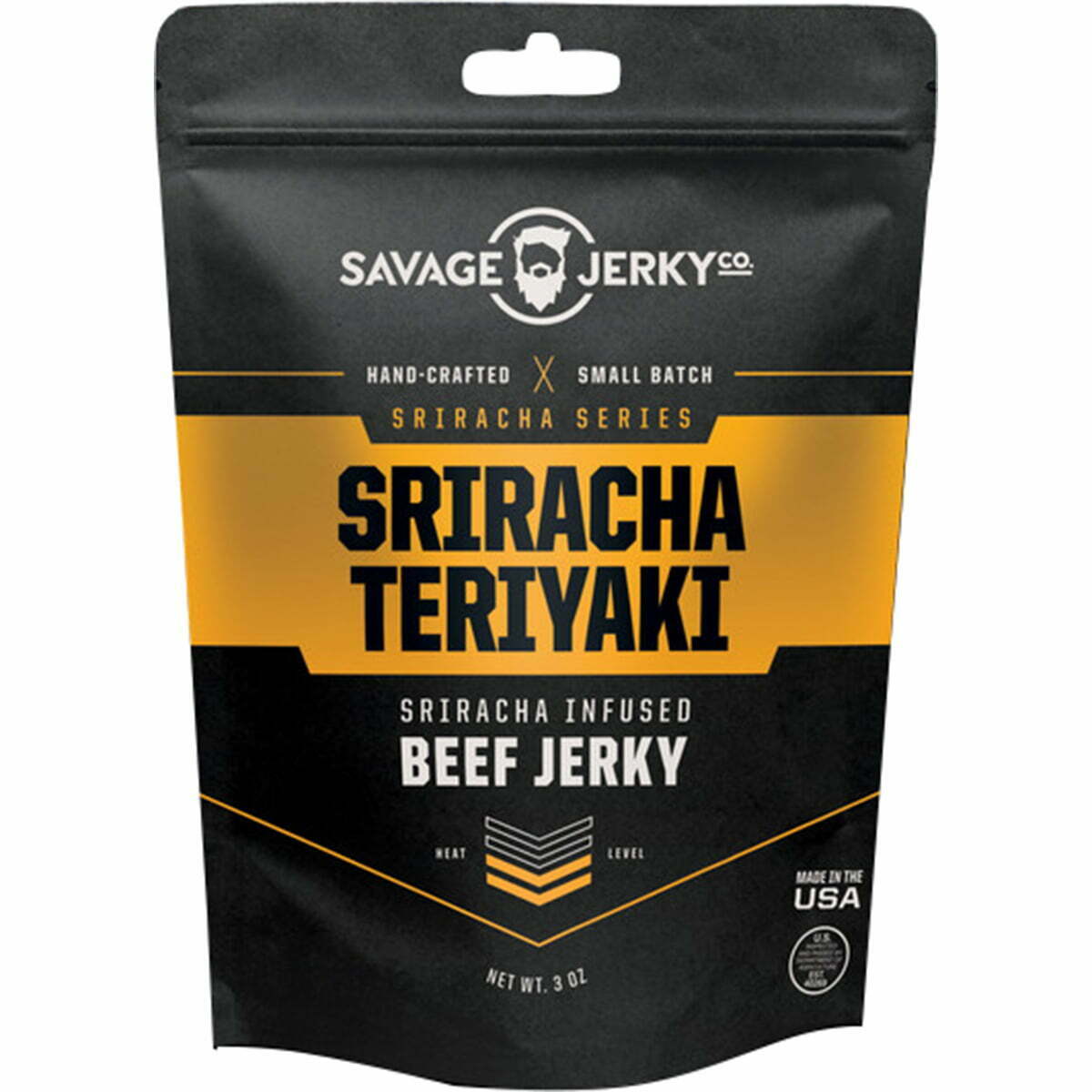
    Savage Jerky Co Jerky Packaging

    5. Savage Jerky Co

    Savage Jerky Co uses matte black packaging to the best effect, with a sleek, smooth package with a lone bold color. This flavor, Reaper, uses a vibrant red, while other flavors use different colors, like Maple Buffalo Bacon in burnt orange and Lime & Garlic with rich green. It makes their packaging bold but iconic and not too busy or loud. The package has a tear-top and a resealable closure for freshness, plus the flexible packaging for the convenience of carrying it everywhere. Their logo is simple and memorable, just like the rest of their package.

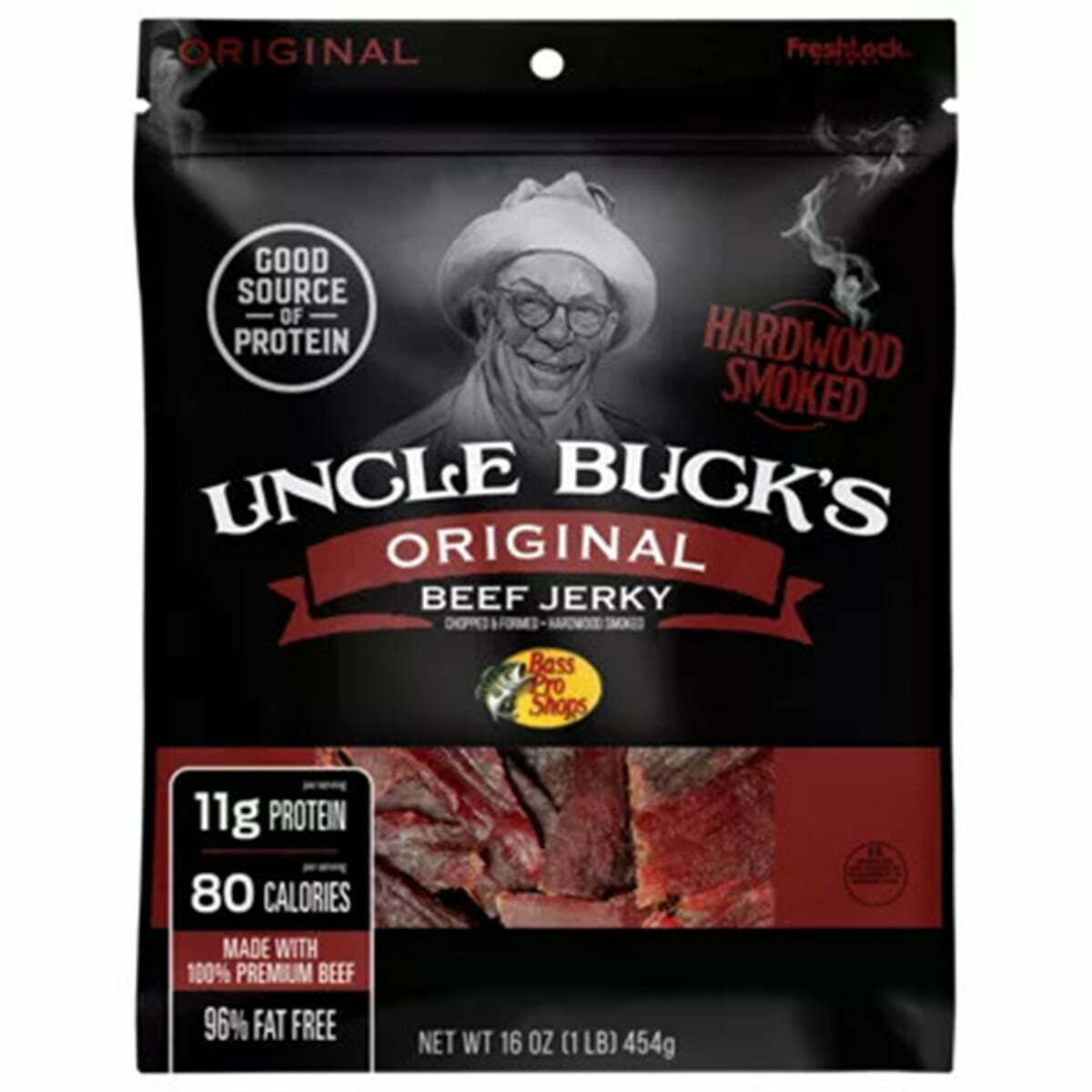
    Uncle Buck’s Original Jerky Packaging

    6. Uncle Buck’s Original

    Uncle Bucks’ Original Beef Jerky is in a matte black finish, similar to a lot of other stand-out brands. It’s handsome and masculine, with a simple font pairing that doesn’t detract from the logo and information. They don’t use a viewing window, but like Lorissa’s, they print an image of their jerky on the front of the package. Printing images can be great when you don’t use a viewing window, but your final product should look very similar to the printed images. They also include essential information on the front, including protein, calories, and fat-free.

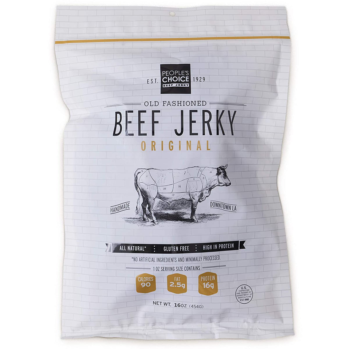
    7.People’s Choice Old Fashioned Beef Jerky Packaging

    7. People’s Choice Old Fashioned Beef Jerky

    The packaging for People’s Choice Old Fashioned Beef Jerky evokes old-fashioned energy and traditional simplicity with its graphics, fonts, and logos. The overall design is constructed of thin lines, thin fonts, and kerning that makes everything simple, minimal, and legible. They incorporate big selling points into creative graphics, like banners and stamps across the packaging to identify “Handmade in LA,” “ Gluten-Free,” “All-Natural,” and the fat and protein counts. Visually, it’s a mostly black and white color palette, which goes with the theme of old-fashioned and traditional. Although it is in flexible packaging, they don’t use a reseal top for preserving what’s left uneaten.

    Kalahari Biltong Jerky Packaging

    8. Kalahari Biltong

    Kalahari Biltong keeps it vibrant, colorful, and eye-catching with flavor-coordinated colors that are bold and bright- orange for original, lime green for chili lime, red for their spicy peri, and blue for garlic. All the colors are extremely bright and pair well with a consistent package graphic across all the flavors. They creatively pair a san serif and script font, and they use it to convey all the necessary information.

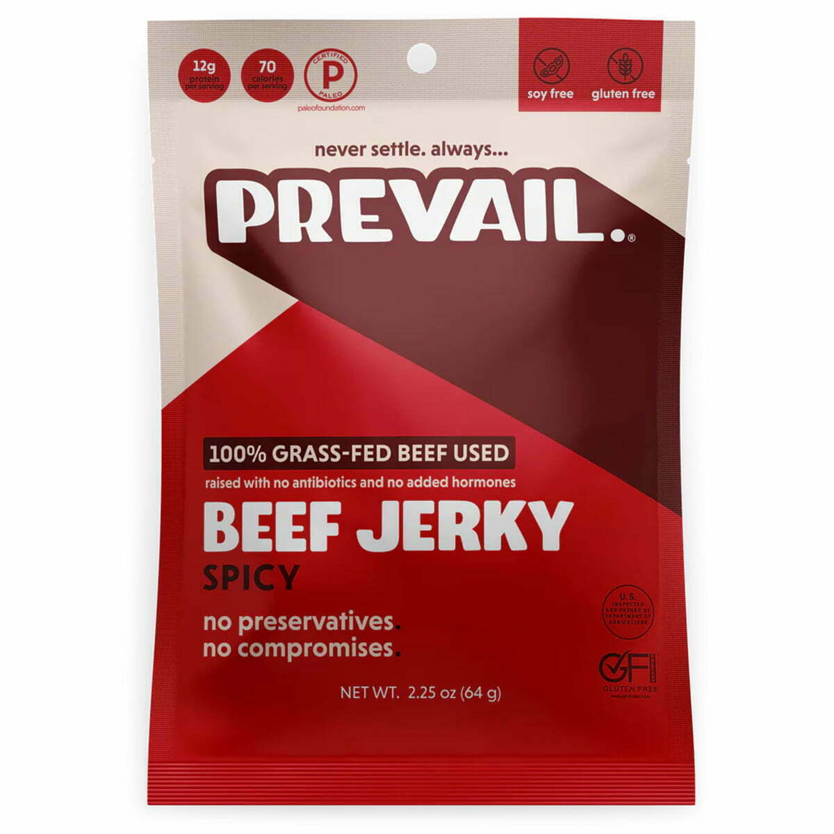
    Prevail Beef Jerky Packaging

    9. Prevail Beef Jerky

    Prevail is another brand that combines the matte finished packaging but, unlike some of the others, uses a monochrome color palette, like the oranges shown here. Their other flavors use a similar method, but with green tones for their lemongrass flavor, blue tones for their original flavor, and red tones for their spicy flavor. The matte finish is smooth and refined but keeps it simple and handsome. The fonts are in either all capital letters or all lower-case letters, which pair well together with san serif choices. They use the same colors to convey their information in stamps (gluten-free, protein count, soy-free, etc.).

    kaimana jerky packaging

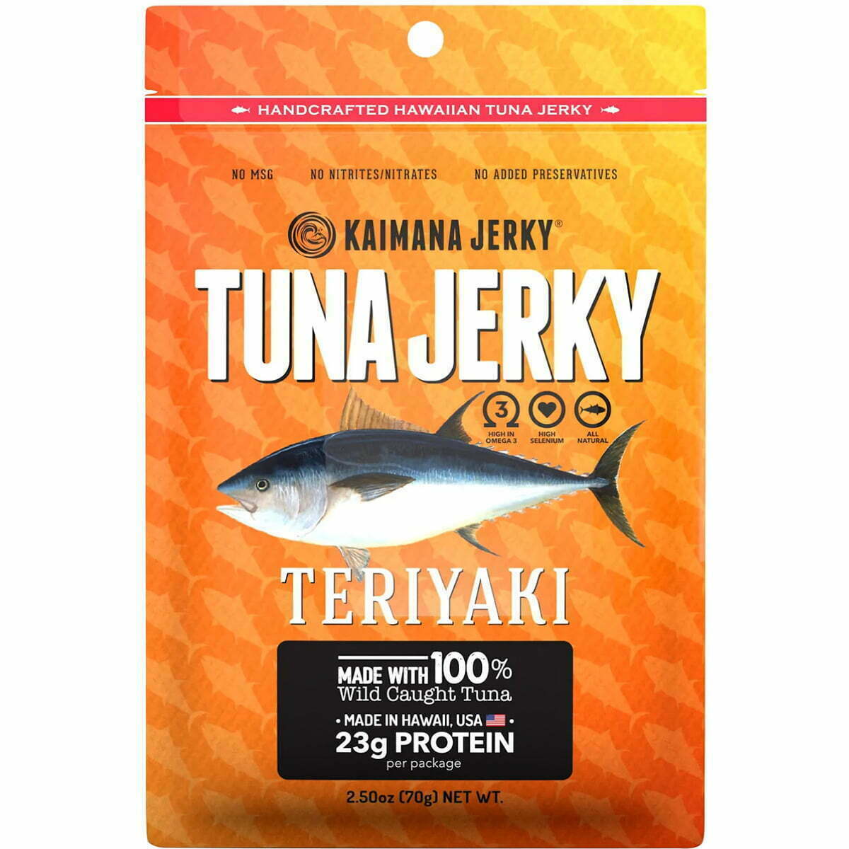
    10. Kaimana Jerky

    Salmon jerky is often seen as a healthier, better-for-you version of beef jerky, like Kaimana Salmon Jerky. Along with selling a healthier version of the product, their packaging appeals to the type of buyer who is more likely to go for healthier choices- those who are also eco-conscious. The packaging is environmentally friendly, with compostable packaging that is printed without colors to look even more natural and earth-friendly. Their logo and graphics are simply printed in shades of brown, black, and white to keep things minimal and attractive, as well.

    Luckily, a lot of these great ideas can be achieved at an affordable quote from this site, simply email us. With CarePac, you can transform your packaging without blowing up your budget on the web. Reach out for more information or to order some samples to see your packaging first-hand! Email us — we’d be happy to provide a quote. 

  • 5 Essential Granola  Packaging Ideas

    5 Essential Granola Packaging Ideas

    5 Essential Granola

    Packaging Ideas

    Granola Companies Who Did It Right:

    5 Essential Rules for Creative Granola Packaging & 10 Brands for Inspiration

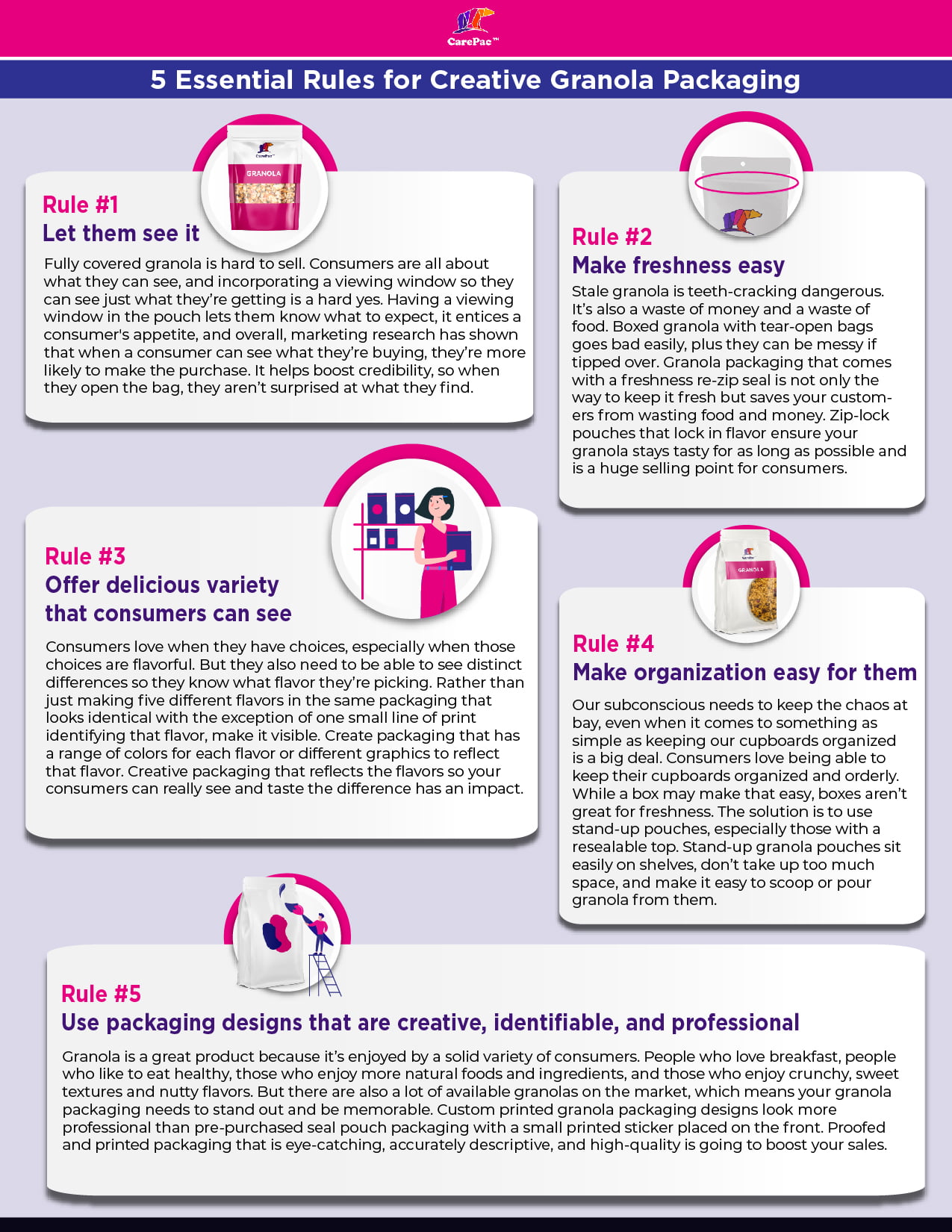
    It’s crunchy, tasty, healthy – and maybe a little bit messy – but with big-brand competition on the shelves, how can you package your granola to really make it sell? It’s not just about the flavor because your consumers first have to pick it off the shelf! When it comes to packaging your granola to sell, there are five essential rules any company should follow. Read on for some great granola packaging ideas. 

    Rule #1: Let them see the snack.

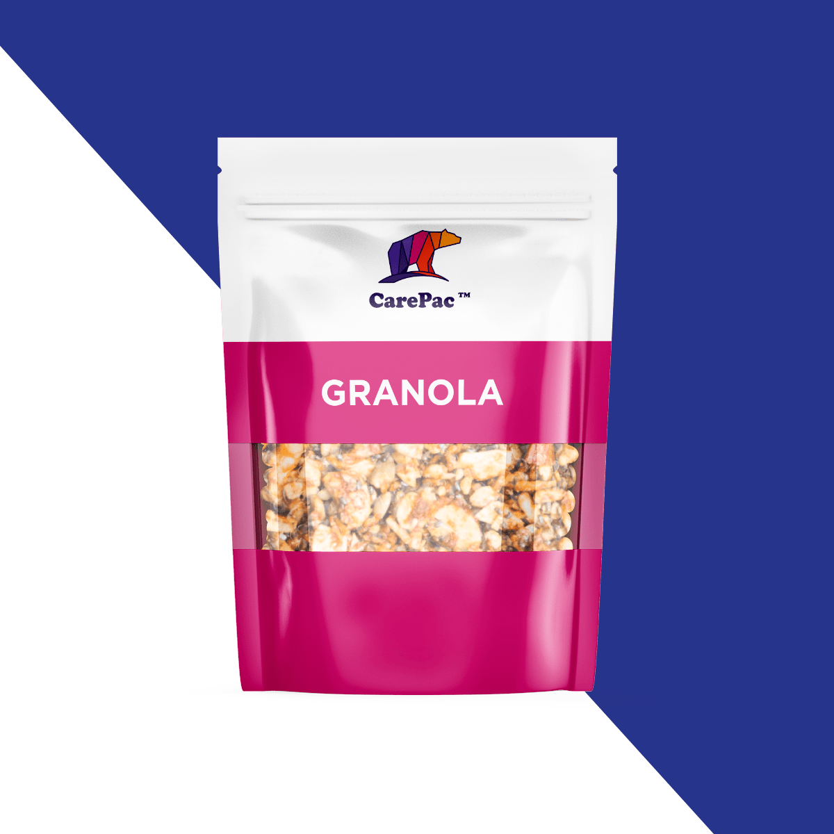
    Fully covered granola is hard to sell. Consumers are all about what they can see, and incorporating a viewing window so they can see just what they’re getting is a hard yes. Having a viewing window in the pouch lets them know what to expect, it entices a consumer’s appetite, and overall, marketing research has shown that when a consumer can see what they’re buying, they’re more likely to make the purchase. It helps boost credibility, so when they open the bag, they aren’t surprised at what they find.

    Rule #2: Make food freshness easy.

    Stale granola is teeth-cracking dangerous. It’s also a waste of money and a waste of food. Boxed granola with tear-open bags goes bad easily, plus they can be messy if tipped over. Granola packaging that comes with a freshness re-zip seal is not only the way to keep it fresh but saves your customers from wasting food and money. Zippered pouches that lock in flavor ensure your granola stays tasty for as long as possible and is a huge selling point for consumers. Also consider using a high barrier material like CareClear-XP.

    Rule #3: Offer delicious variety that consumers can see.

    Consumers love when they have choices, especially when those choices are flavorful. But they also need to be able to see distinct differences so they know what flavor they’re picking. Rather than just making five different flavors in the same packaging that looks identical with the exception of one small line of print identifying that flavor, make it visible. Create packaging that has a range of colors for each flavor or different graphics to reflect that flavor. Creative packaging that reflects the flavors so your consumers can really see and taste the difference has an impact. As a bonus, if you create limited-edition flavors or flavors that go with the seasons, you can create a new sense of demand with your buyers. A sense of urgency over a delicious flavor leaving at the end of summer, with fun, creative packaging to match, encourages them not to want to miss out.

    Rule #4: Make organization easy for them.

    Our subconscious needs to keep the chaos at bay, even when it comes to something as simple as keeping our cupboards organized is a big deal. Consumers love being able to keep their cupboards organized and orderly. While a box may make that easy, boxes aren’t great for freshness. The solution is to use stand-up pouches, especially those with a resealable top. Stand-up granola pouches sit easily on shelves, don’t take up too much space, and make it easy to scoop or pour granola from them.

    Rule #5: Use packaging designs that are creative, identifiable, and professional.

    Granola is a great product because it’s enjoyed by a solid variety of consumers. People who love breakfast, people who like to eat healthy, those who enjoy more natural foods and ingredients, and those who enjoy crunchy, sweet textures and nutty flavors. But there are also a lot of available granolas on the market, which means your granola packaging needs to stand out and be memorable. Custom printed granola packaging designs look more professional than pre-purchased seal pouch packaging with a small printed sticker placed on the front. Proofed and printed packaging that is eye-catching, accurately descriptive, and high-quality is going to boost your sales.

    10 brands that understand packaging! 

    Manna Granola

    Manna Granola does a lot right with their artisanal granola packaging. The matte finish package, a vibrant color that doesn’t overwhelm, minimal graphics to match a minimal-ingredient granola, and a peephole so buyers can see their food. The color palette is a bit retro, but it works. The only questionable choice is the script font for the word “Granola,” which is hard to read. Good thing we have that window to know what we’re getting.

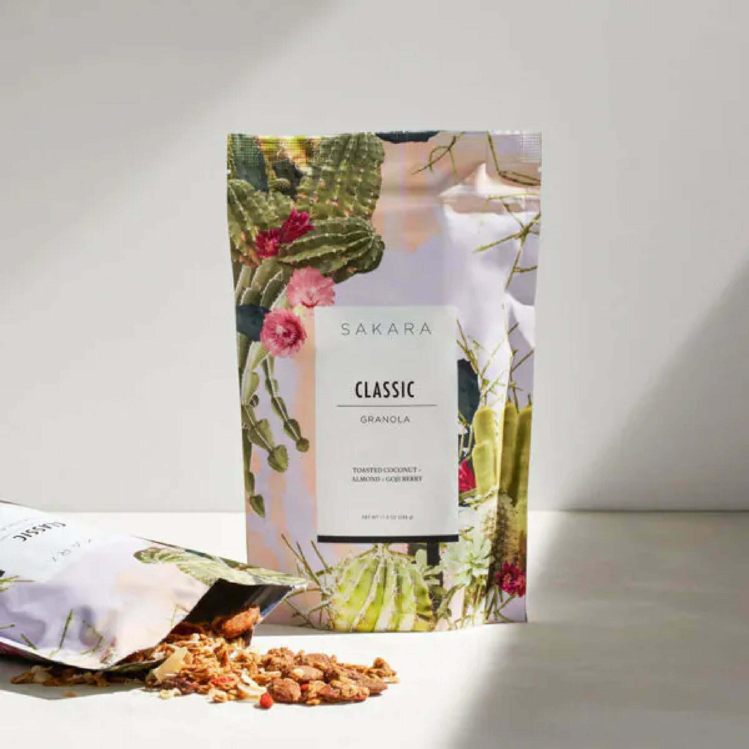
    Sacura

    Sakura’s granola packaging brings bright, colorful, and exciting graphics to their granola in a resealable stand-up pouch. Although they’re missing the window for viewing the granola, it’s still a very appealing package. The choice for the graphics is questionable, though, because although they are pretty, what do the cacti and florals have to do with the flavor? Overall, it’s eye-catching and likely to grab a consumer’s attention.

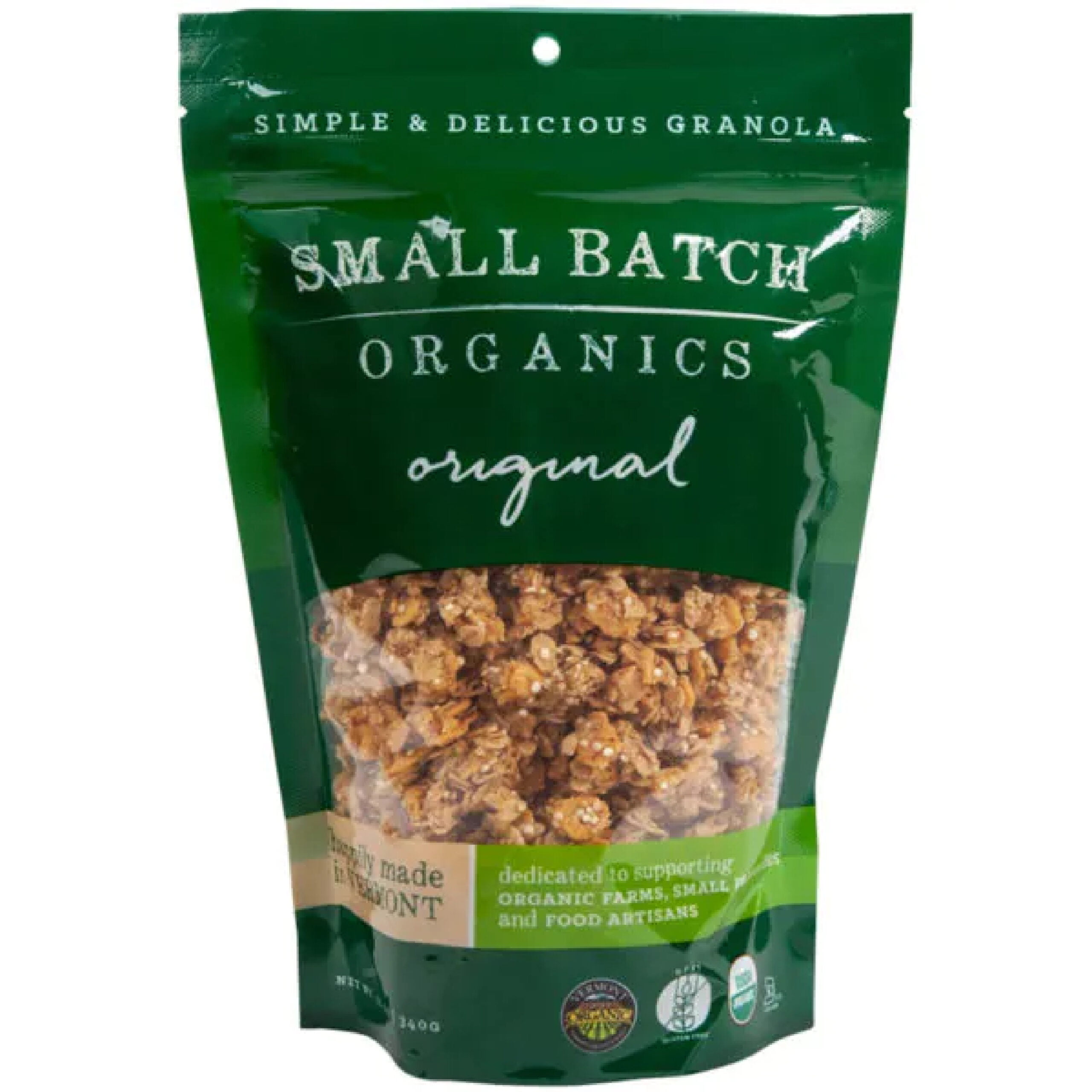
    Small Batch Organics

    Small Batch Organics checks off most of the rules. They don’t have the most exciting, stand-out packaging, but it hits their target demographic well. It is simple and easy on the eye. The font choices go well together. The color palette is very much reflective of a natural, organic product with greens and browns. It may not be the most eye-catching product on the market, but when it comes to finding a healthy and wholesome granola product, the package reflects the product.

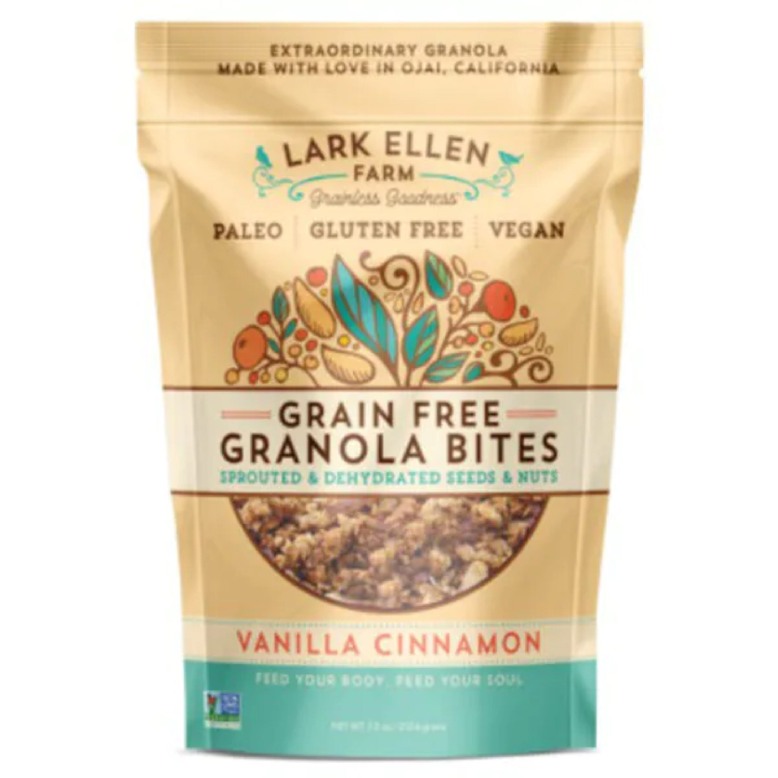
    Lark Ellen Granola

    Lark Ellen Farm’s packaging gives off a cute, friendly, and wholesome with a matching color palette, fun typography, and inviting graphics. It combines fun and functional together well, with a package that keeps the granola fresh and the packaging fresh. It’s easy to read, it’s easy to see, and it looks like it’s going to taste good.

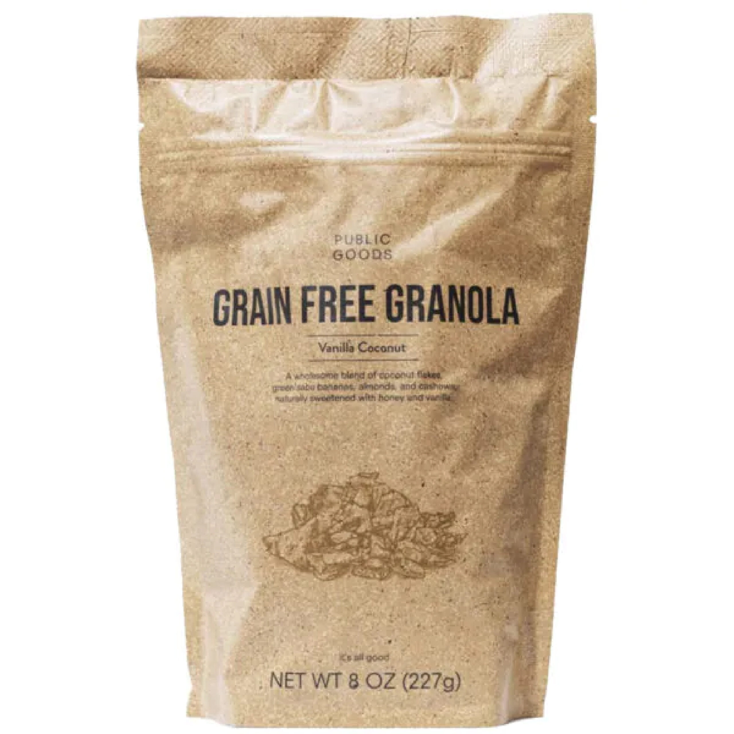
    Public Goods

    Public Goods goes with an ultra-minimalist packaging that works for their product and their brand identity. It keeps it simple and to the point. The packaging would definitely benefit from a viewing window, which would match the packaging with the shades of brown and make it a bit more appetizing to the consumer. However, the rest of it is right on the money.

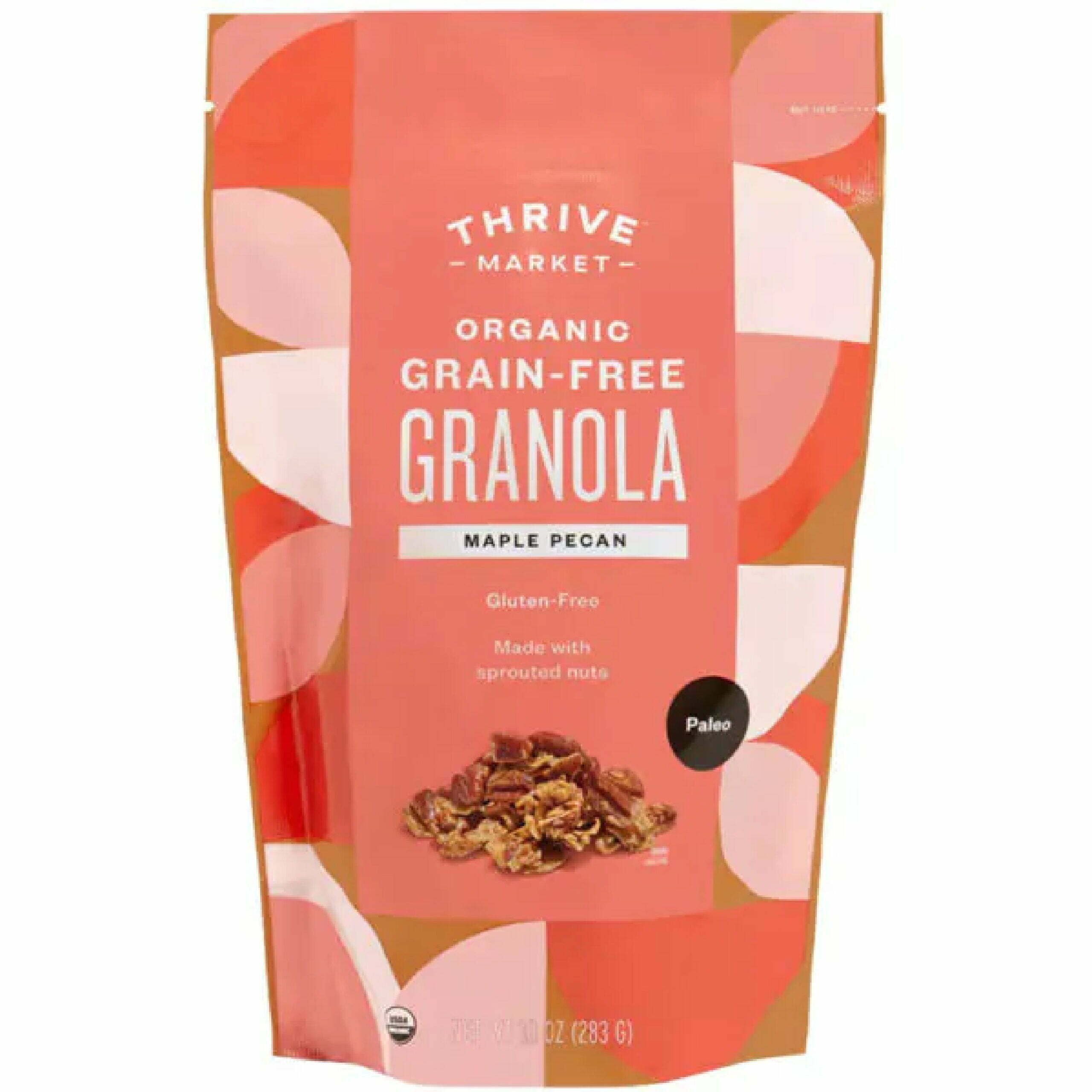
    Thrive Granola

    The soft yet colorful shades of pink and peach on the Thrive granola packaging, along with the large color blocks, make it stand out without being overbearing. The easy-tear, stand-up pouch with fun graphics is certainly going to appeal to a consumer. The biggest downside is going to be the lack of a zip-lock top to keep it fresh and to avoid any spillage from a tipped bag.

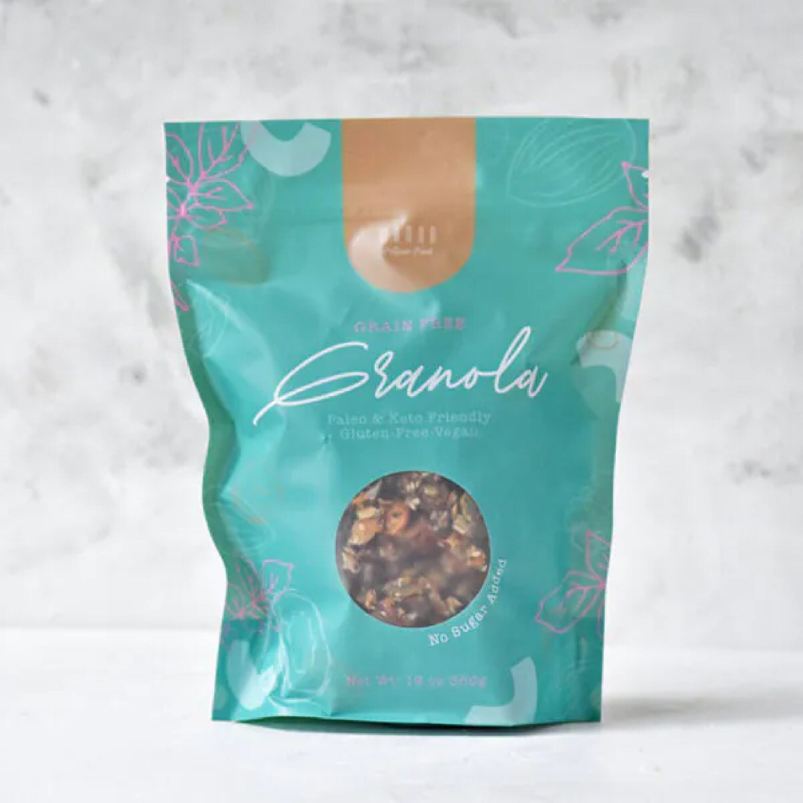
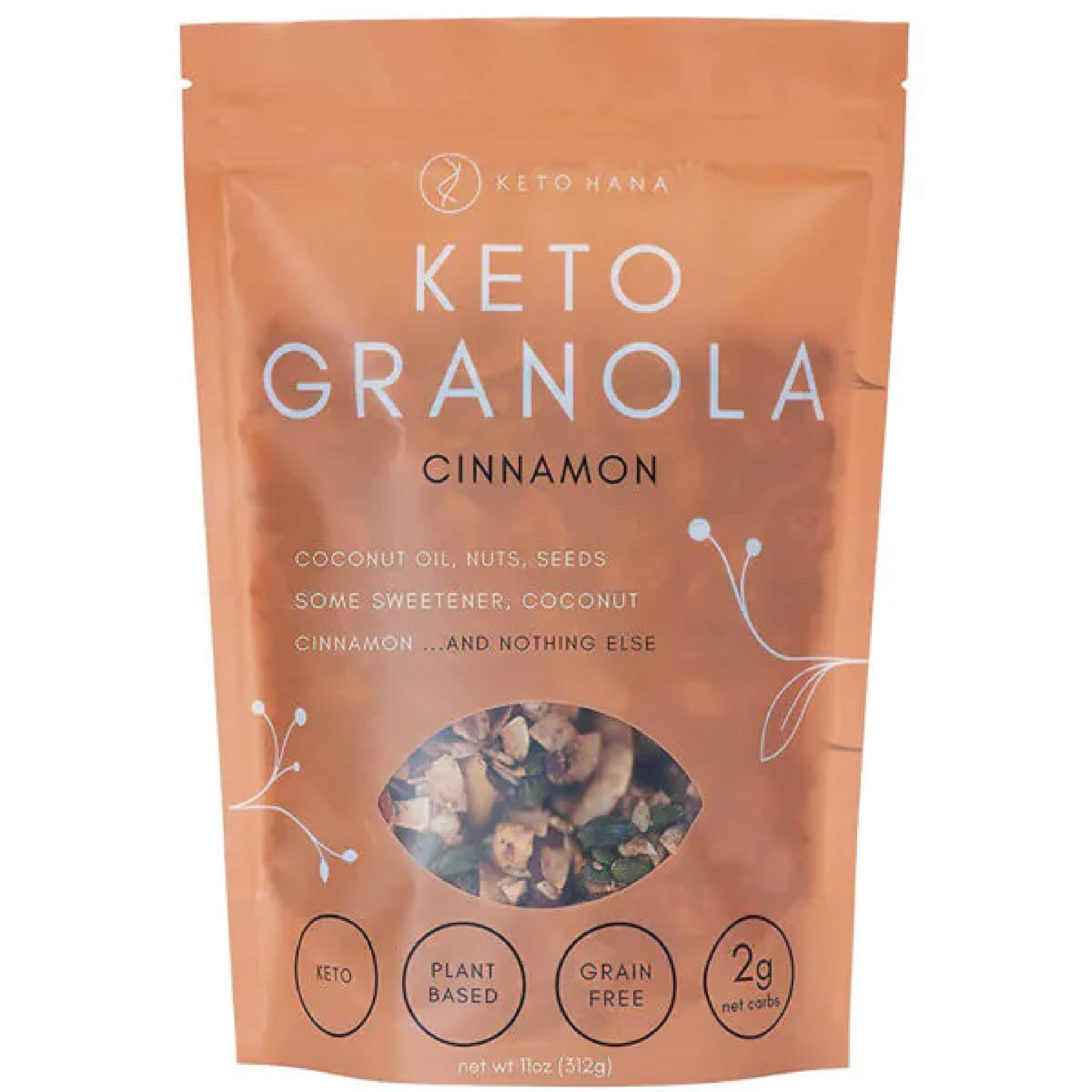
    Keto Hana

    Keto Hanas font choice is simple and direct, but the typography goes perfectly with their brand premise and the limited ingredient, simplified granola concept. The faded packaging with a peekaboo window gives the impression of transparency, literally with the ingredients. Although it is simple, the vine graphics elevate it with a touch of sophistication.

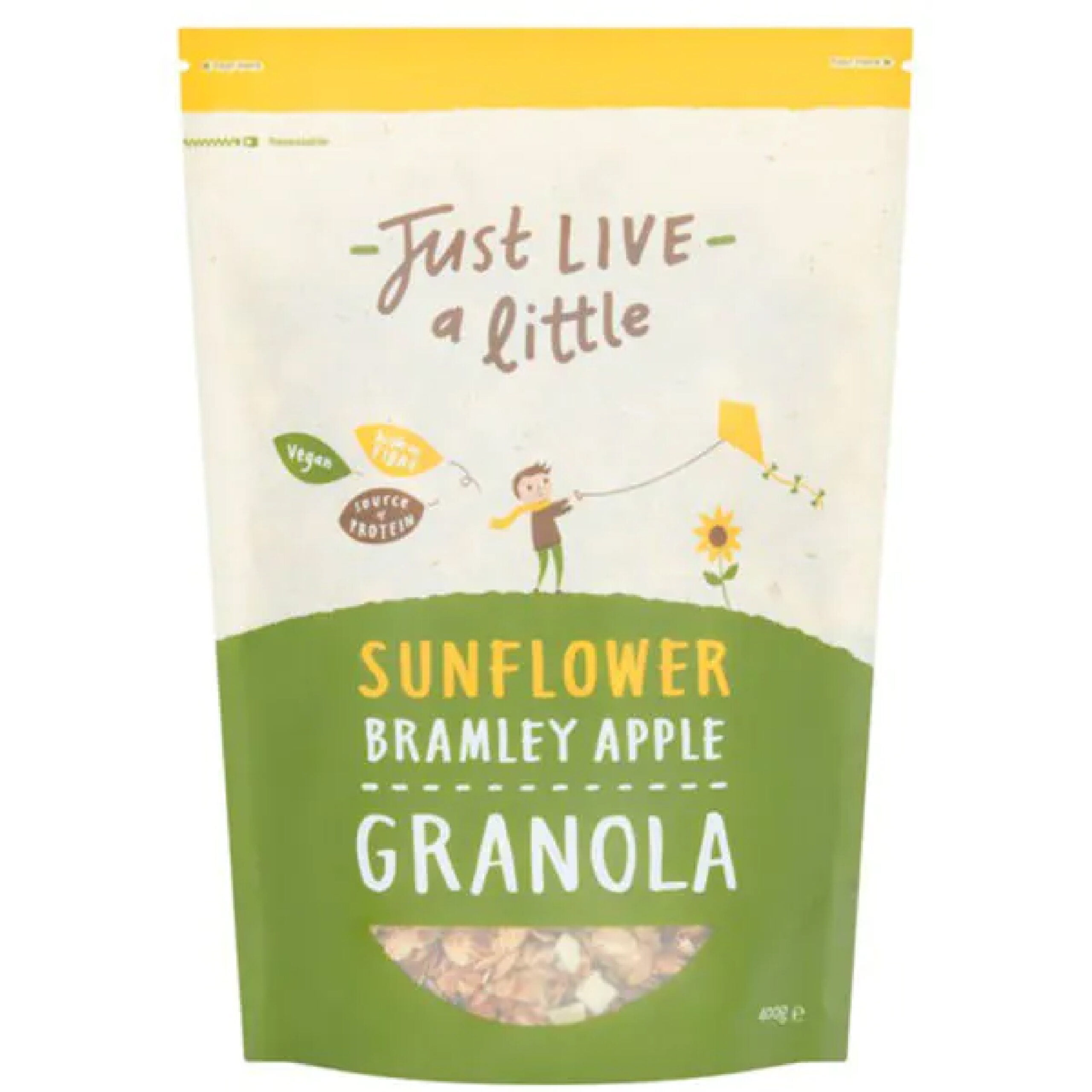
    Just Live a Little

    Just Live a Little has cute and wholesome energy, just like the Lark Ellen Granola. Their typography is inconsistent but in a cohesive way with two unique fonts. They have different color packaging for all their flavors, so it’s easy to tell them apart, but they all stick to the same color palette. It stands up, and it’s easy to tear open and just as easy to reseal.

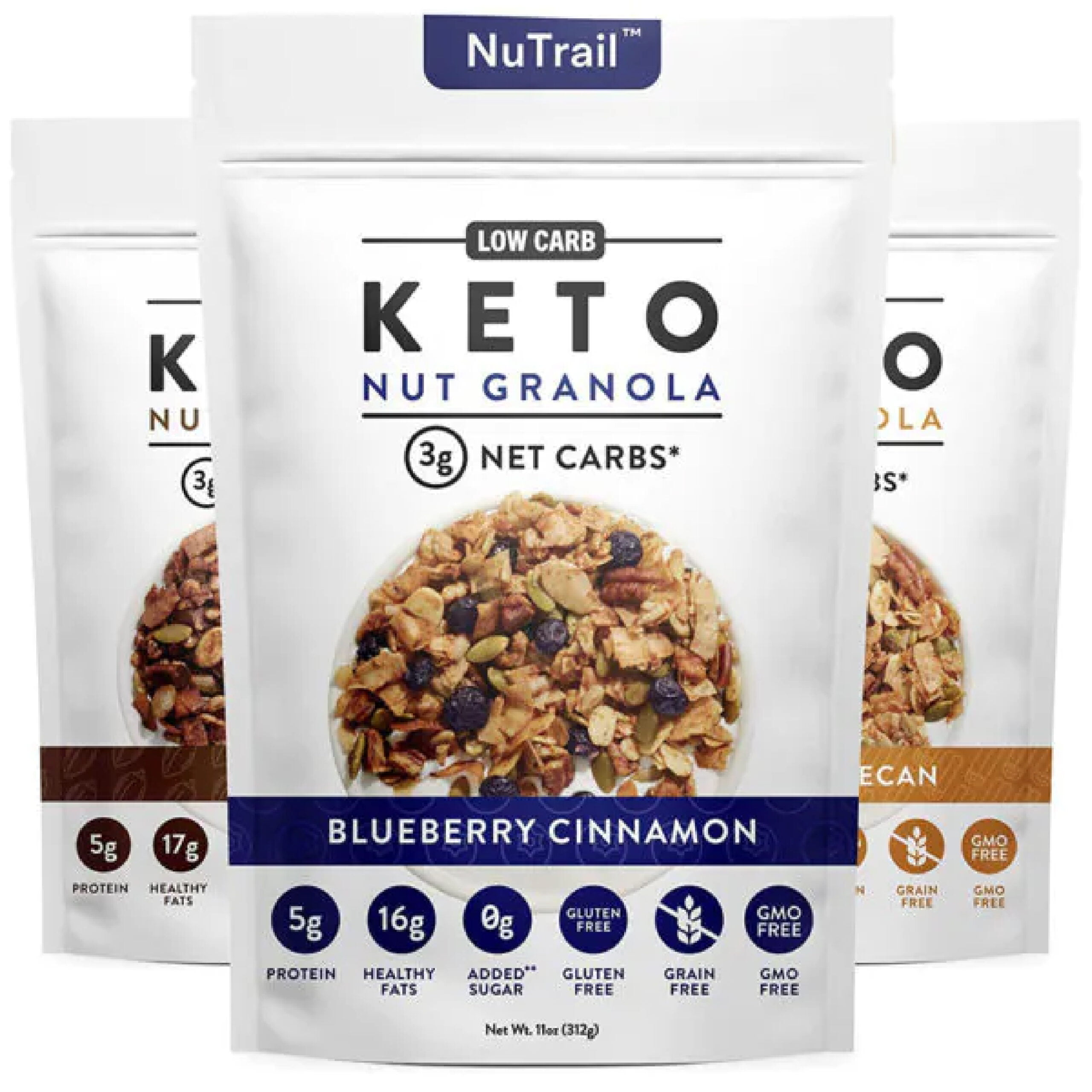
    NuTrail Keto Granola

    The packaging for NuTrail looks clean-cut and healthy. There’s nothing fancy or exciting, but most people who follow a keto diet just need to know what they’re putting in their body, which is the focus of the packaging. They don’t have a window, but at least provide a picture of the granola itself. The small color bands differentiate flavors. Clean fonts, clean colors, and clean graphics for clean eating.

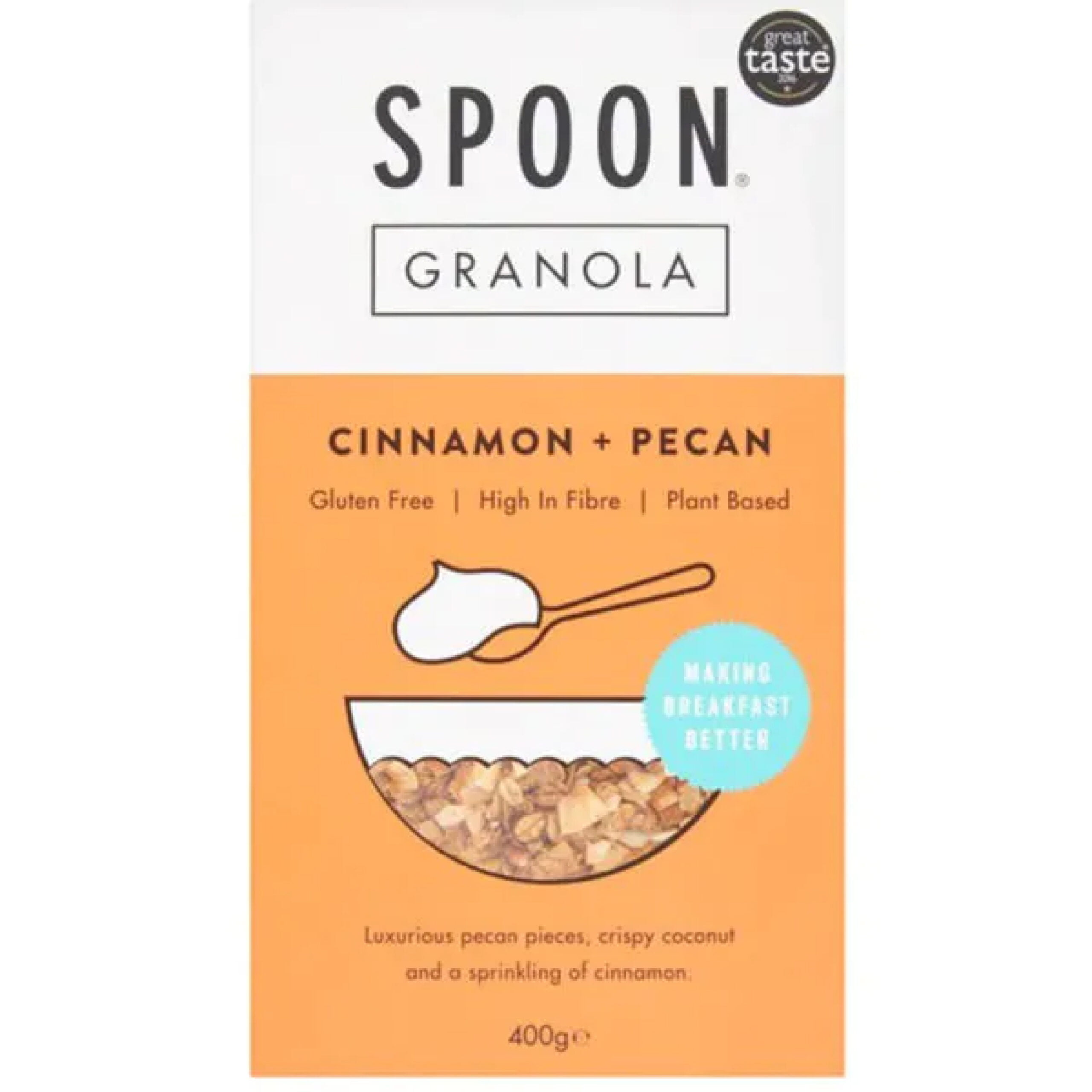
     Spoon Granola

    Spoon Granola is a great example of minimalist design. The graphics are super simple, and the same can be said of the font choices. The typography pairs well with the colors, the lines, and the creative use of the little bowl for the viewing window. Boxes are much harder to stay fresh, but the square packaging still works with the overall design.

    Whether you’re looking to get your granola product into grocery stores or you want to elevate your stand at your local farmers’ market, custom seal pouch packaging for granola should be your next step. CarePac offers budget-friendly professional packaging that features stay-fresh packaging and seals with viewing windows and stand-up packages that will hit all the branding rules. With product packaging design you can print directly on, we have three different film materials to choose from and can help bring your vision to life. Customize each aspect of your flexible packaging and elevate your granola brand for 2022!

    Reach out to us today to find out more about our customizable food packaging and what makes us one of the best flexible packaging companies in the U.S. Don’t make a mistake — call or email us today! 

  • 11 Tea Packaging Ideas For Inspiration

    11 Tea Packaging Ideas For Inspiration

    11 Tea Packaging Ideas For

    Inspiration

    Finding the perfect packaging aesthetic is no easy feat, especially when it comes to teas. You need to find just the right combination of font and color, pair it with the right logo and graphics, and maintain a visual that evokes the voice of your brand. There’s a reason why major companies pay millions a year to craft their dream packaging design. But with the right know-how, you can skip out on spending millions and develop packaging for your products that works for you and keeps you within budget.

    Keep reading to learn more about how to design great tea packaging with a designer like us. 

    ith over 40 films available, we have a material that will ensure your stand up pouch is of the highest quality. We can also combine materials in a custom order. You can combine a black film with a clear film, or metallized with a glossy finishing. It’s your choice! Contact us to learn more about custom printed pouches and stand up pouch projects. Give us a call at 626-559-0377 and request a quotation. We’ll be happy to help you.

    Things to Keep in Mind When Designing Tea Packaging

    So, what’s there to remember as you go into designing your new packaging? To create a tea packaging concept that sells, here are some essential trends to keep in mind:

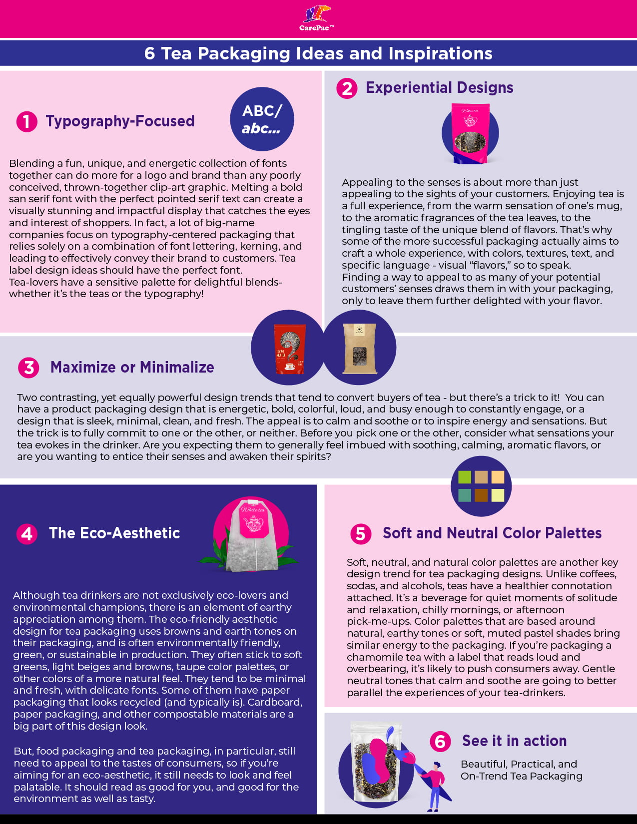
    Typography-Focused Tea Packaging Designs

    Blending a fun, unique, and energetic collection of fonts together can do more for a logo and brand than any poorly conceived, thrown-together clip-art graphic. Melting a bold san serif font with the perfect pointed serif text can create a visually stunning and impactful display that catches the eyes and interest of shoppers. In fact, a lot of big-name companies focus on typography-centered packaging that relies solely on a combination of font lettering, kerning, and leading to effectively convey their brand to customers. Tea label design ideas should have the perfect font.Tea-lovers have a sensitive palette for delightful blends- whether it’s the teas or the typography!

    Experiential Designs

    Appealing to the senses is about more than just appealing to the sights of your customers. Enjoying tea is a full experience, from the warm sensation of one’s mug, to the aromatic fragrances of the tea leaves, to the tingling taste of the unique blend of flavors. That’s why some of the more successful packaging actually aims to craft a whole experience, with colors, textures, text, and specific language – visual “flavors,” so to speak. Finding a way to appeal to as many of your potential customers’ senses draws them in with your packaging, only to leave them further delighted with your flavor.

    Maximize or Minimalize

    Two contrasting, yet equally powerful design trends that tend to convert buyers of tea – but there’s a trick to it! You can have a product packaging design that is energetic, bold, colorful, loud, and busy enough to constantly engage, or a design that is sleek, minimal, clean, and fresh. The appeal is to calm and soothe or to inspire energy and sensations. But the trick is to fully commit to one or the other, or neither. Before you pick one or the other, consider what sensations your tea evokes in the drinker. Are you expecting them to generally feel imbued with soothing, calming, aromatic flavors, or are you wanting to entice their senses and awaken their spirits?

    The Eco-Aesthetic

    Although tea drinkers are not exclusively eco-lovers and environmental champions, there is an element of earthy appreciation among them. The eco-friendly aesthetic design for tea packaging uses browns and earth tones on their packaging, and is often environmentally friendly, green, or sustainable in production. They often stick to soft greens, light beiges and browns, taupe color palettes, or other colors of a more natural feel. They tend to be minimal and fresh, with delicate fonts. Some of them have paper packaging that looks recycled (and typically is). Cardboard, paper packaging, and other compostable materials are a big part of this design look.But, food packaging and tea packaging, in particular, still need to appeal to the tastes of consumers, so if you’re aiming for an eco-aesthetic, it still needs to look and feel palatable. It should read as good for you, and good for the environment as well as tasty.

    Soft and Neutral Color Palettes for Your Creative Tea Packaging

    Soft, neutral, and natural color palettes are another key design trend for tea packaging designs. Unlike coffees, sodas, and alcohols, teas have a healthier connotation attached. It’s a beverage for quiet moments of solitude and relaxation, chilly mornings, or afternoon pick-me-ups. Color palettes that are based around natural, earthy tones or soft, muted pastel shades bring similar energy to the packaging. If you’re packaging a chamomile tea with a label that reads loud and overbearing, it’s likely to push consumers away. Gentle neutral tones that calm and soothe are going to better parallel the experiences of your tea-drinkers. 

    11 Great Tea Packaging Concepts and Ideas for Design

    Euphoric Herbals

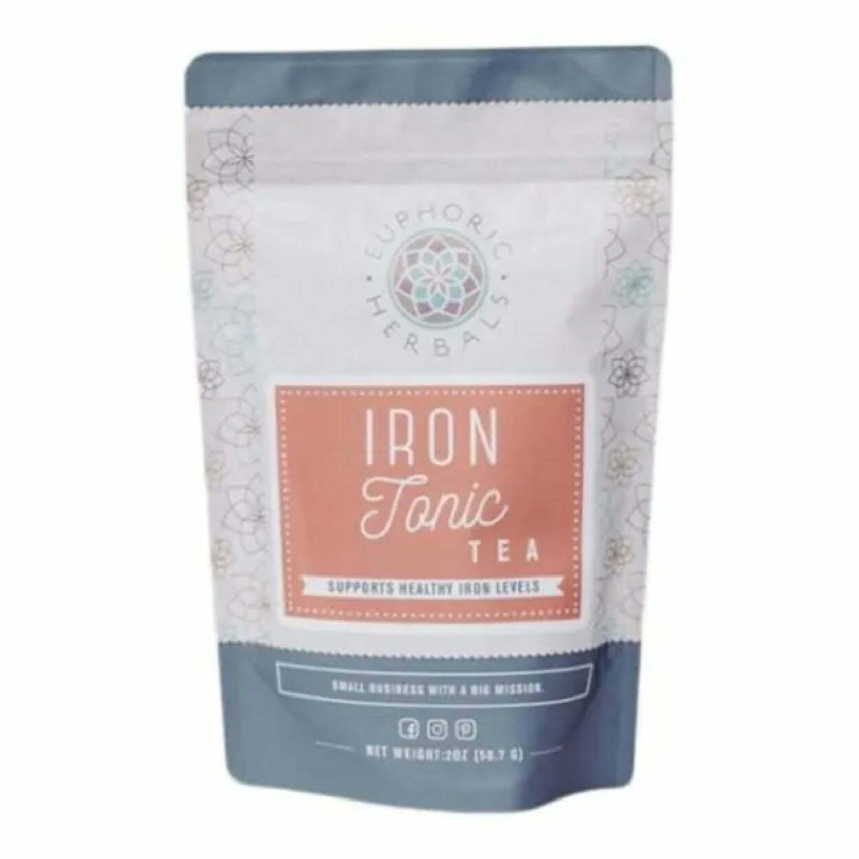
    The Euphoric Herbals packaging for their Iron Tonic tea is a great example of the typography-centered packaging that uses a three-font combination. They also have a soft color palette that pairs well with the fonts for an overall calming yet vibrant and eye-catching package. The neutral tones of brick and slate-blue are contrasting, similar to the script and san serif font of the label. Although it’s not the most exciting packaging, it also has a lot going on, with the floral shape graphics covering the side panels of the package.

    The Pink Tea Box

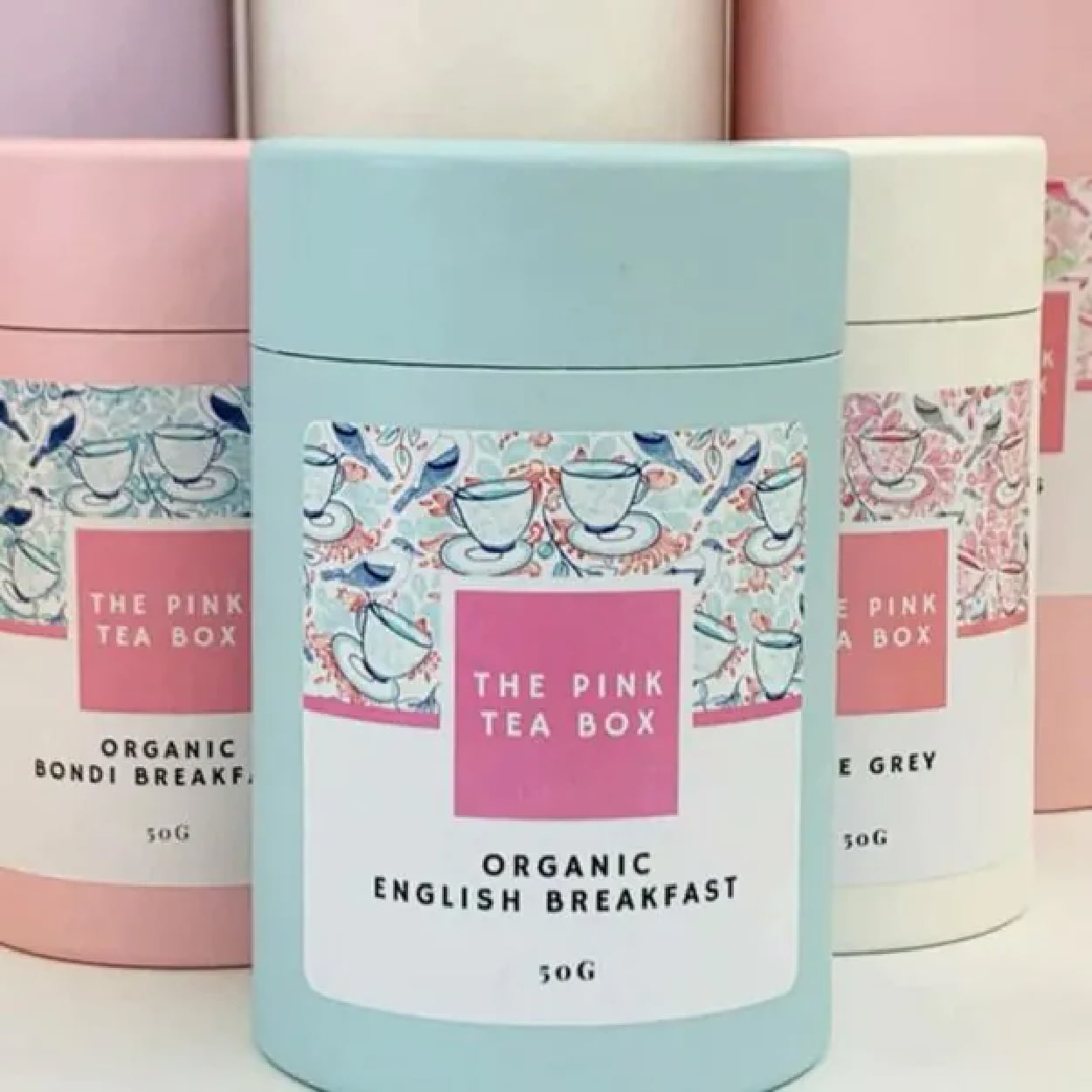
    The pastel palette of the Pink Tea Box is cohesive, concise, and effectively conveys the springtime, floral flavors, and subdued energy of the brand. They pair it well with scribbled graphics of teacups on the label to give a bit of pop while not overwhelming the frame of the label. It breathes feminine energy to appeal to its target demographic. The use of the circular cardboard boxes is also circular, smooth and further maintains the serenity of the packaging as a whole.

    Zest Tea

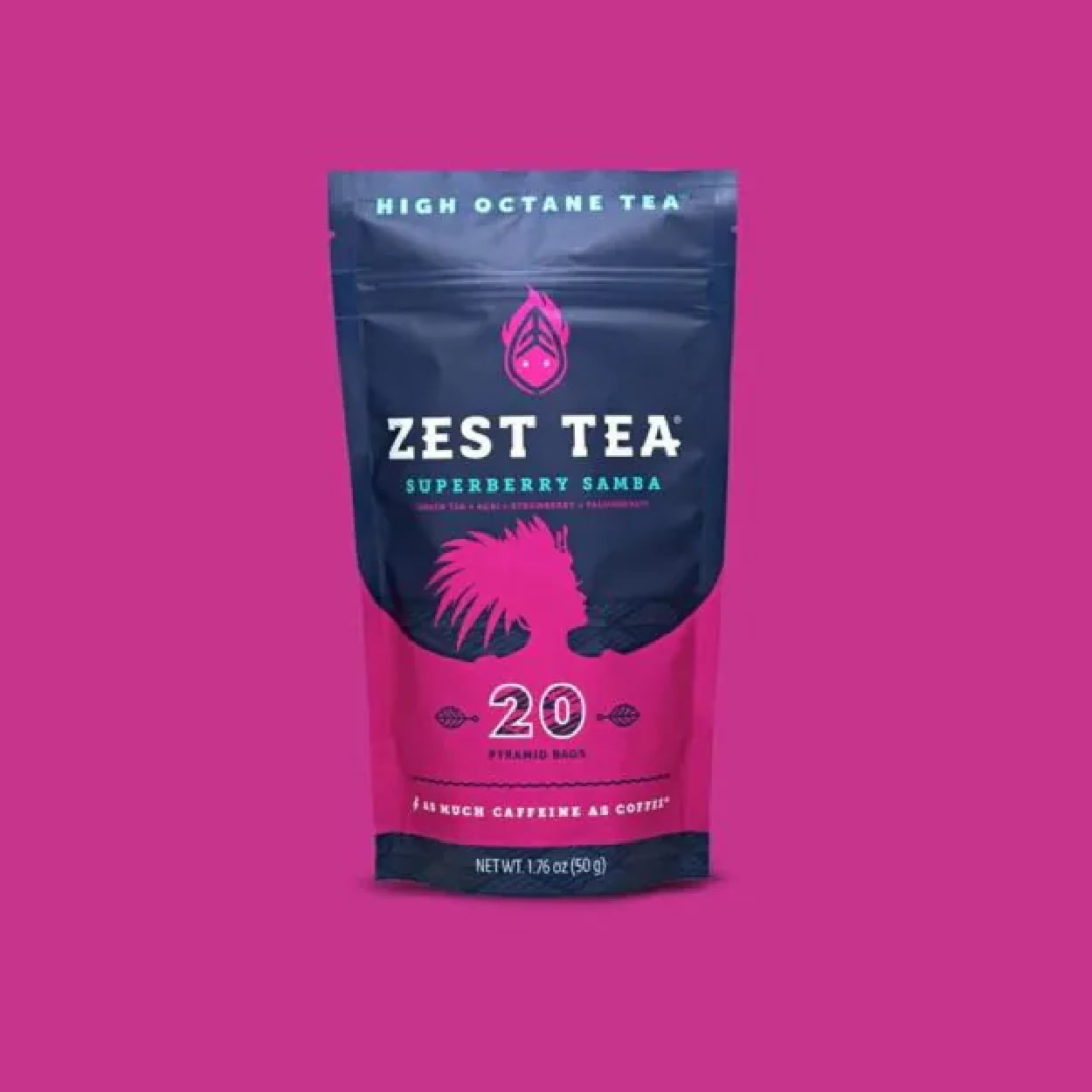
    Zest Tea advertises itself as a high-octane tea, a tea that delivers as much caffeine as a cup of coffee. This means their packaging should evoke high energy, with loud, bold, and dynamic colors and fonts. The bright, contrasting colors play with the bold-paired font in a way that is smooth and appealing, but gives off the same dynamic energy of their tea.

     Woash

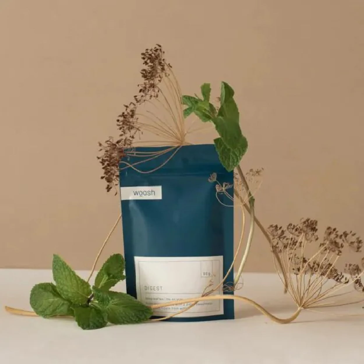
    Woash takes minimalism and neutral coloring to the max with a deep blue and beige palette. No real logo is needed when you take your typography and transform it into a cohesive aesthetic. The packaging pairs it with smooth, clean lines for a simple yet sleek package that looks as easy on the stomach as it is on the eyes.

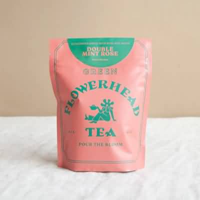
    Flowerhead Tea

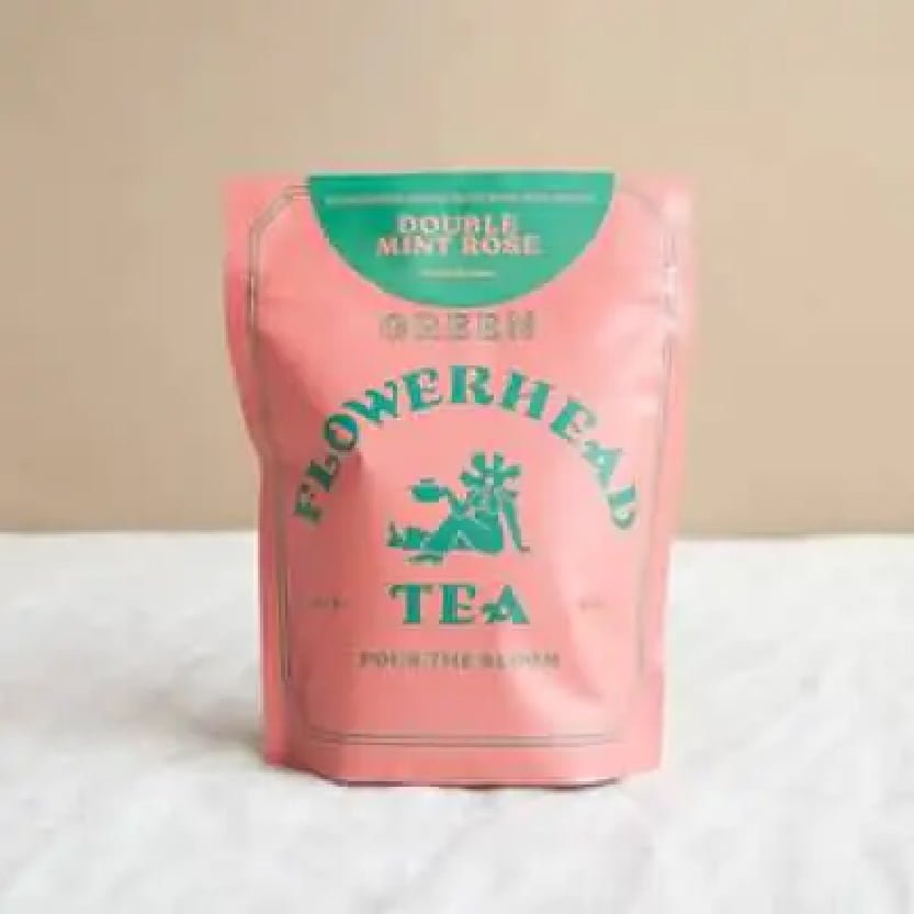
    Flowerhead Tea’s packaging follows its own rules of designs for an experiential effect, with a clashing color palette that is almost hard to look at. The bold, all-caps font choice is equally loud and in-your-face. It’s a bold risk, but it somehow works. It’s all simple, with just two colors, three fonts, and one minimal graphic, but it comes together to sell.

    August

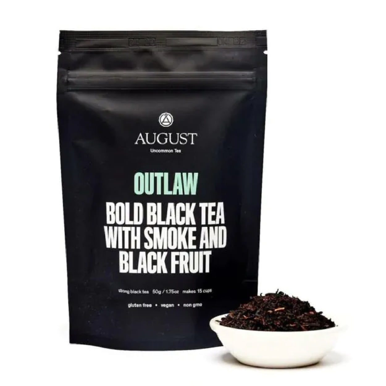
    August’s Outlaw tea packaging is all about dramatic and bold. The stark, all-black packaging paired with simple, loud lettering (it’s literally yelling) strays from the more traditional tea packaging. The typography stays focused and centered with minor pops of color. The consumer knows exactly what they’re getting they and can expect a flavor that’s as bold as the look.

    Healthify Tea

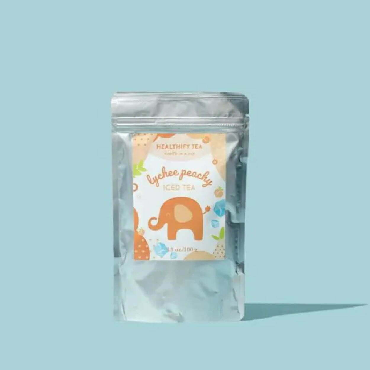
    Healthify Tea has cute, bright, cheery, and fun packaging that is visually pleasing. Although full package branding, as opposed to a sticker on a package, would give it more professionalism and pop, the label is experiential in design, with bright colors, textures, graphics, and unique lettering in the typography. You get a little tingle of joy even just looking at the package, let alone sipping the tea.

    Blume

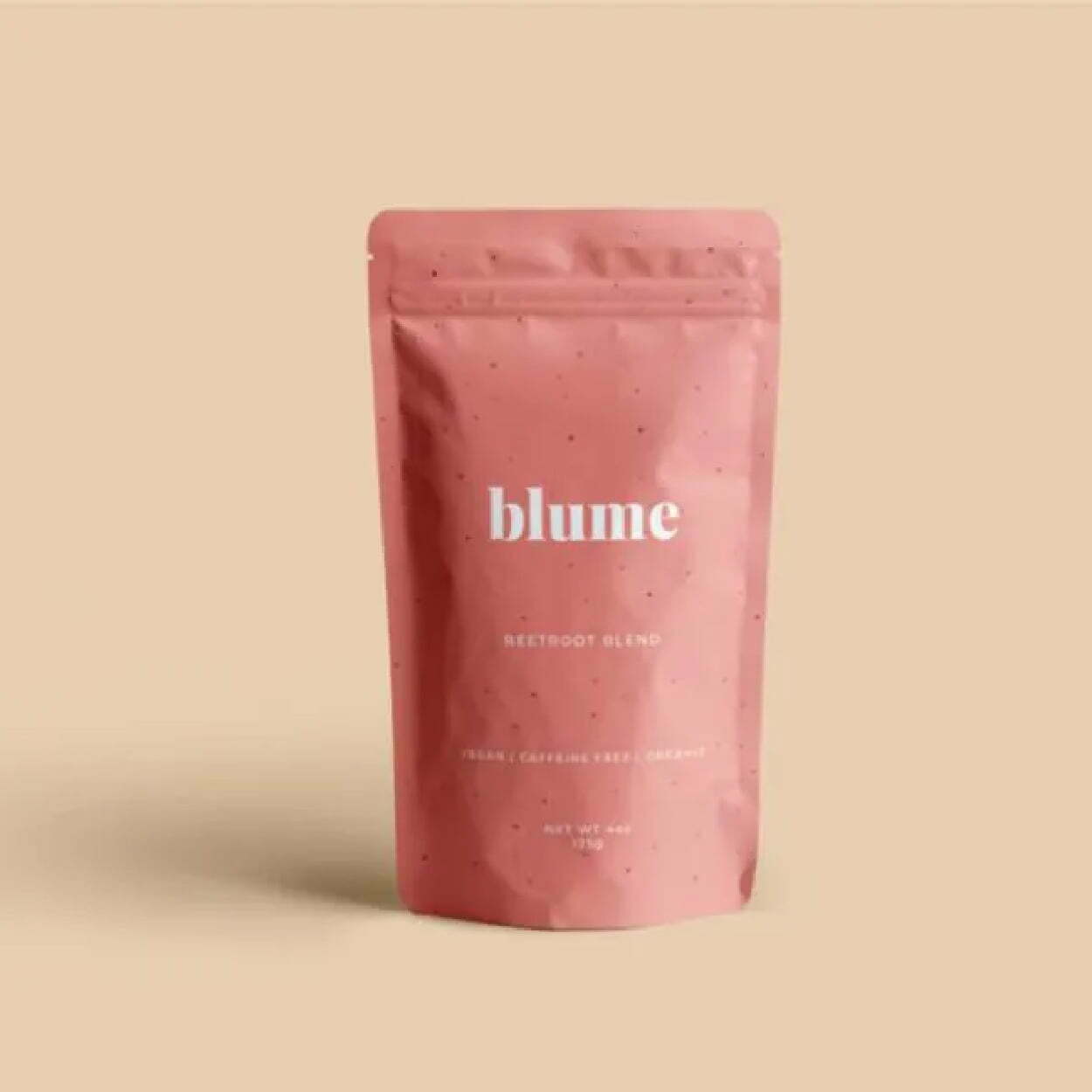
    Blume’s minimalist packaging stays consistent across most of its flavors, with the primary difference being the color of the package. They vary but stay neutral and pastel, with faded shades and tones. They’re also typography-focused for the logo and packaging, with the simple, all-lowercase “blume” as their logo in the key font, paired with san serif fonts that are sleek and linear.

    Sammee

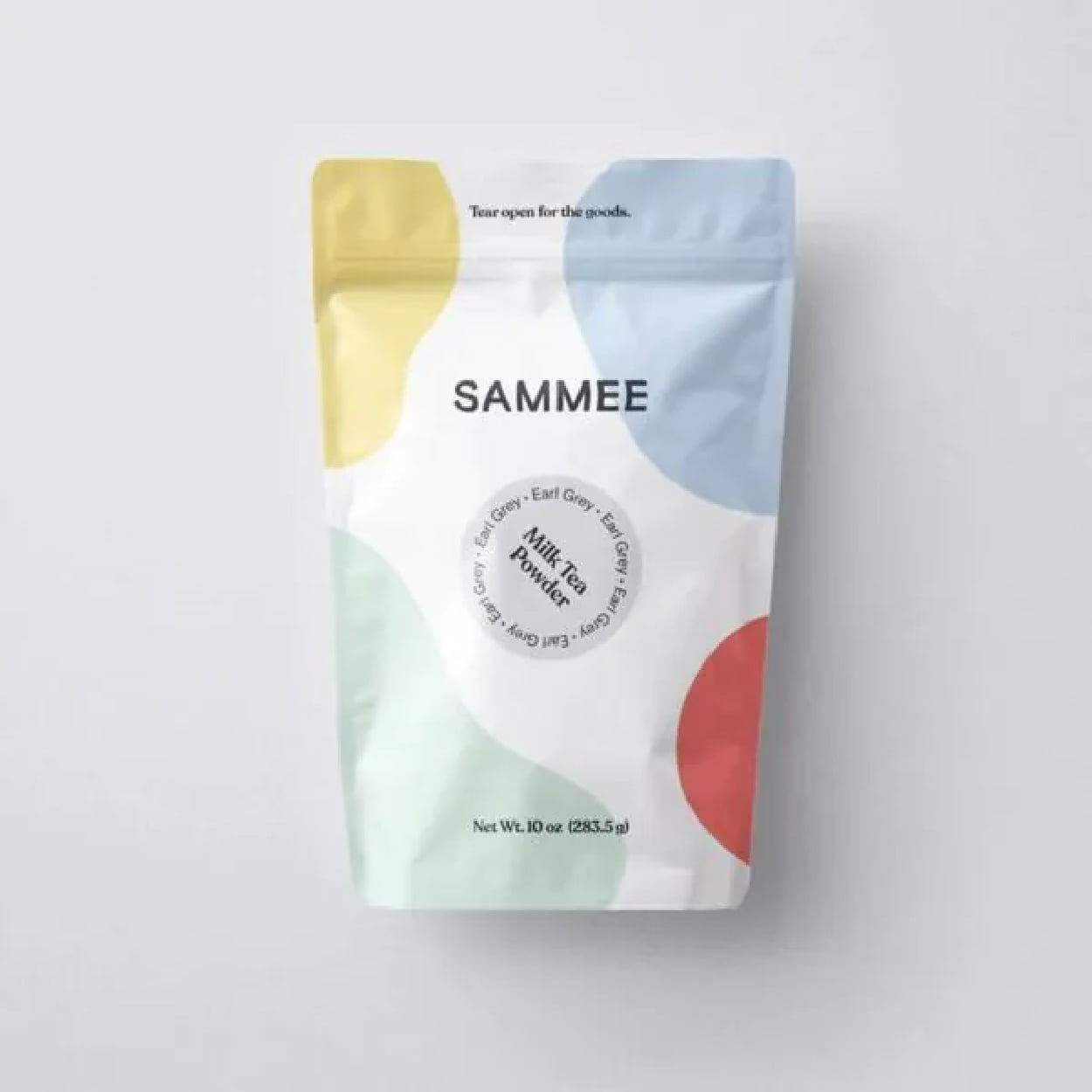
    Sammee takes primary colors and shifts them to a soft, gentle pastel. It keeps the aesthetic simple but with a pop of color that gives energy but doesn’t overwhelm. It feels fluid with the unshaped blocks of color and feels palatable. It’s visually stimulating with colorful, abstract shapes, but in a calm and subdued way. The typography could give more than it currently does, but at least it doesn’t detract from the design.

    Rishi

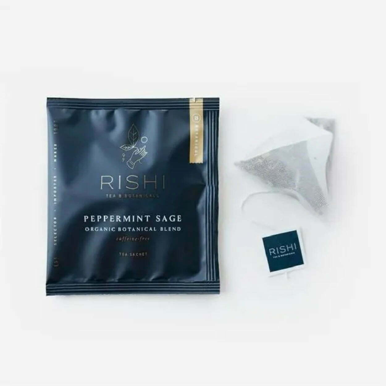
    Rishi’s packaging feels luxurious and rich, with an almost velvet matte finish of the sachet that’s coupled with minimal amounts of gold detailing and sleek, thin lettering. Experiential designs make you feel something other than just a visually appealing package. It looks like whatever you drink from it will feel smooth, calming, and rich with flavorful tea.

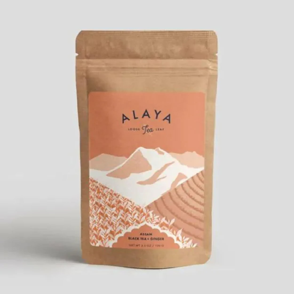
    Alaya 

    Alaya takes eco-friendly and sustainable packaging and pairs it with a minimalism that feels organic, fresh, and healthy. The colors are earthy, with the natural paper bag of the package and the mint-green and white tones on the label. The graphics add a level of complexity but still keep it minimal on the detailing, which matches well with the eco-friendly feel of the tea packaging.

    Professional Packaging with CarePac

    Finding affordable but professional packaging that helps sell your tea is easier said than done – unless you’re using the right custom packaging services. Eliminate your need to stress about quality packaging for sachets, loose leaf tea bags, and sachet bags with our customized tea packaging. 

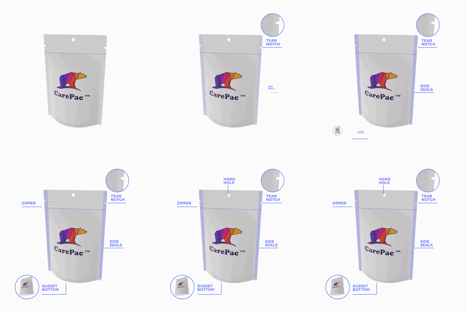
    But having a killer packaging design doesn’t mean much if your package isn’t functional, as well. Tea needs to stay dry, preserved and sealed to maintain its aromatic tastiness, and the tea information should be clearly stated on your tea product packaging. Our standup box package design and packaging’s feature a multi-layer preservation barrier, easy-to-use zip closures, tear notches, hang holes, and more.

    Reach out today to find out how we can help perfect your packaging! Contact us for more information!