Category: Packaging Design

  • Nutritional Labeling Requirements

    Nutritional Labeling Requirements

    If you manufacture food products, you understand the need for Nutrition Facts labels that follow updated dietary and science recommendations. The label helps consumers to make informed choices regarding healthy diet. Its always recommended to hire a qualified expert consultant to help you navigate the regulations of food labeling. One wrong word can mean you must recall all the food and relabel it. FDA labeling isn’t something to DIY.  This article is meant to be a brief overview of some of the labeling requirements you need to keep in-mind. 


    In 2016, the U.S. Food and Drug Administration (FDA) updated the Nutrition Facts label on packaged foods to reflect current scientific information, including the connection between diet and chronic diseases like heart diseases and obesity. This was the first significant nutritional label update in over two decades according to the FDA (current as of 02/10/2021).


    The regulators required manufacturers whose annual sales are $10 million or more to update their labels by January 1, 2020. Those whose yearly food sales fall below $10 million were required to update the labels by January 1, 2021. So, what changed?


    Format and Font Requirements


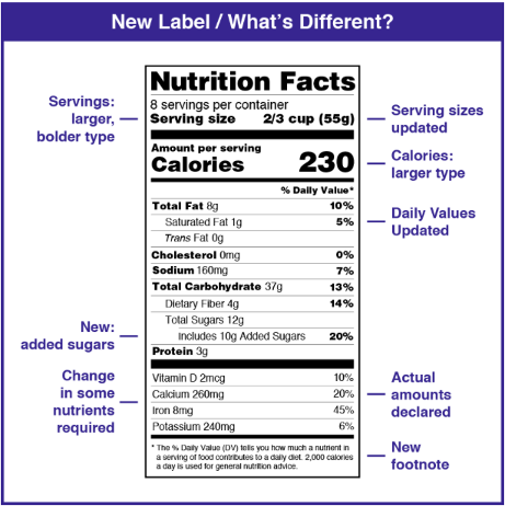
    While the label still maintains its iconic design, the FDA updated it to help consumers to access vital information at a glance. That way, they can make quick and informed nutritional decisions. Some of the changes include the type and size of fonts for ‘serving size,’ ‘calories,’ and ‘servings per container.’


    In addition to listing the % DV (Daily Value) of Iron, Calcium, Vitamin D, and Potassium, the manufacturer needs to declare the actual amount of these nutrients. They can reveal other nutrients and minerals’ gram amounts voluntarily. 


    Here are more specific requirements when formatting the label:

    • The heading Nutrition Facts must be Fanklin Gotchic Heavy or Helvetica Black, flush left and flush right, no smaller than 13 point
    • Serving size must be Helvetica Regular 8 point with 1 point of leading
    • % Daily Value must be 6 points, Helvetica Black
    • Total fat must be 8 points Helvetica black with 4 points of leading
    • The vitamins and minerals section must be 8 points Helvetica Regular, 4 points of leading with 10 point bullets
    • Type below vitamins and minerals is 6 point with 1 point of leading
    • All labels enclosed by ½ point box rule within 3 points of text measure
    • Requirements for lines have also changed 


    More Updates


    In 2018, FDA announced the Nutrition Innovation Strategy, which sets a strategic course for taking action to reduce preventable death and disease related to poor nutrition. From: https://www.fda.gov/food/nutrition-education-resources-materials/new-nutrition-facts-label current as of 06/29/2020


    Serving Sizes are now larger and bold


    The serving size details per container have now gotten real, appearing in large and bold fonts. According to FDA, they must be Helvetica Regular 8 points with 1 point of leading. The updates on the serving sizes also reflect the amount of food and drinks consumption today. 


    Since the initial Nutrition Facts label’s birth, the term ‘serving’ has changed for some foods over time. While the Nutrition Facts label usually lists information based on one serving, some manufacturers may display the details per package. And one package may have more than one serving. 


    Packages’ serving sizes requirements:


    The size of the package affects the nutritional intake. So if the container has one or two servings (like 20-ounce soda), the manufacturer must list the calories and other nutrients as one serving since consumers typically eat or drink them in one sitting. 


    Are you manufacturing larger products (with more than one serving) that a person can consume in one or multiple sittings? In this case, you’ll need to display ‘dual column’ labels that show how many calories and nutrients are there based on both ‘per serving’ and ‘per package (unit).’ Good examples include a pint of ice cream or 20-ounce soda. These dual column labels allow consumers to quickly understand the quantity of nutrients and calories they consume from the whole unit in one sitting. 


    Calories got Bigger


    Calories are also larger and bolder, so consumers no longer have to squint their eyes to find the information. While the 2,000 calories a day is now the general nutrition guide, the exact calorie needs vary depending on every consumer’s weight, age, height, sex, and physical activity. 


    The Percentage Daily Value (% DV) Lows and Highs


    The % DV displays the amount that a nutrient in a serving contributes to a total daily diet. Due to the updates, the item can be lower or higher on the new label. But here’s a general guide:

    • Low nutrient per serving: 5% DV or less
    • High nutrient per serving: 20% DV or more


    Added Sugars, Vitamin D, and Potassium are Included


    Added sugars are a new item on the label since consuming too much of these nutrients can hinder your body from meeting nutritional demands while maintaining calorie limits. These sugars include sugars that manufacturers add during food processing (think dextrose and sucrose), processed sweeteners (like the table sugar), sugars from honey and syrup, and those from concentrated vegetable or fruit juices. For single-ingredient sugars, the labeling requirements are different. 


    Vitamin D and Potassium are other new entrants required to be listed since these nutrients’ intake among Americans mostly fall below the recommended amounts. The listing of Calcium and Iron didn’t change because of the same reason.   


    Some Details are no Longer Necessary


    The updated Nutritional Fact label no longer requires some information. You may ask, which are these details and why have they been erased? 


    FDA has removed the requirement of listing calories from fat and continued to require total fat, trans-fat, and saturated fat. Why? According to studies, the type of consumed fat carries more importance than its amount. 


    They’ve also gotten rid of vitamin A and C- rarely do people experience deficiencies of these nutrients nowadays. But food companies can choose to include them voluntarily. 


    Wrap Up
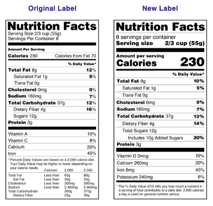
     

    The updated label can help consumers stay within their dietary needs’ limits successfully. They can now choose products with more of the nutrients they need and less of those they may want to cut down. More often, they will consider foods that are rich in dietary fiber, iron, potassium, calcium, and vitamin D and lower in added sugars, sodium, and saturated fat. 


    If you’re looking for the correct package or bag for your products, consider Carepac. Many companies trust us because of the robust technologies and vast experience that go into our packaging solutions. We have you covered from eco-friendly to compostable bags, Kraft paper bags, to zipper top pouch packages. Contact us to get an instant quote now!
  • Get Your Package Designs Right with Pantone Color Numbers

    Get Your Package Designs Right with Pantone Color Numbers

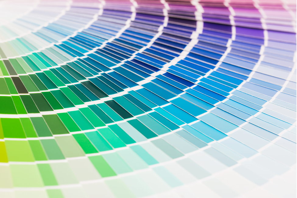
    What does “getting the colors right” really mean when you design packaging? You know from experience that it means not only getting it right on the screen but when printed, not only when printed once but every time, and not only by one printer but all your suppliers wherever they are located. Whether used on a logo, package, or instruction brochure, the right color is essential to the brand because “brand” means continuity, consistency, and quality. At CarePac, we use the Pantone Color system to get your bags done right.


    Color interpretation

    For all our personal familiarity with color, of course—its emotional meaning to us, its stimulative qualities, and its evocation of memories—we all perceive colors slightly differently. Most often it is not the basic colors but the huge variations in shades that drive those disagreements, even arguments, about what color we are seeing. There are now thousands of colors available to use in creating packaging, so there is plenty of room for diverging perceptions.


    So the challenge of getting the colors right is not when we are standing beside someone and looking at a swatch, but, instead, conveying that precise color to multiple printers, often in different countries, sometimes in different languages. And doing so over decades of changes in our suppliers.


    These are the kind of challenges that gave rise to the Pantone color sets and the systems for using them in any possible context. Pantone identifies thousands of colors, in different sets for different applications, by letters and numbers to create a unique tag for every color.


    Multiple materials

    These different color sets specify and communicate color across different industries. For example, the Pantone Plus Series is based on graphic/printing ink and for half-a-century has constituted the Pantone Matching System (PMS). Each of the colors is specified with numbers and a suffix (for example, “C” or “U” to specify if the color is printed on coated or uncoated paper). Depending upon the paper, a Pantone color can look quite different when printed. The number and the suffix get the color right.


    The only exception to this number-and-suffix system are the 18 Pantone Basic Colors (base inks) used to mix the rest of the colors. The basic colors have names such as Pantone Yellow. Another Pantone color system well worth mentioning is the Fashion Home + Interior Guides (FHI). The system is based on specifying textiles: paper (TPG) or cotton (TCX). Again, depending upon the material you are working with, you would choose the guide on which you want to visually see the color.


    Thus, when you work with multiple materials and naturally want to achieve precisely the right color in final production, the pantone number makes possible complete satisfaction with the results. The reason is that the Pantone physical color reference guides, and also the Pantone digital tools for searches and matching, let you see before the printing and manufacturing process begins precisely the color you will get—and convey your choice unmistakably to everyone in the production process.


    Multiple suppliers

    Using different suppliers to produce your packaging and other brand materials inevitable entails some variations in the equipment and processes that will be involved. That means that the resulting color can be considerably different from supplier to supplier. The Pantone system of color tools—physical, digital, and cloud-based—enables you to specify unambiguously a single desired outcome for all those involved. The number given to any color tells the same story in every language, every culture.


    Of course, if you can assign your production to a single supplier and use that supplier repeatedly, the process of communication and the opportunities for inconsistent results are greatly reduced. But for most companies the printing of a logo, packaging, and other brand-related materials must be repeated constantly. And as the company grows and production runs become larger and larger—and perhaps are most efficiently done in other countries—the color problem arises, again. Color measurement and evaluation tools from Pantone and its parent company, X-Rite, make it possible to achieve consistent color from run to run, no matter when or where it is produced. Pantone’s color measurement and evaluation tools mean precision and consistency in your color run after run in any location.


    Pantones and digital printing

    It is highly likely that your design process, today, is in large measure digital whether you are creating real-world or online designs. That means, you want to preserve color accuracy and consistency in moving between digital and physical environments. Pantone has the tools you need to move easily and confidently between those two worlds—to translate a brand’s printed colors into a website design and know how your website designs will look in physical form. Pantone Connect is a new digital platform that gives you immediate access to every Pantone Color in every Pantone Library. The Pantone color sets we discussed—and many more—are there.


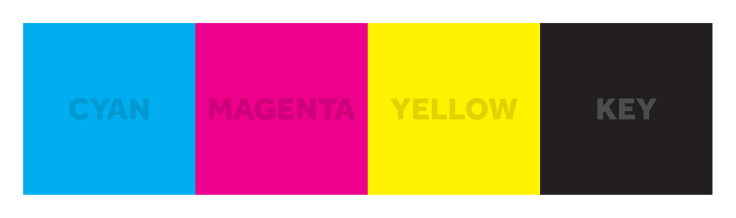
    Onscreen color is produced by a red-green-blue (RGB) system, mixing those primary colors to create others. But when you print from the screen, the resulting colors are produced by CMYK, which is called “four-color process” because it uses Cyan (C), Magenta (M), Yellow (Y) and Black (K). The problem is that RGB and CMYK colors do not precisely match. Pantone has all the tools you need to make the translation again and again to achieve the same results in both environments.  


    At Carepac we rely on Pantone

    At Carepac, we use the Pantone color systems and tools in designing our bags for the spectrum of companies that seek excellent, consistent, distinctive packaging for their products.


    Your next step in getting the color for your packaging every time is to reached out to the Carepac team of bag experts for all the support you need on art design. There is a Carepac bag for virtually any product you want to package efficiently, imaginatively, and for optimal marketing impact and sales. We are ready to discuss your individual needs at every step of the package planning, design, and production process.


    Be sure to check back here for the latest information, insights, and updates.


    Meanwhile, don’t be a stranger. Follow us any day on Twitter for new ideas, offers, and advice on getting your product in the right package.

  • 10 Mistakes to Avoid When Creating Packaging Dielines

    10 Mistakes to Avoid When Creating Packaging Dielines

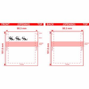
    When designing a packaging dieline, there are a lot of factors to consider.  Issues with sizing, spacing, color fidelity, and regulatory compliance all play a part in your dieline packaging design process. We often see the same set of packaging design mistakes and want you to avoid those in your next project. Those custom dieline mistakes can be divided into issues with your art setup and issues with your proofing. 

    Select Columns Layout

    Art Setup Mistakes (Top 5)

    Getting your images and your packaging art just right is both an art and a science. Here are the top five issues we see with art setup during custom dieline creation. 

    1. Use Adobe Illustrator

    When professionally printing packaging elements you need everything you design to be in Adobe Illustrator (AI). Adobe Illustrator is the industry gold standard for artwork. Other paid and free solutions such as photoshop, Inkscape, BoxySVG, and other document file formats such as  PSD, EPS and SVG are perfectly suitable, but in order to adhere to industry best practices and standards for artwork design, AI is the preferable program. One of the main reasons for using AI is that original art developed in AI is natively vectorized.

    Select Columns Layout

    2. Create All Art as a Vector

    Vector art or “vectorized art” is art that is created based on mathematical formulas for the exact size of the cut lines (don’t worry no math is required to make vectorized art!) Vectors never loses resolution no matter what level you zoom in because a vector is not a picture. There is no pixilation with a vector.  Logos must be a vector. So do any words printed on the packaging, especially nutrition information. 

    Digital photography does not produce a vector. It takes in light through the camera’s lens and converts it into a digital file. That file, however, becomes pixelated when you zoom in. This is incredibly important to consider for your finished packaging. 

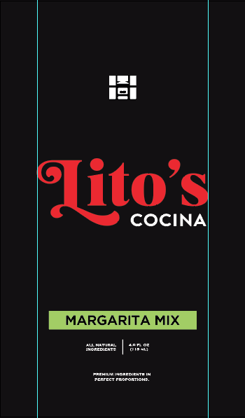
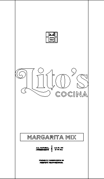
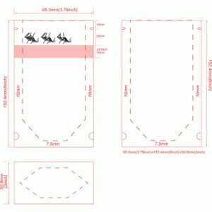
    Here is an example of a vectorized design when viewed in the designs “outlines” mode. 

    Vectorized Art Work as a finished 

    product with color

    Outlines preview showing that the art is made of lines and curves

    A good rule of thumb? Make sure that everything that is not an image on your packaging designs is a vector.

    This makes it easy to create a PDF ahead of production. 

    In order to maintain compliance with governmental regulations, the nutrition information you enter or send cannot pixelate should you adjust the dieline’s size. Barcodes, which must be scannable on your finished product, are especially susceptible to pixilation. Make sure that you design your dieline’s barcode as a vector rather than a picture.

    QR Code that is not vectorized

    A vectorized QR code

    Zoomed in on QR code shows pixilation

    Even when zoomed no pixilation occurs

    3. CMYK versus Pantone 

    CMYK stands for “Cyan, Magenta, Yellow, Black,” and it represents the four basic colors used when printing graphics, images, and other media. Pantone, on the other hand, is a color matching system. Pantone includes a comprehensive set of ink pigments called “color bars” which resemble paint samples from the hardware store.

    CMYK takes those four color choices and blends them together in a subtractive process in order to make all the colors of the rainbow. The drawback is that every printer has slightly different output. The resulting color is a function of the blending process rather than an industry-wide standard. 

    Your finished document will most likely be on some blend of plastic packaging, not on printed paper. Things don’t always translate correctly, especially if you are using CMYK. This is where Pantone truly shines. Each color bar in the Pantone collection includes the exact formulation for that pigment. Any element on your dieline that is not a digital photo should be rendered in Pantone coloring rather than CMYK for the sake of continuity.  

    4. If You Have To Include A Picture, Make Sure The Resolution Is Correct

    Not everything can be a vector. Sometimes your packaging calls for the use of a digital picture. Make sure you use the correct print resolution to prevent your included photos from pixilation. 300 DPI is the minimum choice for high resolution prints. 300 DPI resolution includes 90,000 dots per square inch which can help stave off pixilation should your finished packaging require you to zoom in. Preferably you want the highest DPI / PPI possible, 600, 800 or more. 

    5. Do Your Diligence When Including Images

    Normally when you use images rather than vectors to create your own dielines, they are embedded directly into the dieline products. You can also choose to link those images to a specific file or folder. When the packaging dieline renders in AI for production, it draws the image from another source. One problem we see routinely is that people forget to properly link the image. If you choose not to embed an image on your package, make sure you’ve done your diligence.  

    Proofing Mistakes (Top 5)

    Creating graphical elements is only the first step in the design process. Every dieline requires thorough proofing before it is finalized. Here are the five most common mistakes we see with the proofing phase.

    1. Proofread

    One of the most commonly overlooked processes is proofreading the text on your bag. Small errors in spelling can result in huge errors in customer understanding, but beyond that, a seemingly innocuous mistake could throw your packaging out of compliance with governmental regulations. 

    2. Check Your Sizing and Spacing

    It begins with ensuring that the size of your products packaging is adequate and unaltered after adjustments in your design software. Too many industry professionals forget to make sure that the overall bag dimensions fit the product they’re intended for. One sure fire test you can use is to measure your dieline against a competitor’s product to ensure it fits. 

    3. Outline Your text

    Fonts can be tricky things. They are dependent on files in order to display correctly. Different devices render the same font differently depending on the file packs that are installed. Outlining is a way to ensure continuity between displays. By outlining your fonts, which is a relatively simple process via AI’s editing software, you convert the font into art, much the same as a vector. That way image fidelity is maintained no matter what workspace you are using. See our how-to on outlining text

    4. Ensure Compliance

    We’ve mentioned it before, but compliance is an important part of the dieline process. Far too many people fail to check that the barcode they’ve included serves its intended function. Rather than interacting with the merchant’s POS system, a barcode that hasn’t been properly vetted may spit back gibberish. 

    In the same vein, there is a virtual cavalcade of regulations from entities like the FDA and the USDA which impact the icons and images on your finished packaging. When proofing, make sure to take the necessary time to ensure that your packing meets all regulatory compliance. 

    5. Don’t Cram Too Much Into Your Dieline

    Along the same lines as sizing and spacing, make sure you don’t place visual elements like logos, verbiage, and graphics jammed into the edges of your bag. Not only does it make the packing incredibly difficult to read, it may also violate the above-stated compliance issue. 

    Designing a High-Quality Dieline

    Graphical design is as much an art form as it is an exact science. There are dozens of exact specifications that need to be met in terms of color, spacing, typeset, and overall resolution. With so many variables to keep track of, it is all too easy to make a mistake. 

    The dieline design tips and specific dieline requirements listed above are in on way comprehensive, but they are a good starting point to make sure that your finished dieline truly shines. 

    Check Out Our Wide Selection of Dielines Below

    Showing 1–24 of 153 results

    Default sortingSort by popularitySort by latestSort by price: low to highSort by price: high to low

    Select Columns LayoutInsert Content Template or Symbol

  • 15 Costly Mistakes to Avoid When Designing Custom Printed Bags

    15 Costly Mistakes to Avoid When Designing Custom Printed Bags

    Packaging Design Mistakes to Avoid | Packaging Design Errors

    Have you outgrown stock packaging and stickers? 

    Are you considering custom-printed creative packaging? Congratulations on the new move

    Custom packaging is a great and effective way to increase brand awareness, attain competitiveness, and attract new customers with a creative design, whether through unique holiday packaging, e-commerce packaging, or a stylish type of gift packaging.

    Custom printed bags, for example, allow you to tailor-make your paper packaging based on your needs and align it to your customers or brand identity. Also, they serve as walking advertisements for your business.


    Although custom printed bags are beneficial to your customers and business, they can be costly and actually damage your brand if you don’t nail the design. To avoid this, we have compiled 15 common mistakes when designing custom printed packaging for your customers and their shopping needs. Learn more below.

    #1.  

    Ignoring Customer Needs on Packaging

    Many companies make the mistake of designing printed bags that appeal to their tastes rather than their customers. Customers are the end-users of your customized bags. As such, you must consider their needs, expectations, and preferences for packaging and design printed bags that appeal to them. 

    #2.

    Lack of Differentiation on Custom Packaging

    Any paper product packaging, including custom printed bags should catch a potential customer’s eye. Also, it should differentiate your brand from competitors and other similar businesses. Consequently, your printed bags should not look like your competitors – even though you are trying to outshine them. Instead, design your packaging and boxes in a way that stands out from rivals and conveys your unique brand identity.

    #3.

    Disregarding Errors in Print or Graphics

    A typing or graphic error creates a wrong impression about your products and company as a whole. It shows that your company is careless, and customers may think that your products are full of errors too. Therefore, never disregard any errors in your printed bags. They may be costly to correct but are worth every dollar.

    #4.

    Using Outdated Printing Designs

    Today’s customers want the latest designs of everything, including packaging. Therefore, do not make the mistake of using outdated packaging designs — it will not appeal to them. Consider updating your packaging design to stay ahead of the competition and position yourself as a leader in the sector. Investing in seasonal packaging instead of mass-producing one design is an excellent place to start. Also, consider playing with new packaging and printing designs.

    #5.

    Ignoring the Weight of Items the Bag Will Carry

    When designing a custom printed bag or boxes, do not ignore the weight of the items that go into the bag. The bag should be strong enough to accommodate these items and withstand long-term use. The weight of these items will determine the bag’s thickness. The Carepac team can help you figure out the right material for your bag. Our team is available by phone (to talk to a REAL person) about these kinds of questions. 

    #6.

    Using Printing Materials that are Not Eco-friendly

    The modern consumer is eco-conscious and expects businesses to adopt business practices that are environmentally sound, especially if your product appeals to the environmentally conscious crowd. However, many businesses may not realize how many eco-friendly options exist and therefore end up with traditional packaging. If your product is in the health food space, or appeals to high end buyers, it is time to make the move to eco-friendly printing materials and design packaging.

    #7.  

    Not Keeping it Simple

    Less is more when designing a custom printed bag, so don’t incorporate every type of packaging inspiration into your bag. Do not try to complicate the design of your bag. Do not use jargon or cutesy sayings unless it aligns with your brand. A simple, straightforward, and easy-to-understand design will grab your audience’s attention. As they say, a confused lead never buys.  

    #8.

    Wrong Packaging Materials

    A good custom printed bag is not only attractive but also functional and practical. Using the wrong packaging materials mean that the bag will not be useful. Remarkably, while some materials may be cheap, they may not be ideal for packaging specific products. Ensure that you choose the right packaging material to make printing much more effortless, meet customer expectations, and reduce waste. We offer sustainable packaging, too! 

    #9.

    Using Ordinary Ink for Your Packaging Design

    Ordinary inks produce ordinary printed bags (aka bad packaging!). However, special inks, including metallic, neon colors, reflective, and glow-in-the-dark inks, create standout bags with attention-grabbing details and content. Adding this kind of pizazz to your bag may be perfect in some industries like cannabis where competition is stiff. 

    #10.

    Illegible Printing

    Do not entertain illegible printing in the name of fancy images or fonts. The name, logo, and other specifics on your bag should be clear, visible, and easy to read.

    #11.

    No White Space

    Avoid cluttering your backgrounds with too many colors. It will give your customers a headache. Color experts recommend allowing white space for your background and allowing your designs to breath. Remember, negative space is a design element! 

    #12.

    Failure to Test Your Product  for Mistakes

    The same way you must test drive a car before buying it, test your bags before printing in bulk. Your designers should test them for durability, strength, and practicality. This way, you ensure that a bag is the proper fit and gather feedback from customers

    #13.  

    Incorrect Design Dimensions

    Imagine designing a bag that is too small or too big for your product? If the bag is too small, it can’t fit your product and hence unusable. On the other hand, a bag that is too big is a waste of material. As such, it is best to actually put your product in the same size bag you plan to use when printing a custom bag and see if it fits as expected.

    We can’t tell you how many times people forget to account for the seams in a bag and end up with a bag that’s too small.  Using a bag with the correct dimensions ensures the security of your product, reduces waste, and cuts costs. Double-check your measurements to get the right size of your printed bag.  

    #14.

    Too Big of a Logo on Your Package

    While you want your logo to be front and center in your custom printed bag, you should not make it too big. A giant logo can make your brand seem aggressive, and can also be off-putting. Keep your logo in proportion to the size of the bag. A good designer will be able to help you with this. If you need help with artwork give our team a call. We can help! 

    #15.

    Not Ordering Enough Bags (One of Our Top Packaging Tips!)

    After finishing designing your bags, it is time to order them. You must decide how many bags you would like to order. While this may depend on your budget and storage space, it is advisable to order in bulk to take advantage of bulk buying discounts and ensure you don’t run out of stock quickly.


    Designing custom printed bags can be fun and have positive business outcomes but is vulnerable to mistakes. You can make mistakes in the dimensions, material, and graphics of the bag, which can hurt your business.

    Follow our tips so you don’t make these mistakes when designing custom printed bags.

    Getting in touch with Carepac

    Carepac helps with custom packaging to eliminate the possibility of costly errors. You can contact a REAL packaging expert to answer any questions you may have about the manufacturing process, designing and more.

    Our CareDesignTM process is our signature process where our team works with you to ensure your design and art is perfect.    

    Contact us now!
  • Top 10 Ways to Increase Sales With Custom Printed Packaging Design

    Top 10 Ways to Increase Sales With Custom Printed Packaging Design

    Boost Profit with Custom Printed Sales Packaging

    Running a business is full of as many downs as it is ups. But one area where your brand doesn’t have to struggle in order to succeed is with custom printed packaging design. No matter what you’re selling — whether it’s coffeecosmetics, or dog treats — it’s possible to design custom packaging for your product that practically sells itself.

    But how can your brand create your very own custom packaging that stands a cut above the rest? Read on to learn the top 10 tips about how to create a great design and to see how nailing the perfect packaging can help boost the sale of your product.

    Test Your Packaging Design

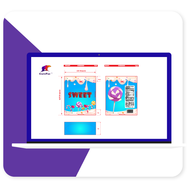
    Don’t forget to be patient! Before you bring your packaging to market, it’s always a good idea to test it out on friends, family, and clients. This is not only a great way to find anything you may have overlooked (i.e., typos, missing information) but also the perfect way to see if your packaging actually speaks to the target audience of your brand.
    Remember that customers buy with their eyes first, so if your design isn’t wowing people the way you want it to, don’t be afraid to return to the drawing board.

    Think Outside The “Sales” Box (Literally)

    A cardboard box can feel old-school — not to mention that it’s just not a great fit for certain products (liquids, anyone?). In contrast, die-cut pouches are available in a wide variety of shapes and sizes. They look sleek and modern and even have the added benefit of keeping your products safe from moisture and oxygen contamination.

    When planning out your brand packaging, don’t forget about die-cut pouches. They might just add the touch of flair that your product needs to fly off the shelves.

    Use The Right Packaging Colors for Your Brand

    When it comes to packaging design for your brand, perhaps nothing affects consumers as strongly as color. If you’re hoping to sell a product that promises relaxation, serenity, and reminds buyers of the environment (such as cannabis), green is a safe choice; in contrast, if you’re trying to get buyers excited and passionate about a high-energy product (such as coffee), a bold color like red may be ideal.

    Being mindful of how different colors look to your customers and what emotions they evoke is necessary for creating a strong packaging design.

    Make The Right Font Choice on Your Packaging

    Just as with color, the font you choose for your product’s packaging can have a huge impact on the success of your packaging design with your customers. Is your product young and hip or more serious and traditional? Pick a font that reflects your chosen aesthetic. And, no matter what you do, make sure that the font you choose is always appropriately sized and easy to read — no one wants to try to squint their way through your sales pitch in the grocery store.

    Avoid Spillage And Damage

    If there’s a chance your product can be spilled, damaged, or destroyed before it’s enjoyed by customers, take that into account. A good packaging strategy should protect your product from decay, oxygen contamination, moisture, and more; some packages are even spill-proof, tamper-evident, or child-proof to provide further security.

    If you care about getting the best product possible into the hands of your customers, choose a packaging system that opts for protection.

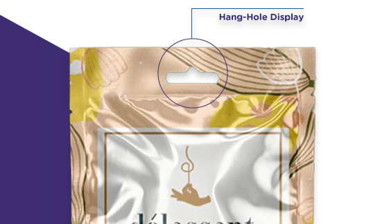
    Flat Pouch Display Bag with Hang Hole

    Don’t Forget About Shelves And Hooks

    Think about how your product is going to be displayed. Is it more important for your packaging design be free-standing on shelves then stand up pouches best choice, or will it likely be hung on a rack? For that matter, is it important that your packaging be able to be displayed both ways for a complete product overview? Determining how and where your product will be displayed can have important implications for your packaging design.

    Tap Into Your Customers’ Emotions to Increase Sales

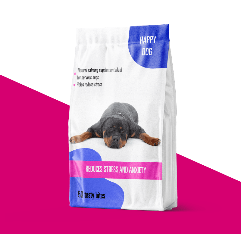
    custom quad seal bags Carepac offers including dog calming supplement and dog food packaging

    People buy with their eyes, but they also buy with their emotions. Don’t be afraid to tap into your customers’ emotions to make connections between your product and their own lives.

    For instance, a good dog treat box should remind a customer of their love for their own dog, and a box of jerky might remind a potential buyer of their love of the great outdoors. Subtly connecting your product to your customers’ emotions is crucial for creating a bond between your product and your target audience.

    Choose The Right Packaging For Your Product

    When it comes to designing packaging, the sky’s the limit — which means that it’s important to sort through the many options out there to choose what works best for you and your product. For instance, some cannabis products might benefit from single-serve packages rather than larger packages, and certain products may be even more appealing if they’re sold in eco-friendly packaging. Specifically tailoring your product to the right packaging is critical for helping it succeed.

    Function Over Form

    Above all else, is your packaging functional and practical? Even the coolest, most eye-catching design won’t make a difference if your packaging isn’t able to stand up on a shelf, and no one will be able to read about how wonderful your product is if the font is way too small.

    Choose the right type of zipper or tear notch for your box based on how customers actually consume your product. Can your product be consumed in one sitting or will a zipper preserve freshness for a product that is meant to be enjoyed over multiple sittings. Go for functionality to end up with a product that practically sells itself.

    Argue Your Case for the Sale on the Packaging

    Finally, your packaging should clearly describe what your product is and what makes it so great. Does your company have a strong philosophy, distinct core values, or a commitment to giving to the community?

    You often only have a few seconds to hook potential consumers with an eye-catching design, well-written product description, and strong corporate identity and vision. Make sure to showcase what you’re all about to get consumers excited about you — and keep them coming back for more.

    Nutritional Supplements Flat Pouches for Capsules Glossy Finish

    Key Packaging Takeaway

    If you’re hoping to design your very own custom printed packaging to help your products stand out, contact us today for an quick online quote. At Carepac, we offer customer service that goes above and beyond. You can speak to a real person in the United States to learn more about how to give your product the best packaging possible. No matter what you’re selling, we’ve got the perfect bag for you.


  • What Packaging Finish Is Best For You?

    What Packaging Finish Is Best For You?

    What Packaging Finish is Best For You? 

    So you’ve done your market research, come up with a great idea for a product, and designed some eye-catching packaging. Now what? Fittingly, if you’re packaging your product in a pouch, one of the last steps you’ll need to check off your list is picking a finish. But selecting a finish requires more than just going with your gut — certain finishes are better for certain products or locations, and making the wrong decision can have dire consequences.


    If you don’t know where to start when it comes to packaging finishes, read on to learn all about the different finishing types available today and what their ideal applications are. Don’t worry: there’s a great finish out there for your product. All you need to do is find it.

    Matte

    packaging finish

    Matte is currently one of the most trendy options for packaging finishing today. Its sophisticated look and texture make it perfect for adding a sleek and modern edge to a wide variety of products. More specifically, a matte finish has several key qualities that make it an ideal choice for packaging specific products, such as:

    • A matte finish stands out. In locations like supermarkets, glossy and shiny packages are the norm, which means that a matte finish stands out to consumers. And with most supermarket consumers spending as little as 3 to 5 seconds when it comes to making a decision about what product to buy, being able to stand out is absolutely crucial for the success of your product. 
    • Its products are perceived to be more natural. A recent study demonstrated that packaged food products were perceived to be more natural when they were in matte packages than they were in glossy packages. These customers also expected the more natural food to taste better and were more likely to buy it.
    • It’s easier to read. In contrast to shiny, glossy packaging, matte packaging reflects less light at the consumer and is thus easier to read. In an environment where every second counts when it comes to convincing a consumer to buy your product, making your product’s packaging as easy to read as possible is a no-brainer.

    While matte may be trendy, it’s not very flashy, and therefore isn’t a perfect fit for every product. However, if you’re packaging all-natural food — like coffee, granola, or jerky — that you want to stand out on a crowded supermarket shelf, a matte finish can be a great way to help your product appeal to consumers looking for a natural, eco-friendly choice.


    Gloss

    packaging finish

    Few things are more unforgettable than a beautifully crafted package with a glossy finish. Not only do humans naturally respond enthusiastically to shiny things, making it likely that your pouch will attract plenty of attention, but a gloss finish can also be used strategically to highlight key logos, words, or images on your packaging. In addition to its high shelf impact, packages with a gloss finish can handle scratches and smudges, as well as dust and dirt, to keep them looking great over time. Finally, a gloss finish can be used to create stunning, vibrant colors that draw consumers in.


    Going for a glossy finish is perfect for anyone who’s not as concerned about projecting an all-natural image as they are about catching consumers’ eyes and hooking them with bold colors and artwork. For instance, a candy manufacturer who wants to express high-energy fun with their packaging might benefit from the durability and vibrancy of a glossy finish.

    Soft Touch

    If your brand is all about luxury, soft touch finishing may just be the perfect choice for your product. Soft touch finishing is used to give products a silky-smooth look and soft, velvety feel that will register with your customers as high-end signifiers. Additionally, because the surface of a soft-touch package has minimal sheen and appears to be almost matte from a distance, it has all of the benefits associated with a matte finish, such as a sophisticated appearance and all-natural essence.


    When it comes to determining what products benefit from a soft touch finish, the sky’s the limit. The main criterion is that most soft-touch packaging comprises high-end, luxury products, making it the perfect choice for upscale vendors in the cannabis, cosmetics, dried fruit, or tea industries. With its primary drawback being its higher cost, soft touch finishing is a great choice for products for which you want to communicate a sense of luxury and indulgence to their consumers. 

    Spot UV

    Spot UV printing is a great way to add a touch of upscale sophistication to your packaging. Because UV printing uses ultraviolet (UV) light to cure varnish in specific areas, it not only produces vibrant, high-sheen packaging but also can be used to target only specific spots or areas. By mixing and matching a spot UV finish with, say, a matte finish, you can end up with a premium, high-end blend of textures. Additionally, the glossy sections of the packaging will have all the protection of a high-gloss finish — meaning that they’ll be able to resist scratching and avoid damage due to moisture.


    Because of its high-end look, a spot UV finish is perfect for high-end products. Luxury cosmetics and cannabis companies can attract a more upscale clientele if their packaging boasts a spot UV finish, and artisanal candy, coffee & tea, and other food companies can stand out by using a finish that suggests their products are high-quality and bespoke. If you’re looking for a finish for your products’ pouch packaging that is both eye-catching and luxurious, a spot UV finish might be the right choice for you.

    Contact [sitetitle] Today

    At [sitetitle], we have all the expertise and experience we need to help you select and apply the right finish for your packaging. We’ll take into account your specific needs as well as your budget to help you decide on a finish that helps your product stand out in all the right ways.


    We’re always here to help, and our team is always available by phone to answer any questions you might have. If you’re ready to get started, visit us online to get an instant quote today. We’re excited to help make your packaging dreams a reality!