Author: Heather Terry

  • Coffee Bag Design: Ideas, Materials & Examples for Roasters

    Coffee Bag Design: Ideas, Materials & Examples for Roasters

    Coffee Bag Design: 15 Brand Examples + How to Build Packaging That Sells

    Some of the Best Coffee Packaging Designs

    Coffee bag design is one of the most important branding decisions a roaster makes. Before a customer tastes your coffee, your packaging has already shaped their perception of your product’s quality, value, and personality. Whether you’re launching a new roast, refreshing an existing brand, or preparing to order custom coffee bags, the right design can help you stand out in a crowded market and drive more sales.

    Effective coffee bag design goes beyond looking good on a shelf. It helps customers quickly understand what sets your coffee apart, reinforces your brand story, and creates a memorable first impression in both retail and online environments. Every choice, from bag shape and material to color palette, typography, and graphics, contributes to how customers perceive your product.

    In this guide, we’ll look at standout coffee packaging examples from successful brands and break down the practical decisions behind their designs. You’ll see how different companies use packaging to communicate quality, attract their target audience, and build brand recognition, while also learning how to apply those same principles to your own coffee bags.

    The best coffee packaging balances function and branding. Customers should be able to quickly identify your coffee, understand its key characteristics, and remember your brand after the purchase. By studying what works—and why—it becomes much easier to create packaging that not only looks great but also supports your business goals.
    What Makes a Great Coffee Bag Design?

    A great coffee bag design does more than catch someone’s attention; it helps them make a purchasing decision. The best designs communicate key information quickly, making it easy for customers to identify your brand, understand what’s inside the bag, and feel confident about the product they’re buying.

    Clarity

    Clarity is the foundation of effective coffee packaging. Your logo, coffee name, roast level, and other essential details should be easy to find and read at a glance. If customers have to search for basic information, they’re more likely to move on to another product.

    Differentiation

    Differentiation matters just as much. Coffee shelves are crowded, and online shoppers often scroll through dozens of products before making a decision. Strong colors, distinctive graphics, unique typography, or a well-designed bag label can help your product stand out from competitors while remaining professional and recognizable.
    Aligned With Your Brand

    The design should also align with your branding. A premium single-origin coffee may call for a refined, minimalist look, while a playful specialty blend might benefit from bold illustrations and vibrant colors. The packaging should accurately reflect the experience customers can expect from the coffee inside.
    Works With the Package

    Finally, great design works with the package itself. Graphics, labels, and messaging should complement the bag format, available print area, and functional features. When branding and structure work together, the result is packaging that looks better, performs better, and creates a stronger impression with customers.

    Coffee Bag Shapes & Formats

    Before you choose colors, graphics, or labeling, it’s important to choose the right bag format. The structure of the package influences everything from shelf presence and perceived value to filling efficiency and shipping costs. Some formats are designed for high-volume production, while others help specialty roasters create a more premium presentation.
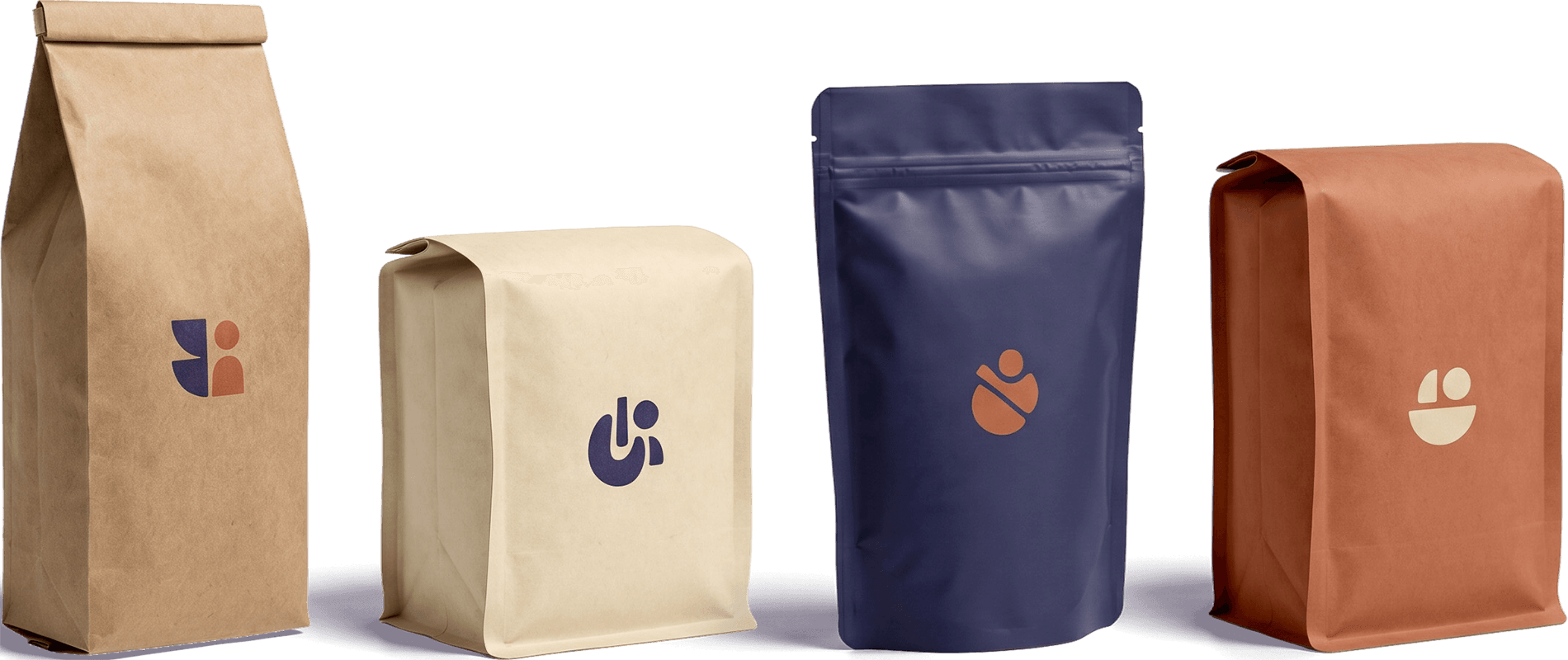

    Side Gusset Bags

    Side gusset bags are one of the most recognizable coffee packaging formats. The sides expand as the bag fills, creating the classic coffee shop shelf appearance that many consumers immediately associate with coffee.

    For roasters producing higher volumes, side-gusset bags are often a cost-effective choice. They maximize storage efficiency, work well with automated filling equipment, and provide ample space for labels or printed graphics. The primary design challenge is that much of the available surface area wraps around the sides, making layout planning especially important.

    Flat Bottom / Square Bottom Bags

    Flat-bottom bags, sometimes called square-bottom bags, have become increasingly popular among specialty coffee brands. Their stable base allows them to stand upright while providing large, uninterrupted panels for branding and product information.

    These bags typically create a more premium appearance than traditional side gusset bags and offer excellent shelf presence in retail environments. Designers have more room to work with, making it easier to showcase logos, illustrations, tasting notes, and other visual elements without feeling crowded.

    Stand-Up Pouches

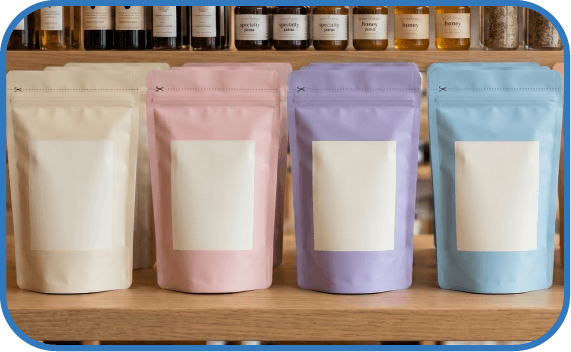
    Stand-up pouches combine flexibility, convenience, and strong visual impact. Their bottom gusset allows them to stand on shelves while maintaining a lightweight, efficient package structure.

    Many direct-to-consumer and e-commerce coffee brands favor stand-up pouches because they ship efficiently and offer ample front-facing space for branding. They’re also highly compatible with common coffee packaging features such as resealable zippers and one-way degassing valves, making them a versatile option for a wide range of products.

    Quad Seal Bags

    Quad seal bags feature four sealed vertical edges that create a rigid, box-like appearance. This structure helps the bag maintain its shape even as the product is removed, resulting in a polished, high-end presentation.

    For brands pursuing a premium or luxury positioning, quad seal bags offer some of the strongest shelf presence available. The multiple panels create opportunities for organized messaging and sophisticated graphics, while the rigid structure conveys quality and attention to detail. Although they often come at a higher cost than other formats, many specialty roasters view them as an investment in brand perception and retail impact.

    Key Graphic Elements in Coffee Bag Design

    Once you’ve selected a bag format, the next step is deciding how your brand will appear on it. The most effective coffee packaging doesn’t happen by accident; it comes from making deliberate choices about how customers will see, understand, and remember your product. Whether you’re briefing a designer or reviewing concepts, these are the key graphic elements that deserve your attention.

    Logo & Logomark Placement

    Your logo is usually the first thing a customer notices, making it the visual anchor of the package. It should be visible from a distance, easy to recognize, and positioned consistently across your product line.

    When evaluating a design, consider how the logo will appear across different bag formats and sizes. A logo that works well on a large flat-bottom bag may become difficult to read on a smaller pouch. Strong coffee brands create systems that scale effectively across multiple package types while maintaining consistency and recognition.

    Typography

    Typography does more than display information. It communicates personality before a customer reads a single word.

    Serif typefaces often signal tradition, craftsmanship, or premium positioning, while sans-serif fonts tend to feel modern, approachable, and contemporary. The most important consideration, however, is legibility. Roast names, origin information, and product details should remain easy to read on retail shelves and in online product photos.

    Color

    Color is one of the fastest ways to influence perception and differentiate products.

    Dark packaging often communicates premium quality, sophistication, and bold flavor profiles. Natural kraft materials can suggest artisanal production, sustainability, or small-batch craftsmanship. Bright, saturated colors are frequently used by newer specialty roasters looking to disrupt category expectations and stand out in crowded retail environments.

    A well-developed color system can also help customers quickly distinguish between blends, roast levels, and seasonal offerings.

    Information Hierarchy

    Customers shouldn’t have to search for the information that matters most.The strongest coffee packaging follows a clear hierarchy: brand name first, coffee name or roast second, and supporting details afterward. Information such as origin, processing method, altitude, tasting notes, certifications, and brewing recommendations should be organized in a way that feels intuitive rather than overwhelming.

    When reviewing a design, ask yourself: what does a customer notice in the first three seconds? If the answer isn’t clear, the hierarchy probably needs work.

    Illustration vs. Pattern vs. Minimal Design

    The visual style you choose tells customers what kind of brand you are before they ever taste the coffee.

    Illustration-heavy packaging often communicates creativity, storytelling, and personality. Pattern-driven designs can create a cohesive visual system across multiple products while maintaining strong shelf impact. Minimalist packaging strips away distractions and focuses attention on typography, materials, and product information.

    None of these approaches is inherently better than the others. The right choice depends on your brand positioning and target audience. As you’ll see in the brand examples later in this guide, some companies use bold artwork to create instant recognition, while others rely on restraint and simplicity. Koffee Kult, for example, demonstrates how limiting color and visual complexity can actually make typography and branding more memorable.

    15 Coffee Bag Designs Worth Studying

    If you’re planning new coffee packaging, one of the best places to start is by studying what already works in the market. The goal isn’t to copy another brand’s look—it’s to understand the decisions behind it and identify ideas that align with your own positioning, audience, and product lineup.

    The examples below showcase a variety of successful coffee bag design styles, from minimalist typography and premium monochrome packaging to bold illustrations and highly recognizable color systems. Each brand takes a different approach to branding, information hierarchy, and shelf presence, but all of them use packaging strategically to communicate value and attract customers.

    As you review these examples, pay attention to what each design is trying to accomplish. How does it stand out? What does it communicate about the coffee inside? And what elements could inspire your own packaging strategy? These aren’t just attractive coffee bags—they’re practical lessons in how effective packaging can shape customer perception and strengthen a brand.
    1

    Intelligentsia

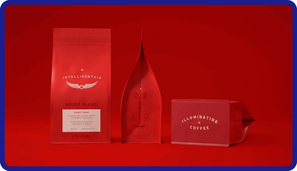
    Intelligentsia Coffee is a far-reaching brand united by its solid logo design and confident red packaging. In this strategy, their wingtip logo is central to the packaging design, backed by a deliberate choice in bold color. The typographic elements are low-contrast, simple, and easy to read on closer inspection, as if the bag wants to catch your eye with the royal red and immediately give you the necessary information. Intelligentsia sources from multiple farms, sporting a “democratic” approach to artisanal coffee. Using a square bottom configuration makes the bag stand out and emphasizes details more. When you’re looking for coffee blends and you see these wings, you know it’s Intelligentsia.

    Takeaway:

    Intelligentsia Coffee shows how a strong, consistent logo paired with bold color and clean typography can create instant brand recognition and clarity, with its red square-bottom bags and winged mark making the product immediately identifiable across diverse coffee offerings.

    2

    Fuel America

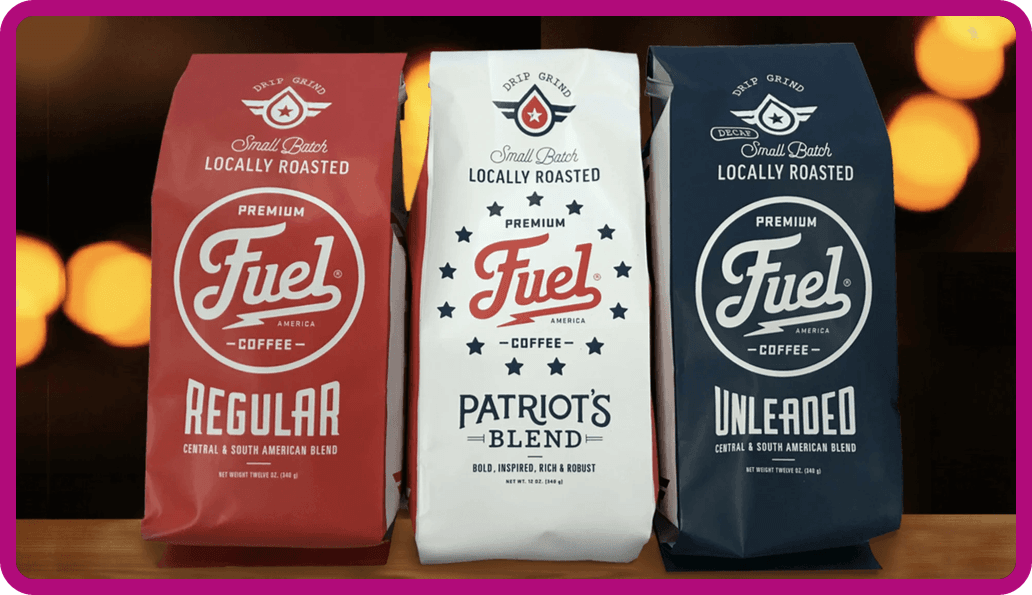
    To contrast the driving force of a logo, Fuel America’s wordmark-centric identity borrows from the vintage American automobile and “trucker” aesthetic to deliver playful but legible typography. Their wordmark is front and center, decorated with circular layouts and modified lettering that calls attention to itself. This side gusseted style uses the information to decorate the bag, without losing the ability to read it quickly. You’ll notice that while Fuel America has its own logomark at the top of the bag, the wordmark is what catches the eye first and foremost.

    Takeaway:

    Fuel America demonstrates how a wordmark-led coffee bag design can use vintage-inspired typography and circular layouts to create a playful, highly legible identity, in which the brand name itself becomes the primary visual hook while still maintaining a clear, functional packaging structure.
    3

    Ozo Coffee

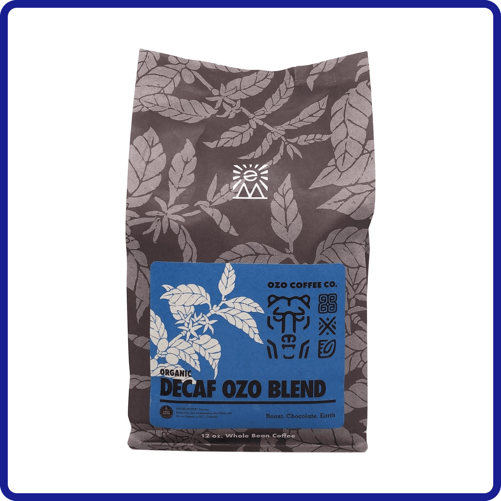
    Ozo Coffee has made the rounds online for their “glyph system,” which they’ve transitioned into a smaller role for their new bag designs. This brand is a great example of pattern designs, with the earth-toned grainy florals covering their entire square bottom bag. On the label, their “glyphs” are still used to signify the specifics of their coffee sourcing: region, origin, processing, taste, and elevation.

    These are a series of icons and symbols with a “key” to decode each shape, developed so that the dedicated buyer is rewarded for reading into the design. It’s not necessarily a game like the back of a cereal box because it actually provides the patient eye with more information on the brand. That’s an accomplishment on its own, but their use of these glyphs and florals to texturize and add intrigue to the overall look is what marks them as a great example of pattern usage.

    Takeaway:

    Ozo Coffee is a strong example of how pattern-driven coffee bag design can add depth and visual texture while still carrying meaningful product information, using earth-toned floral patterns and a refined glyph system to turn the packaging into both a visual and informational experience.

    4

    Koffee Kult

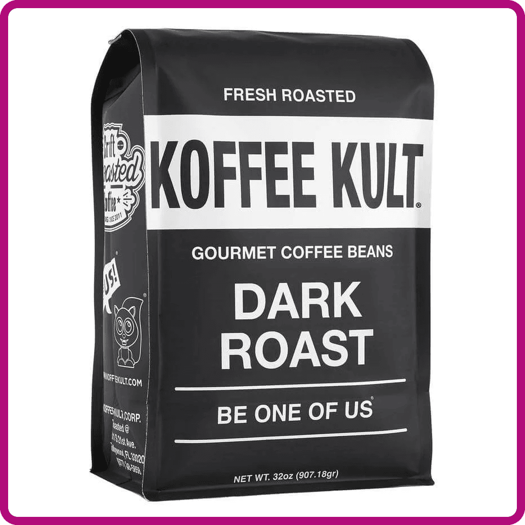
    Koffee Kult grabs attention by running the opposite direction from other bags on the shelf: simple black-and-white with strong modern typography. The letters are doing the work in this presentation without being shaped or warped for decoration. Typography is an entire industry built around making letters legible, playful, professional, or nearly any aesthetic a business might need. For this square bottom bag, the use of the tried and true, simple yet effective modern typeface accomplishes so much on its own. Koffee Kult complements this with small playful drawings on the side folds.

    Monochromatic designs represent a deliberate choice not to use color. This trend is used to great effect by many brands, where the choice of what color to pick can be avoided altogether and still be as visually competent as a bag in royal red, for example. When color is removed, a strong focus can be applied to the package design.

    Takeaway:

    Koffee Kult demonstrates how a monochromatic, typography-first coffee bag design can create strong shelf impact without relying on color, using bold black-and-white contrast and modern type to let the brand name itself carry the visual weight while reinforcing clarity and confidence.
    5

    Death Inc. Coffee

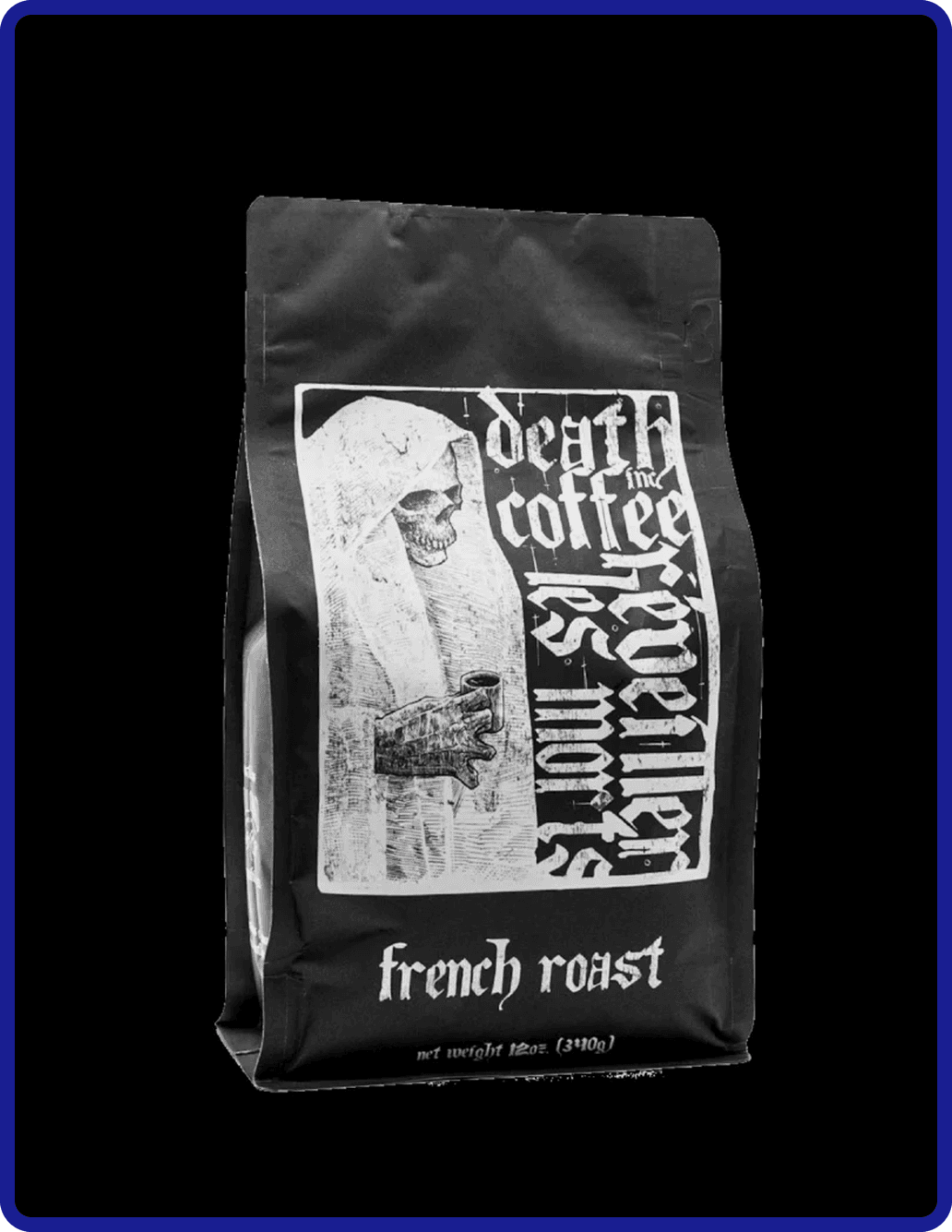
    The death metal aesthetic of skulls and blackletter calligraphy are well-executed by Death Inc. Coffee, with another set of monochromatic bag designs that rely on their illustrations to catch the buyer’s eye. Multiple illustrations across their selection give each roast its own curated appeal, and the sharp ink-work of the grim reapers dominates the focus of the box bottom bag. Strong illustration work will present a great use of the “negative space”: how the blacks and the whites are distributed in an aesthetically pleasing way.

    Death Inc. Coffee maintains an edge of visual interest with its monochromatic choice, rather than a contemporary focus. The typography here is scratchy, brutal, and more decorative than the extremely functional sans-serif fonts out there. The calligraphic letters are used primarily for style, but hearken back to the beginnings of typography when the digital touch didn’t exist.

    Takeaway:

    Death Inc. Coffee shows how a monochromatic, illustration-led coffee bag design can create powerful shelf presence through heavy contrast, detailed artwork, and expressive blackletter typography, using skulls, grim reapers, and dense ink work to turn each roast into a distinct visual statement while maintaining cohesion across the lineup.

    6

    Catfight Coffee

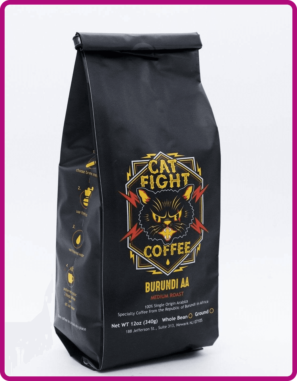
    Catfight Coffee has built its branding around immediate contrast and attitude, using a name and visual identity that are intentionally provocative and hard to ignore. The brand leans into bold, high-energy imagery—often featuring stylized cats in confrontational or boxing-inspired poses—to create a sense of competition, intensity, and personality right at the shelf level. Instead of trying to blend into the more muted, minimalist wave of specialty coffee, Catfight positions itself as loud, playful, and slightly irreverent, which helps it stand out in both retail environments and online marketplaces where attention is limited.

    From a branding perspective, Catfight Coffee’s strength lies in its consistent tone. The visual system typically relies on strong contrast, punchy typography, and a limited but aggressive color palette that reinforces the “fight” concept. This makes the packaging feel cohesive across blends while still giving each product enough variation to be distinct. It also communicates a clear brand stance: this is coffee with personality, not just product information. For customers, that clarity can be powerful—either they resonate with the energy instantly, or they self-select out, which is often exactly what a strong brand identity is designed to do.

    Takeaway:

    Catfight Coffee demonstrates how a provocative, high-energy brand identity can use bold visuals, aggressive tone, and consistent contrast-driven packaging to stand out instantly on the shelf while clearly signaling a personality-led coffee experience that quickly attracts the right audience and filters out the rest.
    7

    Oddly Correct

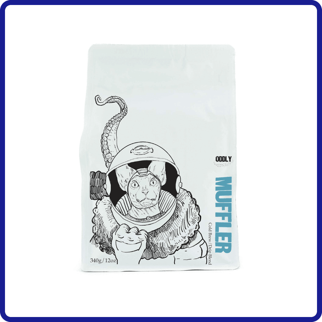
    There’s a simplicity in black, white, or even paper brown bags when they’re chosen over bold matte or gloss colors; a reliable trend that is unlikely to disappear soon. Oddly Correct Coffee places itself on the shelves as a “low-brow/high-quality” brand. Their white square bottom bags are penned with eccentric and thin-lined ink illustrations of space cats, antlered bears, and turtles who all love coffee as much as you do.

    Well-selected illustration is a strong compliment and proven guide for any brand on this list. The past three bags have proven the uses of art for the sake of branding, with each their own unique take on the medium, as well as strong use of the monochromatic. Illustrations tell a story where patterns may serve as pure decoration or texture.

    Takeaway:

    Oddly Correct Coffee shows how a minimalist, monochromatic coffee bag design can still feel distinctive and memorable by pairing simple white packaging with eccentric, story-driven illustrations, using playful line art to reinforce a “low-brow/high-quality” identity that turns restraint into personality and branding clarity.

    8

    Maiden Coffee Roasters

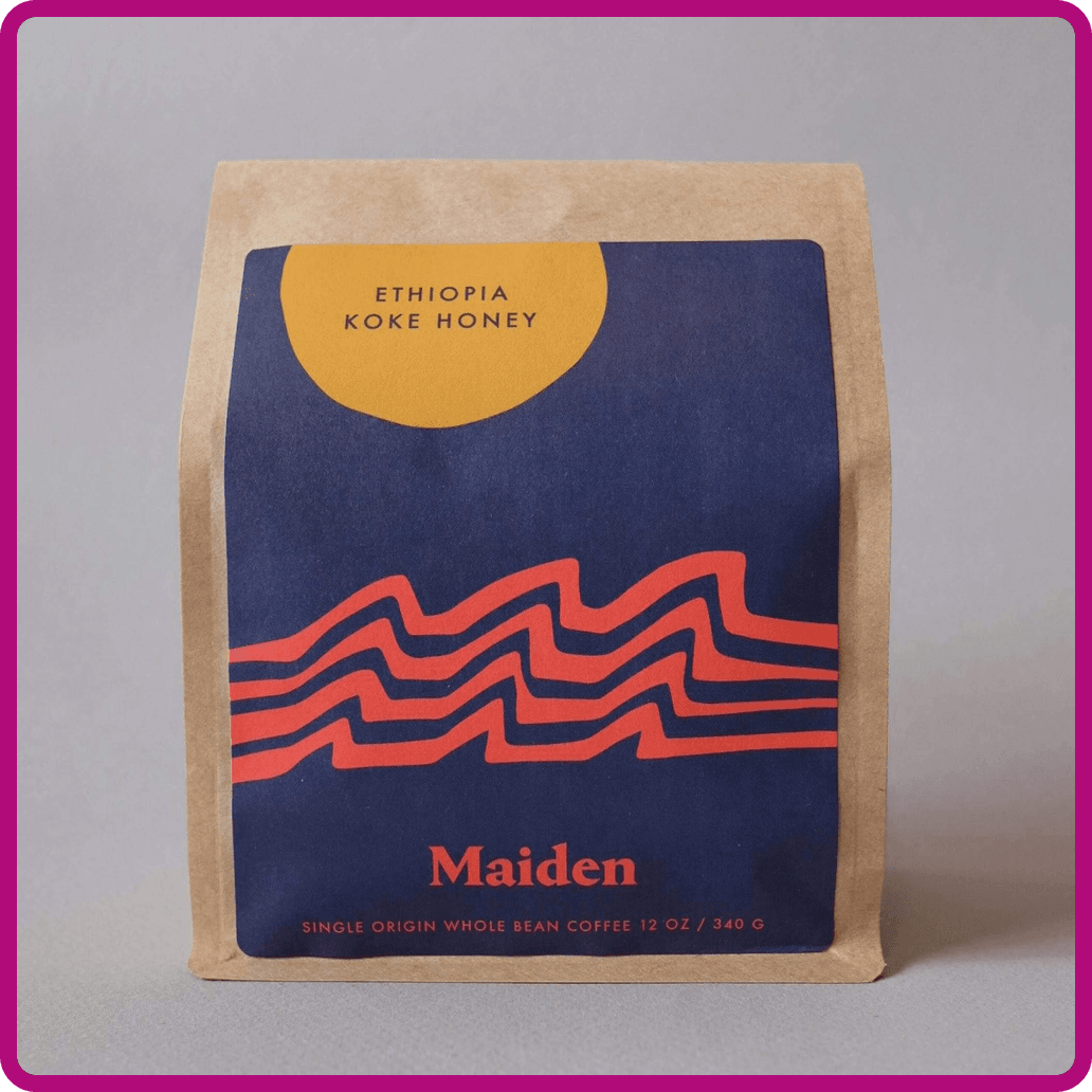
    Each of the previous bag designs represented a different use of logo, type, pattern, or illustration to stake their claim on the shelves, along with deliberate use of color (or black and white). While there is no right answer and each brand’s visual layout has spoken well for itself, sometimes the nuance of design elements is what achieves results.

    Maiden Coffee Roasters, for example, has a strong wordmark that can stand on its own. But their main bag designs consist of smooth, geometric nature shapes that sweep across and seem to pass through the print area. They play with slightly subdued primary reds, yellows, and blues; and Maiden elects to strengthen all this real estate by placing only the roast location, in small capitals, wherever the composition allows them to fit.

    Maiden’s new line of square bottom bags utilizes the wordmark first and foremost in gold, with these subtle colors backing them for a cleaner look that still rests in the realm of “Well thought-out, but not pretentious.” They confidently stride out into olive greens, ambers yellows, and oceanic teal while feeling united to their original brand identity.

    Takeaway:

    Maiden Coffee Roasters illustrates how a balanced, design-led coffee bag strategy can evolve across formats while staying visually consistent, using a strong wordmark foundation paired with subtle geometric shapes and restrained color palettes to create packaging that feels intentional, cohesive, and approachable without becoming overly decorative or self-serious.
    9

    Devocion Coffee

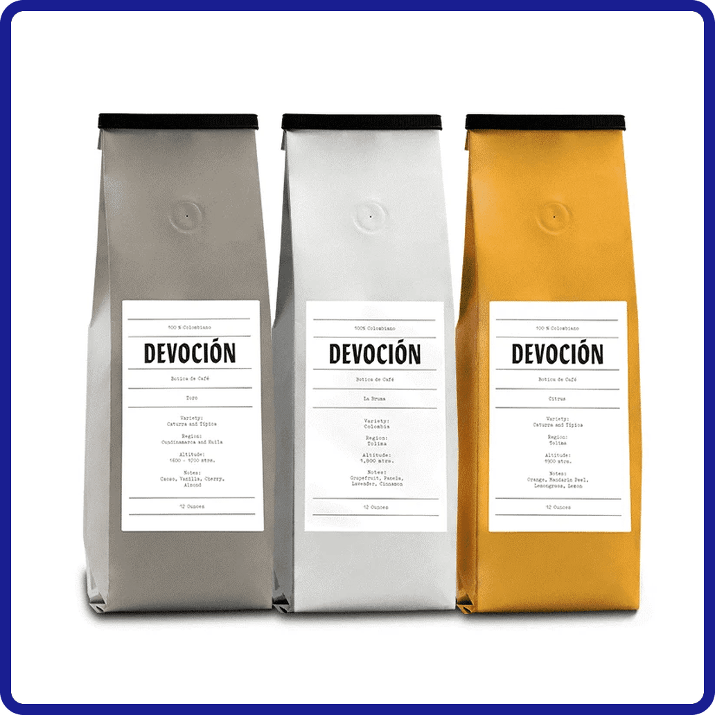
    Somewhere between the timeline of typographic standards lies Devocion’s wordmark: A typeface that might represent the legibility, efficiency, and contemporary nature of Helvetica, but with echoes of hand-drawn Gothic calligraphy from centuries past. All this to say: Devocion’s bags are very simple in design. Everything you need to know is punched on to the bag in small letters, on a traditional elongated bag colored in earth tone or their trademark yellow.

    This simplicity is used to great effect. These side gusseted bags aren’t trying to lure your eye with illustration or pattern; they’re just speaking for themselves. Designs like these emphasize a “come and see” attitude, where the package design isn’t represented as the selling point per se. If your brand’s wordmark can speak volumes, and your coffee bag provides all the information necessary without drawing attention to itself, then the roaster is drawing interest to what they actually do. The focus is on the bean, even though the bag is well-designed.

    Takeaway:

    Devoción demonstrates how a wordmark-led, minimalist coffee bag design can build confidence through restraint, using simple typography, earthy or signature yellow tones, and clean side gusset formats to shift attention away from decoration and toward the coffee itself, creating a “come and see” approach where clarity, origin, and product integrity become the primary branding tools.

    10

    SEY Coffee

    Another Brooklyn-based roaster, SEY Coffee presents itself to the artisanal coffee drinker with sustainable practice at the forefront of their philosophy. Up until now, the aesthetics have been the driving force in this article, for good reason. Done well, they are visual cues to a brand’s ethos. SEY Coffee’s focus on sustainability is perhaps one of the most important factors in proving that coffee brands do have a mission statement besides sales.

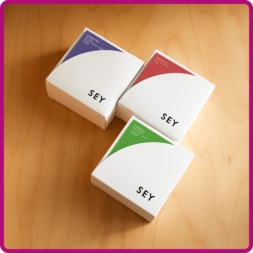
    SEY Coffee presents its roasts in square white boxes denoted with mellow, sweet colors. The three-letter wordmark sits opposite the roast information. You will always know where the beans are sourced from immediately from the package. And, judging on the simplicity in delivering this information, there’s not much more SEY Coffee wants to sell you on, which makes for an excellent package design.

    Takeaway:

    SEY Coffee shows how a mission-driven, sustainability-focused coffee bag design can use minimal structure, soft color accents, and highly organized information hierarchy to communicate transparency and origin first, with a clean wordmark and restrained packaging approach that reinforces trust, clarity, and intentional simplicity over visual excess.
    11

    Dark Matter Coffee

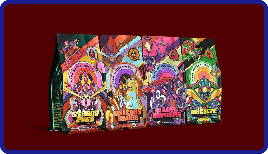
    Coming in with a shotgun blast of psychedelic color, Dark Matter Coffee attempts to astral-project its beans off the shelves with non-primary magentas, pinks, cyans, and greens. The wild color-play of these illustrated bags creates an undeniable allure. The groovy, abnormal titling follows suit and travels back to the 70s and 80s while naming each roast. The illustrations themselves depict mystical beings and creatures of cosmic fantasy, and combined coatings of gloss and matte truly push the limit of a visual hierarchy in this category.

    In all of this organized chaos, you can still make out the brand, the roast, and all of the necessary information. The visual interest of the square bottom bag itself is so strong that it could make a buyer enthusiastic before even trying the blend. If the shelf is a competition of visuals, Dark Matter Coffee races to the top of bags that “pop,” gravitating the consumer’s eyes by sheer force of will and hue.

    Takeaway:

    Dark Matter Coffee demonstrates how an aggressively colorful, illustration-heavy coffee bag design can use psychedelic palettes, layered finishes, and cosmic-themed typography to create maximum shelf impact, proving that even highly experimental visuals can still maintain clear hierarchy when brand, roast, and essential information are structured within the chaos.

    12

    Abracadabra Coffee Co.

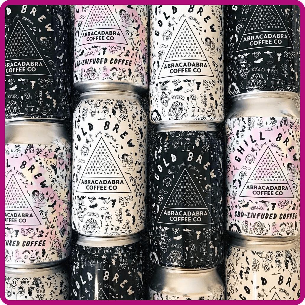
    Abracadabra Coffee Co takes a similar approach to color, but captures the aurora in a hazy pearlescent coated label on plain black-and-white designs. The Vermont roaster creates a unique logo out of letters (where definitions of wordmark and logomark become blurred), and uses this as the texture to stand out. They’re colorful but contained

    Their cold brew cans surround the logo with an overflow of sketched imagery: hands, noses, faces, and other symbols texturize the white or the black coating. This layout creates a layered complexity that doesn’t bog you down. In Abracadabra’s case, all this information still feels straightforward, not fueled by its decoration, but instead using that intrigue to generate interest in their coffee practice and ethos.

    Where brands like Koffee Kult or SEY take the road of minimal space, these two brands exemplify the opposite. All of these brands are highly effective and well-designed, but their different use of design rules slowly reveal how vast your palette of design is, how much choice you have, and where you can narrow your focus and find your own voice. Again, there is seemingly no wrong answer as long as intent and smart design guide the way.

    Takeaway:

    Abracadabra Coffee Co shows how a controlled use of color and texture in coffee bag design can still feel expressive and layered, combining pearlescent finishes, integrated wordmark-logomark typography, and dense illustrative detailing on cans to create visual intrigue while maintaining clear structure, hierarchy, and brand readability.
    13

    Necessary Coffee

    Many of the top coffee brands in the world have traveled long and far on the basis of safe design. Folgers, for example, has kept its design plain, homey, and rooted in the 19th Century American consumer approach before decoration became a common advertising technique. Nowadays, graphic design innovates by looking at the past, the future, and everything in between.

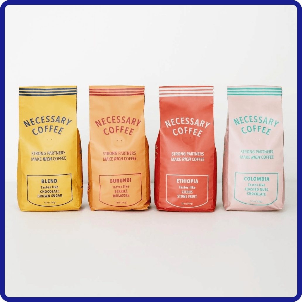
    In the case of Necessary Coffee, their bags hearken back into the honest and frontier-like beginnings of product design. The simple type and linework presents its product plainly, but with the austere and humble side gusseted style that befriends basement shelves and camping tents. They succeed on a vintage minimalism and a two-color setup of their bag designs.

    Takeaway:

    Both Folgers and Necessary Coffee show that simple, familiar coffee bag design can be just as effective as more experimental branding by building trust through clarity, consistency, and restraint rather than visual complexity. Their success comes from confidence in minimalism and tradition, proving that strong branding doesn’t always require innovation—just clear, intentional execution.

    14

    Onyx Coffee Lab

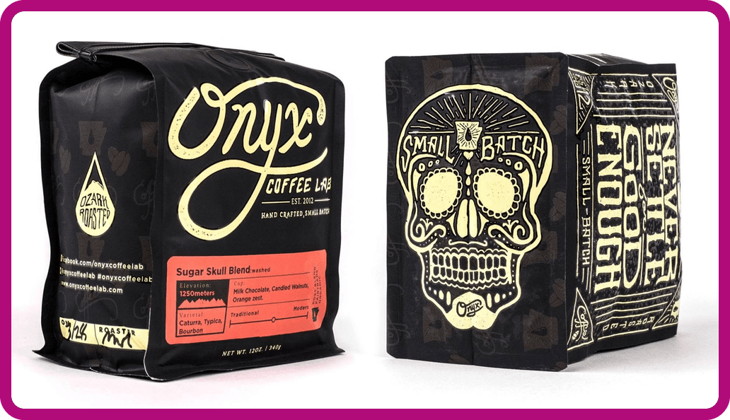
    Onyx Coffee Lab may be the best all-rounder on this list in terms of maintaining visual interest and inviting the consumer to learn more. Onyx combines the black side gusseted bag, playful lettering, vibrant color accents, illustration, and pattern-work on a legible bag design. On paper, all these elements should lead to something rather “ornate,” but Onyx has taken a good swathe of trends and distilled it into its own visual identity. Onyx smooths the “edge” and hones tattoo parlour visuals just enough to appeal to a wider audience.

    Their recent coffee box offerings sport a much more luxurious appeal as one-half embossed floral patterns and one-half gorgeous imprinted wordmark. Both of these looks, tattooed and embossed, are achievable through Onyx’s commitment to balanced design. Much could be said on the efficacy, but largely it all boils down to the fact that Onyx Coffee Labs sends a clear message, and can jump between the aesthetics because of the solid foundation of graphic design work they’ve given to their brand.

    Takeaway:

    Onyx Coffee Lab demonstrates how a balanced coffee bag design can successfully combine multiple visual styles—typography, illustration, pattern, and color—without feeling cluttered, creating a cohesive identity that is both visually engaging and easy to understand at a glance.
    15

    PT’s Coffee

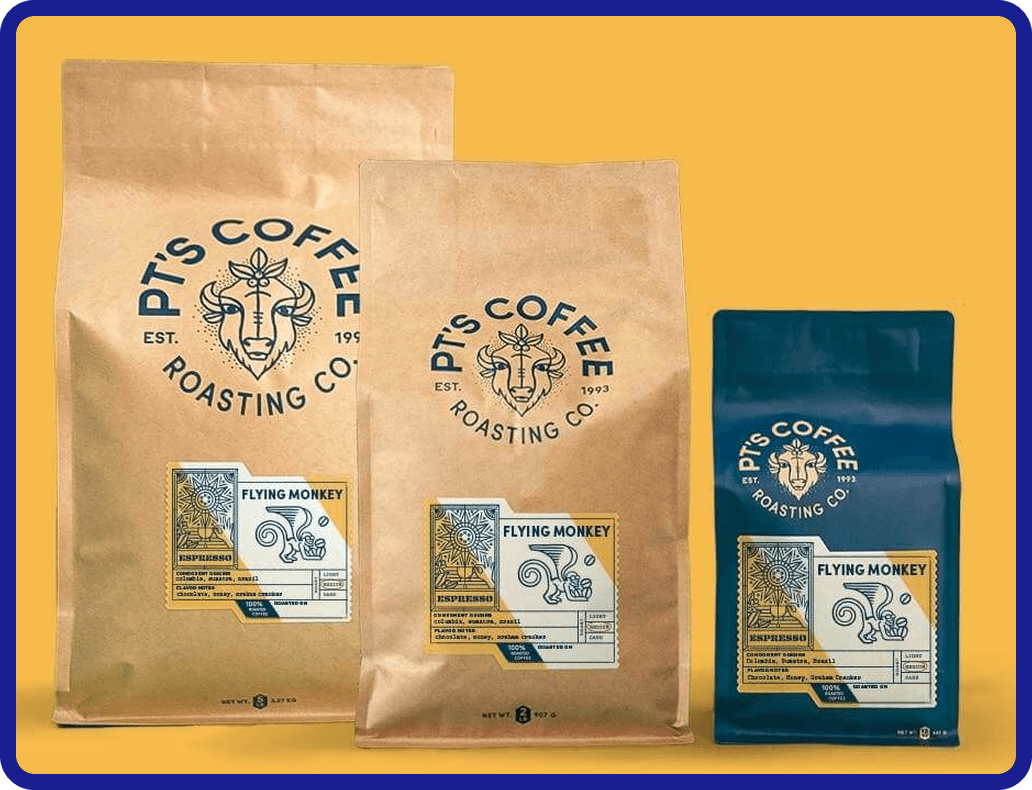
    There have been enough examples of black-and-white bags and ultra-colorful bags. Like Intelligentsia’s design has proven, sometimes one color is all you need. Here, PT’s Coffee chooses a denim blue to lead their wordmark/logomark combination in a circular layout. The superb monoline illustrations add depth and decor to the label. Every element of PT’s Coffee has been treated with thoughtful design so that the whole system is undeniable. And while this circular type and logo is popular, PT’s Coffee is comfortable and honest with their presentation. Trend or not, this is their voice.

    These are a series of illustrations designed to characterize the Kansas roaster’s Midwestern agrarian roots, while also tagging important roast details. The work done on the label and the logo are worthy of their own analysis, but the color is what draws the eye first. The blue is interchangeable to the complementary light brown, and larger square bottom bags sport a classic exposed brown paper that matches the scheme just as well. All of these components work in a wonderful harmony, led by that denim blue that exists either as a matte coat or as print on bare paper.

    Takeaway:

    PT’s Coffee shows how a single, distinctive color—paired with a strong circular wordmark, thoughtful illustration, and consistent system design—can create a cohesive coffee bag identity where simplicity and restraint do not limit visual impact but instead sharpen brand recognition and authenticity.

    Coffee Bag Materials & Packaging That Protect Freshness

    Once you move past visuals and branding, material choice becomes one of the most important decisions in coffee bag design. It directly impacts shelf life, flavor retention, shipping performance, and whether your coffee arrives tasting the way you intended. A great design on the wrong material will still fail if the product inside loses freshness.

    Foil vs. Kraft vs. Clear Laminates

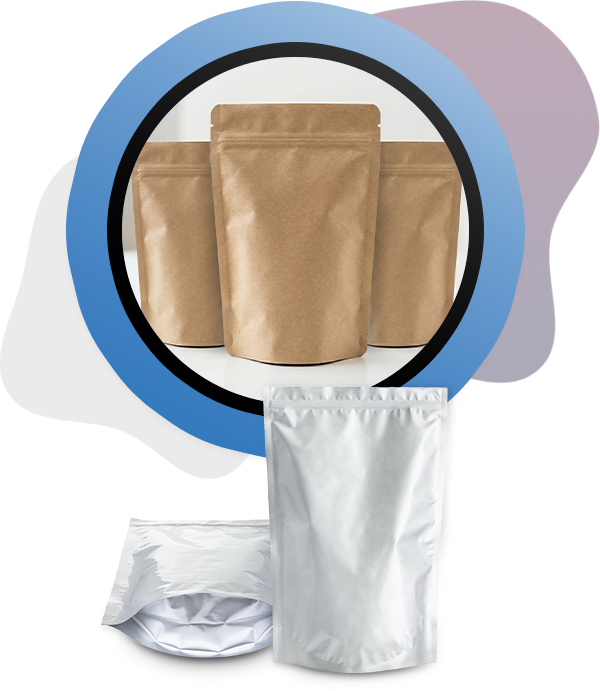
    Foil-lined bags are the industry standard for high-performance coffee packaging because they provide the strongest barrier against oxygen, light, and moisture. They’re typically used for specialty coffee where freshness and flavor integrity are non-negotiable. Kraft paper bags, on the other hand, signal a more natural or artisanal positioning, but they must be paired with an internal barrier layer to properly protect the coffee. Clear laminate or windowed designs are less common for long-term storage but can work well for retail visibility or sample products where product appearance matters more than extended shelf life.

    Oxygen and Moisture Barriers

    Coffee is extremely sensitive to oxygen and humidity, which means barrier performance is not optional—it’s essential. High-quality multilayer films prevent oxidation, which preserves aroma and flavor, while moisture barriers protect against environmental changes during shipping and storage. The better the barrier, the longer the coffee maintains peak freshness after roasting. This is especially important for roasters distributing through retail or national e-commerce channels.

    Degassing Valves

    Freshly roasted coffee releases carbon dioxide for several days after roasting. A one-way degassing valve allows this gas to escape without letting oxygen in, preventing the bag from swelling or bursting while preserving internal freshness. Most retail-ready coffee bags include a valve, and its placement should be considered early in the design stage to avoid interfering with branding, typography, or key visual elements.

    Sustainability Options

    Sustainable coffee packaging has become a major priority for roasters, with kraft paper, recyclable mono-material films, and compostable laminates offering more environmentally conscious alternatives. However, these materials often involve tradeoffs in barrier performance, meaning roasters must balance environmental goals with shelf-life requirements. In many cases, hybrid constructions are used to achieve both sustainability and adequate protection.

    Food Safety Compliance

    Regardless of material choice, compliance with food safety standards is non-negotiable for commercial coffee packaging. Materials that meet FDA CFR 73 guidelines, along with BPA-free and phthalate-free requirements, are standard expectations for retail distribution. Suppliers like CarePac provide packaging options that meet these regulatory standards, enabling roasters to focus on branding and product quality without compromising safety or compliance. In practice, these certifications are not a premium feature—they are table stakes for getting coffee onto store shelves and into customers’ homes with confidence.

    How Custom Coffee Bags Strengthen Your Brand
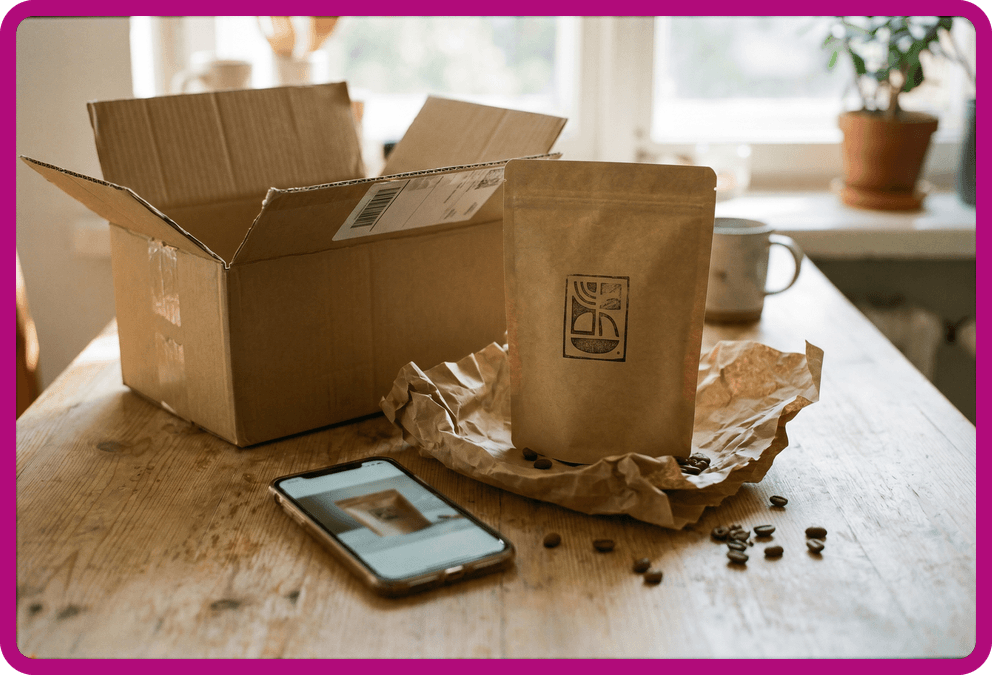
    In a crowded coffee industry, custom coffee bags are often the first, and sometimes only, chance to make an impression. When consumers are faced with dozens of coffee brands on a shelf or scrolling through options online, packaging becomes the primary differentiator. A strong design helps your product stand out immediately, but more importantly, it communicates what kind of brand you are before a customer ever reads a label or tastes the coffee.

    Packaging also plays a direct role in positioning. Material choices, finishes, and structural design signal price tier instantly. Matte black foil with embossing suggests a premium offering, while kraft materials and minimal ink can communicate a more approachable, artisanal feel. In many cases, customers subconsciously assign value based on your packaging long before they understand the details of the coffee itself, making your packaging one of the most important branding tools in your business.
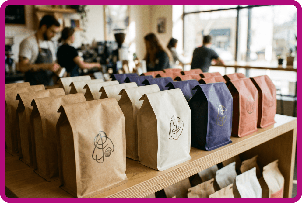
    There are also important differences between direct-to-consumer and retail environments. DTC packaging is often judged in photos, unboxings, and repeat shipments, where clarity and brand recognition matter most. Retail packaging, by contrast, has to perform in a competitive shelf environment where physical presence and quick readability are critical. The best coffee brands design with both contexts in mind, ensuring their identity remains strong no matter where it appears.

    Finally, consistency across SKUs is what turns individual bags into a recognizable system. Rather than treating each roast as a separate design exercise, successful coffee brands build a cohesive visual language that scales across products. This approach strengthens recognition, builds trust, and makes your packaging instantly identifiable as your own—whether it’s seen in a café, a grocery aisle, or an Instagram post.

    Choosing the Right Coffee Bag Design for Your Business
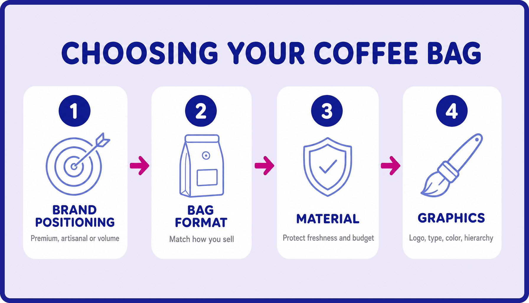
    Choosing the right coffee bag design starts with clarity on your brand positioning, whether you’re aiming for premium, artisanal, or high-volume accessibility. From there, select a bag format that matches how and where you sell, whether that’s retail shelves, e-commerce, or both. Material selection should come next, ensuring your packaging protects freshness while aligning with your sustainability and budget goals. Only then should you move into graphic decisions, where logo placement, typography, color, and visual hierarchy bring your brand story to life on the shelf or screen.

    If you’re ready to move from inspiration to production, CarePac offers fully custom coffee bags with flexible lead times and no minimum order headaches. Get a quote today.

    Lets Get Started

    Made In The USA

    Full PouchCustomization

    Scalable Printing Digital & Plate

  • How Packaging Buyers Can Reduce Cost Per Pouch at Higher Order Volumes

    How Packaging Buyers Can Reduce Cost Per Pouch at Higher Order Volumes

    How Custom Packaging Buyers Can Reduce Cost Per Pouch at Higher Order Volumes

    If you’re ordering pouches and packaging at high order volumes, you already know that volume discounts are available and that ordering more packaging can significantly reduce your total cost. The bigger opportunity, though, is one that most buyers miss.

    It’s the decisions you make before the order is finalized that can have the greatest impact on variable costs: film specs, SKU structure, specialty coatings, raw materials (including compostable materials), format choice, and reorder timing. All of these decisions are locked in with your packaging supplier by the time the quote comes back, which means learning how to reduce custom packaging cost per unit and cost optimization happens earlier than most buyers think.

    In this article, we’ll break down every lever that affects the cost per pouch, ranked by impact, so you can reduce packaging costs on your custom packaging solutions without lowering quality or impacting customer satisfaction.

    Where the Price Breaks Actually Happen in Custom Pouch Orders

    When it comes to identifying where the price breaks happen in the supply chain, there are three core packaging component areas to focus on:

    1

    The fixed cost spread

    Every custom pouch order carries fixed costs, including plate setup, press prep, and quality inspection. At low volumes and fewer units, those fixed costs are a large percentage of the per-unit price. At high volumes, they become negligible. The biggest per-unit savings happen in the jump from small runs to the first meaningful threshold (typically around 5,000–10,000 units). After that, savings continue but flatten.

    2

    The practical tier structure

    Industry pricing typically follows a pattern buyers can plan around. Orders in the 0–2,500-unit range pay near base price; 2,500–10,000 units start to return 15–25% savings; 10,000+ units can reach 25–40% per-unit reduction versus small runs. These aren’t CarePac-specific numbers; they reflect how flexible packaging economics work. The point is that buyers who are already at 10k+ are past the steepest part of the curve, which is why the other levers in this article matter more at that scale.

    3

    The diminishing-returns reality

    Jumping from 50,000 to 60,000 units might only reduce the per-unit price by 2–3%. At that scale, volume alone is no longer the main savings lever. The other packaging strategies in this article matter more.

    Choosing the Right Film Spec Is the Biggest Per-Unit Cost Lever You Have

    Film structure is where most buyers either overspend or underspec, and at high volumes, both are expensive mistakes. Many buyers default to high-barrier foil laminate because it “feels safer.” For products that don’t require that barrier level (i.e., dry snacks with short shelf life, items that sell through in 60–90 days), they’re paying a premium that doesn’t deliver meaningful product benefit. At 50,000 units, the unnecessary material pricing is a significant cost line.

    Therefore, it’s important to match the barrier to the product’s actual shelf-life requirement. For oxygen- and moisture-sensitive products with a 12-24+ shelf life (coffee, jerky, freeze-dried products, supplements, pharmaceutical products), you’ll need to opt for a high-barrier foil or a mylar laminate. For medium-barrier products (snacks, dry goods, pet treats, items with a 6-12 month shelf life), a clear or metalized film will do the trick. Finally, a lower-barrier clear film is perfectly fine for fast-turning products or products with a short shelf life.

    You’ll also need to pay attention to finishes. Matte and soft-touch finishes add cost compared to standard gloss, and at high volumes, that premium quickly accumulates. If your product doesn’t require the perceived value that’s added by a premium finish to compete on the shelf, gloss is the most cost-efficient choice. So, before your next reorder, confirm your product’s actual shelf-life packaging requirements and purchase product packaging accordingly.

    Consolidate SKUs to Maximize Volume Pricing Across Your Product Line

    Another area where buyers can save on their production costs is by combining SKUs to maximize volume pricing. If two or more SKUs share the same film spec, format, and size, they can often be consolidated into a single production run. If material usage is the same, the production run is larger and per-unit economics improve across all three SKUs. This way, the buyer isn’t paying setup costs separately for each individual item.

    For this strategy to work, the size, film structure, format, and finish need to be identical across SKUs. Artwork can differ since it’s handled at the print stage, not the production process stage. Many brands end up with slightly different pouch sizes or film specs across their line because different SKUs were spec’d at different times. Doing a format audit and deliberately standardizing packaging sizes creates consolidation opportunities that didn’t exist before. The per-unit savings from this can be significant, and it can also reduce material waste by reusing the same material across different packaging elements.

    CarePac is proud to offer our customers this discount on multi-SKU orders where specs align. Please inquire about this when requesting a quote, and we’ll work those savings into your estimate.

    Rollstock vs. Premade Pouches: What High-Volume Buyers Need to Know

    For high-volume packaging operations, rollstock film can offer substantial cost savings compared to premade stock packaging. Because the film is supplied on a roll and formed, filled, and sealed on the buyer’s or co-packer’s equipment, rollstock typically costs 30–50% less per unit than premade pouches at equivalent volumes. For brands producing 50,000+ units, that difference can translate into meaningful material cost reductions. The lower retail price results from the supplier providing film rather than finished pouches, eliminating much of the conversion work and packaging waste required to create premade packaging.

    Rollstock is best suited for large and small businesses running VFFS (vertical form-fill-seal) or HFFS (horizontal form-fill-seal) equipment, either in-house or through a co-packer. It works particularly well for high-volume products with predictable production schedules and long, consistent production runs. In these environments, the efficiency of form-fill-seal equipment can significantly reduce packaging costs while maintaining production speed.

    Premade pouches may still be the better choice for brands managing multiple SKUs, frequent changeovers, or operations without access to FFS equipment. They also offer greater flexibility and often support premium printing and pouch aesthetics that some brands prioritize over maximum line efficiency. A simple question can help guide the decision: Does your co-packer run form-fill-seal equipment? If the answer is yes, comparing a rollstock quote alongside a premade pouch quote is well worth the exercise. CarePac offers both rollstock film and premade pouch solutions, allowing buyers to choose the format that best fits their operational and branding positioning goals.

    How Your Reorder Strategy Affects Per-Pouch Cost

    Most buyers focus on packaging and shipping costs when they’re ready to place an order. The buyers who consistently achieve the lowest per-unit pricing start planning their packaging budget and projects much earlier. Forecasting production needs, managing reorder timing, and understanding annual demand can have just as much impact on product cost as the specifications themselves. In many cases, the savings come from planning ahead rather than negotiating harder.

    Rush orders are the most obvious example. Express shipping methods carry a premium over standard or economy production schedules, and at higher volumes, that added cost can become significant, especially once transportation costs are factored in. Buyers who forecast demand accurately and place orders early enough to use standard lead times typically capture savings that rush-order customers leave on the table. The advantage comes from disciplined production planning, not simply ordering premium packaging more frequently.

    Reorders also tend to cost less than first production runs because the initial setup work—such as plate creation, custom inserts, press proofing, and approval processes—has already been completed. For buyers placing an initial order of 10,000 units or more, it’s important to understand that future reorders often become more cost-efficient when specifications remain unchanged.

    Brands with predictable annual demand may also benefit from discussing volume commitments with CarePac, which can unlock more favorable pricing across the year. At the same time, buyers should balance larger order quantities against storage costs and inventory risk. A lower per-unit price only creates real savings if excess inventory won’t become obsolete due to packaging redesigns, regulatory changes, or other product updates.

    Which Packaging Design Features Drive Up Fixed Costs (and Which Are Worth It)

    Certain packaging features can improve functionality, compliance, and shelf appeal, but not every feature delivers enough value to justify the product’s retail price. At high volumes, seemingly small upgrades can have a meaningful impact on per-unit pricing. The key is understanding which features genuinely support your product and sales channel—and which ones have simply become part of the spec by default.

    Among the highest-impact cost drivers are specialty closures. Standard zippers are typically the most economical option, while powder-resistant zippers, child-resistant (CR) zippers, and other specialty closures increase costs. CR zippers carry the largest premium but are essential when regulations require them. Degassing valves are another feature that adds meaningful cost and should generally be reserved for fresh-roasted coffee, where they play a critical role in product performance. Clear windows also increase costs because they require additional print setup and white ink layering. They are often worthwhile when customers want to see the product before purchase, but may provide little value when branding and graphics drive the buying decision.

    Finish options such as matte and soft-touch coatings add cost compared to standard gloss finishes and are best suited for products competing on premium shelf presentation. By contrast, hang holes have a negligible impact on pricing at high volumes and are often worth keeping because they provide flexibility across retail environments that use peg displays. When evaluating any feature, buyers should ask a simple question: Is this feature earning its cost in our specific sales channel? If the answer is yes, keep it. If not, it may be an opportunity to reduce costs on the next reorder without affecting product performance or sales.

    Ready to Reduce Packaging Costs Without Sacrificing Quality? Start With a Quote.

    Per-pouch cost at high volumes is influenced by far more than order quantity. Material selection (including sustainable packaging materials), pouch format, production method, feature choices, and reorder planning all play a role in determining what you ultimately pay. CarePac works with high-volume buyers to optimize these decisions early, helping ensure packaging specifications align with both operational requirements and cost goals.

    If you’re planning a large production run or evaluating ways to reduce your current packaging costs, the next step is to have a conversation about a quote. Request a quote to compare options, or contact our team for a free consultation to discuss specifications, production requirements, and cost-saving opportunities before pricing your project.

    Frequently Asked Questions

  • Stand-Up Pouch vs. Flat Pouch vs. 3-Side Seal Pouch

    Stand-Up Pouch vs. Flat Pouch vs. 3-Side Seal Pouch

    Stand-Up Pouch vs. Flat Pouch vs. 3-Side Seal Pouch: A Buyer’s Comparison

    Introduction to Pouch Packaging Types

    Choosing the wrong flexible pouch type isn’t a design issue. It’s an operational one that shows up in your margins, your line efficiency, and how easily you can scale. The decision between a stand-up pouch, a flat pouch, and a 3-side seal pouch directly impacts per-unit cost, production speed, shipping and storage density, retail shelf performance, consumer experience, and whether your packaging actually runs smoothly on existing filling equipment. In other words, this is less about packaging aesthetics and more about how your entire system performs from the production floor to the end user.

    Within the broader world of flexible packaging, custom pouch packaging, and flexible pouch formats, each structure solves a different operational problem. Stand-up pouches are often chosen for shelf presence and resealability, flat pouches for cost efficiency and compact distribution, and 3-side seal pouches for simplicity and high-speed filling. Understanding where each format creates friction (removes it) determines whether your packaging supports long-term scalability or quietly limits it.

    What Is a Stand-Up Pouch?

    A stand-up pouch is a type of flexible packaging that features a gusseted bottom designed to expand when filled, allowing the package to stand upright on a retailer’s shelf space. This structure creates a stable base that improves visibility and usability while maintaining the lightweight, efficient benefits of pouch packaging. Used for everything from pet food, liquid products, trail mix, and nutritional supplements to coffee packaging, powdered products, and baby food, it is an extremely popular packaging format in the packaging industry.

    From a buyer’s perspective, stand-up pouches are often chosen by many brands because they balance functionality and environmental impact with strong retail shelf presence. The upright structure creates a natural facing position that protects product integrity and maintains freshness, while enhancing visibility in competitive retail environments and improving the packaging’s overall “billboard effect.” The larger front and back panels also provide a significant printable surface area, giving brands more room for design, messaging, and regulatory information without compromising clarity.

    Functional features commonly associated with a stand-up pouch include a resealable zipper, tear notches for easy opening, and hang holes when peg display is required. Many formats also support high-barrier film structures, which help protect product freshness by blocking moisture, oxygen, and light—making them a strong option for food, supplement, and specialty product applications. These features combine to create a more premium, multi-use consumer experience, especially for various products intended to be opened and resealed multiple times.

    Compared to flat base pouches or 3-side seal formats, stand-up pouches often carry a higher unit cost due to the added material required for the gusset and the additional manufacturing steps involved in forming the base. That added complexity is typically offset by stronger shelf impact and improved consumer usability.

    Best-fit use cases for stand-up pouches

    Stand-up pouches are often a strong fit for:

    • Snacks
    • Coffee
    • Pet treats
    • Supplements
    • Powders
    • Granola
    • Dried fruit
    • Candy
    • Protein products
    • Specialty food packaging
    • Products sold primarily in retail environments
    • Multi-use products where resealing matters
    • Premium products where packaging is part of the brand identity or experience

    Overall, the stand-up pouch format is typically selected when retail shelf presence, branding impact, and resealable closures are higher priorities than the absolute lowest per-unit cost.

    What Is a Flat Bottom Pouch (3-Side Seal)?

    Flat bottom bags and 3-side seal pouches (three-side seal pouches) are often used interchangeably, but there are several key differences between them. They refer to a simple flexible packaging format made from film sealed on three sides, with one side left open for filling and then heat-sealed closed. Some suppliers may define the terms slightly differently, but in practice, they describe the same core structure in flexible packaging.

    This format is valued for its simplicity and efficiency. Lay flat pouches typically offer lower per-unit cost, efficient shipping and storage due to their flat profile, and strong compatibility with form-fill-seal systems. They are widely used in high-volume packaging because they are easy to produce, easy to fill, and highly space-efficient in transit.

    However, they do not stand upright and have limited shelf presence on their own, often requiring cartons, display boxes, or hang holes for retail presentation. They are also less suited for multi-use products unless additional features are added.

    Best-fit use cases

    Flat / 3-side seal pouches are often a strong fit for:

    • Single-serve packaging
    • Samples and test SKUs
    • Seasonings, spices, and condiments
    • Tea and coffee samples
    • Powdered drink mixes and supplements
    • High-volume, thin-margin products
    • Products packaged into cartons or display boxes

    In short, flat and 3-side seal pouches are best for cost efficiency, scalability, and single-use applications where retail presence is handled outside the pouch itself.

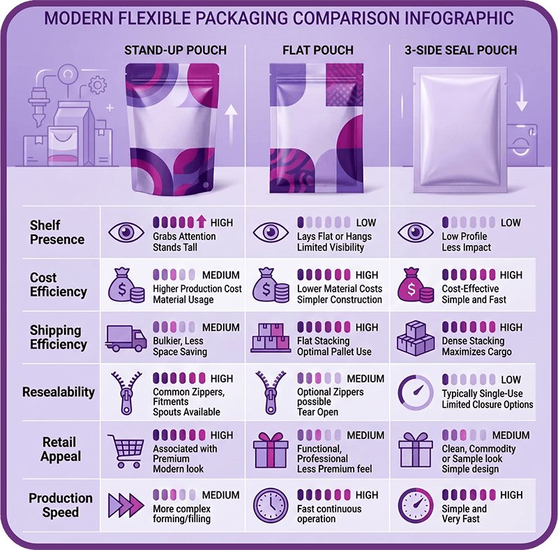
    Stand-Up Pouch vs. Lay Flat Pouch: Key Differences

    The two most common flexible pouch formats—stand-up pouches and flat pouches—solve very different operational and commercial needs. This comparison breaks down how each format performs across cost, shelf presence, production efficiency, and use case so buyers can quickly identify which structure best aligns with their product strategy, volume requirements, and retail goals.

    Comparison Point

    Stand-Up Pouch

    Flat Pouch / 3-Side Seal Pouch

    Best for

    Retail products, premium branding, multi-use products

    Single-serve, sample-size, bulk, high-volume, or cost-sensitive products

    Shelf presence

    Strong; stands upright on shelf

    Limited unless used with hang hole, carton, or display box

    Typical cost

    Usually higher due to bottom gusset and added manufacturing steps

    Usually lower due to simpler structure

    Shipping and storage

    Less compact than flat formats

    Very efficient; stacks and ships flat

    Resealability

    Strong fit for zippers and multi-use features

    Possible in some cases, but less common for single-serve applications

    Filling compatibility

    May require specific equipment depending on operation

    Often compatible with simpler or faster form-fill-seal lines

    Barrier protection

    Depends on film structure, not just pouch format

    Depends on film structure, not just pouch format

    Best product examples

    Coffee, snacks, pet treats, supplements, powders

    Seasonings, samples, condiments, single-serve powders, tea, kits

    Best buyer profile

    Brand prioritizing shelf appeal and consumer experience

    Brand prioritizing cost, efficiency, and high-volume production

    Stand-Up Pouch vs. Flat Pouch: How They Compare

    Cost Per Unit

    In a stand up pouch vs flat pouch comparison, flat (3-side seal) pouches usually win on per-unit cost because they use a simpler structure without a gusset or extra forming steps. This makes them more cost-efficient, especially for high-volume or thin-margin products.

    Stand-up pouches typically cost more, but the added cost can be justified when stronger shelf presence, branding, or resealability helps drive sales.

    Key idea: Flat wins on cost; stand-up wins when presentation supports higher perceived value.

    Shelf Display and Retail Presence

    Stand-up pouches win for retail shelf presence because the gusset allows them to stand upright and creates a strong “billboard effect” for branding.

    Flat pouches can work in retail but usually need hang holes, cartons, or display packaging to achieve visibility.

    Key idea: Stand-up is better for competing on shelf.

    Shipping and Storage Efficiency

    Flat pouches win on shipping and storage because they pack completely flat and maximize space efficiency in cartons, pallets, and warehouses.

    This is especially valuable for high-volume and cost-sensitive products. Stand-up pouches take up more space before filling.

    Key idea: Flat formats are more efficient for logistics and storage.

    Filling Line Compatibility

    Both formats can work with standard equipment, but flat pouches often run more easily on form-fill-seal lines. Stand-up pouches may require more specific setup depending on the system.

    Buyers should confirm compatibility with their co-packer or production team before choosing. CarePac can help evaluate this early.

    Key idea: Fit depends on equipment, not just format.

    Barrier and Product Protection

    Barrier protection comes from the film, not the pouch format. Both stand-up and flat pouches can be built with high-barrier structures for moisture, oxygen, light, and aroma protection.

    Key idea: Choose material structure, not pouch shape, for barrier performance.

    Consumer Experience and Resealability

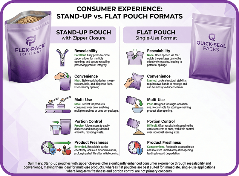
    Stand-up pouches win for multi-use products because they pair well with zippers and resealability features.

    Flat pouches are better for single-use items where simplicity matters more than resealing.

    Key idea: Stand-up for multi-use; flat for single-use efficiency.

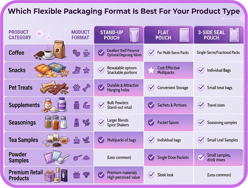
    Which Flexible Packaging Format Is Best for Your Product Type?

    The two most common flexible pouch formats—stand-up pouches and flat pouches—solve very different operational and commercial needs. This comparison breaks down how each format performs across cost, shelf presence, production efficiency, and use case so buyers can quickly identify which structure best aligns with their product strategy, volume requirements, and retail goals.

    Product Type

    Recommended Format

    Why

    Coffee

    Stand-up pouch or flat-bottom pouch

    Strong shelf presence, resealability, and freshness features such as high-barrier films and degassing valve options

    Snacks

    Stand-up pouch

    Better shelf presence and resealable options for multi-use products

    Seasonings

    Flat pouch / 3-side seal pouch

    Cost-effective for single-serve packets, samples, and high-volume runs

    Condiments

    Flat pouch / 3-side seal pouch

    Efficient for portion packs and single-use applications; requires less space

    Supplements

    Stand-up pouch or flat pouch depending on use case

    Stand-up works for multi-use powders; flat works for samples or single-serve packets

    Pet treats

    Stand-up pouch

    Better retail presence, visual appeal, and resealability

    Tea samples

    Flat pouch / 3-side seal pouch

    Compact, efficient, and suitable for sample-size and lightweight products

    Powder samples

    Flat pouch / 3-side seal pouch

    Lower cost and efficient for single-use servings

    Premium retail products

    Stand-up pouch

    Better branding surface and shelf impact

    Bulk or display-box products

    Flat pouch / 3-side seal pouch

    Packs efficiently and works well inside cartons or display boxes

    Who Should Use a Stand-Up Pouch?

    Stand-up pouches are usually a good fit for brands that:

    • Sell products in retail environments
    • Need strong shelf presence
    • Want the package to stand upright without a display box
    • Have multi-use products that benefit from resealability
    • Use packaging as a brand billboard
    • Sell premium or specialty products
    • Need larger printable panels for branding and design impact
    • Want a more consumer-friendly, easy-to-handle pouch format
    • Sell products like coffee, snacks, supplements, powders, pet treats, or specialty foods

    CarePac can help brands customize stand-up pouch size, material structure, finish, zipper, and barrier performance based on the product and sales channel.

    Who Should Use a Flat Pouch or 3-Side Seal Pouch?

    Flat pouches or 3-side seal pouches are usually a good fit for brands that:

    • Package single-serve products
    • Need sample-size packaging
    • Run high volumes on tight margins
    • Ship products in bulk cases, cartons, kits, or display boxes
    • Want to reduce storage and freight inefficiency
    • Are testing a new SKU before scaling
    • Need simple heat-sealed packaging
    • Use form-fill-seal lines suited to flat formats
    • Sell products like spice packets, seasoning sachets, tea samples, condiment portions, supplement samples, or powder packets

    CarePac can help buyers confirm whether flat or 3-side-seal packaging fits their product size, filling process, barrier requirements, and order volume.

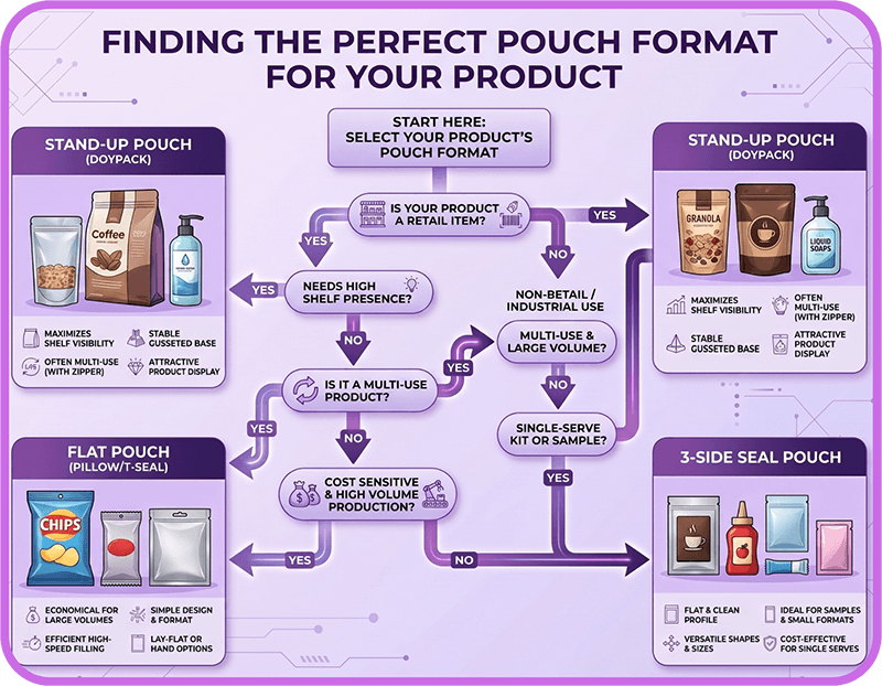
    Which Pouch Format Is Right for Your Product?

    Here’s how we typically walk buyers through this decision at CarePac—less theory, more “what actually works in your operation.”

    Choose a stand-up pouch if:

    • Your product sells in retail environments
    • Shelf presence is a major factor in purchase decisions
    • You need the package to stand upright on its own
    • The product is designed for multi-use consumption
    • Resealability (like a zipper) improves user experience
    • Your brand relies on premium packaging and strong visual impact
    • You sell products like coffee, snacks, pet treats, supplements, powders, or specialty foods

    Choose a flat pouch or 3-side seal pouch if:

    • Your product is single-serve or portion-controlled
    • You are packaging samples or trial sizes
    • Products ship in bulk cases, cartons, kits, or display boxes
    • Cost efficiency and tight margins are a priority
    • You are launching or testing a new SKU before scaling
    • You need a compact, space-efficient packaging format
    • Shelf standing is not required for the product

    If you are not sure which format fits your fill line, order volume, and distribution setup, CarePac’s team can walk you through the options before you commit to a production run. Request a quote today.

    Common Mistakes to Avoid When Choosing a Flexible Pouch Format

    Choosing between pouch formats isn’t just a design decision—it’s an operational one. These are the mistakes we most often see when buyers select flexible packaging.

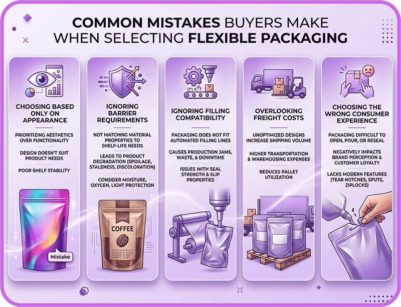
    Mistake 1: Choosing Based on Looks Alone

    It’s easy to default to what looks best on shelf, but appearance is only one part of the equation. The pouch also has to work with your fill line, shipping model, barrier requirements, and overall budget. A format that looks great but slows production or increases costs will create problems later.

    Mistake 2: Assuming Stand-Up Pouches Always Have Better Barrier Protection

    Barrier performance is determined by the film structure, not whether the pouch is stand-up or flat. Both formats can be engineered with high-barrier materials depending on what the product needs to protect against, including moisture, oxygen, light, and aroma loss.

    Mistake 3: Forgetting About Filling Compatibility

    A pouch can look perfect on paper but still create bottlenecks on the production floor. Different structures may require different handling or machinery, especially when working with co-packers or automated form-fill-seal systems. Always confirm compatibility before committing.

    Mistake 4: Ignoring Freight and Storage Costs

    Unit cost is only part of the picture. Storage efficiency, carton configuration, pallet density, and shipping volume all impact total landed cost. Flat pouches often outperform here because they pack more efficiently than gusseted formats.

    Mistake 5: Choosing a Format That Doesn’t Match the Consumer Use Case

    Packaging should match how the product is actually used. Multi-use products typically need resealability and better handling, while single-use products often benefit from simpler, lower-cost formats that prioritize efficiency over reusability.

    Verdict: Stand-Up Pouch vs. Flat Pouch vs. 3-Side Seal Pouch

    There is no single “best” pouch format—only the format that best fits your product and operation.

    Stand-up pouches are typically the stronger choice when shelf presence, resealability, branding, and consumer experience are priorities. Their ability to stand upright and showcase a larger branded surface area makes them especially effective for retail products and premium product lines.

    Flat pouches and 3-side seal pouches are usually the stronger choice when cost efficiency, compact shipping, single-serve applications, or high-volume production matter most. Their simple structure helps reduce costs while maximizing storage and distribution efficiency.

    Ultimately, the right choice depends on your product, filling process, order volume, distribution channel, barrier requirements, and how customers will interact with the package after purchase.

    CarePac can help brands compare pouch formats, materials, features, and custom configurations before placing a packaging order, ensuring the final solution aligns with both operational requirements and brand goals.

    Frequently Asked Questions 

    Lets Get Started

    Made In The USA

    Full PouchCustomization
    Scalable Printing Digital & Plate

  • Doypack Configurations: What They Are & When to Use

    Doypack Configurations: What They Are & When to Use

    Doypack Configurations: What They Are & When to Use Them

    Intro to Doypack Plastic Packaging

    A doypack stand up pouch is one of the most widely used flexible packaging formats in the world. Known for its curved bottom gusset and ability to stand erect on store shelves, this pouch style is popular for products ranging from snacks and coffee to pet food and supplements.

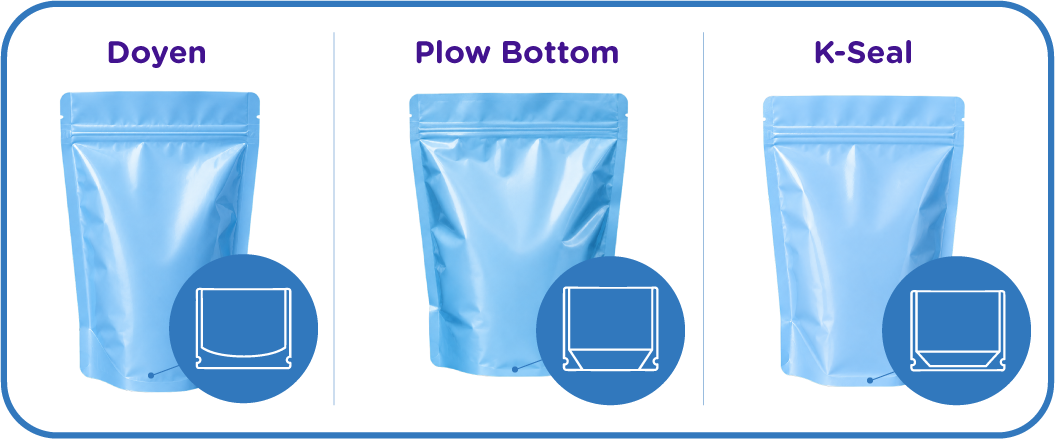
    Doypacks are one of several stand up pouch configurations used in flexible packaging. Understanding how they compare to alternatives like plow bottom pouches and K-Seal pouches can help brands choose the right format for their product, filling process, and shelf display needs.

    Originally developed in 1963 by French inventor Louis Doyen, the doypack design consists of two flat sheets sealed along the sides with a rounded gusset at the bottom. Today, billions of doypacks are used globally each year because they provide an excellent balance of cost efficiency, shelf presence, and packaging performance.

    In this article, we’ll explain how doypack packaging works, when they’re the best option, and how they compare with other common standing pouch structures.

    Key Features of Doypack Flexible Packaging

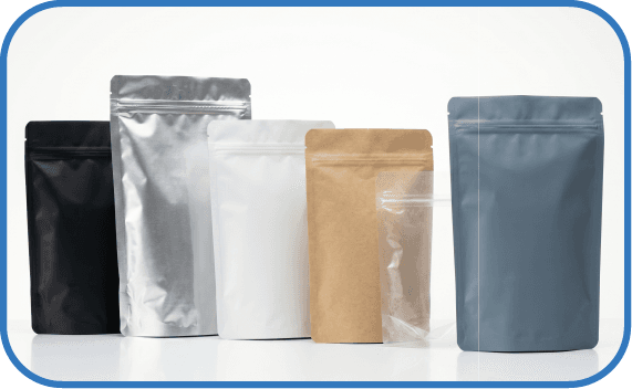
    One of the key advantages of a doypack pouch is its flexibility in design and functionality. Manufacturers can customize these pouches to match specific packaging needs and branding goals. They can be manufactured in different shapes and various sizes and can also be made from eco friendly materials.

    Common doypack configurations include:

    Because the structure of these packaging solutions are relatively simple compared to other stand up pouch designs, doypacks work well across a wide range of industries while remaining cost-effective to manufacture and fill.

    Common Applications of Doypack Packaging Solutions

    Doypack pouches appear in nearly every business and retail category because they offer a good balance between protection, presentation, and cost. They also have a lesser environmental impact than some other packaging solutions.

    Liquids

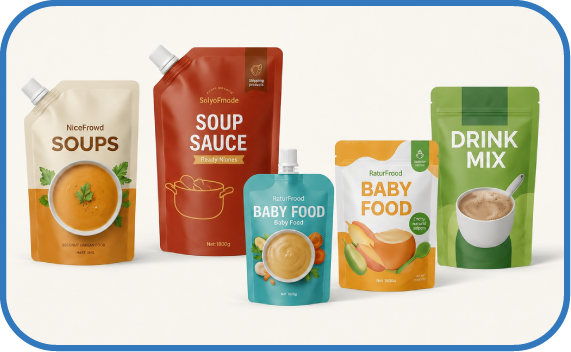
    Spouted doypacks are commonly used for products like soups, sauces, baby food, and drink mixes. Compared to rigid containers, flexible pouches reduce shipping weight and storage space.

    Pet Food

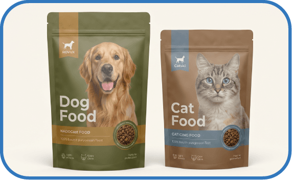
    Fresh pet food brands frequently use doypack pouches because the sealed barrier films help protect against moisture and oxygen exposure.

    Snacks, Coffee, and Confectionery

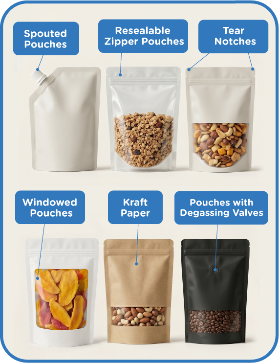
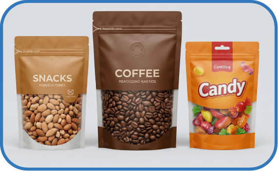
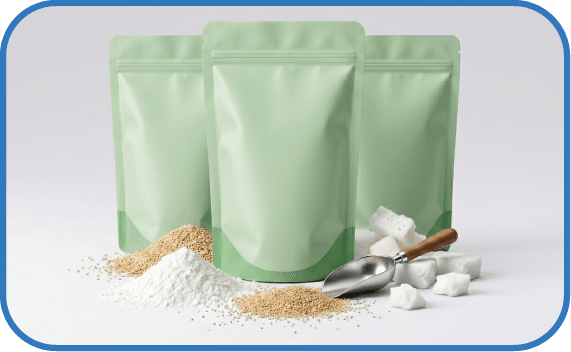
    Many snack brands choose doypacks because the resealable zipper keeps nuts, supplements, and other products fresh after opening. Coffee brands also use doypacks with degassing valves to release CO₂ produced by freshly roasted beans.

    Doypack Pouches vs Other Stand Up Pouch Configurations

    While doypacks are extremely common, they are not the only stand up pouch option available. Other popular configurations include plow bottom pouches and K-Seal pouches.

    Each structure has advantages depending on the product weight, filling method, and retail presentation.

    Feature

    Doypack (Doyen Seal)

    Plow Bottom Pouch

    K-Seal Stand Up Pouch

    Bottom Construction

    Rounded bottom gusset (U-shaped seal)

    Fold-over bottom with simple cinches forming a gusset

    Angled bottom created by angled seals

    Stands on Shelf?

    Yes, generally acceptable

    Only with powder or granular products

    Yes – most stable

    Shelf Stability

    Good for most products

    Depends on product density

    Excellent (most stable)

    Visual Shape

    Soft, rounded base

    Pillow-like

    lat base with angled corners

    Blow Outs

    Balanced performance

    Usually lowest with powder products

    Heavy products may experience blow outs due to gusset complexity

    Premium Look

    Moderate

    Lower

    High / premium

    Common Use Cases

    Coffee, tea, snacks, pet food

    Powder products, granular snacks

    Snacks, supplements, premium food

    Wrinkle Resistance

    Moderate

    Moderate to low depending on fill

    Highest

    Fill Tolerance

    4 star

    5 star

    3 star

    Cost (Relative)

    $$

    $

    $$$

    Best For

    General use stand-up packaging

    Heavy powder products

    Premium shelf presentation

    Alternate Names

    Doyen pouch, doypack

    Square bottom pouch, flat bottom pouch

    K-Seal pouch

    Benefits of a Doypack Bags

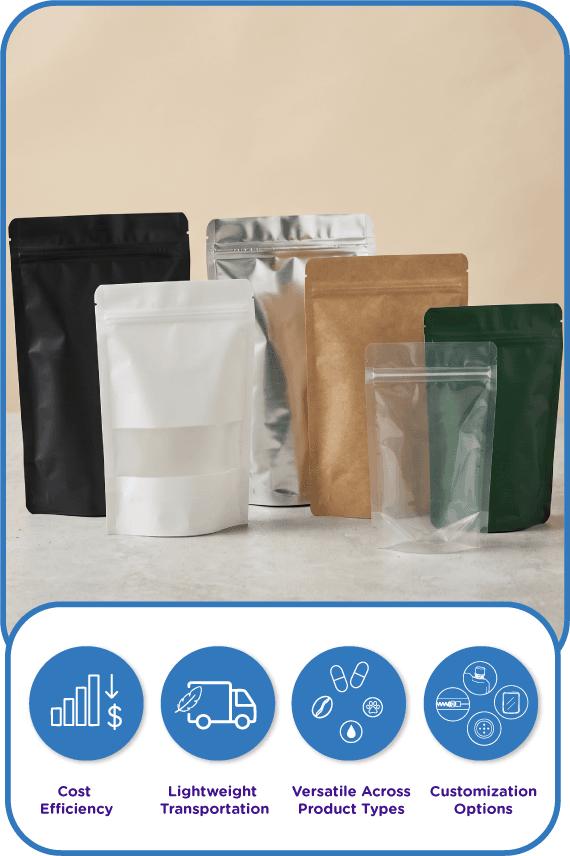
    Doypack pouches are popular because they strike a balance between cost, performance, and shelf display in the market. When compared to other stand up pouch structures, several advantages stand out for both consumers and businesses.

    Cost Efficiency

    Compared to K-Seal pouches, doypacks typically use less material and require simpler sealing patterns. This often makes them more economical for brands scaling production.

    Lightweight Transportation

    Like most flexible packaging formats, doypacks are extremely lightweight. Compared to rigid containers, they reduce shipping costs and warehouse storage space.

    Versatile Across Product Types

    Compared to plow bottom pouches, doypacks perform better across a wider range of products. While plow bottom structures work best for powders or granular fills, doypacks can handle liquids, snacks, coffee, supplements, and pet food.

    Customization Options

    Doypack pouches can include a wide variety of features, including:

    • Zippers
    • Tear notches
    • Degassing valves
    • Windows
    • Spouts
    • Hang holes

    This makes them adaptable for both retail and e-commerce packaging.

    How to Choose the Right

    Stand Up Pouch for Your Product

    Choosing the right pouch configuration depends on several factors including product weight, fill method, and how the product will appear on the shelf.

    Choose a Doypack if:

    • You need versatile packaging for multiple product types
    • You want a cost-effective stand up pouch
    • Your product ranges from light to moderately heavy
    • You want a balance of performance and shelf presence

    Choose a Plow Bottom Pouch if:

    • Your product is powder, granules, or loose fill
    • You want maximum fill tolerance
    • Cost efficiency is the primary concern
    • Shelf presentation is less important

    Choose a Doypack if:

    • Shelf stability is critical
    • You want a premium retail appearance
    • Your product requires a flat base display
    • Packaging aesthetics are a major part of branding

    CarePac: Your Stand Up Pouch Packaging Partner

    Choosing the right pouch configuration can significantly impact product protection, shelf presentation, and packaging costs.

    If you’re unsure which stand up pouch style is right for your product, our team can help you evaluate the best option based on your product type, filling method, and retail goals.

    Not sure which stand up pouch configuration is right for your product?

    Our packaging experts can help you compare doypack, plow bottom, and K-Seal pouch options before you commit.

    Get started with a quote today.

    FAQ: Doypack Stand Up Pouches

    Lets Get Started

    Made In The USA

    Full PouchCustomization
    Scalable Printing Digital & Plate

  • How Does a Chamber Vacuum Sealer Work

    How Does a Chamber Vacuum Sealer Work

    How Does a Chamber Vacuum Sealer Work

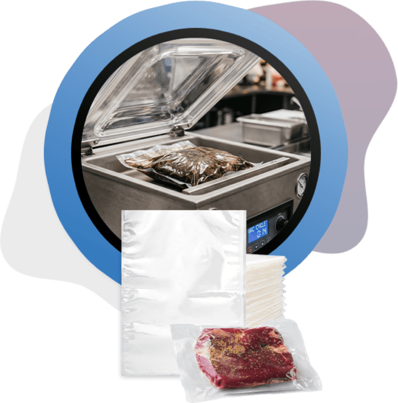
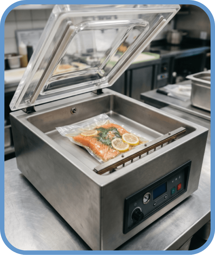
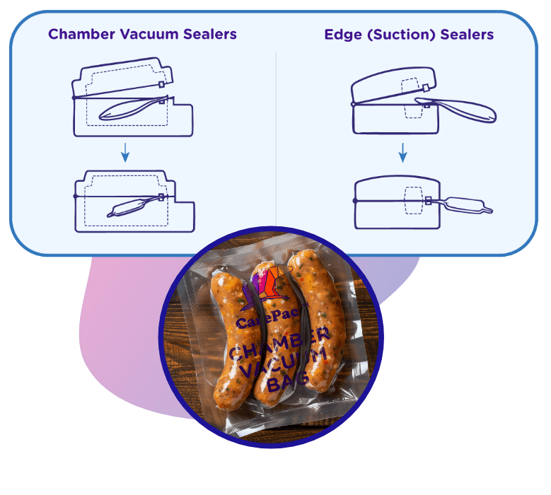
    A chamber vacuum sealer operates by placing a filled pouch inside a sealed enclosure where air is extracted from the entire chamber before the bag is sealed. As the pressure drops evenly inside and outside the pouch, air escapes from the package without the aggressive suction used in edge-style machines. The sealing bar then closes the bag while the vacuum is still maintained, and normal air pressure is restored once the cycle finishes, tightening the package around the product. The end result is a very tight package that perfectly protects the product inside. 

    Because the vacuum is created in a controlled environment, the process is especially effective for producing uniform seals and consistent results. This makes chamber sealing well suited for delicate foods, liquids, and high-volume production where reliability matters. Manufacturers such as Pouchworth often recommend chamber systems when consistency, efficiency, and product protection are priorities.

    What Is a Chamber Vacuum Sealer?

    A chamber vacuum sealer is a type of vacuum packaging equipment designed for professional and commercial use. Unlike countertop edge sealers, where the open end of the bag sits outside the machine and air is pulled directly from the pouch, chamber sealers hold the entire package inside the unit during the sealing cycle. The machine evacuates air from the whole chamber — not just the bag — creating balanced air pressure inside that allows the contents to remain stable during sealing.

    This structural design is why chamber vacuum sealers are widely used in commercial kitchens, food manufacturing operations, and sous vide preparation. They are particularly useful for packaging liquids and wet foods because the equalized pressure prevents spills and produces dependable seals. The result is a versatile packaging method that supports longer shelf life and more consistent product presentation.

    How a Vacuum Chamber Sealer Works (Step by Step)

    Though we’ve answered “how does a chamber vacuum sealer” work in theory, you might be wondering how it works in practice. Here’s a step-by-step breakdown of how a chamber vacuum sealer works.

    Step 1 – Air Is Removed From the Entire Chamber

    During this step, the vacuum pump removes air from the whole chamber. The pressure inside the bag and outside the bag stays equal, which is why this prevents liquids from being pulled out.

    Step 2 – The Bag Is Heat-Sealed Under Vacuum

    In step 2, the sealing bar engages while the chamber is still under vacuum. The heat melts the bag layers together, which creates a strong, more reliable seal.

    Step 3 – Air Re-enters the Chamber (Compression Effect)

    Finally, the chamber returns to normal atmospheric pressure inside. Here, the outside pressure compresses the bag tightly around the product and users typically “see” the vacuum effect. It’s important to note that compression does not happen during air removal, which is a common misconception people have about chamber vacuum sealers.

    Why Chamber Vacuum Sealing is Better for Liquids

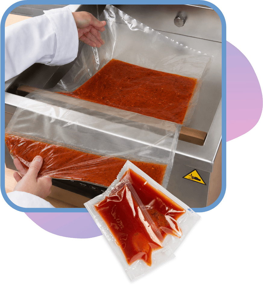
    Chamber vacuum sealers are especially well suited for packaging liquids such as soups, sauces, marinades, and brines. Because the entire chamber is evacuated during the sealing cycle, pressure is reduced evenly around the pouch. This allows liquids to remain stable inside the bag instead of being forced toward the opening, making it much easier to achieve a clean, reliable seal.

    Unlike edge-style vacuum sealers that rely on directional suction, chamber machines do not pull liquids upward through the bag opening. This greatly reduces the risk of spills entering the sealing area or the machine itself. As a result, users experience fewer messes, less equipment wear, and fewer seal failures, making chamber vacuum sealing a more dependable solution for packaging wet foods and liquid products.

    Chamber Vacuum Sealers vs Edge (Suction) Sealers

    How Edge Sealers Work

    Edge (or suction) vacuum sealers remove air by pulling it directly through the open end of a bag. The bag opening is positioned outside the machine while a vacuum pump extracts air and then heat-seals the edge. Because the air has to travel through the bag opening, these machines require textured or channeled vacuum bags that allow air to flow out during the sealing process.

    This design works well for dry foods but creates challenges when sealing liquids. Directional suction can pull soups, sauces, or marinades toward the sealing area, increasing the risk of spills, weak seals, or machine contamination.

    Key Differences at a Glance

    Featur​​​​​​​e

    Chamber Vacuum Sealers

    Edge (Suction) Sealers

    Air removal method

    Air is removed from the entire sealed chamber

    Air is pulled directly from the bag opening

    Liquid compatibility

    Excellent for liquids and wet foods

    Limited; liquids can interfere with sealing

    Bag type

    Uses smooth, standard vacuum pouches

    Requires textured or channeled bags

    Seal strength

    Consistent, uniform seals

    Can vary depending on air removal

    Typical use cases

    Commercial kitchens, food production, sous vide, liquid packaging

    Home use, small batches, mostly dry foods

    Understanding these differences helps ensure you select the right equipment for your application and packaging needs.

    What Types of Bags Do Chamber Vacuum Sealers Use?

    Chamber vacuum sealers use smooth, non-textured pouches designed to handle the full vacuum process inside the sealed chamber. Unlike edge (suction) sealers, these bags don’t require mesh or channeling to allow air to escape, because the air is removed from the entire chamber rather than just through the bag opening.

    This design offers several advantages: it typically uses less plastic, lowers overall bag costs, and allows for more consistent seals. Some chamber pouches are even reusable, depending on the material and application. It’s important to note that chamber bags are not interchangeable with edge sealer bags — using the wrong type can result in poor seals or machine damage. Choosing the correct bag ensures optimal performance, reduces waste, and maintains food quality.

    Common Use Cases for the Chamber Vacuum Sealing Process

    Chamber vacuum sealers are versatile tools widely used across commercial and culinary applications. One of the primary use cases is commercial packaging — from meal prep services to food manufacturers — where consistent, professional-quality seals are essential. For more examples of how businesses use chamber sealing, see our use case pages.

    They’re also key for food preservation and shelf-life extension, helping restaurants, catering operations, and production facilities keep ingredients fresh longer by removing oxygen and reducing spoilage. Additionally, chamber sealers are commonly used for infusion and compression techniques, allowing chefs and food innovators to marinate, flavor, and compress ingredients efficiently while maintaining precise control over texture and taste.

    Final Thoughts

    Chamber vacuum sealers combine a simple yet effective three-step process: place the pouch in the chamber, evacuate air from the entire chamber, and seal the bag under vacuum. This method ensures consistent, reliable results that are difficult to achieve with edge (suction) sealers.

    The key advantages — excellent liquid compatibility, uniform seal strength, smooth pouch use, and reduced risk of spills or seal failure — make chamber sealers the preferred choice in professional kitchens, food manufacturing, and high-volume packaging operations. For businesses looking to optimize packaging efficiency and product quality, understanding both the machine and the correct pouch materials is essential.

    If you’re sourcing chamber vacuum pouches or other packaging solutions, choosing the right materials matters just as much as the machine.

    Lets Get Started

    Made In The USA

    Full PouchCustomization
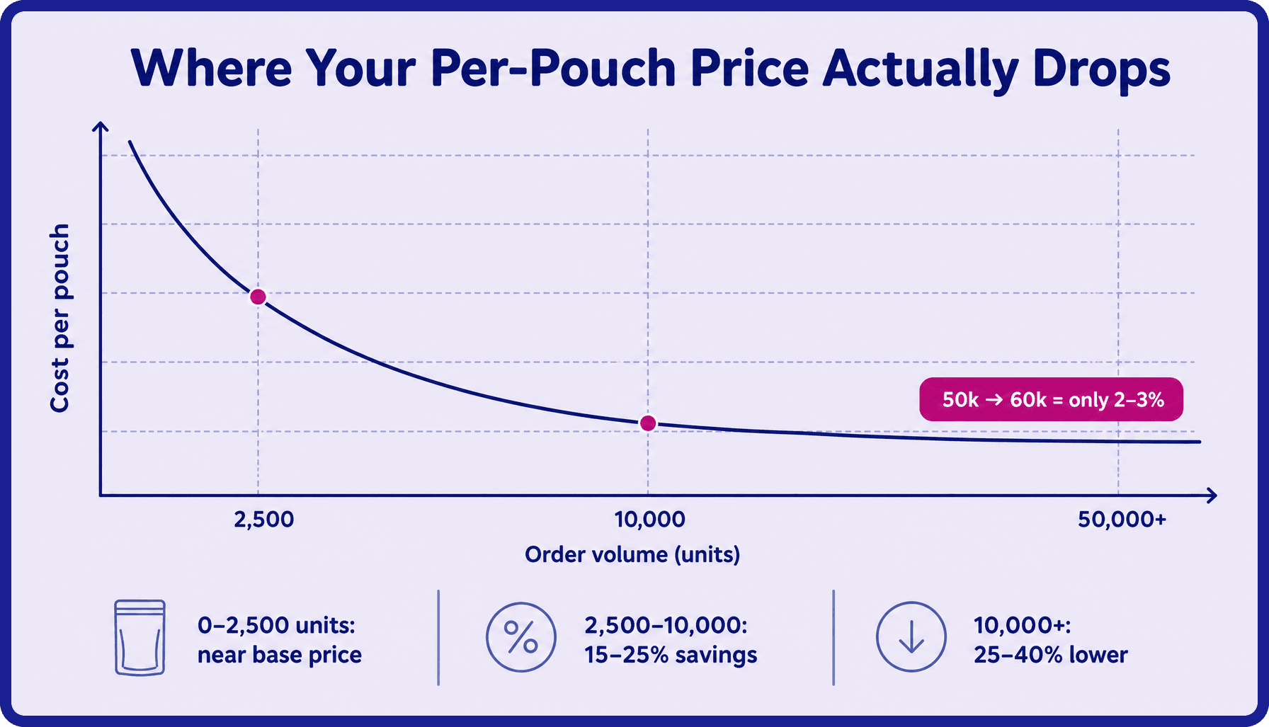
    Scalable Printing Digital & Plate

  • How to Choose the Right Bag Size

    How to Choose the Right Bag Size

    A Guide to Choosing Packaging Size for Your Product

    Why Bag Sizing Is Confusing for First-Time Buyers

    If it’s your first time buying packaging materials and you feel completely lost in finding the right sized packaging, you aren’t alone. Many of our first time customers struggle to optimize packaging and often find themselves with excess packaging waste or product dimensions that are totally off, especially if they are packaging irregular items or fragile products. This type of material waste can have a negative environmental impact, which is why finding the right sized eco friendly packaging options is so important.

    Unfortunately, finding the sweet spot is tough. Simply put, finding the right packaging measurements for shipping boxes, particularly sustainable packaging, is not intuitive for new brands. But doing so can help you achieve certain business goals, enhance the customer experience, and decrease your carbon emissions. If you’re looking for an efficient fit for multiple products, keep reading to learn more.

    Different flexible packaging pouch sizes and product packaging formats, including snack pouches and beef jerky bags, illustrating how packaging dimensions impact branding, storage, and shelf appearance.

    Weight ≠ volume, and density affects everything

    This is an extremely common misconception when it comes to dimensional weight pricing and finding the right packaging dimensions. People are used to going to the store and buying Ziplock bags in quart or gallon sizes, which is easy and convenient for at-home use but not as part of the packing process for commercial products. Why? The volume of various products is different and must be accounted for in your packaging strategy. An example of this is popcorn kernels vs popped popcorn. Each has a different density that must be considered when purchasing packing materials.

    Packaging infographic explaining the difference between product weight and product volume, comparing two-ounce dense snacks versus lightweight popcorn to demonstrate flexible pouch sizing requirements.

    Incorrect sizing = wasted product, empty bags, and poor shelf presence

    Most of the time, customers design their packaging size to be too small. Although it’s seldom that customers make their packaging too big, both can be problematic. A bag that’s too small and doesn’t have enough space will lead to wasted product, and packaging that’s too big means half empty bags and unhappy customers. In both instances, the shelf presence is poor and your bottom line and overall customer experience is impacted.

    Infographic comparing too small, correctly sized, and oversized flexible packaging bags, showing how proper pouch sizing improves product presentation, reduces wasted space, and prevents sealing issues.

    Length, Width, and Height — And Why Density Changes Everything

    When it comes to volume and weight, you need to remember that density changes everything. “Ounces” or “grams” on packaging doesn’t directly translate to bag dimensions because product density impacts how much space your product actually takes up. For example, two ounces of chips and two ounces of nuts require completely different packaging sizes. If you’re having difficulty with this aspect of your packaging strategy, you aren’t alone. A lot of our customers are challenged with this, and we’re more than happy to help, especially if you’re trying to find the right material and size for multiple items.

    Pro Tip: Use Competitor Custom Packaging as Your Benchmark

    If you’re curious about product protection and want to avoid waste materials during packaging selection (i.e., be more eco friendly), we recommend buying competing products and measuring the bag yourself to find a starting size. After all, the packaging already meets customer satisfaction metrics and doesn’t impact the shelf life of the product. This is the fastest (and cheapest) way to avoid sizing mistakes. Simply cut the bag open, flatten it fully, and measure length, height, and gusset. If you send us the length, width, and height or the bag dimensions, we can match competitor packaging dimensions exactly.

    Connect with us today to get started with finding the right packaging choice that can help reduce costs and enhance your sustainable practices.

    Custom stand-up pouch sizing process showing packaging prototypes and almond packaging samples used to determine the correct flexible packaging dimensions and optimal product presentation.Flexible packaging material comparison chart showing thin versus thick pouch materials, highlighting cost efficiency, durability, puncture resistance, and product protection for custom packaging bags.

    Visual Guide: Packaging Dimensions to Cut Costs

    Thickness (mil or micron) affects how much stress a bag can handle. Thicker bags generally support heavier or sharper items, while thinner bags work well for more lightweight products. It’s important to note that weight capacity also depends on packaging material and seam quality, not just on the thickness. Thinner bags are also more cost efficient, but more prone to punctures or tearing. Thicker bags provide more protection and structure, especially during shipping and handling. Thicker bags also feel sturdier and more premium, signaling protection and quality. 

    Just remember: thicker isn’t always better. It means more cost and material, so the right choice depends on the product you’re packaging and how badly you need to lower costs – not what the thickest or most premium option is.

    Reality Check: Common Sizing Mistakes to Avoid

    When it comes to improving your operational efficiency, here are some common mistakes to avoid:

    Ordering way too big – We regularly see brands order 8″ × 10″ bags for a 2 oz product, only to realize the bag looks half-empty on shelf. Oversizing or the tendency to add extra space hurts product presentation and makes customers question the product safety and value.

    Underestimating bulky or irregular shapes – Products that are airy, chunky, or uneven don’t settle neatly and typically requires a bigger bag than you think. Brands often size based on weight alone, then discover the product needs far more volume than expected.

    Forgetting headspace – Food packaging needs room for sealing, freshness, and sometimes nitrogen flushing. Filling a bag edge-to-edge leaves no margin for proper closure or compliance, which can detract from product protection and decrease customer satisfaction.

    Overfilling to “make it work” – Trying to force product into a too-small bag can compromise seal integrity, leading to leaks, failed drop tests, and higher returns. If you’re seeking a minimal packaging look, you can achieve this by leaving extra space in the bag on purpose. 

    When to Get Expert Help (And Why It Improves Cost Efficiency)

    If you’re guessing on bag size, thickness, or structure, you’re taking a risk—and packaging mistakes get expensive fast. CarePac helps brands size packaging based on real product samples, not assumptions. We test fit, recommend the right packaging dimensions and thickness, and make sure the bag performs the way it should.

    We also match competitor bags, optimize material thickness for your specific use case, and help prevent costly misprints or reorders caused by sizing errors. Most importantly, we help you avoid ordering thousands of bags in the wrong size—saving time, money, and frustration.

    Get expert sizing help — free with your first quote.

    Packaging team reviewing custom flexible pouch sizes and stand-up pouch samples to determine the best packaging dimensions for product fit, shelf appeal, and branding performance.

    FAQs: Finding the Right Packaging

    Lets Get Started

    Made In The USA

    Full PouchCustomization
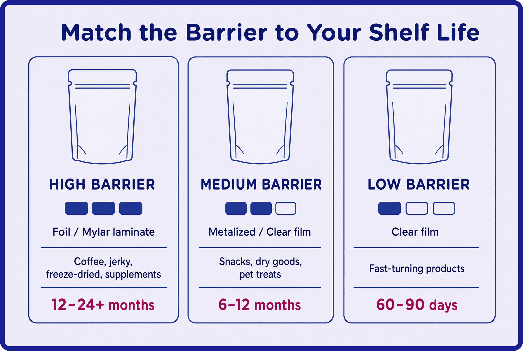
    Scalable Printing Digital & Plate

  • How to Manage Lead Time for Overseas Packaging

    How to Manage Lead Time for Overseas Packaging

    How to Manage Lead Times for Overseas Packaging

    Why Lead Time Management Is So Hard for Growing Brands

    Overseas packaging lead times and production times are rarely a single, linear countdown. In reality, they’re made up of multiple parallel timelines happening at once: artwork development and approval, supplier production, freight booking, customs clearance, and even co-packer scheduling on the receiving end. New and scaling brands often assume these steps happen one after another, when in fact many overlap and depend on each other to stay on track.

    Because of that overlap, most delays in the packaging industry don’t start on the factory floor. They start much earlier. A late artwork revision, a missed proof approval, or a misunderstanding about print methods (like plate printing versus digital) can quietly stall everything. Once production is ready, shipping introduces its own variables: express air freight, fast ocean, or slow ocean options each have different timelines, costs per pound or kilogram, and duty or tariff considerations that vary by product and origin.

    Comparison of air freight and sea freight options showing speed, cost, and volume differences, highlighting trade-offs between faster delivery and lower costs when managing overseas packaging lead times.Container ship navigating rough ocean waters, symbolizing shipping delays, port congestion, weather disruptions, and extended transit times affecting overseas packaging delivery schedules.

    Then come the factors no supplier can control: weather disruptions across the Pacific, port delays or labor strikes, and multiple levels of customs inspection can all stretch timelines without warning. The key takeaway is simple: packaging lead time is not just manufacturing time, and even a small delay early in the process can ripple across the entire chain. 

    With experience managing these moving parts, CarePac helps brands identify risks early, align timelines realistically, and avoid the costly surprises that derail overseas packaging projects.

    The Full Imported Packaging Timeline

    If you’re curious about what a typical timeline breakdown looks like, here’s a step-by-step look at what you can expect at each phase.

    Artwork prep – Here, your team will actually finalize a design and your final design is turned into a technical file that can actually be used to print your final packaging. 

    Proof approval – Unfortunately, many customers only notice errors the first time they look at an actual proof they have to sign. Fortunately, we catch a lot of errors that might not be caught by foreign producers because we speak English as a first language and engage in routine quality checks. 

    Production window – Timelines vary by the type of printing and style of bag and how busy the factory is. We offer three production schedules: express, standard, and economy. We try to group projects by type and how quickly customers need their packaging, and in doing so we’re able to provide customers with lower prices through more efficient production. 

    Freight (air vs sea) – Overseas packaging can ship via express carriers, air freight, or several types of ocean shipping, with faster transportation options costing more. International shipments require a freight broker and a customs bond, and while vendors may recommend their own brokers, you remain the importer of record and responsible for any issues. 

    Customs clearance – Custom clearance can be a swift process or a long, laborious process. Customs may open up corrugated boxes and products can get lost in customs clearance stage.

    Deliver to co-packer- Last mile delivery is often a logistical challenge because once it arrives in the United States, you have to get it to the final destination. The boxes your product comes in are not made of metal, and depending on the shipping method, they may arrive damaged.

    As you can see, there are many stages to importing packaging from overseas and it’s best to prepare for compounding potential delays (ex: if artwork is late, nothing can move forward).

    How to DIY Overseas Packaging Lead Time Management (The Reality Check Guide)

    If you do decide to do it on your own and aren’t partnering with a local supplier like CarePac, here is a complete walkthrough of what brands must manage on their own. If it feels overwhelming, that’s because it is. The complexity of handling this in-house cannot be underestimated and partnering with a company that understands the supply chain and focuses on customer satisfaction can give you a competitive advantage.

    Workflow infographic showing steps like gathering inputs, backward planning timelines, managing parallel workflows, and identifying red flags to optimize overseas packaging lead time management.

    Step 1 — Gather All Core Inputs Before You Start

    Before you can build a realistic overseas packaging timeline, you need to plan ahead and ensure all critical inputs are locked or clearly defined. This includes artwork status (not started, in progress, or press-ready), regulatory readiness (final formulation and completed FDA or compliance label approvals), your co-packer’s next available production window and blackout dates, supplier production lead times (often 4–8 weeks), chosen shipping method (air or sea with realistic transit times), and your true in-market target date. Miss even one of these details, and every downstream estimate becomes a guess—setting the project up for delays before it even begins.

    Step 2 — Build a Backwards-Planning Timeline

    The most reliable way to manage overseas packaging is to plan backward from your launch date. Start with the in-market date, then subtract shipping time (plus a 1–2 week buffer), supplier production lead time, proofing and revision cycles (often 1–3 weeks), and finally the time required to fully finalize artwork—often longer than brands anticipate. The key takeaway: if artwork isn’t press-ready when this chain begins, every downstream milestone shifts, and delays tend to add weeks, not just business days.

    Step 3 — Manage Each Workflow in Parallel

    Overseas packaging stays on schedule only when every workflow moves in parallel, not in isolation. That means locking in artwork readiness with clear file requirements, setting expectations for proofing and revision cycles, aligning co-packer availability with supplier production timelines, and making informed air vs. sea freight decisions early. Add in active customs clearance tracking and a consistent communication cadence across all vendors, and it becomes clear: on-time packaging depends on multiple parties moving in sync, not waiting on one another.

    Step 4 — Watch for These Red Flags

    Certain signals almost always indicate a delay is coming. If artwork is still “in progress” with less than 8–10 weeks before launch, the co-packer can’t confirm a run date, or regulatory labels aren’t finalized, timelines are already at risk. Choosing sea freight against tight retail deadlines or planning for multiple proofing rounds are additional warning signs that packaging may miss its target date.

    Step 5 — Where CarePac Makes This Entire Process Easier

    CarePac helps brands gut-check their assumptions and validate timelines before costly mistakes are locked in. We guide clients through backward planning to keep launch dates realistic, drawing on experience that shows artwork and proofing are almost always underestimated. By centralizing communication between suppliers, co-packers, and designers, CarePac reduces misalignment and risk—making the process far more efficient than DIY, which is possible but time-intensive, easy to misjudge, and prone to delays.

    Alarm clock next to flexible packaging pouch representing tight production schedules, lead time delays, and the importance of timeline management when ordering custom packaging from overseas suppliers.

    Final Thoughts: Plan Early, Communicate Often, and Don’t Go It Alone

    Managing overseas packaging lead times is one of the biggest operational challenges brands face, because even small delays early in the process ripple across every step. The key to staying on track is to start earlier than you think, keep all parties aligned, engage in open communication, and actively manage every parallel workflow. While it’s possible to do it yourself, working with an experienced partner like CarePac can save time, reduce stress, and prevent costly delays—reach out for guidance or support to make your next launch smoother.

    Start your journey on the right foot. Talk with a packaging expert today!

    Team reviewing global supply chain map and packaging samples during a planning meeting, highlighting collaboration, lead time forecasting, and international logistics coordination for overseas packaging orders.

    FAQs: Overseas Packaging Lead Times

    Lets Get Started

    Made In The USA

    Full PouchCustomization
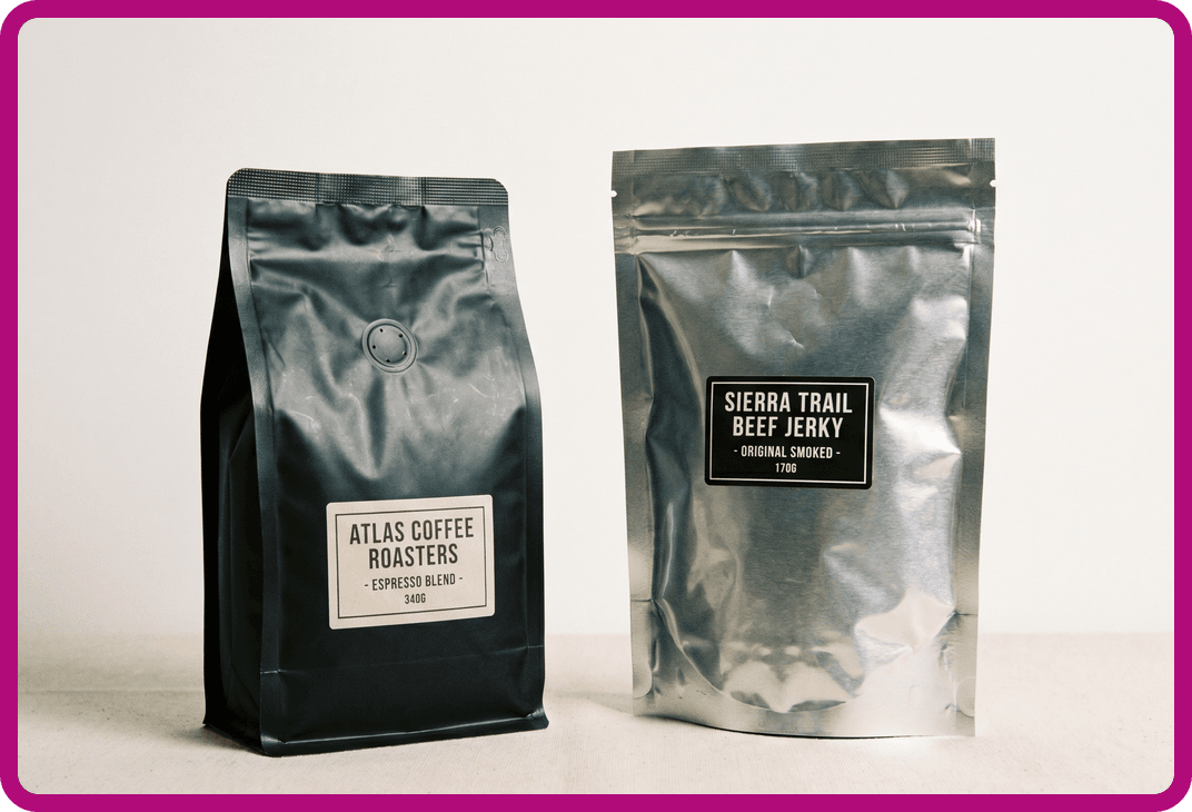
    Scalable Printing Digital & Plate

  • What Is HACCP and Why It Matters for Food Packaging Safety

    What Is HACCP and Why It Matters for Food Packaging Safety

    What Is HACCP and Why It Matters for Food Packaging Safety

    What Is HACCP Food Safety?

    The Hazard Analysis and Critical Control Points (HACCP) program is a risk-based food safety management system that’s designed to identify, evaluate, and control hazards in the food production process, including packaging. The HACCP food safety plan forms the foundation of modern preventive controls for the food supply chain and aligns closely with the Food Safety Modernization Act (FSMA). The HACCP food safety plan is a requirement for many businesses in the food supply chain, including food manufacturers, schools, and the companies and personnel involved in the retail and food industries.

    Food safety professional wearing protective gear with HACCP certification badge, representing compliance with hazard analysis and critical control points standards in food production and packaging.

    Why the HACCP Food Safety Program & Critical Control Points Are Important for Food Packaging

    The HACCP food safety plan is important for food packaging because the packaging and packaging materials itself can introduce hazards and food safety risks, including chemical residues, physical contaminants, and improper sealing. By establishing quality assurance protocols, preventive measures, and identifying potential hazards before they become issues, the HACCP food safety plan can help food packaging companies prevent issues before they occur and establish corrective actions when they do. This is a vital component of CarePac’s preventive quality control systems and VOC testing, ensuring our raw materials and packaging remains compliant with the HACCP, FSMA, and PCQI.

    The 7 Principles of HACCP Implementation

    When it comes to the HACCP food safety plan and becoming HACCP certified, there are seven principles that have been established that can help determine critical control points and support controlling food safety hazards. These are:

    1. Conducing a hazard analysis (i.e., identifying hazards, including biological hazards)

    2. Identifying critical control points (CCPs)

    3. Establishing critical limits

    4. Establishing monitoring procedures for manufacturing and processing equipment

    5. Establishing corrective actions

    6. Establish verification procedures

    7. Establishing record keeping and documentation procedures

    At CarePac, we take food safety hazards seriously and incorporate all of the above into our safety plan and quality management systems. We identify potentially hazardous products ahead of time all in an effort to safeguard public health. From our production equipment to the raw material we use, we adhere to all federal, state, and local regulations, including those outlined in the HACCP framework.

    Food production team working in a hygienic facility alongside a diagram of the seven principles of HACCP, including hazard analysis, critical limits, monitoring, verification, and record keeping.Automated food manufacturing line producing baked goods under HACCP guidelines, demonstrating critical control points, contamination prevention, and food safety monitoring in industrial processing.

    How an HACCP Plan Differs from FSMA and PCQI

    You might be wondering how an effective HACCP plan is different from FSMA or PCQI. You can think of it this way: HACCP is the system that outlines good manufacturing practices and standard operating procedures, FSMA is the law, and PCQI is the person responsible for implementing and maintaining food safety systems. The FSMA’s preventive controls and hazard identification methodology evolved from HACCP principles and and expanded them into more facilities, including food packaging and facilities that produce animal food. CarePac aligns with all three – we’re a PCQI-certified team that manages HACCP-based safety systems under FSMA compliance.

    HACCP in Action at CarePac

    CarePac integrates HACCP methodology directly into our quality control process to ensure every packaging product is safe, compliant, and consistent. We evaluate each material and process step for potential contamination or quality risks that could lead to food safety risks, and the key production stages where the risk of contamination or failure are tightly managed. Additionally, we leverage VOC testing, in-line inspections, and per-batch sample checks to verify that CPPs remain within acceptable limits. All quality checks and test results are formally documented.

    By applying the seven core principles of HACCP end-to-end, we can help minimize contamination risks within the food industry, verify structural integrity at critical control points, and ensure repeatable quality across every production run.

    What HACCP Means for the Food Industry & CarePac Customers

    Our HACCP-based quality system gives customers confidence that every pouch, film, and packaging component is produced with food safety and regulatory compliance at the forefront. By applying preventive controls throughout material selection, lamination, sealing, and final conversion, CarePac minimizes contamination risks long before they can impact your product, regardless of where your product falls on the food supply chain.

    This approach not only strengthens safety, but also supports your internal QA programs. During audits or inspections, customers can rely on CarePac’s documented controls, VOC test data, and calibration records to demonstrate that packaging materials meet FSMA-aligned expectations and industry standards.

    Transparency is built into the process: CarePac maintains lot-level traceability, detailed quality records, and material safety documentation — all available upon request. Whether you need VOC results, COAs, or manufacturing traceability, CarePac provides clear, verifiable data to support your food safety plan and reinforce confidence in your supply chain.

    Partner With a HACCP-Based Packaging Company

    CarePac’s HACCP-driven quality system, PCQI oversight, and FSMA-aligned preventive controls ensure your packaging materials are manufactured with safety and regulatory compliance built in. If you need VOC data, COAs, traceability records, or support for an upcoming audit, our QA team is ready to help.

    Request documentation or connect with our quality specialists today to verify compliance and strengthen your food safety program.

    HACCP diagram illustrating hazard analysis and critical control points, showing the core food safety system used to identify, evaluate, and control biological, chemical, and physical food safety hazards.

    FAQs About HACCP and Food Safety

    Lets Get Started

    Made In The USA

    Full PouchCustomization
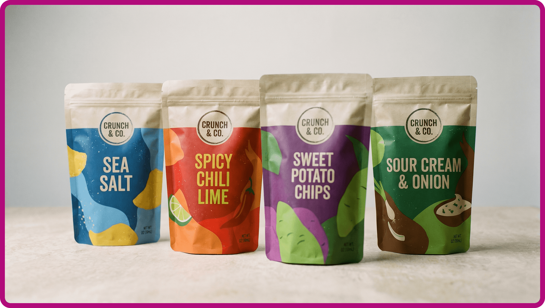
    Scalable Printing Digital & Plate

  • PCQI Certified and Why It Matters for Food Packaging Safety

    PCQI Certified and Why It Matters for Food Packaging Safety

    What Is PCQI and Why It Matters for Food Packaging Safety

    What Is PCQI (Preventive Controls Qualified Individual)?

    PCQI stands for Preventive Controls Qualified Individual, and is a designation given to someone trained under the FDA’s standardized curriculum. This certification aligns with the Food Safety Modernization Act (FSMA) food rule and risk-based preventive controls, which aim to provide safe, quality food for all Americans. PCQIs ensure that a food manufacturer’s written food safety plan is properly developed, implemented, and maintained. Preventive Controls Qualified Individuals are a good indication that food companies and food manufacturers have food safety procedures in place, including having a knowledge of hazard analysis, preventive controls for human food, supply-chain programs, and recall plans in place in the event of identified hazards.

    Preventive Controls Qualified Individual inspecting flexible packaging film on manufacturing equipment, ensuring packaging materials meet FSMA preventive control and food safety standards.Preventive Controls Qualified Individual holding a tablet while reviewing food safety practices alongside packaged food ingredients, highlighting hazard analysis and preventive controls under FSMA regulations.

    What Does a PCQI Do?

    Key duties of a PCQI certified individual include writing the food safety plan, validating and reanalyzing it, verifying preventive controls, and reviewing records to ensure compliance and prevent recalls. All of these combined ensure food safety and that food products are safe for human consumption.

    Here are some practical examples about what a Preventive Controls Qualified Individual would do day-to-day:

    • Conduct hazard analysis and develop risk-based preventive controls for their food production processes
    • Validate that the preventive controls are adequate and reanalyze the food safety plan when significant changes occur or a trigger event happens, like a food recall 
    • Maintain and update the written food safety plan and safety assurance documentation
    • Ensure that appropriate corrective actions are taken when a deviation from the plan occurs at any point during the food production process 
    • Oversee training, recordkeeping, and internal audits for compliance with federal regulations
    • Lead responses to FDA inspections and corrective actions necessary to maintain compliance

    Why Having a PCQI Matters for Food Packaging Manufacturers

    Packaging manufacturers benefit from having a PCQI-certified professional on staff, even though it’s not technically required, because that expertise of federal regulations brings an added layer of accountability and assurance that food safety hazards can be avoided. A PCQI helps ensure packaging materials and processes align with food safety plans, supplier verification programs, and quality assurance expectations from food processors and major brands. Their oversight supports proactive risk management—identifying potential contamination points or compliance gaps before they become issues. 

    At CarePac, our commitment to preventive controls, documented training, and robust safety plans reflects our ongoing promise to customers and food safety compliance: delivering packaging that not only protects products but also upholds the highest standards of food safety, regulatory integrity, and meets federal regulations.

    Close-up of a quality control professional documenting inspections on food packaging equipment, representing PCQI responsibilities in preventive controls, recordkeeping, and food safety compliance.

    How CarePac’s PCQI Strengthens Our Quality and Compliance

    Our PCQI certified staff and food safety experts maintain and audit the company’s food safety plan and quality systems. They oversee several different areas to help maintain compliance, including VOC testing, production monitoring, and documentation that supports compliance. Our alignment with FDA preventing controls for human food and food contact companies means we take human food regulation seriously and work internally to avoid food safety hazards as they relate to packaging. From the beginning to the end of our production runs, our PCQI ensures consistent safety assurance.

    Preventive Controls Qualified Individuals (PCQI) walking through a food processing facility while reviewing safety procedures, demonstrating FSMA compliance and proactive food packaging safety oversight.

    What These Food Safety Certifications Mean for CarePac Customers

    CarePac’s customers benefit directly from this PCQI certified oversight. By having a qualified individual dedicated to safety assurance and preventive controls, each packaging product is evaluated through the same rigorous standards that food processors themselves follow. This means every pouch, rollstock, or film CarePac produces is part of a documented and verified food safety plan, not just a manufacturing process. We work to identify hazards and ensure food safety.

    This approach gives customers confidence that their packaging is not only compliant but also consistent and high quality across every order. It’s part of CarePac’s broader commitment to reliability, transparency, and trust—ensuring the materials that protect your products are held to the same high standards as the food itself.

    Partner With a PCQI-Certified Packaging Company

    CarePac’s Food Safety Modernization Act-aligned preventive controls serve as proof of reliability and dedication to food safety across all food facilities. From raw material sourcing to final inspection, every step in our process is built around compliance, consistency, and customer confidence.

    If you need documentation, VOC testing details, or want to review how our packaging supports your food safety plan requirements, our team is ready to help. Reach out today to speak with a CarePac packaging expert and ensure your materials meet the highest preventive control standards.

    FAQs About PCQI Certification and Food Safety and Quality

    Lets Get Started

    Made In The USA

    Full PouchCustomization
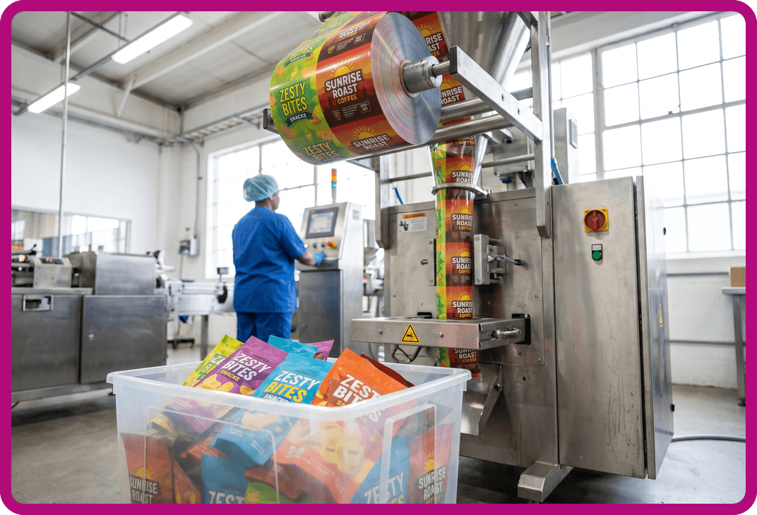
    Scalable Printing Digital & Plate

  • Custom Trading Card Packaging Solutions

    Custom Trading Card Packaging Solutions

    Custom Trading Card Packaging Solutions

    Why Packaging Matters for Trading Cards

    Trading card packaging is an extremely important part of trading card collecting, as it can mean the difference between a card that maintains (or increases) its money value and one that’s damaged and has little to no value. Not only does high-quality trading card packaging protect the card inside, but it can enhance collectability and create a premium retail experience for collectors.

    While many people default to baseball cards when they think about trading cards, there are actually several industries and use cases for trading cards, including collectible card games, sports cards, promotional cards, event giveaways, prototypes, and retail-ready packs. If you produce trading cards for any of these industries, CarePac’s custom printed packaging for niche markets is the solution you’re looking for.

    Collection of baseball and fantasy trading cards in protective cases, showing CarePac custom printed packaging and card sleeves for collectors and retailers.

    Fin Seal Pouches for Trading Cards

    Fin seal packaging is the gold standard packaging for trading cards, and it involves a raised, vertical seam at the back of the package. This forms a strong, tamper-resistant, and moisture-proof barrier along the sides for the cards inside. With CarePac’s fin seal pouches, you can customize every square inch of your trading card packaging, including customizing the size, style, and color of the text on the pouch. Fin seal pouches are the same format used by major TCG brands, and it’s the gold standard for a reason!

    Whether you’re looking for small run packaging or packaging for mass production, there is a lot of flexibility with fin seal pouches. By purchasing fin seal pouches from CarePac, there are extra advantages, including FDA compliant materials, durable seals, customization in CYMK or PMS colors, and the confidence that you’re working with a tried-and-true packaging company.

    Hanging resealable CarePac pouches containing collectible baseball cards, designed for retail displays and protective trading card packaging solutions.

    Roll Stock Packaging Options

    Another packaging option for trading cards is roll stock. Roll stock is a printed or unprinted flexible film that can be run through your own packaging machines. Since much of the control is in your hands, at least in terms of how and when the packaging is produced, this is a very cost-effective packaging option for high-volume production. Roll stock packaging is compatible with horizontal form fill seal (HFFS) equipment, and can be used with several material options, including metallic foil, matte film, or clear film if you want to show off branded inserts. If you’re looking for scalability, efficiency, and a reduced per-unit cost, you can’t go wrong with roll stock.

    High-speed manufacturing line printing CarePac custom card packaging with precision, featuring modern printing equipment and blue packaging designs for trading cards.Two foil trading card packs and a child holding collectible sports cards, highlighting CarePac’s durable and resealable packaging for gaming, anime, and sports card collections.

    Customization & Add-On Options

    Whether you opt for fin seal pouches, roll stock packaging, or some other type of trading card packaging, there are several customization and add-on options to consider: 

    As you can see, the sky is the limit when it comes to designing customizing your trading card packaging. From adding custom artwork on one side to incorporating a specific design or logo, no request is too difficult for the trading card packaging experts at CarePac.

    Minimums, Turnaround Times & Pricing

    At CarePac, we make it easy to start small and scale big. Whether you need to design a handful of prototypes for testing or full-scale retail packaging runs, our flexible MOQs ensure you get exactly what you need without overcommitting. Our standard turnaround time ranges from 2-4 weeks, depending on the specifics of your project, and we’re committed to meeting your deadlines without sacrificing quality. 

    Because every project is unique, we don’t publish static pricing. Instead, our team provides personalized quotes based on your exact specifications, materials, and order volume. For more information about our minimums, turnaround times, or pricing, contact us today.

    Clear resealable CarePac pouches containing collectible sports cards displayed on a counter, demonstrating protective packaging for baseball and sports memorabilia.Close-up of premium collectible card packaging and custom printed boxes with gold foil detailing, showcasing CarePac’s high-quality packaging for trading cards and limited edition sets.

    Why Choose CarePac for Trading Card Packaging

    When it comes to protecting and showcasing your trading cards, we bring deep expertise in specialty packaging for niche industries. We understand that trading card packaging isn’t just about protection—it’s about presentation, brand identity, and collectability.

    Our team combines precision quality control with advanced material science, ensuring that every pack or pouch meets the highest standards for durability and shelf appeal. And, unlike our competitors, you don’t have to print your cards with us to order packaging. Additionally, we offer sustainable packaging options so you can protect your cards and the environment at the same time. 

    Ready to partner with CarePac to design packaging that reflects the value of what’s inside? Bring your ideas to life with CarePac. Get a Quick Quote or contact us to get started. You won’t find a better packaging partner!

    FAQs

    Lets Get Started

    Made In The USA

    Full PouchCustomization
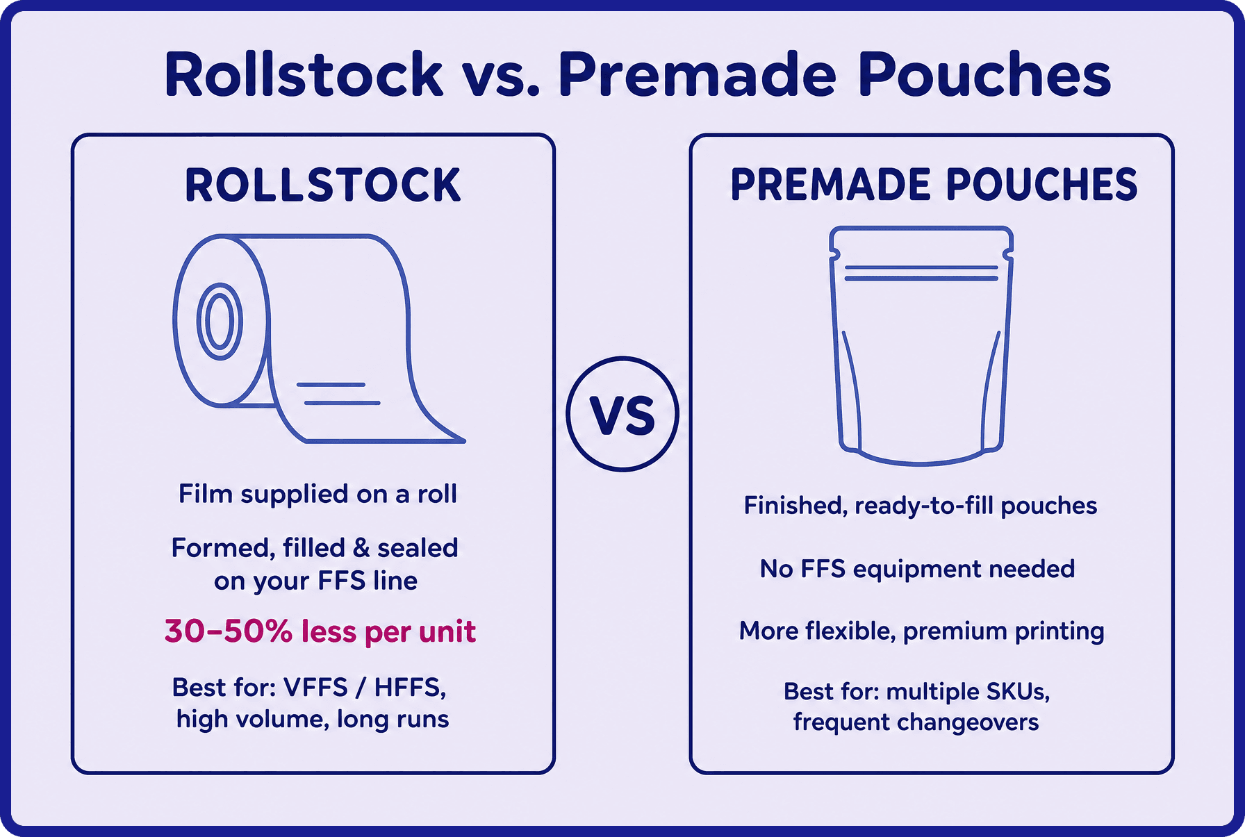
    Scalable Printing Digital & Plate