Author: Heather Terry

  • 5 Essential Granola  Packaging Ideas

    5 Essential Granola Packaging Ideas

    5 Essential Granola

    Packaging Ideas

    Granola Companies Who Did It Right:

    5 Essential Rules for Creative Granola Packaging & 10 Brands for Inspiration
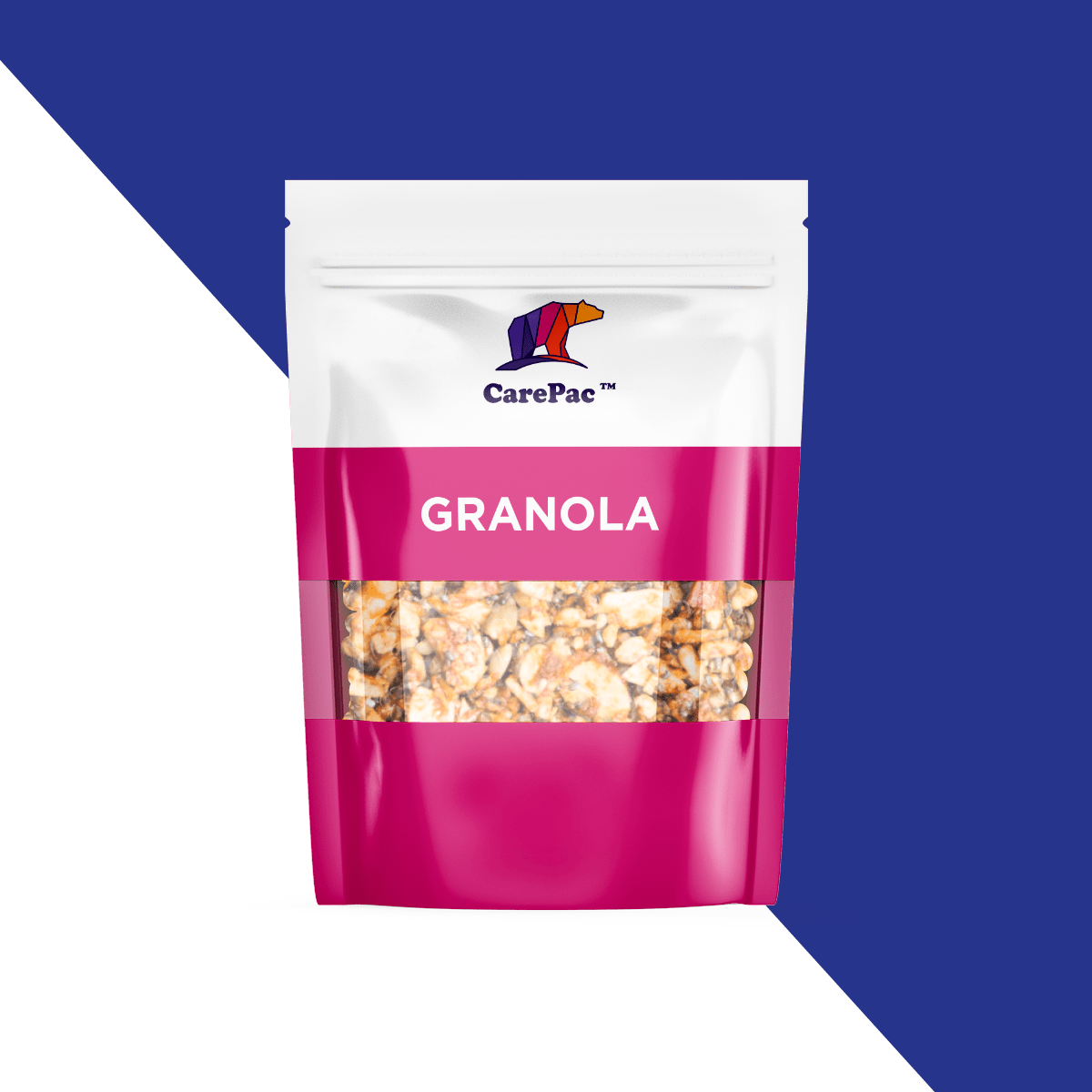
    It’s crunchy, tasty, healthy – and maybe a little bit messy – but with big-brand competition on the shelves, how can you package your granola to really make it sell? It’s not just about the flavor because your consumers first have to pick it off the shelf! When it comes to packaging your granola to sell, there are five essential rules any company should follow. Read on for some great granola packaging ideas. 

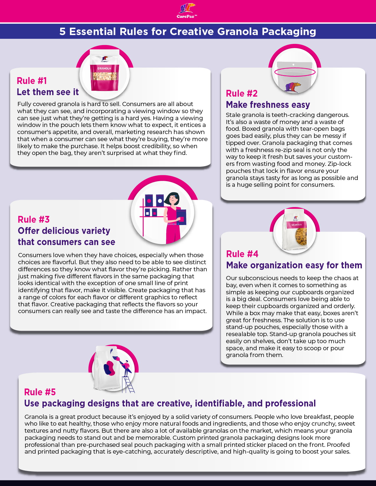
    Rule #1: Let them see the snack.

    Fully covered granola is hard to sell. Consumers are all about what they can see, and incorporating a viewing window so they can see just what they’re getting is a hard yes. Having a viewing window in the pouch lets them know what to expect, it entices a consumer’s appetite, and overall, marketing research has shown that when a consumer can see what they’re buying, they’re more likely to make the purchase. It helps boost credibility, so when they open the bag, they aren’t surprised at what they find.

    Rule #2: Make food freshness easy.

    Stale granola is teeth-cracking dangerous. It’s also a waste of money and a waste of food. Boxed granola with tear-open bags goes bad easily, plus they can be messy if tipped over. Granola packaging that comes with a freshness re-zip seal is not only the way to keep it fresh but saves your customers from wasting food and money. Zippered pouches that lock in flavor ensure your granola stays tasty for as long as possible and is a huge selling point for consumers. Also consider using a high barrier material like CareClear-XP.

    Rule #3: Offer delicious variety that consumers can see.

    Consumers love when they have choices, especially when those choices are flavorful. But they also need to be able to see distinct differences so they know what flavor they’re picking. Rather than just making five different flavors in the same packaging that looks identical with the exception of one small line of print identifying that flavor, make it visible. Create packaging that has a range of colors for each flavor or different graphics to reflect that flavor. Creative packaging that reflects the flavors so your consumers can really see and taste the difference has an impact. As a bonus, if you create limited-edition flavors or flavors that go with the seasons, you can create a new sense of demand with your buyers. A sense of urgency over a delicious flavor leaving at the end of summer, with fun, creative packaging to match, encourages them not to want to miss out.

    Rule #4: Make organization easy for them.

    Our subconscious needs to keep the chaos at bay, even when it comes to something as simple as keeping our cupboards organized is a big deal. Consumers love being able to keep their cupboards organized and orderly. While a box may make that easy, boxes aren’t great for freshness. The solution is to use stand-up pouches, especially those with a resealable top. Stand-up granola pouches sit easily on shelves, don’t take up too much space, and make it easy to scoop or pour granola from them.

    Rule #5: Use packaging designs that are creative, identifiable, and professional.

    Granola is a great product because it’s enjoyed by a solid variety of consumers. People who love breakfast, people who like to eat healthy, those who enjoy more natural foods and ingredients, and those who enjoy crunchy, sweet textures and nutty flavors. But there are also a lot of available granolas on the market, which means your granola packaging needs to stand out and be memorable. Custom printed granola packaging designs look more professional than pre-purchased seal pouch packaging with a small printed sticker placed on the front. Proofed and printed packaging that is eye-catching, accurately descriptive, and high-quality is going to boost your sales.
    10 brands that understand packaging! 

    Manna Granola
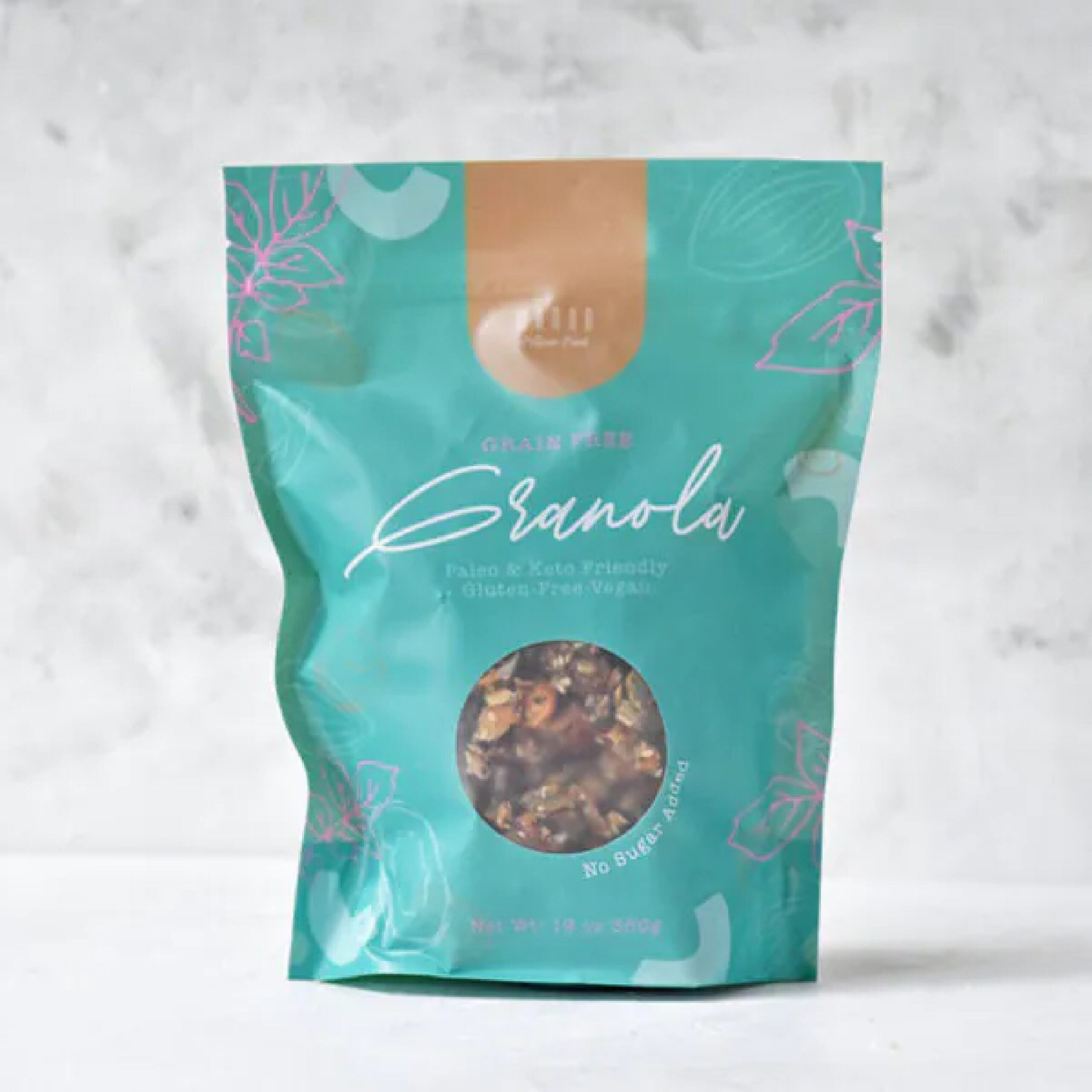
    Manna Granola does a lot right with their artisanal granola packaging. The matte finish package, a vibrant color that doesn’t overwhelm, minimal graphics to match a minimal-ingredient granola, and a peephole so buyers can see their food. The color palette is a bit retro, but it works. The only questionable choice is the script font for the word “Granola,” which is hard to read. Good thing we have that window to know what we’re getting.

    Sacura
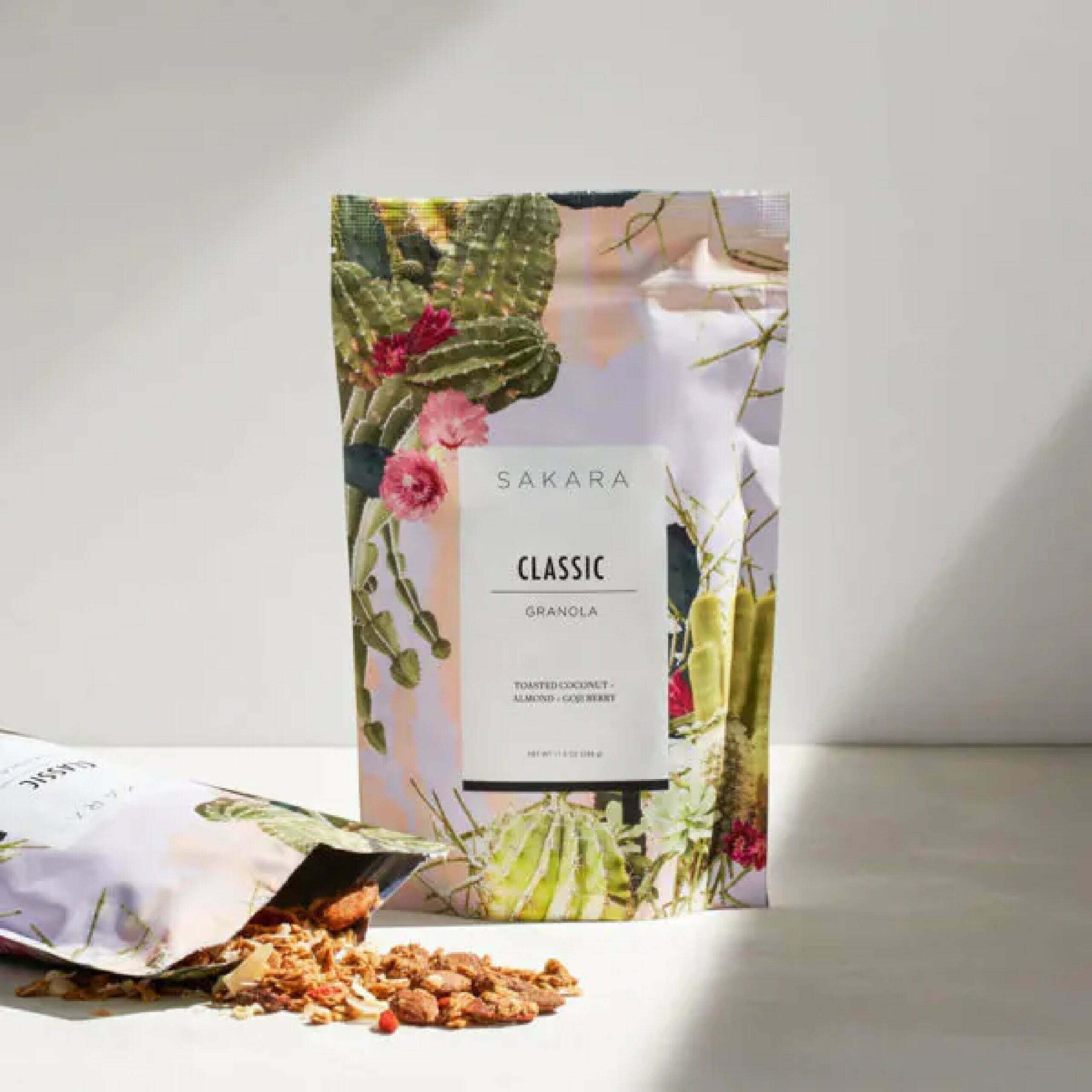
    Sakura’s granola packaging brings bright, colorful, and exciting graphics to their granola in a resealable stand-up pouch. Although they’re missing the window for viewing the granola, it’s still a very appealing package. The choice for the graphics is questionable, though, because although they are pretty, what do the cacti and florals have to do with the flavor? Overall, it’s eye-catching and likely to grab a consumer’s attention.

    Small Batch Organics
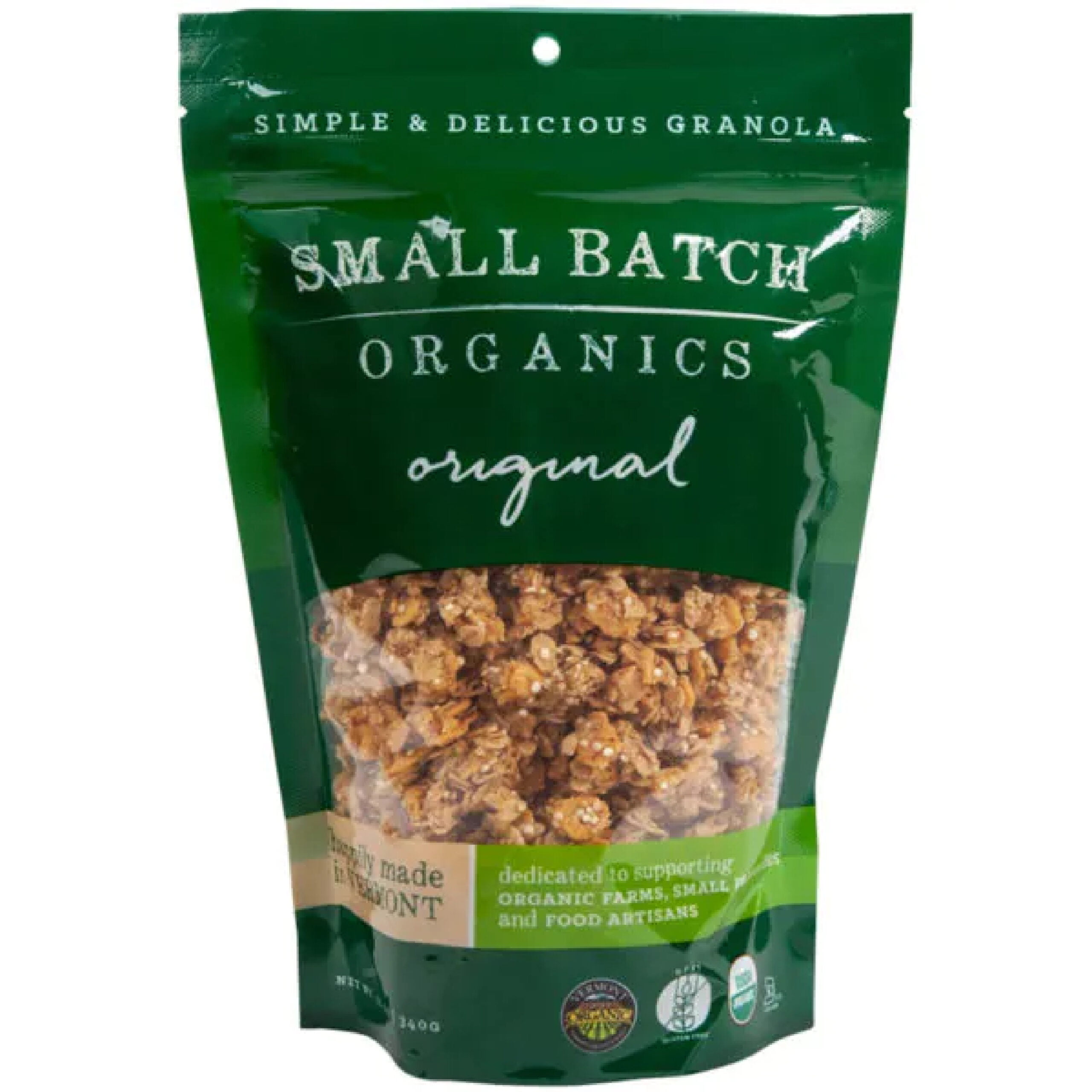
    Small Batch Organics checks off most of the rules. They don’t have the most exciting, stand-out packaging, but it hits their target demographic well. It is simple and easy on the eye. The font choices go well together. The color palette is very much reflective of a natural, organic product with greens and browns. It may not be the most eye-catching product on the market, but when it comes to finding a healthy and wholesome granola product, the package reflects the product.

    Lark Ellen Granola
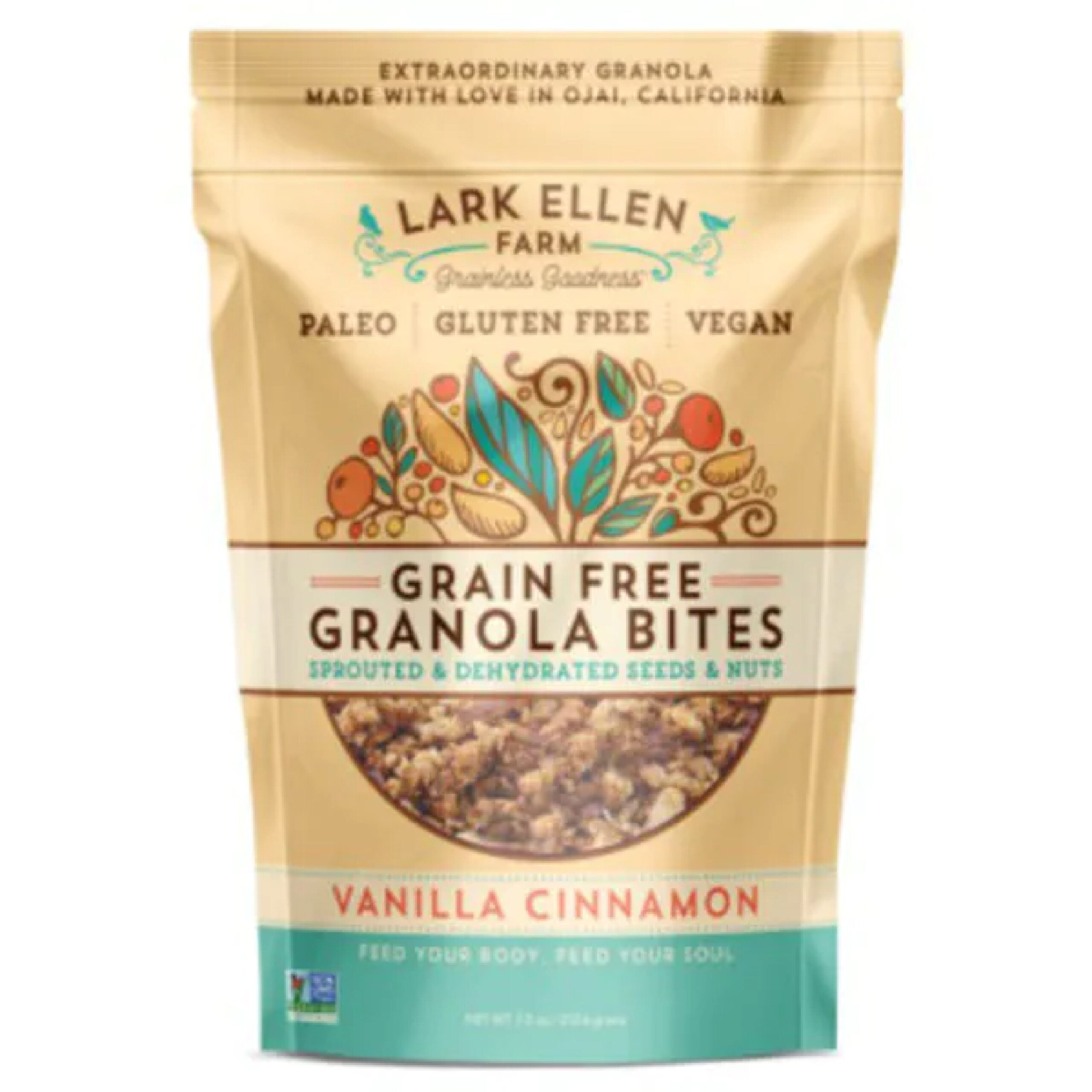
    Lark Ellen Farm’s packaging gives off a cute, friendly, and wholesome with a matching color palette, fun typography, and inviting graphics. It combines fun and functional together well, with a package that keeps the granola fresh and the packaging fresh. It’s easy to read, it’s easy to see, and it looks like it’s going to taste good.

    Public Goods
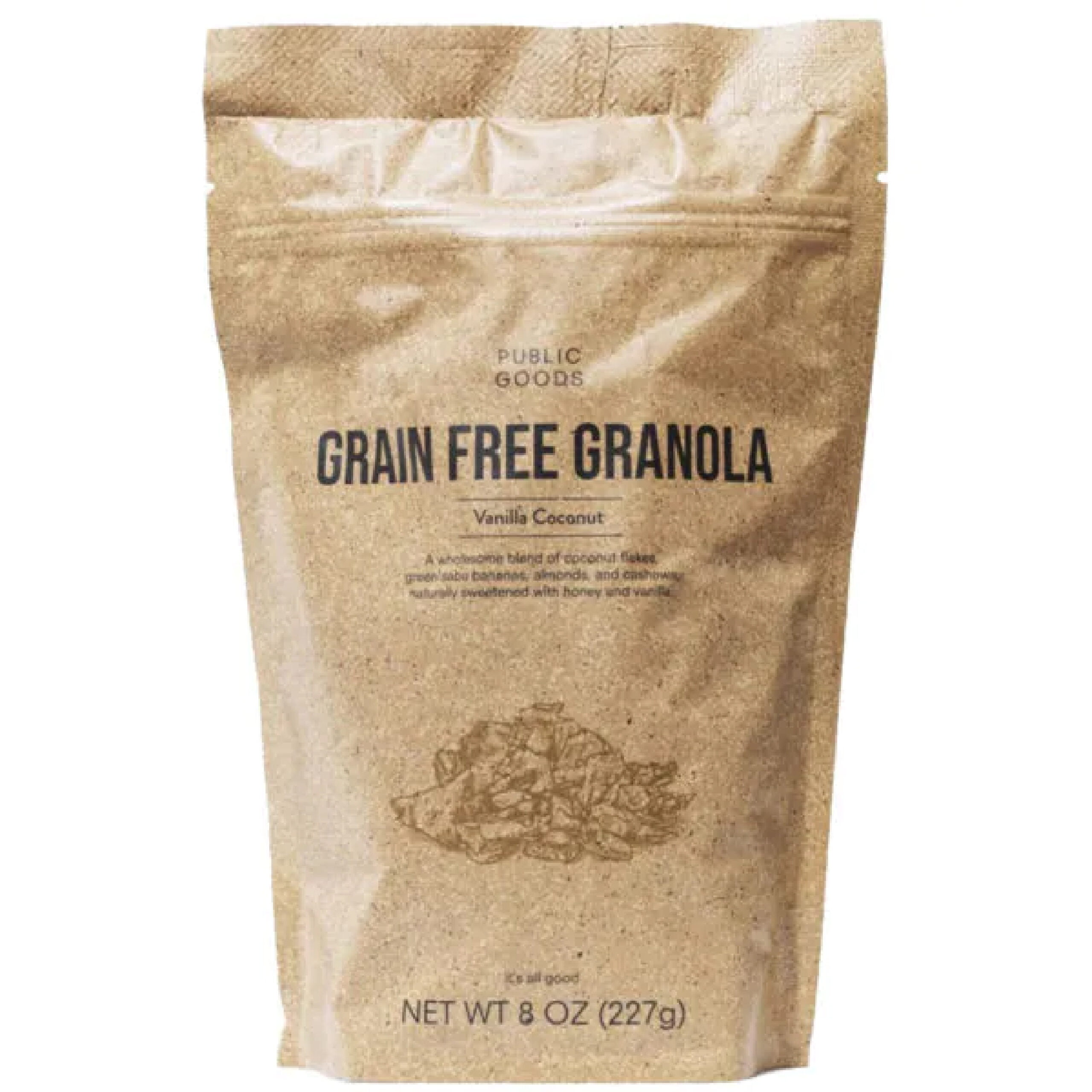
    Public Goods goes with an ultra-minimalist packaging that works for their product and their brand identity. It keeps it simple and to the point. The packaging would definitely benefit from a viewing window, which would match the packaging with the shades of brown and make it a bit more appetizing to the consumer. However, the rest of it is right on the money.

    Thrive Granola
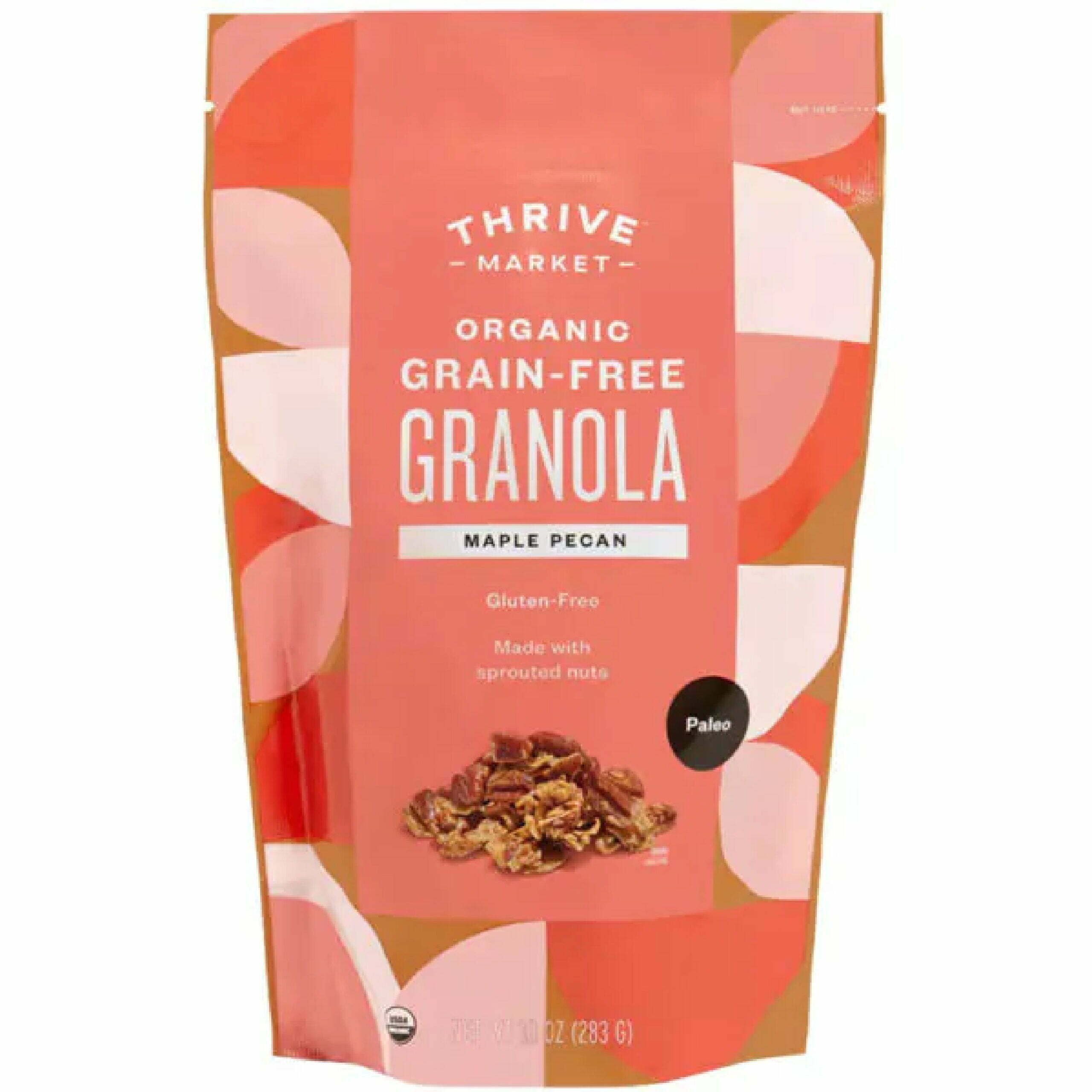
    The soft yet colorful shades of pink and peach on the Thrive granola packaging, along with the large color blocks, make it stand out without being overbearing. The easy-tear, stand-up pouch with fun graphics is certainly going to appeal to a consumer. The biggest downside is going to be the lack of a zip-lock top to keep it fresh and to avoid any spillage from a tipped bag.

    Keto Hana
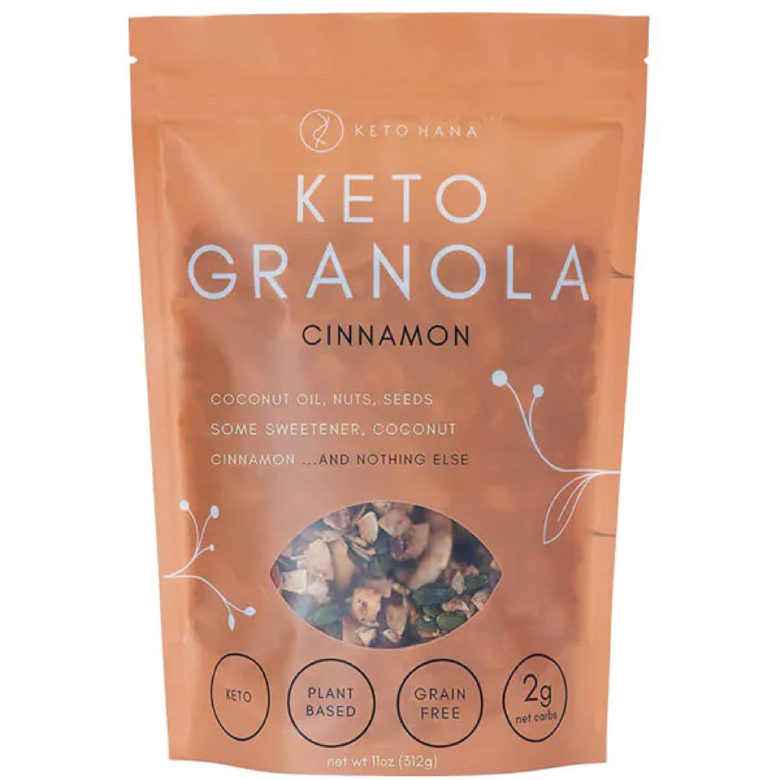
    Keto Hanas font choice is simple and direct, but the typography goes perfectly with their brand premise and the limited ingredient, simplified granola concept. The faded packaging with a peekaboo window gives the impression of transparency, literally with the ingredients. Although it is simple, the vine graphics elevate it with a touch of sophistication.

    Just Live a Little
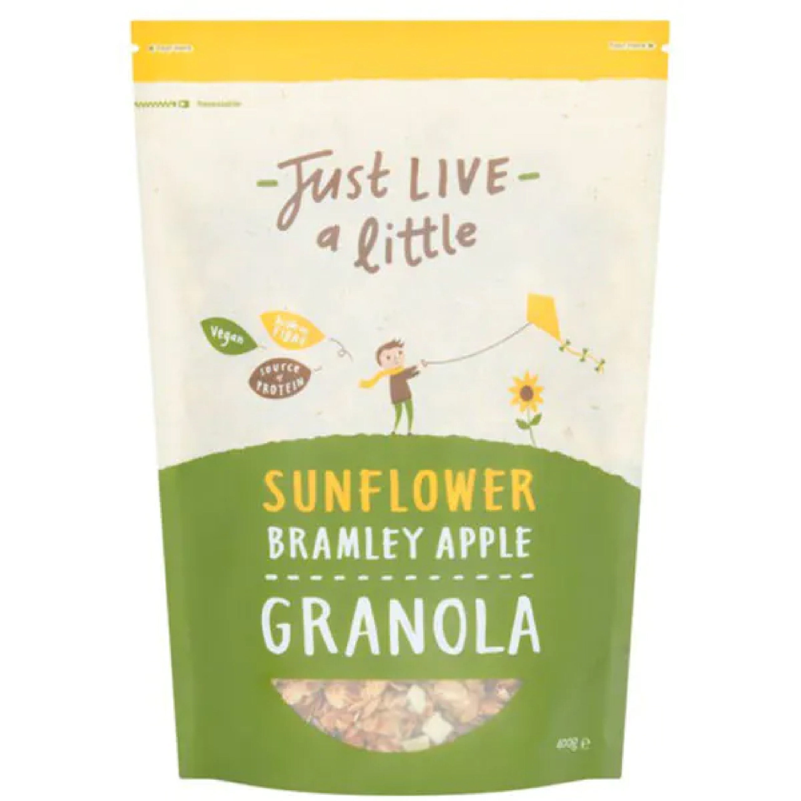
    Just Live a Little has cute and wholesome energy, just like the Lark Ellen Granola. Their typography is inconsistent but in a cohesive way with two unique fonts. They have different color packaging for all their flavors, so it’s easy to tell them apart, but they all stick to the same color palette. It stands up, and it’s easy to tear open and just as easy to reseal.

    NuTrail Keto Granola
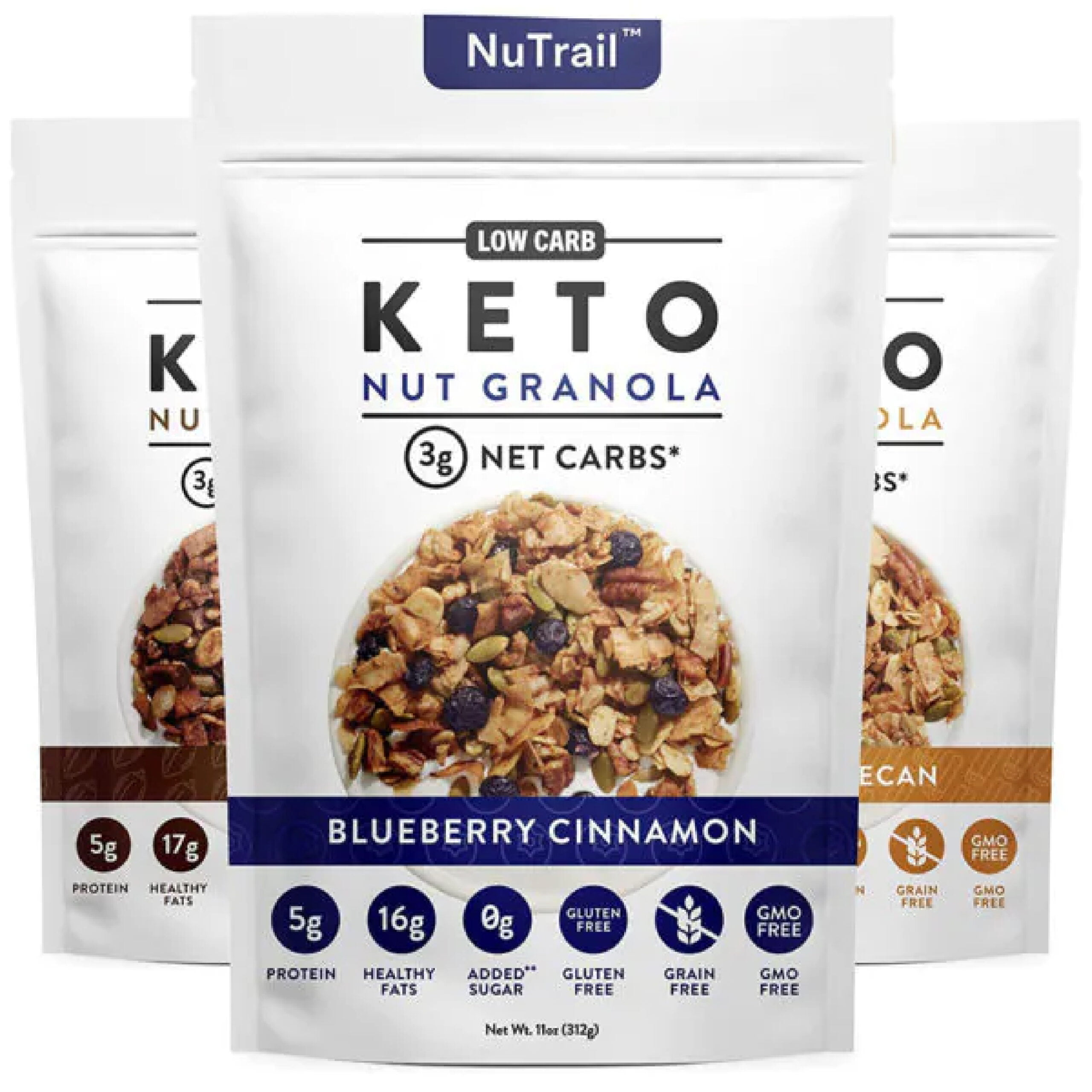
    The packaging for NuTrail looks clean-cut and healthy. There’s nothing fancy or exciting, but most people who follow a keto diet just need to know what they’re putting in their body, which is the focus of the packaging. They don’t have a window, but at least provide a picture of the granola itself. The small color bands differentiate flavors. Clean fonts, clean colors, and clean graphics for clean eating.

     Spoon Granola
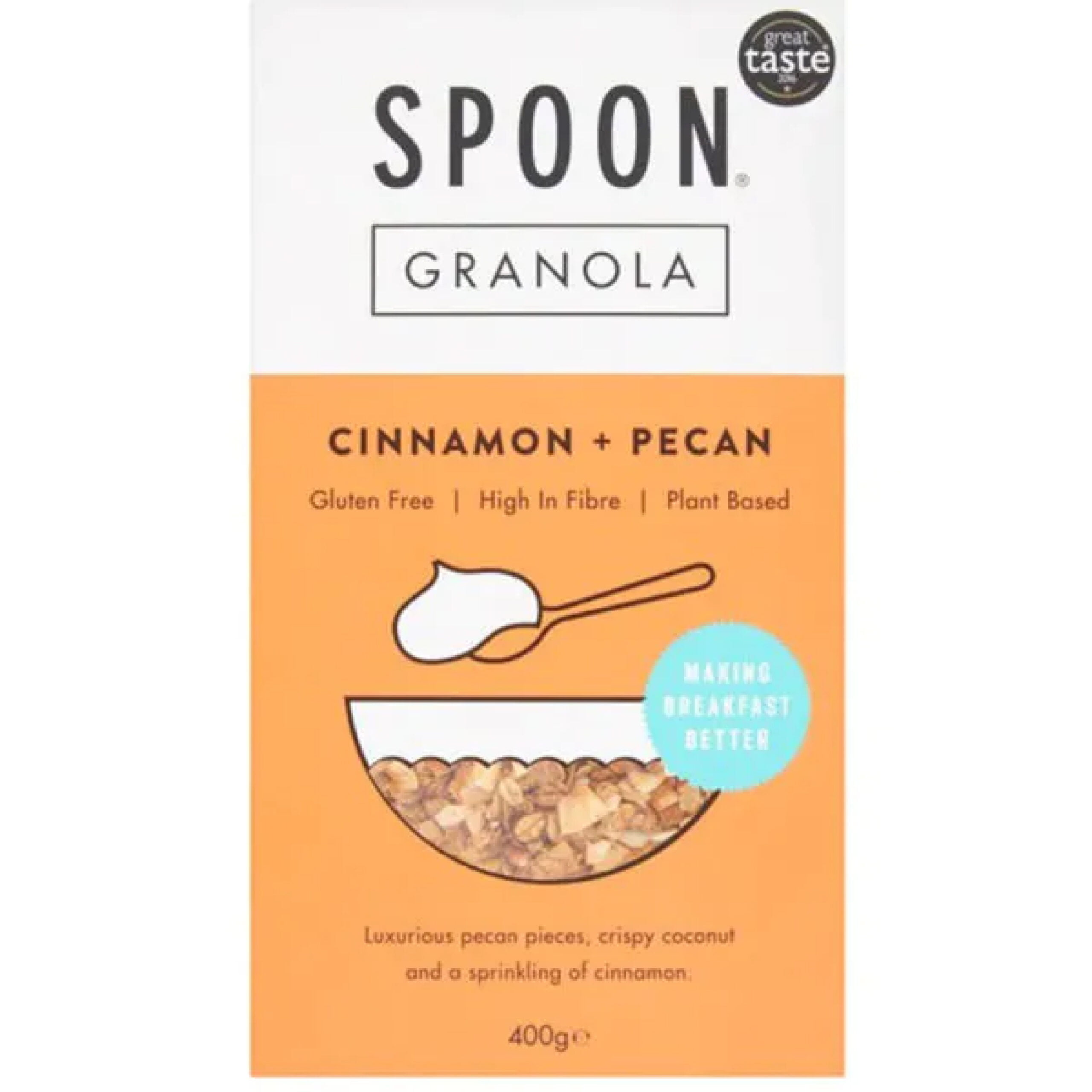
    Spoon Granola is a great example of minimalist design. The graphics are super simple, and the same can be said of the font choices. The typography pairs well with the colors, the lines, and the creative use of the little bowl for the viewing window. Boxes are much harder to stay fresh, but the square packaging still works with the overall design.
    Whether you’re looking to get your granola product into grocery stores or you want to elevate your stand at your local farmers’ market, custom seal pouch packaging for granola should be your next step. CarePac offers budget-friendly professional packaging that features stay-fresh packaging and seals with viewing windows and stand-up packages that will hit all the branding rules. With product packaging design you can print directly on, we have three different film materials to choose from and can help bring your vision to life. Customize each aspect of your flexible packaging and elevate your granola brand for 2022!

    Reach out to us today to find out more about our customizable food packaging and what makes us one of the best flexible packaging companies in the U.S. Don’t make a mistake — call or email us today! 
  • 11 Tea Packaging Ideas For Inspiration

    11 Tea Packaging Ideas For Inspiration

    11 Tea Packaging Ideas For

    Inspiration

    Finding the perfect packaging aesthetic is no easy feat, especially when it comes to teas. You need to find just the right combination of font and color, pair it with the right logo and graphics, and maintain a visual that evokes the voice of your brand. There’s a reason why major companies pay millions a year to craft their dream packaging design. But with the right know-how, you can skip out on spending millions and develop packaging for your products that works for you and keeps you within budget.

    Keep reading to learn more about how to design great tea packaging with a designer like us. 

    ith over 40 films available, we have a material that will ensure your stand up pouch is of the highest quality. We can also combine materials in a custom order. You can combine a black film with a clear film, or metallized with a glossy finishing. It’s your choice! Contact us to learn more about custom printed pouches and stand up pouch projects. Give us a call at 626-559-0377 and request a quotation. We’ll be happy to help you.

    Things to Keep in Mind When Designing Tea Packaging

    So, what’s there to remember as you go into designing your new packaging? To create a tea packaging concept that sells, here are some essential trends to keep in mind:

    Typography-Focused Tea Packaging Designs

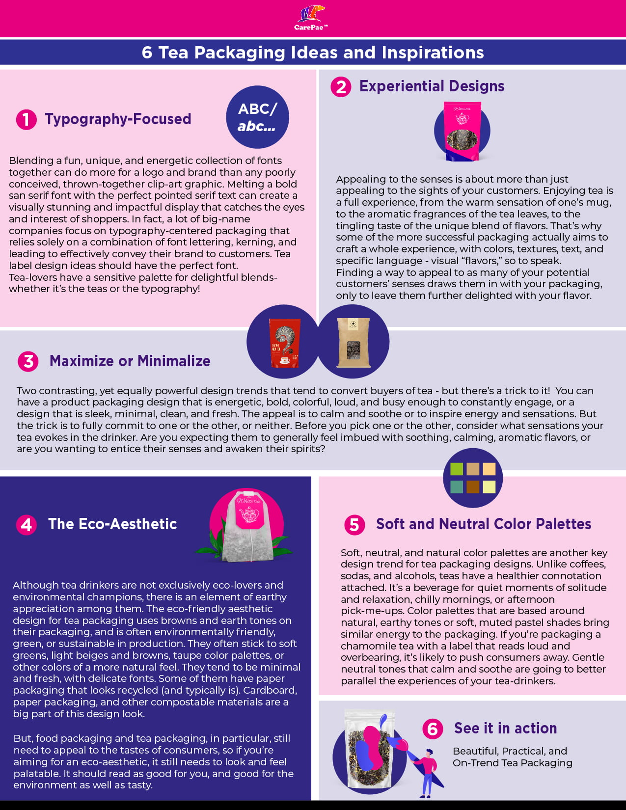
    Blending a fun, unique, and energetic collection of fonts together can do more for a logo and brand than any poorly conceived, thrown-together clip-art graphic. Melting a bold san serif font with the perfect pointed serif text can create a visually stunning and impactful display that catches the eyes and interest of shoppers. In fact, a lot of big-name companies focus on typography-centered packaging that relies solely on a combination of font lettering, kerning, and leading to effectively convey their brand to customers. Tea label design ideas should have the perfect font.Tea-lovers have a sensitive palette for delightful blends- whether it’s the teas or the typography!

    Experiential Designs

    Appealing to the senses is about more than just appealing to the sights of your customers. Enjoying tea is a full experience, from the warm sensation of one’s mug, to the aromatic fragrances of the tea leaves, to the tingling taste of the unique blend of flavors. That’s why some of the more successful packaging actually aims to craft a whole experience, with colors, textures, text, and specific language – visual “flavors,” so to speak. Finding a way to appeal to as many of your potential customers’ senses draws them in with your packaging, only to leave them further delighted with your flavor.

    Maximize or Minimalize

    Two contrasting, yet equally powerful design trends that tend to convert buyers of tea – but there’s a trick to it! You can have a product packaging design that is energetic, bold, colorful, loud, and busy enough to constantly engage, or a design that is sleek, minimal, clean, and fresh. The appeal is to calm and soothe or to inspire energy and sensations. But the trick is to fully commit to one or the other, or neither. Before you pick one or the other, consider what sensations your tea evokes in the drinker. Are you expecting them to generally feel imbued with soothing, calming, aromatic flavors, or are you wanting to entice their senses and awaken their spirits?

    The Eco-Aesthetic

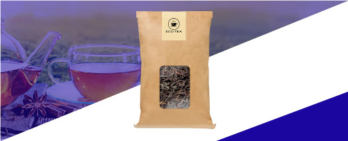
    Although tea drinkers are not exclusively eco-lovers and environmental champions, there is an element of earthy appreciation among them. The eco-friendly aesthetic design for tea packaging uses browns and earth tones on their packaging, and is often environmentally friendly, green, or sustainable in production. They often stick to soft greens, light beiges and browns, taupe color palettes, or other colors of a more natural feel. They tend to be minimal and fresh, with delicate fonts. Some of them have paper packaging that looks recycled (and typically is). Cardboard, paper packaging, and other compostable materials are a big part of this design look.But, food packaging and tea packaging, in particular, still need to appeal to the tastes of consumers, so if you’re aiming for an eco-aesthetic, it still needs to look and feel palatable. It should read as good for you, and good for the environment as well as tasty.

    Soft and Neutral Color Palettes for Your Creative Tea Packaging

    Soft, neutral, and natural color palettes are another key design trend for tea packaging designs. Unlike coffees, sodas, and alcohols, teas have a healthier connotation attached. It’s a beverage for quiet moments of solitude and relaxation, chilly mornings, or afternoon pick-me-ups. Color palettes that are based around natural, earthy tones or soft, muted pastel shades bring similar energy to the packaging. If you’re packaging a chamomile tea with a label that reads loud and overbearing, it’s likely to push consumers away. Gentle neutral tones that calm and soothe are going to better parallel the experiences of your tea-drinkers. 

    11 Great Tea Packaging Concepts and Ideas for Design

    Euphoric Herbals

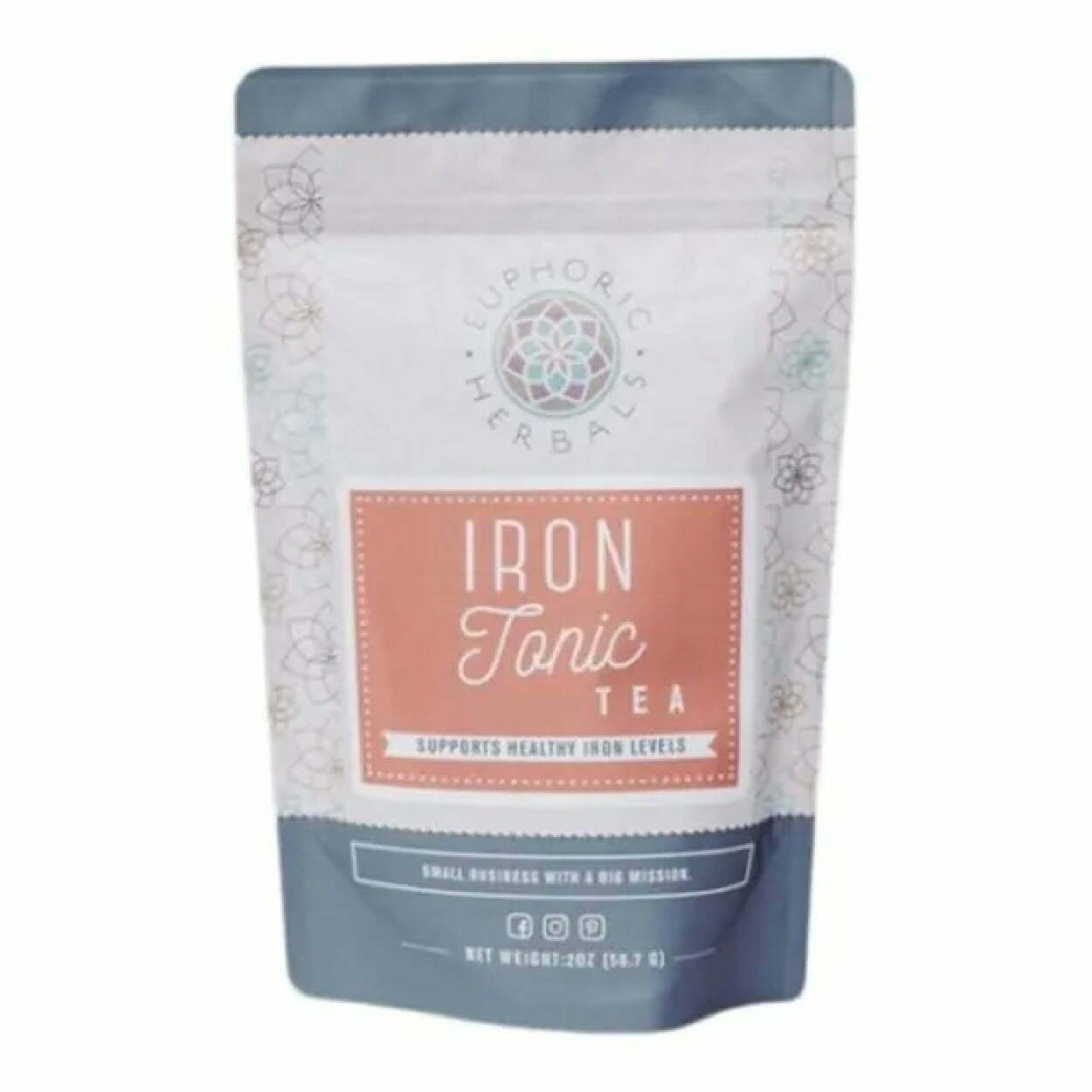
    The Euphoric Herbals packaging for their Iron Tonic tea is a great example of the typography-centered packaging that uses a three-font combination. They also have a soft color palette that pairs well with the fonts for an overall calming yet vibrant and eye-catching package. The neutral tones of brick and slate-blue are contrasting, similar to the script and san serif font of the label. Although it’s not the most exciting packaging, it also has a lot going on, with the floral shape graphics covering the side panels of the package.

    The Pink Tea Box

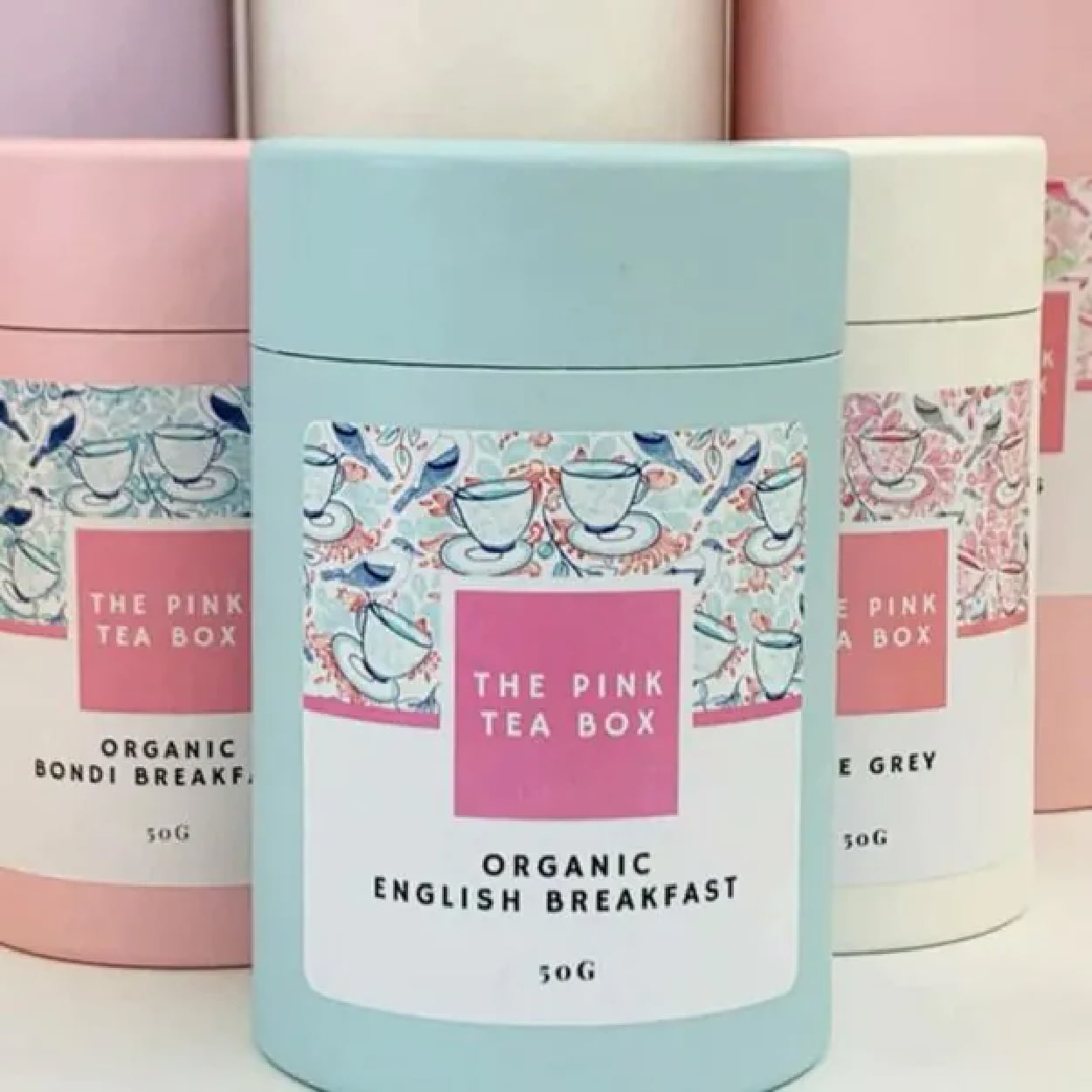
    The pastel palette of the Pink Tea Box is cohesive, concise, and effectively conveys the springtime, floral flavors, and subdued energy of the brand. They pair it well with scribbled graphics of teacups on the label to give a bit of pop while not overwhelming the frame of the label. It breathes feminine energy to appeal to its target demographic. The use of the circular cardboard boxes is also circular, smooth and further maintains the serenity of the packaging as a whole.

    Zest Tea

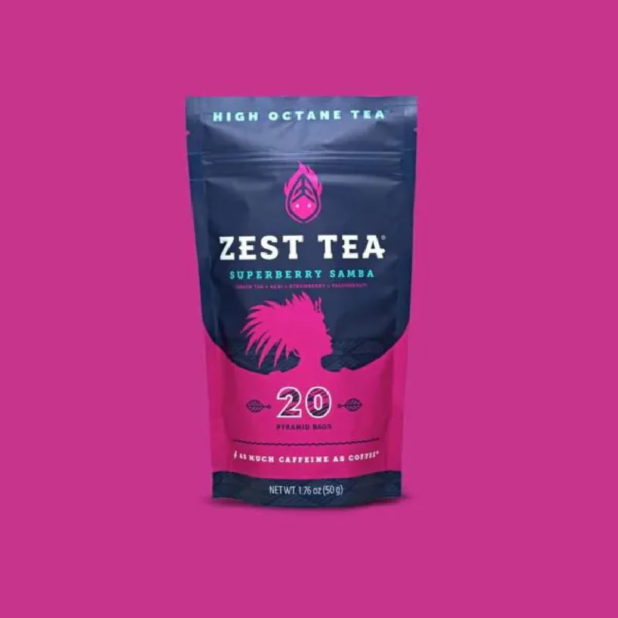
    Zest Tea advertises itself as a high-octane tea, a tea that delivers as much caffeine as a cup of coffee. This means their packaging should evoke high energy, with loud, bold, and dynamic colors and fonts. The bright, contrasting colors play with the bold-paired font in a way that is smooth and appealing, but gives off the same dynamic energy of their tea.

     Woash

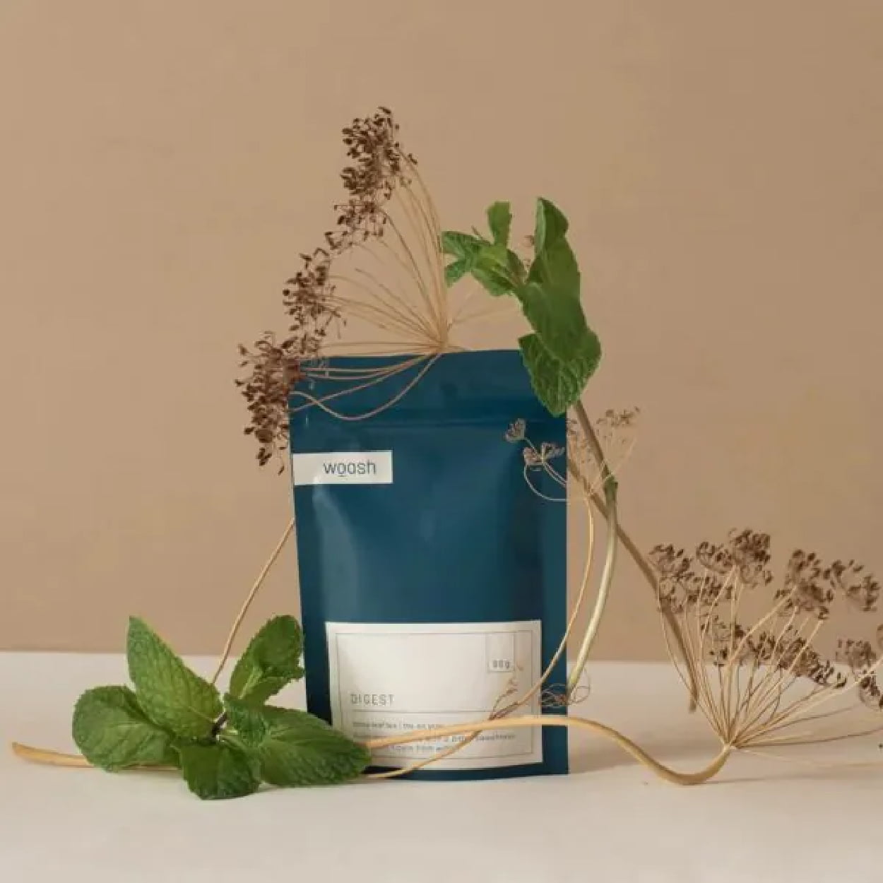
    Woash takes minimalism and neutral coloring to the max with a deep blue and beige palette. No real logo is needed when you take your typography and transform it into a cohesive aesthetic. The packaging pairs it with smooth, clean lines for a simple yet sleek package that looks as easy on the stomach as it is on the eyes.

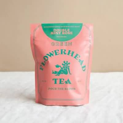
    Flowerhead Tea

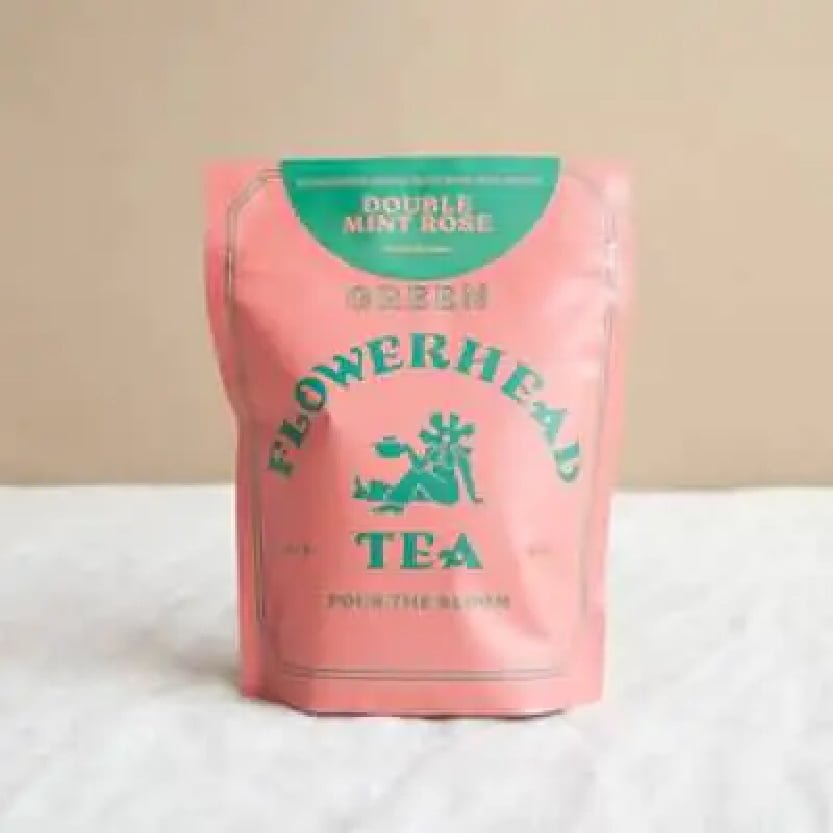
    Flowerhead Tea’s packaging follows its own rules of designs for an experiential effect, with a clashing color palette that is almost hard to look at. The bold, all-caps font choice is equally loud and in-your-face. It’s a bold risk, but it somehow works. It’s all simple, with just two colors, three fonts, and one minimal graphic, but it comes together to sell.

    August

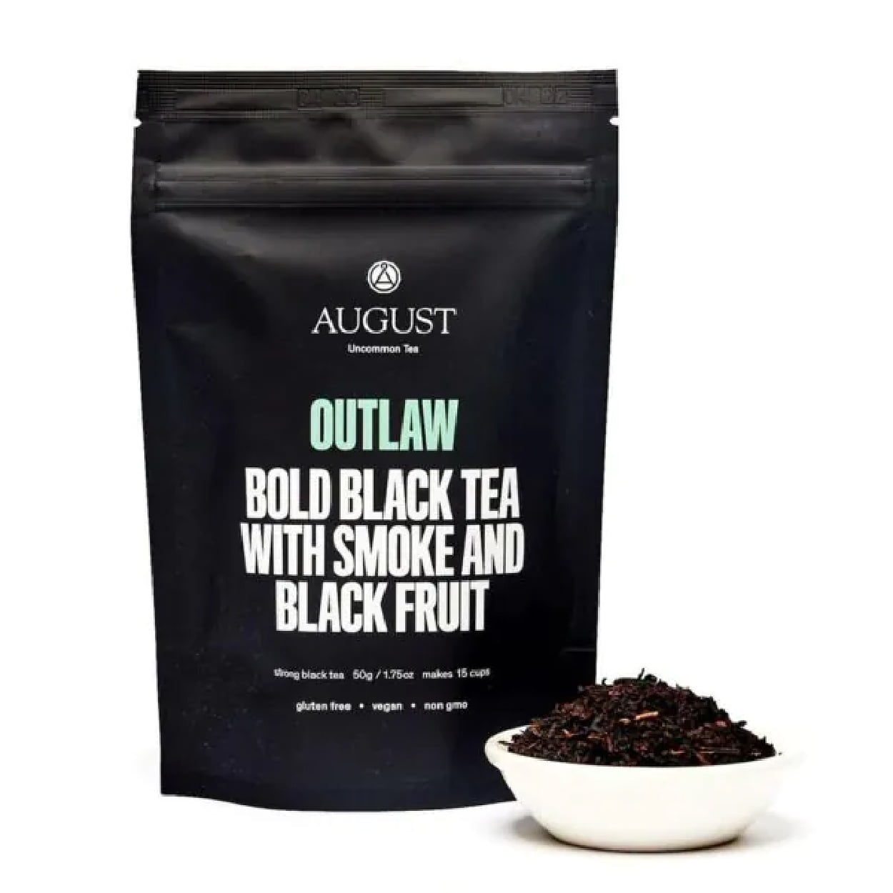
    August’s Outlaw tea packaging is all about dramatic and bold. The stark, all-black packaging paired with simple, loud lettering (it’s literally yelling) strays from the more traditional tea packaging. The typography stays focused and centered with minor pops of color. The consumer knows exactly what they’re getting they and can expect a flavor that’s as bold as the look.

    Healthify Tea

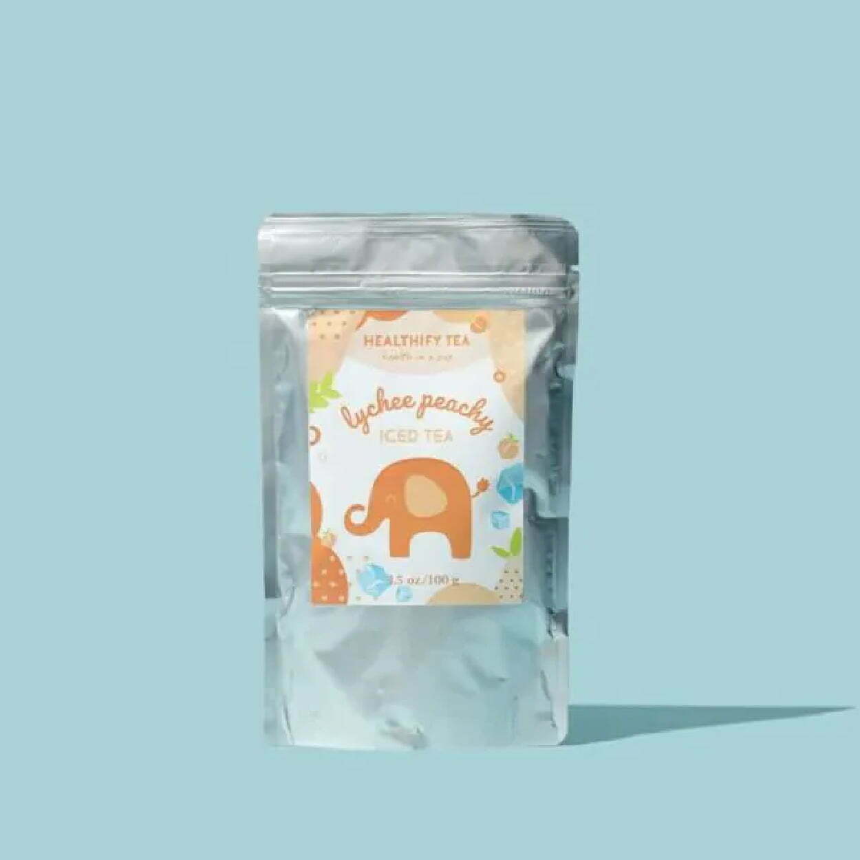
    Healthify Tea has cute, bright, cheery, and fun packaging that is visually pleasing. Although full package branding, as opposed to a sticker on a package, would give it more professionalism and pop, the label is experiential in design, with bright colors, textures, graphics, and unique lettering in the typography. You get a little tingle of joy even just looking at the package, let alone sipping the tea.

    Blume

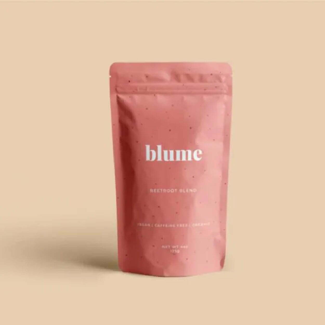
    Blume’s minimalist packaging stays consistent across most of its flavors, with the primary difference being the color of the package. They vary but stay neutral and pastel, with faded shades and tones. They’re also typography-focused for the logo and packaging, with the simple, all-lowercase “blume” as their logo in the key font, paired with san serif fonts that are sleek and linear.

    Sammee

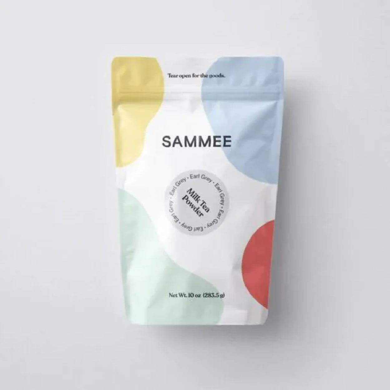
    Sammee takes primary colors and shifts them to a soft, gentle pastel. It keeps the aesthetic simple but with a pop of color that gives energy but doesn’t overwhelm. It feels fluid with the unshaped blocks of color and feels palatable. It’s visually stimulating with colorful, abstract shapes, but in a calm and subdued way. The typography could give more than it currently does, but at least it doesn’t detract from the design.

    Rishi

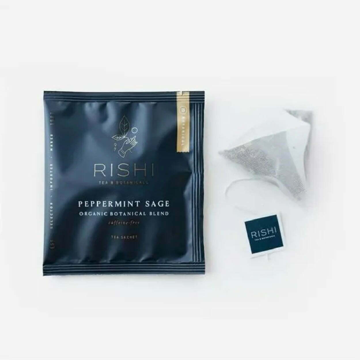
    Rishi’s packaging feels luxurious and rich, with an almost velvet matte finish of the sachet that’s coupled with minimal amounts of gold detailing and sleek, thin lettering. Experiential designs make you feel something other than just a visually appealing package. It looks like whatever you drink from it will feel smooth, calming, and rich with flavorful tea.

    Alaya 

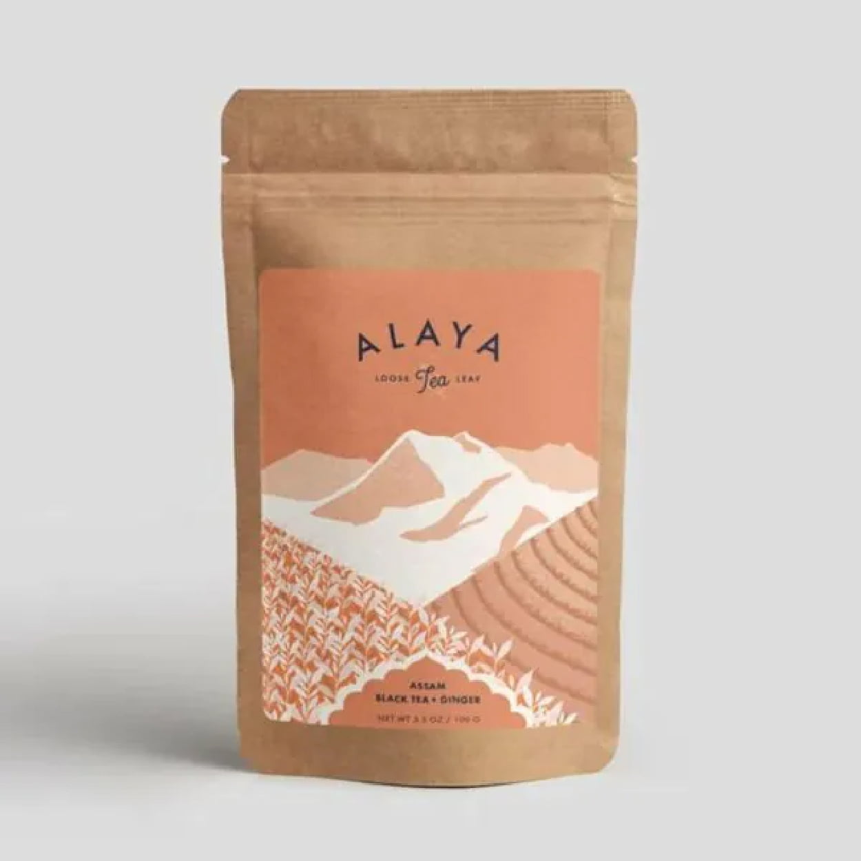
    Alaya takes eco-friendly and sustainable packaging and pairs it with a minimalism that feels organic, fresh, and healthy. The colors are earthy, with the natural paper bag of the package and the mint-green and white tones on the label. The graphics add a level of complexity but still keep it minimal on the detailing, which matches well with the eco-friendly feel of the tea packaging.

    Professional Packaging with CarePac

    Finding affordable but professional packaging that helps sell your tea is easier said than done – unless you’re using the right custom packaging services. Eliminate your need to stress about quality packaging for sachets, loose leaf tea bags, and sachet bags with our customized tea packaging. 

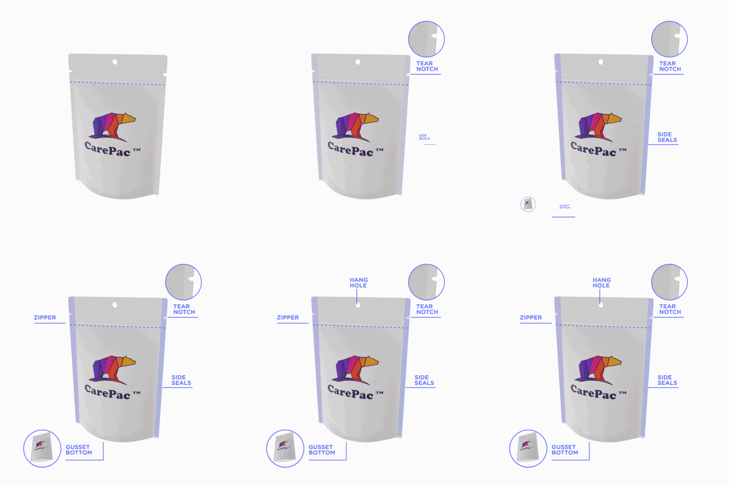
    But having a killer packaging design doesn’t mean much if your package isn’t functional, as well. Tea needs to stay dry, preserved and sealed to maintain its aromatic tastiness, and the tea information should be clearly stated on your tea product packaging. Our standup box package design and packaging’s feature a multi-layer preservation barrier, easy-to-use zip closures, tear notches, hang holes, and more.

    Reach out today to find out how we can help perfect your packaging! Contact us for more information! 

  • 5 Candy Packaging Ideas as Sweet as Your Candy

    5 Candy Packaging Ideas as Sweet as Your Candy

    5 Candy Packaging Ideas as

    Sweet as Your Candy

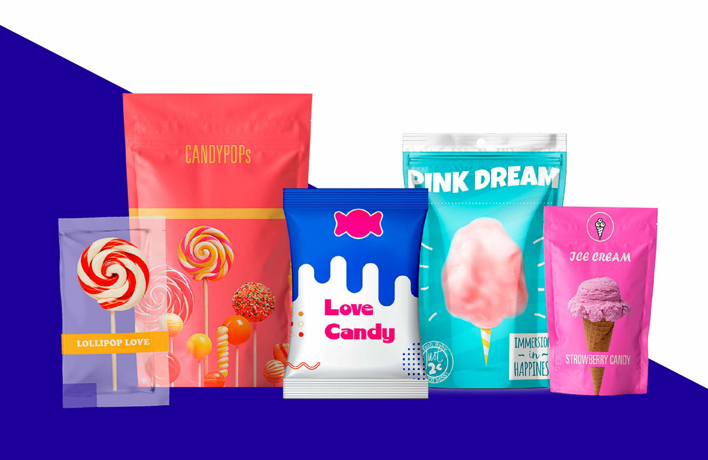
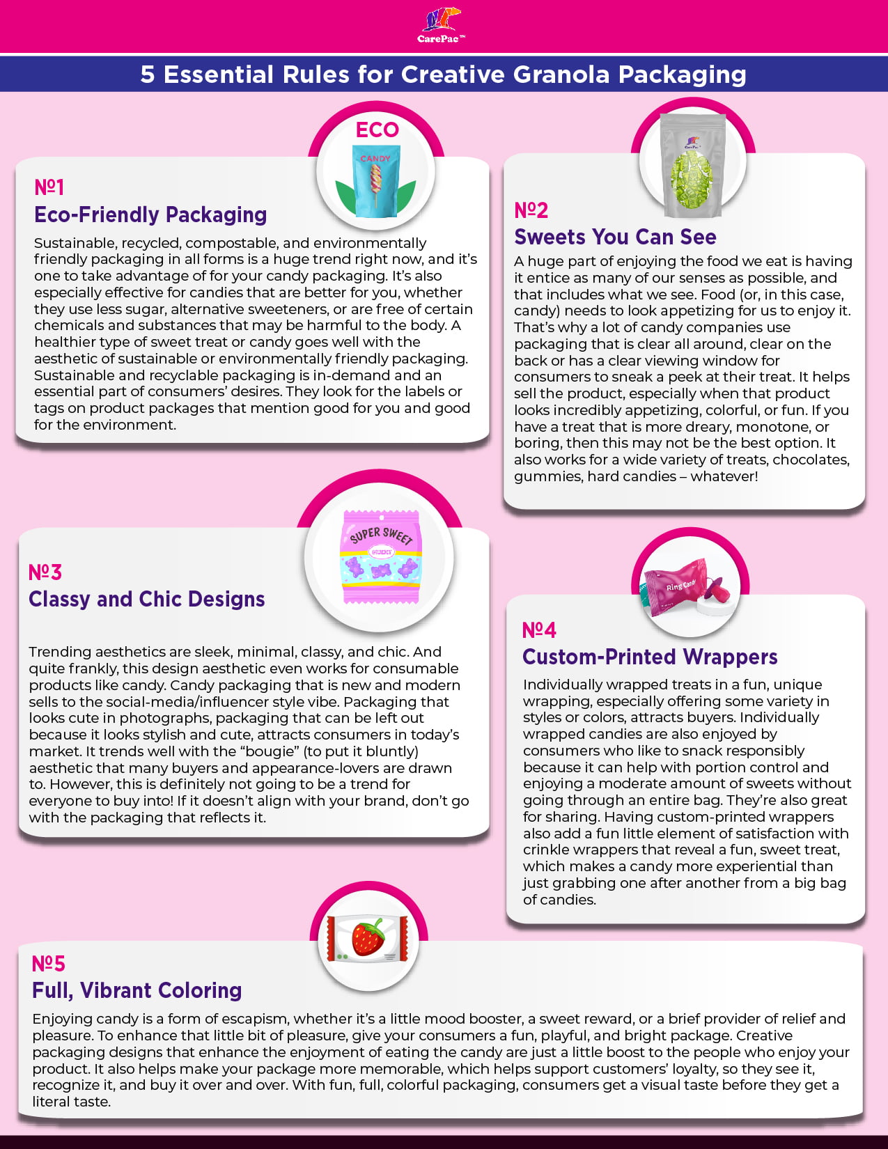
    The candy industry is not an easy one to break into. Candy producers are competing with big-name companies for market share in a massive industry. But luckily, more and more consumers are turning to new, small-business treats to satisfy their sweet tooth. Now’s the time to go all-in with your candy packaging ideas to embrace the moment for your candy business. With the right packaging, you can establish your identity, attract consumers to your candy, and build loyalty with those consumers.

    As good as your candy may taste, they first need to pick it off the shelves. So before you dive into planning out your own candy packaging, here are five trends in 2022 to keep in mind.

    Sweets You Can See

    A huge part of enjoying the food we eat is having it entice as many of our senses as possible, and that includes what we see. Food (or, in this case, candy) needs to look appetizing for us to enjoy it. That’s why a lot of candy companies use packaging and boxes that is clear all around, clear on the back or has a clear viewing window for consumers to sneak a peek at their treat. It sells the product, especially when that product looks incredibly appetizing, colorful, or fun. If you have a treat that is more dreary, monotone, or boring, then this may not be the best option. It also works for a wide variety of treats, chocolates, gummies, hard candies – whatever!

    Popular Candy Packaging That’s Eco-Friendly 

    Sustainable, recycled, compostable, and environmentally friendly packaging in all forms is a huge trend right now, and it’s one to take advantage of for your candy packaging. It’s also especially effective for candies that are better for you, whether they use less sugar, alternative sweeteners, or are free of certain chemicals and substances that may be harmful to the body. A healthier type of sweet treat or candy goes well with the aesthetic of sustainable or environmentally friendly packaging. Sustainable and recyclable candy packaging is in-demand and an essential part of consumers’ desires. They look for the labels or tags on product packages that mention good for you and good for the environment.

    Classy and Chic Design Ideas

    Trending aesthetics are sleek, minimal, classy, and chic. And quite frankly, this design aesthetic works for consumable products like candy. Candy packaging that is new and modern sells to the social-media/influencer style vibe. Packaging that looks cute in photographs, packaging that can be left out because it looks stylish and cute, attracts consumers in today’s market. It trends well with the “bougie” (to put it bluntly) aesthetic that many buyers and appearance-lovers are drawn to. However, this is definitely not going to be a trend for everyone to buy into! If it doesn’t align with your brand, don’t go with the packaging that reflects it.

    Custom-Printed Plastic Candy Boxes

    Individually wrapped treats in a fun, unique wrapping, especially offering some variety in styles or colors, attracts buyers. Individually wrapped candies are also enjoyed by consumers who like to snack responsibly because it can support portion control and enjoying a moderate amount of sweets without going through an entire bag. They’re also great for sharing. Having custom-printed wrappers also add a fun little element of satisfaction with crinkle wrappers that reveal a fun, sweet treat, which makes a candy more experiential than just grabbing one after another from a big bag of candies.

    Full, Vibrant Coloring

    Enjoying candy is a form of escapism, whether it’s a little mood booster, a sweet reward, or a brief provider of relief and pleasure. To enhance that little bit of pleasure, give your consumers a fun, playful, and bright package. Creative candy packaging designs that enhance the enjoyment of eating the candy are just a little boost to the people who enjoy your product. It also helps make your package more memorable, which helps support customers’ loyalty, so they see it, recognize it, and buy it over and over. With fun, full, colorful candy packaging, consumers get a visual taste and idea before they get a literal taste.

    Designs That Work

    Gem Gem

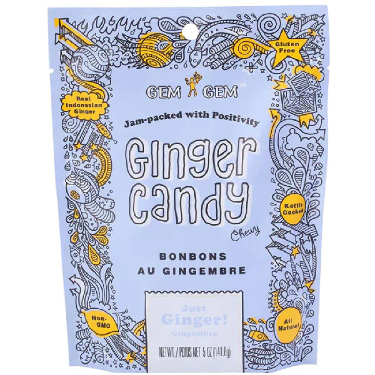
    The ginger candy chews by Gem Gem come in an adorable, energetic packaging design that is playful, fun, and easy. The two-color palette of blue and yellow pair well together in a fun and bright way, while the fun fonts add to the playful feel. The unique scribbled graphics also make it fun and playful since it feels like a teenager’s notebook that is distracting and reflects the ease that is enjoyable with candy. This popular candy packaging is full of color with also feels cohesive and consistent.

    Crow & Moss

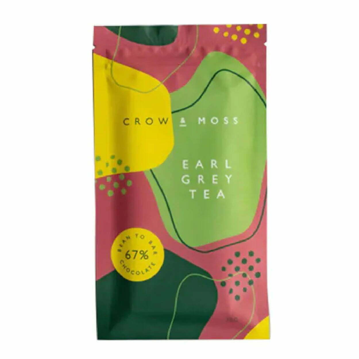
    Crow and Moss has a classy and chic tear-away packaging for their chocolate brittle bar that is sophisticated and looks rich with deep colors. The abstract shapes and patterns scattered throughout almost make it too handsome to just be chocolate. But overall, the aesthetic of this candy packaging paper totally works! 

    The Organic Candy Factory  

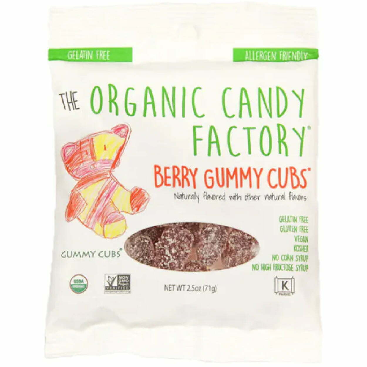
    Organic candies are marketed as earth and natural, which is why the Organic Candy Factory’s sweet package uses a font that almost looks handwritten, along with a bear sketch that definitely looks handwritten. The handwritten tone of the package makes the candy seem almost homemade, so the buyer gets the impression that it contains better-for-you ingredients. Plus, organic can mean healthy, which can mean flavorless – so including the package window so buyers can sneak a peek at how delicious the gummies look only helps to sell them even more.

    Sabadi Organic Italian Candies

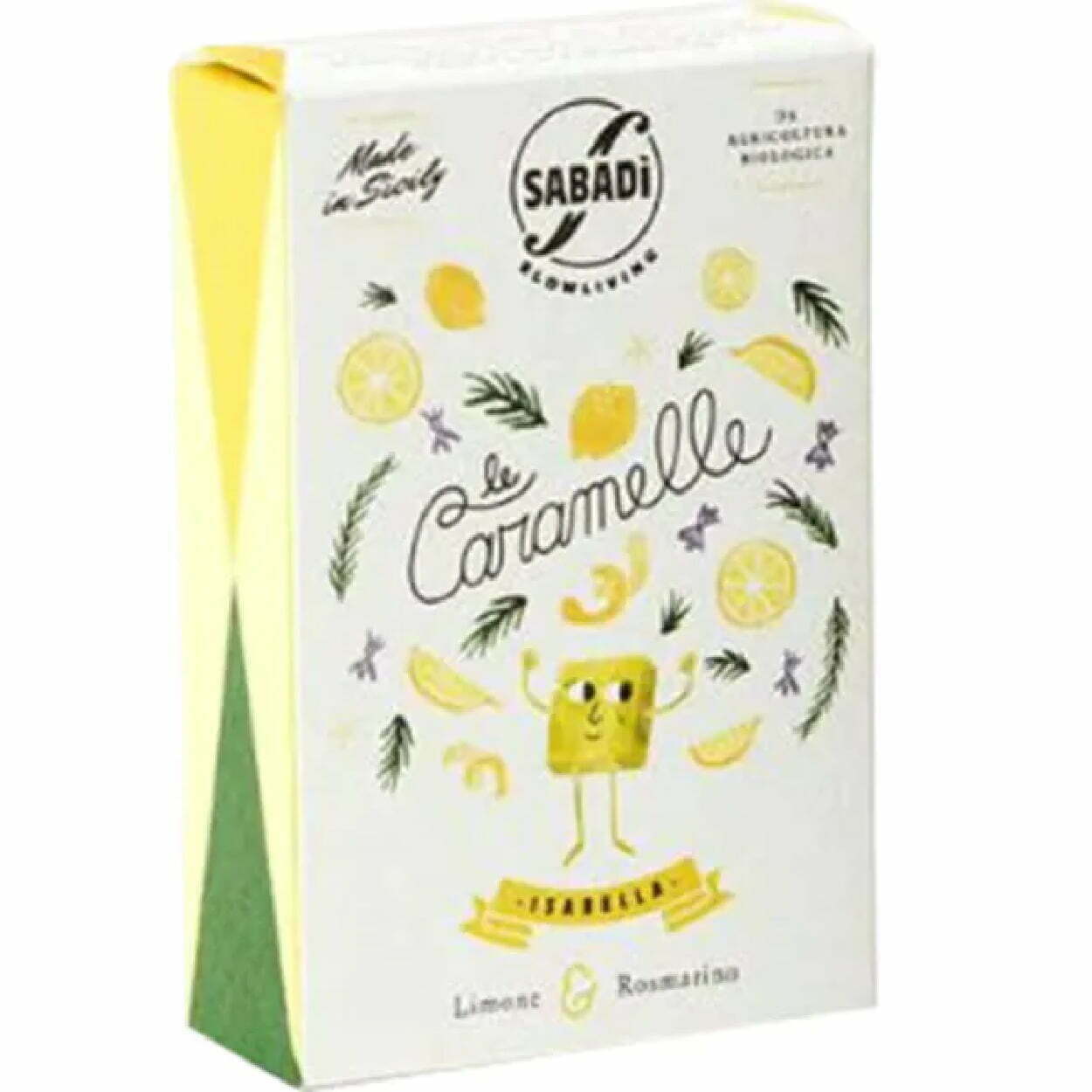
    Sabadi Organic Italian Candies has a lot of good packaging going on. First, the box is light and playful with a bright and vibrant color palette that uses the white space well. Boxes aren’t the easiest to store or stash, but luckily, they also have individually candies custom wrapped and ready to grab. Better yet, the packing of these wrappers is fun, eye-catching, and unique. The packaging of the candy is as delightful as the candies themselves!

    Giddy Up Nuts 

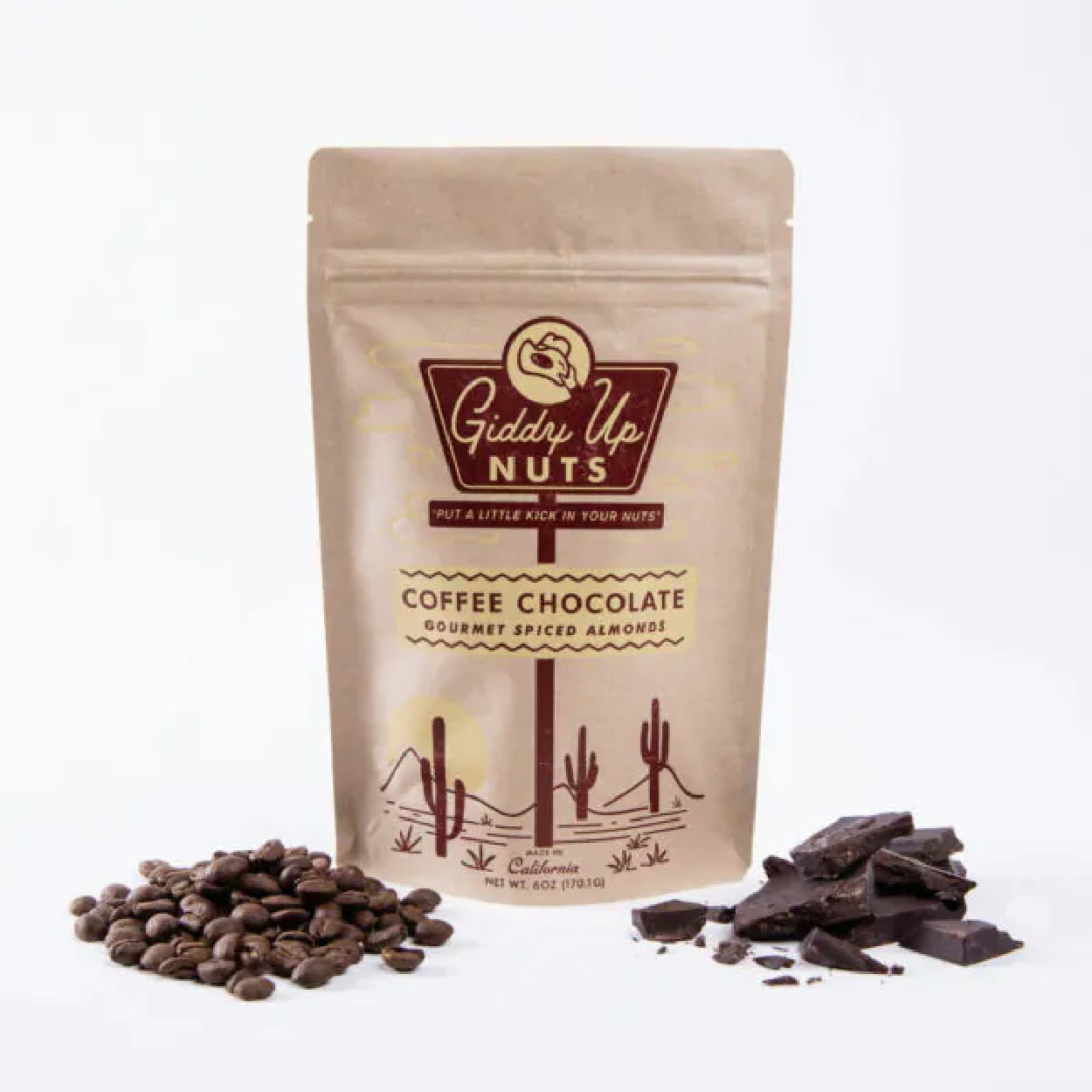
    The packaging for Giddy Up Nuts is minimal, sharp, and simple. Two shades of brown between the print and the packaging material make it look natural and earthy, which makes sense since both cocoa and nuts are earth-made. The eco-friendly packaging is spot on and works for them, although the package isn’t the most eye-catching.

    Tamalitoz

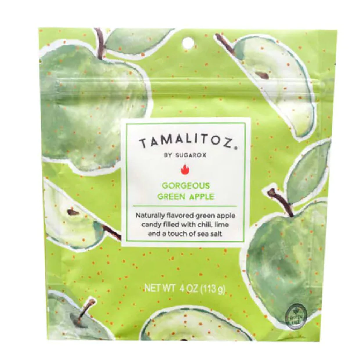
    The designs of Tamalitoz packagings are refreshingly original. Each package takes the color of the fruit that inspires the flavor of that particular candy bag. The graphics are scattered and fun and make it look as fresh and delicious as the candy tastes. The fruity colors are super bright and vibrant, which makes their packaging pop out on the shelf.

    Smart Sweets

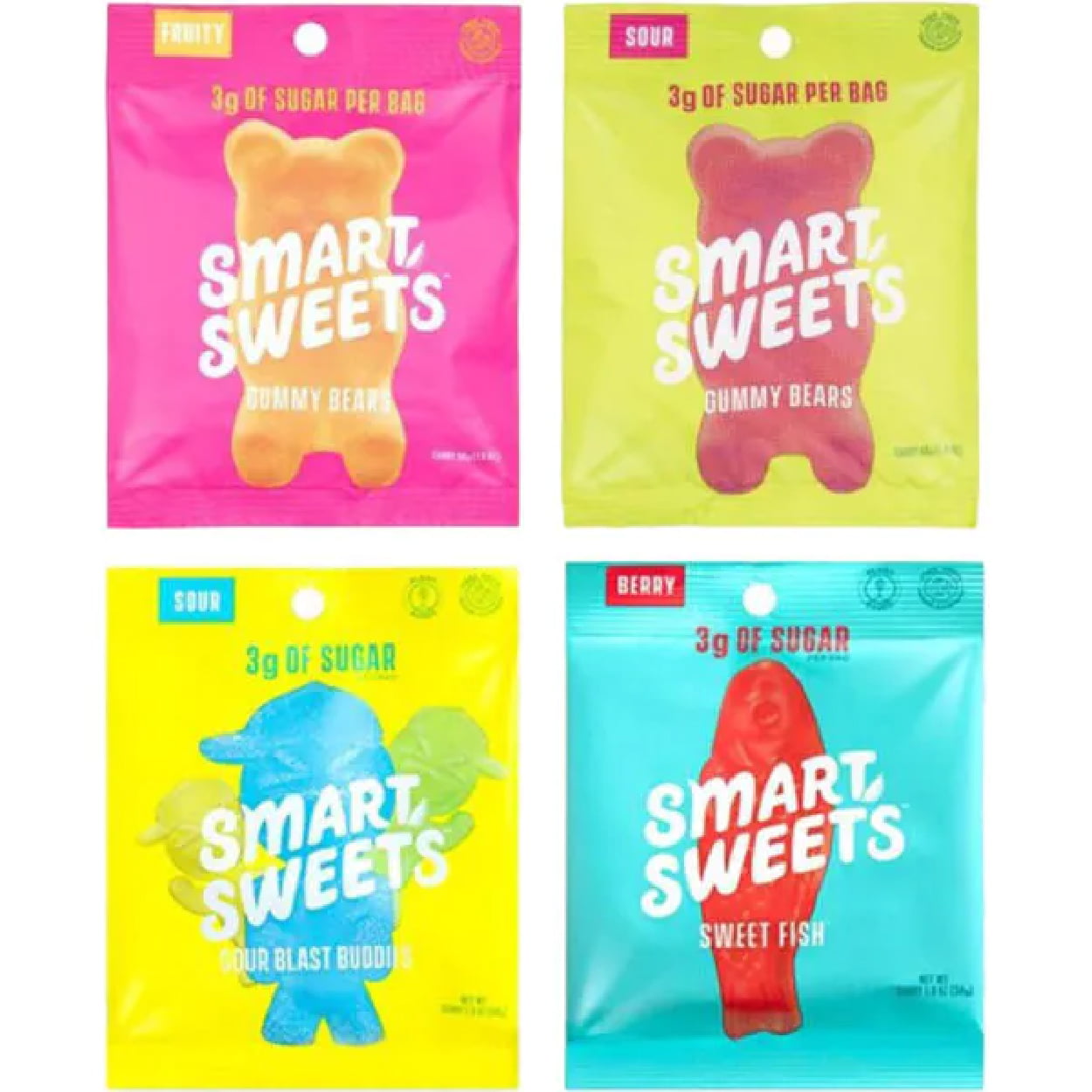
    All of the Smart Sweets plastic candy boxes have three things going for them: bright and loud full-package color, flavor stamps, and the sugar quantity, which is their primary selling point. Smart Sweets is all about low-sugar candies with zero alcohol sugar, so they keep it straight and simple on their bags with only the essential bits of information on them. When considering your packaging, think about making your unique selling point clear.

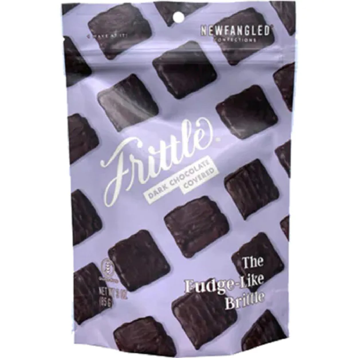
    Newfangled Confections Frittle

    Newfangled Confections makes a bag that is recognizable and memorable but without being loud or too bright. The purple tone, which is a luxurious and rich color, paired with deep dark chocolate and a script font makes for a packaging that pairs bright and fun with classy and chic — perfect for their peanut brittle.

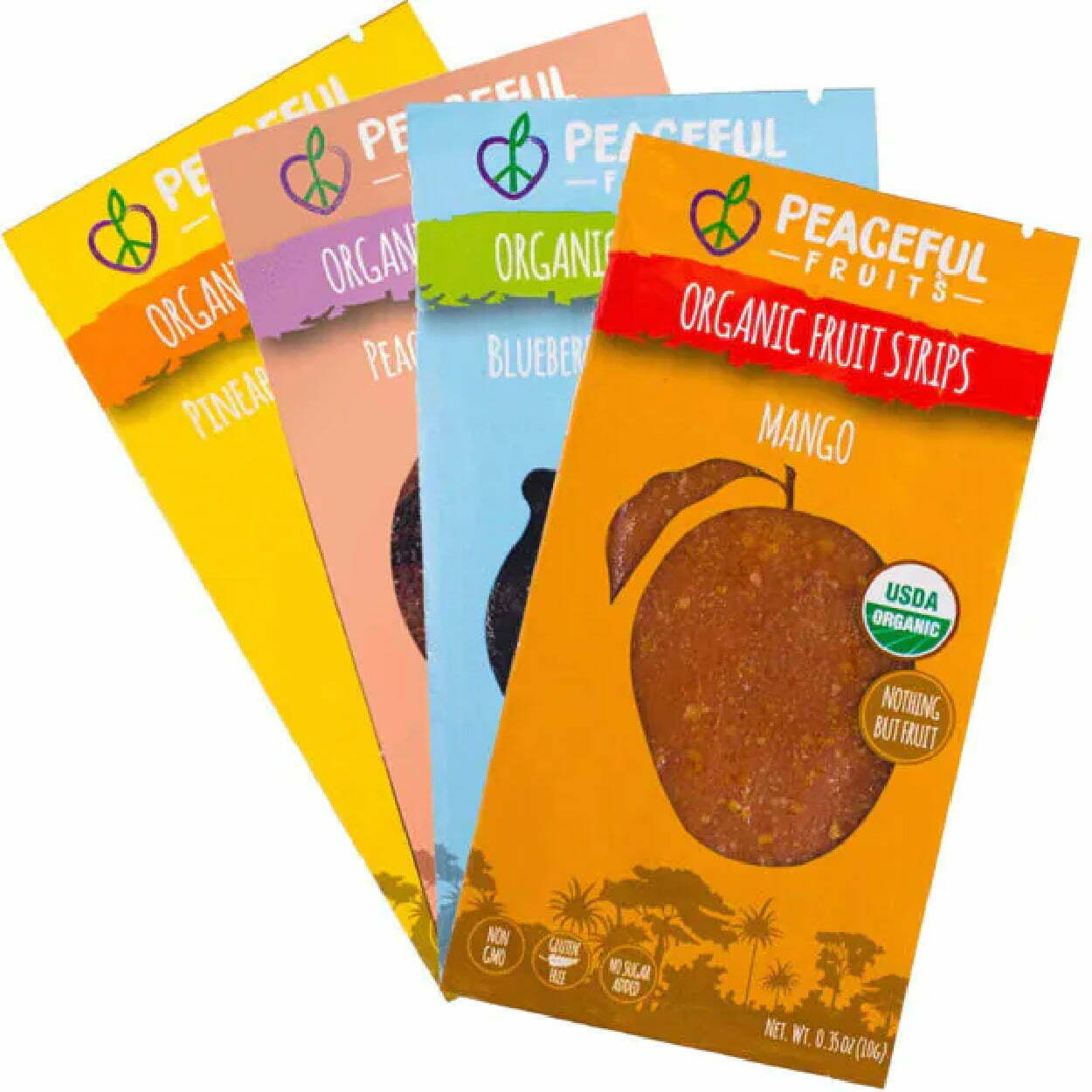
    Peaceful Fruits

    Peaceful Fruits packaging is another vibrant and colorful packaging, with easy tear-away notches for easy opening for a light snack. Each package has a two-toned color with colors close on the color wheel, so they match together well. The “organic” identification goes well with the large, all-caps typography that identifies the product and flavor, and they use the package window in a creative way, shaped like the fruit that matches its flavor.

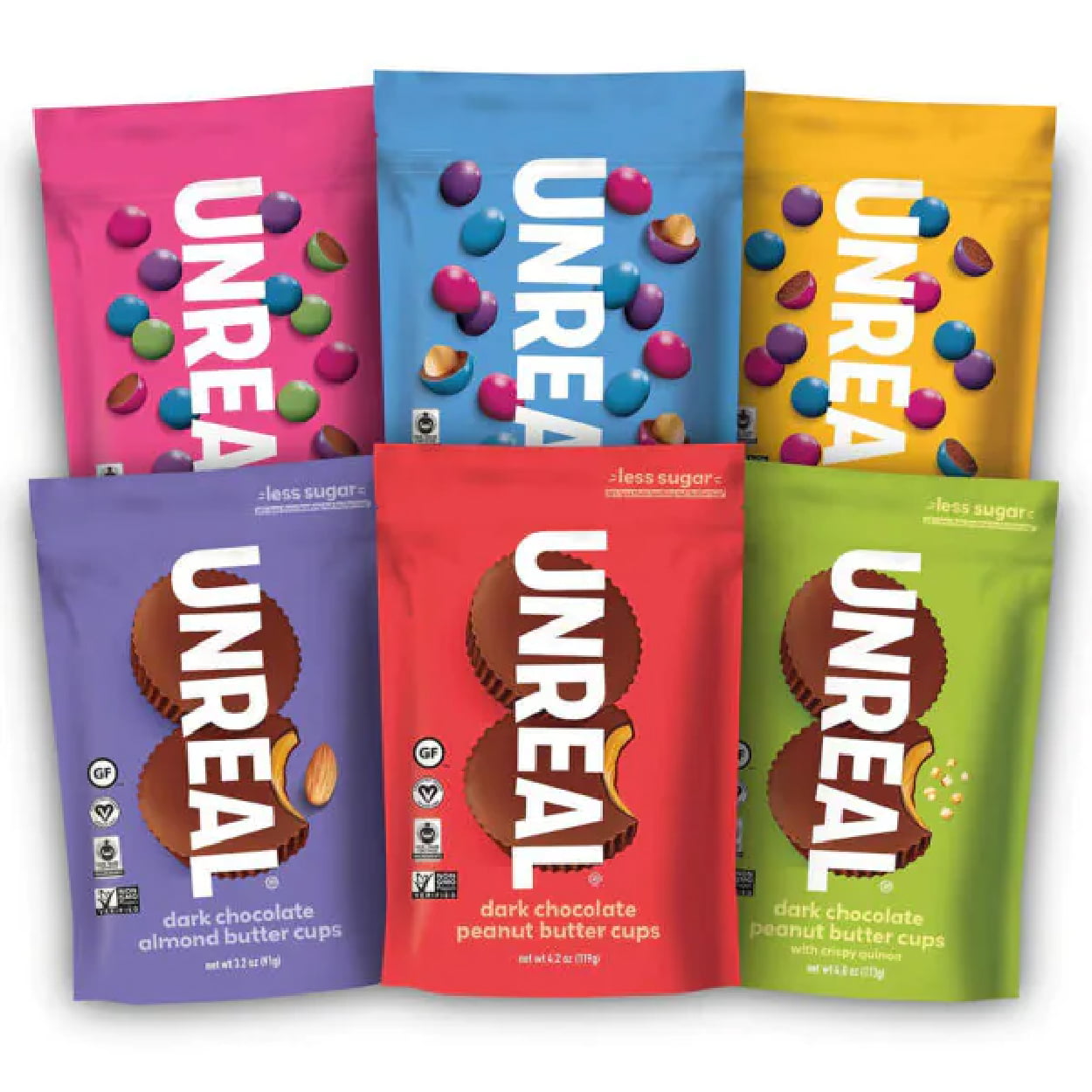
    Unreal Chocolates

    Unreal is another brand that uses bright, colorful, eye-grabbing packaging that helps it stand out on the shelves. The flexible packaging has a tear-away notch but isn’t resealable, which is okay since each piece is individually wrapped, so it still stays fresh. Their big, bold typography logo is memorable and has earned an ability to be identified by consumers, which has helped them build loyalty, too.

    Budget-Friendly, High-Quality Custom Candy Packaging

    This year, boost your candy sales with great candy packaging that’s perfect for your product. CarePac offers customizable candy packaging design in different sizes, styles, and materials, with full-print packaging however you want it. Easy-tear packages, triple-seals, zip closures to keep it fresh, or individually wrapped packages are all options, along with clear, black, and silver films that preserve freshness. No matter what kind of chocolates, gummies, hard candies, or chews you’re looking to sell, our flexible packaging can be personalized to best attract your target consumers and can feature health information on an easy-to-read menu. 

    Interested in finding out more about our packaging prices or options? Check out our website today!
  • 6 Skin Care Packaging Ideas

    6 Skin Care Packaging Ideas

    6 Skin Care Packaging Ideas

    Skin Care Packaging Ideas | Packaging for Cosmetics

    Expectations are high when it comes to skincare and the cosmetics container it comes in, and in an aesthetic-driven industry, the aesthetic of your packaging is extremely important to your customer when it comes to creating a product that sells. Skincare brands focus on clean products, convenience, minimalism, a fresh look, limited ingredients, and eye-catching designs that attract without overwhelming. 

    Help your skincare brand and skin care products catch the spotlight with these 6 skin care packaging tips. 

    Six Skin Care Packaging Ideas

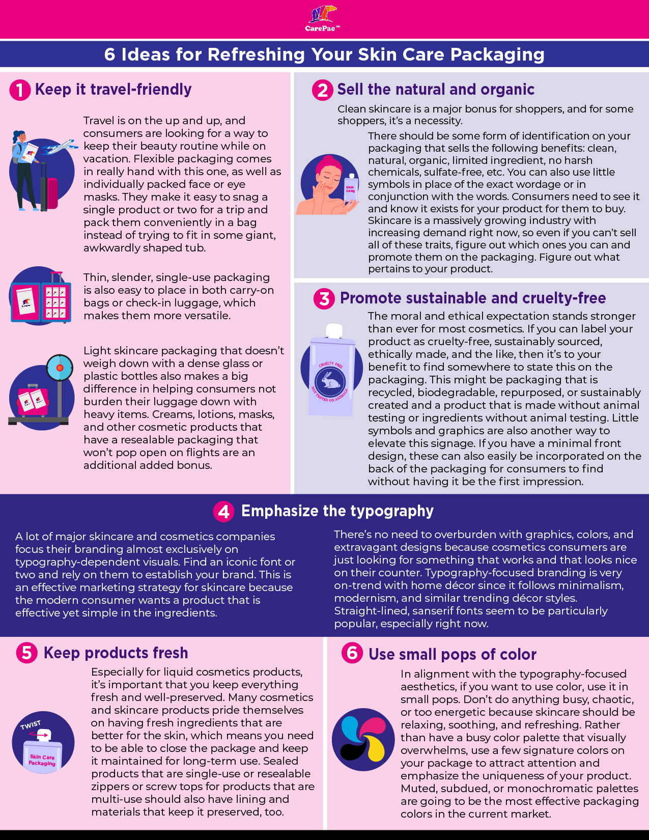
    1. Keep it travel-friendly.

    Travel is on the up and up, and consumers are looking for a way to keep their beauty routine while on vacation. Flexible packaging comes in really hand with this one, as well as individually packed face or eye masks. They make it easy to snag a single product or two for a trip and pack these cosmetics conveniently in a bag instead of trying to fit in some giant, awkwardly shaped tub or bottles. Thin, slender, single-use packaging is also easy to place in both carry-on bags or check-in luggage, which makes them more versatile. Light skincare packaging that doesn’t weigh down with a dense glass or plastic bottles also makes a big difference in helping consumers not burden their luggage down with heavy items. Creams, lotions, masks, and other cosmetic products that have a resealable packaging that won’t pop open on flights are an additional added bonus.

    2. Sell the natural and organic.

    Clean skincare is a major bonus for shoppers, and for some shoppers, it’s a necessity. There should be some form of identification on your packaging that sells the following benefits: clean, natural, organic, limited ingredient, no harsh chemicals, sulfate-free, etc. You can also use little symbols in place of the exact wordage or in conjunction with the words. Consumers need to see it and know it exists for your product for them to buy. Skincare is a massively growing industry with increasing demand right now, so even if you can’t sell all of these traits, figure out which ones you can and promote them on the packaging. Figure out what pertains to your product and make sure your buyers know it.

    3. Promote sustainable and cruelty-free.

    The moral and ethical expectation stands stronger than ever for most cosmetics. If you can label your cosmetics product as cruelty-free, sustainably sourced, ethically made, and the like, then it’s to your benefit to find somewhere to state this on the packaging. This might be packaging or bottles that are recycled, biodegradable, repurposed, or sustainably created and a product that is made without animal testing or ingredients without animal testing. Little symbols and graphics are also another way to elevate this signage. If you have a minimal front design, these can also easily be incorporated on the back of the packaging for consumers to find without having it be the first impression.

    4. Emphasize the typography.

    A lot of major skincare and cosmetics companies focus their branding almost exclusively on typography-dependent visuals. Find an iconic font or two and rely on them to establish your skin care brands. This is an effective marketing strategy for skincare because the modern consumer wants a product that is effective yet simple in the ingredients. There’s no need to overburden with graphics, colors, and extravagant designs because cosmetics consumers are just looking for something that works and that looks nice on their counter. Typography-focused branding is very on-trend with home décor since it follows minimalism, modernism, and similar trending décor styles. Straight-lined, sanserif fonts seem to be particularly popular, especially right now.

    5. Keep products fresh.

    Especially for liquid cosmetics products or facial care products, it’s important that you keep everything fresh and well-preserved. Many cosmetics and skincare products pride themselves on having fresh ingredients that are better for the skin, which means you need to be able to close the package and keep it maintained for long-term use. Sealed products that are single-use or resealable zippers or screw tops for products that are multi-use should also have lining and materials that keep it preserved, too.

    6. Use small pops of color.

    In alignment with the typography-focused aesthetics, if you want to use color on your cosmetics packaging, use it in small pops. Don’t do anything busy, chaotic, or too energetic because skincare should be relaxing, soothing, and refreshing. Rather than have a busy color palette that visually overwhelms, use a few signature colors on your package to attract attention and emphasize the uniqueness of your product. Muted, subdued, or monochromatic palettes are going to be the most effective packaging colors in the current market. 

    Skin Care Packaging Design Inspirations 

    These brands get it, and have implemented a lot of the best practices. The designs below should inspire some creative ideas of your own! Check out the best skin care trends and cosmetic packaging ideas. 
    Drunk Elephant

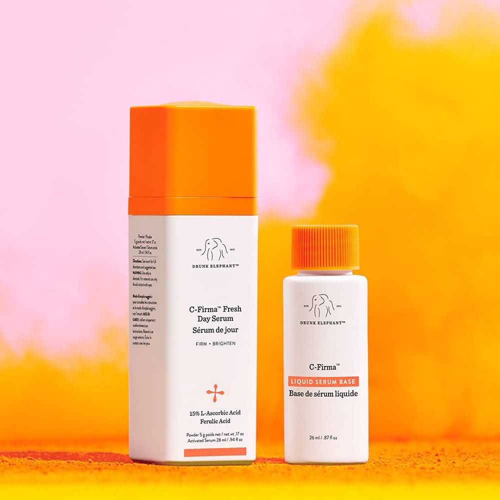
    Drunk Elephant Packaging

    The entire Drunk Elephant line of facial care products features white bottles with colorful, monochromatic lids. The minimal use of color is refreshing and eye-catching, and the minimalistic, drawn elephant graphic is cute yet professional. They pair it with little pops of additional orange throughout the bottle (or whatever the signature color is for that product). The typography isn’t anything crazy, but overall, the packaging is effective and sells well.

    JLO Beauty

    JLO Beauty Packaging

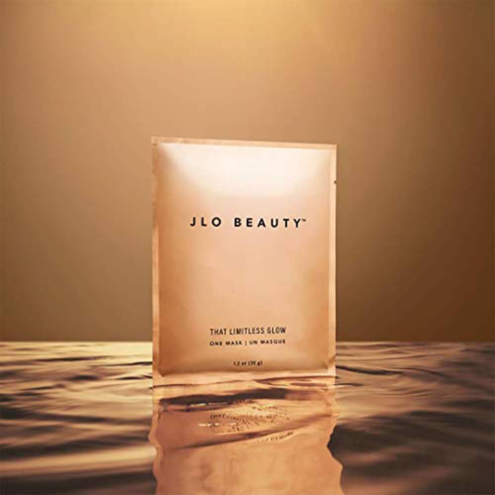
    Jennifer Lopez’s new skincare and cosmetics line is typography-focused, with no graphics, no color, and a simple font pairing that looks professional, sleek, and stylish. It’s modern and aesthetically pleasing for facial care products, which particularly targets the modern consumer. Two bold san-serif fonts strategically placed on the package that is single-use with one mask are all it took to sell. It’s also in convenient tear-open packaging that contains one mask and makes it easy to pack or store.

    Sephora Hair

    Sephora Hair Packaging

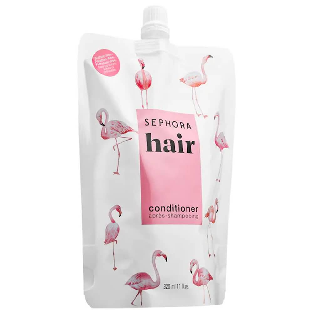
    The Sephora brand of skin care formulas and cosmetics products all follow similar packaging designs, although they have plenty of variety with the types of packaging they use. Simple color palettes, usually just one or two colors that are engaging and often energetic and bright, are characteristic of them. Most of their Sephora brand packaging also has cute graphics, fun colors and styles, and bold and funky fonts. It strays from the norm but still keeps it fun on a visual level.

    Youth to the People

    Youth to the People Packaging

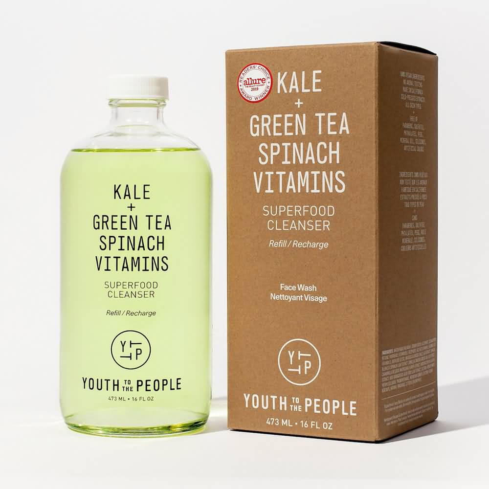
    Youth to the People markets itself with its beauty products packaging as being nutrient-rich, health-food-focused, and made with natural ingredients. Clear packaging bottles and cosmetic containers gives off a sense of transparency, which consumers want since they want to know what is in their product (although clear packaging works better for clear liquids and not for thicker creams). They emphasize “kale” and “green tea” on most of their packaging. They also give off a natural and eco-friendly tone with the simple brown cardboard packaging.

    Volition 

    Volition Packaging

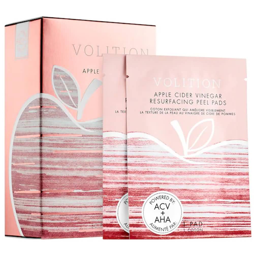
    Volition’s mask set has quite a bit more color than most skincare brands, but the pop of pink is effective, especially when paired with the apple logo, which denotes a healthy connotation. Multiple, single-use masks that are individually wrapped with a tear-notch but still packaged conveniently within the cardboard box help for organization and gives the option to pack a mask or two when traveling.

    Wishful

    Wishful Packaging

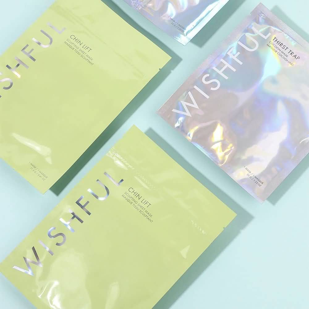
    Wishful effectively uses a pop of color – the lime green – and pairs it with the signature holographic lettering that is present on all their various packaging. It’s bright and fun, and their products’ color matches the packaging as well. The typography-focused logo and branding are also straight and to the point, but the colors make it fun and engaging.

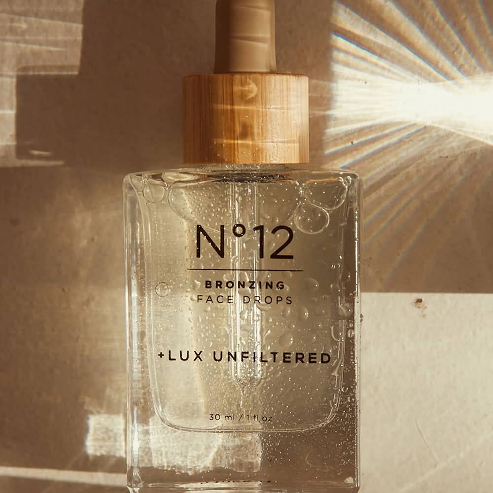
    Lux Unfiltered 

    Lux Unfiltered Packaging

    Lux Unfiltered uses a neutral palette and bamboo-toned shades to convey a sense of a natural and healthy product. The typography is central to the design, and the clear packaging also gives off transparency to consumers. It may not be natural and organic, but it gives off that vibe with packaging that seems ‘healthier,’ so to speak.

    Amika

    Amika Packaging

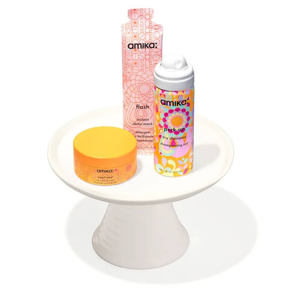
    Amika is one of those rare brands that pulls off a lot of color and pulls it off well. They don’t limit their color palette; they don’t focus on their typography (although their font choice is unique and memorable) and it doesn’t give off natural and organic vibes. But what they have works! The patterns are soothing and repetitive, which is consistent across all their products. The color wheel is always well-represented but with colors that pair well rather than clash (orange/blue/lime green, pink/orange/yellow, etc.), and it’s a great energy overall.

    Pattern

    Pattern Packaging

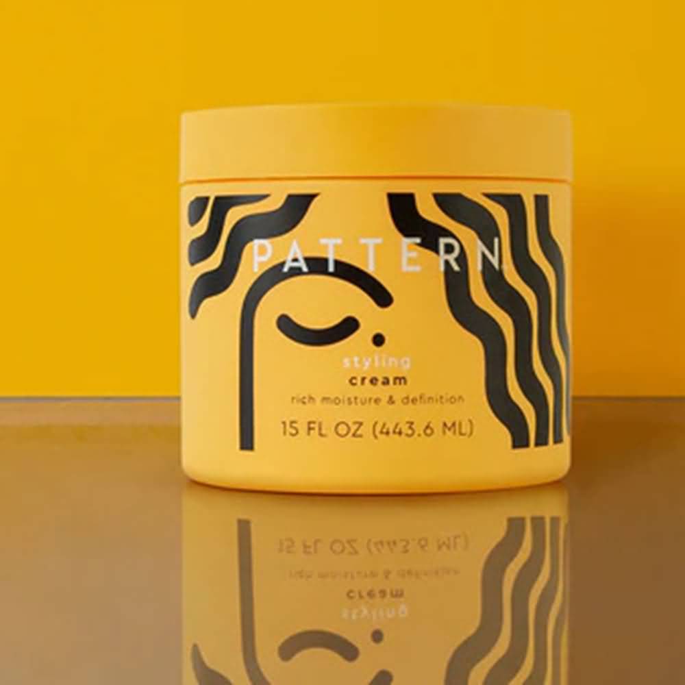
    Pattern uniquely caters to textured hair, which is evident by its logo and graphic. The black and yellow color palette keeps it minimal and has a single pop of color. The simple abstract graphic underneath linear, bold typography and a package in full color make for a bold, eye-catching package.

    Rael Beauty

    Rael Beauty Packaging

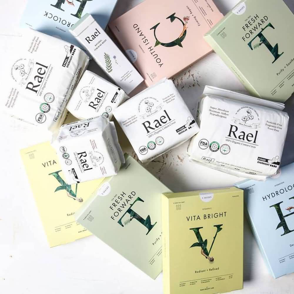
    Rael Beauty’s pastel color palette to distinguish the different types of masks they have keeps it easy to tell them apart and easy on the eyes. The single-letter serif font logo wrapped in leaves is earthy yet professional. Single packages keep each mask fresh and make it easy for consumers to take them on travels.

    Find the Right Beauty Products Packaging Provider to Bring Your Design to Life

    Finding the perfect combination packaging that looks how you want it to look but also functions well and is on-trend can be a challenge. CarePac offers custom, flexible, full-print packaging in a range of styles, sizes, and shapes. Sheet masks and peel-off face masks are in-demand, so you need packaging that stands out. Resealable packaging, single-use packaging, and easy-to-open packaging are all options depending on the type of product.

    Skincare product packaging needs to follow an aesthetic that allows it to stay competitive in today’s market, no matter what your target demographic is. Affordable packaging that keeps your product fresh saves you money and is easy to customize for what you’re trying to sell is easy to get with CarePac.

    Contact us today for a quick quote or samples!